How real-estate platform design highlighted distinctive properties and drove sales
Project:
the project
Most residential developments lose buyers online because the digital experience fails to communicate its value. Competitive pricing and a prime location mean nothing if visitors can't grasp them within the first few seconds of landing on a page.
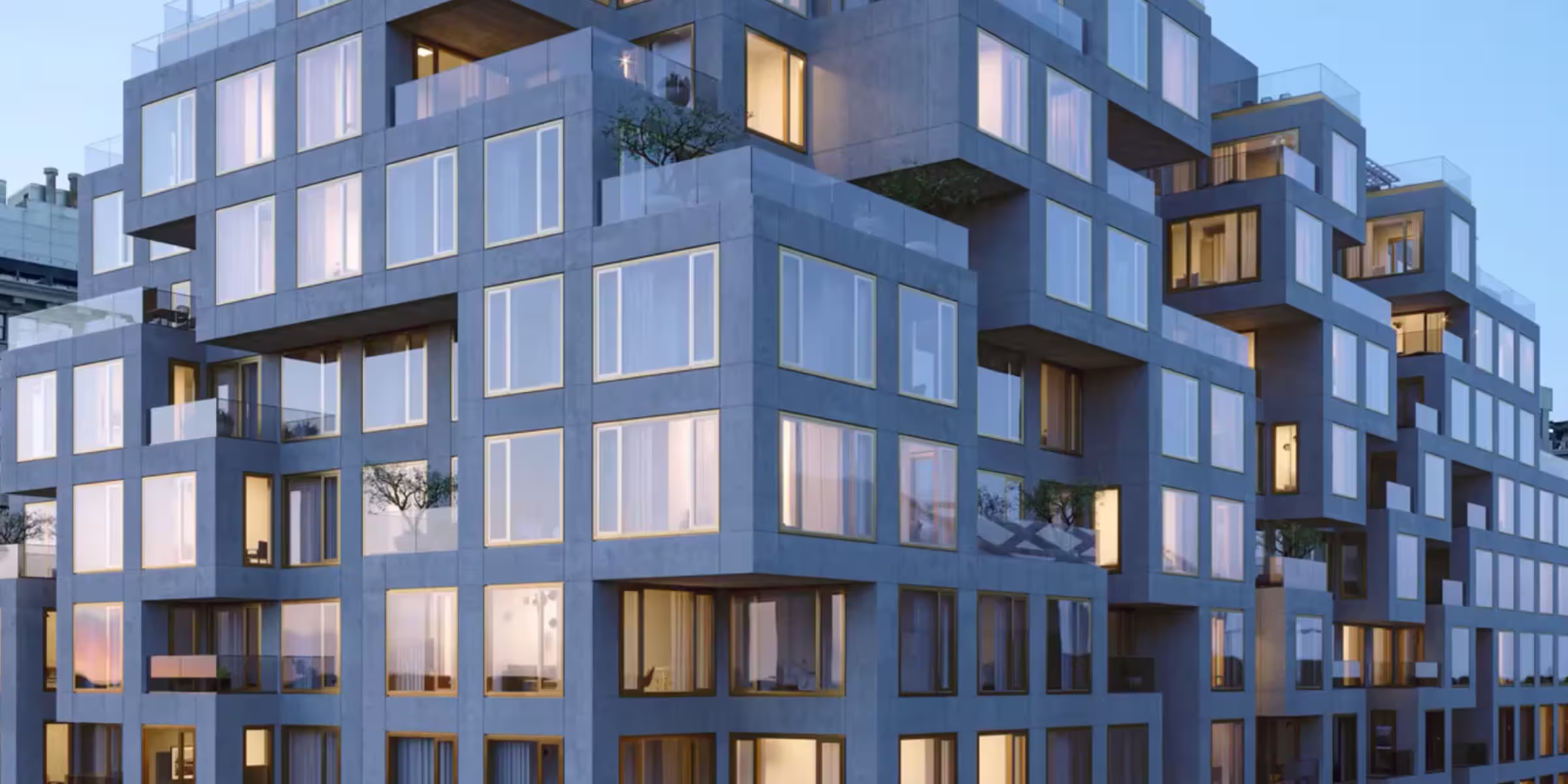
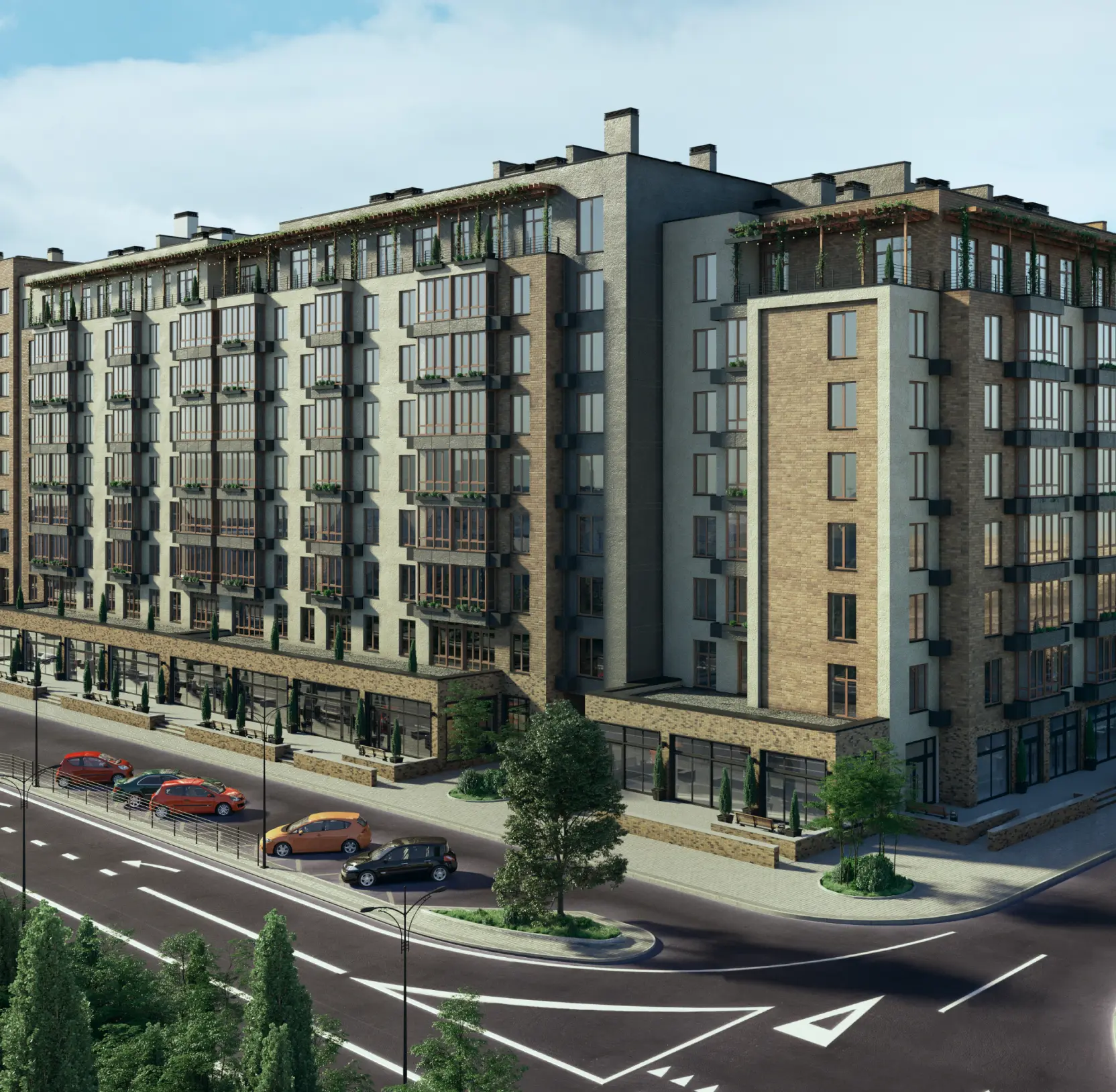
Riviera City offers prime-location apartments with exceptional layouts and pricing. Their old website had the information. What it lacked was the structure to turn that information into decisions.
We rebuilt the platform as a sales tool from the ground up. The measure of success was simple: fewer buyers leaving with unanswered questions, more of them picking up the phone.
The Project’s
Discovery Phase
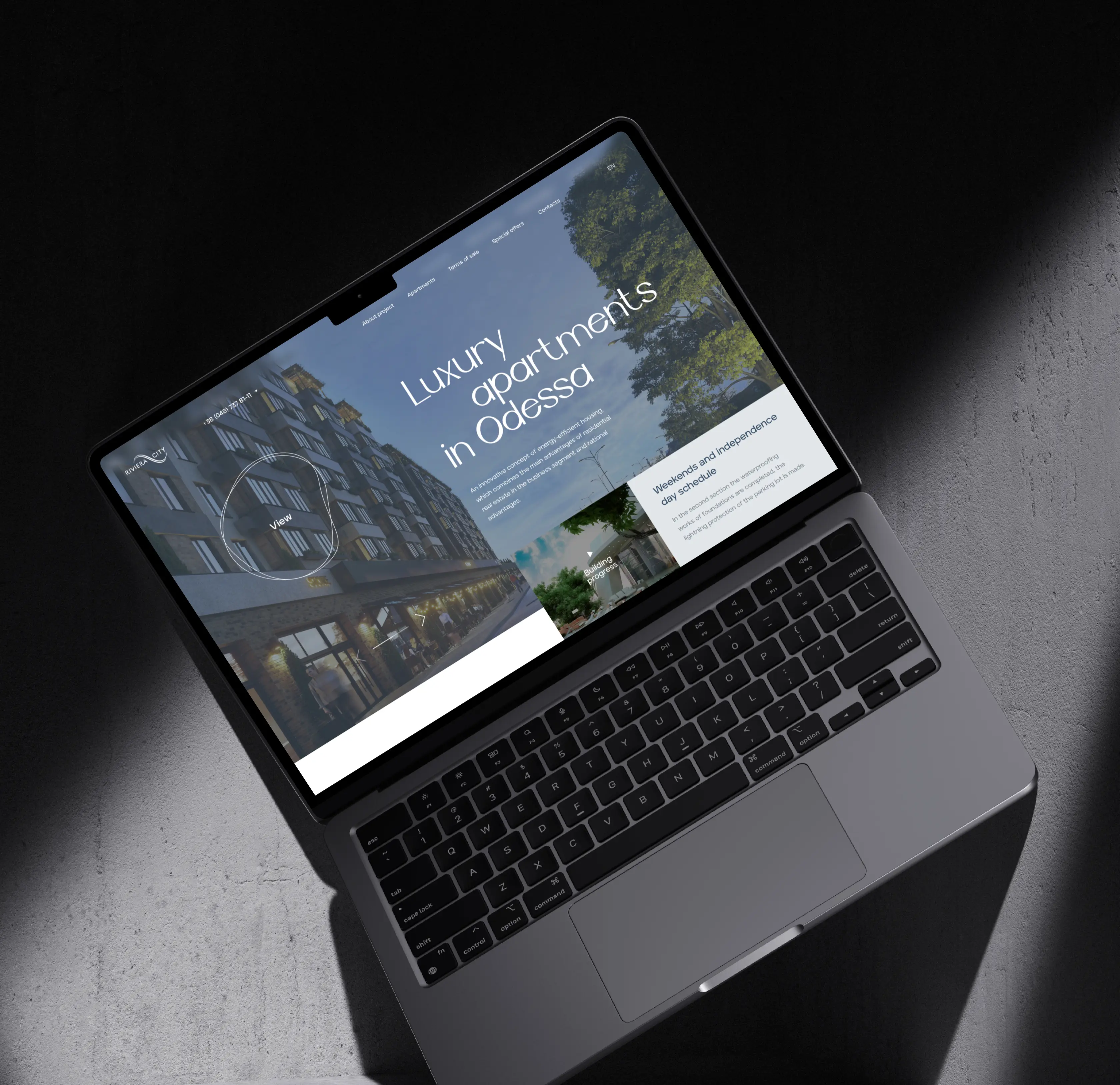
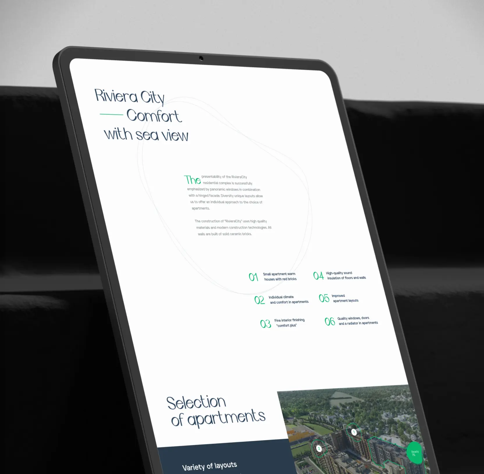
Designed a homepage to establish premium positioning and guide buyers toward inquiry
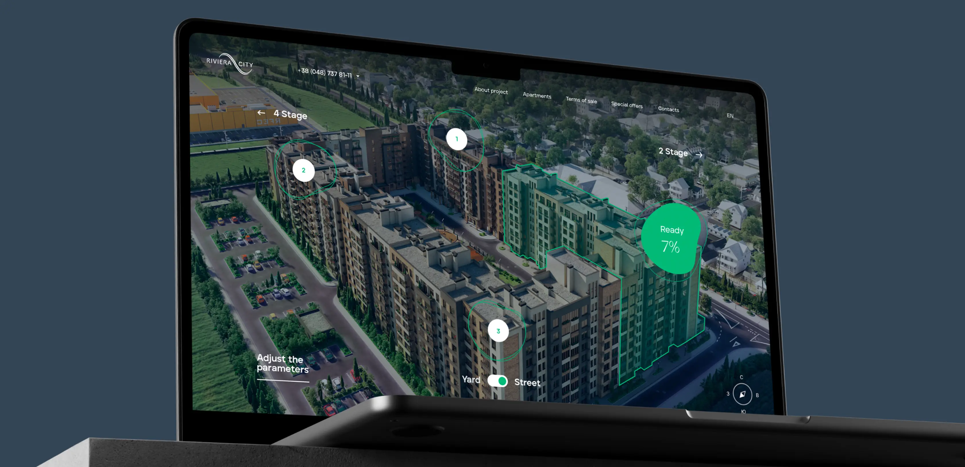
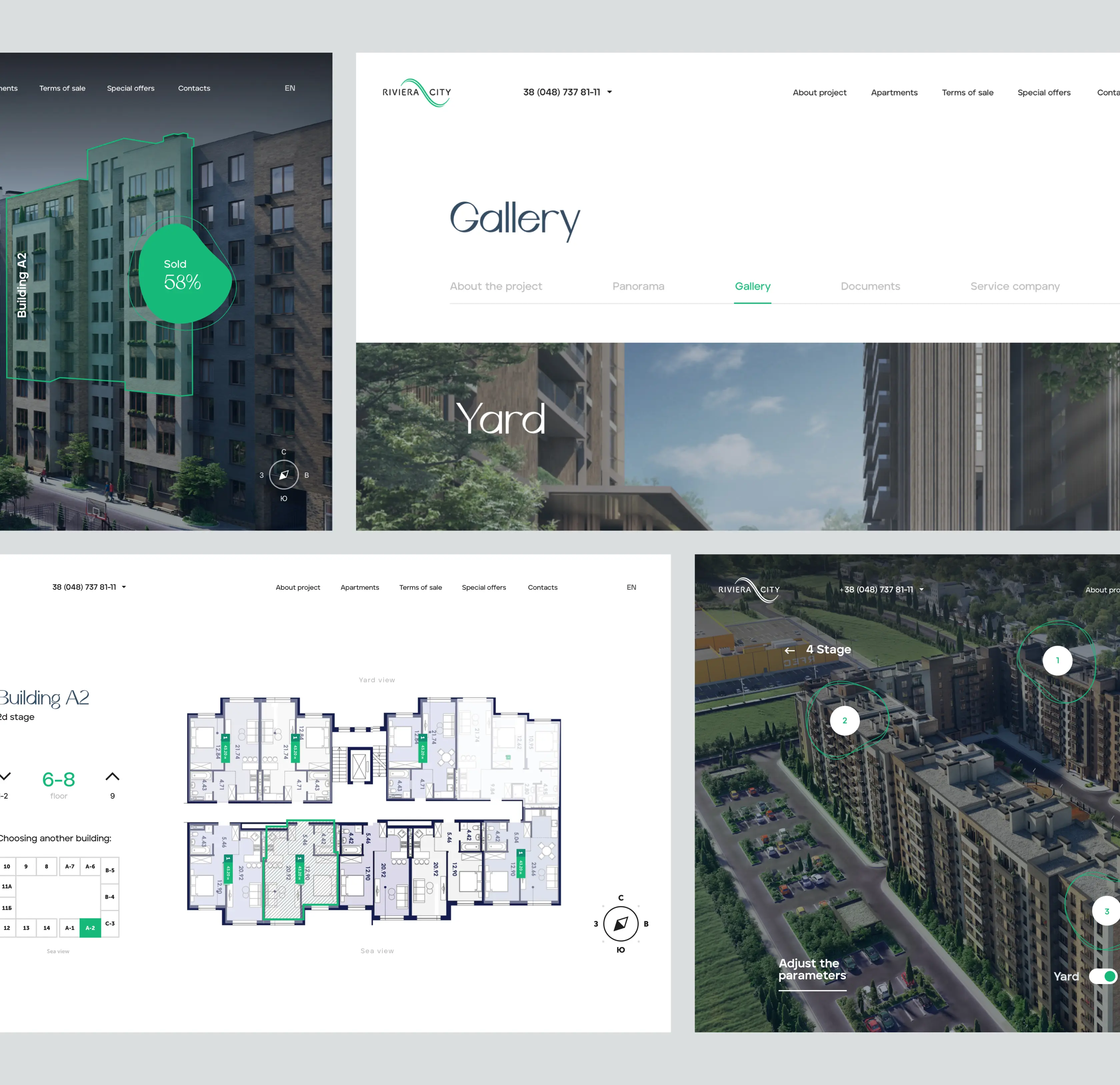
The homepage follows a deliberate sequence: a 3D preview of the complex, development highlights, apartment selection tools, then contact options. Each stage answers the question the previous one raised, which keeps buyers moving forward rather than leaving to find answers elsewhere. By the time a visitor reaches the apartment selection tools, they already understand why this development is worth their time.
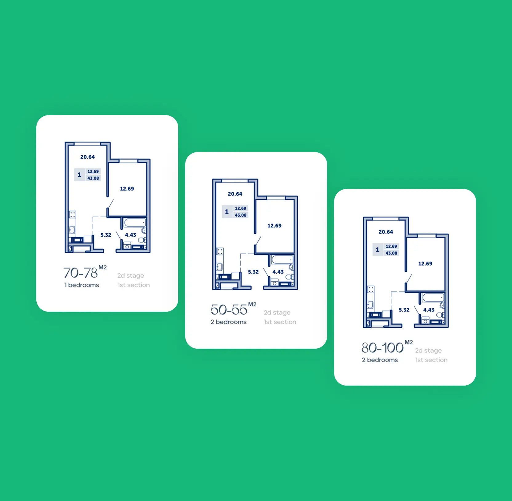
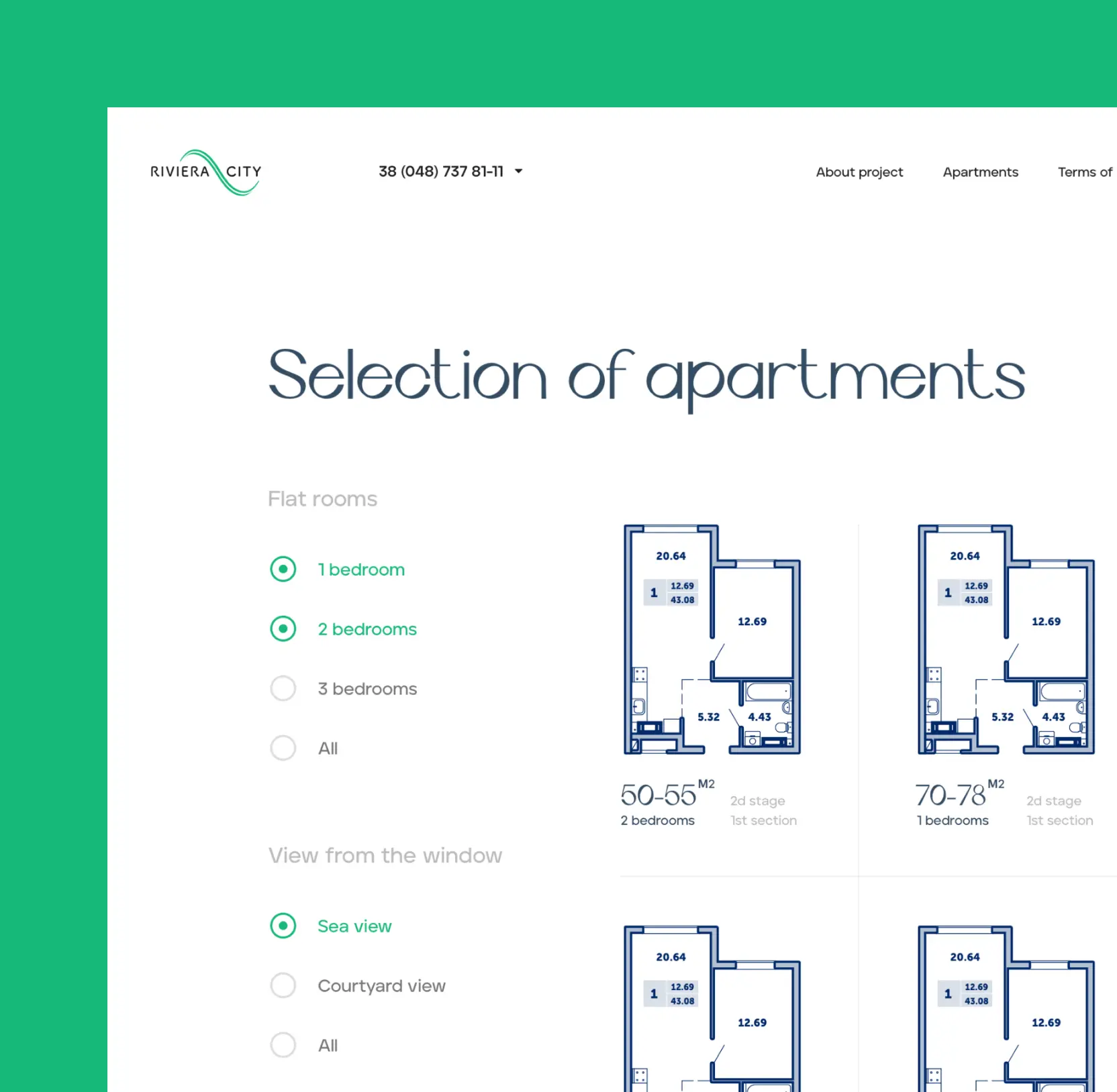
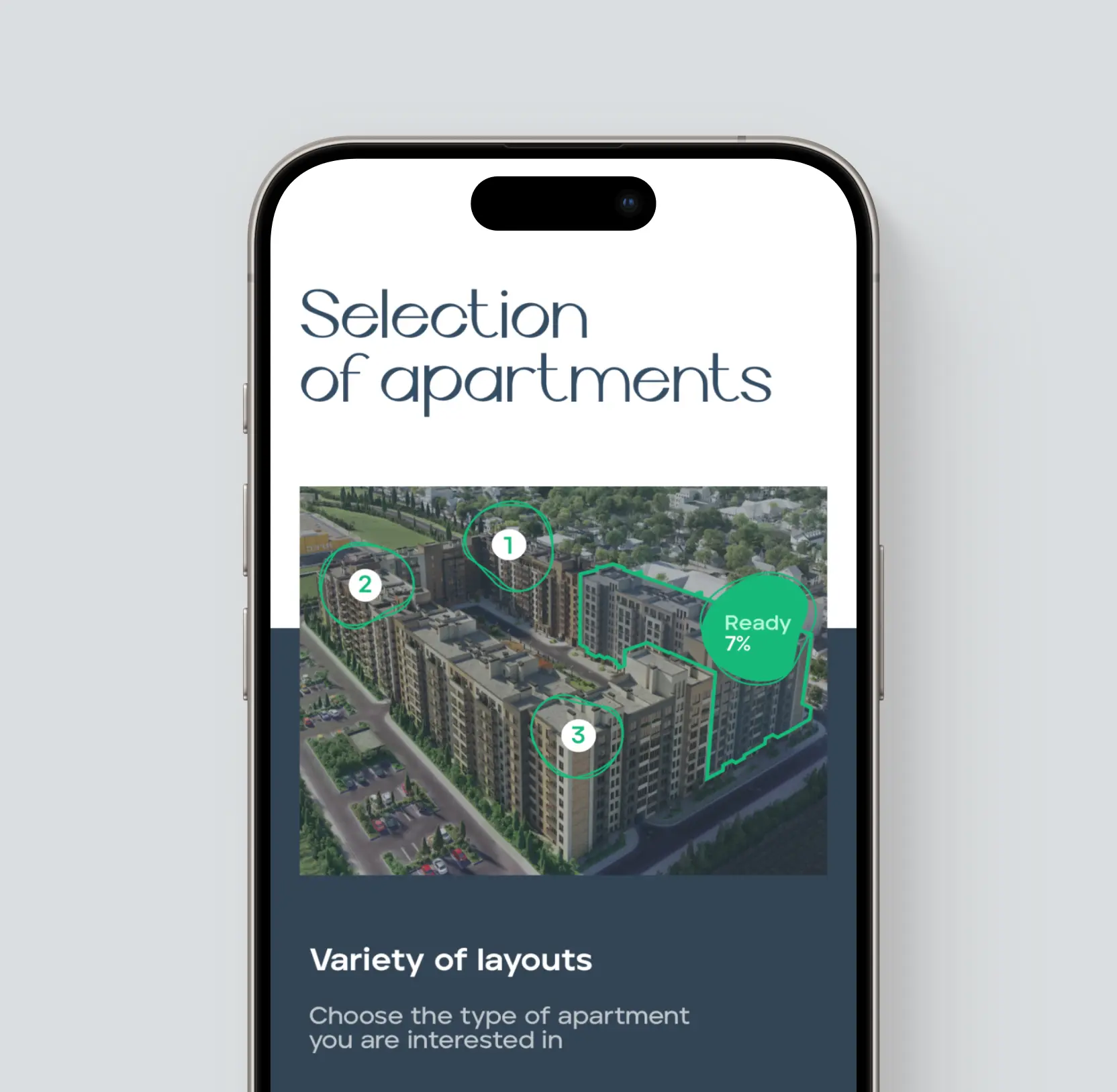
Built interactive floor plans and filters to shorten the apartment selection cycle
Comparing layouts across multiple floors is where most buyers stall. To move them through that stage faster, we added filters for number of rooms, floor position, and window orientation, paired with both standard 2D floor plans and full 3D visualizations.
Buyers overwhelmed by large inventories benefit immediately: filters eliminate irrelevant options before decision fatigue sets in. Remote and out-of-city buyers gain something different: the 3D floor plans substitute for an in-person visit during early evaluation, which widens the qualified lead pool without adding workload to the sales team.
Speaking of which, sales teams handling high inquiry volumes see shorter calls. Buyers who have already explored the layouts arrive with specific questions rather than open-ended ones, which compresses the time between first contact and decision.
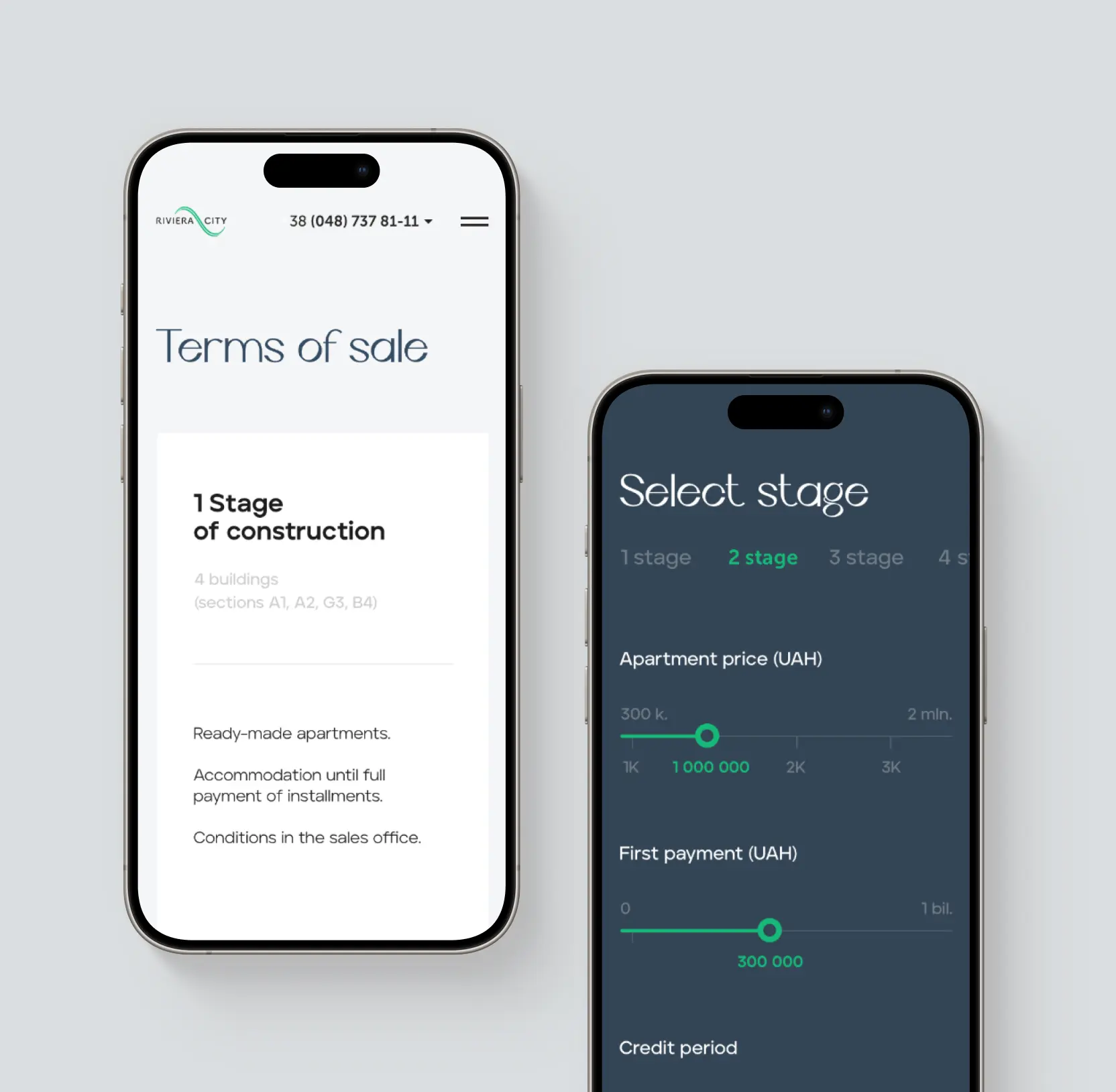
Shipped a payment calculator to convert browsers into qualified leads
On the Terms of Sale page, a three-input calculator handles the math buyers would otherwise leave the site to do elsewhere: apartment price, down payment, loan duration.
First-time buyers hesitate most when they can't quickly answer "can I afford this?" Removing that question from the equation removes the most common reason people leave without getting in touch.
Developers offering installment or mortgage-linked structures get an additional advantage, the calculator makes financing options visible and concrete rather than abstract.
And because buyers who work through the numbers and stay on-site are already pre-qualified in the most practical sense, the tool functions as lead filtering just as much as it functions as conversion support.
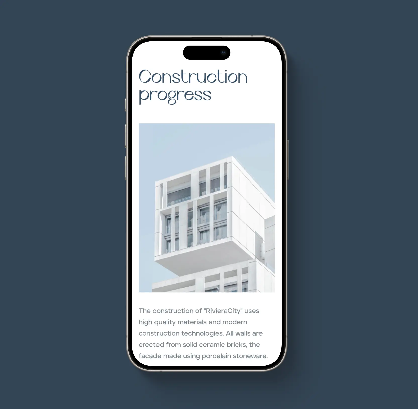
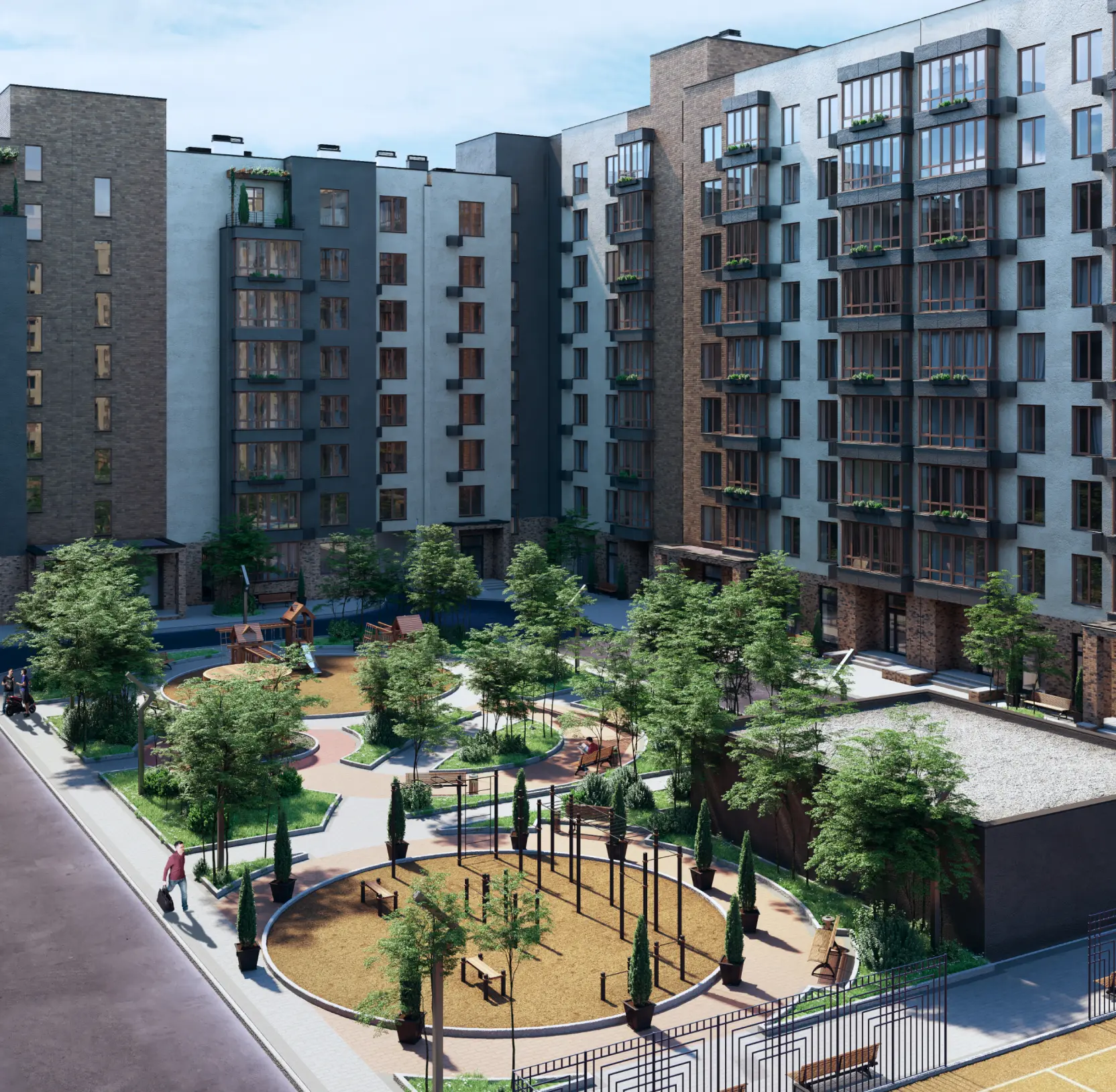
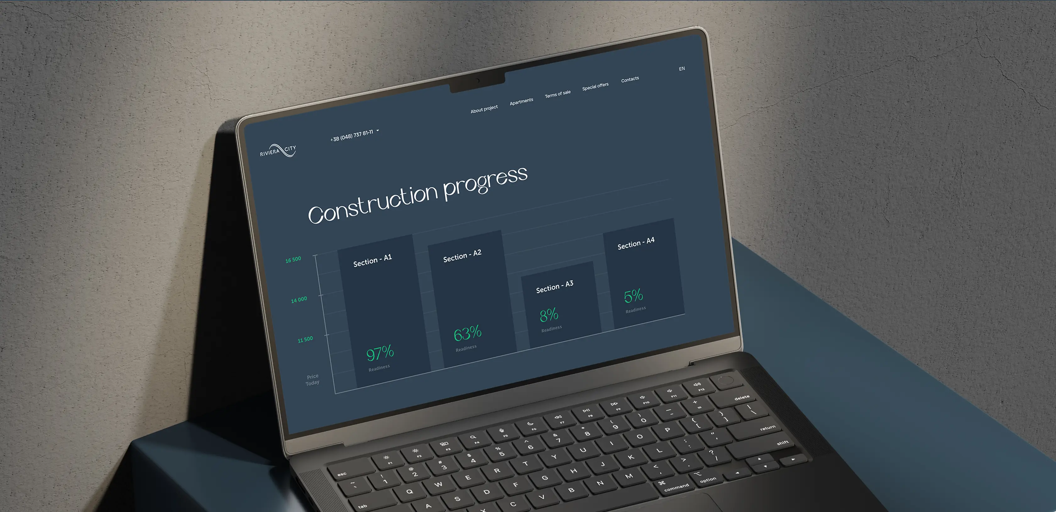
Created a construction progress page to build purchase confidence
Off-plan sales carry an inherent risk perception that no amount of render quality fully resolves. Buyers are committing real money to something that doesn't yet exist, and they know it. A progress page with visual diagrams showing build status by section addresses that directly.
Developers competing against finished inventory also gain an unexpected edge: visible construction momentum reframes "not yet built" as a sign of active progress.
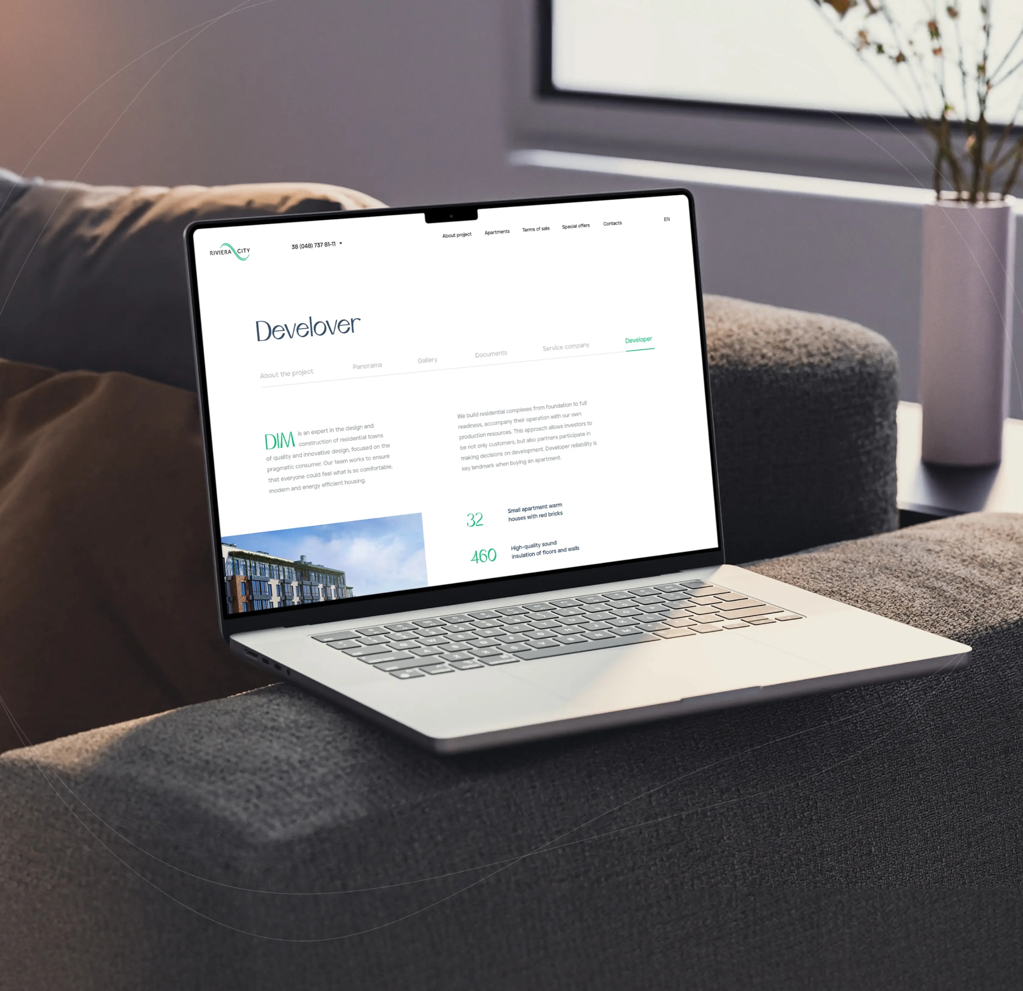
Built a developer credentials page to eliminate late-stage hesitation
Company background, completed projects, and supporting documentation are organized into a dedicated section with its own navigation. Buyers who want to verify the developer before signing anything can do so in one place, without contacting sales to ask basic questions.
Late-stage hesitation often has nothing to do with the apartment. It comes down to trust in the company building it. Accessible credentials address that before the sales conversation even starts. Investors conducting due diligence move faster when the documentation is structured and findable rather than scattered.
Optimized for mobile to capture buyers at every stage of the decision cycle
Cross-device consistency is among the most underestimated factors in real estate platform design. A buyer who starts on their phone and picks up their laptop later expects the same experience on both. When the mobile version is a stripped-down version of the desktop, that transition creates friction and friction at the consideration stage costs leads.
We offered a real estate platform design that loads the first screen in two to three seconds under simultaneous traffic. Every feature: filters, floor plan explorer, the interactive building model, works at full capability on mobile.

Mobile first web design guide: strategy, rollout, and examples

Real estate
Lazarev. agency offers comprehensive digital design services. Discover our range of related expertise supported by impactful case studies.
More Startups Cases


FAQ
How long does it take to rebuild a real estate platform into an actual sales tool?
For Riviera City, the full build: homepage restructure, interactive apartment explorer, 3D building model, payment calculator, construction progress page, and full mobile optimization, took three to four months. The bottleneck is getting alignment on where buyers drop off and what questions they leave with before a single screen gets built. Developers who come in knowing their conversion problem move significantly faster than those who treat it as a visual refresh.
We have a website with all the information. Why aren't buyers contacting sales?
Information and structure are different problems. Riviera City had the same issue: the pricing, layouts, and location advantages were all there, but nothing was sequenced to move a buyer from curiosity to inquiry. When visitors can't answer "what does this look like, why is it worth my time, and can I afford it" in that order and without leaving the page, they leave.
What's the actual business case for investing in real estate platform design at this stage?
A weak platform costs you the leads that never convert. Every buyer who leaves the site to run payment calculations elsewhere, or abandons the apartment explorer because the filters don't work on mobile, or hesitates at the final stage because they can't verify the developer, is a lead the sales team never gets to speak to. Good real estate platform design removes those exits one by one. The calculator alone on this project addressed the single most common reason first-time buyers leave without contacting sales.
Our sales team is already handling inquiries. Do we actually need an interactive building model?
The 3D model on this project was built to improve the quality of who reaches them. Buyers who have already rotated the building, explored their preferred floor, and checked availability arrive with specific questions rather than open-ended ones. That compresses every call. It also expands the top of the funnel: remote and out-of-city buyers who wouldn't visit in person during early evaluation can now qualify themselves before getting in touch, without adding a single task to the sales team's workload.
How does showing construction progress actually affect purchase decisions?
Off-plan buyers carry a risk perception that renders and brochures don't resolve. They know they're committing money to something unfinished, and they're looking for evidence that the project is real and moving. A progress page with visual diagrams showing build status by section gives them that evidence directly. For Riviera City, it also addressed a competitive problem: buyers comparing this development against completed inventory were using "not yet built" as a reason to hesitate. Visible momentum reframed that. It turned an objection into a proof point.
What makes a payment calculator worth building when buyers can just use a bank's calculator?
Buyers who leave the site to run numbers elsewhere don't always come back. The calculator on this project kept that calculation inside the platform, three inputs, an instant result, with an option to receive a full breakdown by email. That last part matters: a buyer who requests the email summary has self-identified as a serious prospect. They've told you their price range, their down payment capacity, and their preferred loan term, without a sales call. The tool converts them into pre-qualified leads.
How does real estate platform design change what investors see when they evaluate the project?
Investors in real estate developments are evaluating the sales operation behind your website. A platform that shows a structured buyer journey, measurable engagement with apartment selection tools, and a calculator generating qualified lead data tells a different story than a static website with a contact form. Riviera City's real estate platform design made the commercial logic visible: how many buyers are exploring which units, where they spend time, and at what point they request a payment breakdown.


Hit me up! Let’s chat about your growth


