How Lazarev.agency helped Dynascale attract new leads and build an engine for profit growth
Project:

the project
Dynascale is a U.S.-based enterprise provider of private cloud and managed IT services, operating 10+ data centers nationwide. Yet, despite enterprise-grade infrastructure, white-glove support, and long-term client loyalty, they lacked visibility, clarity, and traction in a perception-driven market.
In short: Dynascale was an enterprise-grade provider with no digital infrastructure to support enterprise growth.
That’s where Lazarev.agency came in.
Impact & Outcome
Lazarev.agency helped Dynascale overcome growth challenges with a strategic brand revamp, enterprise-grade UX design, and messaging tailored to key audiences.
The Project’s
Discovery Phase
Created a lead-generating web experience
Dynascale needed a growth engine. We restructured the entire digital experience around actual buyer journeys instead of internal org charts.
Now, visitors can quickly find what they need based on their role, challenge, or industry and take meaningful next steps without friction. The site actively drives new conversations, rather than passively displaying information.

Turned “too risky” into “where do I sign?”
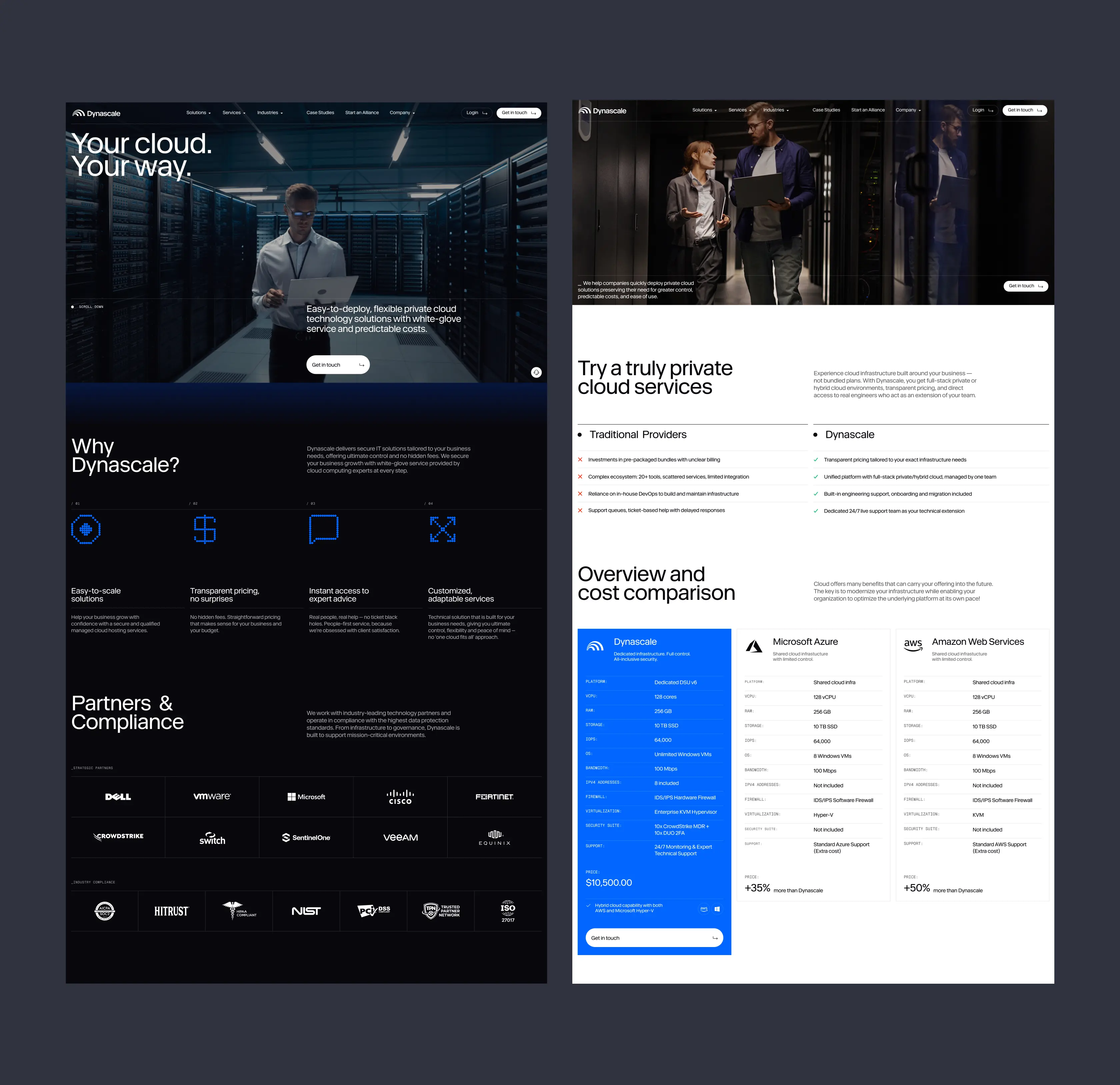
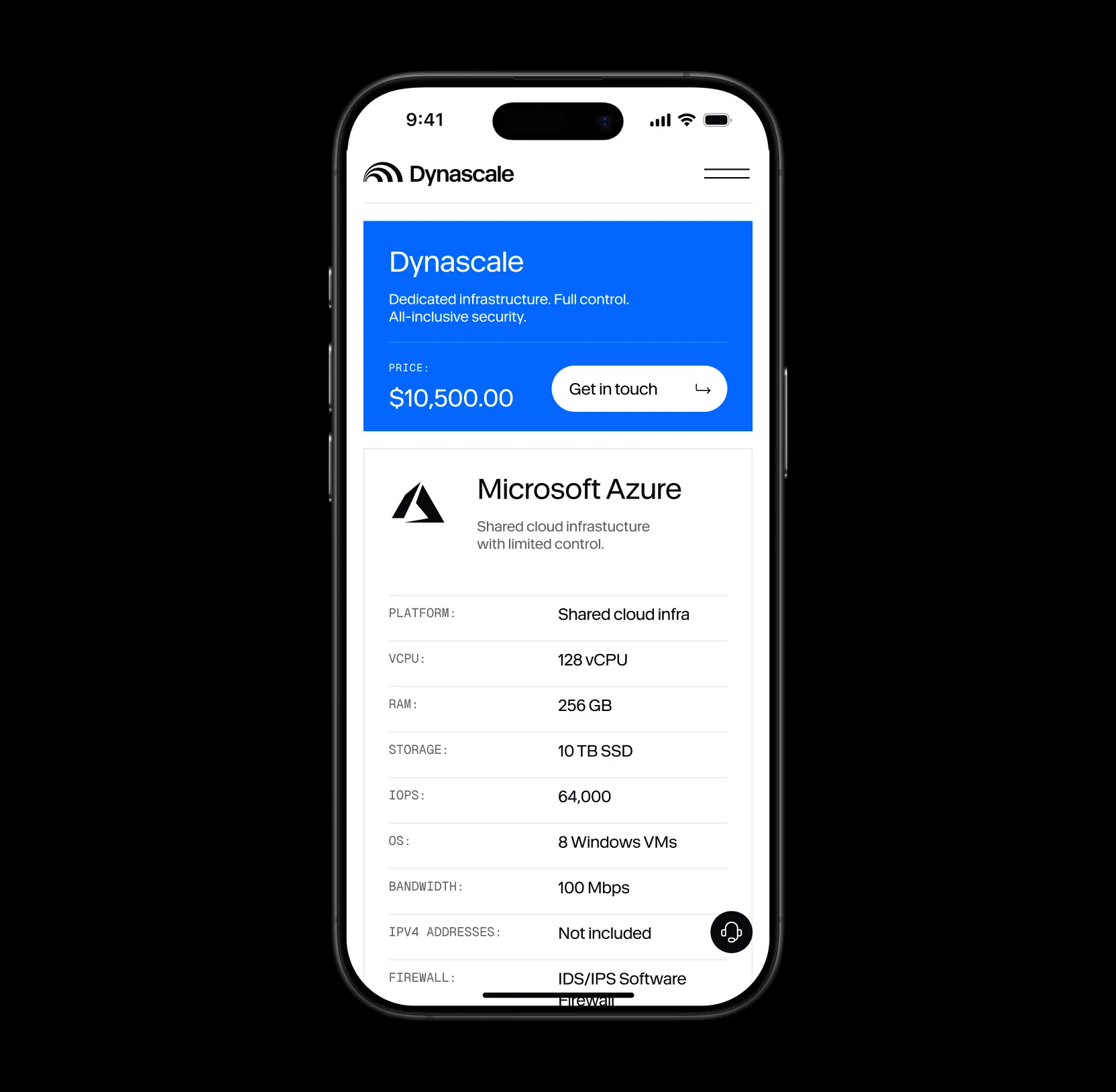
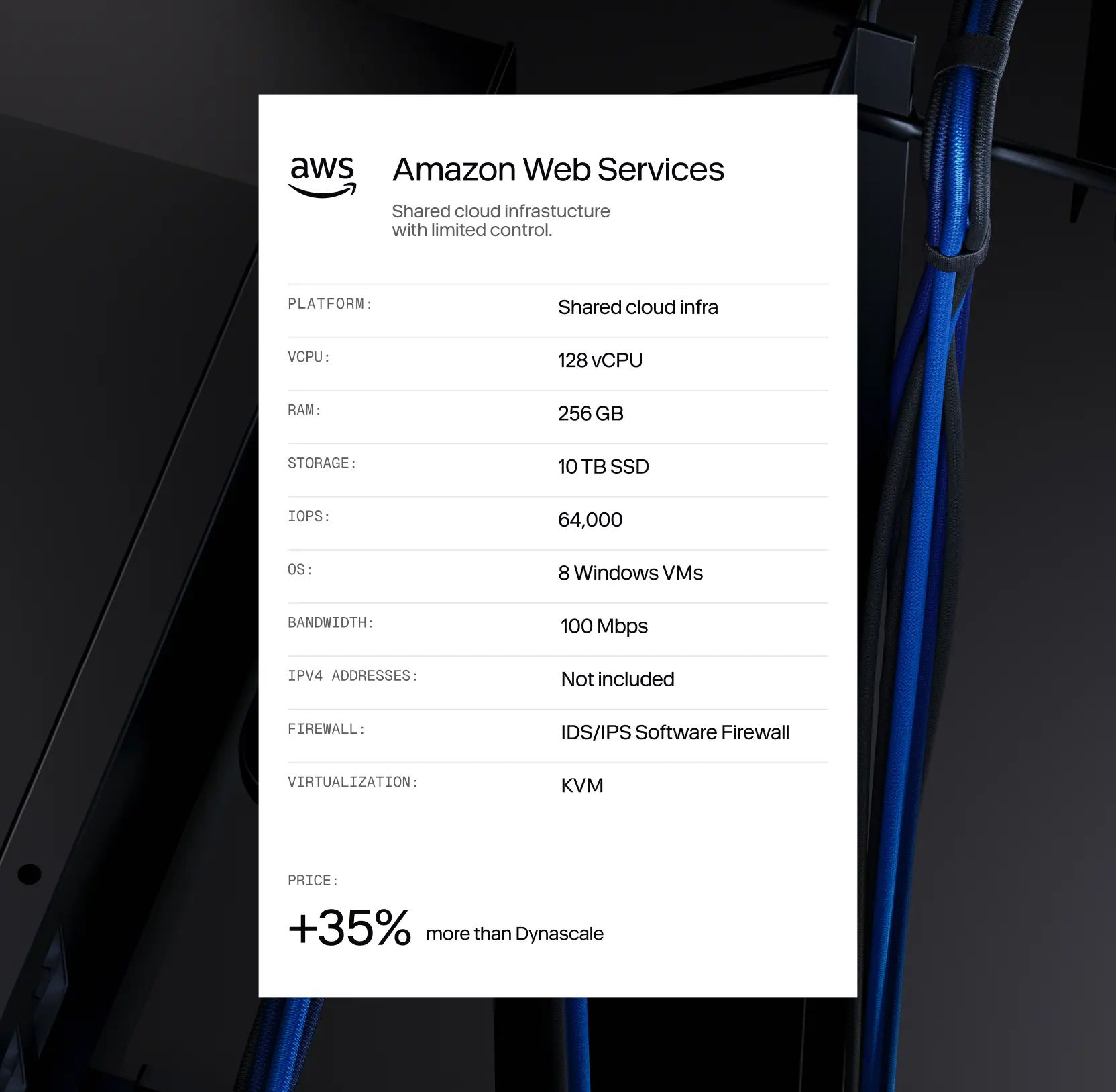
Many prospects assumed private cloud was riskier, harder to scale, or simply more expensive than public hyperscalers. We used this perception to our advantage. By shifting the conversation from specs to business outcomes, making pricing and compliance fully transparent, and reframing private cloud as the smarter, more controlled choice for mid-market teams, we changed how buyers evaluated the offer.
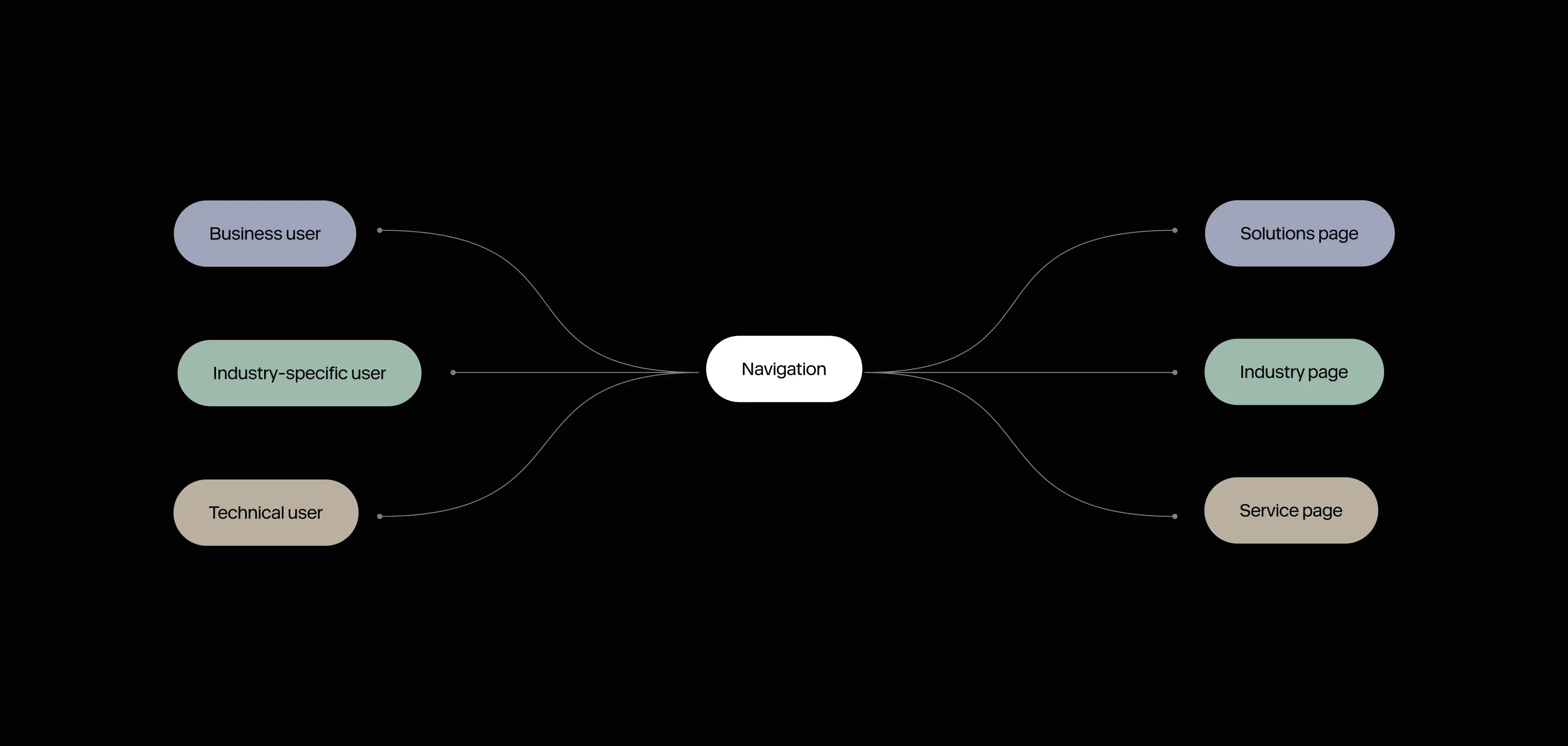
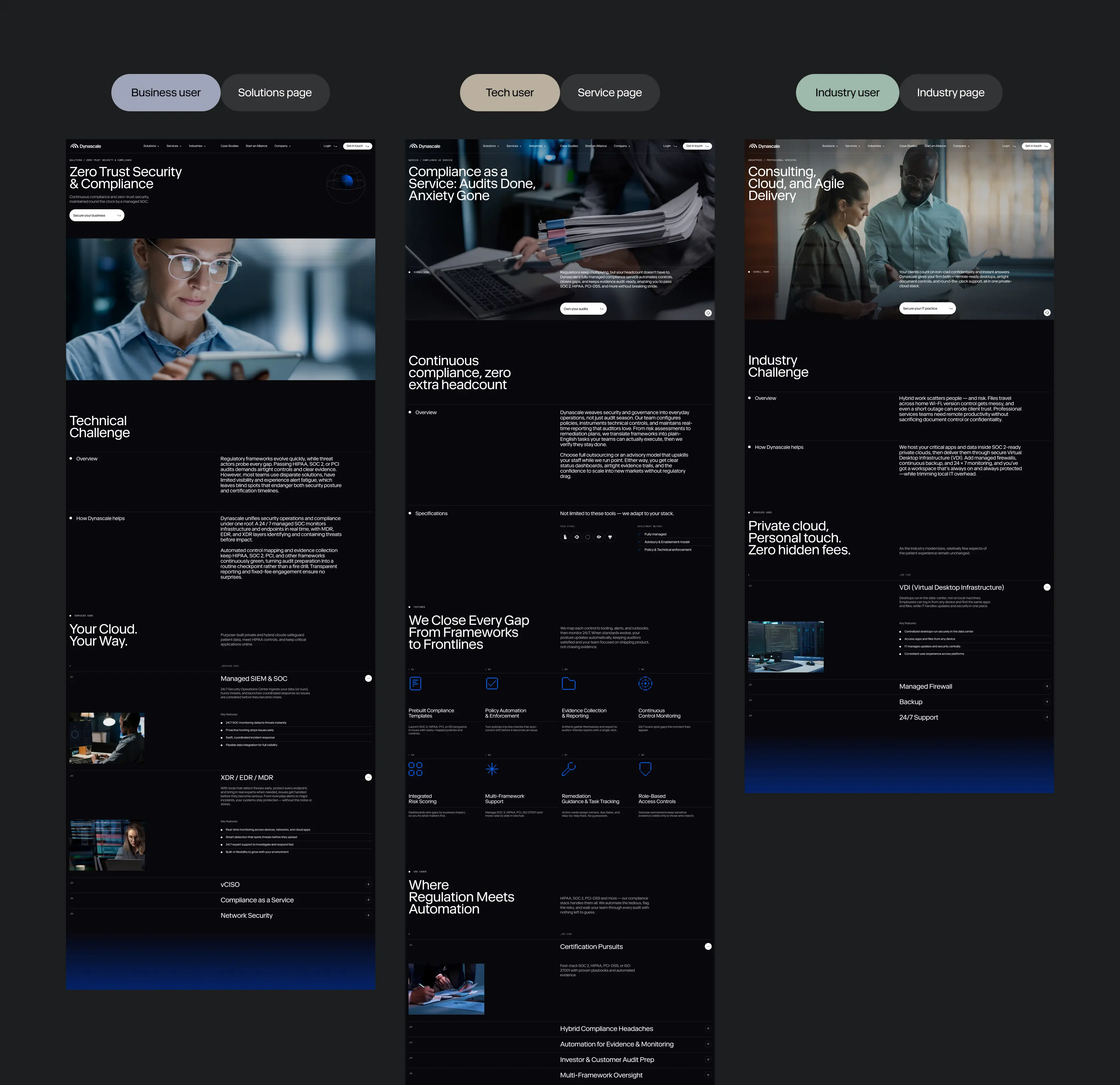
Dynascale started owning the narrative. To align content with real user needs, we introduced three distinct page types: Solutions, Industries, and Services — each tailored to a specific audience mindset. Each page follows a clear and consistent content model: Challenge → What We Offer → Services We Use — making the value story easy to understand and compare across offerings.
Positioned Dynascale as a scalable enterprise partner with whom you want to work
We helped Dynascale move away from generic IT messaging and toward a value-driven, outcomes-based narrative. Instead of talking about infrastructure, we focused on what business and technical buyers actually care about predictability, control, compliance, and support. This repositioning allowed Dynascale to speak directly to procurement leads, CTOs, and business stakeholders with clarity and confidence, eliminating the perception gap between what the company delivered and how it appeared.
To overcome skepticism and build trust, we introduced transparent pricing blocks, comparison tables with other providers, and visual proof of credibility through partnerships and compliance indicators. By combining strategic messaging, structured value presentation, and real data, we redefined the private cloud as a smart, future-ready solution tailored to the needs of growing businesses.

The complete website redesign guide: strategy & launch
Converted nationwide reach into a sales asset
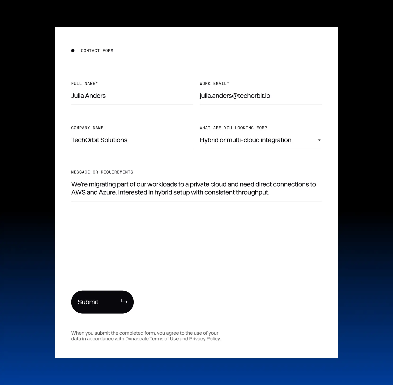
Dynascale had the infrastructure, but it wasn’t working hard enough to close deals. We changed that by creating an interactive map that instantly showcases their data centers and rapid-deployment capabilities across the U.S.
Instead of telling buyers they could scale, we showed it: visually, clearly, and in real time. With an embedded inquiry form, prospects can request deployments in specific locations, making reach and flexibility not just visible, but actionable. For enterprise buyers, that’s proof they can count on.
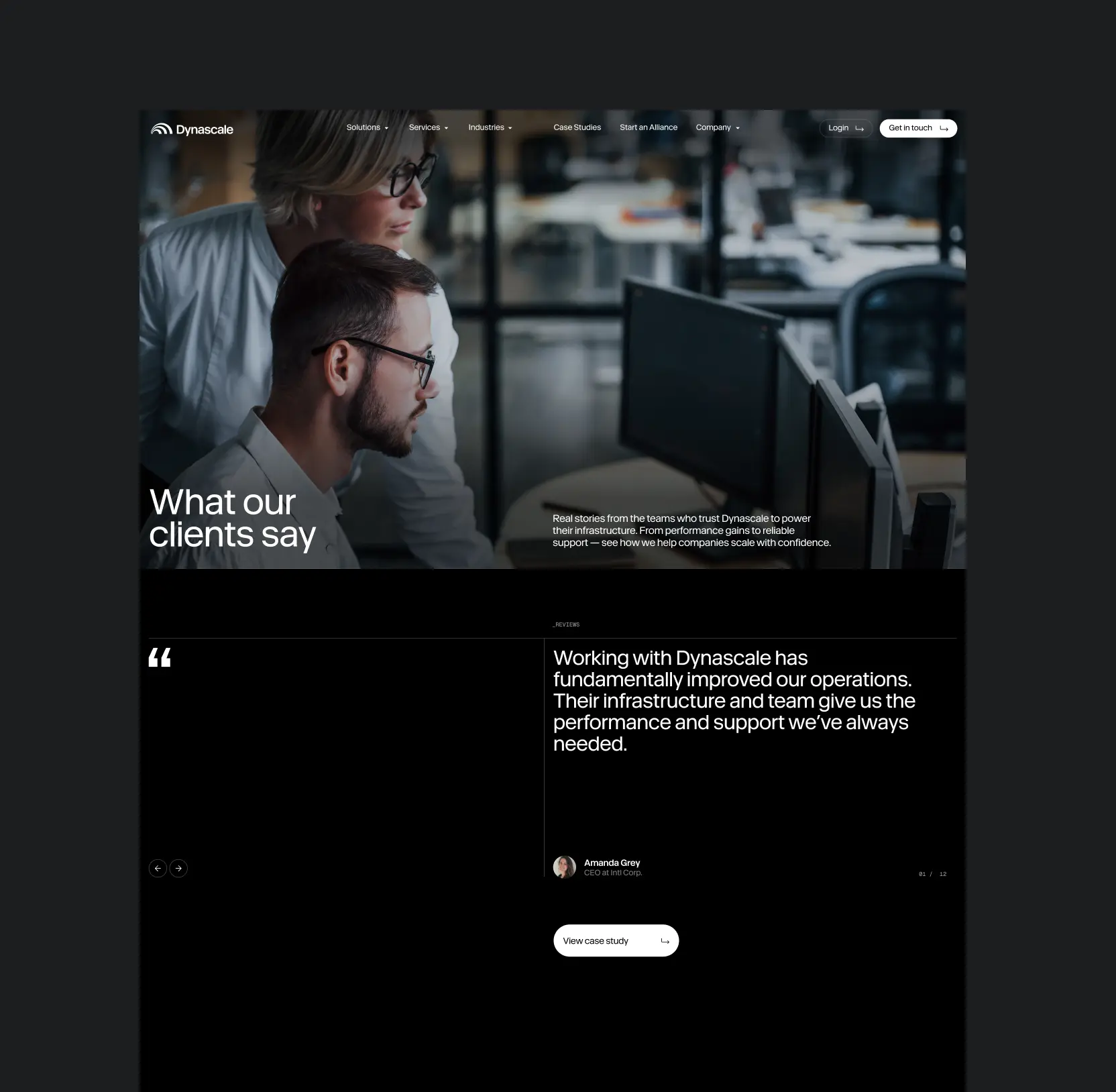
Transformed proof into purchase power
Enterprise buyers make decisions based on evidence, yet Dynascale’s credibility wasn’t immediately visible online. To close this trust gap, we put real-world success at the center of the digital experience. The new section showcased tangible results, industry-specific wins, and the depth of Dynascale’s technical expertise, turning past client victories into a powerful conversion tool.
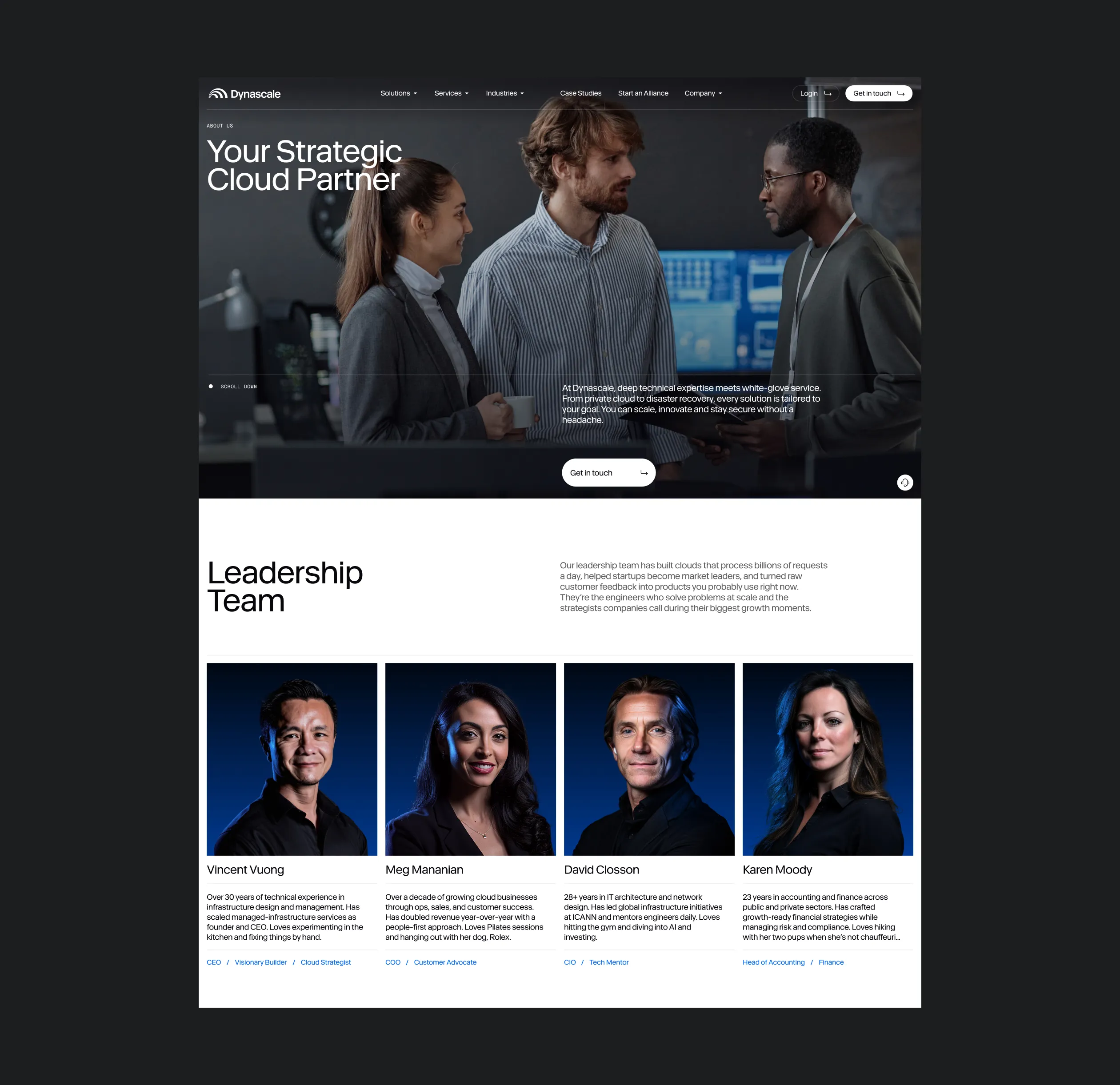
We reinforced these stories with authentic testimonials, recognizable client logos, and proof points like certifications and technical partnerships. To humanize the brand further, we brought the team forward, reshaping the About Us page into a compelling portrait of the people behind the platform.
Redesign that fuels enterprise growth and profit
Rather than focusing on visual design alone, Lazarev.agency addressed the root business problems that were holding Dynascale back. We repositioned Dynascale as an enterprise-grade partner ready to scale with mid-sized and large businesses. The rebrand clarified what made their offer better and not just different from competitors.
The website was rebuilt from the ground up to guide real decision-makers, from CTOs to procurement leads, through a clear, trust-driven journey.Instead of just polishing the surface, we overhauled the entire narrative. Now, Dynascale shows up as a secure, human, and highly credible alternative to public cloud providers with a voice and platform to match.

How AI influences design and the reciprocal impact of UX on AI-driven products


AI & ML
Lazarev. agency offers comprehensive digital design services. Discover our range of related expertise supported by impactful case studies.
More Enterprises Cases


FAQ
What are the most effective ways to reposition an IT services brand in a crowded market?
Repositioning starts with clarifying your core value proposition and eliminating friction in how it's communicated. For Dynascale, we focused on building a credibility-driven brand narrative, redesigning the content structure to match decision-maker expectations, and adding trust signals throughout. These included industry pages, pricing transparency, and clear proof of enterprise readiness.
How can a B2B tech company scale beyond referral-based growth?
The key is building a digital presence that converts unfamiliar visitors into qualified leads. For Dynascale, we replaced a static, outdated website with a guided user journey, value-led messaging, and tailored paths for different buyer types, helping them attract and convert beyond personal networks.
What helps increase credibility for mid-size private cloud providers?
Trust is built through consistency, proof points, and relevance. We helped Dynascale establish enterprise credibility through compliant visuals, partnership mentions, side-by-side comparisons with hyperscalers, and a humanized design system that balanced tech with trust.
How do you simplify complex messaging for technical services?
By mapping real user needs to structured content. For Dynascale, we introduced a Challenge → Solution → Service format that made technical offerings approachable for non-technical buyers. Each section helped clarify what Dynascale does and why it matters to the end user.
What’s the best way to structure content for both business and technical buyer?
Split your site architecture into role-based entry points. For Dynascale, we created distinct content types — Solutions, Industries, Services, each aligned with different user expectations. This helped visitors quickly find the information most relevant to their role.
How can better navigation increase conversions on a B2B site?
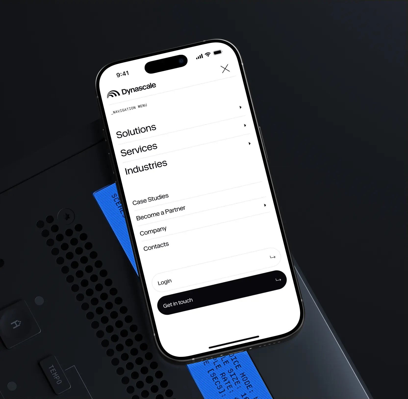
Navigation is a sales tool. We transformed Dynascale’s header into a guided experience that helps users self-identify and explore solutions faster. This role-based approach improved clarity, engagement, and ultimately led to stronger conversions.
What are key elements of a high-converting homepage for IT service providers?
A strong homepage needs clear positioning, visible trust signals, value-driven headlines, and CTA-friendly structure. For Dynascale, we reframed the homepage to highlight transformation outcomes, not just services, using proof, comparisons, and simple language to move users toward action.


Hit me up! Let’s chat about your growth


