How we helped DragonGC transform its brand into a trusted LegalTech leader
Project:
the project
DragonGC is a LegalTech AI platform that helps companies stay compliant and strengthen shareholder relations. Despite a strong product and high market potential, the brand was at an early stage: the outdated logo didn’t reflect ambition, there was no visual system, and communication was fragmented and unrecognizable.
As the company prepared to scale and accelerate growth, it risked losing trust from clients and investors without a cohesive brand. Our task was to build a modern, consistent identity from scratch, one that highlights DragonGC’s expertise, gives the brand authority, and makes it competitive on the international market.
The Project’s
Discovery Phase
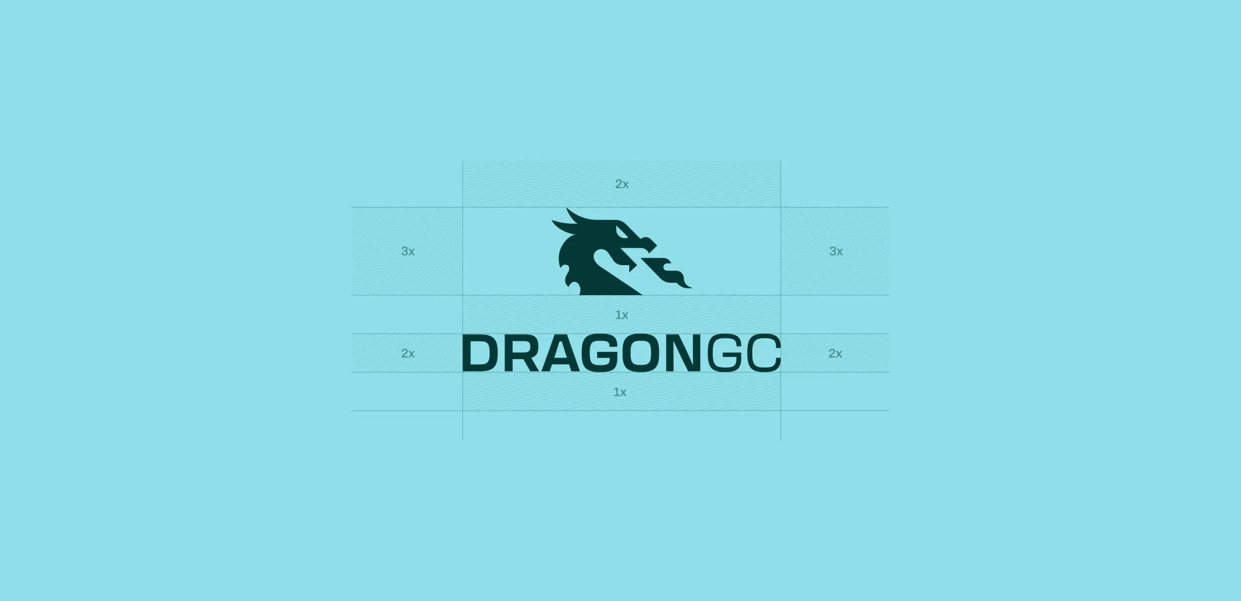
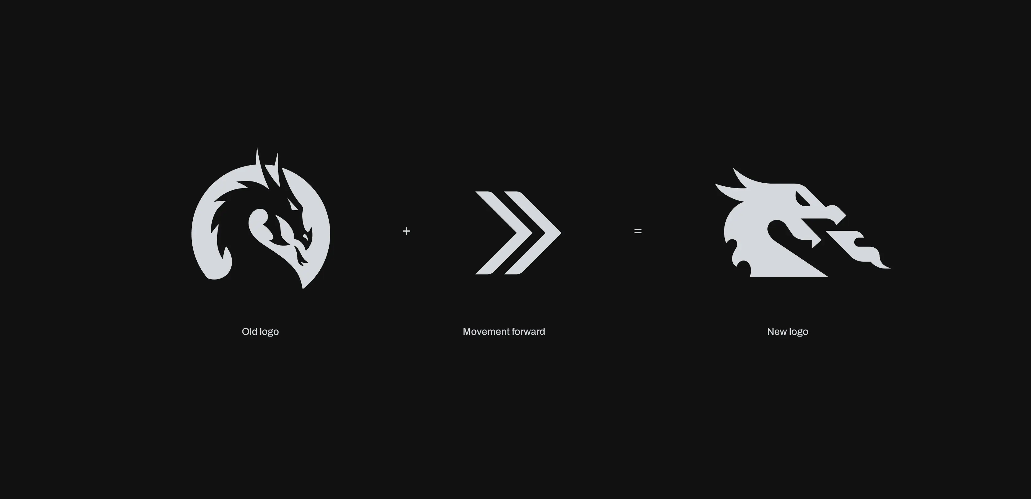
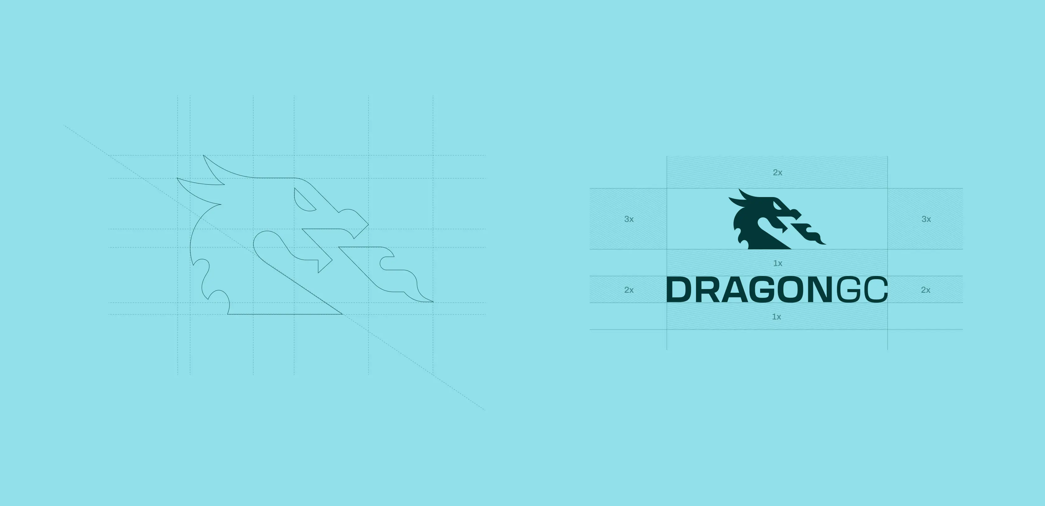
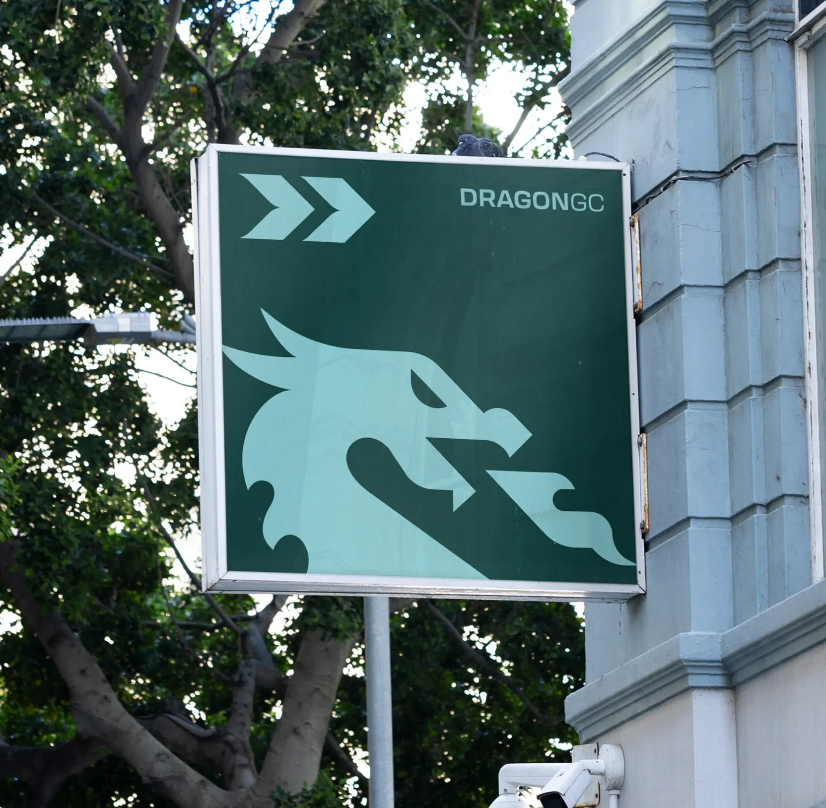
Transformed logo from symbol to strategic statement
When DragonGC approached us, their brand already featured a distinctive green Chinese dragon, symbol of strength, good fortune, and a deliberate nod to the platform’s launch year. However, the existing logo failed to convey this vision: it was cluttered with details, used a muted color palette, and the dragon’s downward gaze implied stagnation rather than ambition.
We retained the iconic dragon while redefining its presence. The design was streamlined, extraneous elements were removed, and the composition made more dynamic. Crucially, we repositioned the dragon’s gaze forward, signaling ambition, strategic momentum, and a clear focus on future growth.
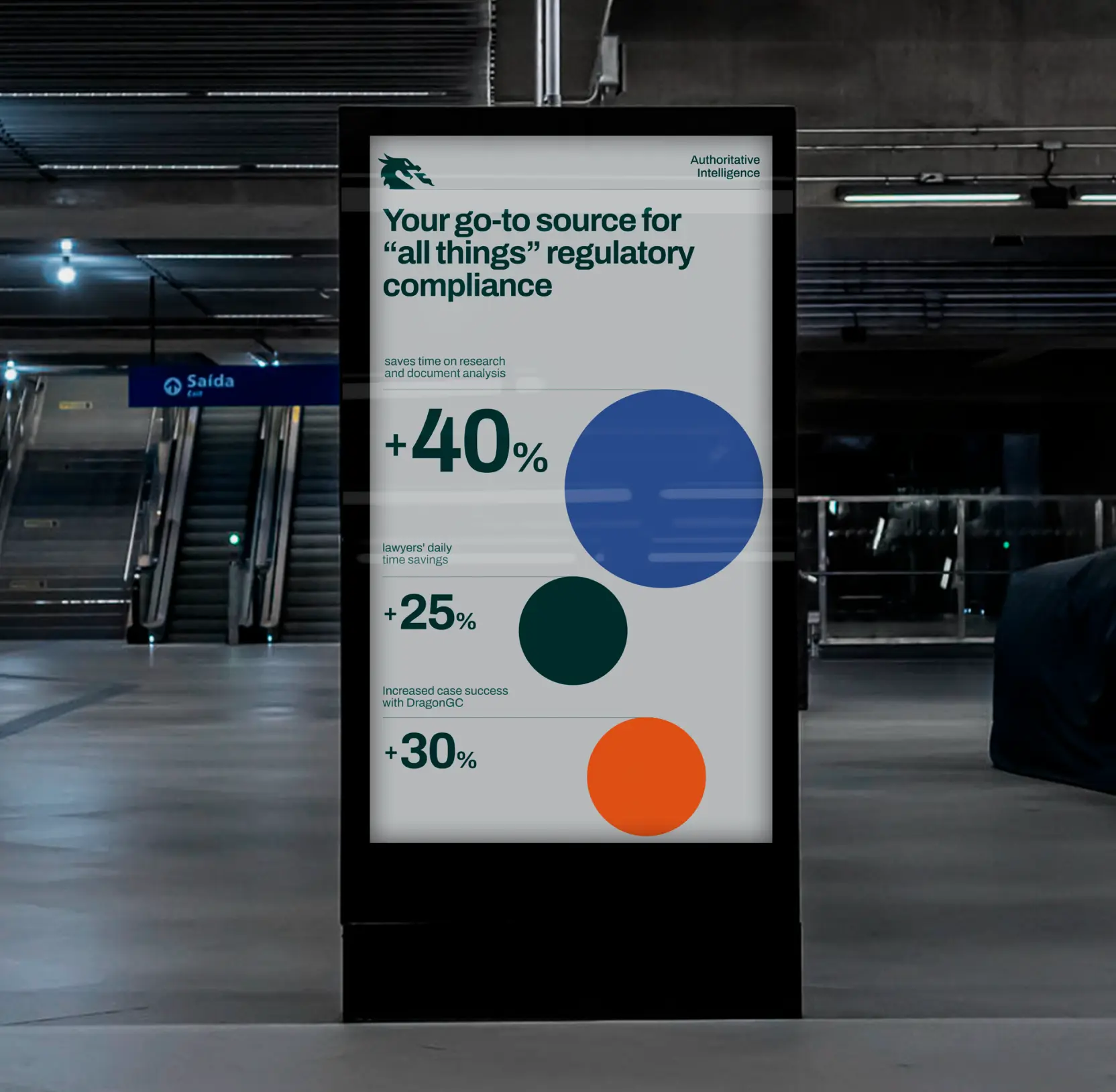
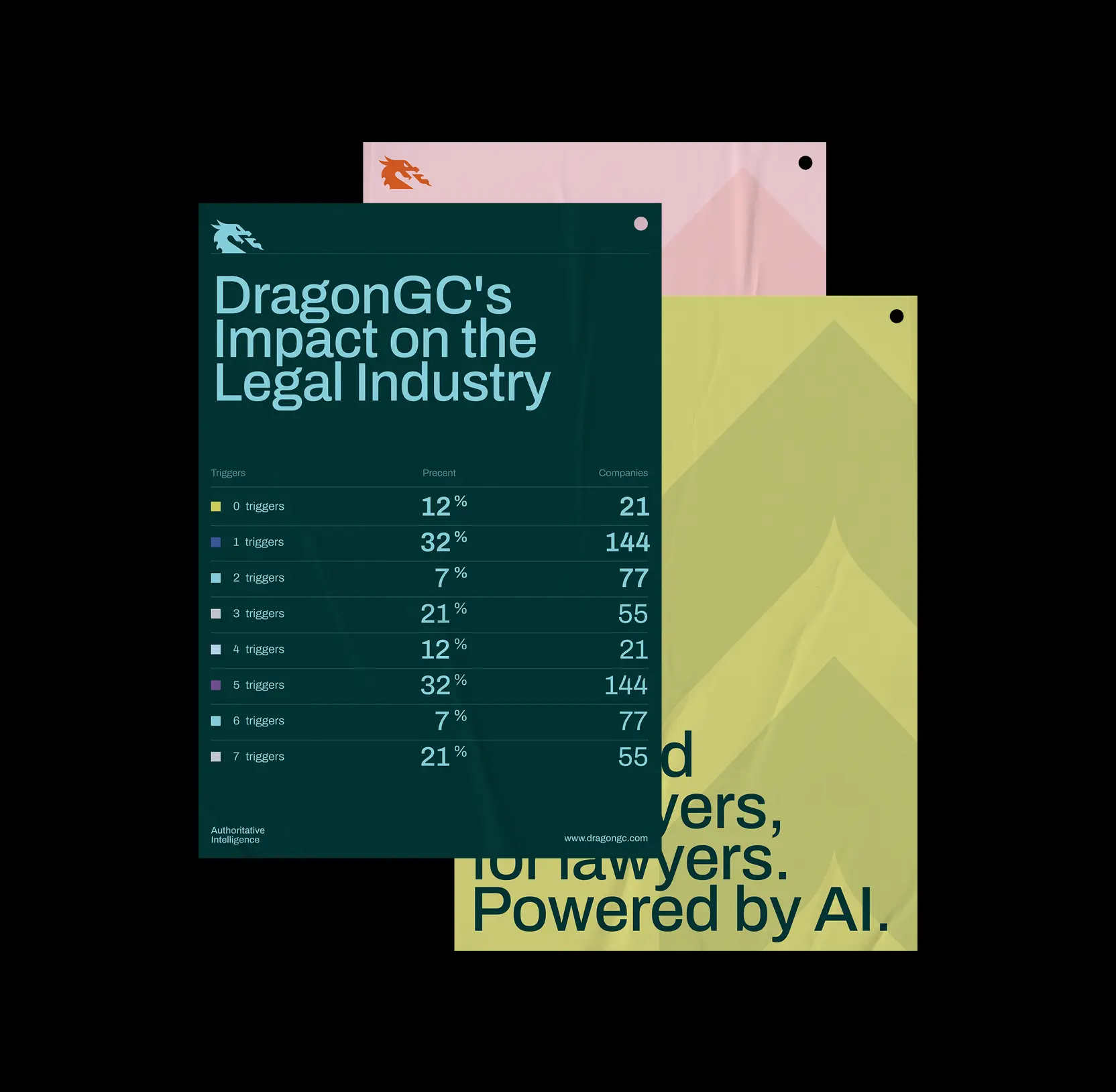
Crafted data visualization that turns complex insights into action
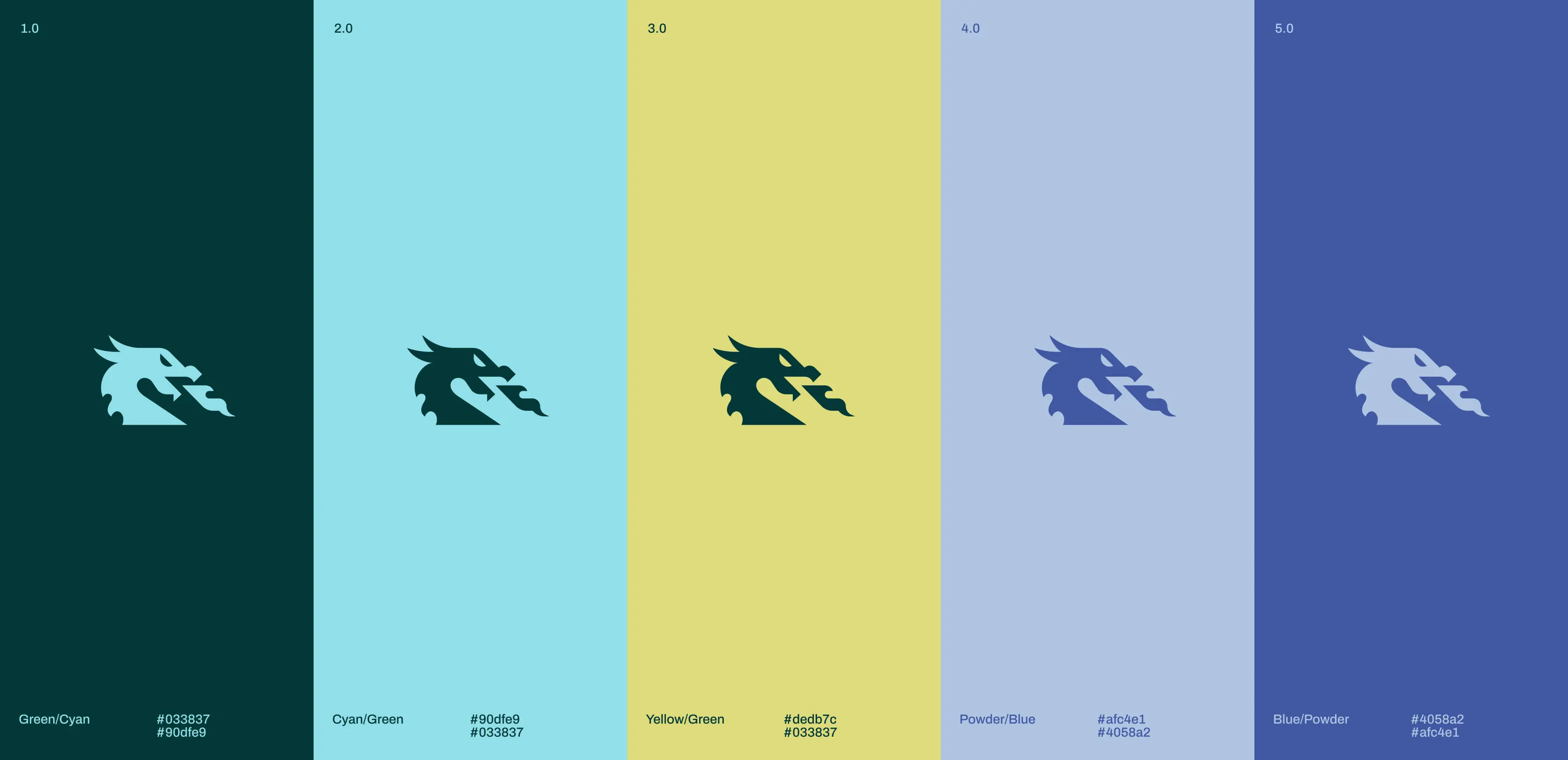
For DragonGC, where analytics and research are at the core of the product, data visualization plays a crucial role. The old charts looked overloaded and failed to represent the brand. In the redesign, we expanded the color palette so it could naturally work across interfaces and charts. Additional accent colors make visualizations clear and expressive.
The new system supports all types of visualizations, from line and pie charts to complex infographics. As a result, DragonGC’s analytical materials became easier to read while also gaining a branded character that strengthens trust and positions the company as precise and technology-driven.
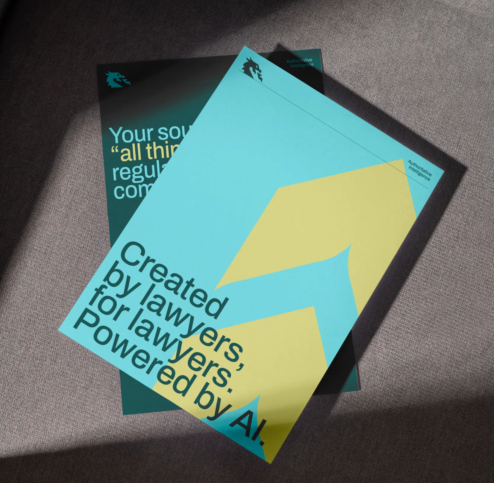
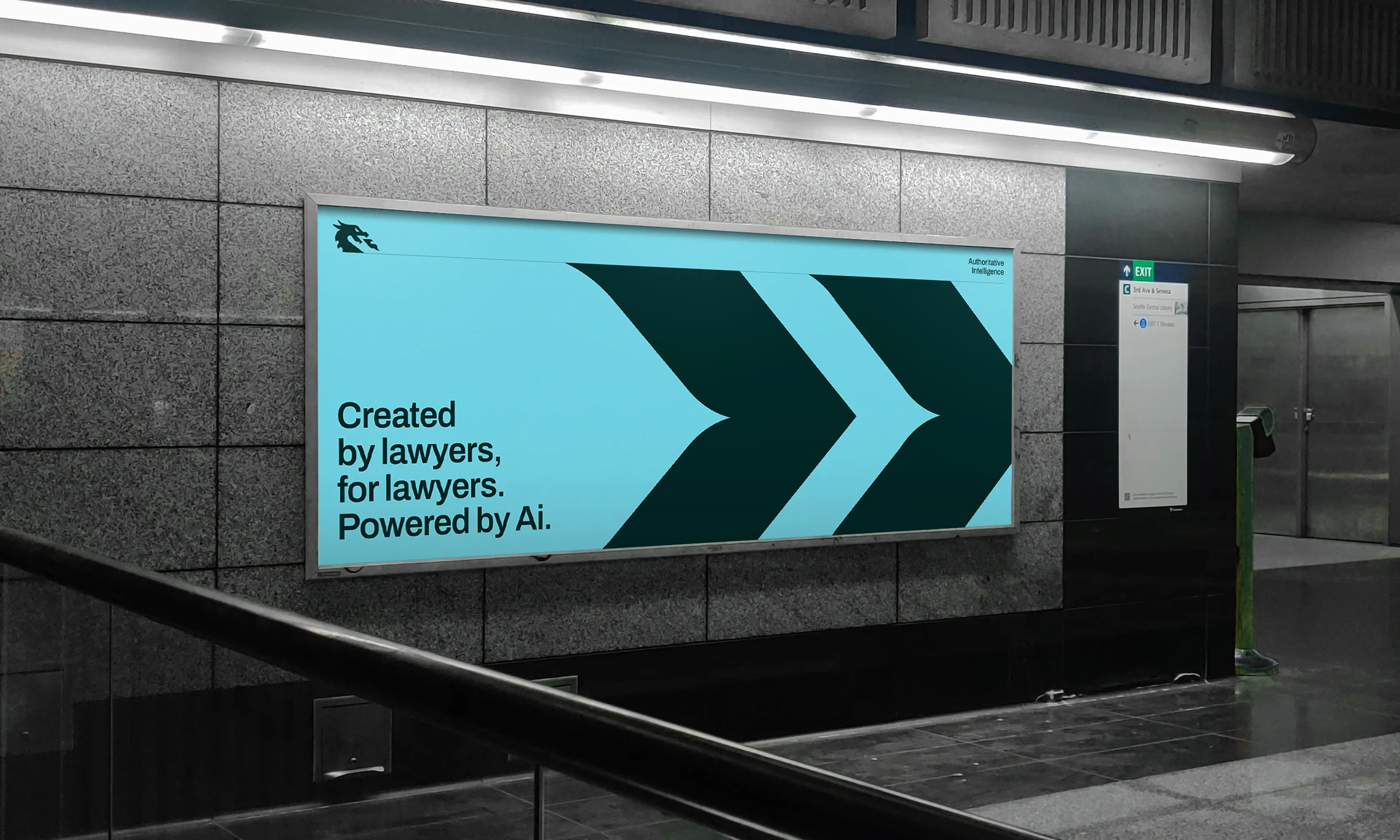
Designed a dynamic pattern system for brand recognition
The forward motion embedded in DragonGC’s logo inspired the brand’s pattern system. Arrows and the logo itself were transformed into rhythmic grids and dynamic compositions, creating a visual language that conveys momentum and progress.
These patterns are flexible by design: they can appear as subtle textures in reports and presentations or as bold accents in posters and digital media. Whether used individually or combined, they consistently reinforce the brand’s identity, communicate ambition, and enhance recognizability across all touchpoints.

15 legaltech design agencies reimagining the digital law world as we know it
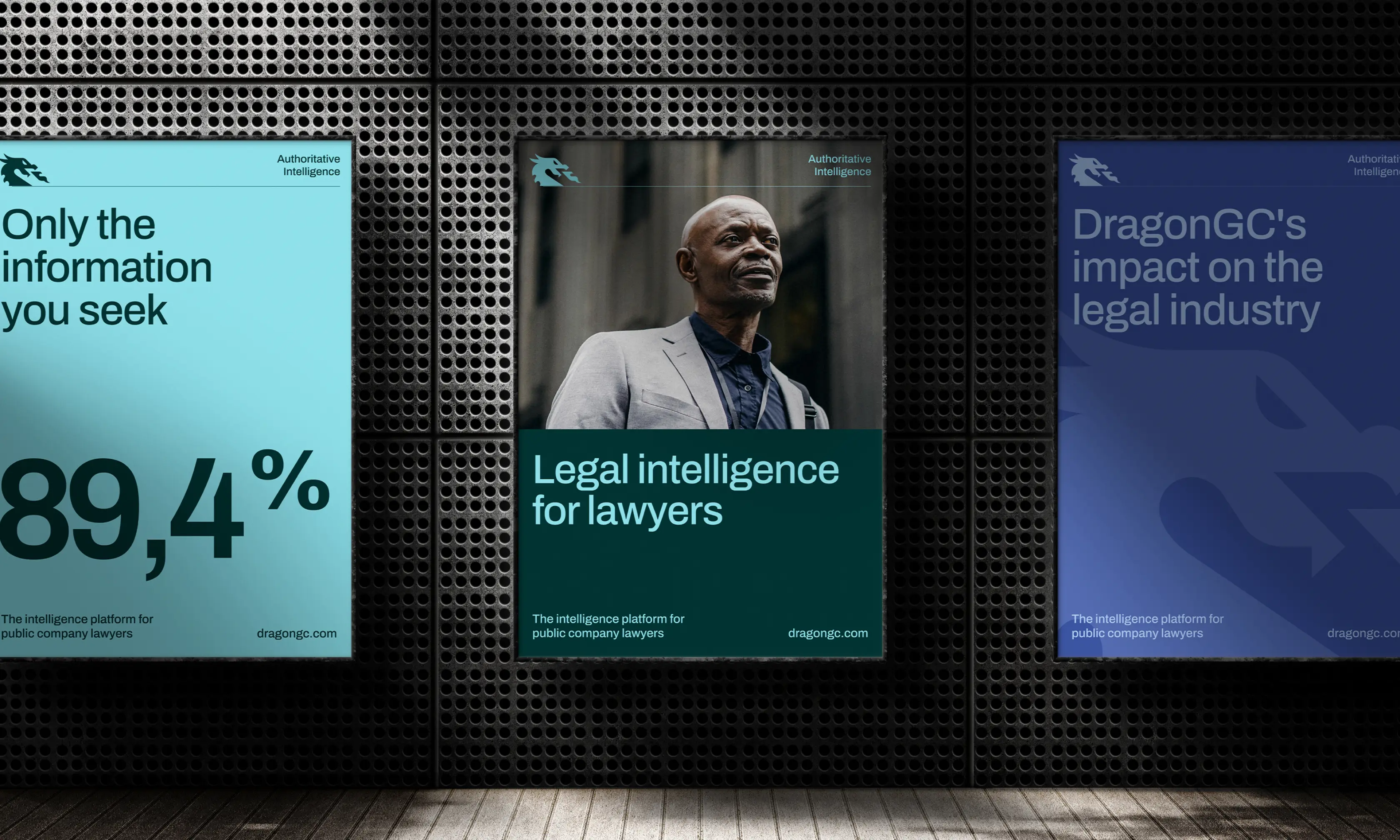
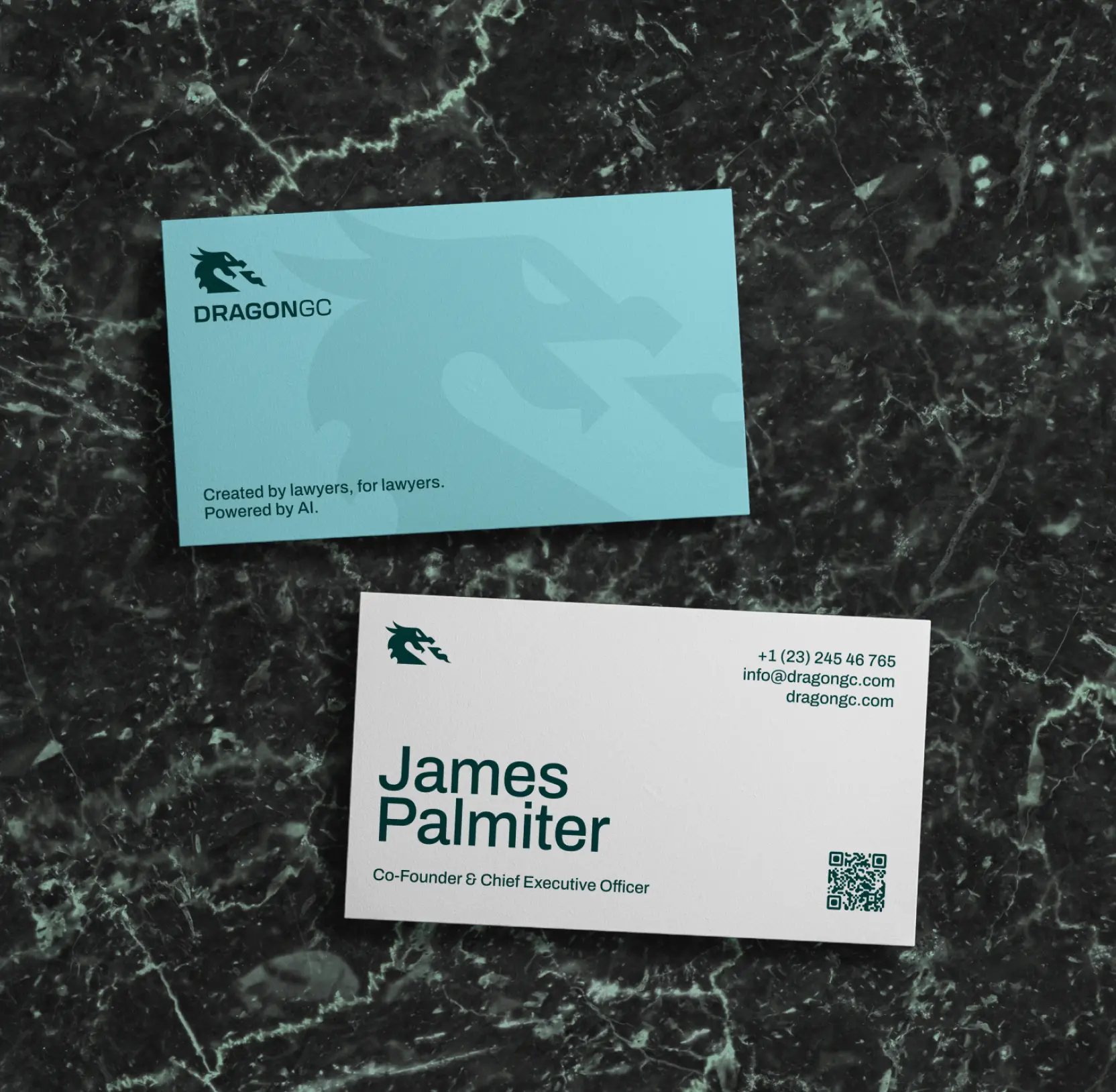
Shaped brand communication to build trust through consistency
Before the redesign, DragonGC lacked both a visual and verbal communication system. The brand operated without a unified style, leaving messaging fragmented and reducing trust with clients and investors.
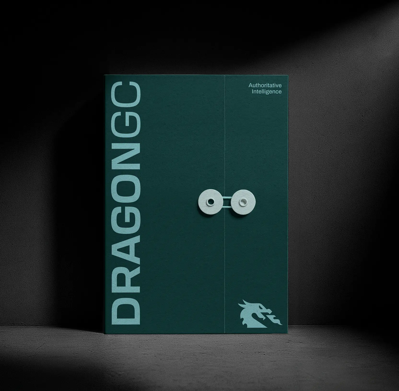
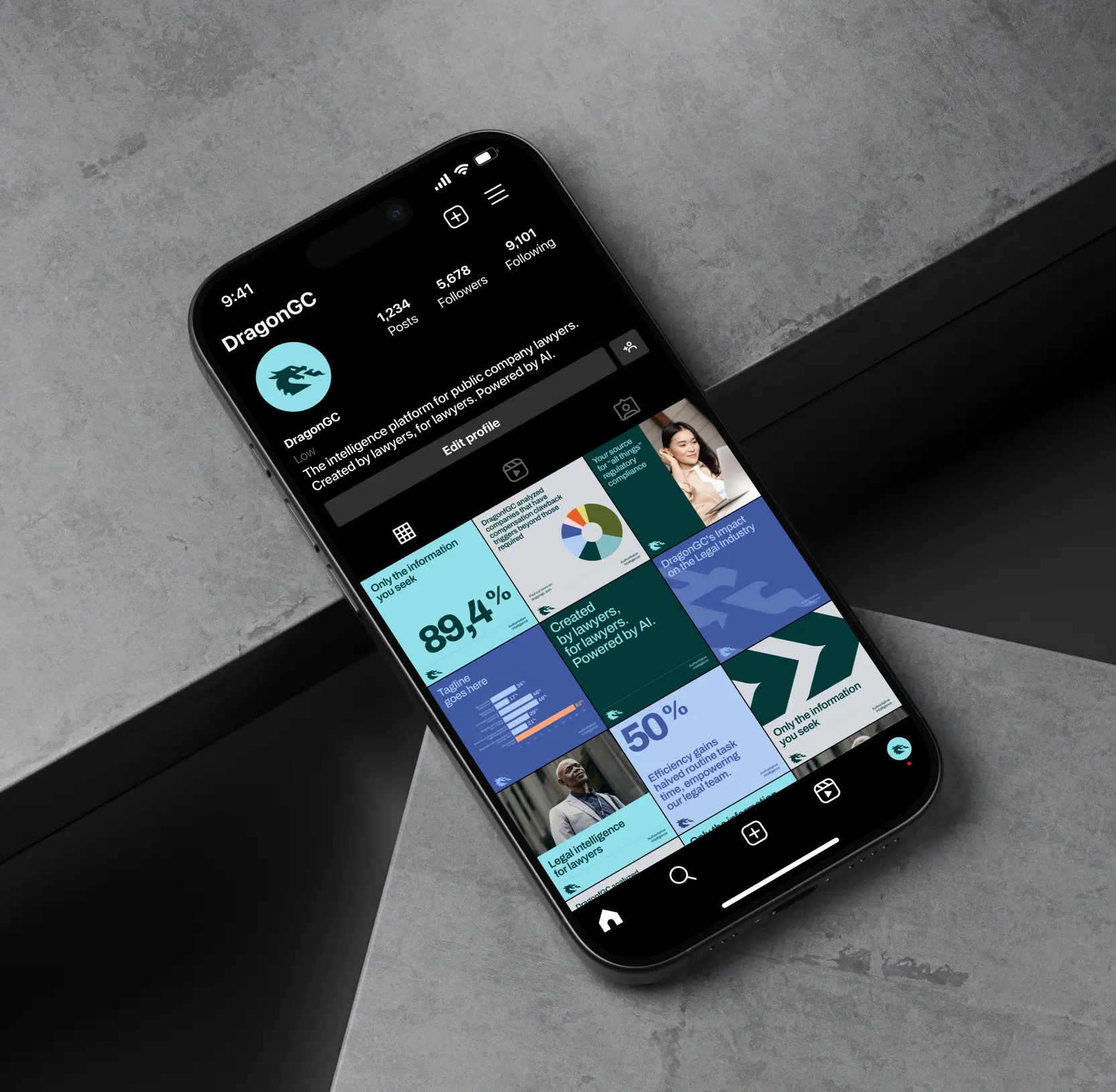
We developed a complete communication ecosystem from scratch, defining a consistent visual language, a clear tone of voice, and a full suite of assets, including presentations, analytical reports, social media, print materials, and offline applications.
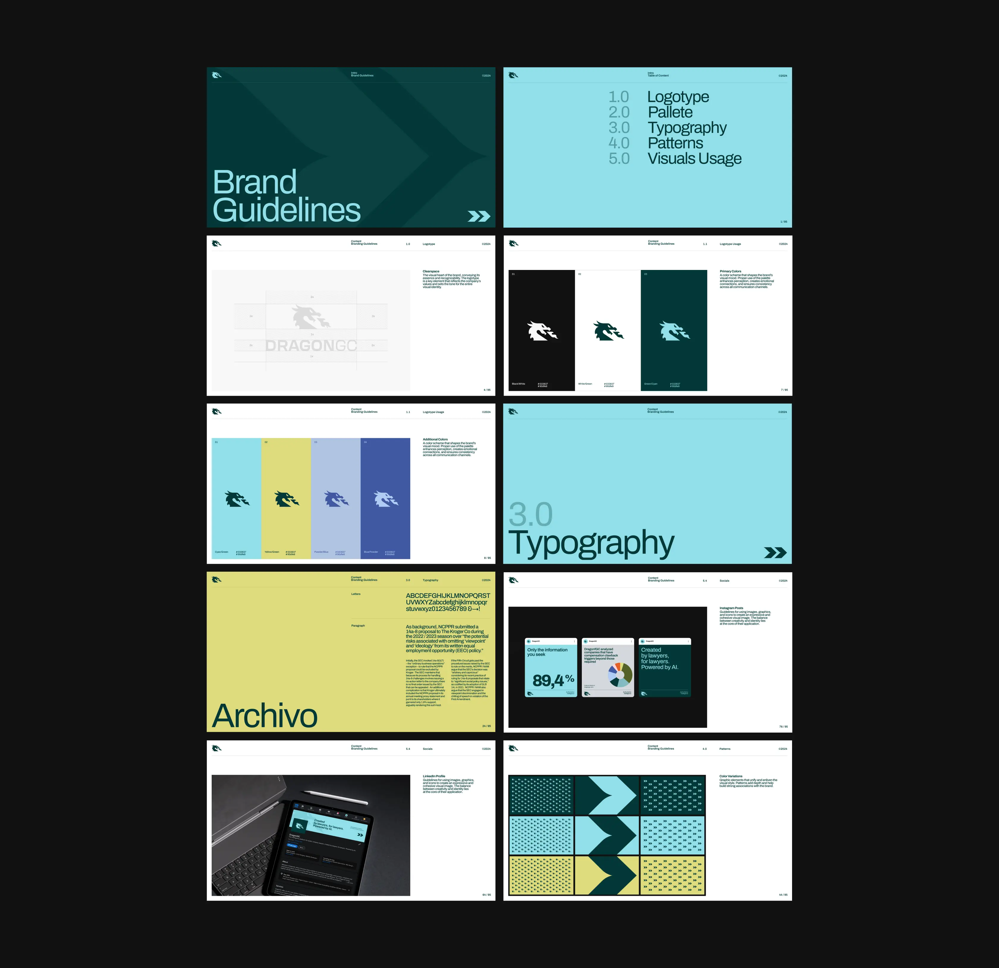
Every decision was codified in DragonGC’s first brand book, covering logo usage, color palette, typography, patterns, and visual guidelines.
This system ensures that all touchpoints reflect the brand’s authority, communicate expertise, and present a cohesive, professional identity ready for international growth.

AI & ML
Lazarev. agency offers comprehensive digital design services. Discover our range of related expertise supported by impactful case studies.
More Scaleups Cases
FAQ
What are the best ways to redesign a LegalTech platform logo for trust and growth?
For DragonGC, we simplified the existing dragon logo, removed unnecessary details, and changed its gaze to forward-looking. This conveys ambition and strategic progress, helping the brand build credibility with clients and investors while maintaining recognition.
How can visual patterns strengthen a tech brand’s identity?
We transformed DragonGC’s logo and arrow elements into dynamic patterns that create a consistent visual language. These patterns are flexible — used as subtle textures in reports or bold accents in digital media — reinforcing brand character and memorability.
How do you create a cohesive brand communication system from scratch?
DragonGC lacked a unified style and messaging. We developed a full communication ecosystem, including visual language, tone of voice, and assets for presentations, social media, and offline materials. All guidelines were consolidated in the brand book to ensure consistency and professional presence.
What strategies improve client and investor trust through branding?
By building a consistent logo, visual system, and communication guidelines, DragonGC strengthened its perceived authority. Clear, professional branding reduces uncertainty and signals expertise, which is critical during scaling and fundraising phases.
How can a LegalTech AI platform make its brand internationally competitive?
DragonGC’s redesign focused on modern, globally understandable visuals, flexible patterns, and clear messaging. This approach ensures the brand resonates with international audiences and positions the platform competitively in the LegalTech market.
What role does tone of voice play in B2B tech branding?
DragonGC’s new brand voice communicates expertise, clarity, and confidence. A consistent tone across reports, presentations, and social media enhances credibility, strengthens relationships with shareholders, and supports marketing efforts for enterprise clients.
How does a structured brand book help scale a tech company?
The DragonGC brand book documents logo usage, color palette, typography, patterns, and communication rules. It acts as a single source of truth, ensuring all internal teams and external partners apply the brand consistently, which is essential for scaling operations and maintaining trust.


Hit me up! Let’s chat about your growth


