How we helped a premier fine wine retailer boost add-to-basket rate by 65% with a mobile-first redesign

Award-Winning
Project:
No items found.
Industry:
E-commerce
Services:
Design system
Digital transformation services
UX/UI design
Web design services
About
the project

Hedonism Wines, known for curating an exceptional selection of over 6,500 wines and 3,000 spirits, was struggling to convert its sophisticated clientele from offline to online. While their physical store had earned a reputation as one of London's finest wine boutiques, their website failed to match this level of excellence, especially when it came to providing a seamless user experience for mobile customers.

The digital platform couldn't adequately showcase their sommelier expertise or highlight the premium wine collections they offered. With mobile users making up the majority of traffic, poor mobile browsing experiences were leading to high bounce rates and abandoned carts. The platform wasn't catering effectively to both seasoned collectors seeking rare vintages and newcomers looking for guided discovery. As a result, Hedonism Wines was missing valuable revenue opportunities.

Results

Our redesigned mobile-first platform revolutionized how Hedonism Wines engaged with customers. By creating an intuitive browsing experience, optimizing for mobile, and enhancing the checkout flow, we significantly improved user engagement and conversions.

45%

increase in add-to-basket actions across all devices

2.8x

more customers progressed from browsing to starting the checkout process

No items found.

The Project’s
Discovery Phase

No items found.
No items found.

Enhanced brand perception through visual identity overhaul

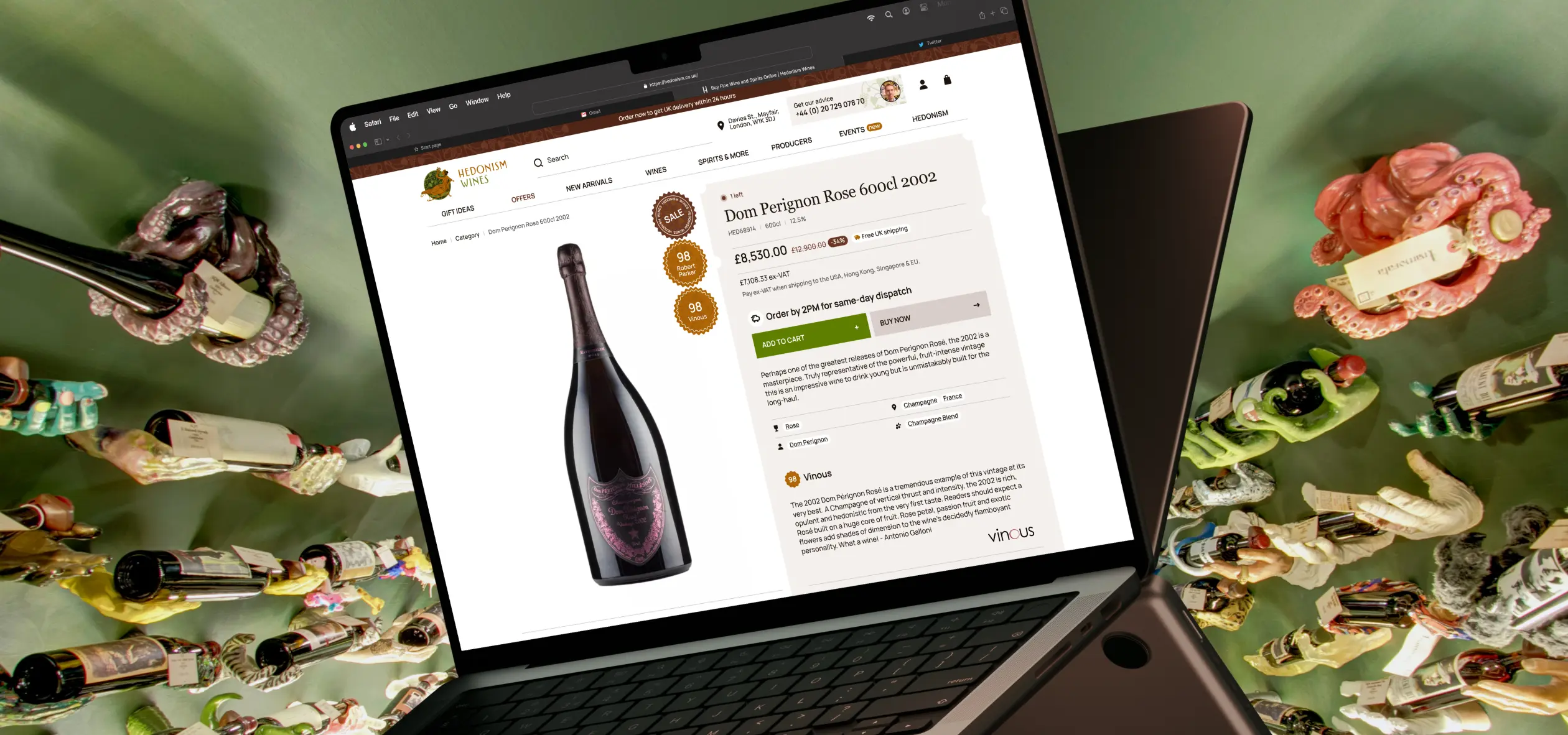
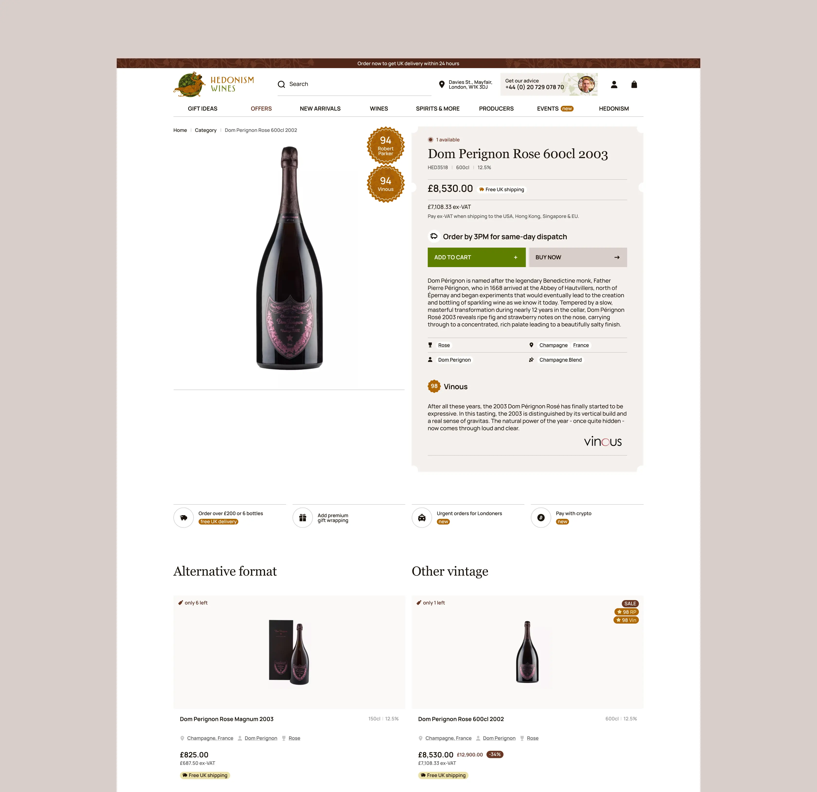
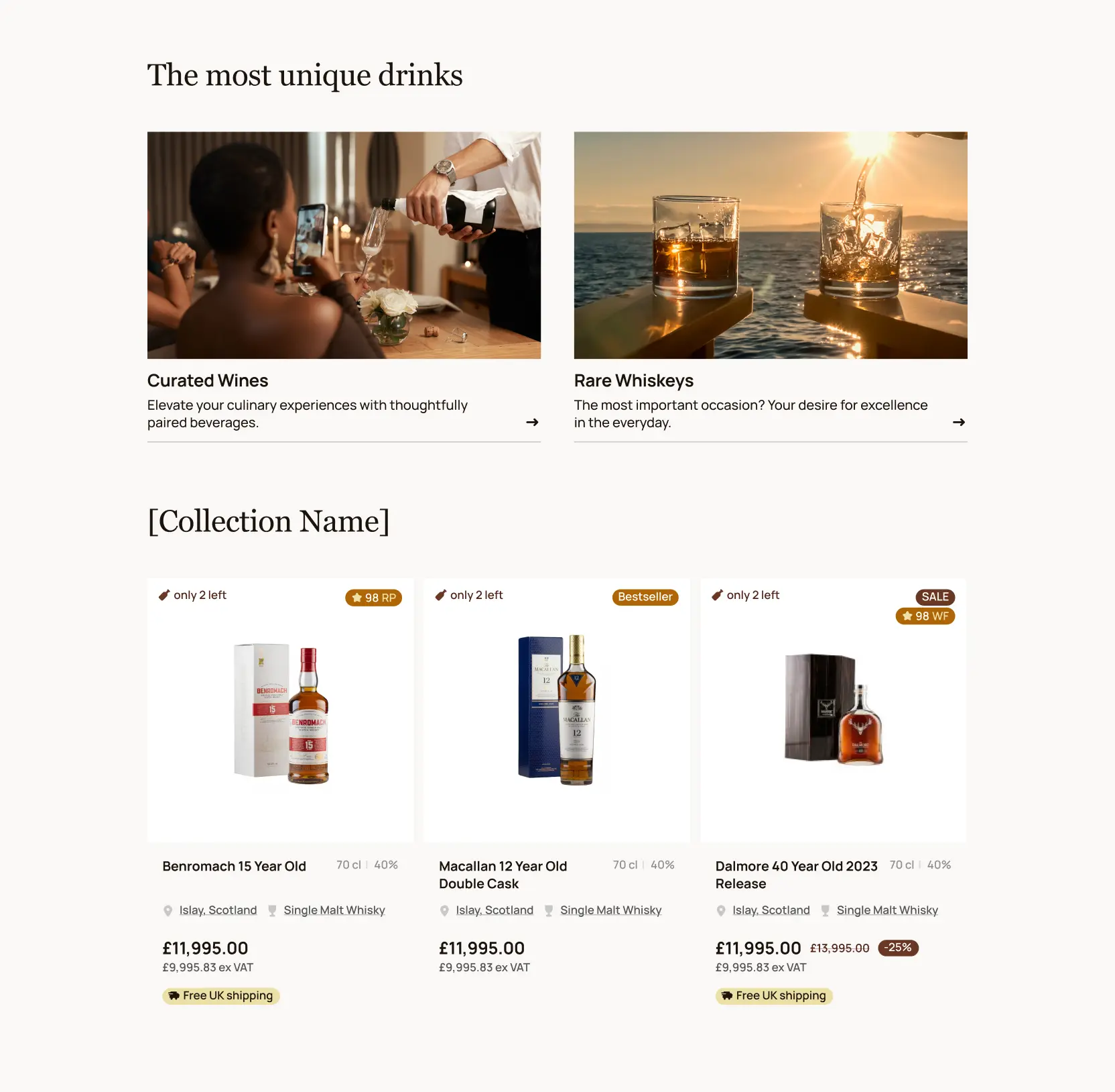
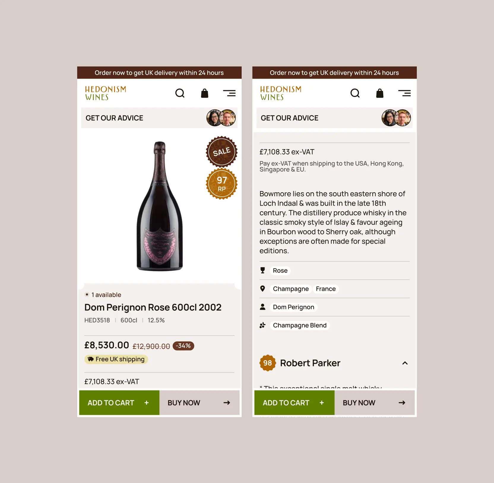
We elevated Hedonism Wines’ digital presence with a design overhaul that captured the brand's luxury and expertise. The new look featured premium typography, sophisticated color palettes, and intuitive product labeling. Key elements of the redesign included sommelier-curated collections, which made it easier for users to navigate through the vast selection of over 6,500 wines.

The streamlined purchase journeys reduced friction, encouraging immediate purchases, while strategic calls-to-action (CTAs) elevated user engagement. This visual transformation turned browsing into an immersive discovery process, improving overall user experience and boosting customer retention.

What luxury brands can learn from our ecommerce website redesign case

No items found.

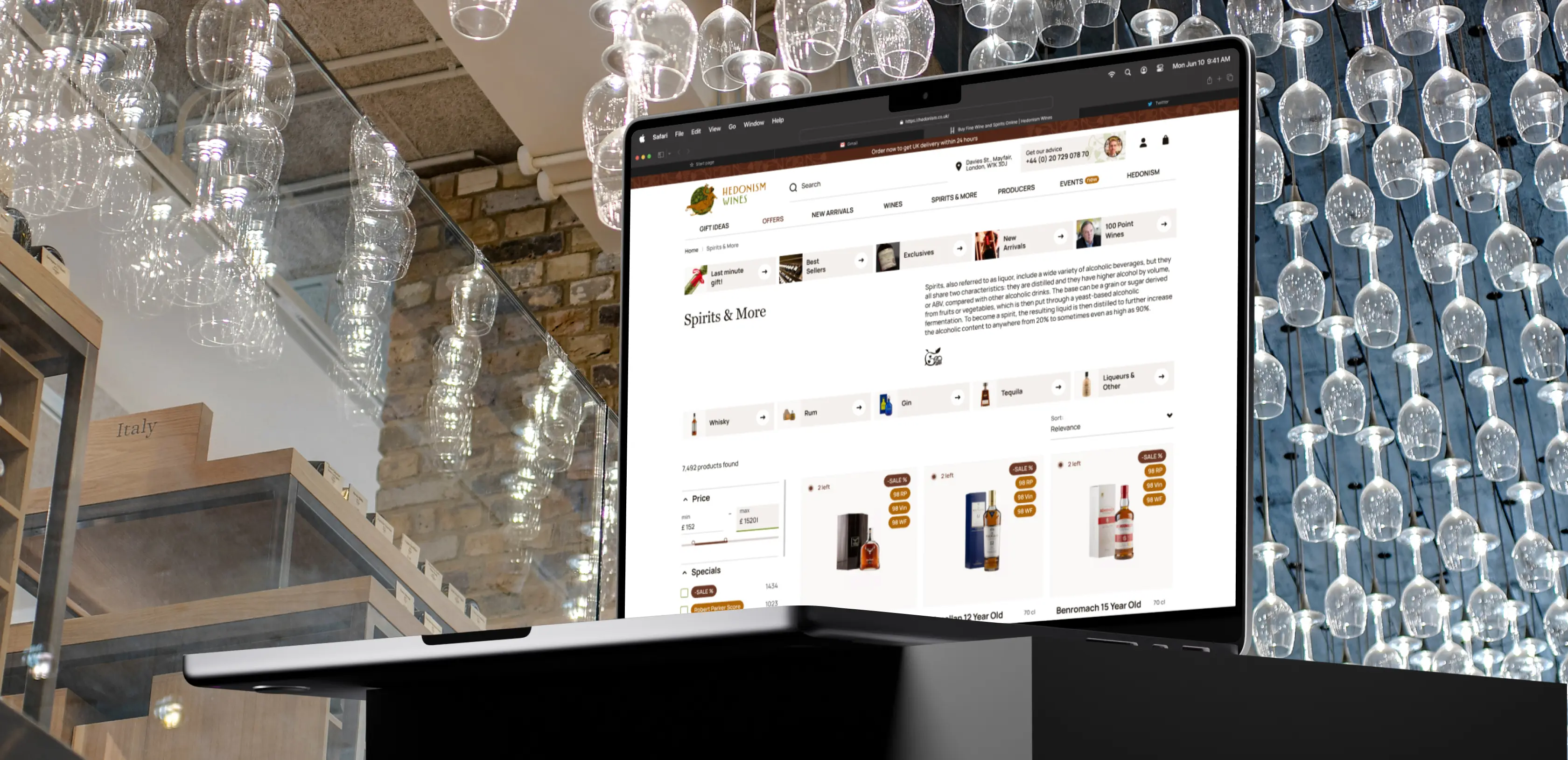
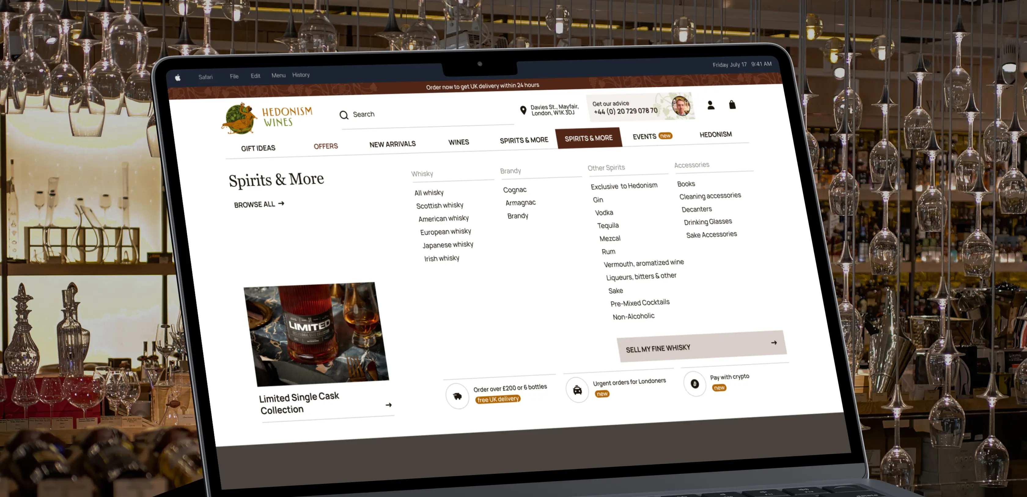
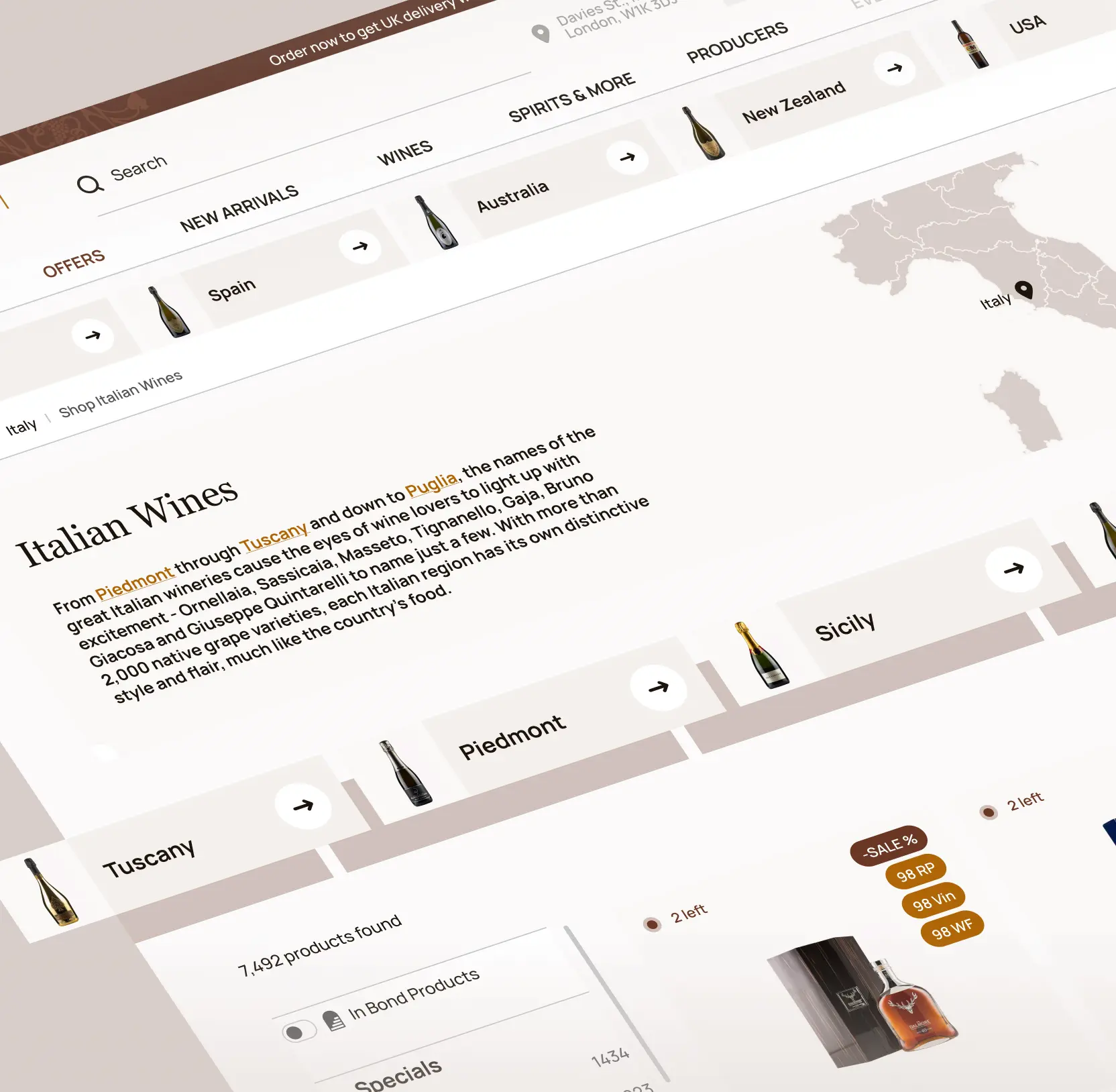
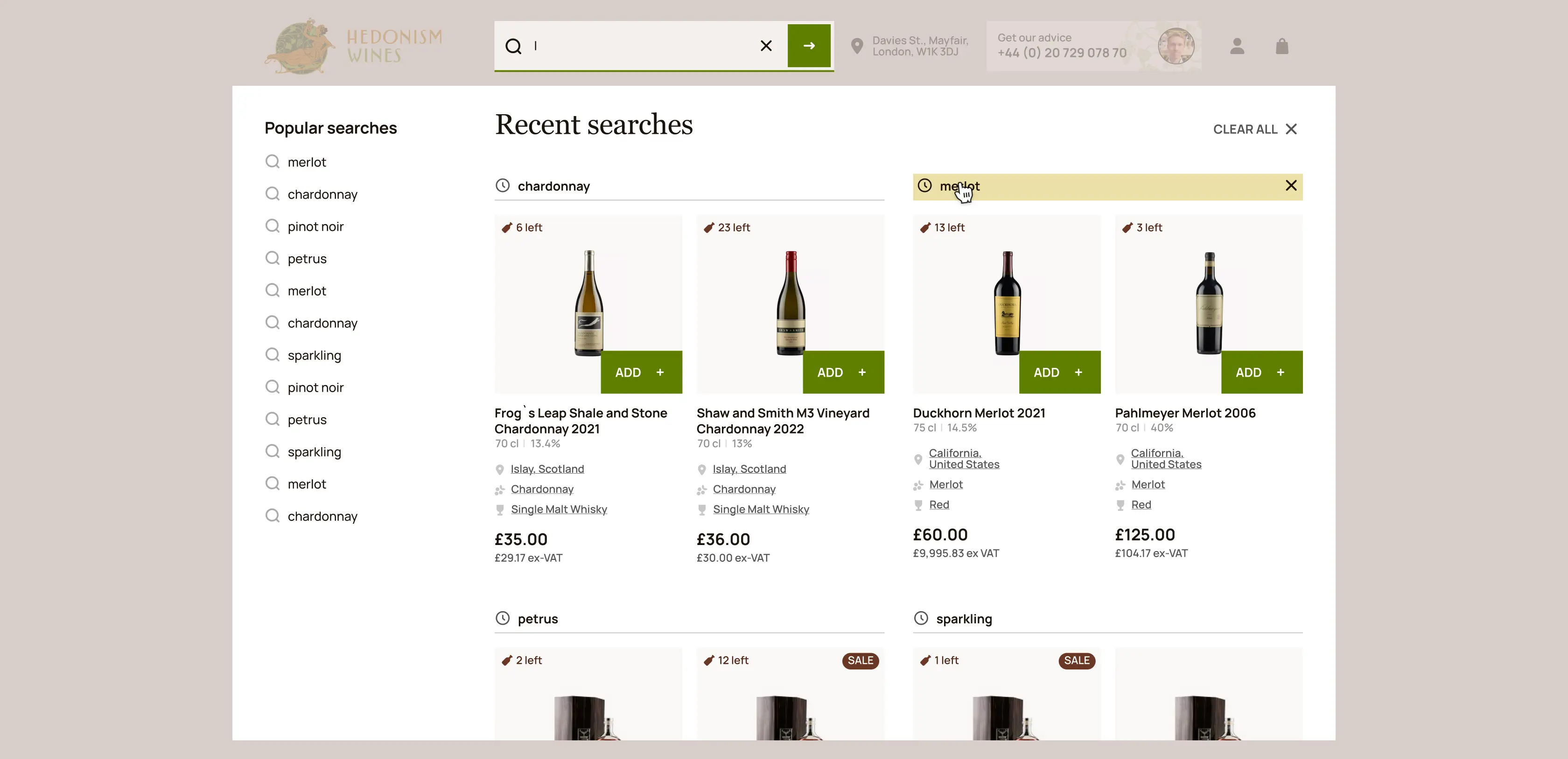
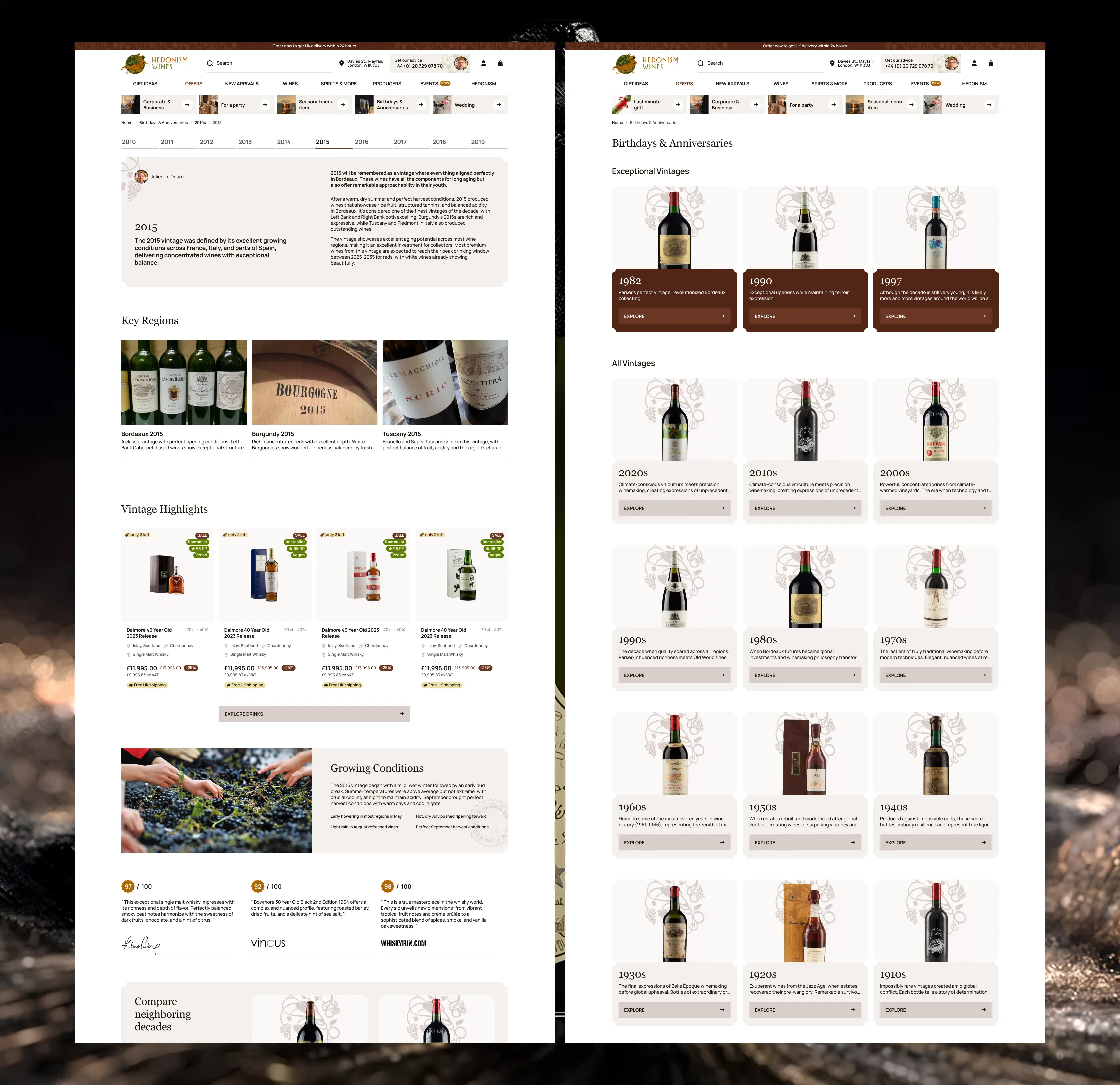
Optimized navigation and streamlined product discovery

Wine enthusiasts often found themselves overwhelmed by Hedonism’s extensive catalog. The previous site made it difficult to browse efficiently, especially on mobile devices, leading to high abandonment rates.

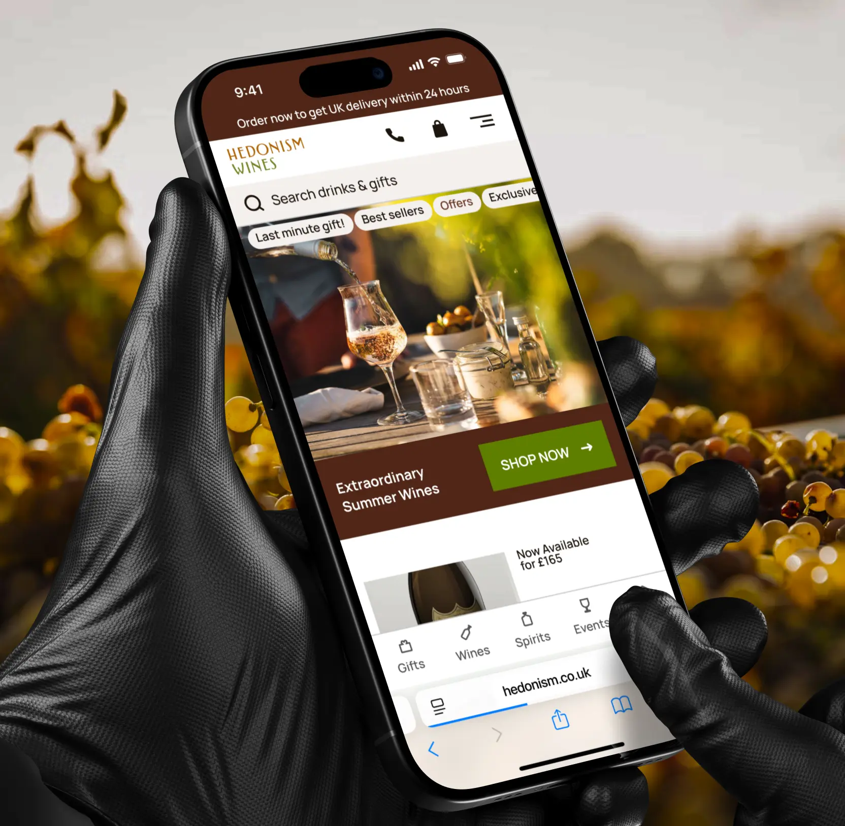
Our redesign tackled this by revamping the navigation structure, including a new megamenu that showcased products visually and enhanced the search function with intelligent suggestions. Sommelier-curated collections, like "100 Point Wines" and vintage-specific pages, were added to guide users toward premium selections. This approach resulted in a 54% increase in Add-to-Basket actions and improved overall satisfaction.

No items found.

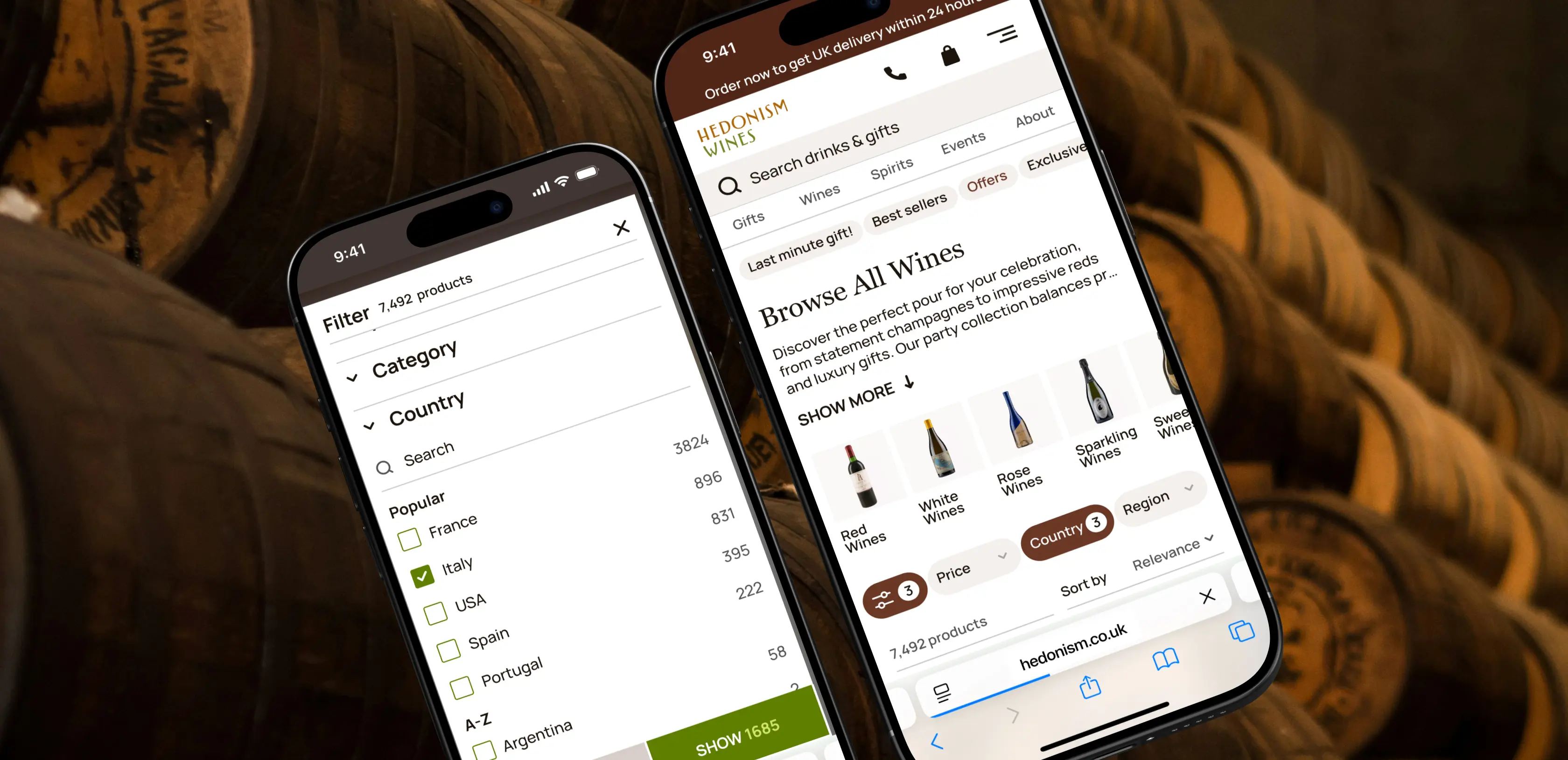
Enhanced mobile experience for seamless customer journeys

Given that most customers access Hedonism via mobile, the original desktop-centric design was a major barrier for mobile users. We reimagined the entire mobile experience by simplifying navigation to make it thumb-friendly and reducing unnecessary clicks.

We also prioritized search functionality and ensured curated collections were easily accessible. The checkout process was streamlined to minimize abandonment. This mobile-first approach resulted in dramatically improved engagement, lower bounce rates, and a far more user-centric browsing experience.

Design-led mobile site optimization practices & wins from Lazarev.agency

No items found.

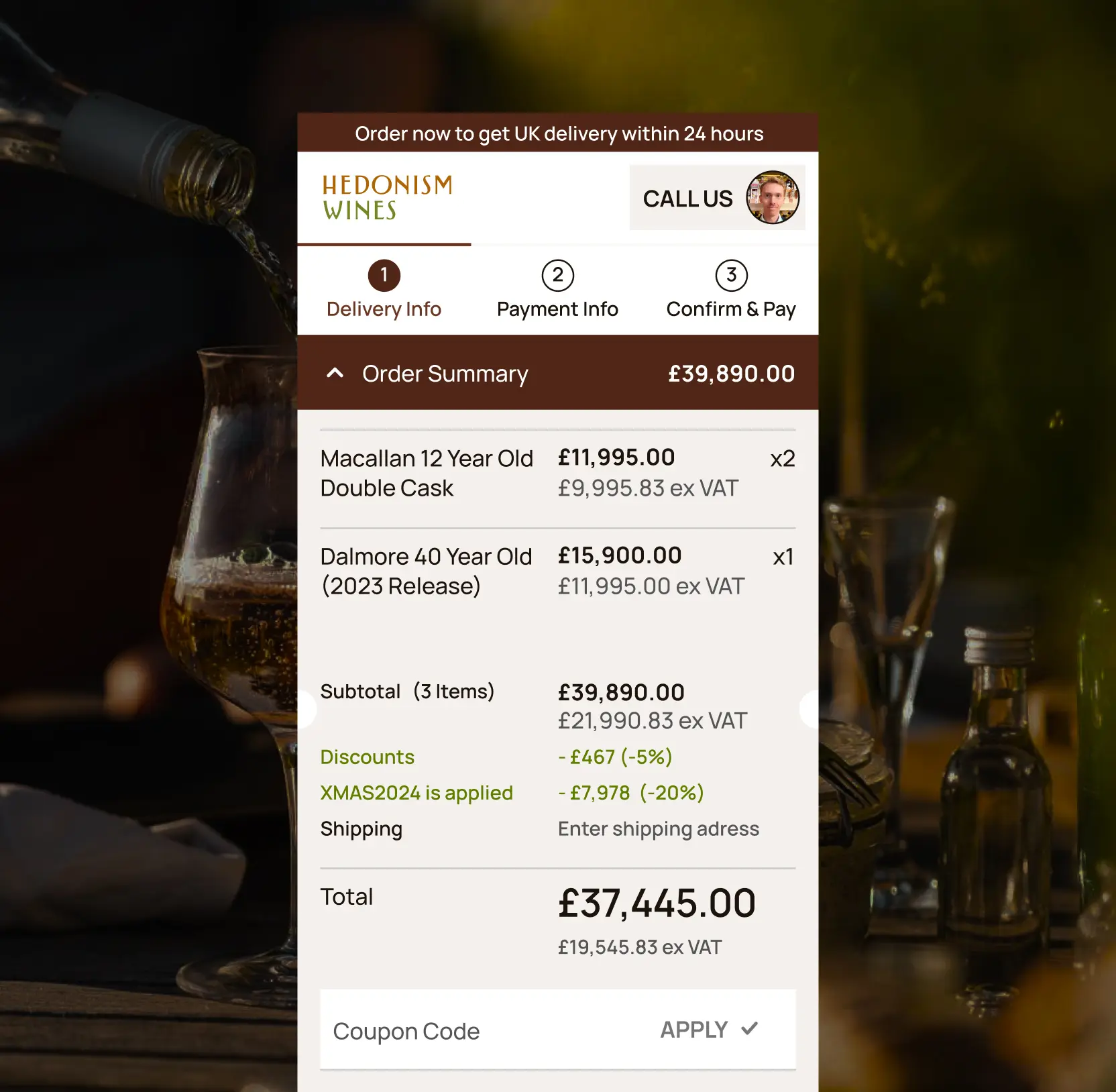
Streamlined conversion funnel for increased checkout completions

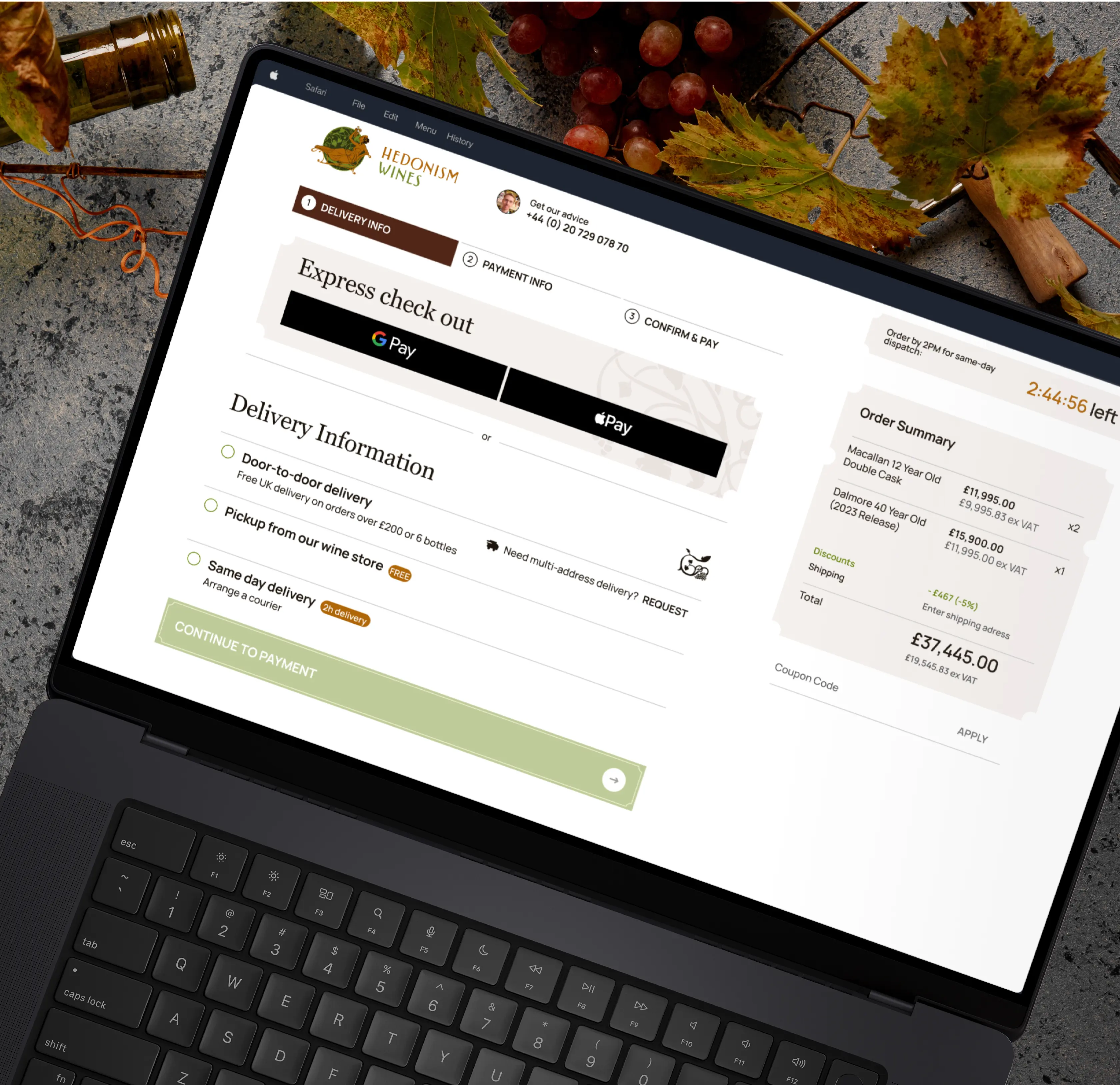
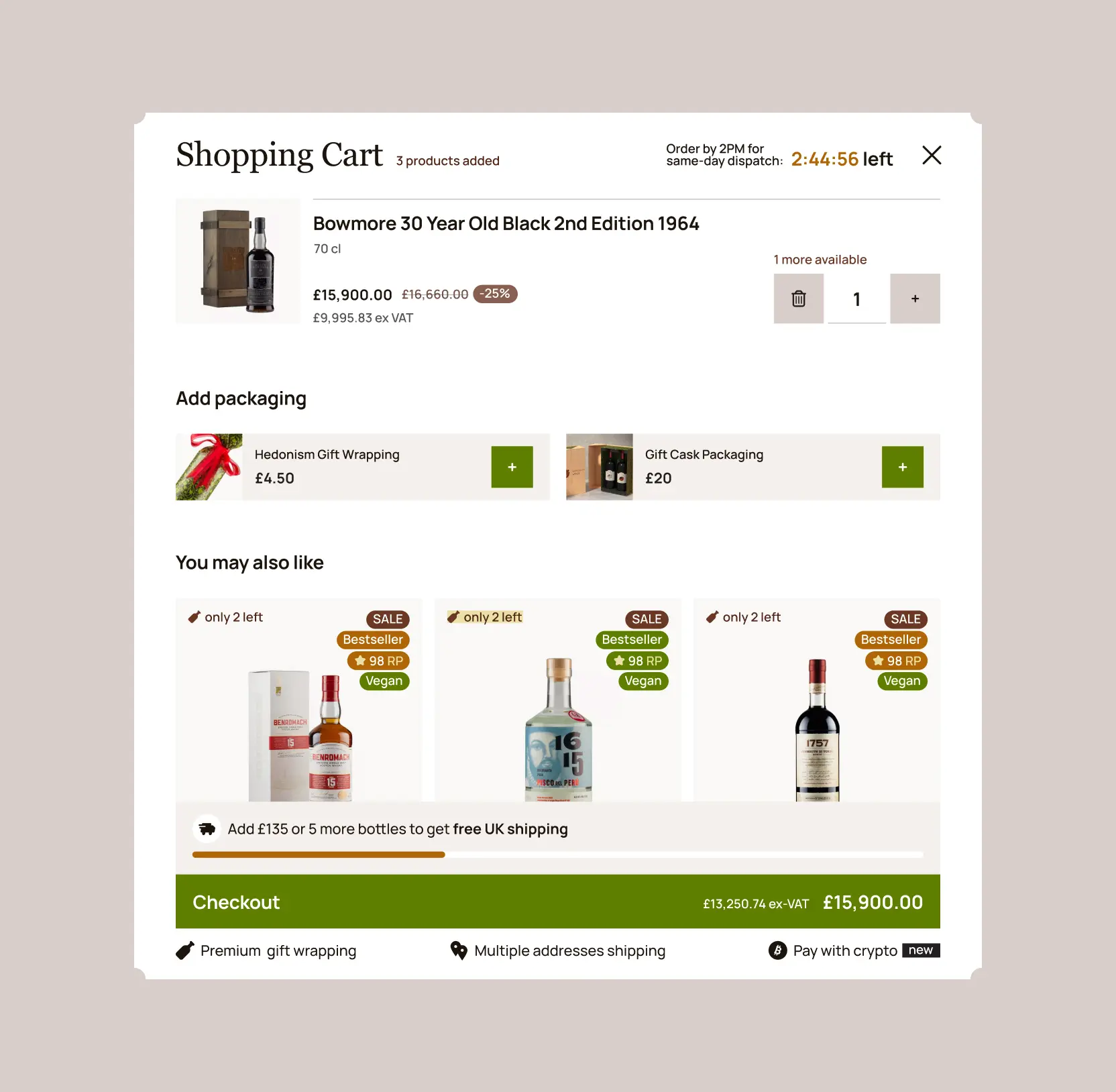
Customers were dropping off during the checkout process due to a complex and intimidating funnel, as well as a lack of trust signals. To address this, we simplified the entire conversion journey by adding product recommendations, clear labeling for ratings, and strategically placed offers.

The cart experience was streamlined with progress indicators, while trust signals, such as security badges and delivery timers, were introduced to improve purchase confidence. This optimization led to a 45% increase in completed checkouts and higher overall conversion rates.

No items found.

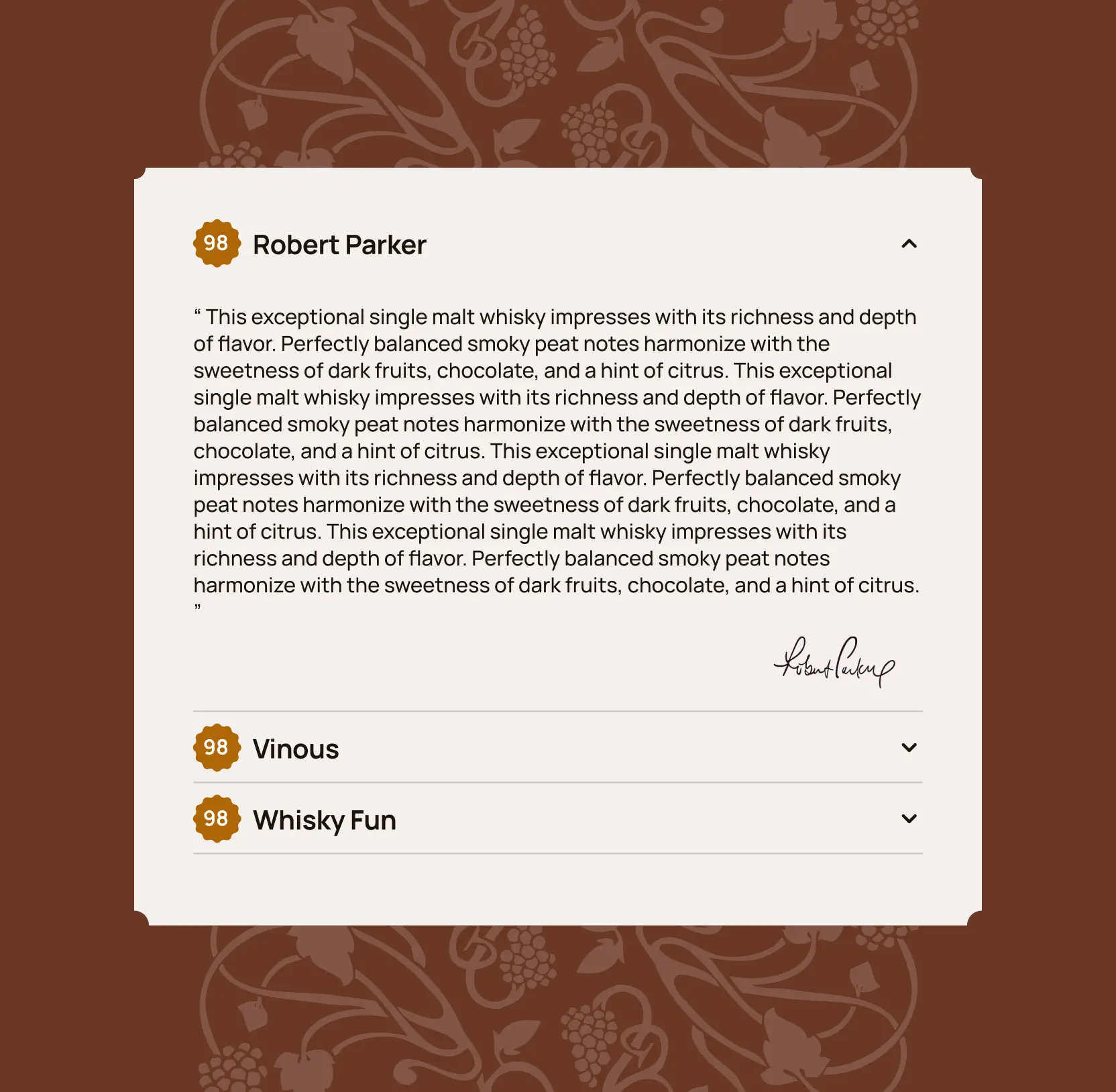
Boosted brand positioning and expertise showcase

The original website did not effectively communicate Hedonism’s status as London's premier fine wine boutique. To strengthen its premium positioning, we integrated sommelier-curated collections and expert ratings from renowned sources like Robert Parker and Wine Spectator. 

We also created dedicated vintage pages that provided historical context for premium selections, as well as offering luxury gift experiences. These additions helped build trust and credibility, reinforcing Hedonism’s position as an authority in fine wines and spirits, while justifying their premium pricing.

No items found.
E-commerce
Explore E-commerce

E-commerce

Lazarev. agency offers comprehensive digital design services. Discover our range of related expertise supported by impactful case studies.

explore

More Scaleups Cases

FAQ

/00-1

What are the best strategies to increase engagement on a premium wine retail platform?

One of the most effective strategies to increase engagement for a premium wine retail platform like Hedonism Wines is to focus on an intuitive, mobile-first redesign. By optimizing the browsing experience with sommelier-curated collections, intuitive navigation, and visually appealing product labeling, Hedonism was able to capture the attention of wine enthusiasts and guide them toward premium selections. Additionally, incorporating personalized recommendations and streamlined checkout processes helped boost user engagement, leading to a 45% increase in Add-to-Basket actions.

/00-2

How can a wine retailer optimize product discovery for customers with a wide selection of wines?

For a wine retailer with a vast selection, like Hedonism Wines, optimizing product discovery involves revamping the navigation and categorization system. We restructured the navigation with a new megamenu, showcasing wines through curated collections such as "100 Point Wines" and vintage-specific pages. These collections made it easier for both seasoned collectors and newcomers to find premium selections, significantly increasing Add-to-Basket actions by 54%. Intelligent search suggestions further enhanced the discovery process.

/00-3

How important is mobile optimization for a fine wine retailer’s online sales?

Mobile optimization is crucial, especially when the majority of traffic comes from mobile users. At Hedonism Wines, the original desktop-centric design created friction for mobile customers. By redesigning the site with a mobile-first approach, we simplified navigation to make it thumb-friendly and prioritized search functionality. These changes resulted in improved engagement, lower bounce rates, and a far more user-friendly experience. This mobile optimization was key to improving overall user experience and increasing conversions.

/00-4

What improvements can be made to a wine retailer’s checkout process to reduce cart abandonment?

Reducing cart abandonment requires simplifying the checkout process and instilling confidence in customers. At Hedonism Wines, we streamlined the entire conversion funnel by adding product recommendations, clear labeling for ratings, and strategically placed offers. The cart experience was enhanced with progress indicators and trust signals, such as security badges and delivery timers. These changes improved purchase confidence and led to a 45% increase in checkout completions.

/00-5

How can a fine wine retailer build trust with customers to justify premium pricing?

Building trust for a premium wine retailer involves showcasing expertise and curating personalized experiences. Hedonism Wines strengthened its brand positioning by integrating expert ratings from respected sources like Robert Parker and Wine Spectator, along with sommelier-curated collections. We also created vintage-specific pages that provided historical context for premium selections, helping customers understand the value of their purchases. These elements reinforced Hedonism’s credibility and justified their premium pricing.

/00-6

What role do curated collections play in improving the user experience for wine retailers?

Curated collections play a pivotal role in guiding users toward personalized, premium selections. For Hedonism Wines, the introduction of sommelier-curated collections like “100 Point Wines” and vintage-specific pages simplified the decision-making process for customers. These collections, along with improved navigation and intelligent search suggestions, made it easier for users to explore the vast catalog, ultimately increasing engagement and boosting Add-to-Basket actions by 54%.

/00-7

How can a wine retailer improve its mobile browsing experience to match its offline store reputation?

To match the reputation of an offline store, a wine retailer must offer a seamless, enjoyable mobile browsing experience. Hedonism Wines achieved this by implementing a mobile-first design that made navigation easy, especially with thumb-friendly patterns. By prioritizing search functionality and curating collections for easy access, we reduced friction for mobile users. The simplified checkout process further contributed to a smoother, more satisfying mobile experience, which helped improve conversions and user satisfaction.

/00-8

/00-9

/00-10

/00-11

/00-12

/00-13

/00-14

Hit me up! Let’s chat about your growth

Kirill Lazarev
Founder of Lazarev.
Let’s talk
Your Custom Space is Almost Ready!!! <1 min

We’ve created this space specially for you, featuring tailored ideas, design directions, and potential solutions crafted around your future product.

Everything’s Ready!

Your personalized space is ready to go. Dive in and explore!

12%
Analyzing data...
Explore Now
Hey, your personal page is being crafted.
Everything’s Ready!
12%
Go
Your Custom Space Ready!!!

Recognizing that financial researchers utilizing Rhea need to process data and generate reports, we aimed to enhance their efficiency. Consequently, both text-based and widget results provided by AI can be seamlessly transformed into a report, with the added capability to edit the data.

UX for AI, Lazarev. digital product design agency

The command results are presented on a graphical interface through widgets. Accompanying CTAs are available to assist users in refining commands for processing the results further.

Widgets design for AI Fintech analysis app by Lazarev. product design agency

The Connect app also focuses on career growth and advancement. Therefore, we provided users with the option to send something akin to their digital business cards through the messaging system. This allows others to explore their skills and experience.

Messaging system for a mobile app designed by Lazarev. best design studio

We let users build their own schedule by picking their favorite sessions, workshops, and speakers. They can even export the schedule to their personal calendar for better organization.

Scheduling, event schedule for conferences, design by Lazarev. UI UX agency

Right there, we provided traders with the ability to compare various assets and observe how their value changed under the influence of news within different time periods. This feature facilitates making more informed decisions on investments.

A widget with the graph showing crypto asset comparison.

On the Matta marketplace, the availability of pricing information for products is contingent upon the intricacies of supply and demand.

To address this aspect of price absence, we gave buyers an ability yo request Price and Features Information (PFI). Upon making this request, the supplier will dispatch the PFI to the user via email and WhatsApp in PDF format.

Checkout design for an online marketplace

Similar to any marketplace, we've integrated a feature for adding products and suppliers to your Favorites. This allows buyers to receive notifications about product availability and save desired items for future purchase if the timing isn't right.

Digital product design for chemical marketplace

To enhance interactivity further, we made the decision to move away from providing users with only text-based instructions on how to address a particular issue.

Instead, we offered visual aids that accompany the text answers, helping users navigate the app and resolve their issues more swiftly.

Gamification design with dark UI elements for the Payoneer financial app.

Customers can ask the assistant any question, thanks to its neural network power, and it can even offer a weather forecast.

We made sure that the customer support section is accessible to everyone. If someone prefers not to or is unable to record their voice, they can use text input to pose a question, and vice versa.

AI-driven chat design by Lazarev. AI design agency

Brands need to connect any of the available wallets to mint NFTs. On the consumer side, though, individuals without a wallet can create a new one on the fly by using their email or social media. Alternatively, they can purchase NFTs using fiat currency and complete the entire transaction without any knowledge of Web3.

A graph showing the price history of an NFT, designed by Lazarev. design agency

We've implemented a personalized Customers section within Console, enabling collectors to manage customers who settle their debts through Collect. This empowers them with easy access to account data, detailed transaction insights, and the flexibility to provide customized payment solutions for individual cases.

Two desktop interfaces showing Customer's module within Tratta app

Central to our objectives was streamlining processes and boosting productivity for Console users. To accomplish this, we introduced highly customizable Settings. This empowers collectors to tailor the platform to their individual workflows and preferences. For instance, collectors can personalize settings to determine which features their customers will view in the Collect platform, including special offerings, discounts, and more.

Two desktop screens showing the Settings module of Tratta app

Each inventory management report is further fortified by the inclusion of the tenant's signature, solidifying the inspection process's validity and accountability.

A pop-up showing how to sign an inspection results once it was completed

To ensure a landlord's capability to substantiate claims against a tenant's deposit for damages, or vice versa, to verify that the damages are attributable to wear and tear, it is imperative that inspections exhibit the robustness required to endure legal scrutiny.In line with our approach, our inspections are comprehensive, incorporating intricate descriptions accompanied by photographic evidence.

A pop up showing how to add photos to an inspection of an apartment

To elevate user engagement and foster a deeper comprehension of the available apartments, we crafted the interactive house model within the "Selection of Apartments" section. This immersive experience empowers potential buyers to take a 360-degree tour, flipping between street and yard views with a simple toggle switch. As they hover their cursor or tap (for mobile users),  the house's specific sections illuminate, offering valuable insights into construction timelines and housing readiness. The interactive journey extends to selecting a floor and pinpointing a specific apartment with the help of a visual builder, simplifying the decision-making process and potentially increasing conversion rates.

An interface screen shpwing the 3D model of a complex and a widget that allows to switch between different complex's sections

For a more accessible experience, we've integrated a calendar widget right alongside the daily task list. A simple click takes users to a detailed breakdown of tasks, anything from completing quizzes to reading materials. This strategy keeps users within the app, providing a sense of encouragement and support rather than overwhelming them with excessive demands.

A mobile version of the Daily Actions page

We introduced an interactive widget at the top of the homepage, allowing users to track upcoming elections and assess their preparedness based on articles read, candidate knowledge, and quiz participation. By providing users with a clear measure of their readiness, the design solution motivates them to engage with educational content and explore candidate profiles while actively participating in quizzes.

Three states of the interactive widget on the homepage

Our solution was to design a switch that lets users transfer money to the fund’s international bank accounts. The website now offers the flexibility to contribute in multiple currencies (USD, UAH, EUR) using various payment methods tailored to the user's location. Donors can also donate through Paypal, support the fund on Patreon, or make donations in cryptocurrency.

Widgets displaying various donation platforms

An interactive payment widget responds with the organization founder, Serhiy Prytula’s phrases, every time a user enters any sum of money in the donation field. Such a solution proved to be efficient, encouraging more people to donate through the widget and increasing the average contributions by almost a quarter.

The mobile version of the donation page

One standout feature of Redbrain is the inclusion of price history and price forecasts directly on the product page. In line with Redbrain's dedication to delivering the best deals to consumers, we introduced a block that presents price trends from various retailers for easy comparison. Further below, we provide results generated by forecasting algorithms, helping consumers determine the optimal time to make their purchase.

The Price history section of the Redbrain website

Below the product imagery, consumers find essential product details like a comprehensive overview, rankings, and technical specifications. Given the pivotal role of product content in influencing consumer choices, we've enhanced the content display with interactivity and incorporated ample white space to ensure easy readability.

The scroll of the Redbrain page

This versatility in data presentation underscores our commitment to delivering a user-centric and highly functional interface, empowering users with diverse tools to effectively engage with critical information.

A map featuring an organized table filled with data

Following the analysis process, the resulting data  manifests on the interface. In the context of the Threat Area module, we have thoughtfully provided three distinct alternatives for data display: a map, table and integrated map and table together. A dynamic map presentation highlights the pertinent area, ensuring immediate focus.

Three screens featuring thread-level analysis

We paid special attention to the numbers, as this is what we can be proud of in spite of any difficulties. A minimum of text - a maximum of really important information.

The site offers a responsive view across mobile, tablet, and desktop. We provided the optimal searching experience while maintaining the site content regardless of the device.

The Awards section of the UkrainianPower website

We wanted to showcase the skateboards' benefits unobtrusively, step by step. To this end, we opted for interactive components that entertain people and educate them about the high-end technical specs and benefits like full customization.

 A page featuring a brief guide on using a compact control panel

The content flow seamlessly directed people towards the choice of deferred payment and customer reviews on the skateboards, instilling a sense of trust along the way.

A product webpage showcasing a motor controller replacement kit

We created a catching design style with contrasting colors, dynamic composition, and smart typography that bring visitors' attention to key elements.

An attention-grabbing widget spotlighting the advantages of 11Sight

The web calculator counts the cash back, given the number of invited users. It adds interactivity to the experience and evokes trust, showing commission transparency.

We've made tutor-student communication smooth. The “Questions” feature lets students pick teachers for paid inquiries. Additionally, students can step into the role of a tutor and provide answers to their peers' questions. Simplifying the tutoring process further, we've introduced the “Working Hours” section. This feature allows users to specify their platform availability, facilitating the system in finding suitable, available tutors.

Mobile screen displaying rate the teacher feature

For easy module and lesson navigation, we've created a side menu that opens and closes as needed. It also features a progress list with checkpoints, clearly indicating completed units and those remaining. In the “Learn” section, students can access both free and paid materials. They can study multiple materials on one topic, take quizzes, and move through to the next modules.

Interface showcasing the modules & lessons navigation

As we explored users' perspectives further, we discovered that some don't usually leave comments online due to not remembering all the details or being short on time. These insights led us to develop tags, making it easy for people to share their experiences at places they've been. This fresh idea replaced the old star rating system with tags, offering a simpler and friendlier way to express opinions.

The mobile screen showcasing the Tags functionality

Acknowledging the interconnected nature of workflows, we've introduced a powerful dependencies feature to further enhance the automation of the user experience. These dependencies establish a connection between two workflows, offering users the flexibility to select which workflow to link with. The types of dependencies include simultaneous start, immediate repeat and time delay.

Two compact pop-up windows to manage dependencies

Addressing the central challenge of managing recurrence, we aimed to create a seamless experience for setting repeated workflows. Our solution involves a full-page popup directly on the workflow page. It allows users to manage recurrences comprehensively, setting recurrence frequency, due dates, project durations, and more.

A full-screen pop-up interface for configuring recurring events

Our thoughtfully crafted input fields, controls, and CTA buttons distinguish themselves within the interface, all thanks to their skillful use of design accents and proportions. This approach not only enhances the interface's visual appeal but also boosts user efficiency.

An image showcases various screens, buttons, widgets, and design elements

In our quest to simplify the user experience and eliminate needless steps, we made the deliberate choice to incorporate a right-hand sidebar that opens when you click on a project task. This UX patterns conceal all non-essential information, preventing user overload, while prominently presenting the crucial details necessary for efficient project management.

The sidebar that appears when users click on a project task

The crisp UI design, featuring well-balanced proportions and a logical information structure, enhances readability and helps digest complex financial data.

Numerous screenshots of the Boel IT web product

Recognizing that Vessel Finance could potentially be utilized by less seasoned investors, we incorporated tooltips to explain the column headers. This  addition aims to enhance user understanding when calculating the benefits from vessels.

Desktop webpage displaying a table with year-on-year parameters

The product delivery schedule is presented on an interactive roadmap that advances on its own as visitors scroll through the section.

We present several ordering options to give existing and new customers the freedom of choice and help them make informed buying decisions through in-depth offerings explanations.

Speaking to a broad range of audience segments meant creating technical specs that give entry-level consumers just enough information and knowledgeable engineers - the ability to dive deep.

Through straight composition and powerful copy, we familiarize people with the uniqueness of the Inertia Wheels MAX and inspire them to experience the product in work.

We reimagined the resource center to become a hub of stories, use cases, educational articles, and videos to showcase the breadth of what's possible with the Inertia Wheels MAX.

Through rich interactions, 3D renders, and digestible copy, we show off the unique physical features of the Inertia Wheels MAX, drive demand, and encourage our audience to explore the product further.

Brands need to connect any of the available wallets to mint NFTs. On the consumer side, though, individuals without a wallet can create a new one on the fly by using their email or social media. Alternatively, they can purchase NFTs using fiat currency and complete the entire transaction without any knowledge of Web3.

The list of smart contracts on a green background

Brands need to connect any of the available wallets to mint NFTs. On the consumer side, though, individuals without a wallet can create a new one on the fly by using their email or social media. Alternatively, they can purchase NFTs using fiat currency and complete the entire transaction without any knowledge of Web3.

An assortment of crypto wallet options
No items found.
00 FPS