
Your brand appears in the palm of someone’s hand, lit by a pocket-sized screen, judged by a single thumb-swipe. If the journey feels natural thanks to snappy motion, readable text, effortlessly clear actions, then users stay and explore.
When more than half of the world's internet traffic comes from screens less than six inches wide, a page that shakes, freezes, or obscures the main action is a loss of revenue and a drain on brand trust.
That’s why our product design teams treat mobile site optimization not as a “smaller version” but as the primary stage where relationships begin.
Key takeaways
- Start with mobile journeys. We prototype critical flows on phone viewports first, then scale up, flipping the usual “shrink to fit” approach.
- Performance is UX. Design, engineering, and content delivery network choices are measured against Core Web Vitals budgets from day one, not bolted on in QA.
- Content adapts to moments of need. Micro-copy, imagery, and even data density reflow based on real usage contexts logged in analytics.
- Component libraries > breakpoints. A responsive design system built around tokenized spacing, typography, and interaction states slashes future iteration time across devices.
Why is mobile optimization important
- Mobile traffic is now the majority. StatCounter data shows phones generated ≈ 59.7% of global web traffic in April 2025.
- Google moved to mobile-first indexing. Since the switch was completed in 2024, the mobile version now decides how search engines rank and index your pages.
- Core Web Vitals reward speed and stability. Independent case studies collected by Conductor illustrate that shaving even a few hundred milliseconds from Largest Contentful Paint (LCP) lifts both rankings and conversion rates.
In short, mobile site optimization is no longer “nice to have” but the baseline for discoverability, user engagement, and revenue.
How a product design agency approaches mobile site optimization
Use this quick comparison to understand why design-led mobile site optimization delivers more than code tweaks alone.
“Dev shops tune the code, SEO firms tune the crawl; we tune the moment a thumb becomes a ‘Yes.’”
{{Anna Demianenko}}
10 mobile optimization best practices we apply on mobile-focused projects
Below are the ten mobile optimization best practices we build into every mobile-first project. These habits will keep pages fast, thumb-friendly, and Core Web Vitals safe from day one.
- Design for the smallest breakpoint first. Content, CTAs, and navigation must feel native on limited screen space before scaling up to desktop site layouts.
- Keep critical actions above the “thumb fold.” High-impact CTAs sit within easy reach on common phone screen sizes.
- Use the same URL for mobile and desktop versions when possible; avoid fragmented “m.” or “/amp/” structures that dilute authority and complicate mobile SEO.
- Respect Core Web Vitals budgets. Lazy-load non-critical images, defer off-screen video, and cap cumulative layout shift.
- Adopt a content-delivery network early. A global CDN keeps mobile site speed consistent for users on diverse networks.
- Employ adaptive imagery. Next-gen formats (AVIF/WebP) plus srcset keep retina displays crisp without ballooning page loads.
- Prioritize semantic, natural-language search. AfroTech’s tag-based search and Riptide’s parts-finder both reuse one search index for mobile pages and desktop users — no duplicate technical SEO.
- Make mobile checkout single-step. Apple Pay and Google Pay eliminate form-filling delays; the same one-tap confirmation is what drives fast conversions in today’s best nonprofit donation flows.
- Audit accessibility as part of mobile performance. Color contrast, tap-target size, and motion-reduction settings sit in the same backlog as site speed.
- Instrument real-user metrics. We stream field data into design sprints to validate mobile experience improvements continuously.
Mobile design in action
The principles above move from slide decks to live code in our client work.
The 4 snapshots below show how our team applied the same mobile site optimization playbook across media, entertainment, civic tech, and e-commerce — always with the same 3 checkpoints: What blocked mobile users? → How did design solve it? → What changed afterward?
AfroTech — media hub redesign
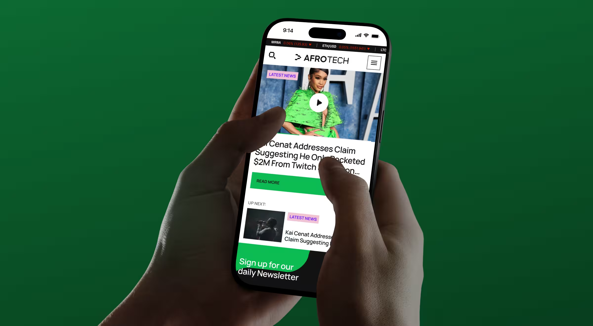
A flagship event and content brand for Black tech professionals, now consumed mostly on mobile devices.
- Challenge: Out-of-date layout stalled on phones; ads crowded the viewport.
- Mobile solutions: Responsive grid, video-first hero, dual-column news feed, sticky “Subscribe” banner, and an adaptive dark mode for OLED screens.
- Outcome: User community expanded from ≈ 500 attendees in 2017 to 20,000 in 2022 for AfroTech events, reflecting stronger on-site engagement and recurring mobile traffic.
🔍 Read the full case study here.
Mappn — entertainment app
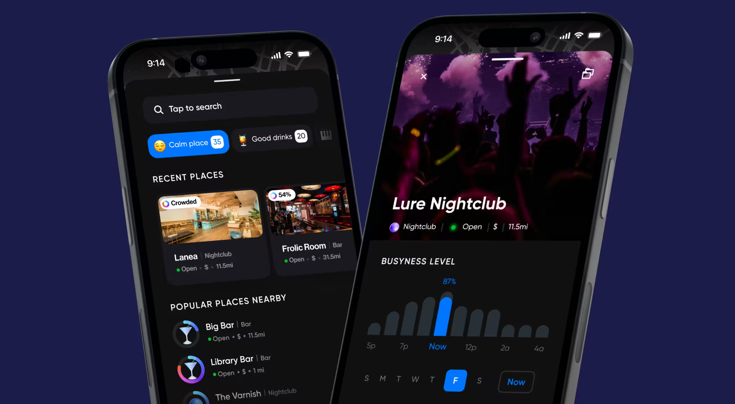
A real-time map that helps party-goers find busy venues and quick-book tables.
- Challenge: Stand out in a crowded entertainment market.
- Mobile solutions: Real-time map with busy-ness heat overlay, tag-based quick reviews to replace slow star ratings.
- Outcome: Early beta users reported higher session length; qualitative testing confirmed a smoother mobile experience even in low-light dance-floor conditions.
🔍 Read the full case study here.
Activote — civic participation platform
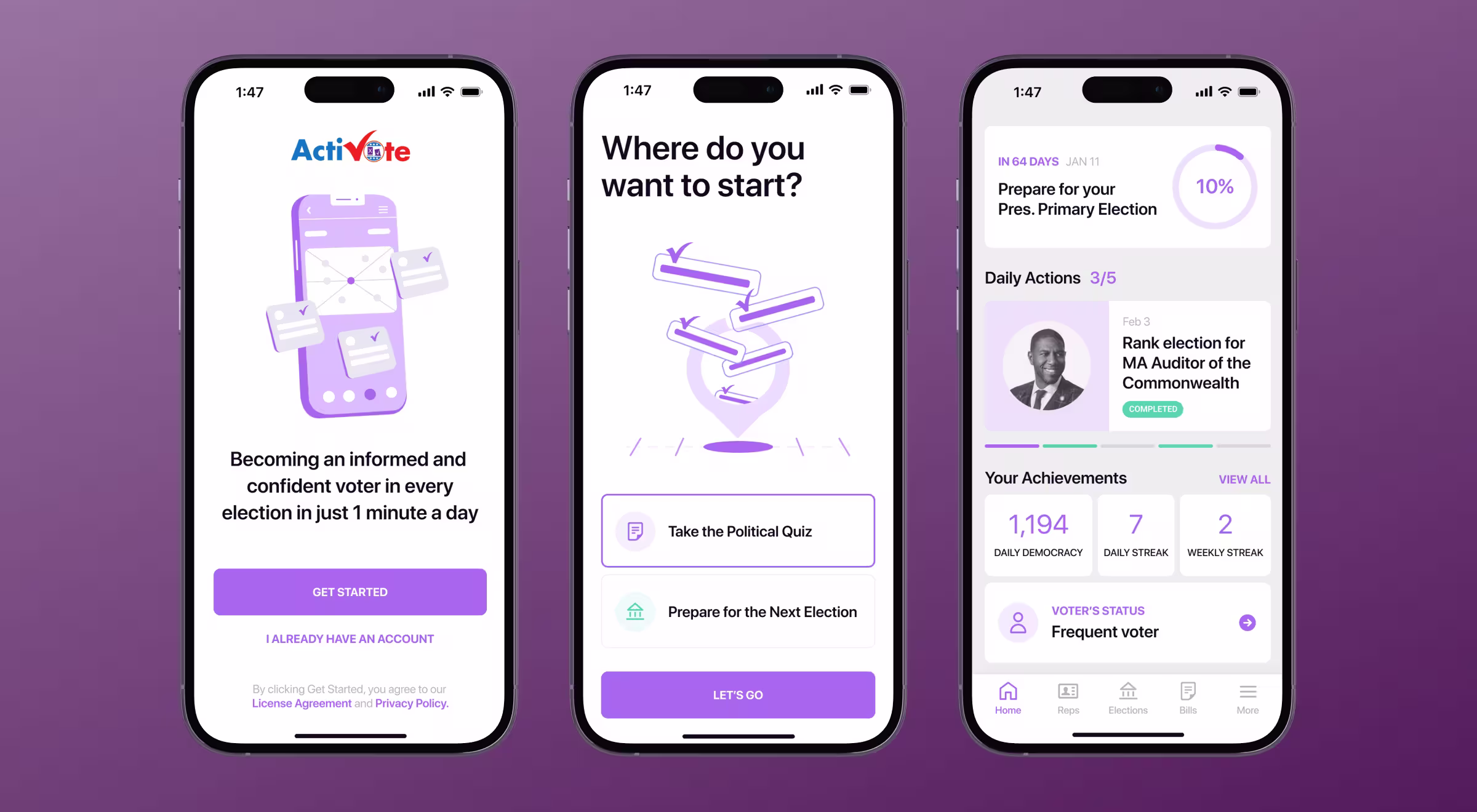
A pocket guide to elections that turns political facts into daily, actionable tasks.
- Challenge: Desktop-centric flows lost mobile voters before they reached key deadlines and candidate info.
- Mobile solutions: Tap-through timeline for early voting, absentee rules surfaced via pop-ups; progressive disclosure keeps mobile pages under 250 KB.
- Outcome: Internal analytics show a notable uptick in checklist completion on mobile phones compared with the previous desktop-only flow.
🔍 Read the full case study here.
Riptide — mobile-first e-commerce
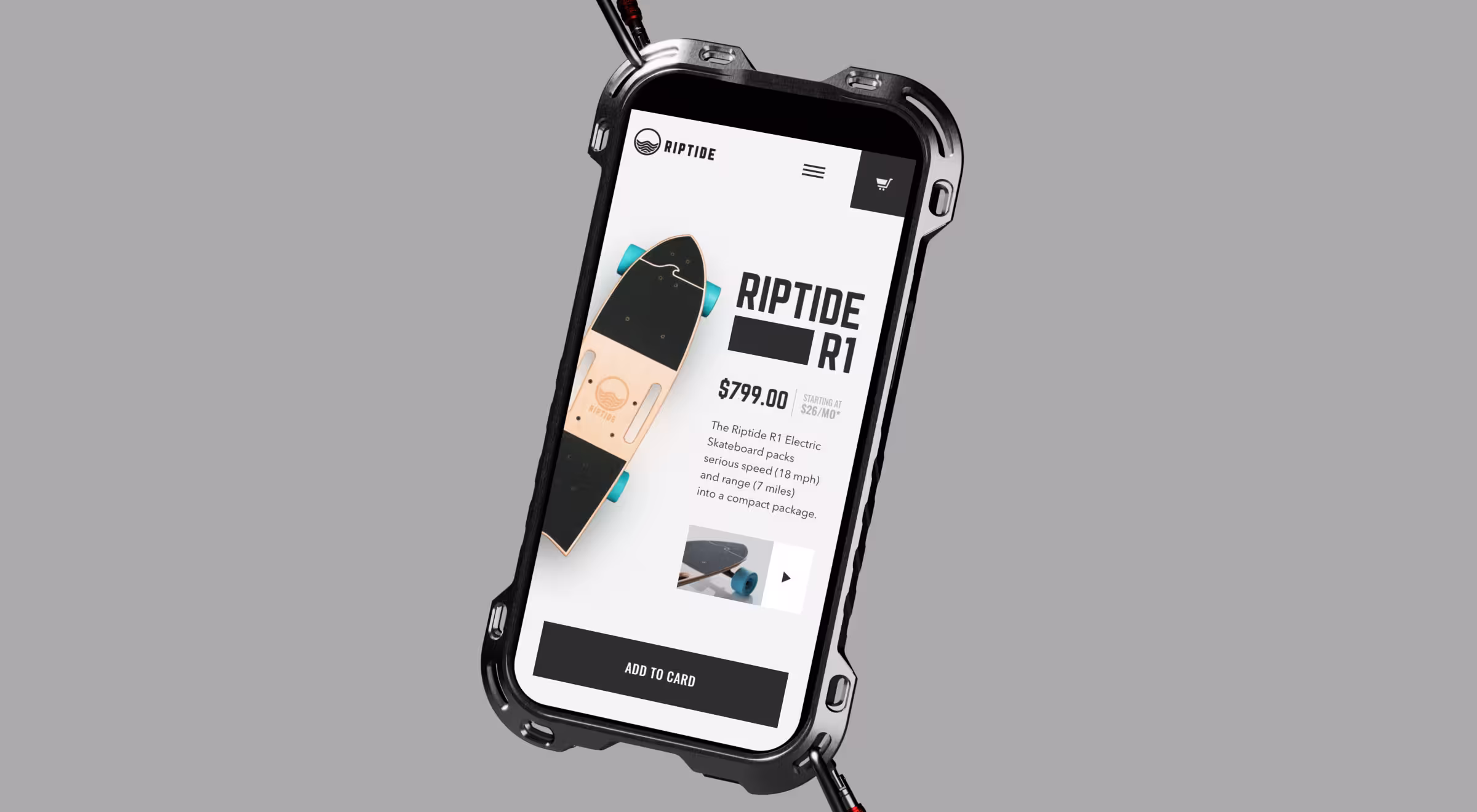
A direct-to-rider brand that packs dual-motor power into a pocket-sized deck and sells almost exclusively through mobile search and social.
- Challenge: The legacy desktop site felt heavy on phones: off-screen menus, oversized hero videos, and unoptimized images pushed mobile load time past the three-second “bounce” cliff and hid the most-wanted CTA (“Add to cart”) above the thumb zone.
- Mobile solutions: Full-bleed product cards with inline ratings and real-time stock cues. Thumb-reach “Add to cart” and a fixed bottom bar that lets riders jump straight to checkout without stretching to a top corner. Progressive image loading to keep scroll smooth on spotty 4G. Same HTML across devices so bots and browsers cache once and render fast everywhere.
- Outcome: Client metrics show a sold-out run worth ≈ $500K within two months of launch; the founders soon finalized an acquisition deal, and Riptide entered the top-10 skateboard brands by U.S. sales.
🔍 Read the full case study here.
Together, these examples show that mobile site optimization important work blends responsive web design, behavioral research, and performance engineering — far beyond a one-time “compress images” sprint.
Optimize website mobile SEO and much more
Mobile users decide whether to stay or bounce in 50 ms. A mobile-friendly website that loads fast, respects Core Web Vitals, and feels tailor-made for the user’s device converts better, ranks higher, and protects brand equity.
If your site speed reports stay red, let’s discuss a mobile optimized website revamp grounded in product design.


.webp)


.avif)