Lviv.travel attracted 300,000+ foreign visitors in the first year after launch

Award-Winning
Project:
No items found.
Industry:
Travel & event
Services:
Creative web design services
Travel and tourism web design agency
Customer experience design agency
About
the project

No digital gateway for Ukraine's cultural capital  

With 2.2 million annual visitors, travelers faced scattered information and outdated sources. Tourists pieced together trips from blogs, outdated directories, and unofficial and often misleading guides. For an internationally known city, this was a structural gap: high interest but low digital discoverability and planning efficiency.

Lviv needed a unified digital platform to help tourists efficiently discover and plan their journeys through the city's rich historical and cultural offerings. 

That’s where Lazarev.agency came in.

Results

Tourists felt the impact in the first year of launch 

Visitors immediately discovered what they'd been missing — a coherent platform where planning their Lviv journey became effortless. International travelers could finally access comprehensive information about attractions, events, and cultural sites without navigating multiple outdated sources.

300K

Foreign tourist arrivals increased considerably in the first year after launch.

85%

Reduction in tourist information requests to local administration offices.

No items found.

The Project’s
Discovery Phase

No items found.
No items found.

Created a unified city platform for 2.2 million annual visitors

Before we engaged, Lviv was leaving tourism revenue on the table. International travelers researching the city landed on a patchwork of outdated listings, with no authoritative source to convert their interest into a booked trip. For a city competing with Krakow and Prague for the same Eastern European travel budget, such a fragmented digital footprint was a commercial liability. 

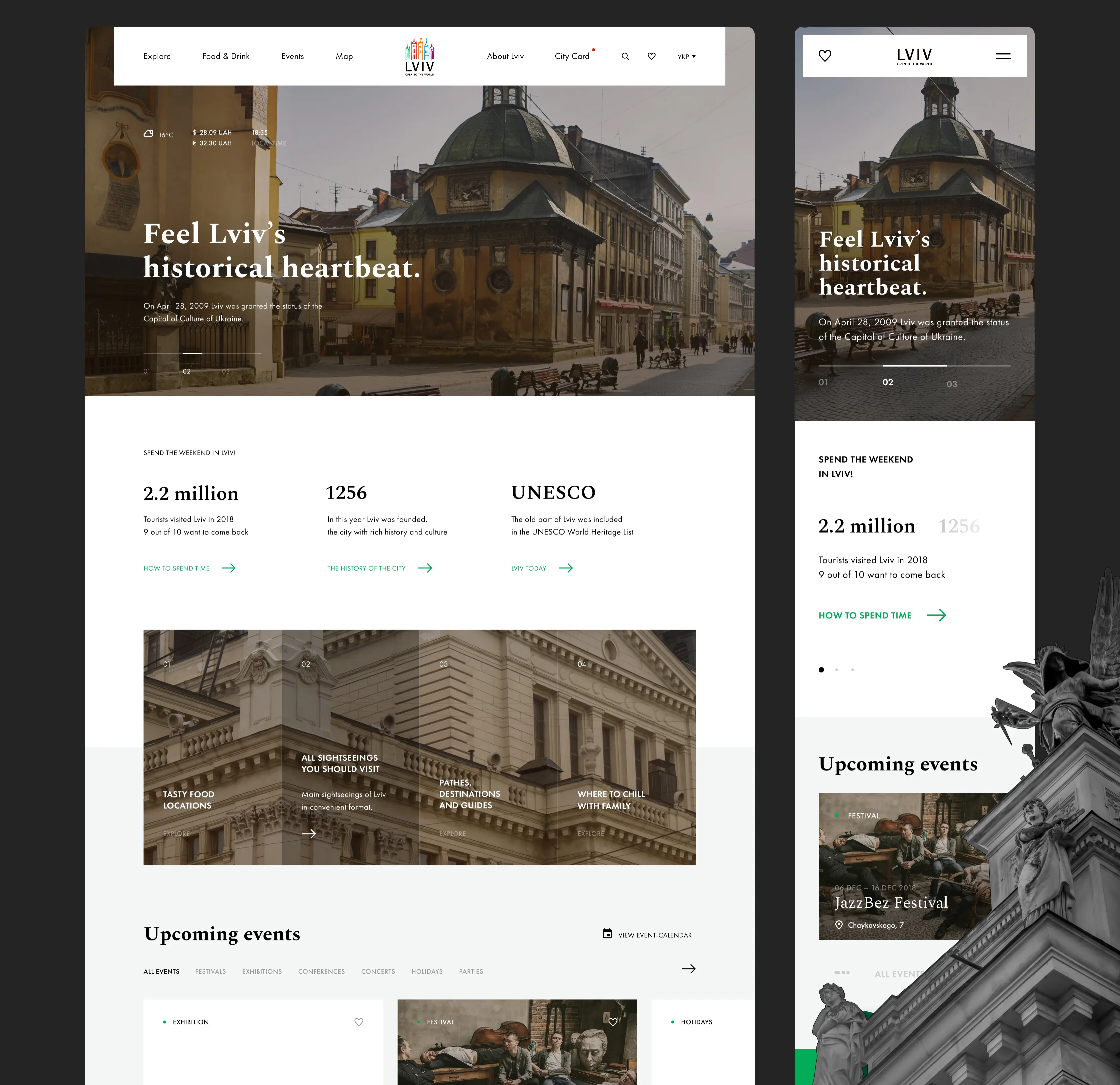
We consolidated every revenue-relevant touchpoint (attractions, dining, events, the paid City Card program, curated itineraries) into one navigation system

The homepage leads with three credibility anchors (2.2M annual visitors, founded 1256, UNESCO status) because international travelers convert faster when a destination signals scale and legitimacy upfront. 

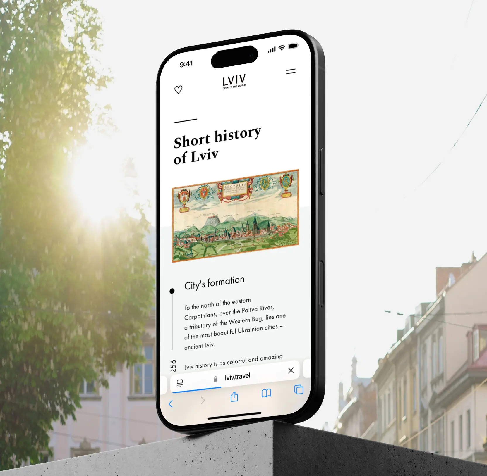
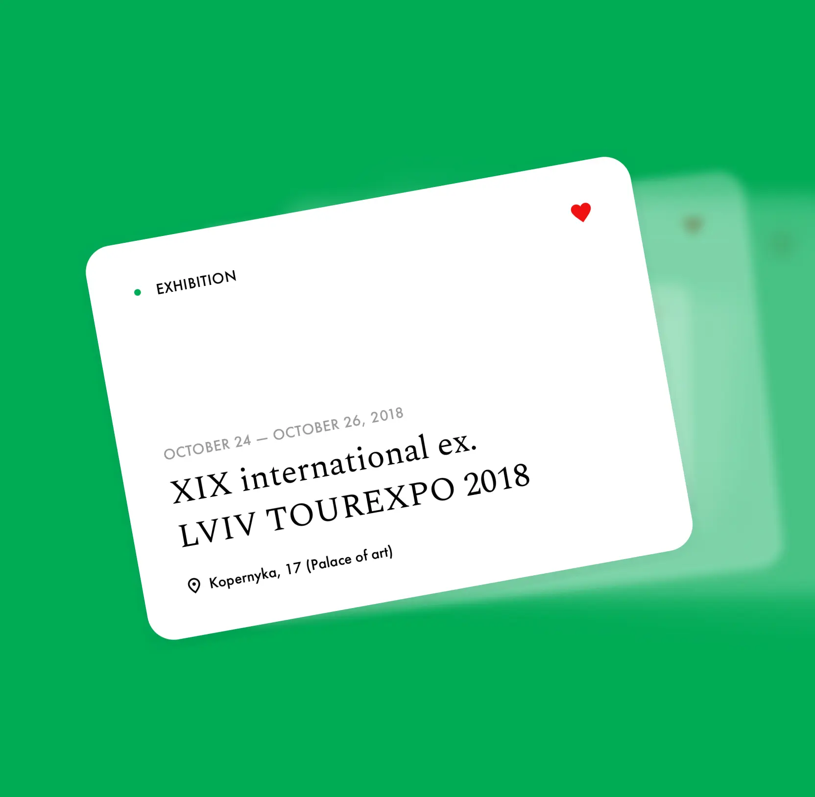
The filterable event calendar was built to capture demand from a high-value segment — festival and conference travelers, who spend more and stay longer. The bilingual, mobile-first build was a deliberate move to reach foreign visitors where 70%+ of travel research happens: on a phone, in English.

13 travel and tourism web design companies proving design drives bookings

No items found.

Made the map the city's primary discovery and revenue engine

A tourism map is where intent becomes itinerary and where a city either captures spend or loses it. Lviv's existing tools forced travelers to triangulate across Google Maps and PDF guides, breaking the planning flow just as they were ready to commit.

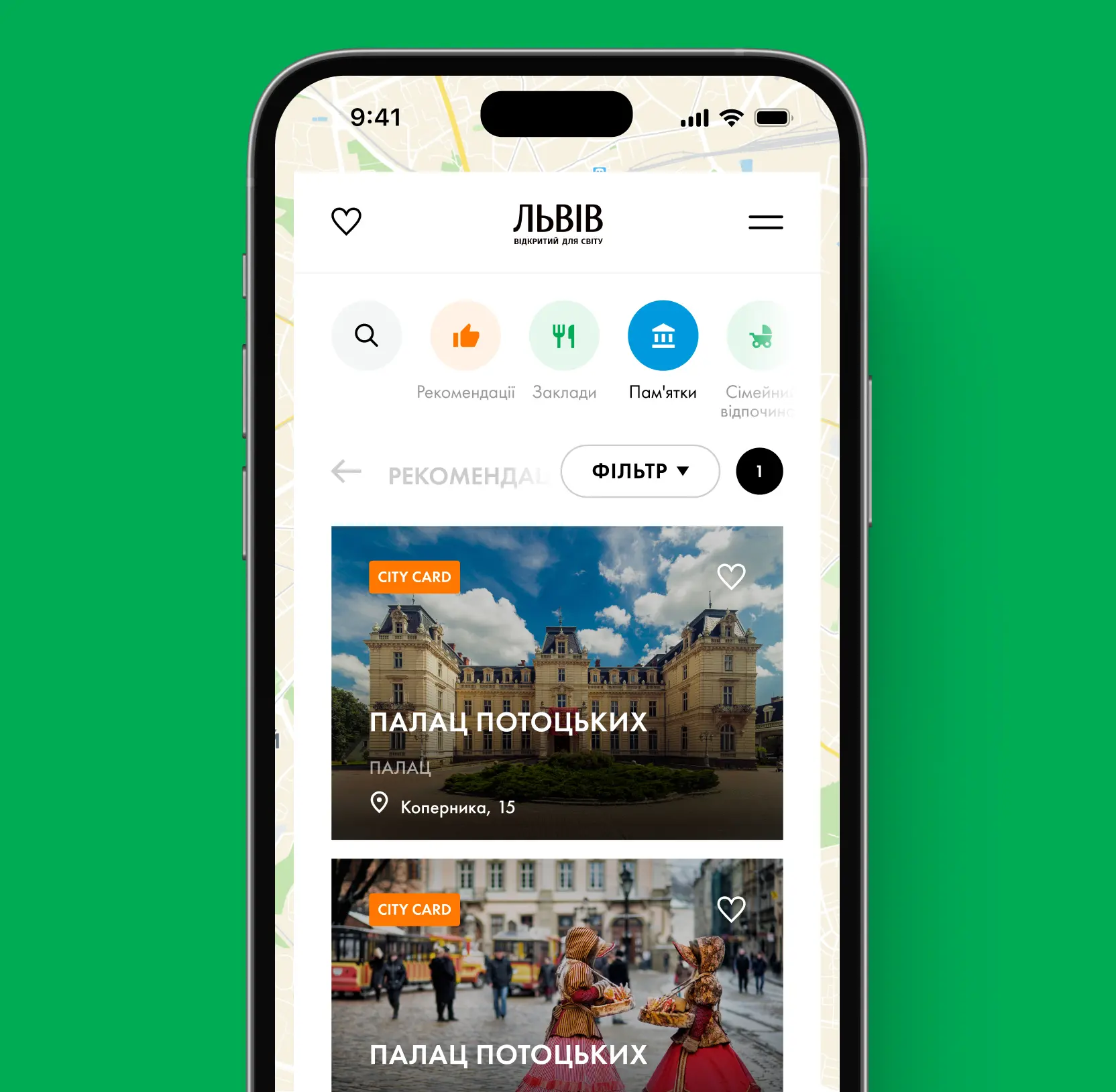
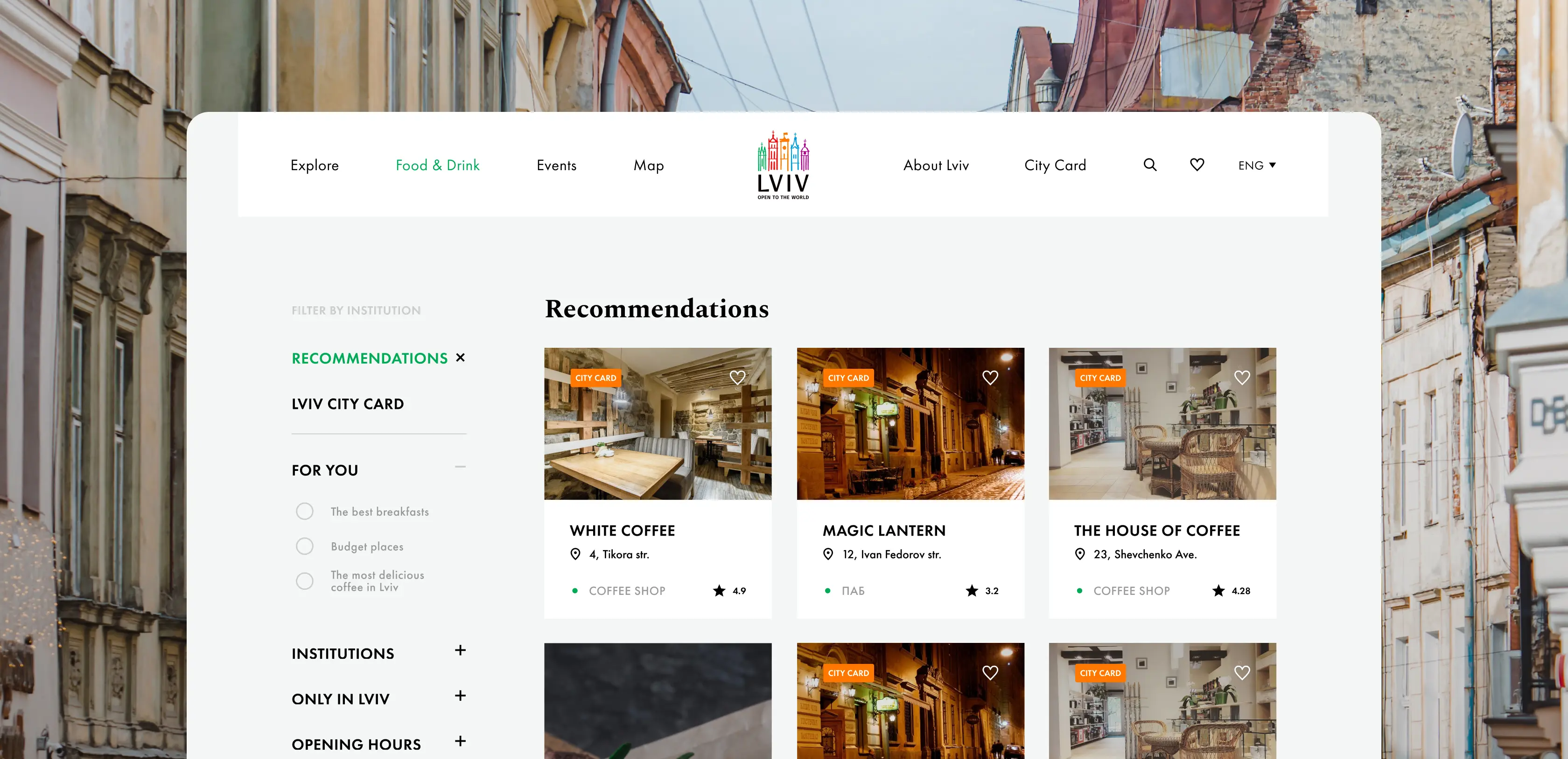
Lazarev.agency rebuilt the map as the platform's commercial hub. Filters map directly to how visitors make decisions: through Recommendations, Places, Landmarks, and Family Leisure tabs. 

The paid City Card program is woven into discovery itself: every eligible venue carries a City Card badge. The save-to-favorites feature keeps users in the ecosystem between sessions, and the mobile-first build captures the second, higher-intent wave of decisions — when a tourist is already in the city deciding what to do next.

No items found.

Designed personal travel tools to convert browsers into committed visitors

Tourists who can't save what they find leave with nothing. Every forgotten attraction is a missed visit, a missed City Card purchase, a missed restaurant booking. Lviv had no way to retain the intent travelers were already showing.

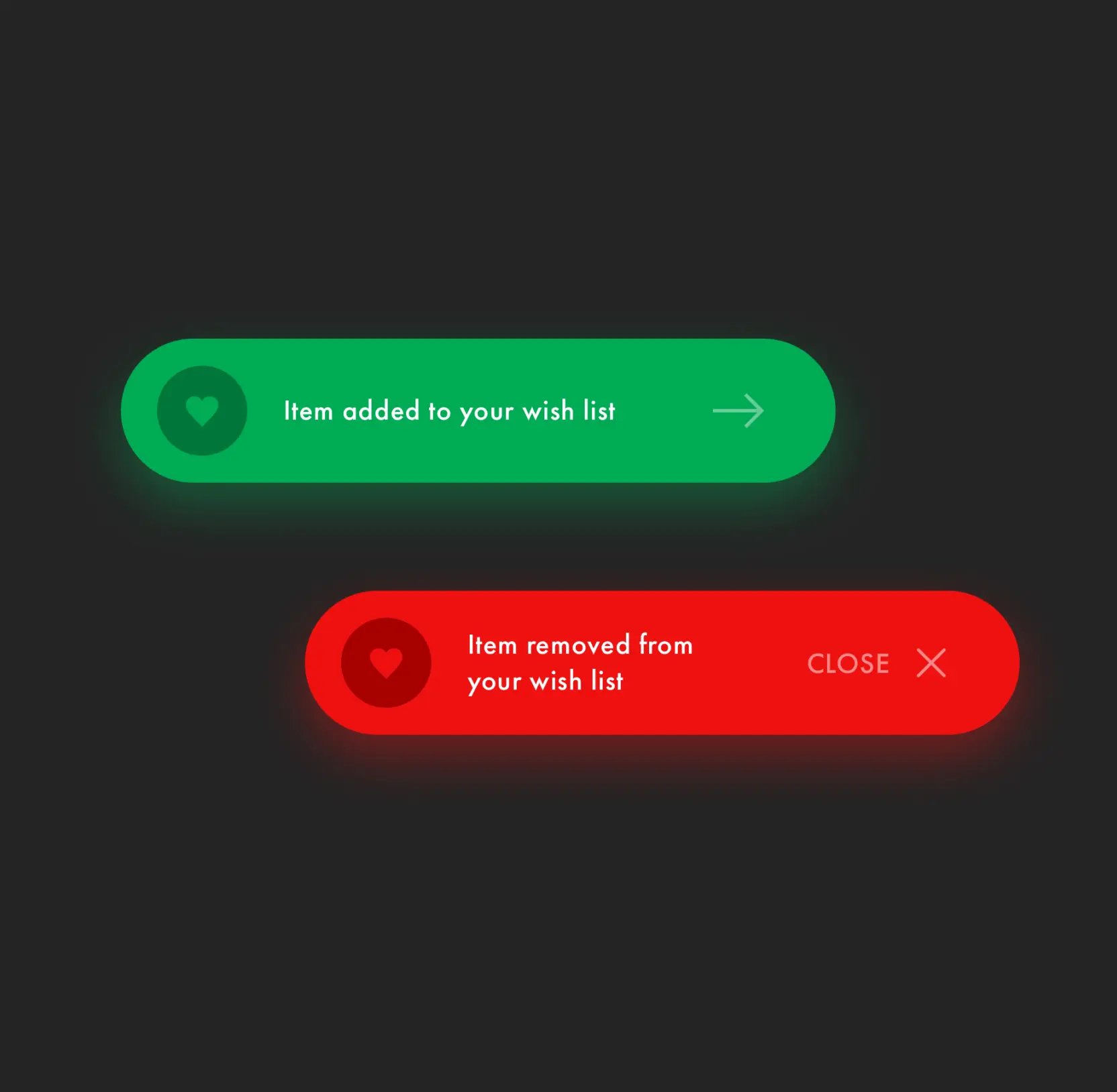
Lazarev.agency built a personal layer into the platform: wish-lists across attractions, events, and venues, plus curated guide-lists that let visitors assemble their own itineraries before they ever land. Saving is acknowledged with clear, on-brand feedback (green for added, red for removed), so the interaction feels rewarding enough to repeat. Because saved items persist across sessions, the platform becomes a return destination. And with much of the saved inventory being City Card–eligible, every item a tourist saves makes the paid pass an easier sell.

No items found.
Explore

explore

More Startups Cases

FAQ

/00-1

How can tourism platform design increase international visitor numbers?

Most destinations lose visitors before they ever pack a bag. The trip looks too complicated, the information is scattered, the planning takes too long and someone picks an easier city instead. A well-designed tourism platform removes that friction. Attractions, events, routes, and navigation in one place means visitors spend less time researching and more time deciding. And when the decision is easy, more of them follow through.

/00-2

Why is a unified digital gateway important for top tourist cities?

Top destinations require a centralized platform to maintain credibility and control their narrative. Without it, travelers rely on fragmented third-party sources that weaken the city’s brand authority.

/00-3

How do interactive maps improve tourist engagement?

Interactive maps simplify route planning and contextual discovery. They allow travelers to visualize proximity between landmarks and organize efficient exploration paths, increasing time spent on the platform.

/00-4

What features encourage active trip planning on tourism websites?

Planning a trip is something else entirely and most platforms never make that shift happen. Wish-lists, saved locations, event bookmarking, structured guides, these allow actual itinerary building. Visitors come back, go deeper, and arrive already knowing where they're headed.

/00-5

Why is mobile optimization critical for tourism platforms?

Tourists consult their phones constantly between stops, at intersections, and over lunch. A platform that works only on a desktop is half a platform. Mobile optimization means maps load fast, saved itineraries are accessible without a strong signal, and nearby attractions surface without friction. The platform becomes a travel companion. Visitors stay oriented, stay engaged, and make better use of their time in the city.

/00-6

How can digital platforms reduce administrative workload for cities?

More than most cities expect. A significant share of tourist inquiries: directions, opening hours, event schedules, and neighborhood recommendations are questions a well-structured platform can answer on its own.

When visitors can find everything themselves, the volume of calls, emails, and front-desk questions drops sharply. In this case, administrative inquiries fell 85% after launch. Staff time shifts away from repeating basic information and toward work that requires a human.

/00-7

When should a city invest in a tourism platform redesign?

Investment becomes critical when visitor information is fragmented, international positioning lacks clarity, or digital infrastructure does not reflect the city’s global standing. Strategic tourism platform design can directly influence tourism growth metrics.

/00-8

/00-9

/00-10

/00-11

/00-12

/00-13

/00-14

Hit me up! Let’s chat about your growth

Kirill Lazarev
Founder of Lazarev.
Let’s talk

Recognizing that financial researchers utilizing Rhea need to process data and generate reports, we aimed to enhance their efficiency. Consequently, both text-based and widget results provided by AI can be seamlessly transformed into a report, with the added capability to edit the data.

UX for AI, Lazarev. digital product design agency

The command results are presented on a graphical interface through widgets. Accompanying CTAs are available to assist users in refining commands for processing the results further.

Widgets design for AI Fintech analysis app by Lazarev. product design agency

The Connect app also focuses on career growth and advancement. Therefore, we provided users with the option to send something akin to their digital business cards through the messaging system. This allows others to explore their skills and experience.

Messaging system for a mobile app designed by Lazarev. best design studio

We let users build their own schedule by picking their favorite sessions, workshops, and speakers. They can even export the schedule to their personal calendar for better organization.

Scheduling, event schedule for conferences, design by Lazarev. UI UX agency

Right there, we provided traders with the ability to compare various assets and observe how their value changed under the influence of news within different time periods. This feature facilitates making more informed decisions on investments.

A widget with the graph showing crypto asset comparison.

On the Matta marketplace, the availability of pricing information for products is contingent upon the intricacies of supply and demand.

To address this aspect of price absence, we gave buyers an ability yo request Price and Features Information (PFI). Upon making this request, the supplier will dispatch the PFI to the user via email and WhatsApp in PDF format.

Checkout design for an online marketplace

Similar to any marketplace, we've integrated a feature for adding products and suppliers to your Favorites. This allows buyers to receive notifications about product availability and save desired items for future purchase if the timing isn't right.

Digital product design for chemical marketplace

To enhance interactivity further, we made the decision to move away from providing users with only text-based instructions on how to address a particular issue.

Instead, we offered visual aids that accompany the text answers, helping users navigate the app and resolve their issues more swiftly.

Gamification design with dark UI elements for the Payoneer financial app.

Customers can ask the assistant any question, thanks to its neural network power, and it can even offer a weather forecast.

We made sure that the customer support section is accessible to everyone. If someone prefers not to or is unable to record their voice, they can use text input to pose a question, and vice versa.

AI-driven chat design by Lazarev. AI design agency

Brands need to connect any of the available wallets to mint NFTs. On the consumer side, though, individuals without a wallet can create a new one on the fly by using their email or social media. Alternatively, they can purchase NFTs using fiat currency and complete the entire transaction without any knowledge of Web3.

A graph showing the price history of an NFT, designed by Lazarev. design agency

We've implemented a personalized Customers section within Console, enabling collectors to manage customers who settle their debts through Collect. This empowers them with easy access to account data, detailed transaction insights, and the flexibility to provide customized payment solutions for individual cases.

Two desktop interfaces showing Customer's module within Tratta app

Central to our objectives was streamlining processes and boosting productivity for Console users. To accomplish this, we introduced highly customizable Settings. This empowers collectors to tailor the platform to their individual workflows and preferences. For instance, collectors can personalize settings to determine which features their customers will view in the Collect platform, including special offerings, discounts, and more.

Two desktop screens showing the Settings module of Tratta app

Each inventory management report is further fortified by the inclusion of the tenant's signature, solidifying the inspection process's validity and accountability.

A pop-up showing how to sign an inspection results once it was completed

To ensure a landlord's capability to substantiate claims against a tenant's deposit for damages, or vice versa, to verify that the damages are attributable to wear and tear, it is imperative that inspections exhibit the robustness required to endure legal scrutiny.In line with our approach, our inspections are comprehensive, incorporating intricate descriptions accompanied by photographic evidence.

A pop up showing how to add photos to an inspection of an apartment

To elevate user engagement and foster a deeper comprehension of the available apartments, we crafted the interactive house model within the "Selection of Apartments" section. This immersive experience empowers potential buyers to take a 360-degree tour, flipping between street and yard views with a simple toggle switch. As they hover their cursor or tap (for mobile users),  the house's specific sections illuminate, offering valuable insights into construction timelines and housing readiness. The interactive journey extends to selecting a floor and pinpointing a specific apartment with the help of a visual builder, simplifying the decision-making process and potentially increasing conversion rates.

An interface screen shpwing the 3D model of a complex and a widget that allows to switch between different complex's sections

For a more accessible experience, we've integrated a calendar widget right alongside the daily task list. A simple click takes users to a detailed breakdown of tasks, anything from completing quizzes to reading materials. This strategy keeps users within the app, providing a sense of encouragement and support rather than overwhelming them with excessive demands.

A mobile version of the Daily Actions page

We introduced an interactive widget at the top of the homepage, allowing users to track upcoming elections and assess their preparedness based on articles read, candidate knowledge, and quiz participation. By providing users with a clear measure of their readiness, the design solution motivates them to engage with educational content and explore candidate profiles while actively participating in quizzes.

Three states of the interactive widget on the homepage

Our solution was to design a switch that lets users transfer money to the fund’s international bank accounts. The website now offers the flexibility to contribute in multiple currencies (USD, UAH, EUR) using various payment methods tailored to the user's location. Donors can also donate through Paypal, support the fund on Patreon, or make donations in cryptocurrency.

Widgets displaying various donation platforms

An interactive payment widget responds with the organization founder, Serhiy Prytula’s phrases, every time a user enters any sum of money in the donation field. Such a solution proved to be efficient, encouraging more people to donate through the widget and increasing the average contributions by almost a quarter.

The mobile version of the donation page

One standout feature of Redbrain is the inclusion of price history and price forecasts directly on the product page. In line with Redbrain's dedication to delivering the best deals to consumers, we introduced a block that presents price trends from various retailers for easy comparison. Further below, we provide results generated by forecasting algorithms, helping consumers determine the optimal time to make their purchase.

The Price history section of the Redbrain website

Below the product imagery, consumers find essential product details like a comprehensive overview, rankings, and technical specifications. Given the pivotal role of product content in influencing consumer choices, we've enhanced the content display with interactivity and incorporated ample white space to ensure easy readability.

The scroll of the Redbrain page

This versatility in data presentation underscores our commitment to delivering a user-centric and highly functional interface, empowering users with diverse tools to effectively engage with critical information.

A map featuring an organized table filled with data

Following the analysis process, the resulting data  manifests on the interface. In the context of the Threat Area module, we have thoughtfully provided three distinct alternatives for data display: a map, table and integrated map and table together. A dynamic map presentation highlights the pertinent area, ensuring immediate focus.

Three screens featuring thread-level analysis

We paid special attention to the numbers, as this is what we can be proud of in spite of any difficulties. A minimum of text - a maximum of really important information.

The site offers a responsive view across mobile, tablet, and desktop. We provided the optimal searching experience while maintaining the site content regardless of the device.

The Awards section of the UkrainianPower website

We wanted to showcase the skateboards' benefits unobtrusively, step by step. To this end, we opted for interactive components that entertain people and educate them about the high-end technical specs and benefits like full customization.

 A page featuring a brief guide on using a compact control panel

The content flow seamlessly directed people towards the choice of deferred payment and customer reviews on the skateboards, instilling a sense of trust along the way.

A product webpage showcasing a motor controller replacement kit

We created a catching design style with contrasting colors, dynamic composition, and smart typography that bring visitors' attention to key elements.

An attention-grabbing widget spotlighting the advantages of 11Sight

The web calculator counts the cash back, given the number of invited users. It adds interactivity to the experience and evokes trust, showing commission transparency.

We've made tutor-student communication smooth. The “Questions” feature lets students pick teachers for paid inquiries. Additionally, students can step into the role of a tutor and provide answers to their peers' questions. Simplifying the tutoring process further, we've introduced the “Working Hours” section. This feature allows users to specify their platform availability, facilitating the system in finding suitable, available tutors.

Mobile screen displaying rate the teacher feature

For easy module and lesson navigation, we've created a side menu that opens and closes as needed. It also features a progress list with checkpoints, clearly indicating completed units and those remaining. In the “Learn” section, students can access both free and paid materials. They can study multiple materials on one topic, take quizzes, and move through to the next modules.

Interface showcasing the modules & lessons navigation

As we explored users' perspectives further, we discovered that some don't usually leave comments online due to not remembering all the details or being short on time. These insights led us to develop tags, making it easy for people to share their experiences at places they've been. This fresh idea replaced the old star rating system with tags, offering a simpler and friendlier way to express opinions.

The mobile screen showcasing the Tags functionality

Acknowledging the interconnected nature of workflows, we've introduced a powerful dependencies feature to further enhance the automation of the user experience. These dependencies establish a connection between two workflows, offering users the flexibility to select which workflow to link with. The types of dependencies include simultaneous start, immediate repeat and time delay.

Two compact pop-up windows to manage dependencies

Addressing the central challenge of managing recurrence, we aimed to create a seamless experience for setting repeated workflows. Our solution involves a full-page popup directly on the workflow page. It allows users to manage recurrences comprehensively, setting recurrence frequency, due dates, project durations, and more.

A full-screen pop-up interface for configuring recurring events

Our thoughtfully crafted input fields, controls, and CTA buttons distinguish themselves within the interface, all thanks to their skillful use of design accents and proportions. This approach not only enhances the interface's visual appeal but also boosts user efficiency.

An image showcases various screens, buttons, widgets, and design elements

In our quest to simplify the user experience and eliminate needless steps, we made the deliberate choice to incorporate a right-hand sidebar that opens when you click on a project task. This UX patterns conceal all non-essential information, preventing user overload, while prominently presenting the crucial details necessary for efficient project management.

The sidebar that appears when users click on a project task

The crisp UI design, featuring well-balanced proportions and a logical information structure, enhances readability and helps digest complex financial data.

Numerous screenshots of the Boel IT web product

Recognizing that Vessel Finance could potentially be utilized by less seasoned investors, we incorporated tooltips to explain the column headers. This  addition aims to enhance user understanding when calculating the benefits from vessels.

Desktop webpage displaying a table with year-on-year parameters

The product delivery schedule is presented on an interactive roadmap that advances on its own as visitors scroll through the section.

We present several ordering options to give existing and new customers the freedom of choice and help them make informed buying decisions through in-depth offerings explanations.

Speaking to a broad range of audience segments meant creating technical specs that give entry-level consumers just enough information and knowledgeable engineers - the ability to dive deep.

Through straight composition and powerful copy, we familiarize people with the uniqueness of the Inertia Wheels MAX and inspire them to experience the product in work.

We reimagined the resource center to become a hub of stories, use cases, educational articles, and videos to showcase the breadth of what's possible with the Inertia Wheels MAX.

Through rich interactions, 3D renders, and digestible copy, we show off the unique physical features of the Inertia Wheels MAX, drive demand, and encourage our audience to explore the product further.

Brands need to connect any of the available wallets to mint NFTs. On the consumer side, though, individuals without a wallet can create a new one on the fly by using their email or social media. Alternatively, they can purchase NFTs using fiat currency and complete the entire transaction without any knowledge of Web3.

The list of smart contracts on a green background

Brands need to connect any of the available wallets to mint NFTs. On the consumer side, though, individuals without a wallet can create a new one on the fly by using their email or social media. Alternatively, they can purchase NFTs using fiat currency and complete the entire transaction without any knowledge of Web3.

An assortment of crypto wallet options
No items found.