How Riptide hit $500K in sales shortly after website launch
About the project
The electric skateboard brand set out to boost sales
Riptide built a reputable brand name with powerful, affordable electric skateboards that embodied freedom, boldness, and serenity. Ahead of a New Year’s sale, the founders asked Lazarev.agency to craft a tailored digital experience to boost interest and reflect the brand’s spirit.
Here’s how our design partnership unfolded.
$500K
The Riptide team hit $500K in sales in 2 months after launching the new site.
Top 10
Riptide ranked in the top 10 brands for skateboard sales in the U.S.
Acquisition
After the successful sell-out of the skateboards, the Riptide founders sold the company.
Experience design conveying a sense of freedom
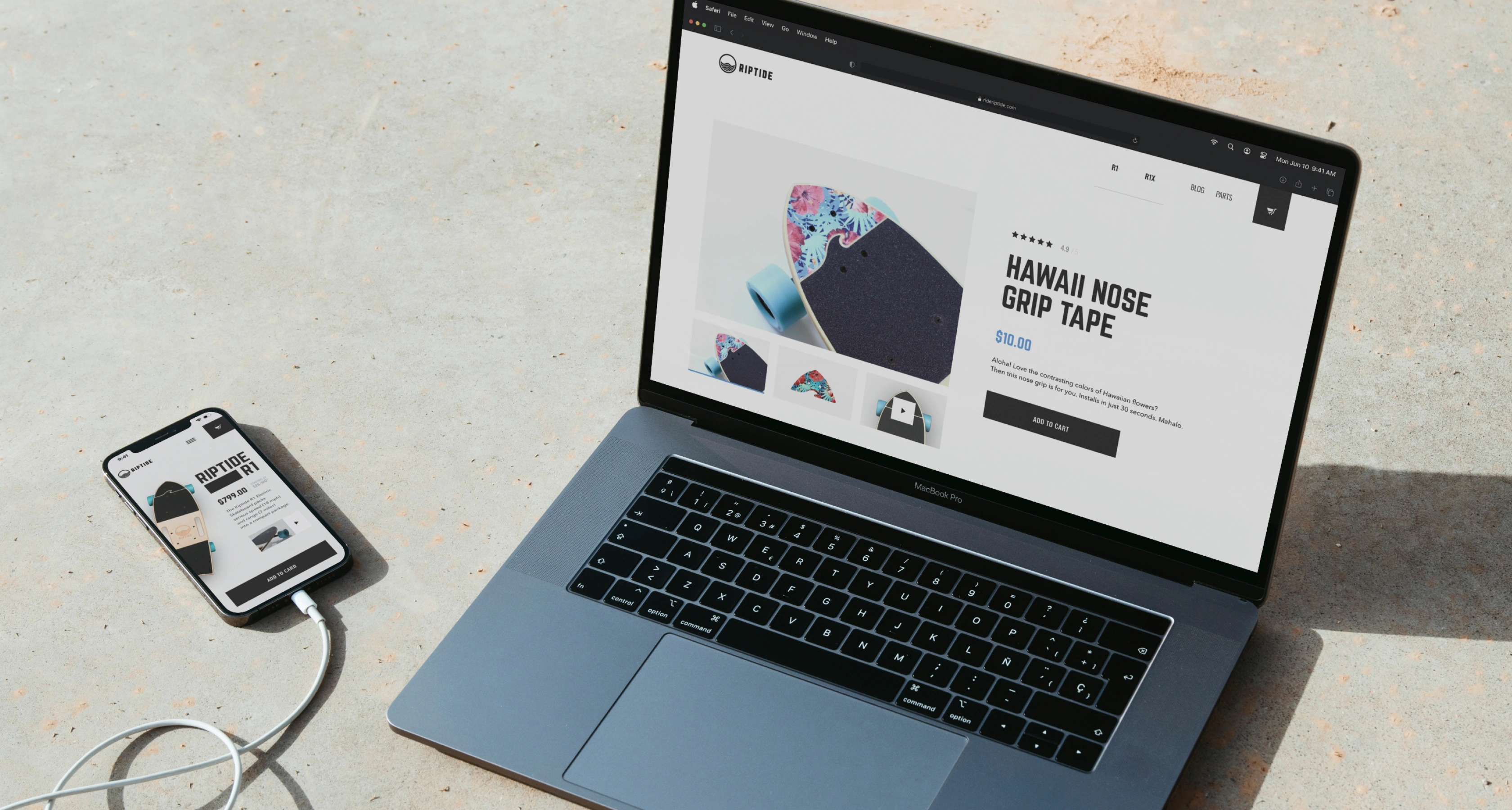
For a category where most competitors lead with watts and price tags, we positioned Riptide on the feeling buyers pay a premium for: the pull of the open road. The brand's core values, i.e., freedom, speed, and serenity, were translated into commerce-driving design decisions.
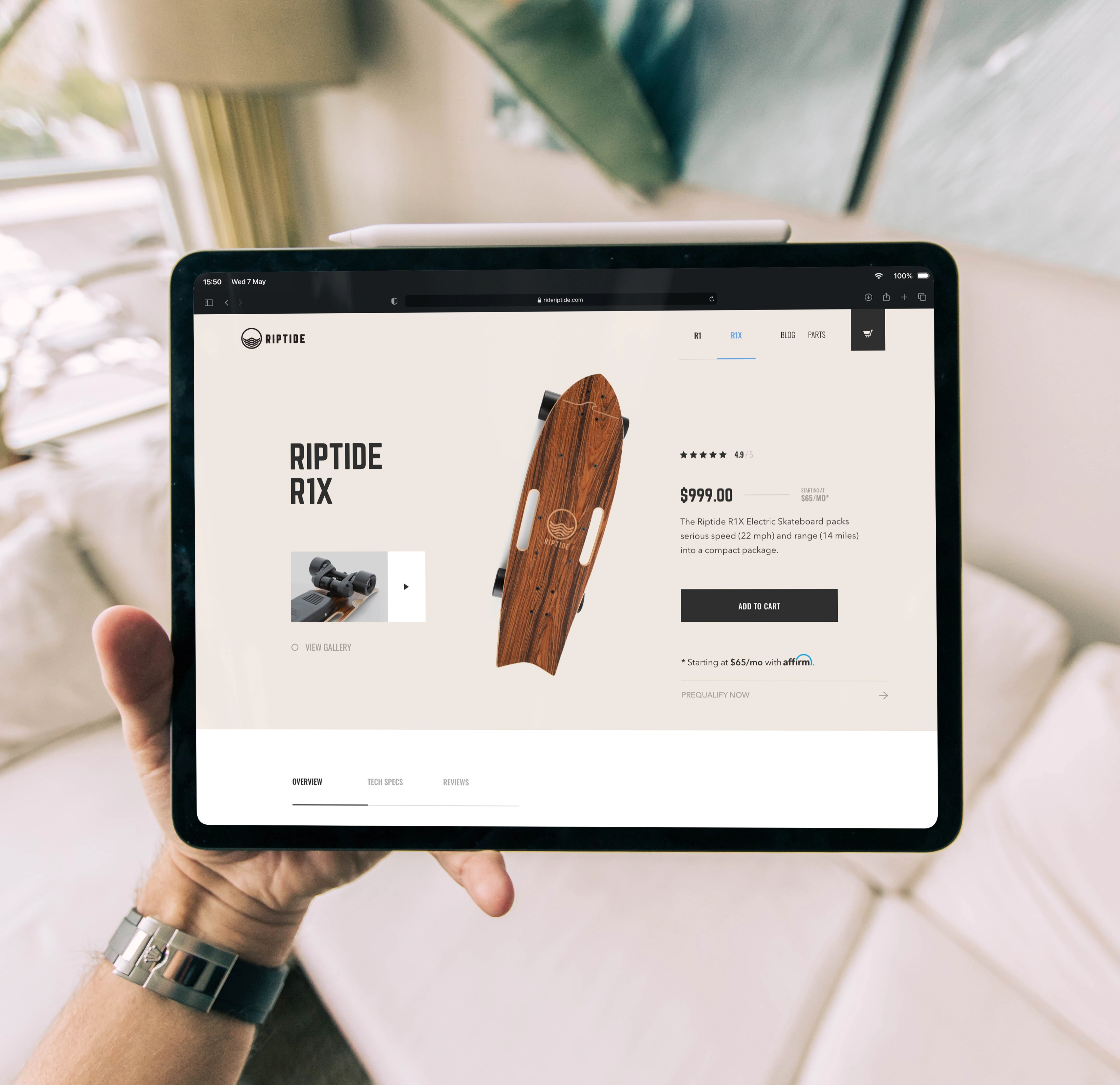
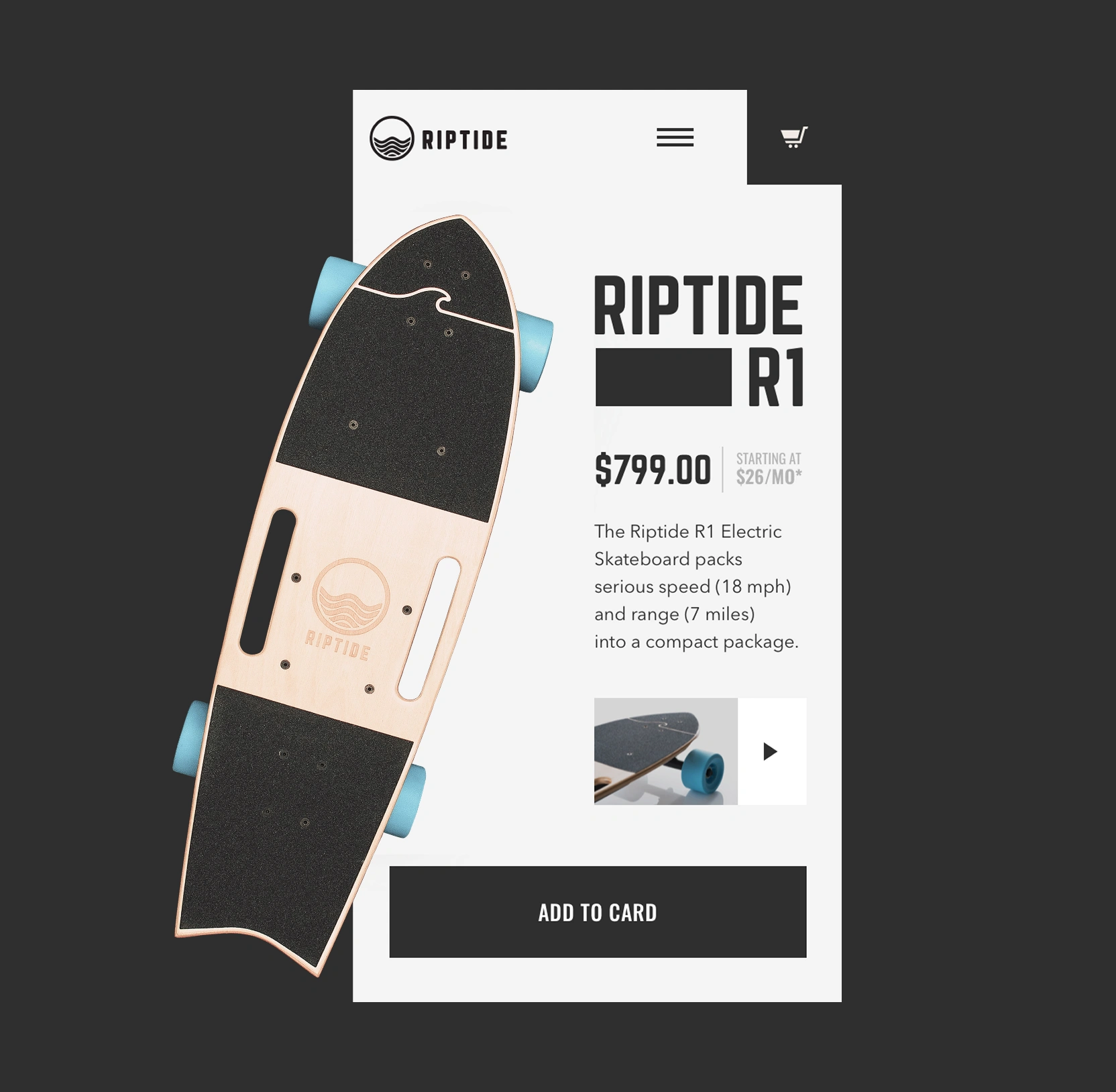
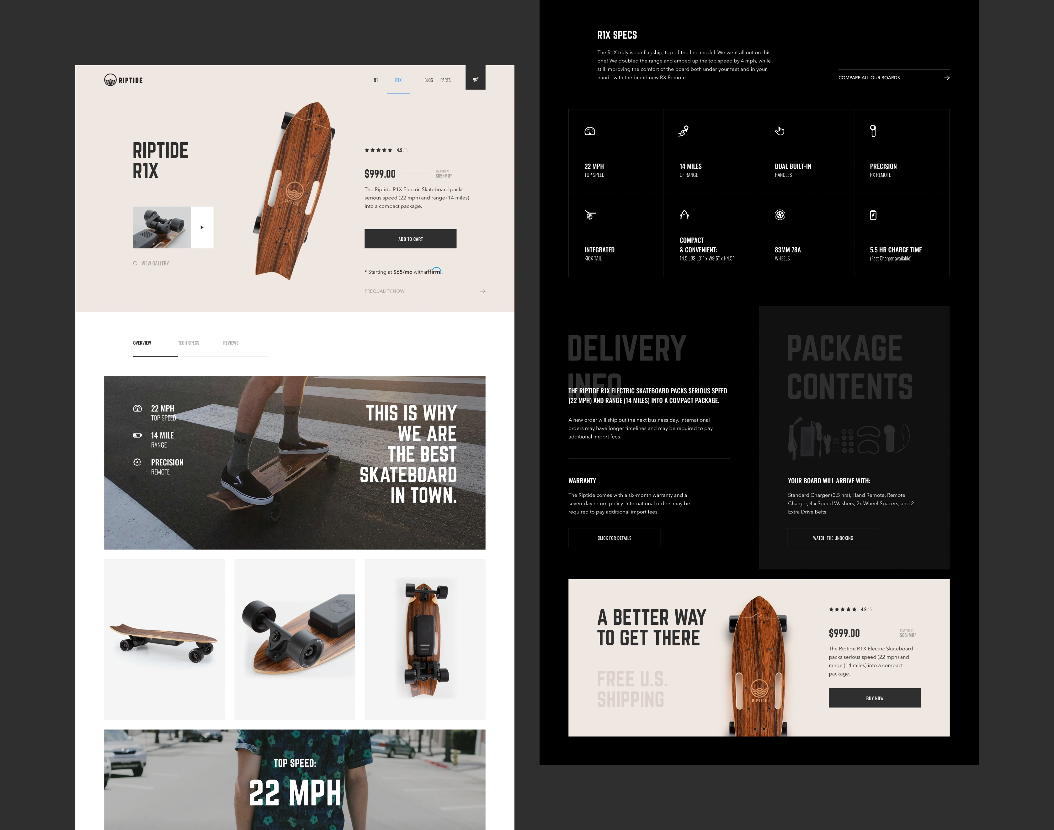
An unconventional grid lets the board break out of its frame so the product itself does the persuading, holding attention on the deck instead of the price. Generous negative space signals a premium tier and keeps the eye on what converts.
A story-based content flow to build rapport with the brand
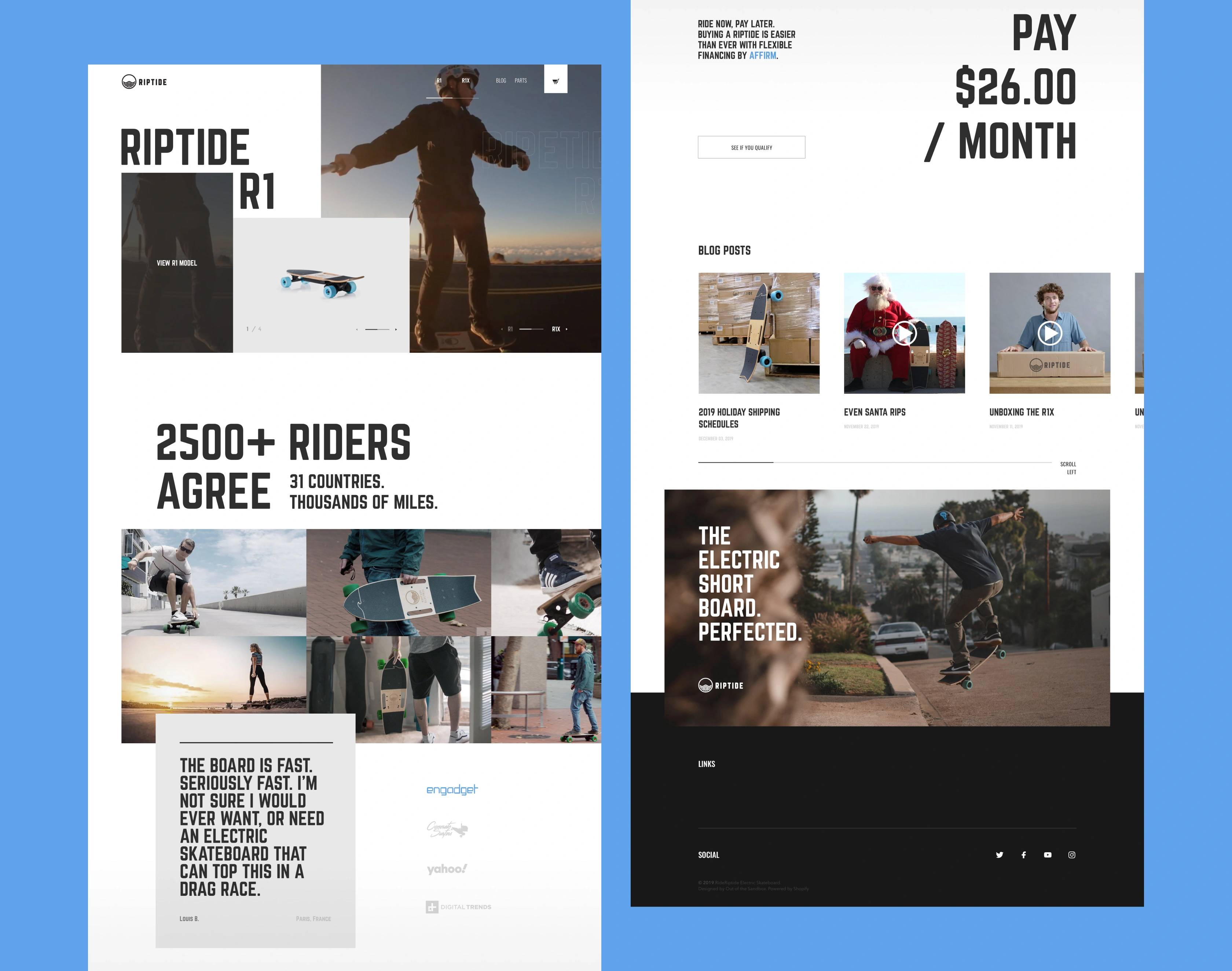
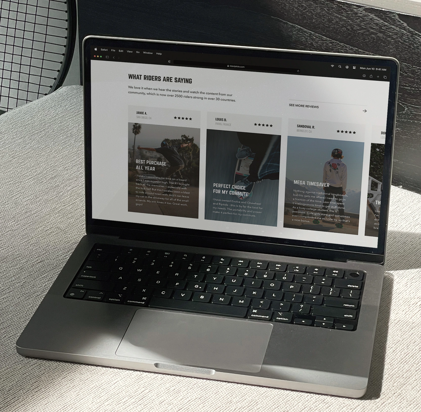
We staged the Riptide page as a story where the prospect goes through proof before price: headline scales the community, and the press row transfers authority from third-party media.
Only then does the financing block arrive, with an option for monthly payments reframing a full-price sticker as a coffee-budget commitment.
Strategic information architecture to simplify browsing and shorten time-to-value
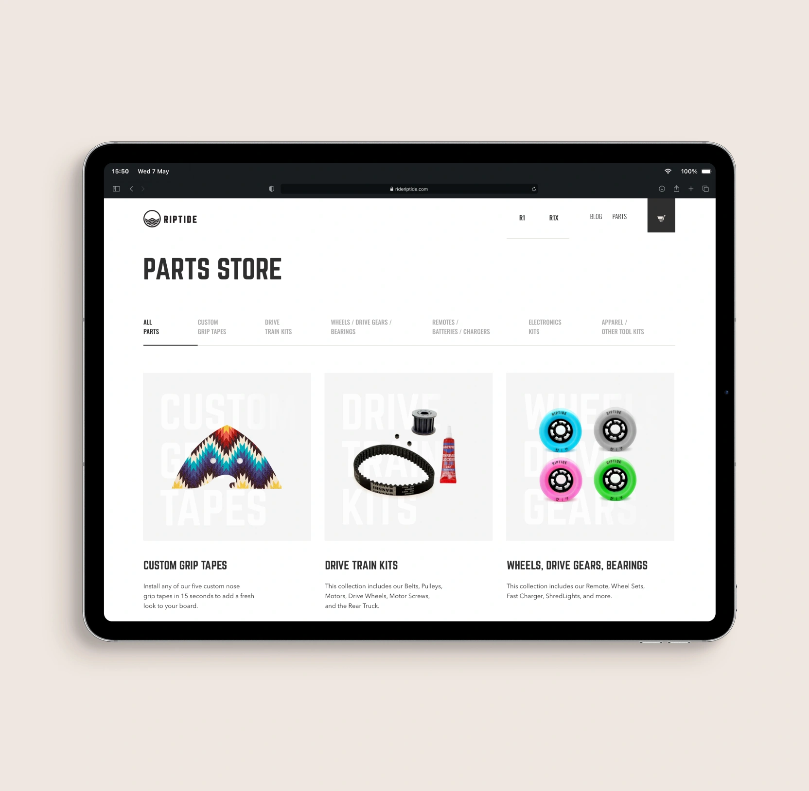
We pulled the three buyer moments out of submenus and gave each one a top-level entry: choosing a model, comparing models, and returning for parts.
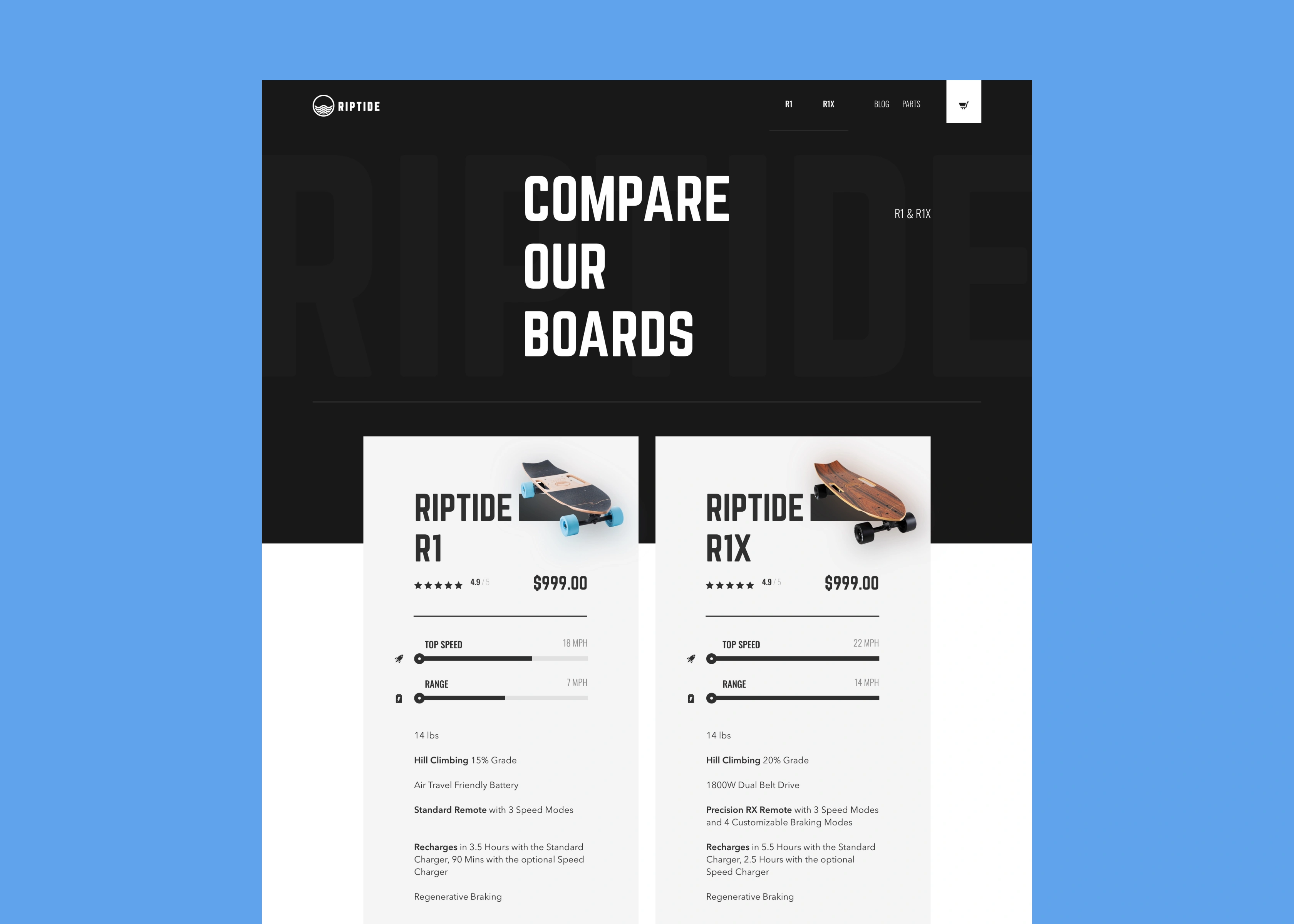
A customer can switch between R1 and R1X models with one click from anywhere on the site. The comparison view handles the harder question of which model fits, using side-by-side specs and slider visualizations that make differentiation scannable in seconds. The parts store gets equal billing, treating existing owners as a revenue stream of its own.
The payoff lands on both sides of the purchase: a shorter consideration cycle for prospects, and a recurring revenue channel from owners who would otherwise drift to third-party parts retailers.
Detailed product pages to improve buyer confidence
We built each product page to answer every question a buyer would otherwise stall on before they reach for a comparison tab. Specs land as an icon grid, so differentiation is visible at a glance.
Package contents and warranty terms sit on the same page. A closing CTA band catches the scroll-through visitor with rating, price, and free U.S. shipping restated as a final nudge.
On a four-figure purchase, depth pays back with a sharper conversion from buyers who see the full picture before they buy, and a lower return rate from buyers who don't discover surprises after delivery.
Frequently asked questions
Common questions
about this topic
What are the best ways to increase conversion in an e-commerce website design?
Focus on showing product value immediately and removing friction across the buying flow. In this case, we prioritized product-first layouts, clear content structure, and simplified checkout. Users understood the offer faster and moved to purchase without unnecessary steps, which helped convert existing traffic into revenue during peak demand periods.
How can e-commerce UX improve product engagement and sales?
People stay engaged when exploring products is simple and natural. We added motion, kept page layouts consistent, and made switching between models effortless. That way, visitors can compare options and understand how each one performs without thinking too much about it. They spend more time on the site and feel more confident buying, without needing to look elsewhere.
What design changes help reduce cart abandonment in e-commerce?
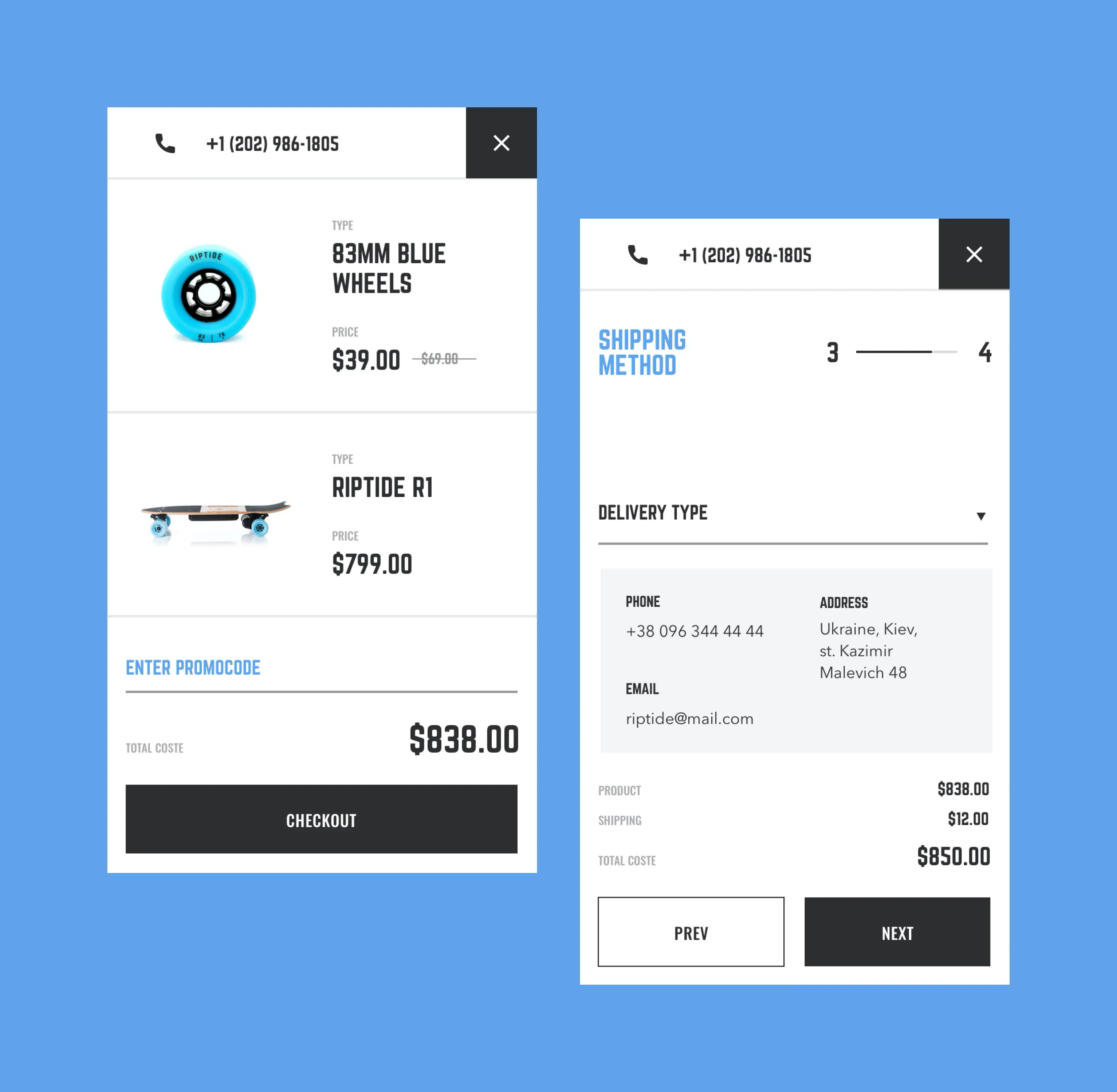
People are more likely to complete a purchase when the checkout process feels straightforward. Our team broke it into easy steps, cut down the number of fields on each screen, and added trust signals right before payment. On mobile especially, this makes the process feel quick and manageable, keeping shoppers from abandoning their carts.
How do you present complex products effectively in an online store?
People understand complex products better when they see them in action before reading the details. We showed real-life scenarios and motion videos to highlight how the product performs, then added the technical specs. This lets users get the “feel” first, making it easier to make confident buying decisions without getting lost in information.
How can brands improve mobile conversion in e-commerce?
Shopping on mobile works best when everything feels easy and fast. The team kept navigation simple, made buttons and actions easy to find, and made checkout smooth. So, people can browse products and complete their purchase in one go, without any frustration.
What is the role of product comparison in e-commerce conversion?
Product comparisons become easier when differences are shown clearly on the page. Comparison tools built into the navigation let users see how each model stacks up at a glance. No jumping between tabs or searching elsewhere is needed, so decisions happen faster, and purchases feel more confident.
What makes an e-commerce website design effective during high-demand sales periods?
Peak sales periods demand quick decisions and clear information. Immediate product clarity, easy navigation, and a smooth checkout make it simple for visitors to act. With these elements in place, traffic converts efficiently, helping the brand sell out inventory fast without leaning on big discounts or long promotions.
More cases like this
Related cases you
might find useful
Voice AI video editor app design: how we shipped Elva's brand, onboarding, and agentic editing flow
Lazarev.agency designed Elva, a voice-first AI video editor — brand, UX, UI, onboarding, monetization — as one launch. Webby Winner, Best Visual UI in AI.
How our redesign made Abu Dhabi University's depth clear for applicants and students
Abu Dhabi University had depth, but its digital experience hid it. Lazarev.agency redesigned the platform around the needs of applicants, students, and faculty, transforming a fragmented ecosystem into a unified digital campus where information, services, and opportunities are easier to find and act on.
How we helped a premier fine wine retailer boost add-to-basket rate by 65% with a mobile-first redesign
Explore how Hedonism Wines boosted add-to-basket rates 65% with mobile-first redesign & improved UX.
Let's talk about your AI adoption challenge
Tell us where adoption stalls. You’ll hear back from a senior product and UX lead with a practical action plan.