How we helped Dynascale transform from invisible provider to trusted partner
Project:

the project
Dynascale helps ambitious businesses take control of their infrastructure with secure and flexible private cloud solutions. More than just IT services, they offer the confidence of enterprise-grade reliability combined with the personal touch of a true partner.
They came to us at a turning point. The company already delivered enterprise-grade private cloud solutions but wasn’t perceived as the partner it truly was. The brand felt fragmented, invisible, and too small for the scale of its ambitions.
Our task was to help Dynascale find its true voice and presence to build a brand that reflects its expertise, conveys trust, and resonates with the businesses it serves. The result is an identity that balances clarity with humanity and positions Dynascale as a confident, reliable partner ready for growth.
The Project’s
Discovery Phase
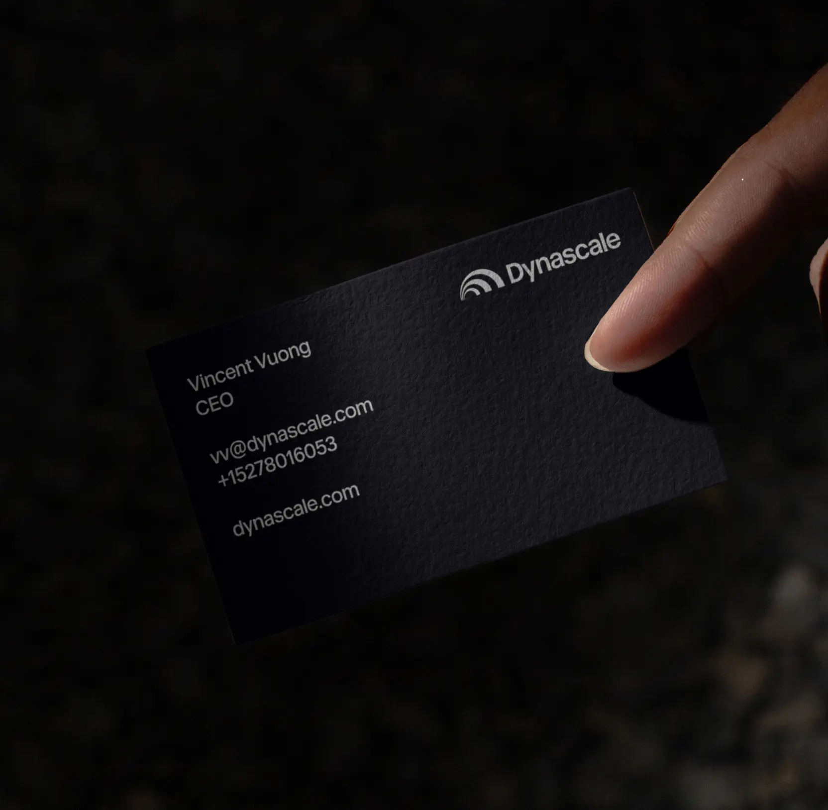
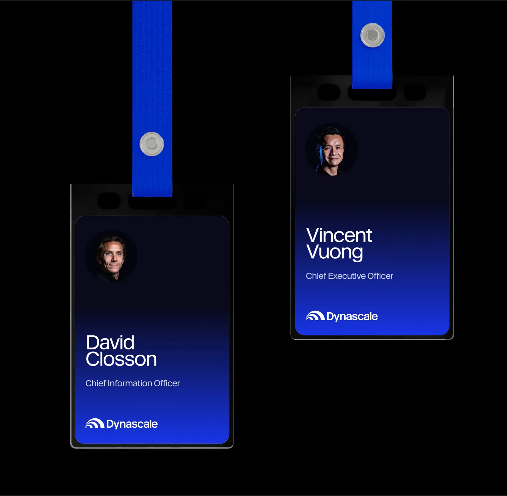
Redesigned logo to embody growth and motion
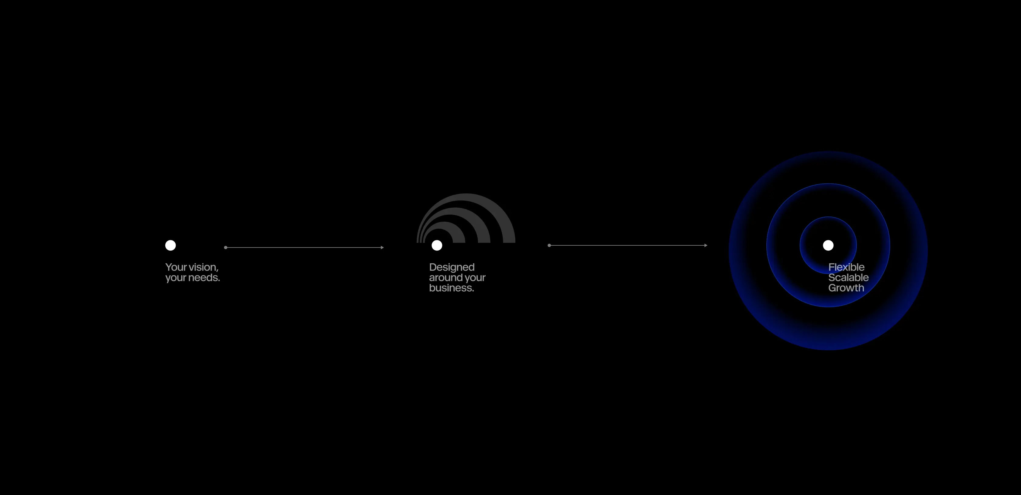
The Dynascale logo is built around a simple yet powerful metaphor. Several arcs form the “D” monogram, a mark that simultaneously recalls an orbit, signal waves, and a trajectory of growth. It captures the essence of the brand: forward motion, scalability, and development that always begins with the client’s needs.
This shape works as a visual story. At the center, the business with its unique challenges. Around it, expanding layers of Dynascale’s support and technology, turning the starting point into a sustainable growth path.
Concentric circles extend the theme of motion and scalability, conveying a sense of flexibility and depth across different applications. Yet the logo remains the heart of the identity, a symbol of transparency, reliability, and confidence.

Relaunched positioning and defined a client-centric brand voice
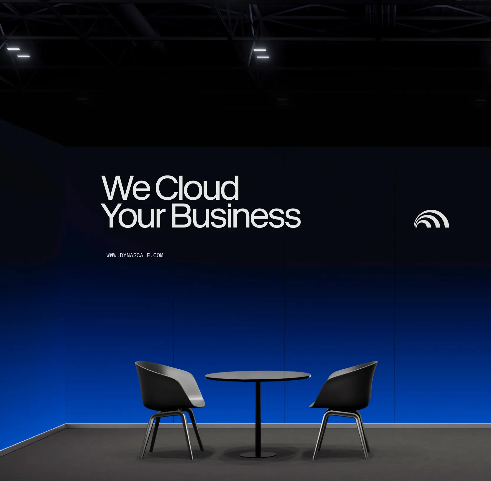
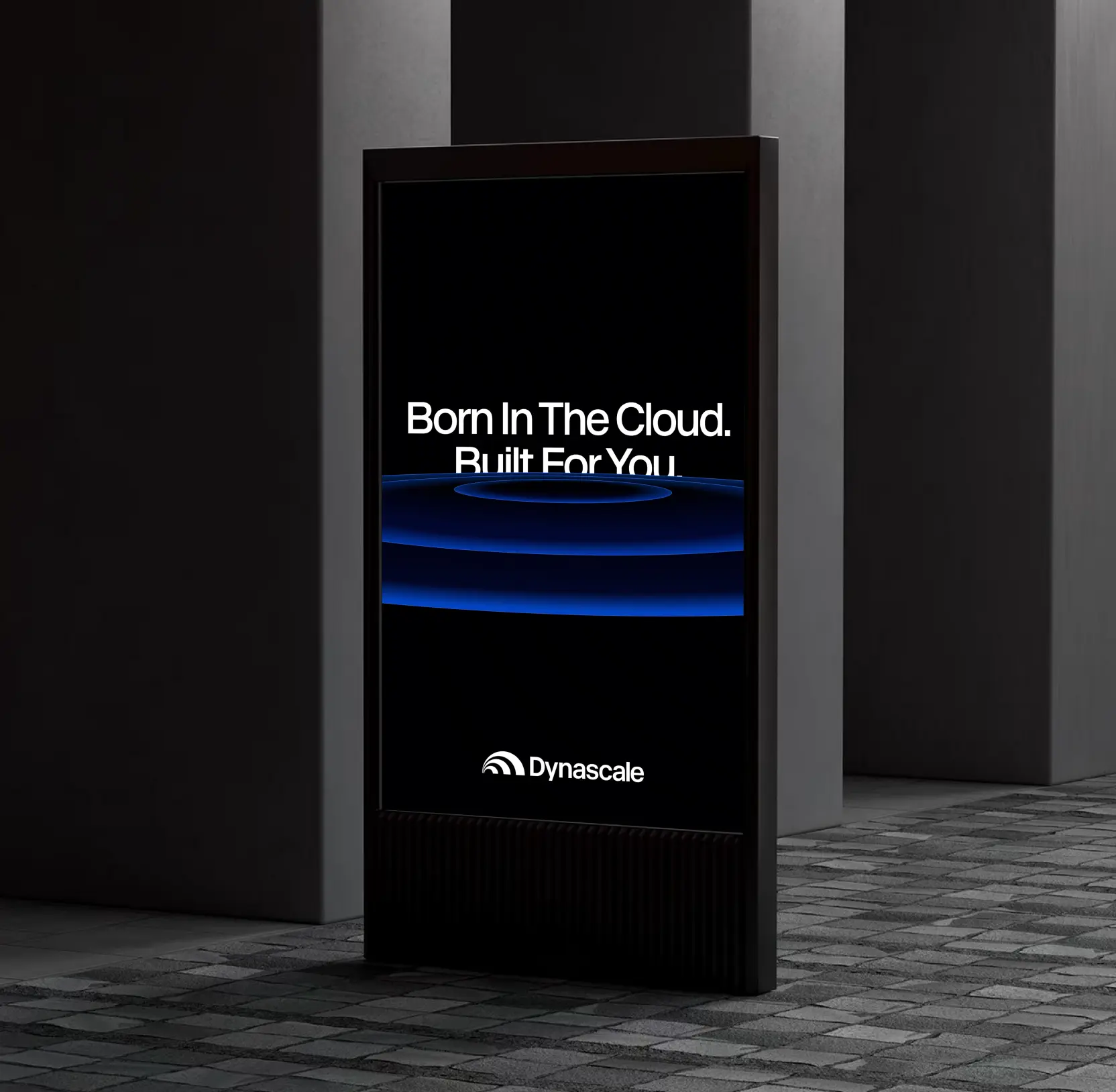
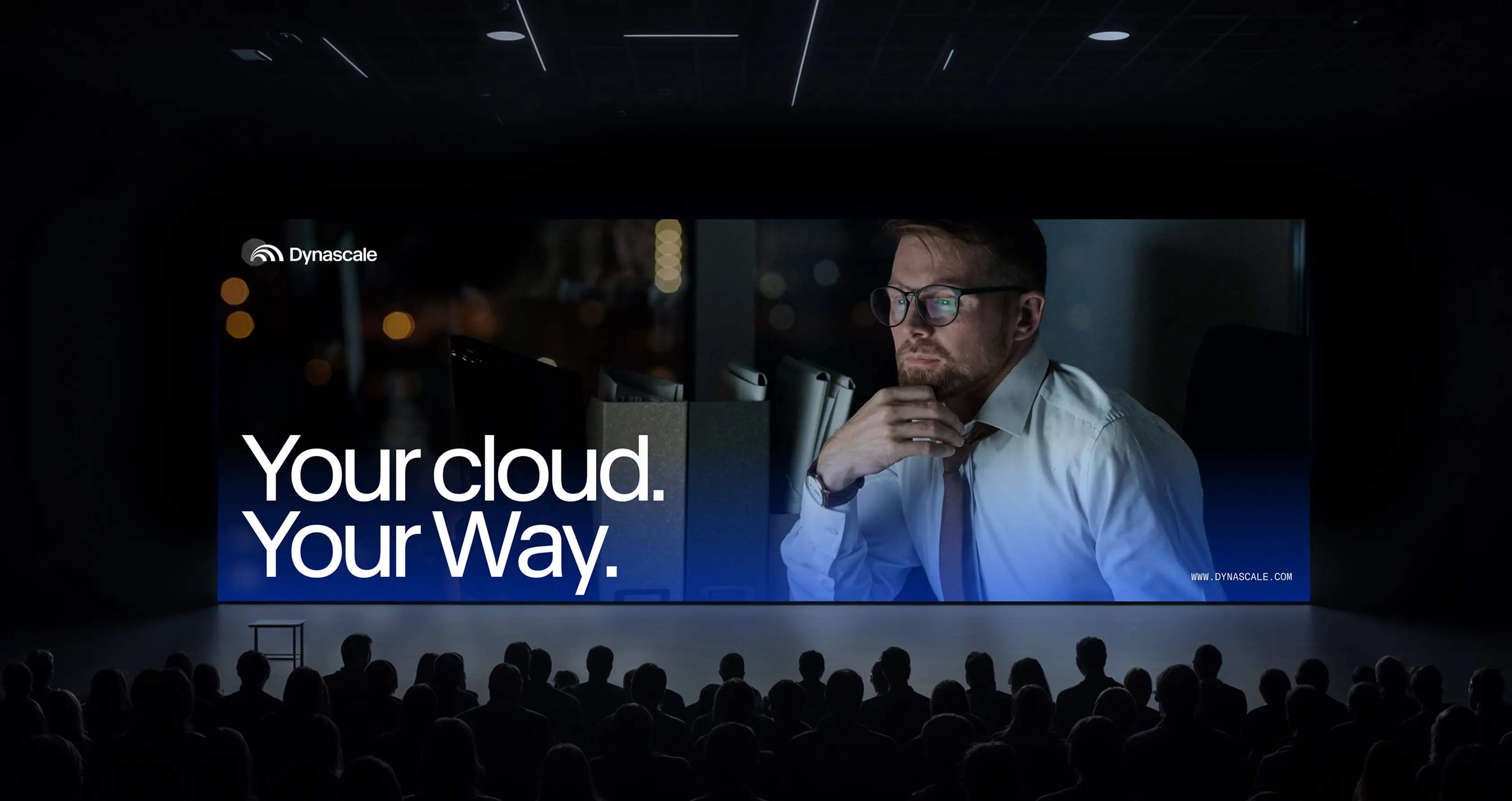
We relaunched Dynascale’s positioning to close the gap between the company’s mature capabilities and how the market perceived them. The new brand speaks about predictability, transparency, and partnership.
The tone of voice is built on three principles: simplicity of language, confidence in expertise, and a human-first approach. Dynascale now communicates like a partner who makes complex things understandable while always putting the client’s business at the center of the dialogue.
Key messages reinforce this positioning: they are about the trust and peace of mind that companies gain when entrusting their critical environments to Dynascale.
This shift made the brand more relatable to its audience and set it apart from hyperscalers, for whom clients are just another billing line.
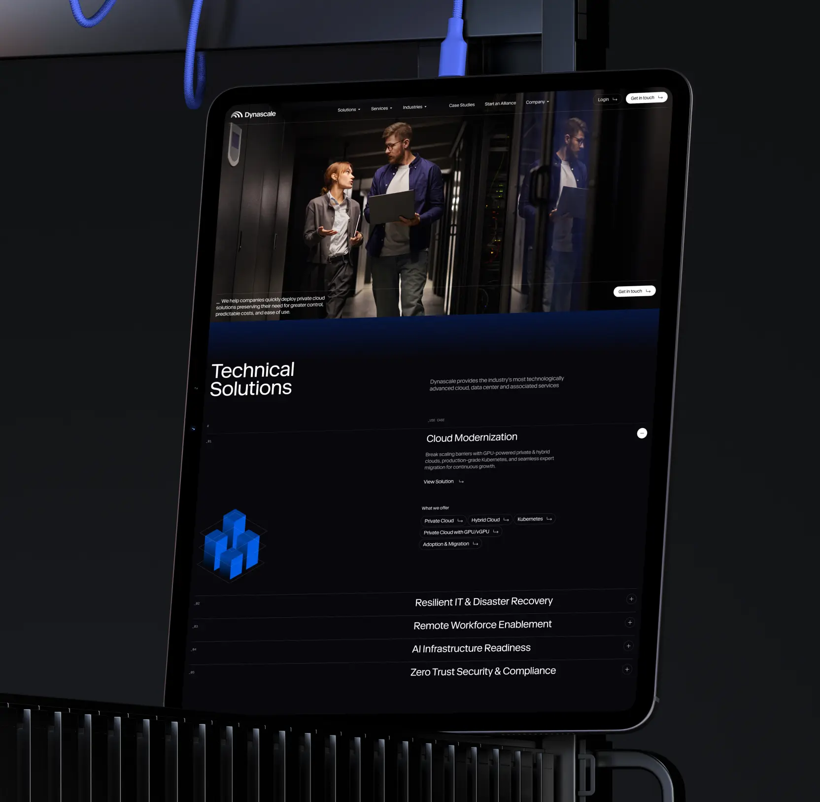
Designed icons and illustrations to reflect technological depth
For Dynascale’s visual language, we created a custom set of icons and illustrations. The icons are inspired by digital displays, where images are formed from a grid of glowing dots. This approach brings a strong technological character and instantly connects to the world of data and infrastructure.
The illustrations build on this aesthetic: simple cubes and spheres are given depth through brand gradients. Smooth color transitions turn flat shapes into dimensional, dynamic structures, visual metaphors for the scalability and flexibility of Dynascale’s cloud solutions.

Structured identity rules to support confident brand expansion
The final deliverable was Dynascale’s brand guidelines, a practical tool for brand development. It consolidates the essential identity elements: from semantics and positioning to the logo, patterns, typefaces, and visual principles.
The brand book acts as a foundation for consistency and recognition across every channel. It ensures clarity and cohesion in communication while leaving room for creative adaptation. With it, the Dynascale team gained a reliable framework to grow, evolve, and scale the brand with confidence.


AI & ML
Lazarev. agency offers comprehensive digital design services. Discover our range of related expertise supported by impactful case studies.
More Enterprises Cases

FAQ
How can companies visually communicate growth and innovation through their logo?
A well-designed logo can act as a visual metaphor for growth, motion, and scalability. For example, in the Dynascale case, we crafted a “D” monogram using intersecting arcs that evoke orbiting trajectories and signal waves. This design communicates the brand’s forward motion while centering the client’s business needs, turning a simple logo into a story of sustainable growth and technological capability.
What strategies can improve a brand’s market perception and positioning?
Repositioning a brand involves aligning market perception with actual capabilities while emphasizing trust and partnership. In Dynascale’s case, we relaunched their positioning to highlight predictability, transparency, and human-first support, replacing the “black-box” perception. This helped the brand communicate like a confident partner, making complex solutions understandable and relatable to clients.
How can a company develop a clear, human-first brand voice?
A strong brand voice balances expertise with accessibility. Dynascale’s voice was built on three principles: simple language, confident expertise, and client-centric communication. By framing messaging around partnership and predictability, the brand connects with audiences on a human level, making technical cloud solutions approachable and trustworthy.
How can icons and illustrations enhance a tech brand’s identity?
Custom visual assets reinforce a brand’s technological character and core values. For Dynascale, we created icons inspired by digital displays and illustrations using dimensional cubes and spheres with brand gradients. These assets visually represented scalability, flexibility, and depth, helping clients instantly recognize the brand’s focus on modern, reliable cloud solutions.
Why are brand guidelines important for consistent growth and recognition?
Brand guidelines are not just rules, they are a strategic tool to ensure consistency, clarity, and scalability. Dynascale’s brand book consolidated positioning, logo usage, patterns, typography, and visual principles, providing a framework that allows teams to grow the brand confidently while maintaining cohesion across all touchpoints.
How can design convey client-centric solutions in B2B tech?
Design can tell a story where the client is at the center of every solution. Dynascale’s visual identity, from logo arcs to patterns, illustrates layers of support surrounding the client’s business. This approach positions the brand as a partner that builds solutions around the client, reinforcing trust and demonstrating value beyond infrastructure.
What are effective ways to differentiate a tech brand from larger competitors?
Differentiation comes from clarity, human-first communication, and meaningful design. Dynascale set itself apart from hyperscalers by focusing on predictability, transparency, and partnership. Their visual identity and messaging emphasized client-centric growth, while their brand voice and assets communicated reliability, flexibility, and technological sophistication in a way that large, impersonal providers cannot replicate.


Hit me up! Let’s chat about your growth


