How we helped Accern build a unified brand and attract strategic investments
Project:


the project
Accern, a leading NLP company, transforms vast structured data into actionable business solutions. With new product launches on the horizon, Accern faced the strategic need to build a unified brand ecosystem that would position it as the primary, market-defining brand.
Another key objective was to accelerate growth and attract strategic investment. To meet this challenge, CEO and founder Kumesh Aroomoogan partnered with Lazarev.agency.
Our strategy focused on creating a scalable, modern, and audacious brand identity that underscores Accern’s potential as a high-value investment. At the core of the brand is intelligent data processing, reflected in design principles of Minimalism, Boldness, Modernity, and Confidence, seamlessly integrated into the refreshed brand identity.
The Project’s
Discovery Phase
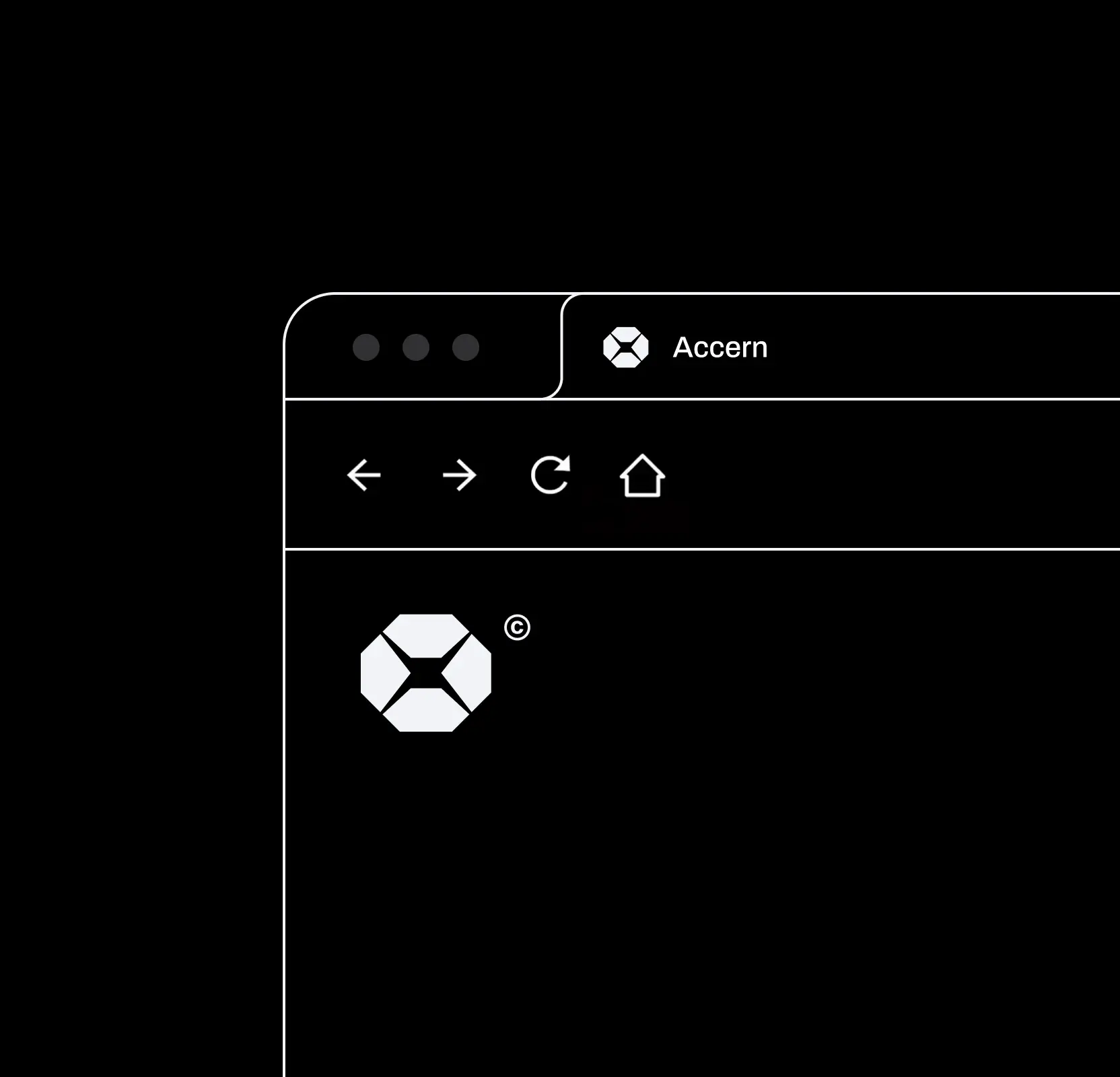
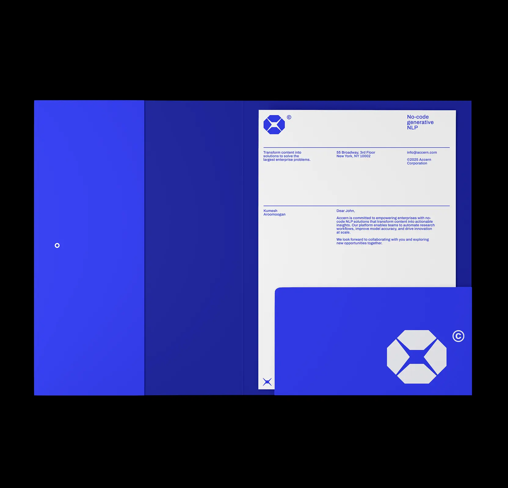
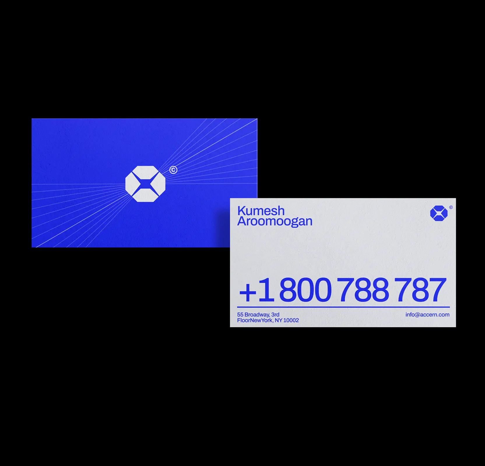
Crafted a transformer icon as the centerpiece of Accern’s identity
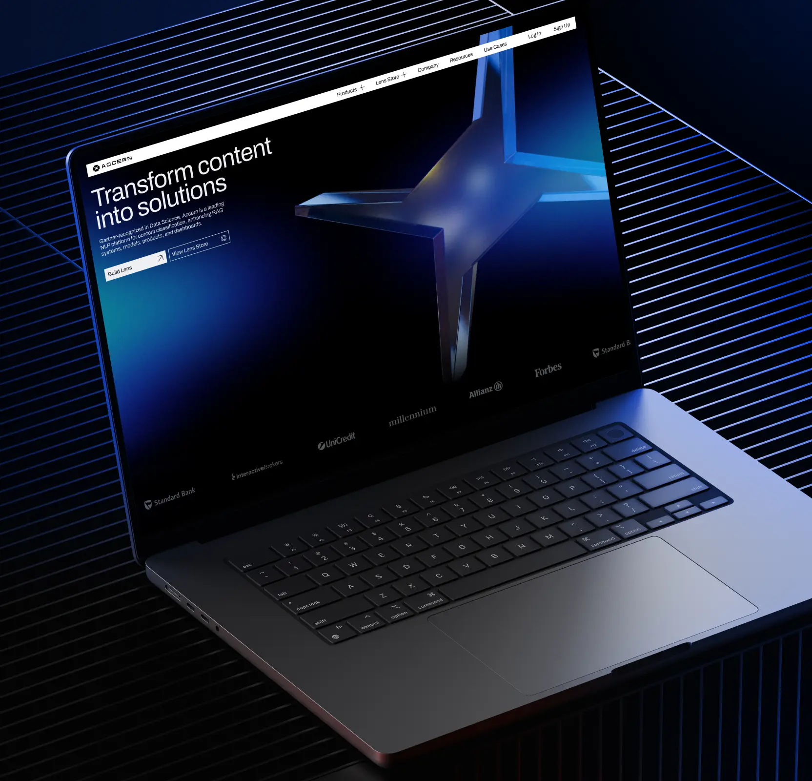
We designed a central, iconic element, the transformer, reflecting Accern’s promise of turning raw data into actionable insights. This symbol represents the systematic flow where data is processed, organized, and transformed into business-ready solutions.
To reflect the inherent 3D nature of data processing, we introduced diagonals and dimensionality, which guided both the logo design and the visual language of the website.
In the logo, the transformer serves as the logomark: sharp angles convey boldness and corporate confidence, while the void at its center symbolizes depth and the transformative 3D space of Accern’s intelligent data operations.
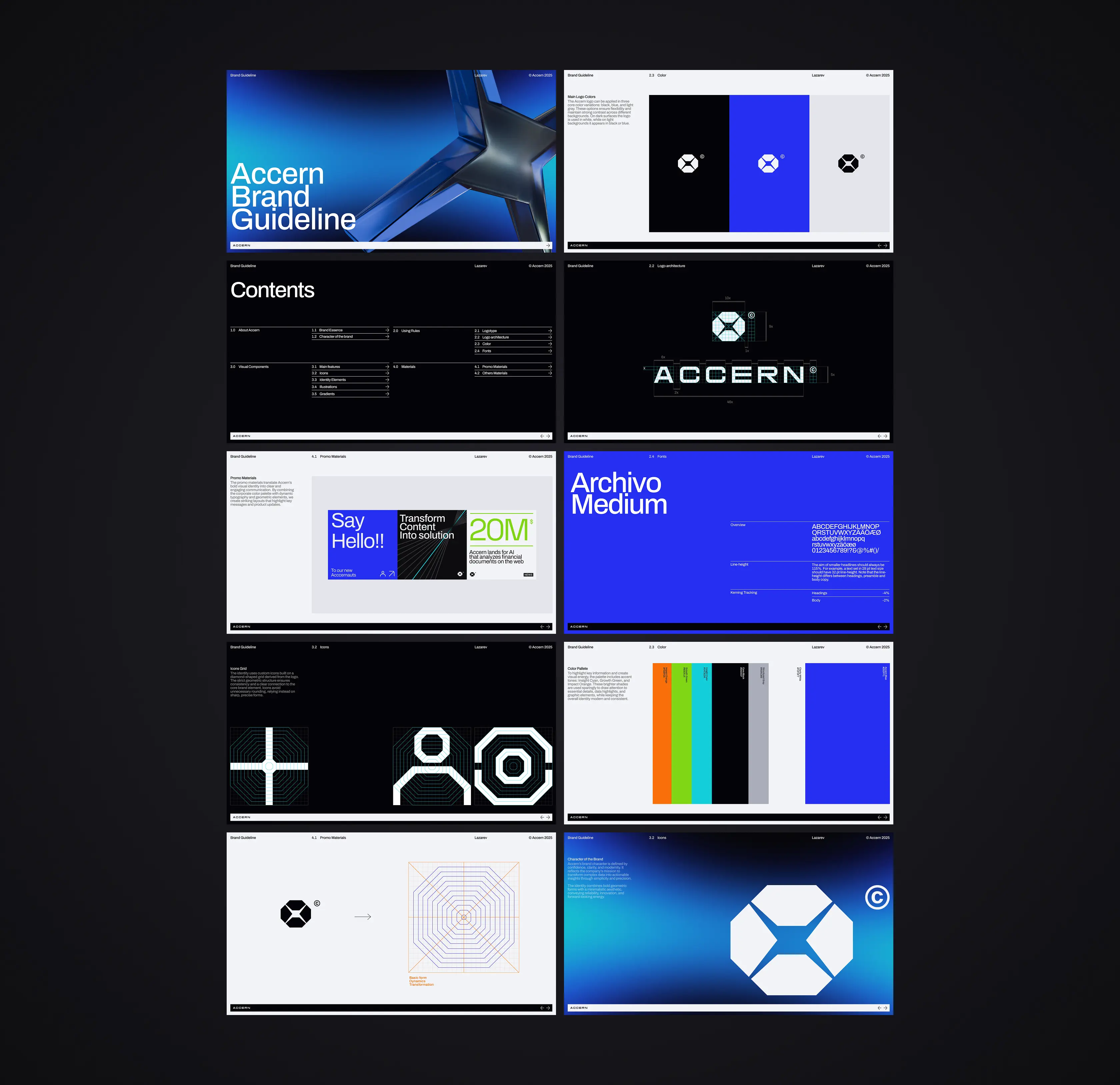
Built a systematic grid for consistent logotype and logomark
We designed a unique grid system to ensure each letter of Accern’s logotype shared the same size and weight, creating a sense of strength and stability.
Square letterforms reinforced this robust, balanced appearance, while a horizontal stretch further emphasized reliability, a motif echoed throughout the website design.
The same grid guided the creation of the logomark, ensuring consistency and cohesion across all brand elements.

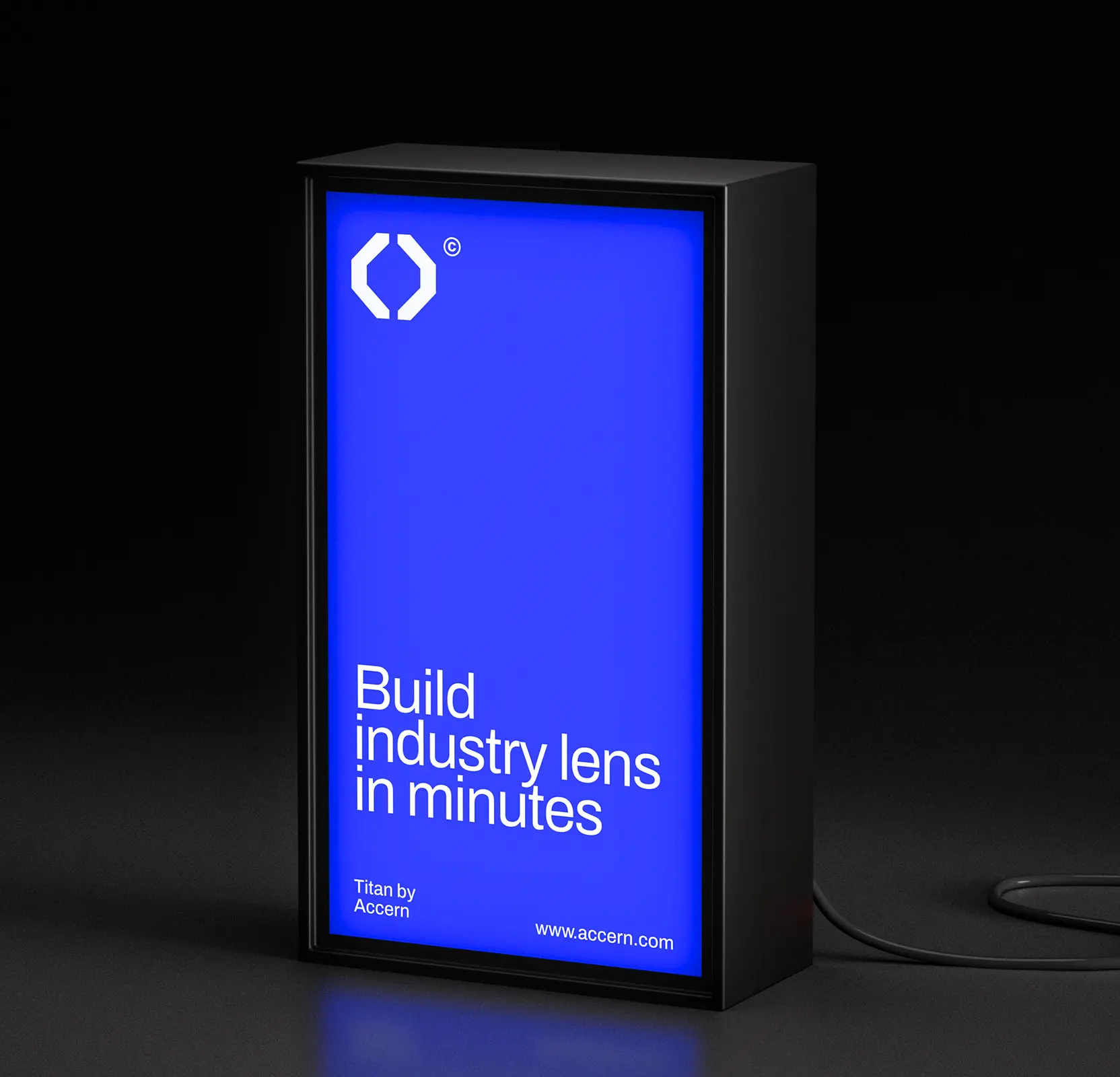
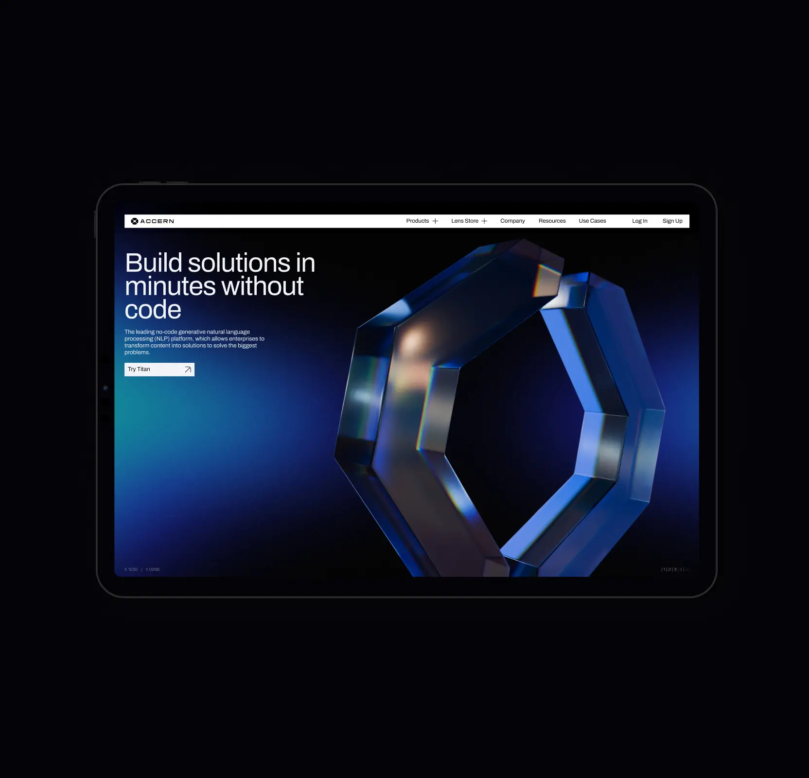
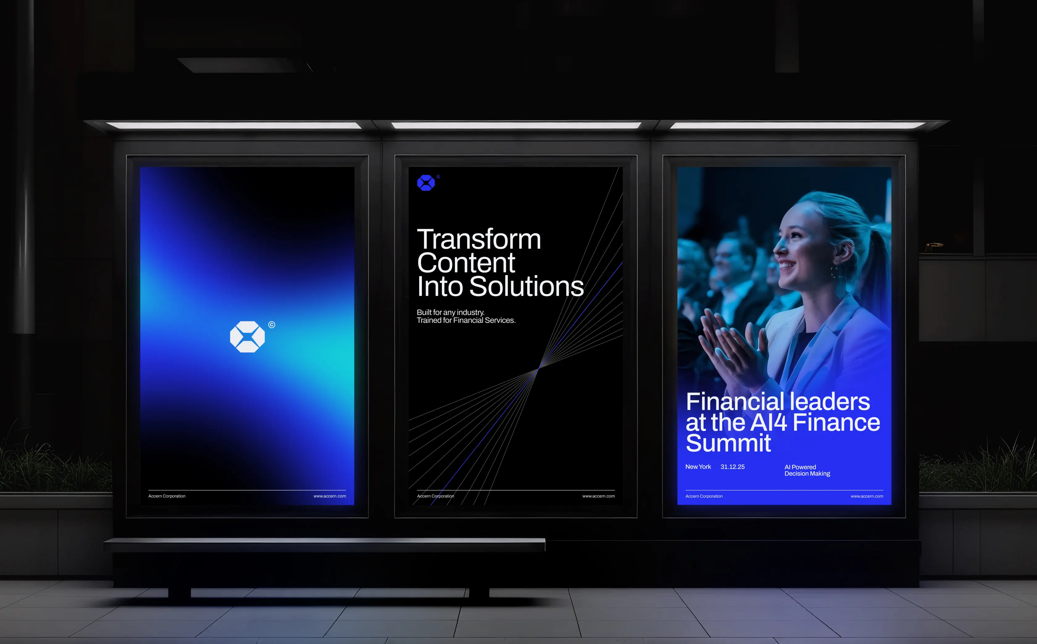
Developed dynamic brand elements to reflect data transformation
To capture the dynamism of Accern’s data transformation process, we transformed the logo into an octagon composed of progressive, dynamic lines. These lines visually convey movement and growth, forming a flexible grid that became the foundation for all brand elements.
Using this system, we created icons and other visual assets applied across the website and brand collateral, ensuring a cohesive and energetic identity that reflects Accern’s innovative approach.
.avif)
Scale or stall? UX design examples built for data-heavy products that can’t afford churn
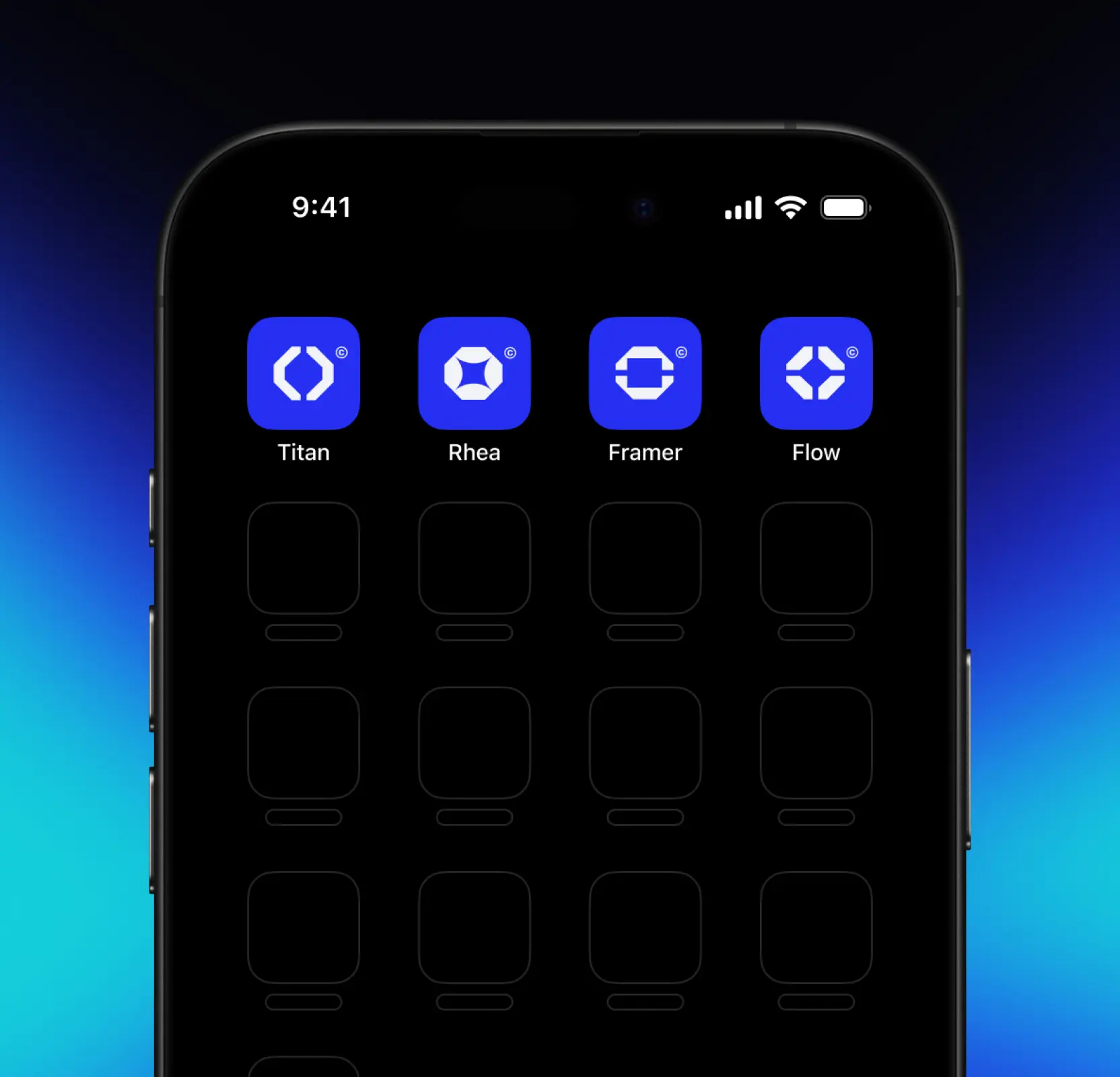
Established a consistent brand ecosystem across products
We created a cohesive and adaptable brand ecosystem for Accern by designing product logos for Titan, Framer, Flow, and Rhea. Using the same grid as the main Accern logo and incorporating elements from the dynamic octagon, each logo reflects its product’s unique value proposition while maintaining alignment with the overall brand identity.
Added corporate flair to strengthen brand presence
We refined Accern’s color palette to reinforce a professional, modern, and confident brand image. Blue remained the primary color, supported by white and gray tones for a corporate feel, while brighter accent colors were used selectively to highlight key details such as statistics, charts, and graphics, ensuring clarity and visual impact across all touchpoints.
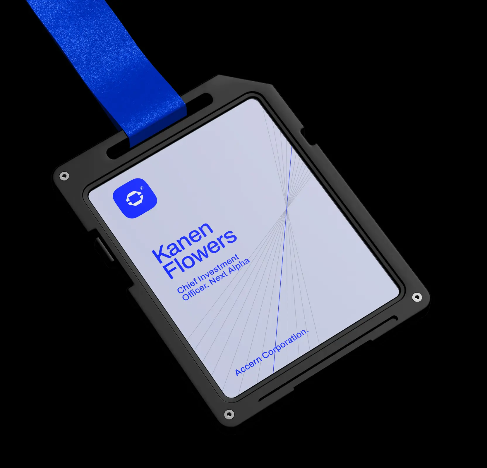
Developed comprehensive brand guidelines for seamless integration
We created detailed brand guidelines and designed marketing collateral, brand materials, and merchandise to ensure consistent application of Accern’s identity. This framework guarantees that every touchpoint adheres to the new branding standards, enabling seamless integration and a cohesive brand experience across all platforms.


AI & ML
Lazarev. agency offers comprehensive digital design services. Discover our range of related expertise supported by impactful case studies.
More Enterprises Cases

FAQ
How can companies create a brand identity that communicates innovation and trust?
Building a cohesive brand identity involves combining visual elements, messaging, and product ecosystems to reflect expertise and reliability. In the Accern case, Lazarev.agency developed a scalable logo, dynamic visual elements, and a structured grid system that conveyed boldness, confidence, and the transformative power of data. This approach positioned Accern as both modern and trustworthy in the NLP and data solutions market.
What strategies can improve market perception for technology companies?
Aligning market perception with actual capabilities is crucial. Accern’s repositioning highlighted predictability, corporate confidence, and client-centric solutions. By integrating these principles into the logo, product branding, and website design, Lazarev.agency helped Accern communicate its value effectively, making the brand more relatable to clients and appealing to investors.
How can logos and core brand elements reflect complex processes like data transformation?
Visual storytelling can simplify complex concepts for your audience. For Accern, the central “transformer” symbol in the logo represented how raw data is processed into actionable insights. This 3D-inspired design was extended into dynamic lines and grids that informed the creation of icons and other brand elements, demonstrating expertise while keeping the identity approachable.
How can companies create a consistent brand ecosystem across multiple products?
Consistency across products builds recognition and trust. Accern’s product logos: Titan, Framer, Flow, and Rhea, were designed using the same grid and dynamic octagon elements as the main brand, ensuring each product maintained its unique identity while remaining visually tied to Accern’s overall ecosystem.
How do color schemes and corporate design elements influence brand perception?
Colors communicate professionalism and credibility. Accern’s palette: blue as the primary color, with white and gray accents, reinforced a modern, corporate tone. Brighter colors were applied selectively to highlight key data points, charts, and graphics, creating visual hierarchy while maintaining a confident, business-oriented identity.
Why are brand guidelines critical for growth and consistent messaging?
Comprehensive brand guidelines ensure all touchpoints maintain a unified identity. Lazarev.agency developed guidelines for Accern covering logo usage, visual assets, marketing materials, and merchandise. This framework allowed the team to deploy the brand consistently across platforms, strengthening recognition and supporting strategic growth initiatives.
How can a modern, bold brand identity help attract strategic investors?
A well-crafted identity signals professionalism, scalability, and vision. By integrating bold geometric forms, dynamic visual systems, and a clear corporate tone, Accern’s refreshed brand identity positioned the company as a promising investment opportunity, helping generate measurable investor interest and support for future growth.


Hit me up! Let’s chat about your growth


