How we enabled a leading FinTech company to enhance developer engagement and accelerate product adoption
Project:
the project
Quantillium, a leading financial data infrastructure company, offers real-time access to global stock exchange filings via a unified API. While its backend was strong, the platform’s frontend lacked clarity and didn’t fully convey its product’s depth.
To address this, Quantillium partnered with Lazarev.agency to create a seamless user experience that makes financial data accessible, trustworthy, and relevant to developers, data teams, and decision-makers. Our task was to transform raw financial data into clear, compelling product descriptions that would increase product adoption and engagement.
A complete redesign of Quantillium’s digital presence – built to support easier exploration, clearer communication, and faster adoption of their API by developers and data-driven teams. By elevating UX, visuals, and structure, we helped translate backend power into frontend confidence.
increase in data accessibility across key product areas
increase in session duration, driven by improved product engagement
The Project’s
Discovery Phase
Redesign for competitive edge

The complete website redesign guide: strategy & launch

Built for the professionals who drive market growth
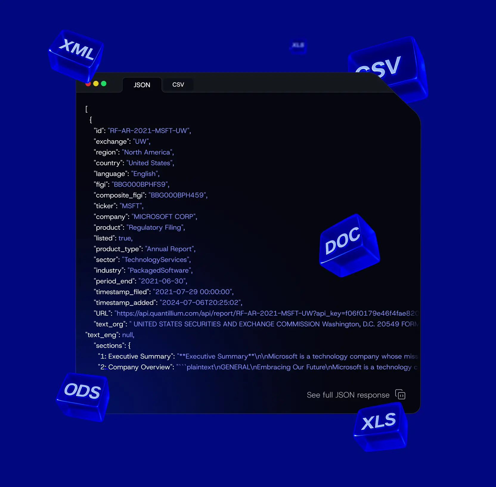
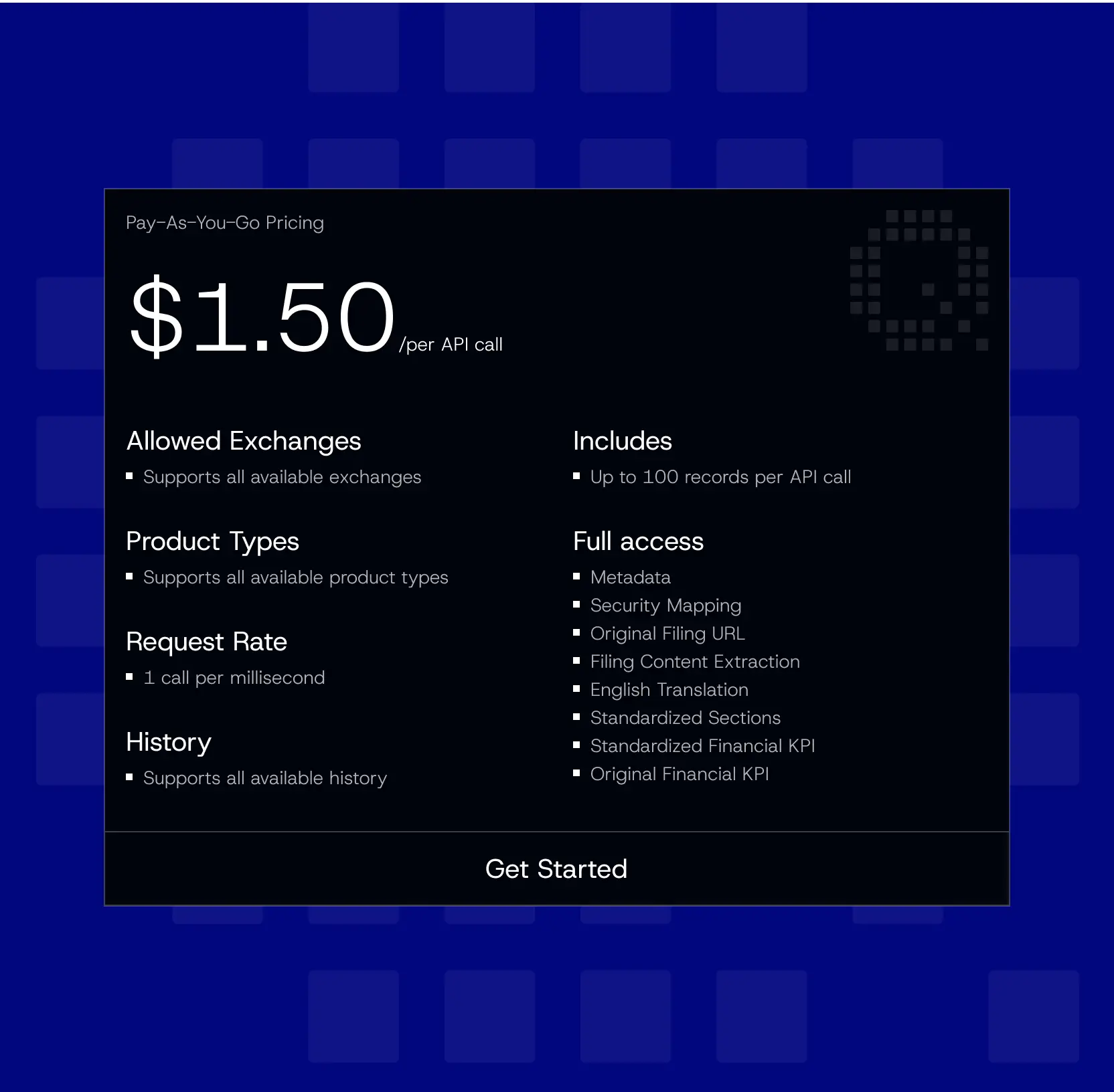
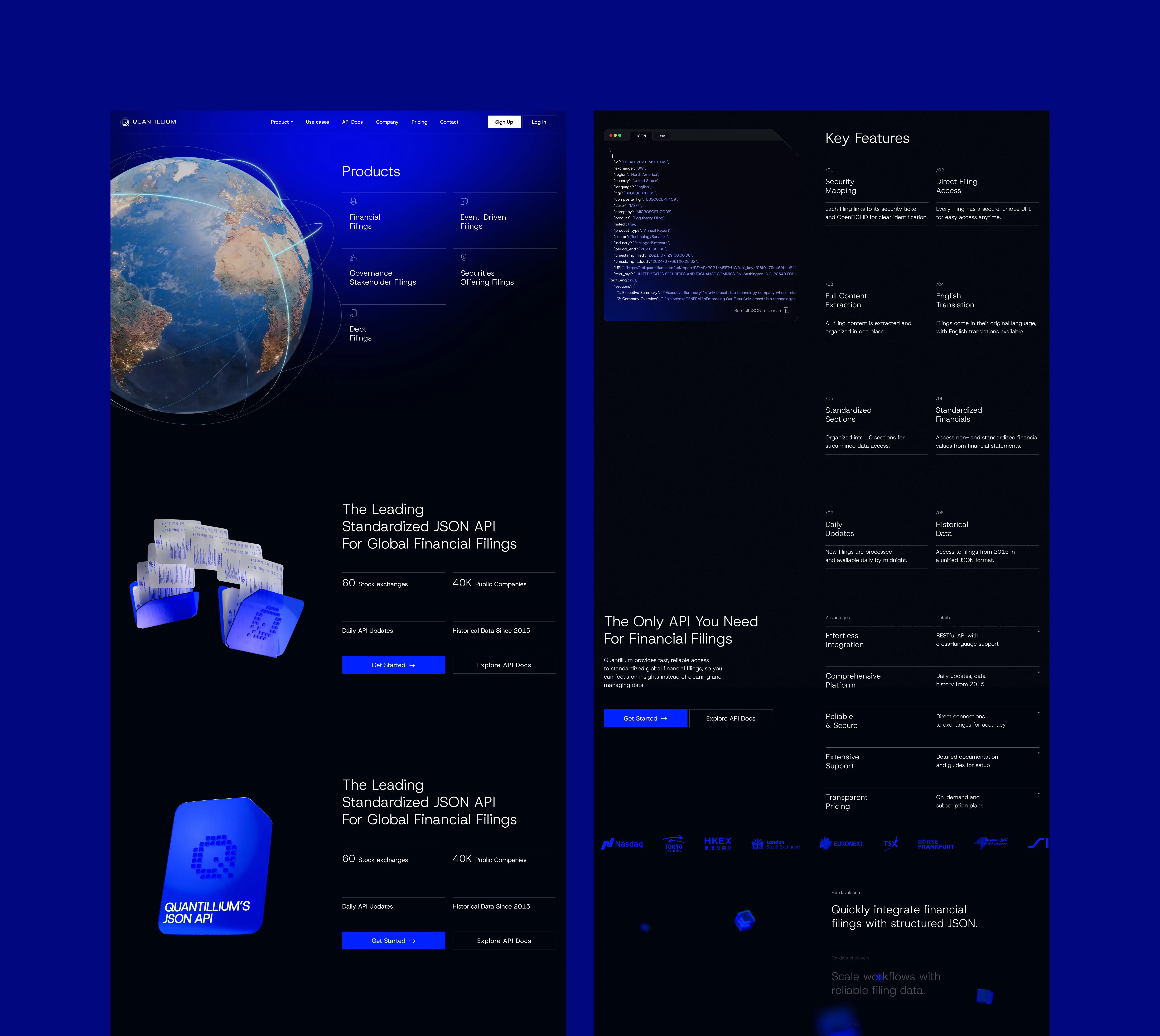
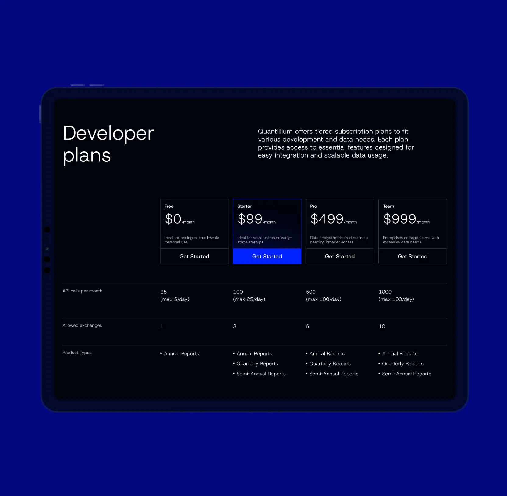
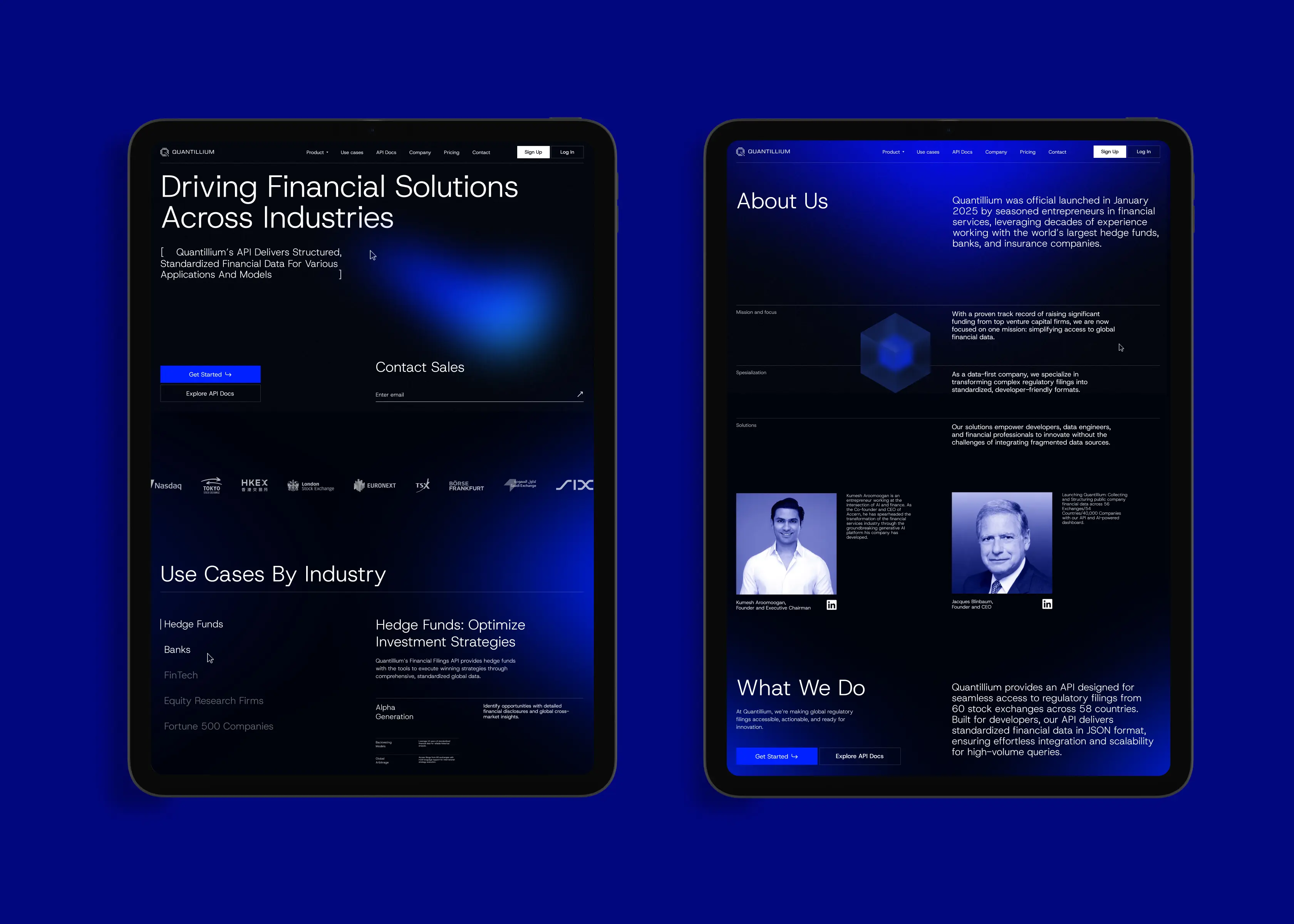
Quantillium’s users: developers, financial analysts, and decision-makers, demand accuracy, clarity, and speed. We turned complex JSON datasets into a clear and engaging landing page experience tailored to their needs. From the very first screen, the website demonstrates the product in action: data is integrated into a structured storytelling flow, where each block highlights the API’s value and practical use cases.
3D visuals and dynamic transitions emphasize both the scale of Quantillium’s infrastructure and the transparency of its processes. This role-focused storytelling helps each audience immediately grasp how the platform works and how it can accelerate their decision-making, turning technical complexity into intuitive clarity.
Crafted a visual identity from the ground up for a product that had none
Before the redesign, Quantillium had no visual identity to communicate the sophistication and scale of its product. We created a design system from scratch, tailored to a developer-first audience. A dark theme enhances usability for data exploration, while a deep blue palette conveys technological precision and clarity.
Sharp typography and geometric forms reinforce a sense of accuracy, while 3D elements and subtle terminal-style animations reference real-time API workflows. This new visual language presents Quantillium as a cutting-edge technological tool and establishes a strong, recognizable digital identity.

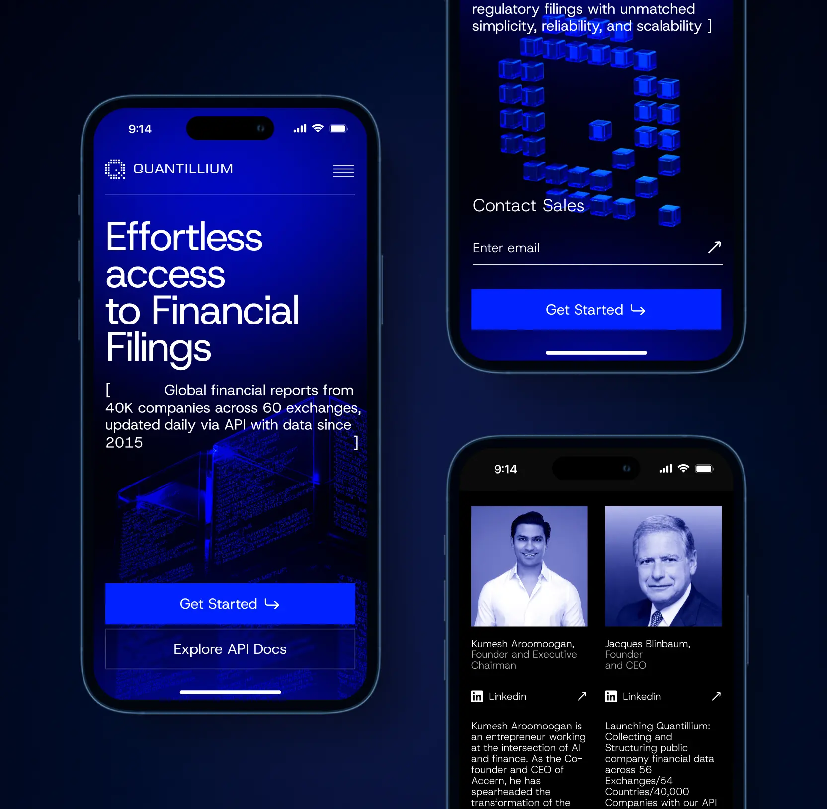
Adapted 3D and motion for mobile and tablet experiences
Quantillium’s audience actively accesses data on the go, which meant the landing page had to deliver the same high-impact storytelling across devices. We optimized 3D graphics, animations, and interactive elements for mobile and tablet formats, ensuring they retained both clarity and performance. Instead of scaling visuals down, we rethought their placement and rhythm to make them intuitive on smaller screens. This way, users experienced the same sense of technological sophistication and product transparency whether they explored Quantillium from a desktop, tablet, or smartphone.


Fintech
Lazarev. agency offers comprehensive digital design services. Discover our range of related expertise supported by impactful case studies.
More Enterprises Cases

FAQ
How can financial data platforms improve user engagement for developers?
In our case study with Quantilium, we enhanced user engagement by creating a developer-first product page with clear, actionable content. We restructured the flow to prioritize developer queries like “What can I build with this?” and “How do I start?” This improved engagement by providing clear answers and reducing friction in the user journey, leading to a 32% increase in session duration.
What strategies can fintech platforms use to make complex financial data accessible to non-technical users?
At Quantilium, we focused on simplifying raw financial data through intuitive design and clear visual hierarchy. By breaking down complex datasets into digestible insights, we helped users regardless of their technical background quickly understand and apply the information. This approach increased data accessibility by 30% andenhanced the overall user experience.
How can product transparency boost trust and adoption in fintech platforms?
We translated Quantilium’s raw financial data into a clear, engaging story, providing transparency through intuitive visual elements. By displaying real-time updates, tracking metrics, and ensuring users could easily access detailed data, we fostered trust and increased API documentation visits by 18%. Transparency was key to fostering a deeper sense of confidence among users and developers.
What role does motion design play in improving the user experience for fintech products?
Motion design guides users and enhances clarity. For Quantilium, we introduced subtle animations and 3D visualizations that reinforced product messaging while keeping the focus on the data. This dynamic experience improved user engagement, showing that motion design can drive both interest and understanding.
How can fintech companies better communicate their value proposition to technical audiences?
Quantilium faced challenges in conveying its value to a technical audience. To address this, we built a clean, minimalist interface that immediately communicated the product’s core value. By organizing content logically and integrating motion-enhanced visuals, we ensured that the messaging was clear and trustworthy, making the product more appealing to developers and technical stakeholders.
How can API documentation be optimized to increase developer adoption?
To boost API adoption, Quantilium’s redesign focused on making the documentation easier to navigate and understand. By simplifying the information flow and presenting it with clear, structured layouts, we ensured developers could quickly find the information they needed, reducing friction and increasing the likelihood of integration.
What’s the impact of front-end design on fintech product adoption?
The frontend of any fintech product is critical for adoption. By enhancing Quantilium’s frontend experience, we made its powerful backend more accessible and easier to use. We employed a modern visual identity, intuitive content flow, and engaging motion design to transform complex infrastructure into something users could trust and interact with confidently. As a result, adoption rates surged, and we saw increased API traffic and developer engagement.


Hit me up! Let’s chat about your growth


