How redesigning Mozayix's interface gave risk managers their hours back
Project:
the project
Faster decisions for managers protecting people and assets
Mozayix helps global enterprises protect their assets, people, and reputation. Its managers run security risk assessments, site surveys, threat modeling, and incident reports across many locations at once. The capabilities were all there. The interface around them made every task heavier than it should be.
So risk data sat scattered across screens, and managers spent their days hunting for it when they should have been acting on it. For a risk management firm, slow navigation and shaky data hit commercial performance in lost billable hours and calls made on weaker information.
Mozayix partnered with Lazarev.agency to rebuild the platform’s user experience and eliminate the time a manager spends finding information. Here's how we did it.
The Project’s
Discovery Phase
One rebuild across every screen managers use
Mozayix had the right capabilities buried in an interface managers fought to use, and every extra click was time taken from the real work of assessing risk.
We reworked the central overview, the project pages, the assessment wizards, and a companion mobile app against one test: does this cut the time a manager spends finding information?
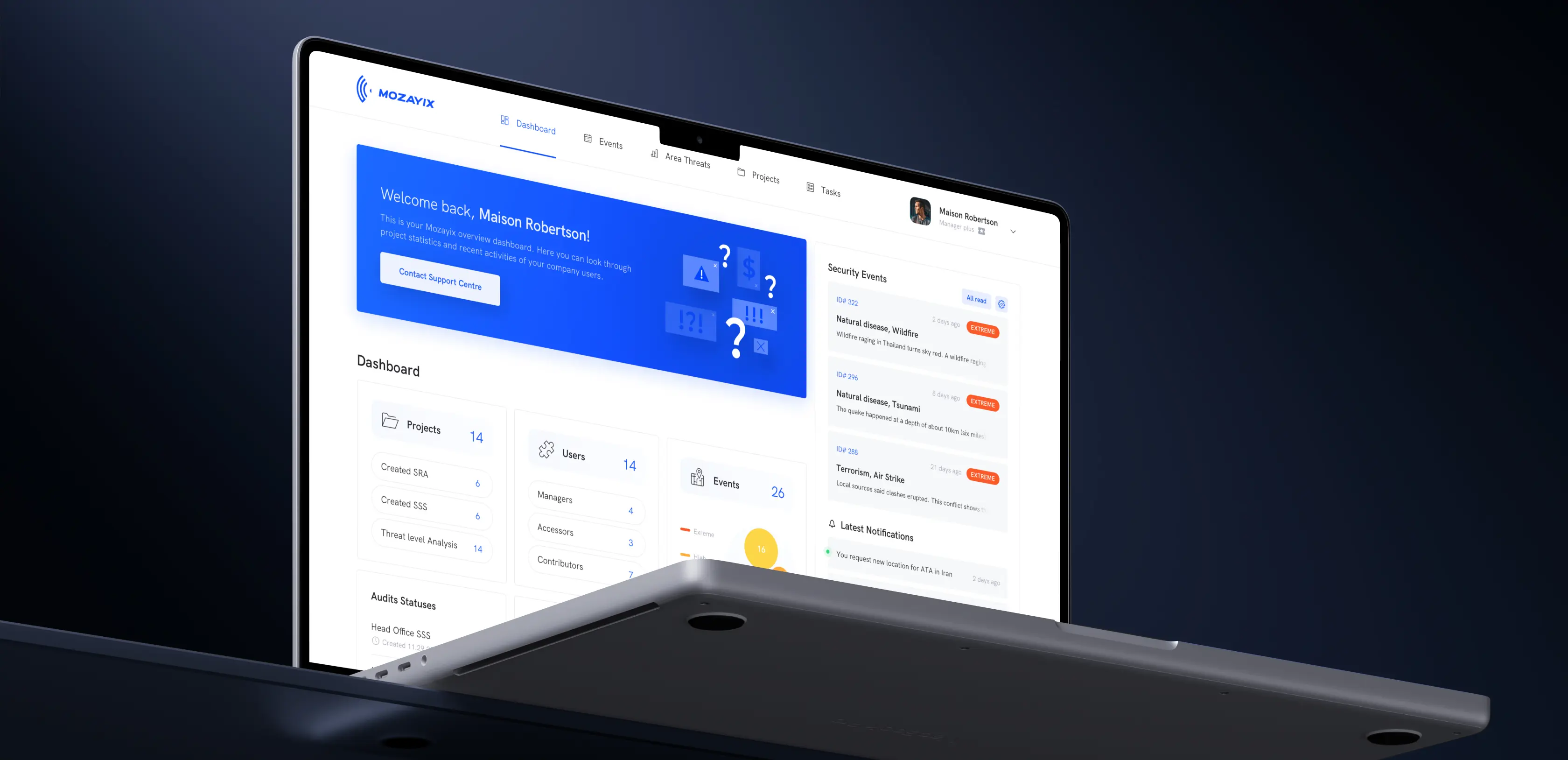
We kept one consistent way of working across web and phone, so a manager moves from a full risk score at the desk to a quick regional safety read on the move without relearning the tool. Users spend their hours on judgment and response, which is what makes the rebuild worth paying for.
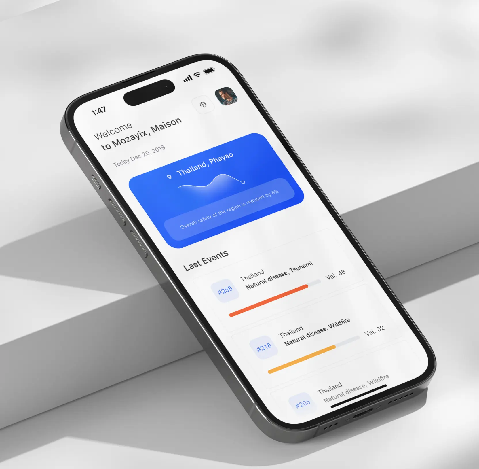

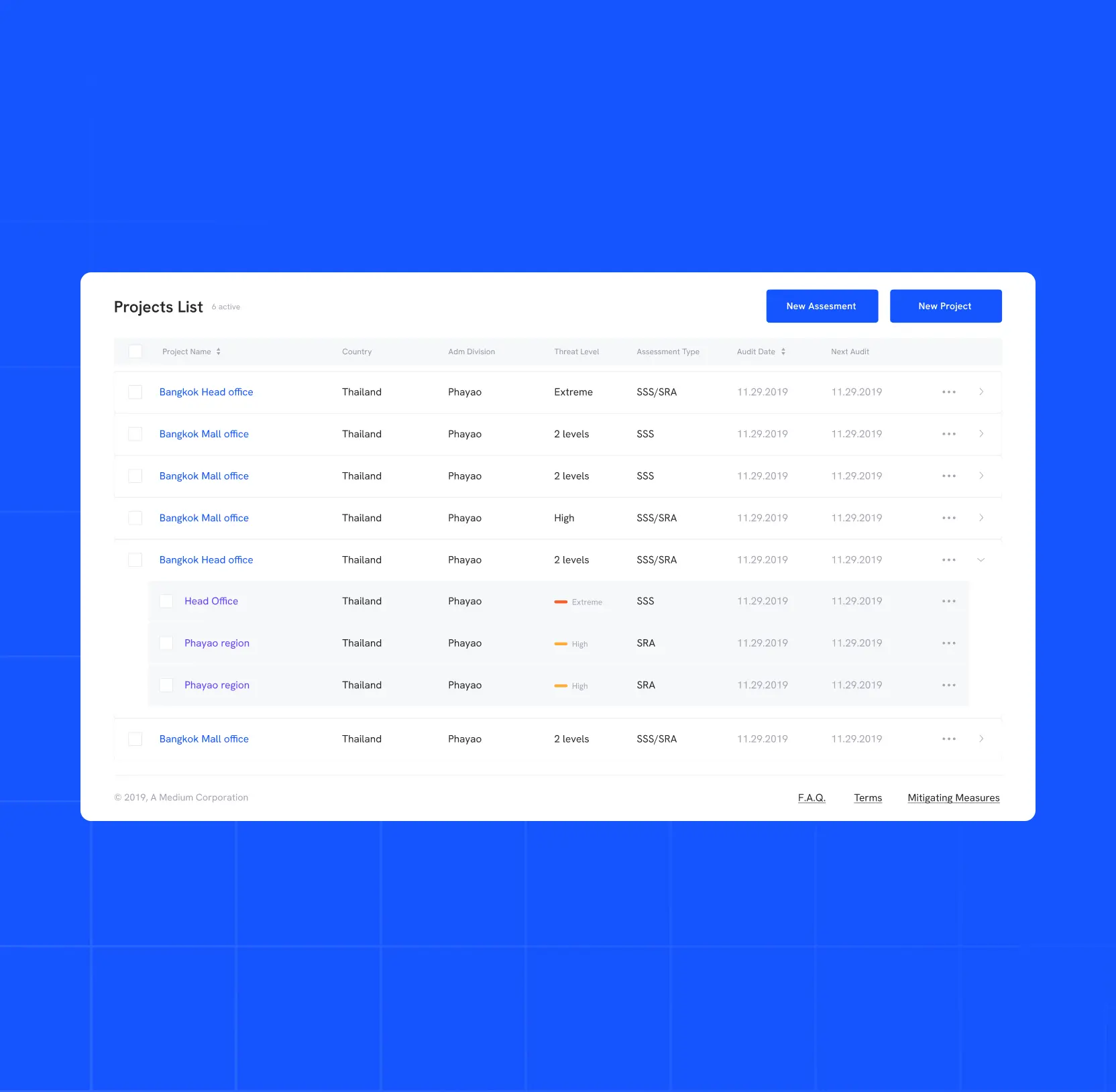
Immediate visibility across every project and event
When risk data lived across separate sections, managers spent the start of every shift hunting for what needed attention.
We redesigned Mozayix's central dashboard to consolidate projects, security events, and notifications into a single overview, with the highest-severity items pushed to the top. Hence, the most urgent case is the first thing a manager reads.
We also replaced cluttered layouts with structured data grids. That way, managers can scan a full project list, threat levels, and assessment types in one pass.
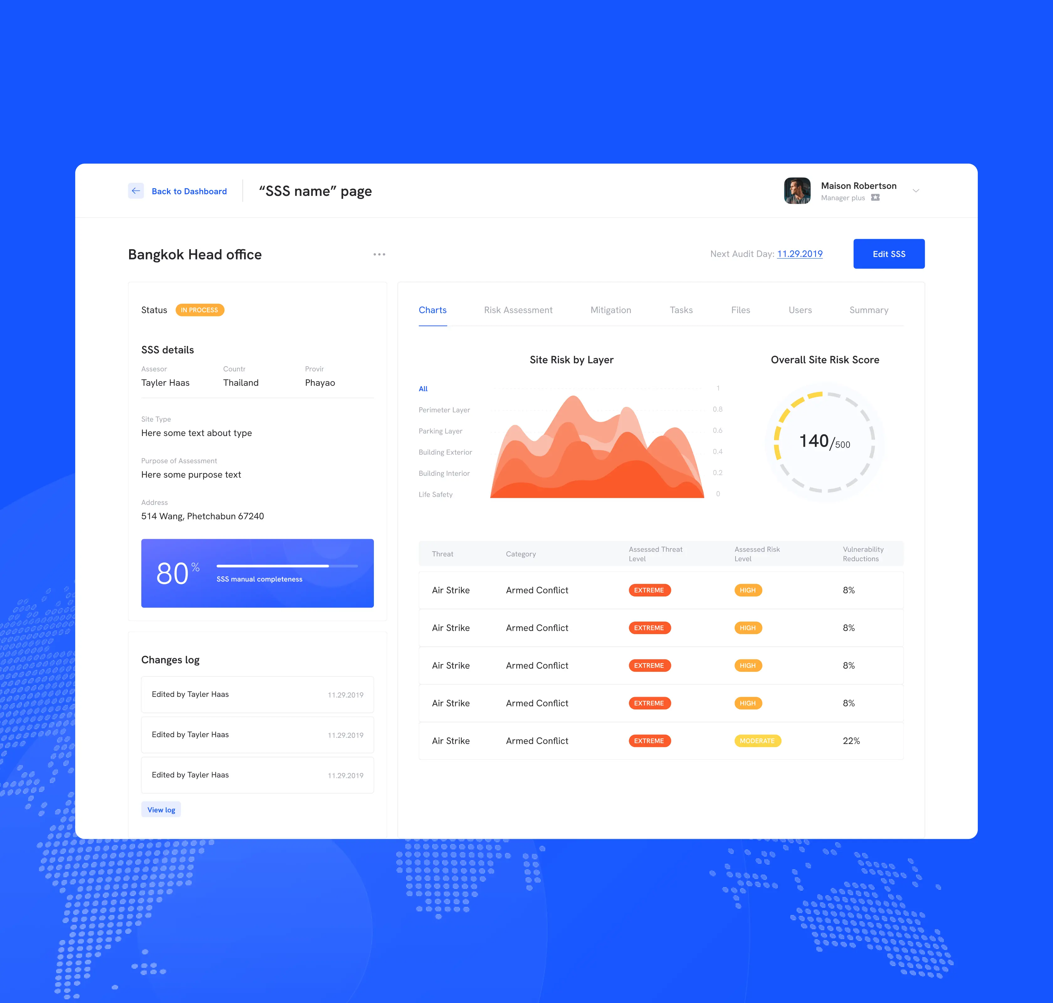
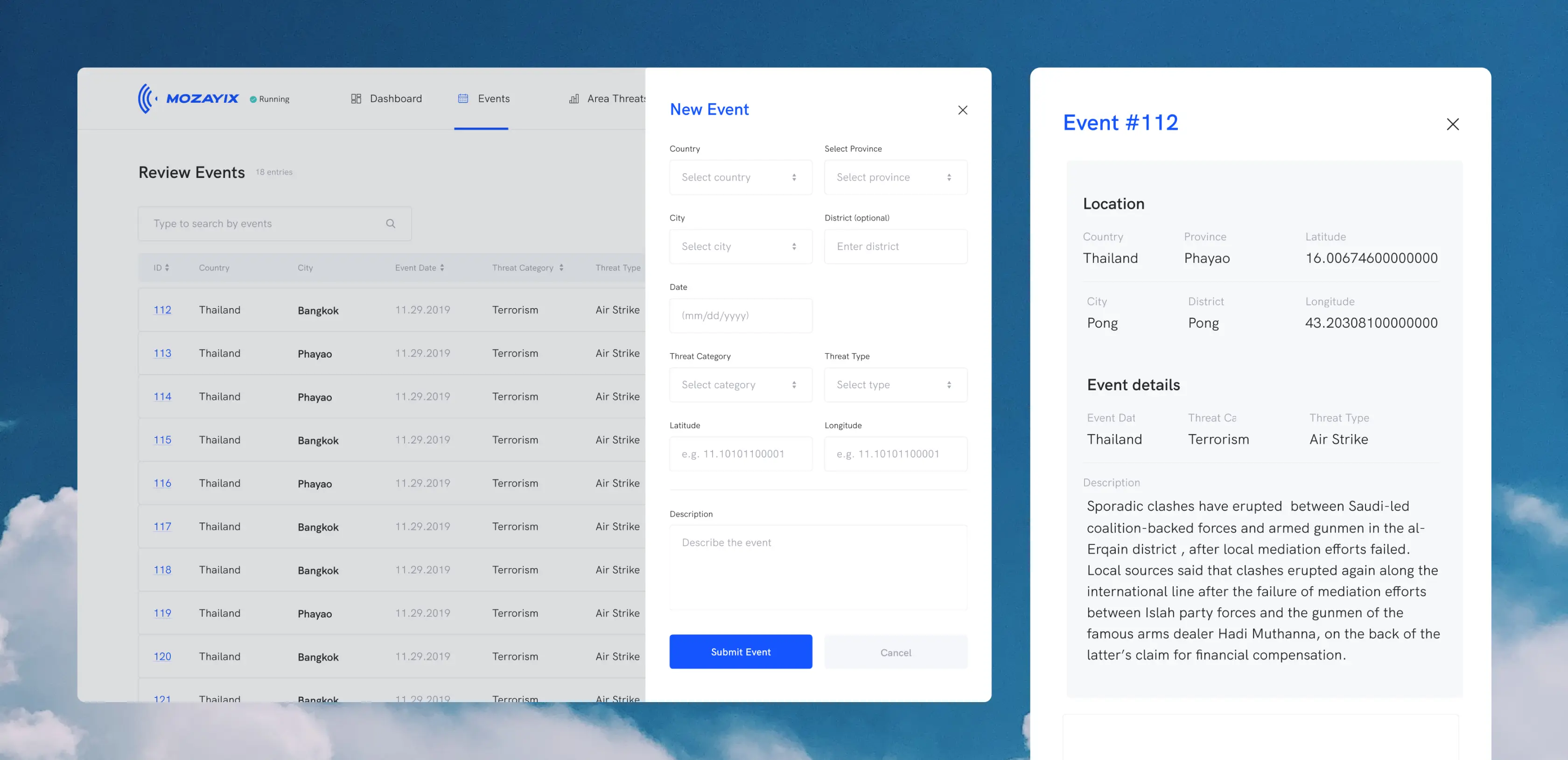
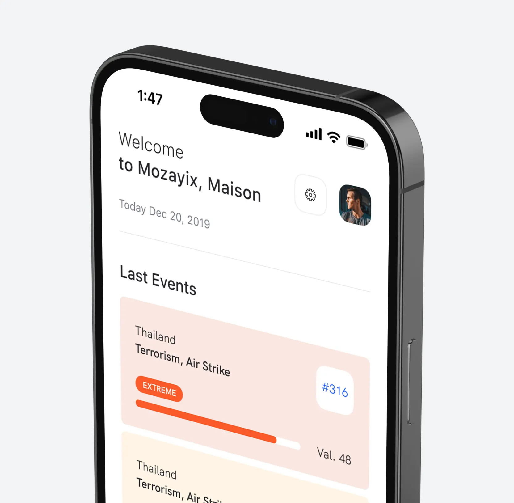
Guided event entry for accurate, consistent records
When managers entered event data by hand with no set order, small mistakes slipped in, and one wrong coordinate could place a threat in the wrong location.
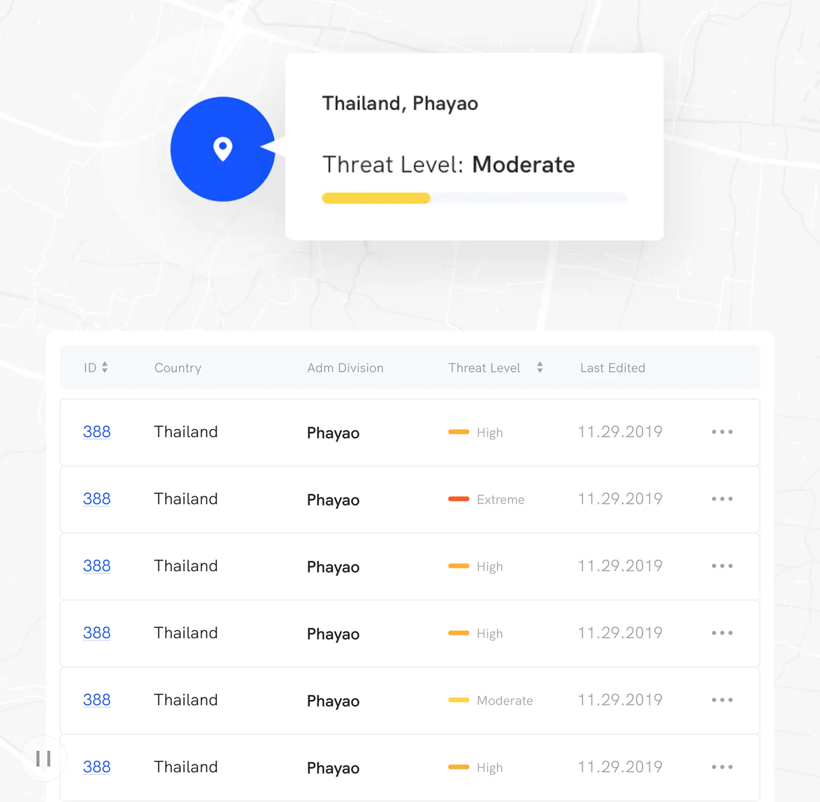
Our team redesigned the flow to guide each entry step by step: location, coordinates, threat category, and threat type, all captured before the record is saved. We also gave every saved event two homes, a row in a searchable grid, and a pin on a map colored by threat level. Those two design decisions let managers see where danger clusters and act on it, working from data they can trust.
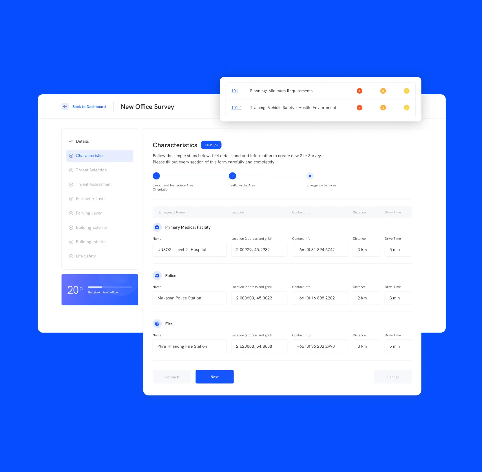
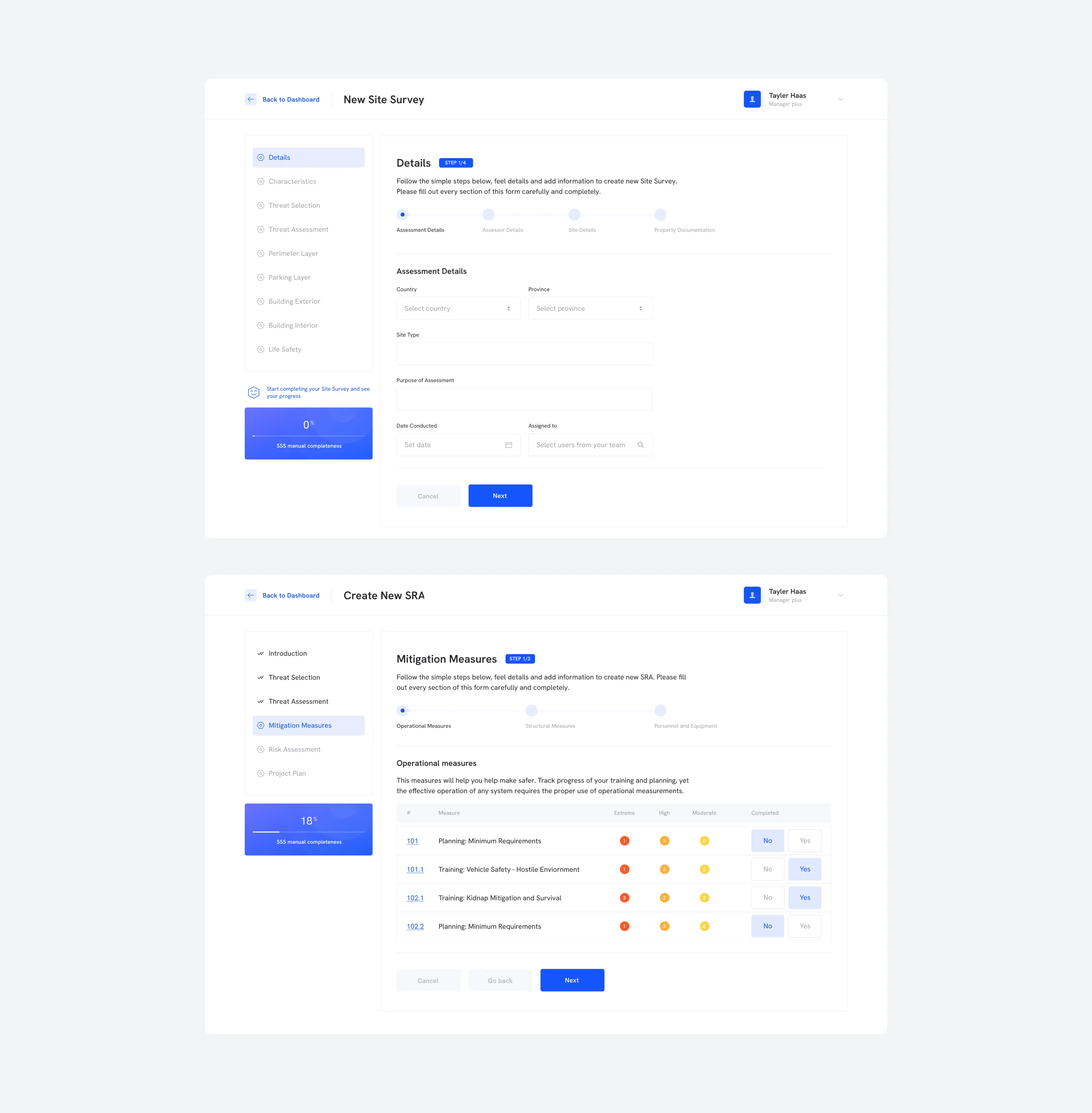
Two project types, one guided way to start
Mozayix managers run two different jobs, Security Site Surveys and Security Risk Assessments, and each needs its own inputs and steps. Without a guided path, managers relearned setup every time, skipped required fields, and produced inconsistent assessments.
We built a separate guided wizard for each type, New Site Survey and Create New SRA, breaking setup into ordered steps with a live completeness bar, all inside one module, so managers work in one familiar place.
We also put a Mozayix app in their pocket, surfacing the latest events by threat level so a manager stays current away from the desk. Every assessment now starts complete and consistent, and managers carry one way of working across both project types and both screens.

AI & ML
Lazarev. agency offers comprehensive digital design services. Discover our range of related expertise supported by impactful case studies.
More Scaleups Cases

FAQ
How does enterprise risk assessment app design improve decision-making speed for managers handling complex, multi-site operations?
Enterprise risk decisions slow when data is scattered across screens. Mozayix redesigned dashboards to surface critical information instantly. Each project gets its own view, so users see only what's relevant — no manual filtering. Threats are mapped visually, making patterns easier to read and act on. This approach reduces time from question to action, enabling faster, more confident enterprise risk management decisions.
What are the most effective UX design patterns for enterprise platforms managing large volumes of structured operational data?
Enterprise platforms fail when data is shown at the storage level. Risk managers need task-focused information. Dashboards are to be structured by priority, so top-level metrics land first and the detail is a click away. Input should follow a guided flow, reports can be filtered to just the events in question, and the map view should give the whole picture a place to live. These patterns reduce cognitive load and accelerate confident decision-making.
How should enterprise risk management software handle multiple project types with different workflows without fragmenting the user experience?
Mozayix handles multiple project types, each with unique requirements, inputs, and outputs. A generic workflow produces errors and slows managers by forcing constant adaptation. Separate platforms create fragmentation and require multiple mental models. Distinct workflows within a unified module allow tailored initiation while maintaining consistent navigation. Managers build habits, reducing complexity and increasing efficiency across projects.
What is the business case for investing in UX redesign for an existing enterprise risk assessment platform?
Enterprise platforms with accumulated usability debt slow managers by increasing navigation time and causing data entry mistakes. Complex interfaces constrain scalability and reduce operational efficiency.
For risk management firms, these challenges directly affect commercial performance. The Mozayix redesign resolved platform-wide usability issues. Improvements lead to faster project initiation, fewer input errors, and more time spent on actual risk assessment.
How does map-based visualization improve threat modeling outcomes in enterprise security software?
Traditional threat modeling stops at the data: tables, risk scores, matrices. The transition from "what do we do next?" is left to whoever opens the file. Complex results can obscure value when interpretation is required. Map-based visualization presents threat levels spatially, showing high-risk areas directly.
In Mozayix, maps follow structured sequential inputs for identification and analysis. For enterprise risk assessment app design, spatial visualization bridges the gap between analysis and immediate operational decision-making.
How should B2B SaaS companies approach dashboard design for enterprise users managing concurrent projects across multiple locations?
Enterprise users managing multiple projects need dashboards that answer both cross-project and per-project questions. A single platform-wide view can overwhelm with information, while isolated dashboards force navigation before context emerges.
Mozayix solves this with a two-level dashboard structure: a central overview for all projects and per-project dashboards for detailed, task-specific insights, reducing cognitive load and speeding operational decisions.
What should large enterprises look for when evaluating a UX design partner for a complex risk management platform redesign?
Enterprise platforms don't get redesigned by making them prettier. They get redesigned by understanding the logic underneath and building an interface to match it. Risk management platforms involve varied project types, sequential threat modeling, and multi-variable incident filtering. Mozayix began with a discovery phase to map manager workflows before touching visuals. Proper sequencing improves operational performance.


Hit me up! Let’s chat about your growth


