How we enhanced conversion rates and product discovery for a leading US tire retailer
Project:
the project
Priority Tire, a prominent online tire retailer, approached us with a website that, while functional, lacked modern design and optimal user experience. The primary challenge was that tires are not typical e-commerce products, selection hinges on specific parameters rather than visuals, and most users are not tire experts.
Our objective was to redesign the platform to facilitate quick, confident decision-making through intuitive navigation, smarter search, and streamlined product presentation.
Our redesign focuses on helping users find tires faster and buy easier. By streamlining navigation, simplifying product discovery, and optimizing product pages and checkout, we expect to see measurable improvements in how users interact and convert.
conversion lift expected from improved product pages, upsells, and smoother checkout.
product discovery boost projected from upgraded search, simplified navigation, and smarter filtering.
The Project’s
Discovery Phase
Modernized visual identity while preserving brand familiarity
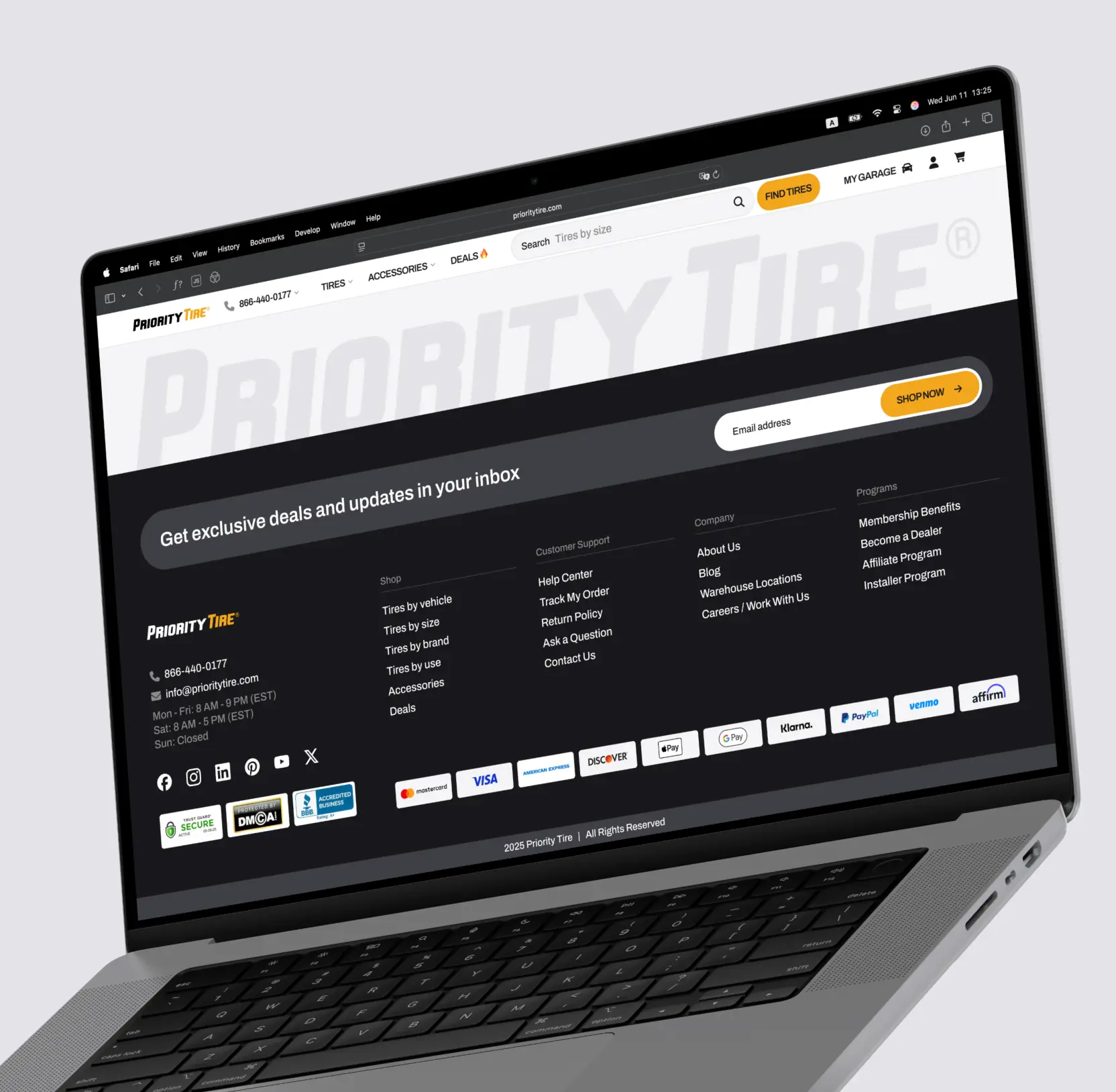
We refreshed the website’s look with a clean, contemporary UI that aligns with current design standards, ensuring the site feels fresh yet recognizable. Maintaining brand consistency was vital to retain customer trust and loyalty, balancing innovative visuals with familiar elements.

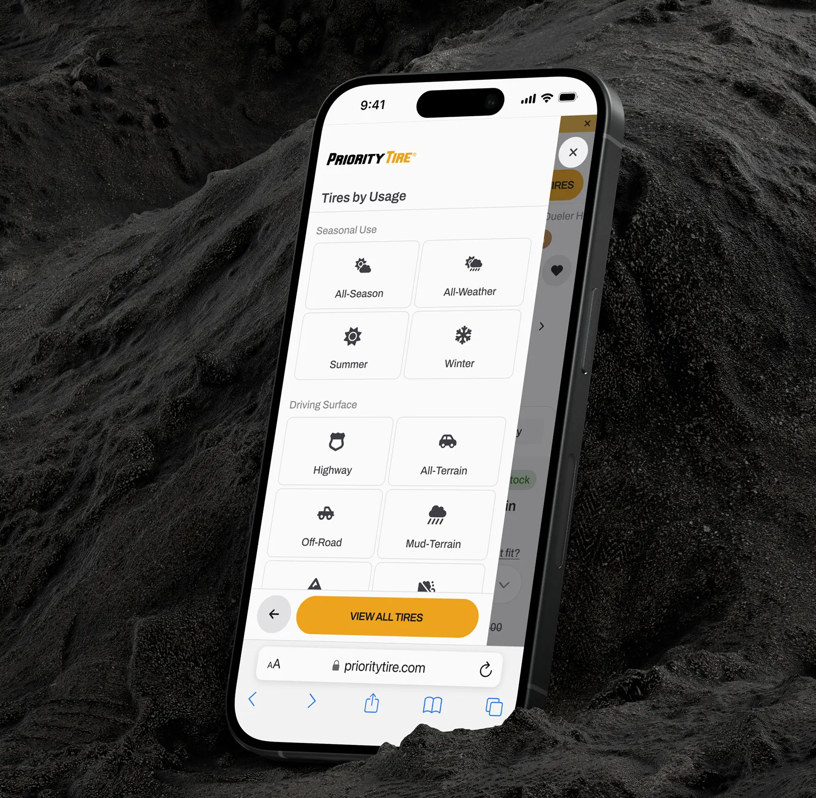
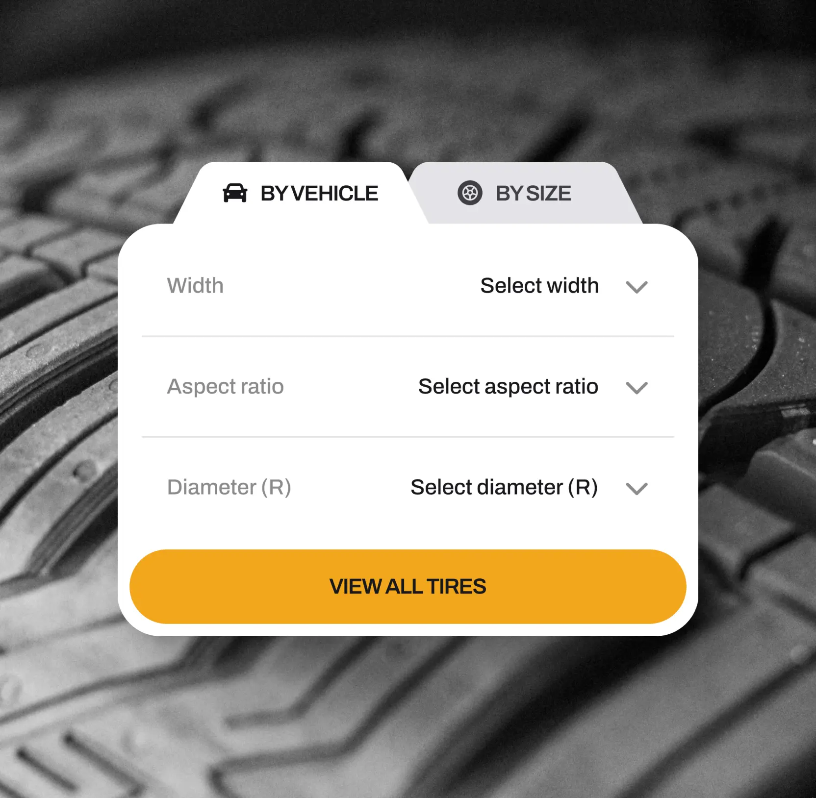
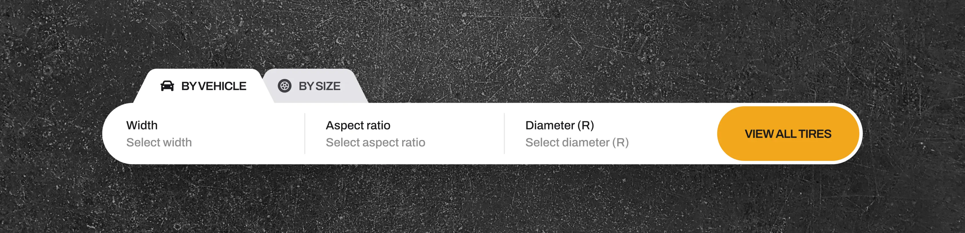
Redesigned the search and navigation for seamless user journeys
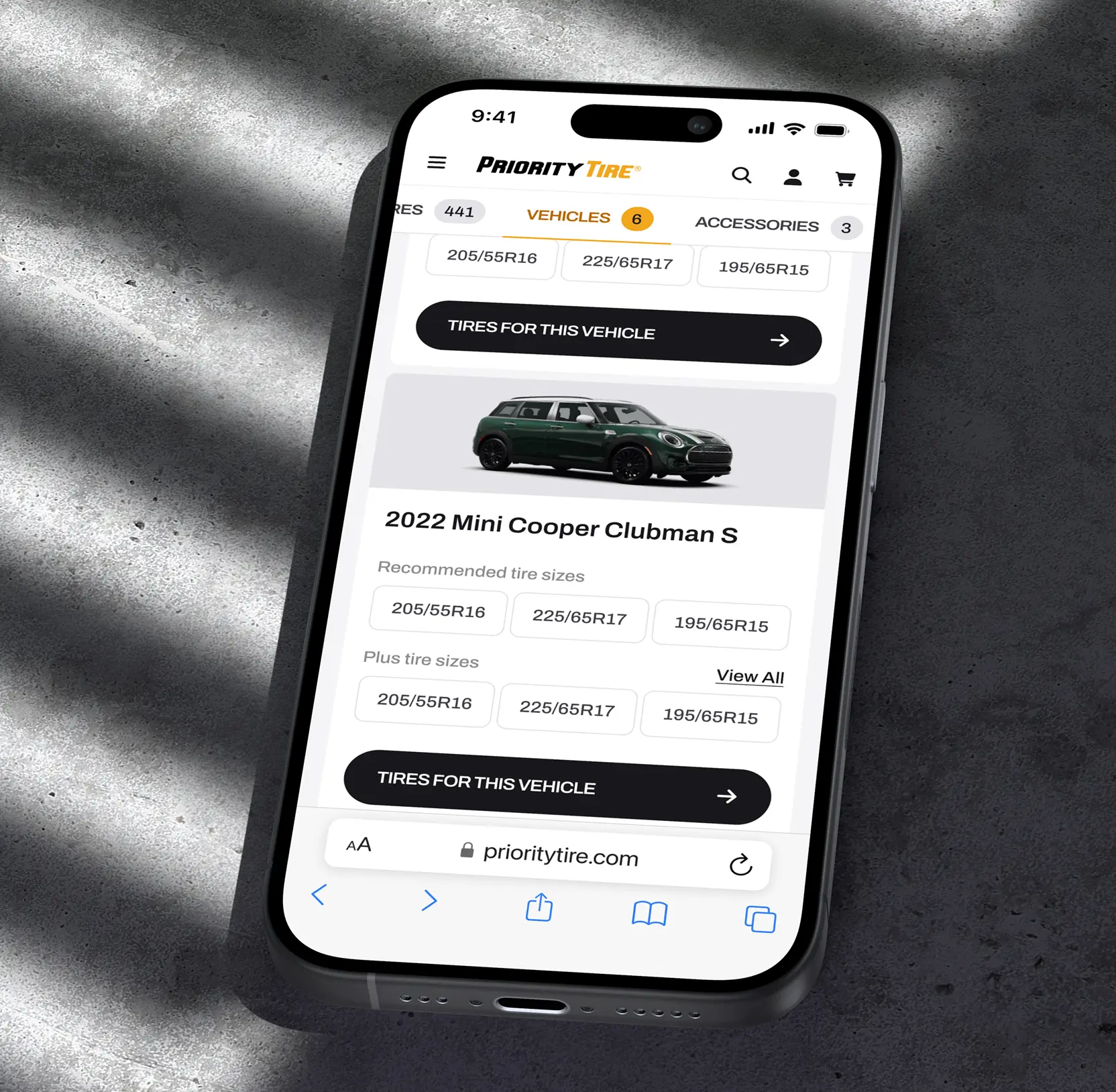
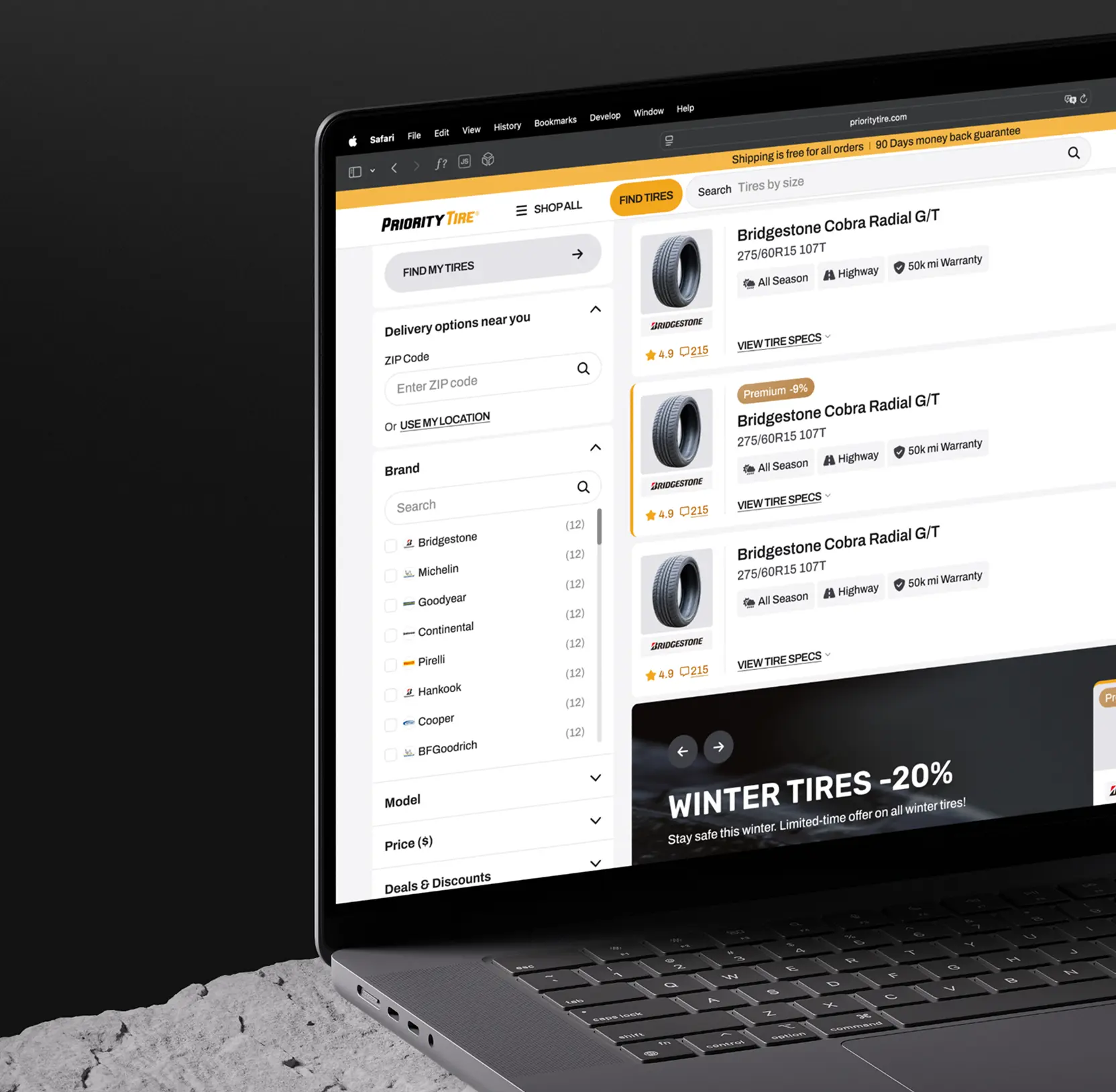
We overhauled all entry points, including the search bar, header navigation, and the Find Tires widget, making them smarter and more intuitive. Features include proactive suggestions, multiple search parameters (size, purpose, product), and a mobile-optimized streamlined flow. The Find Tires tool was restructured to prioritize vehicle selection, simplifying the process for non-expert users.

Ready to rule your industry? 11 website redesign companies to get you there

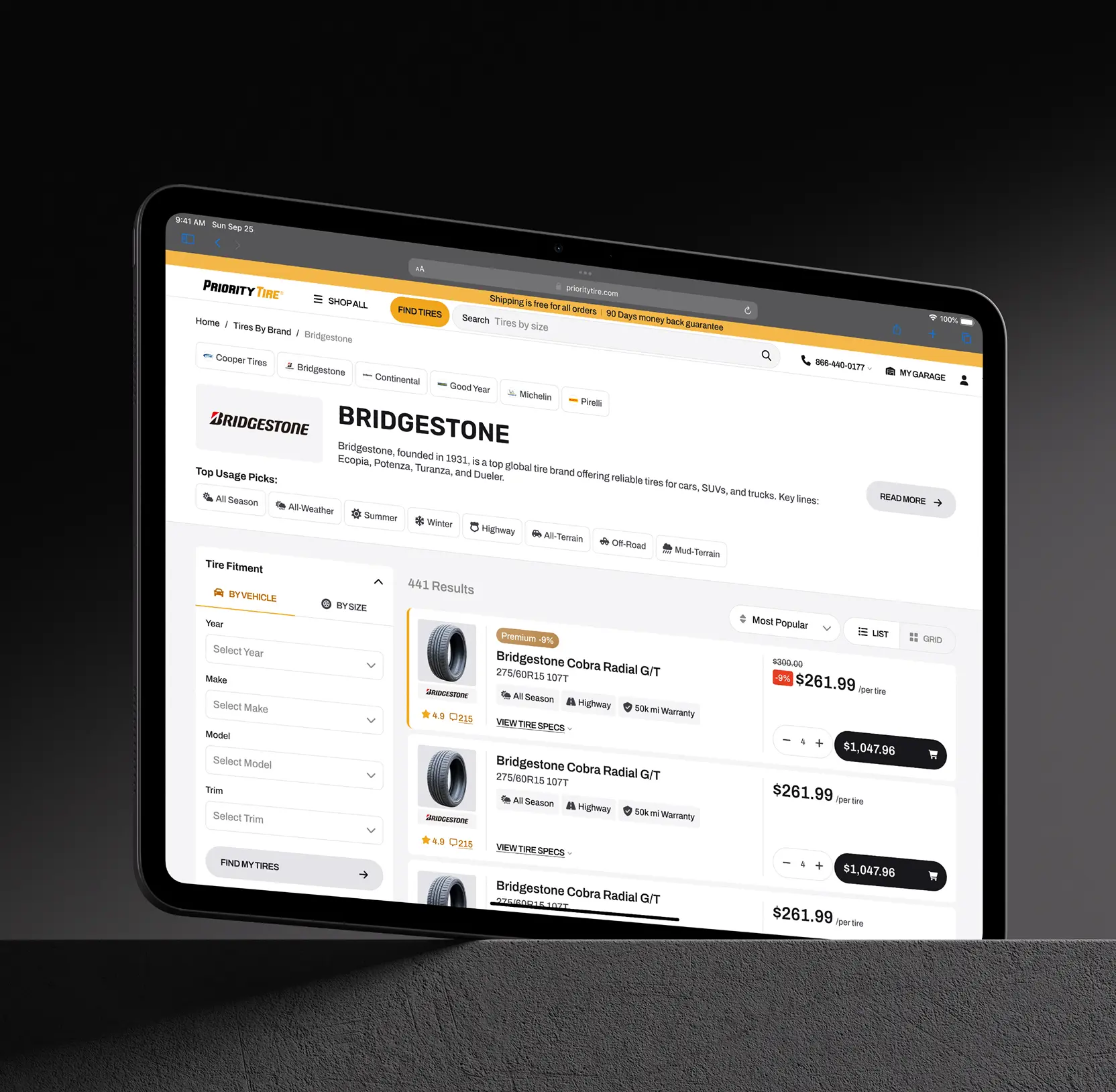
Elevated product catalog to facilitate confident choices
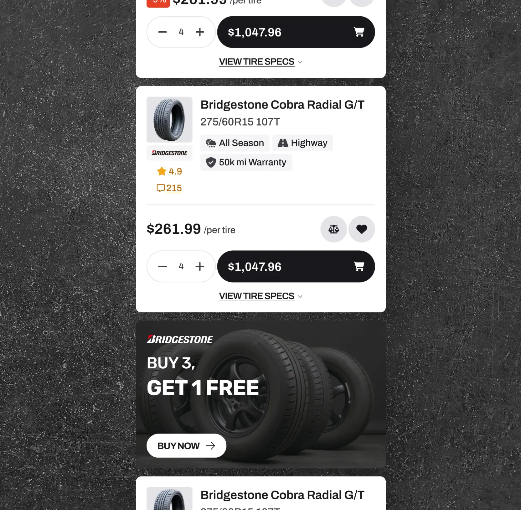
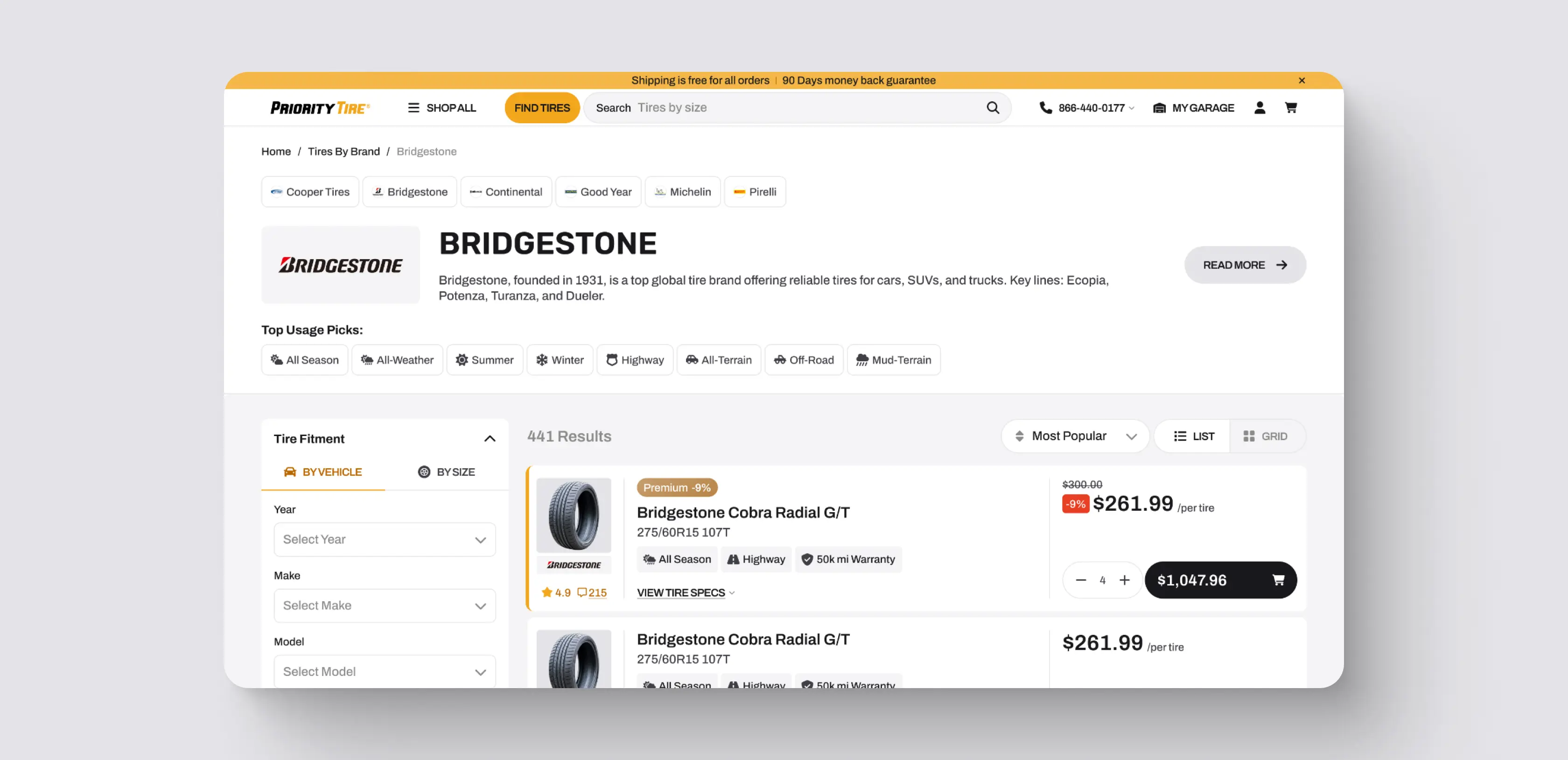
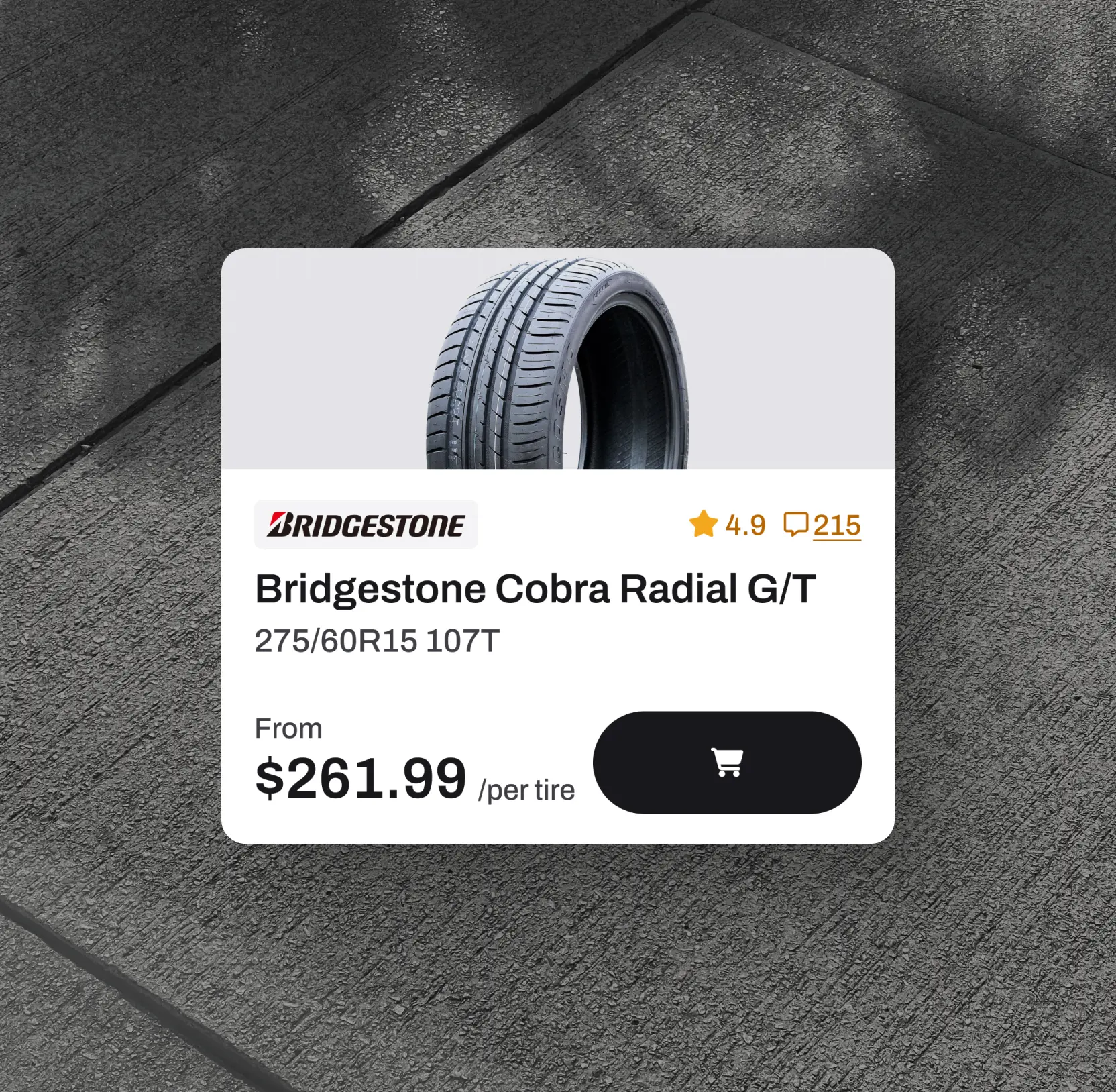
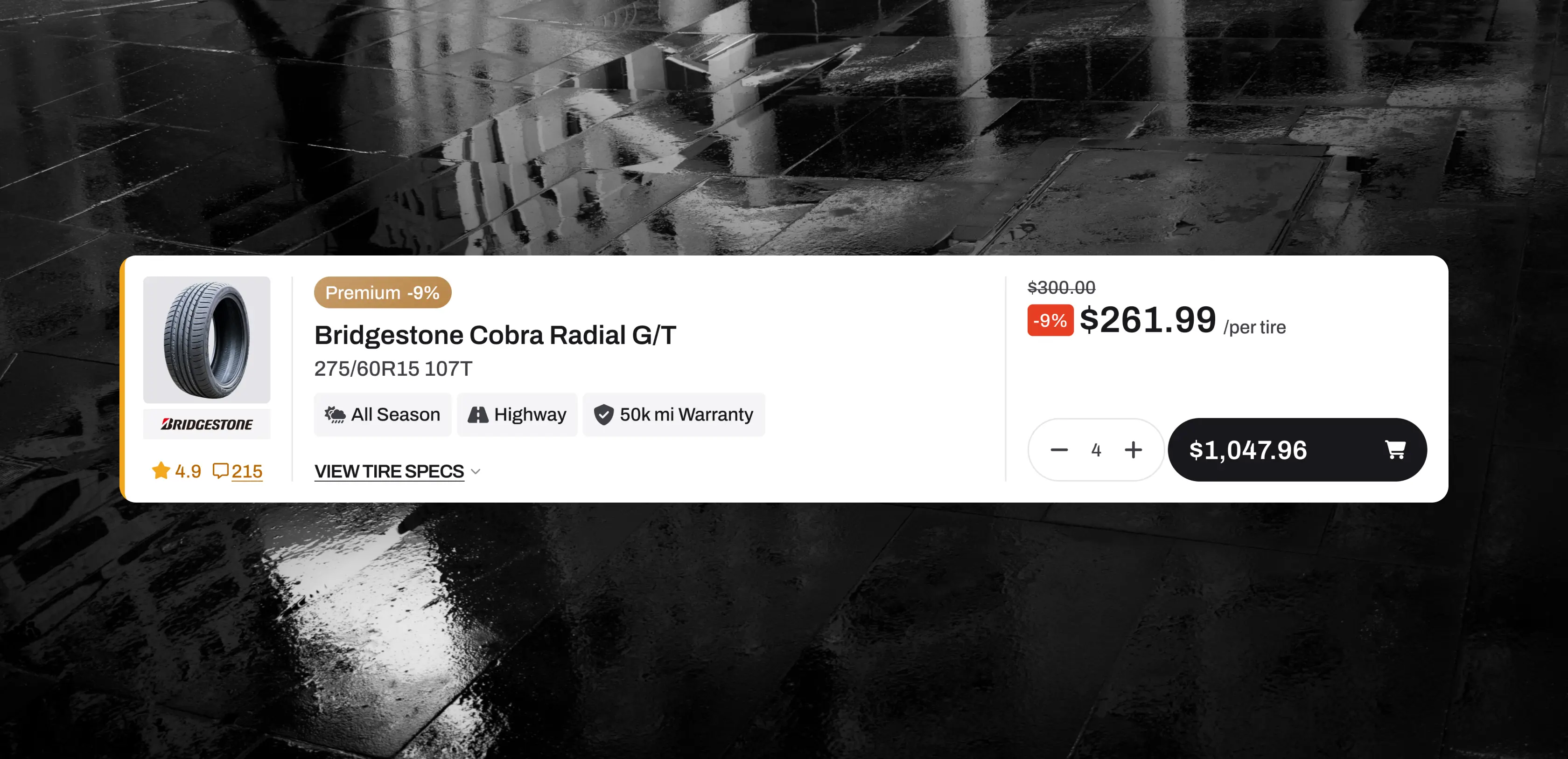
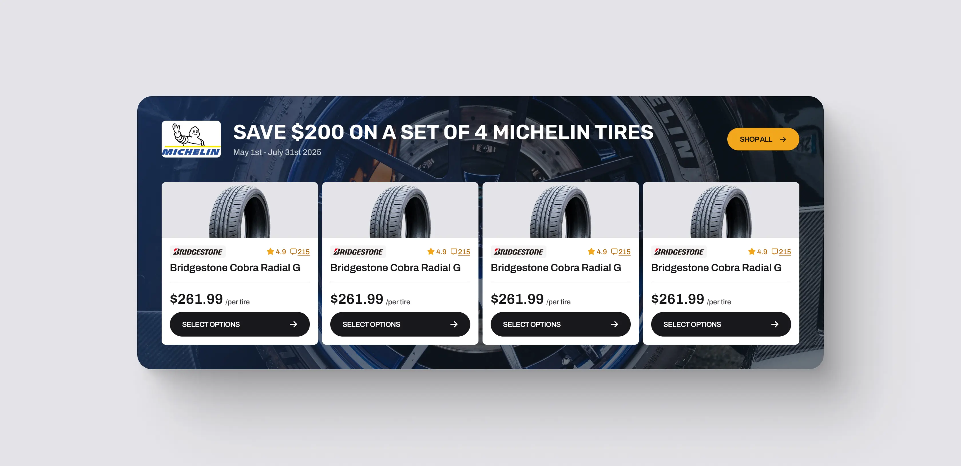
The catalog pages were transformed into dynamic, user-centric spaces. We introduced horizontal navigation, related categories, and tailored suggestions to assist users in narrowing options efficiently. Product cards now highlight key attributes like seasonality, warranty, and purpose, with a cleaner layout that minimizes visual clutter. Filters were optimized to emphasize the most relevant options, including rating-based filtering, enhancing decision speed and confidence.
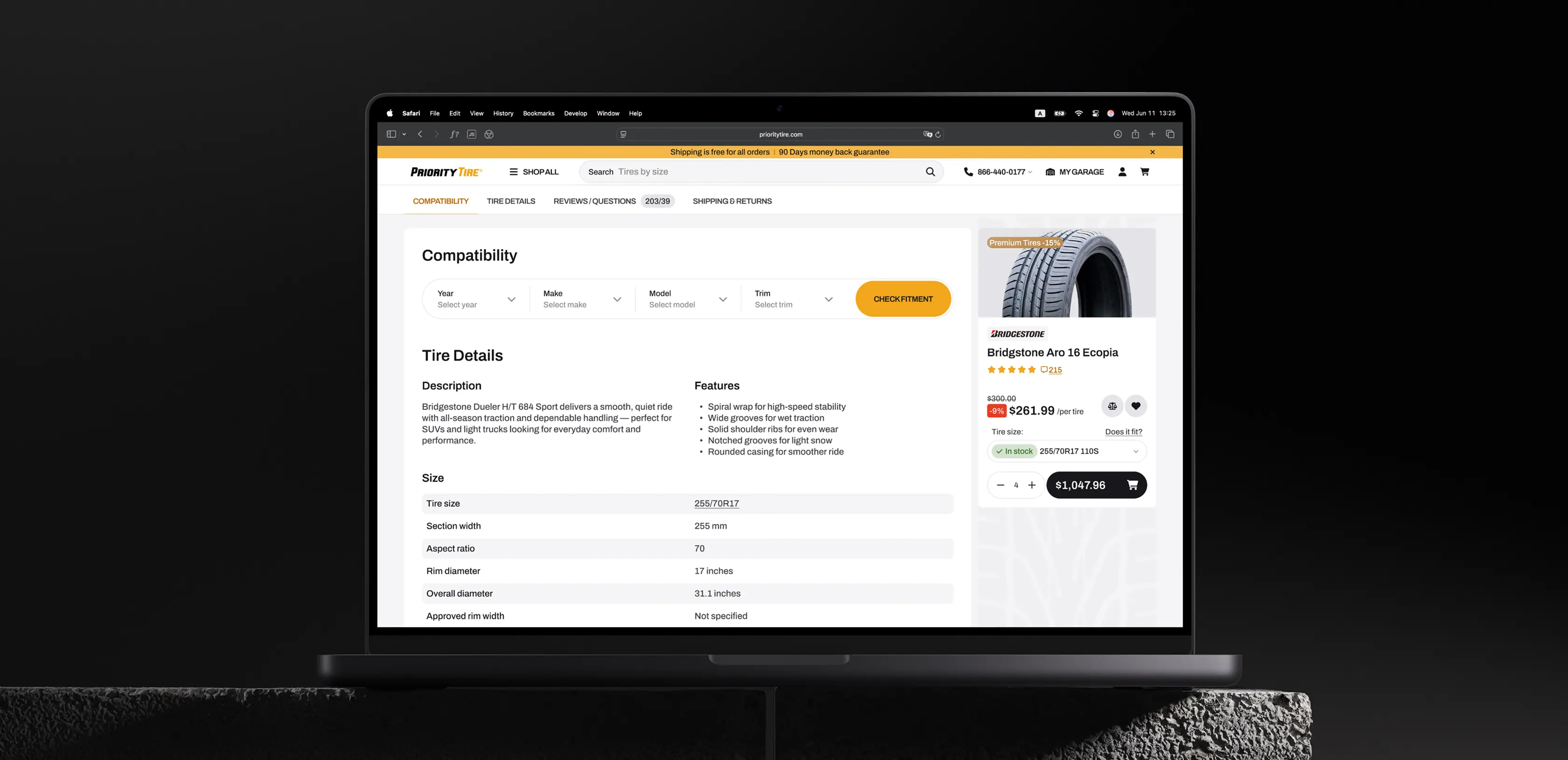
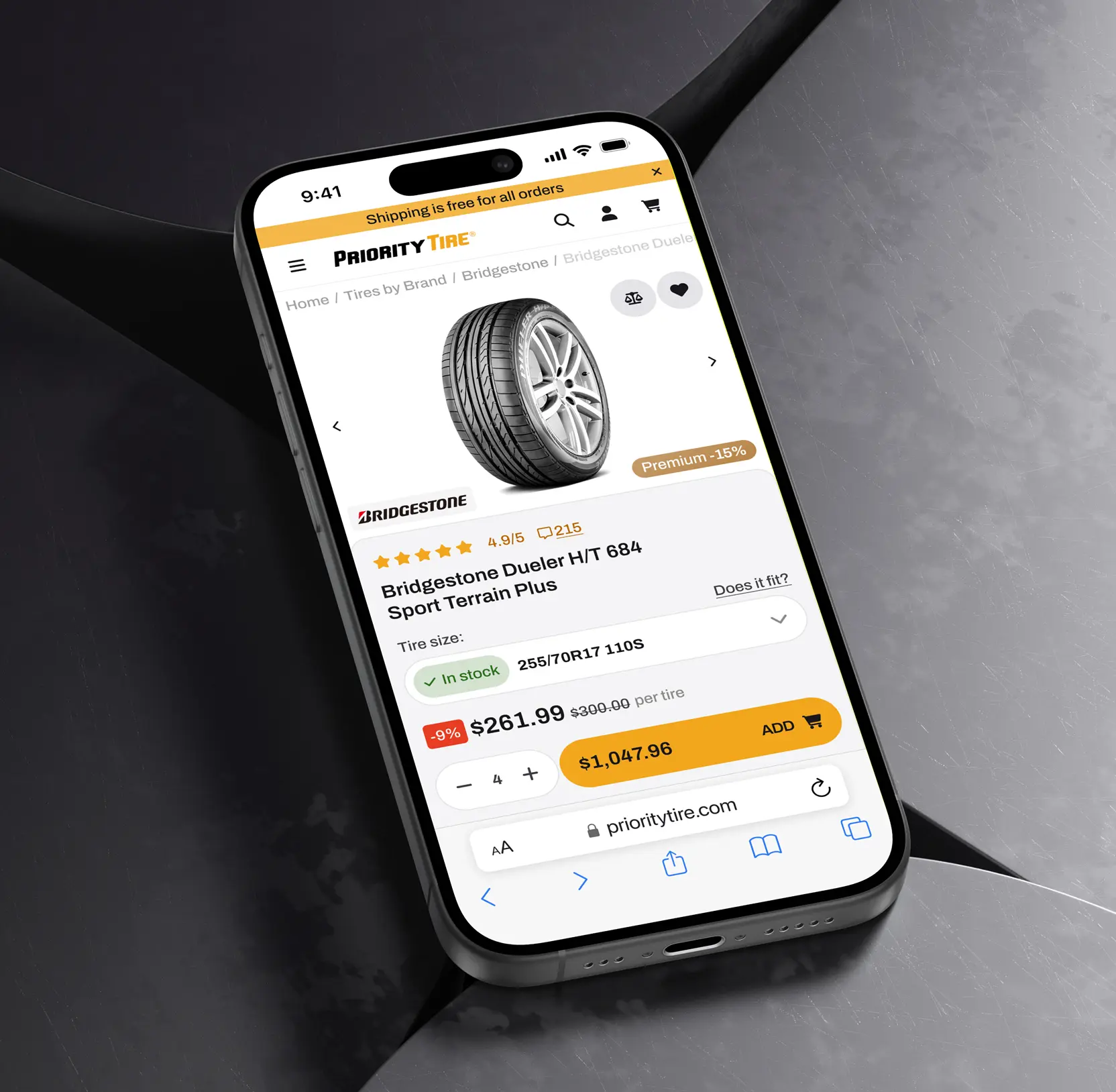
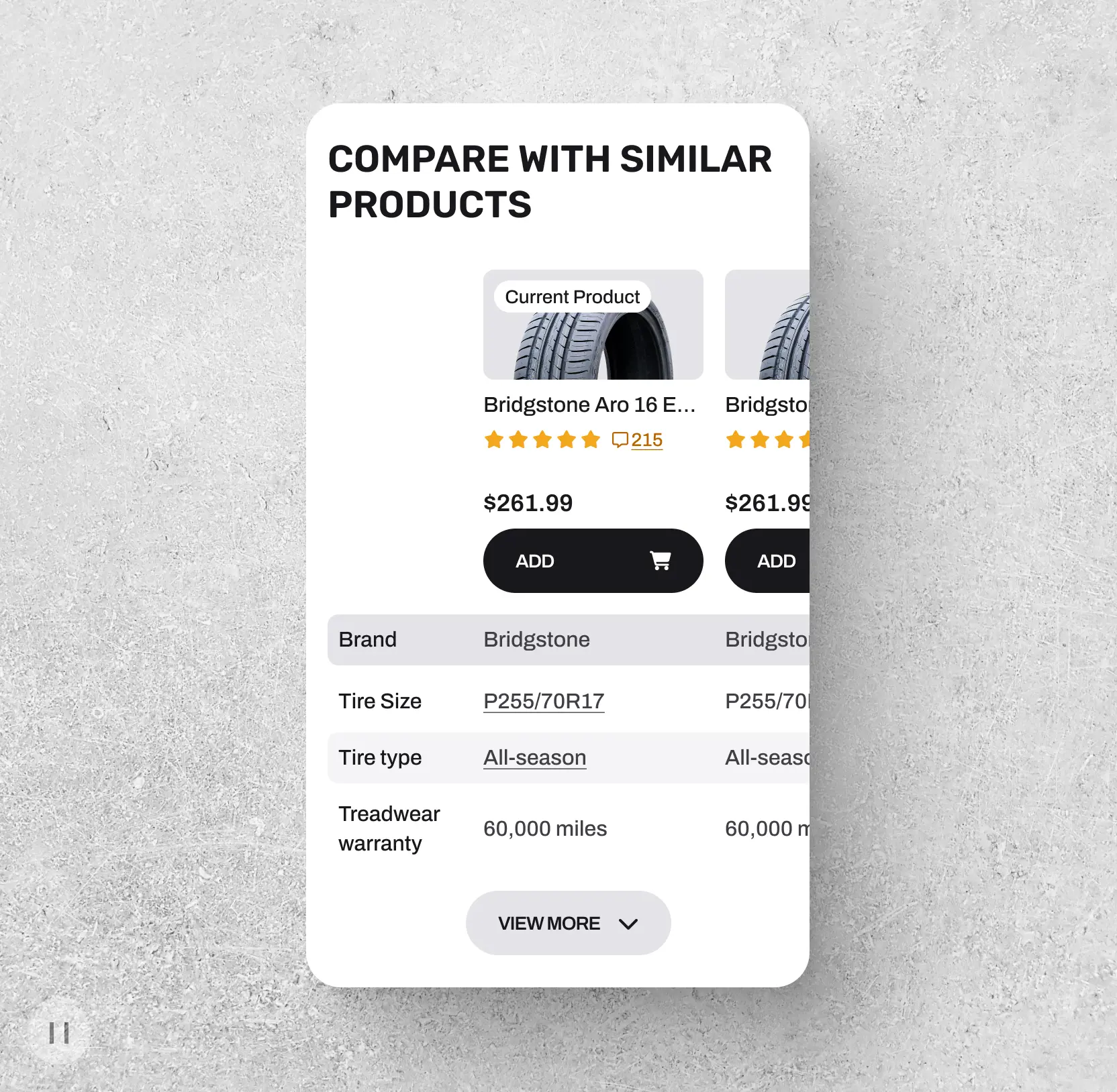
Created product pages that sell
We prioritized critical information on product pages, ensuring clarity for both novices and experts. Additional features, such as recommended accessories and comparison tables, were integrated directly into the product interface to encourage exploration and facilitate upselling. This comprehensive approach increased user engagement and improved conversion potential.
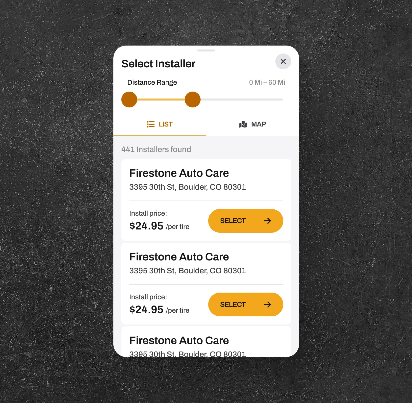
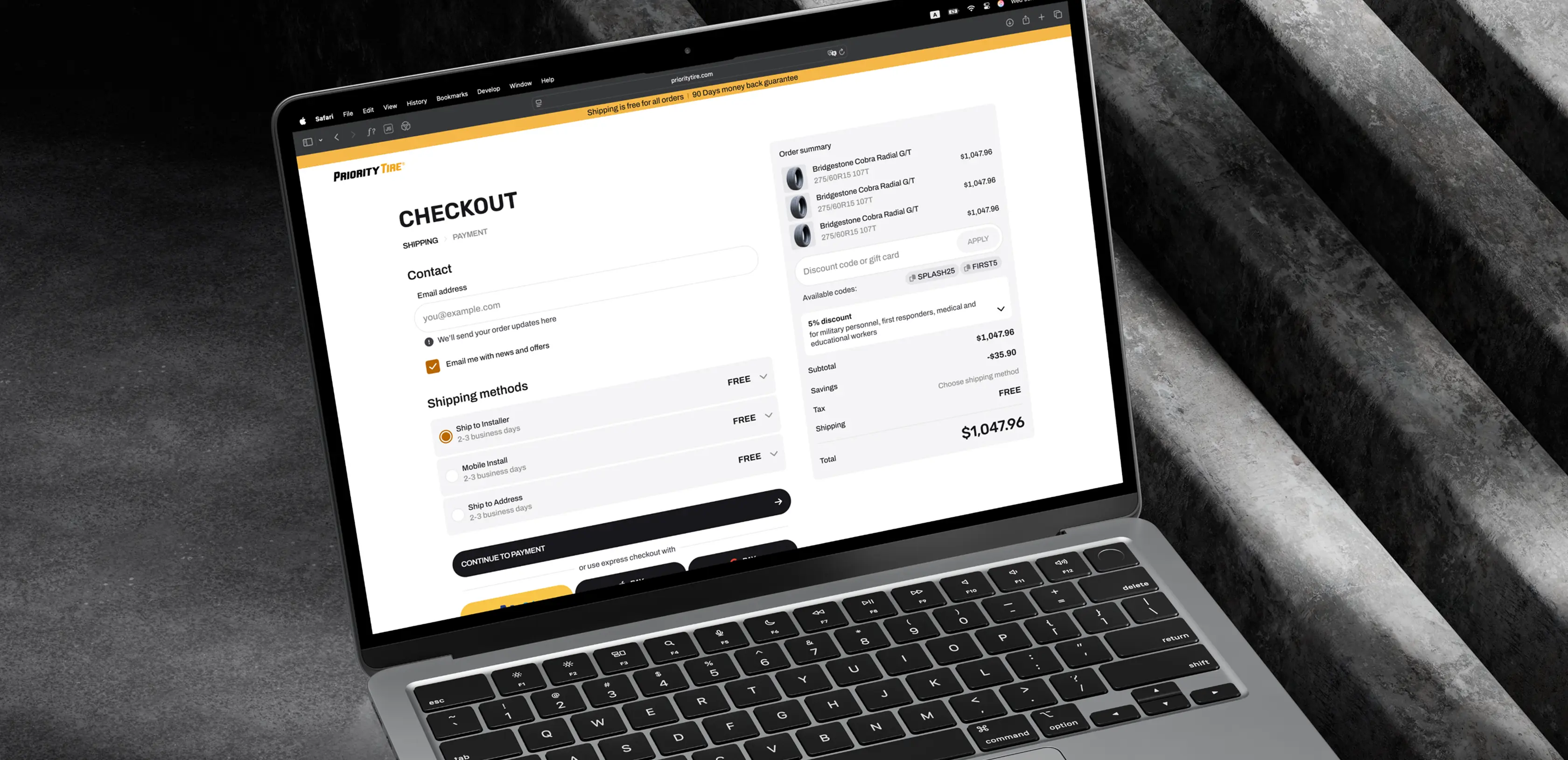
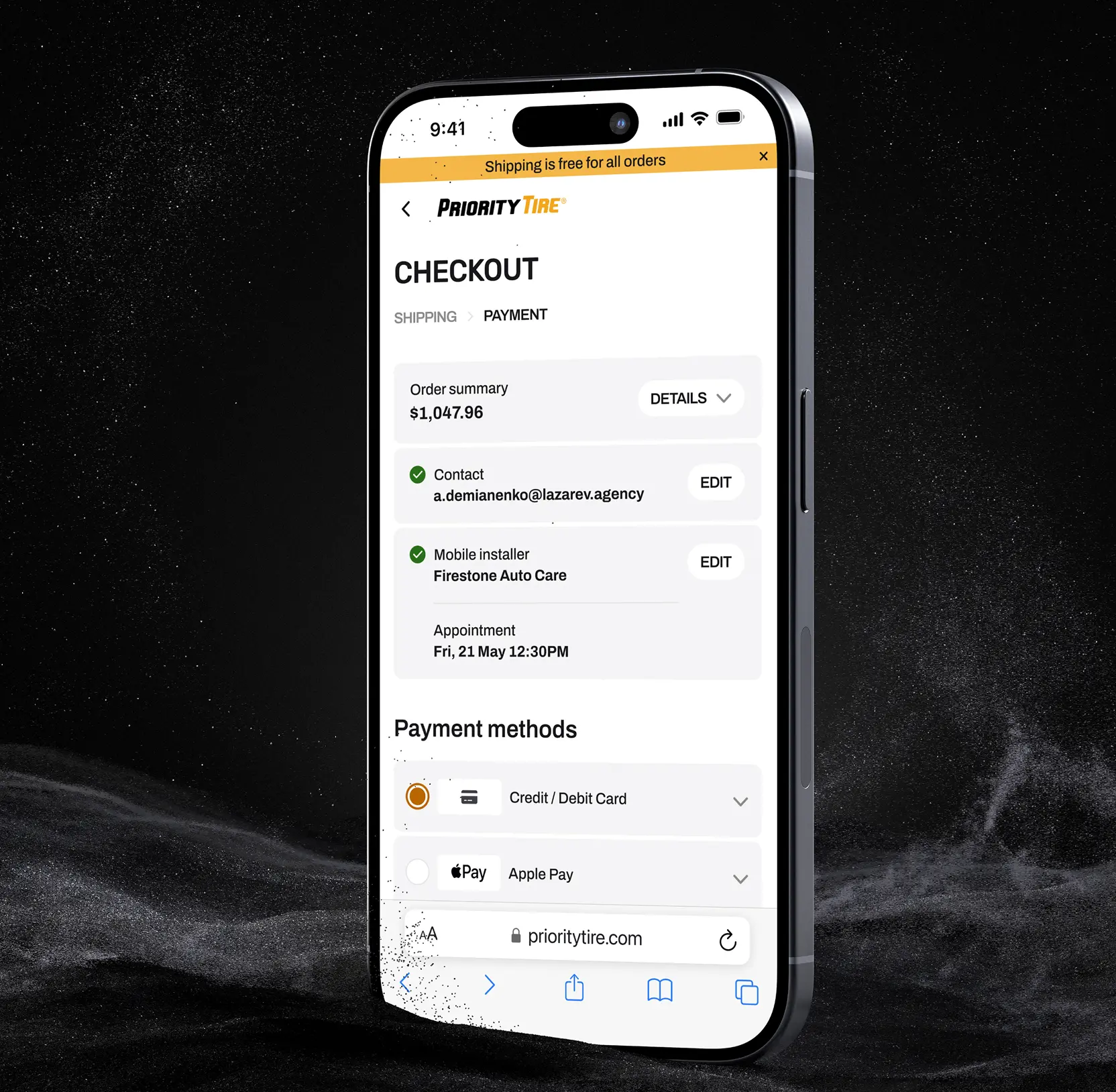
Optimized checkout process focused on delivery clarity
Recognizing the importance of delivery options, we designed a flexible, transparent checkout flow. Users can select from multiple delivery methods ship to installer, mobile installer, or home delivery with minimal steps. Delivery options are prominently displayed early in the process. Promo codes are easily accessible, and multiple payment and express checkout methods are available to expedite transactions, reducing cart abandonment.
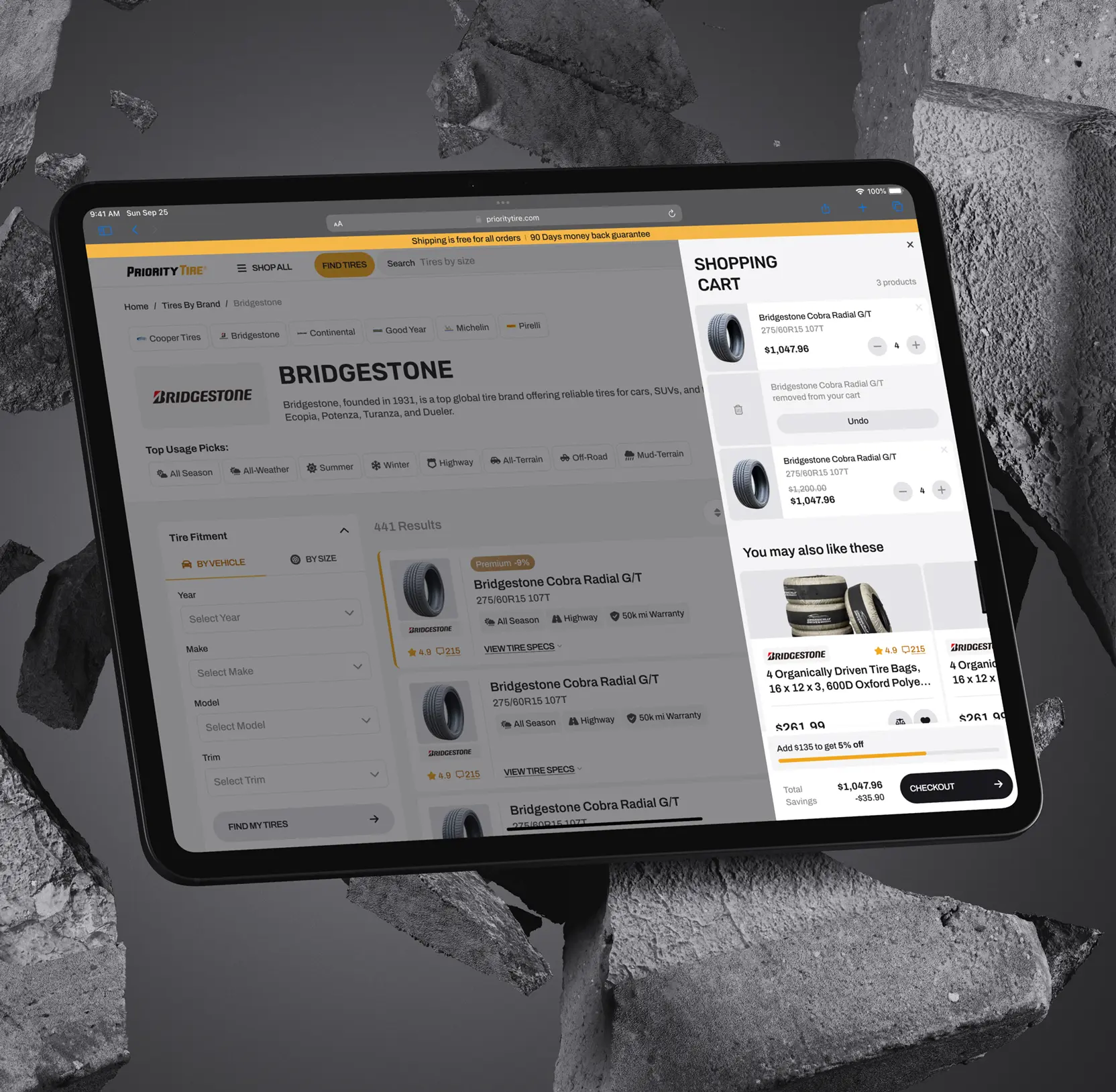

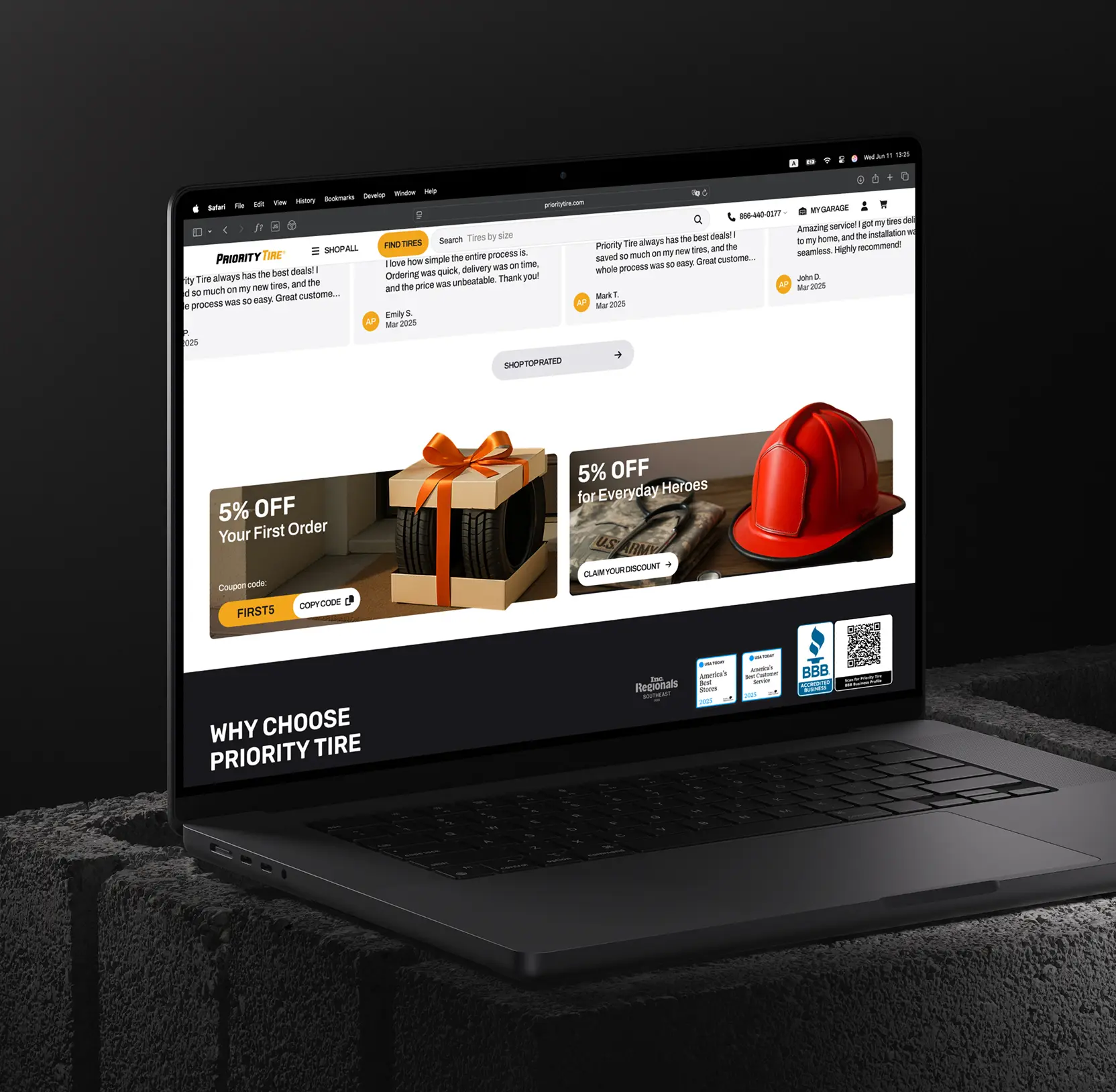
Developed a design focused on conversion enhancements
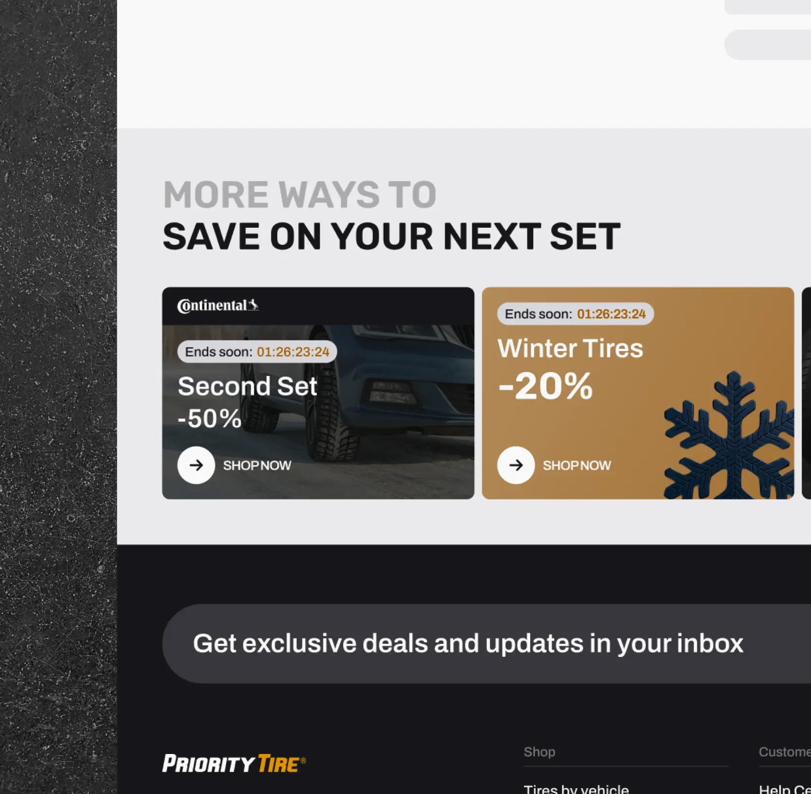
Throughout the platform, we embedded strategic elements to boost conversions such as guiding users from empty states with relevant offers and helpful widgets. Interactive banners with 3D effects and real product previews make promotions engaging and actionable. These enhancements ensure continuous user engagement and facilitate smooth progression through the sales funnel.

AI & ML
Lazarev. agency offers comprehensive digital design services. Discover our range of related expertise supported by impactful case studies.
More Scaleups Cases

FAQ
How did you improve user experience to increase online conversions for a tire retailer?
We redesigned their website with a modern, clean visual identity, streamlined navigation, and smarter search features. These enhancements made it easier for users, especially non-experts, to find the right tires quickly, leading to an expected 25% increase in conversions through improved product pages, upselling, and smoother checkout.
What strategies were implemented to enhance product discovery for a tire retailer's customers?
We upgraded search tools with proactive suggestions, optimized filters, including rating-based options and restructured navigation to emphasize vehicle selection. These changes boosted product discovery by approximately 20%, helping users find suitable tires faster and with greater confidence.
How did the redesigned search and navigation contribute to easier tire selection?
All entry points, such as the search bar, header navigation, and Find Tires widget, were revamped for intuitiveness. Features like multi-parameter search (size, purpose), mobile optimization, and a vehicle-focused selection flow simplified the process for non-expert users, making their journey seamless.
In what ways were product pages optimized to drive sales and engagement?
Product pages now highlight key attributes like seasonality, warranty, and purpose clearly. Additional elements such as recommended accessories and comparison tables encourage exploration and upselling, resulting in increased user engagement and higher conversion potential.
How was the checkout process improved to reduce cart abandonment?
We designed a transparent, flexible checkout flow with early visibility of delivery options (home, installer, mobile installer). Promo codes are accessible, and multiple payment options, including express checkout, streamline the purchase, making the process faster and more user-friendly.
What conversion-focused design elements were integrated across the platform?
Interactive banners with 3D effects, real product previews, and relevant offers at key user journey points were embedded. These elements engage users actively, guide them through the sales funnel, and promote continuous interaction with the site.
What measurable improvements are expected from the redesign?
The platform anticipates a 25% lift in conversions and a 20% boost in product discovery, driven by smarter search, simplified navigation, optimized product pages, and an engaging checkout experience all tailored to facilitate quick, confident purchasing decisions.


Hit me up! Let’s chat about your growth


