How we transformed a digital marketing platform into a user-centric and trustworthy solution
Project:
the project
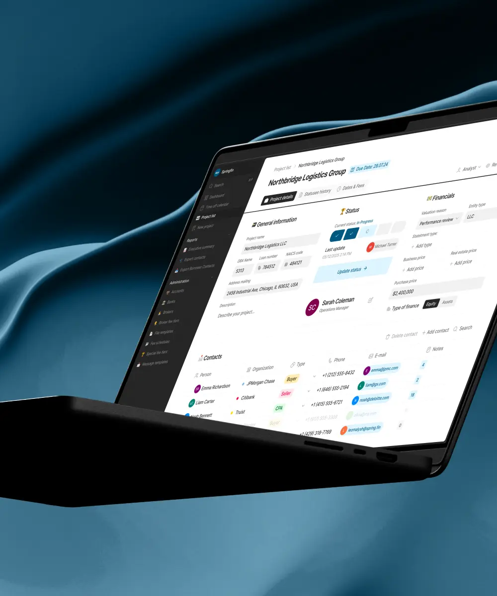
Fractal Protocol, a rapidly growing business in the digital marketing space, faced a challenge: their platform was becoming increasingly dense and complex, making it difficult for users to navigate, trust, and fully utilize its features. Lazarev.agency was engaged to overhaul the platform’s visual language and user experience, aiming to make it clearer, faster, and more approachable without sacrificing the sophistication needed for advanced marketing operations. The goal was to create a modern, scalable design system that builds trust, enhances clarity, and supports the platform’s growth.
Design that delivers measurable impact
Our redesign of Fractal Protocol's platform led to significant improvements in user engagement and decision-making efficiency. By simplifying complex data presentations and enhancing usability, we achieved measurable business outcomes that align with industry benchmarks.
improvement in usability
boost in user satisfaction
The Project’s
Discovery Phase
Built a new visual system tailored to data-heavy content
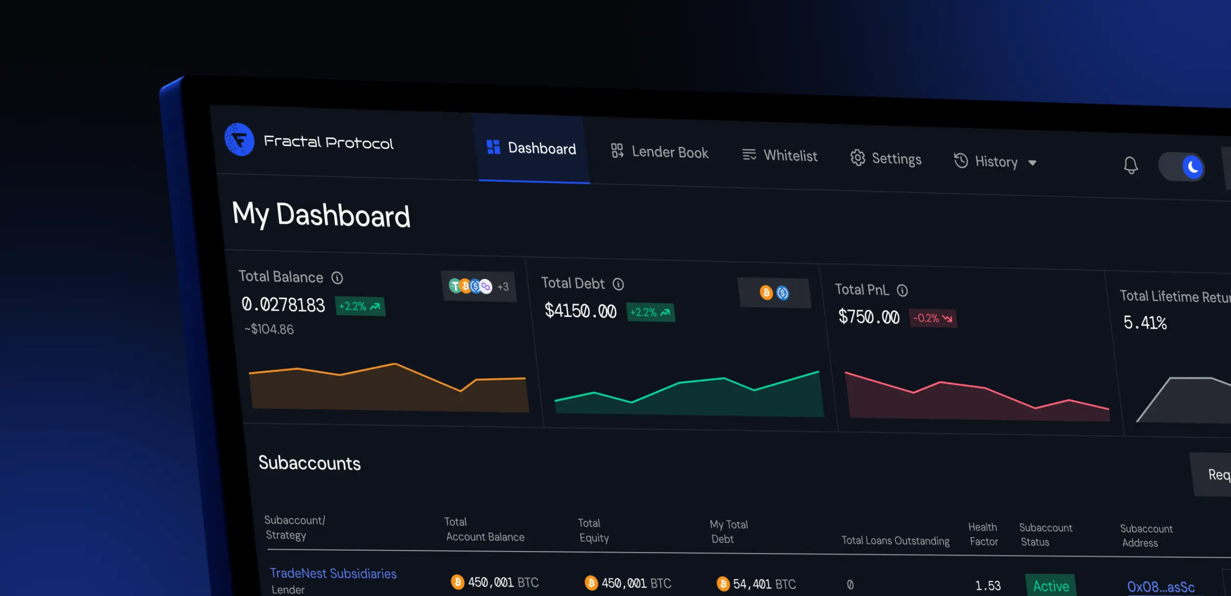
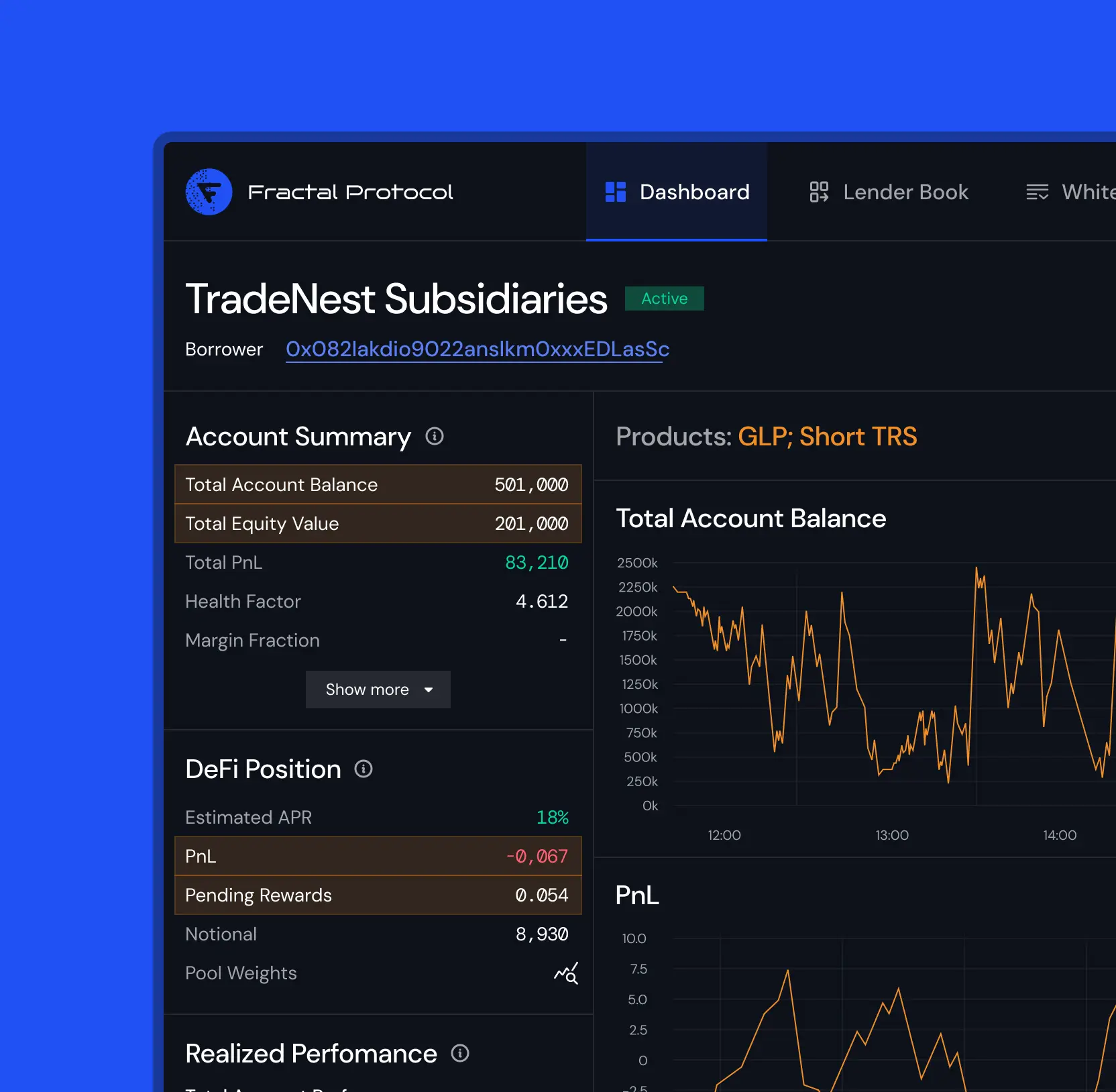
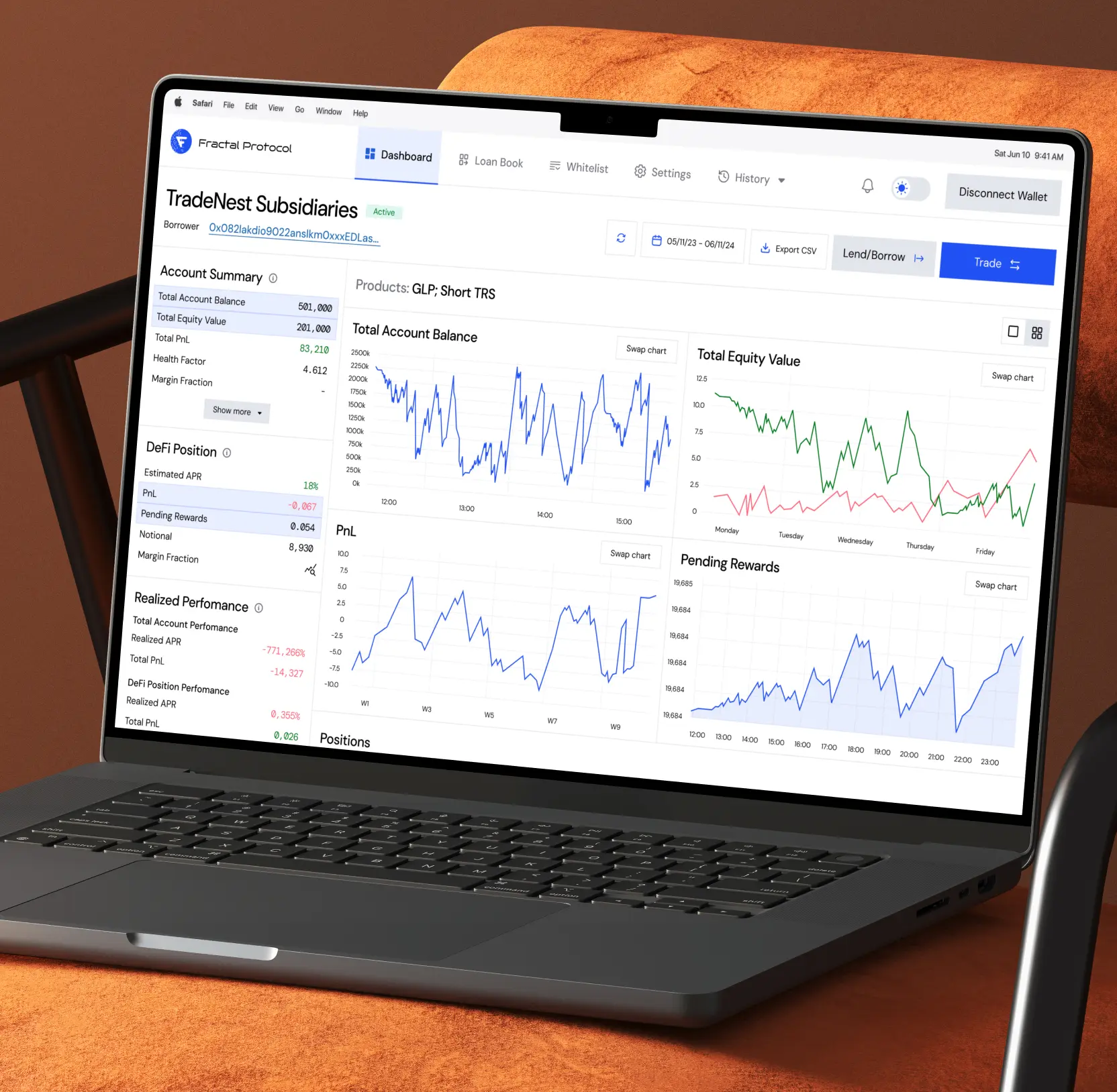
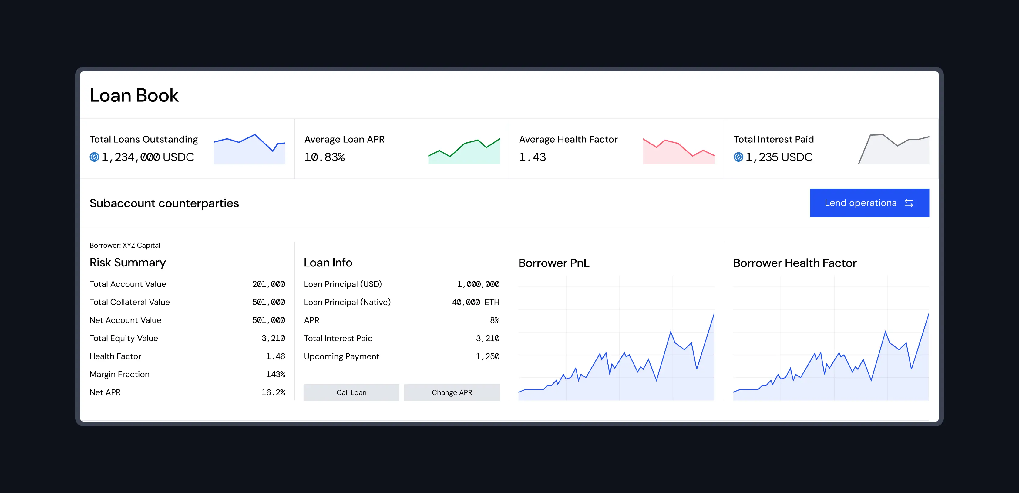
We started by analyzing the existing platform to identify pain points in data presentation and user flow. Our team then restructured the information architecture, breaking down dense dashboards into digestible sections.
We prioritized intuitive navigation and context-aware layouts, ensuring users could access high-level insights or drill down into granular data seamlessly. This restructuring not only improved clarity but also accelerated decision-making processes, empowering users with faster access to critical metrics.


Developed a modern visual system supporting flexibility and scalability
To elevate the platform’s visual identity, we crafted a comprehensive design system that balanced professionalism with approachability. The system features a clean, modern aesthetic with a flexible grid, a refined color palette, and consistent typography that adapts effortlessly across various modules.
We designed components that work in both dark and light modes, ensuring readability and comfort regardless of user environment. This visual system supports complex data visualizations: charts, tables, and metrics, making them easier to interpret and interact with, fostering trust and confidence in data-driven decisions.

Customer experience design in the age of AI UX

Validated design decisions through real user testing
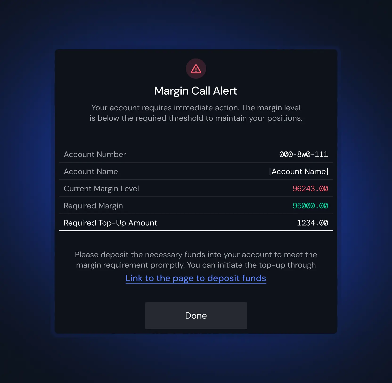
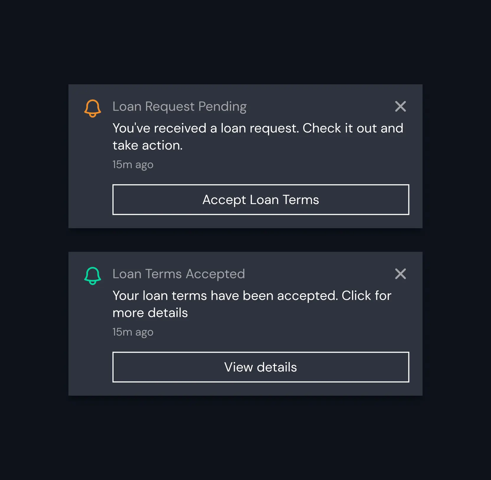
Understanding that trust and usability are paramount, we conducted extensive testing with actual users: digital marketing professionals and business owners. We observed how they interacted with the redesigned platform, focusing on ease of navigation, clarity of data, and overall confidence in executing tasks.
Based on insights gathered, we refined key elements: we enhanced visual cues for important statuses, added contextual tooltips for complex metrics, and simplified interactions around critical actions like campaign adjustments and report exports. This iterative validation ensured that the platform was truly user-centered and adoption-ready.


AI & ML
Lazarev. agency offers comprehensive digital design services. Discover our range of related expertise supported by impactful case studies.
More Scaleups Cases
FAQ
How did you approach restructuring the platform’s data and interface?
We analyzed the existing platform to identify pain points, then redesigned the information architecture by breaking down dense dashboards into digestible sections. We prioritized intuitive navigation and context-aware layouts to improve clarity and decision-making speed.
What was the focus when developing the new visual system?
The visual system was designed to be modern, flexible, and scalable, balancing professionalism with approachability. It features a clean aesthetic, adaptable components for dark and light modes, and supports complex data visualizations to foster trust and ease of interpretation.
How was user feedback incorporated into the redesign process?
We conducted extensive testing with real users: digital marketing professionals and business owners to observe interactions and gather insights. Based on this feedback, we refined visual cues, added contextual tooltips, and simplified interactions to improve usability and confidence.
What is the significance of the dual-theme design?
We developed both light and dark themes to accommodate user preferences and environmental lighting conditions. The themes are cohesively designed, ensuring visual comfort and accessibility, encouraging longer engagement and a better user experience.
What benefits did the platform’s redesign bring to its users?
Users experienced improved clarity, faster access to critical data, enhanced trust in data accuracy, and a more approachable interface. Overall, the platform became more user-centric, scalable, and ready for future growth.
How does this transformation support the platform’s long-term scalability?
By creating a modern, flexible design system and a clear information architecture, the platform can easily adapt to new features and data complexities, ensuring sustained usability and trust as the platform evolves.


Hit me up! Let’s chat about your growth


