.avif)
Modern product teams live and die by growth dashboards, yet even the smartest founders still hit the same wall: users bail when navigation feels vague, data feels dense, or onboarding feels like homework.
That’s because “good enough” UX no longer cuts it.
Below, we unpack some best UX design examples that prove 2 important things:
- Even household-name products keep reinventing core flows to stay relevant.
- A focused agency can deliver even deeper wins for niche B2B platforms.
Founders, product managers, and design leads looking for practical inspiration — buckle up.
Key takeaways
- Big brands validate that investing in UX still moves the needle even after product-market fit.
- Structured data, personalized onboarding, workflow unification, and narrative storytelling are four repeatable levers you can apply today.
- Each Lazarev.agency’s case shows how the same principle scales to finance, ed-tech, climate tech, and legal AI.
- Action step: save the pairing that matches your roadmap and share it at your next sprint-planning session.
Why strategic UX is still revenue lever in 2025
McKinsey tracked 300 public companies for five years and found that top-quartile design performers grew revenue 32% faster than their peers, with a 56-point edge in total shareholder return.
Meanwhile, Nielsen’s 2024 global marketing survey shows that 72% of CMOs plan bigger digital budgets this year, yet 38% admit they still can’t measure cross-channel ROI — a gap first-rate UX products can close by turning attention into action.
With that in mind, let’s examine four best experience design examples from market leaders and see how the same principles power Lazarev.agency's data-heavy products!
Turn “too much data” into discovery
Airbnb “Categories” + “Split Stays”
Before the update, remote-work travelers typed a city into Airbnb, scrolled endless cards, and abandoned when overwhelming users with choices spiked cognitive load. CEO Brian Chesky also faced criticism for overtourism concentrated in a few hot spots.
Airbnb introduced 50+ curated Categories (Design, OMG!, Countryside, etc.) plus an algorithmic split-stay flow that pairs two homes for trips ≥ 7 nights. The redesign surfaces around 40% more listings in a single search while keeping a clear visual hierarchy that guides the user journey from discovery to booking.
.avif)
For product teams, this is a prime example of reducing choice paralysis with smart grouping and contextual CTAs instead of extra UI features.
Quantillium financial-data portal
Before the redesign, Quantillium’s unified filings API dropped raw SEC data on users with little guidance — overwhelming developers and analysts. Lazarev.agency transformed it into a discovery-driven product portal: structured sections, clear “Get Started” and “Explore Docs” paths, and role-based storytelling that shows value from the first screen.
.avif)
A new visual identity — dark theme, deep blue palette, and 3D “Q” motifs — turned dry datasets into a narrative of global transparency. Motion cues guided attention, while mobile-optimized 3D kept the experience consistent on every device.
Impact: +32% session duration, +18% API-doc visits, and +30% accessibility across key product areas.
Design thinking takeaway: turn dense data into clarity with hierarchy, narrative, and identity because even the most technical products win when complexity feels human.
Clarity before onboarding without overwhelming users
Notion’s checklist wizard
The blank-page problem — new users landed in an empty workspace, unsure how to start, hurting early user engagement.
Notion split onboarding into three tracks: Personal, School, Team. Each driven by a checklist that seeds relevant templates and shows progress bars. A 2025 UX audit measured ≈ 50 seconds to first meaningful action for personal accounts, slashing time-to-value and boosting customer retention.
.avif)
Key takeaway: granular user research plus role-specific defaults create a user-friendly interface that motivates users without adding technical jargon.
HiTA AI landing redesign + research strategy
HiTA AI is an AI-powered learning assistant that helps students solve problems with hints, not answers but unclear messaging stalled growth. We, as a top AI product design agency, redesigned the landing into a scenario-driven portal split by audience (“For Educators,” “For EdTech & Research”), each showing concrete benefits like 3× faster learning and 70% less admin work
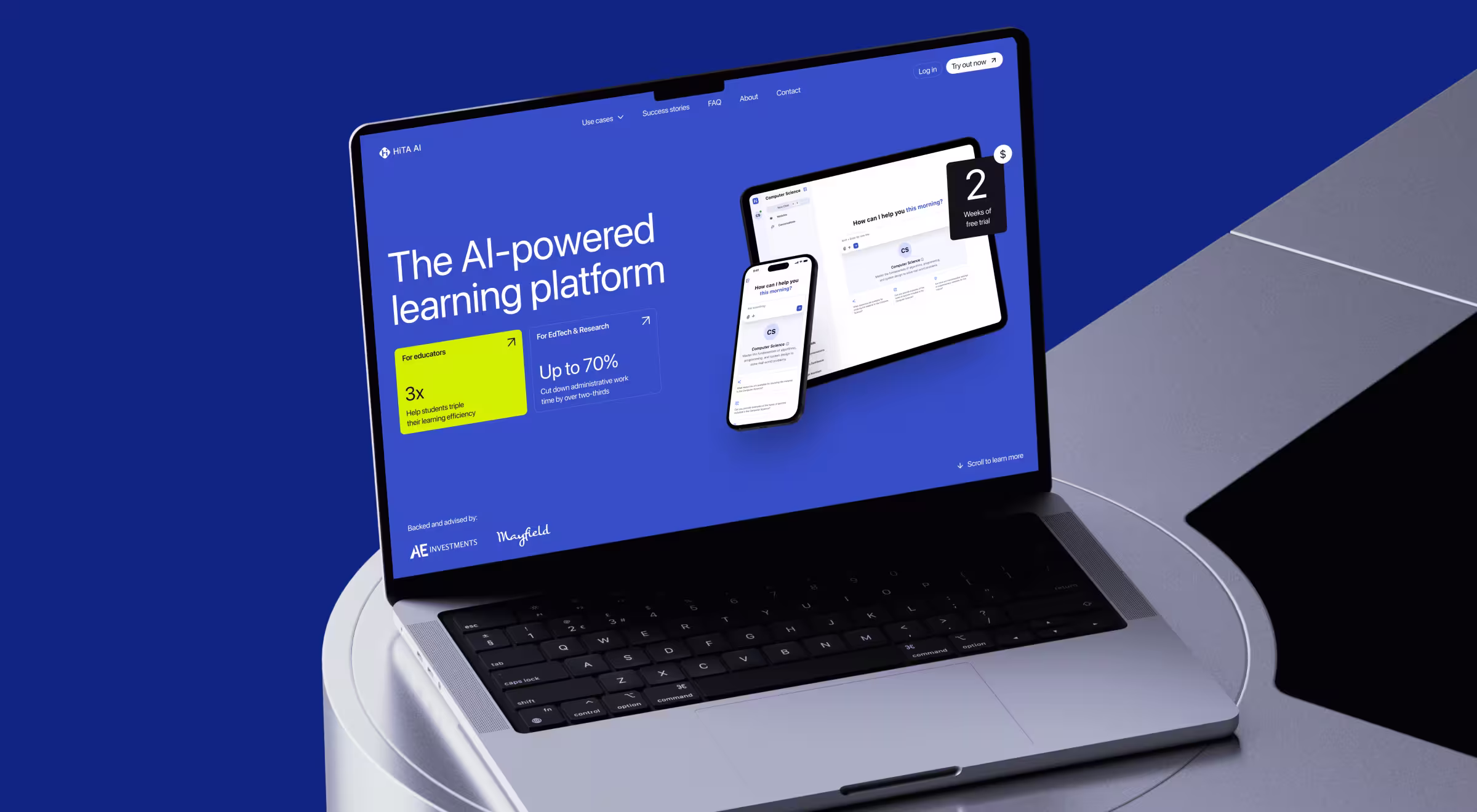
We embedded an AI Assistant directly on the page, letting visitors ask questions as they explored, turning the site itself into proof of value. Alongside, we built a research strategy that mapped user needs, validated problems, and gave the team a focused roadmap for sustainable expansion.
Result: community grew to 2,000+ educators and students, with a clear product story and a strategy that balances short-term adoption with long-term mission.
Lesson: product clarity means role-specific flows, evidence-led benefits, and interactive proof that earns user trust before onboarding even begins.
💡 Pro tip: Before you personalize onboarding, make the value obvious and the trial path effortless; clarity earns the right to optimize first-run flows later. Use micro-copy and user-friendly interface hints (“Allowing users to ask anything”) to reduce hesitation and motivate users through first-run friction.
Give power users a single control center
Slack sidebar overhaul
Enterprise Grid customers juggled multiple workspaces, DMs, and later-lists, eroding focus and user control.
Slack shipped a far-left nav with six icon tabs (Home, DMs, Activity, Later, More, Create) and let power-users pin or hide sections. The update bundles channels from every workspace into one mobile-apps-ready view, trimming context-switching and helping many users spot priorities faster.
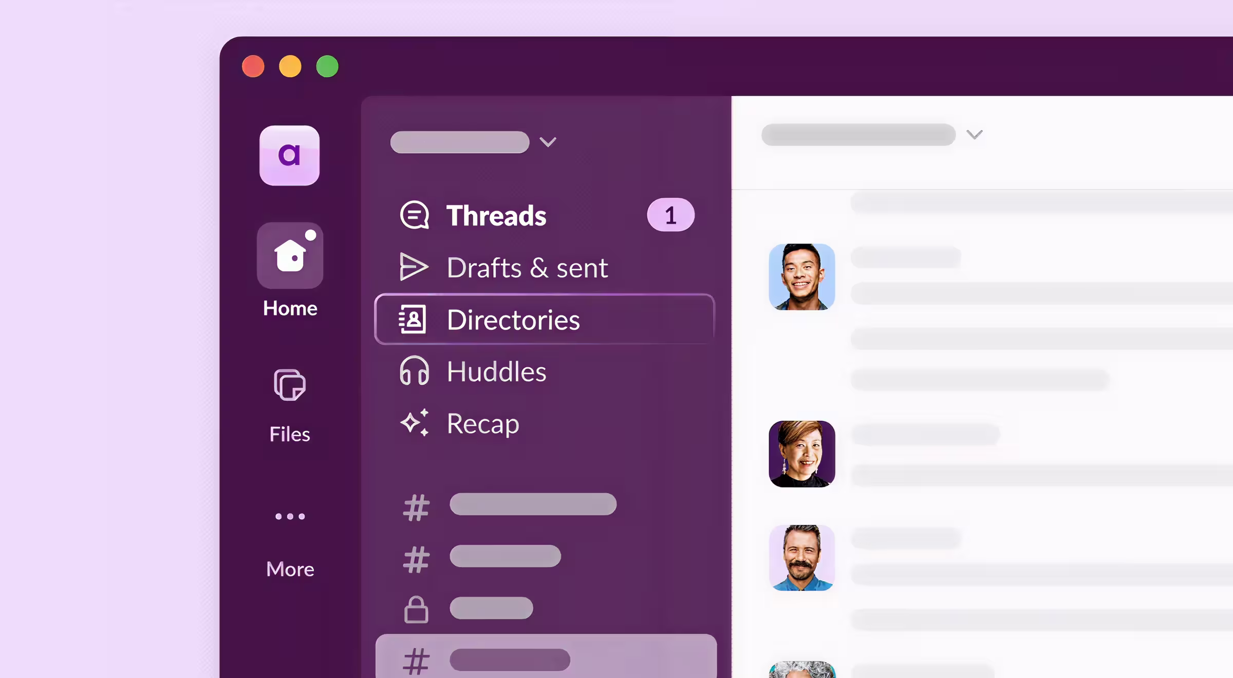
Lesson to learn: merge high-frequency tasks first; advanced UI features can follow once users manage the core flow with less friction
SolarDrive renewable-energy CRM
Before Lazarev.agency, SolarDrive juggled five disconnected tools. We:
- Merged lead gen, permitting, and crew chat into one dashboard.
- Added task boards, search bar filtering, and timeline views to cut cognitive load.
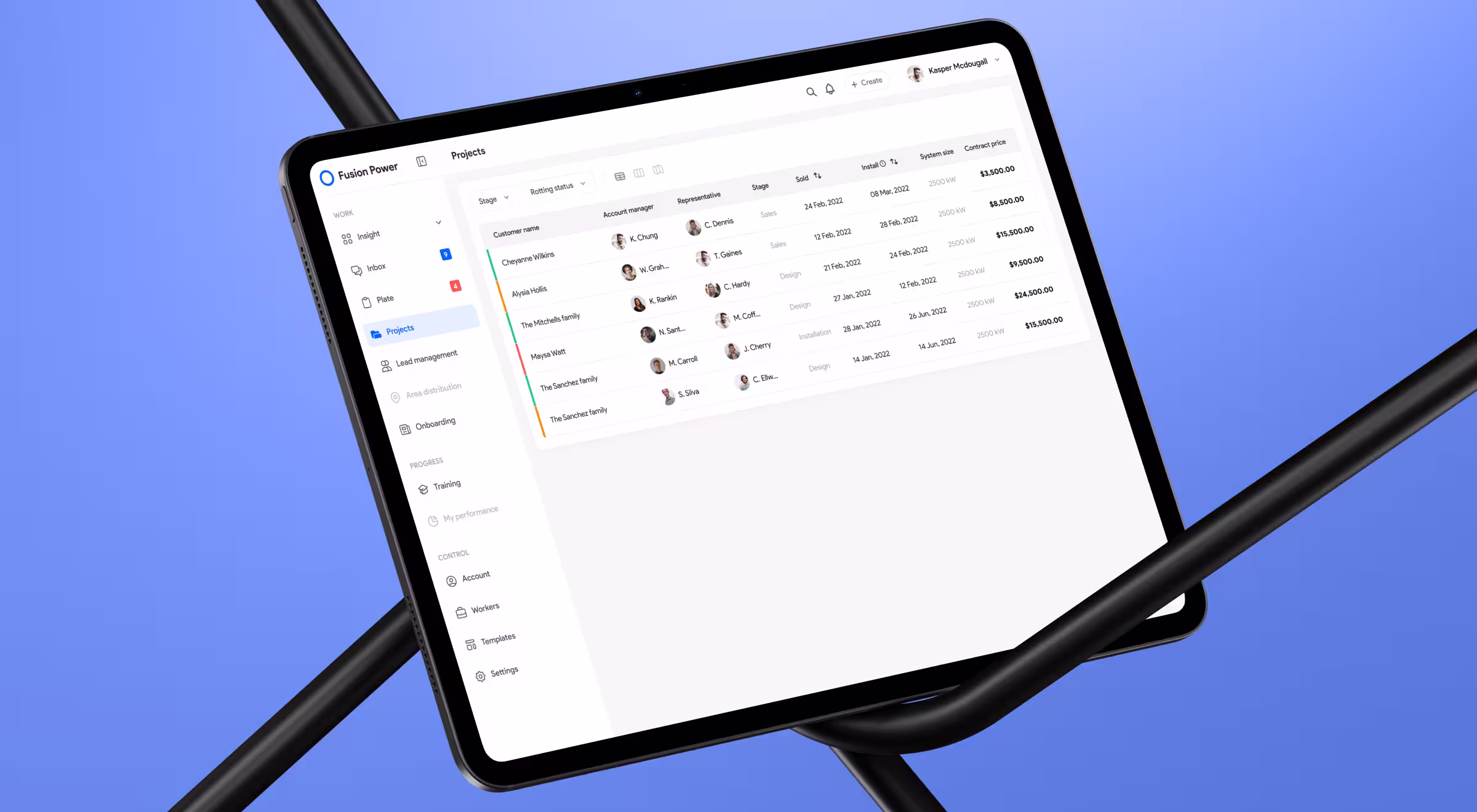
Outcome: 2× clients served per day and 2.4 h saved daily on hand-offs.
Great UX design example of how users manage multistep projects when information, messaging, and docs live in one place.
Package niche expertise like a data story
Spotify Wrapped
The engagement challenge — streaming apps fight churn when playlists feel static.
Wrapped 2024 layered monthly “music evolution” cards, an AI-generated podcast recap, and share-optimized slides that dominated social feeds each December. Spotify calls it a record-breaking, culture-making year for fan sharing.
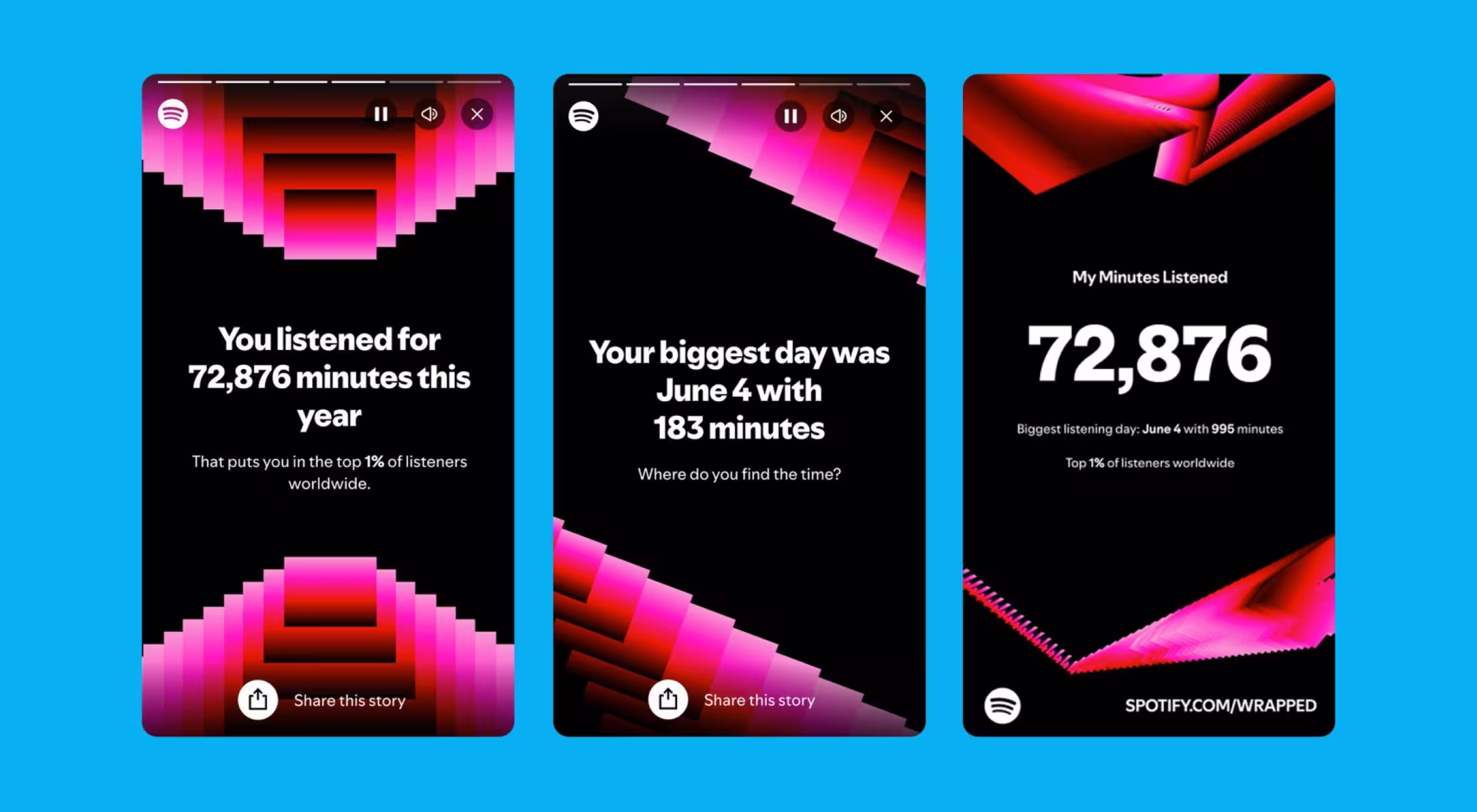
By turning raw stats into narrative visual elements, Spotify shows how data storytelling can motivate users, spark virality, and keep potential customers talking long after the in-app session ends.
Result: 120 million users loaded their first slide in 640 ms on average (1.3 s on 3G), and Wrapped shares on social rose by 19%.
DragonGC legal-tech platform
Fortune-1000 counsels fear disclosure missteps. Lazarev.agency reframed dry filings into “authoritative intelligence” for DragonGC:
- Unified 500+ disclosure topics and AI-curated benchmarking inside one branded design system.
- Redesigned About & Blog pages to bolster transparency and customer retention.
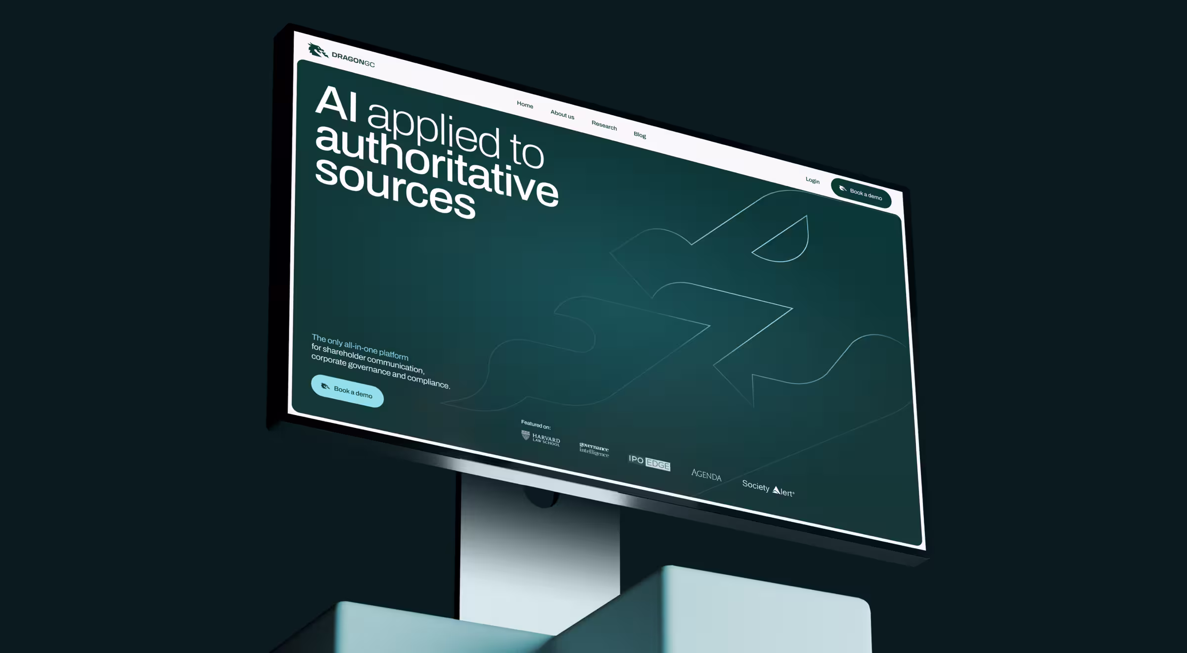
Result: a visually appealing resource hub that turns regulatory sprawl into snackable insights — “Wrapped” for compliance.
UX/UI design examples takeaways for product leaders
🔎 Want to see how data hierarchies drive real revenue? Check our deep-dive on data-driven UX for complex B2B tools!
Turn your UX design ideas into actionable steps
Exceptional UX goes well beyond headline consumer brands. When clarity, speed, and trust translate into deliberate interface patterns, even niche products rise to the top of their category.
Ready to see how your roadmap could benefit from a principle-driven overhaul? Let’s talk!
Future-proof your product with product redesign services AI UX design agency and unlock measurable business growth.


.webp)


.avif)