How we helped a new streaming aggregator build a bold identity and stand out in a crowded market
Project:

the project
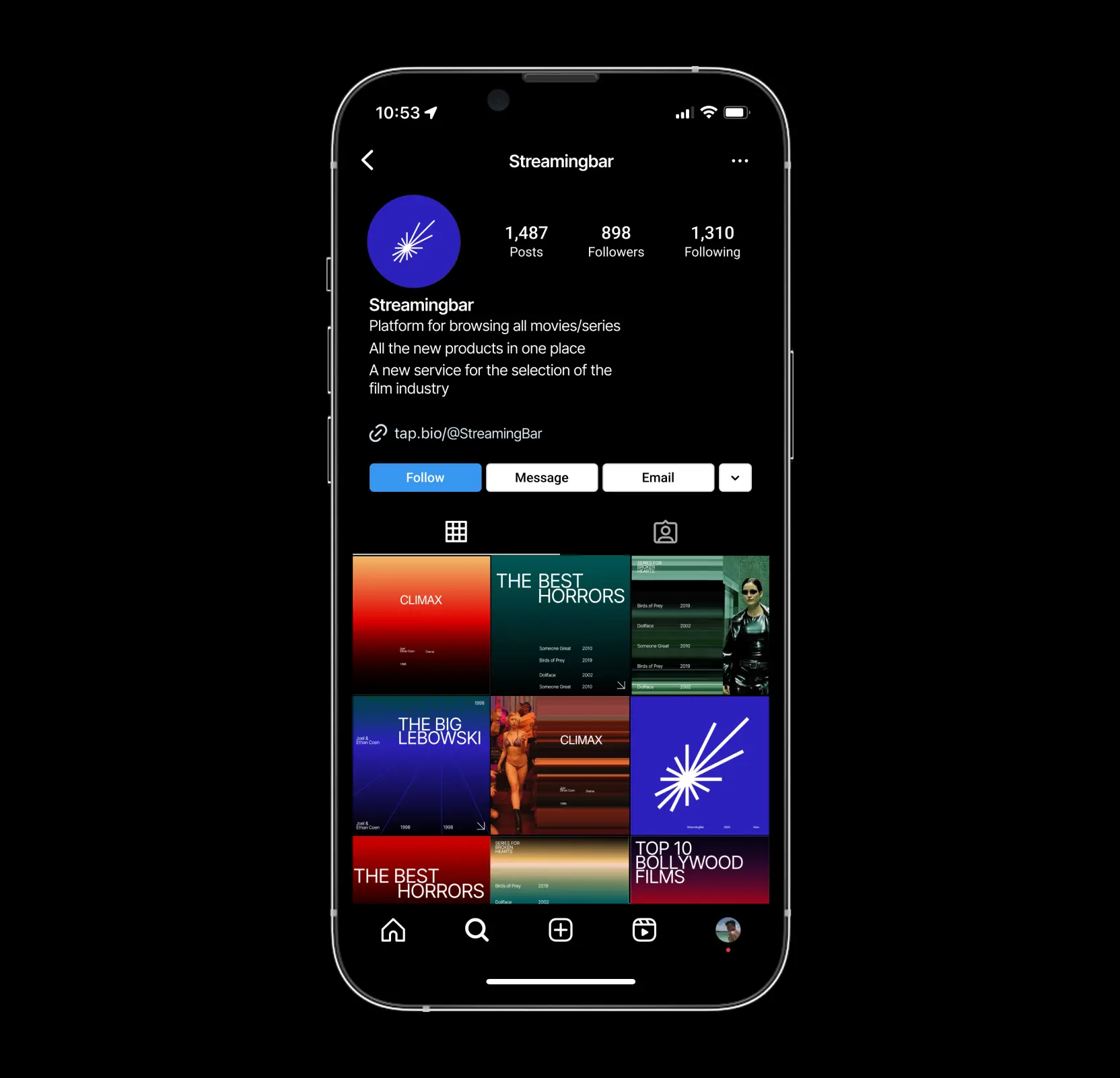
Streaming Bar is a new product in the entertainment and streaming sector. Its goal is to offer users more than just a movie catalog: it’s a platform for browsing, connecting, and communicating through chats and forums.
When the team approached us, the task was to create a recognizable brand from scratch. It needed to be modern, dynamic, and easily scalable. We conducted market research, analyzed competitors, and defined the brand’s core semantics. Based on this, we developed the visual direction High Speed Stream, built the identity system, and prepared a complete brand book.
The Project’s
Discovery Phase
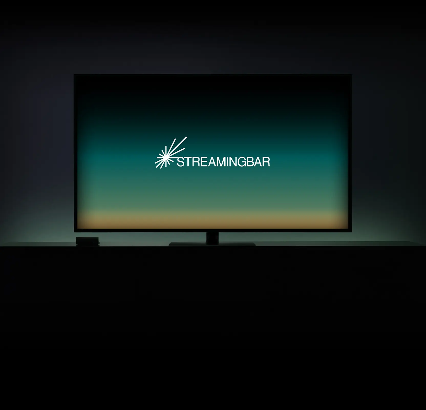
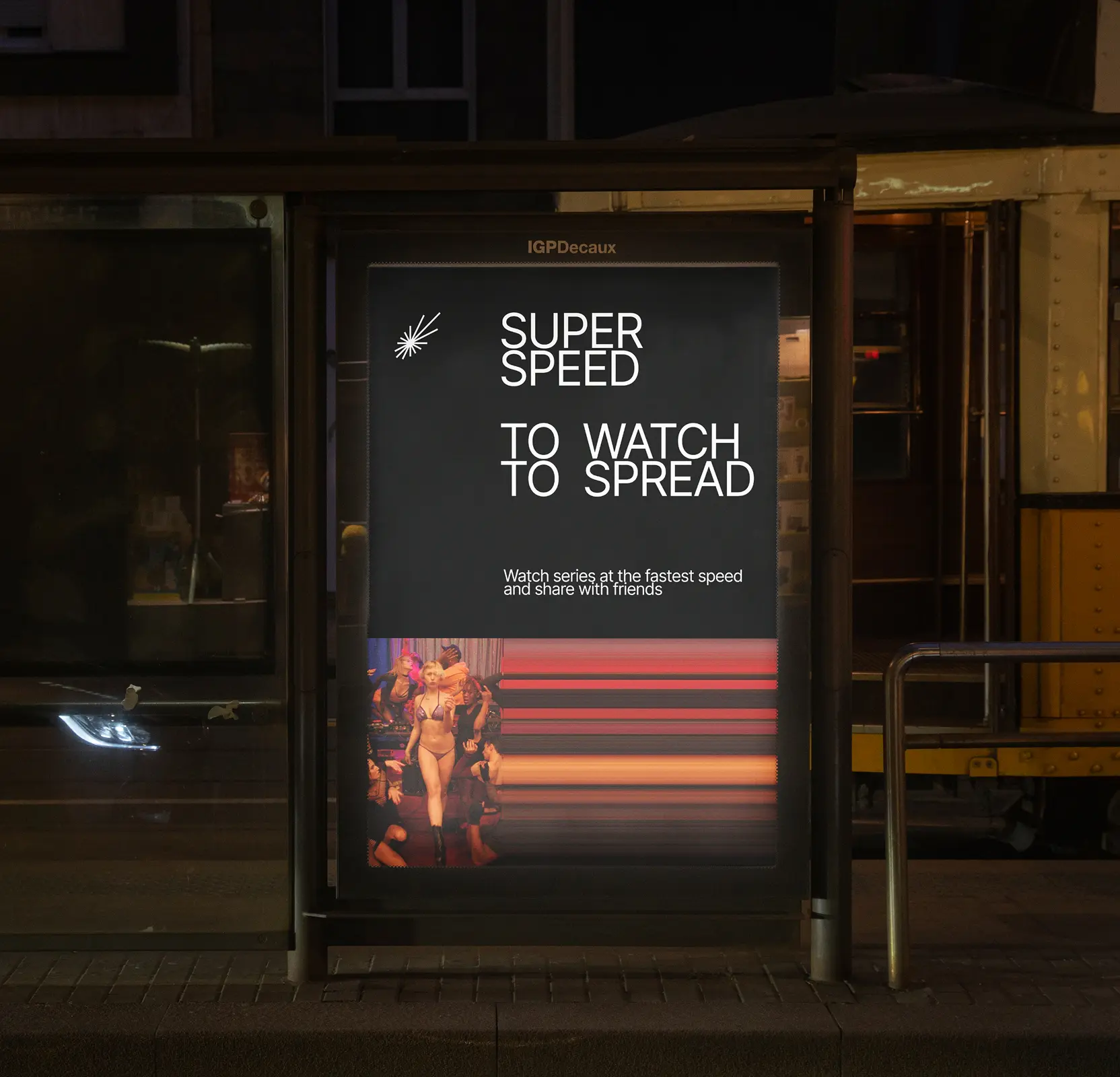
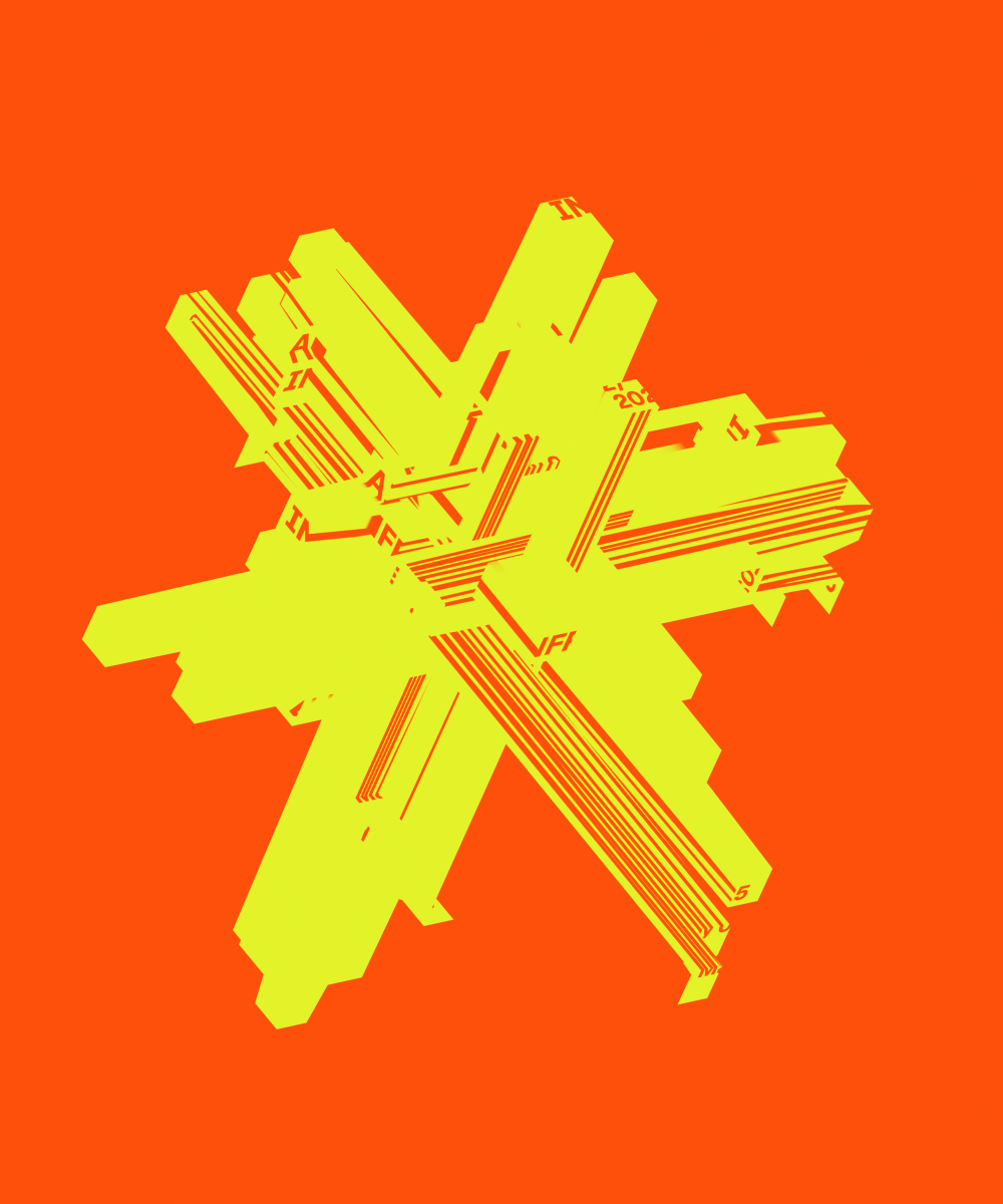
Designed a logo to express speed and support business growth
The Streaming Bar logo translates the idea of speed and light into a clear business signal. A centralized core with radiating lines represents scalable distribution, constant activity, and high-throughput content flow. The mark communicates momentum, reliability, and growth, positioning Streaming Bar as a modern, future-ready entertainment platform built for expansion.
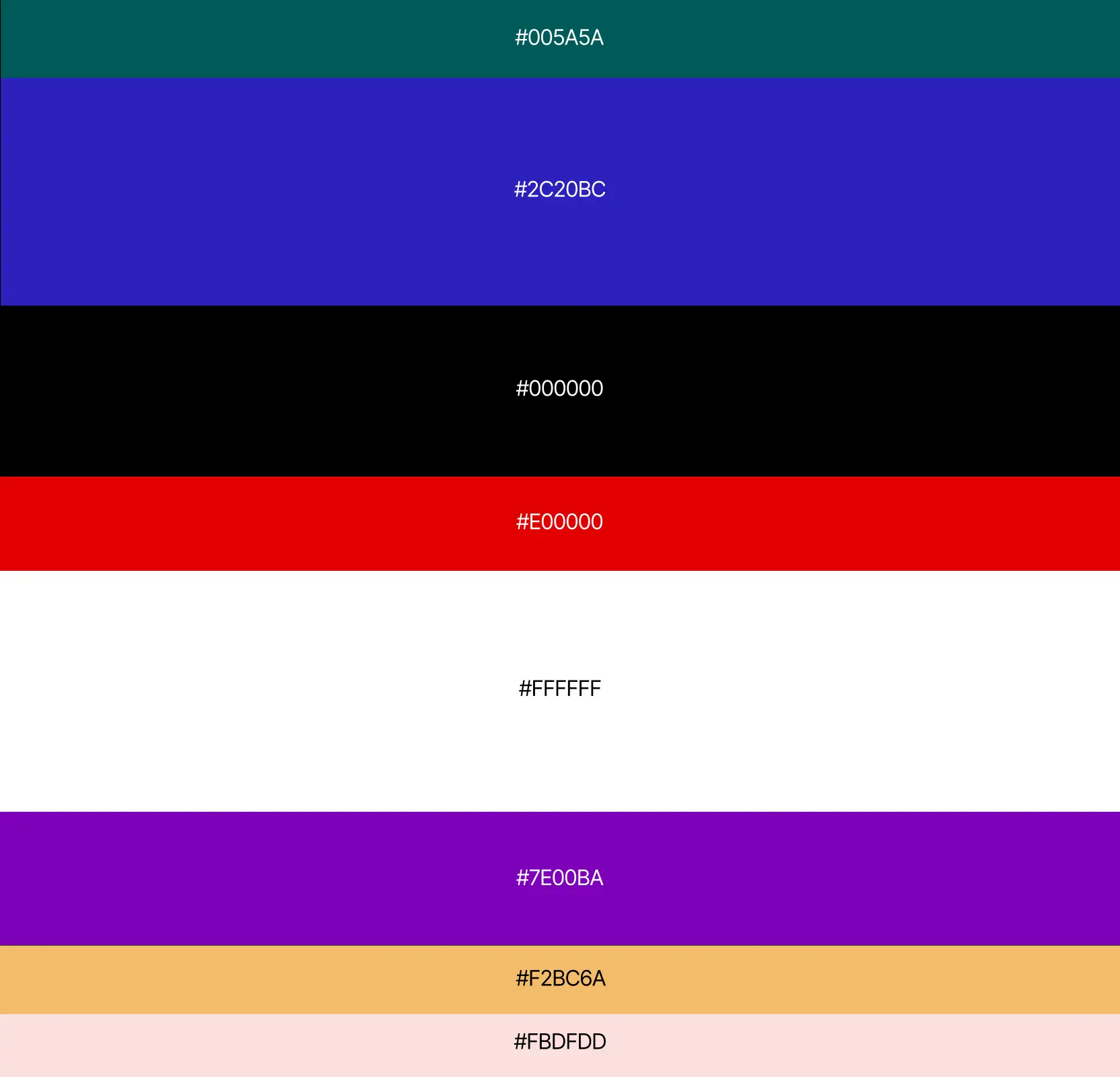
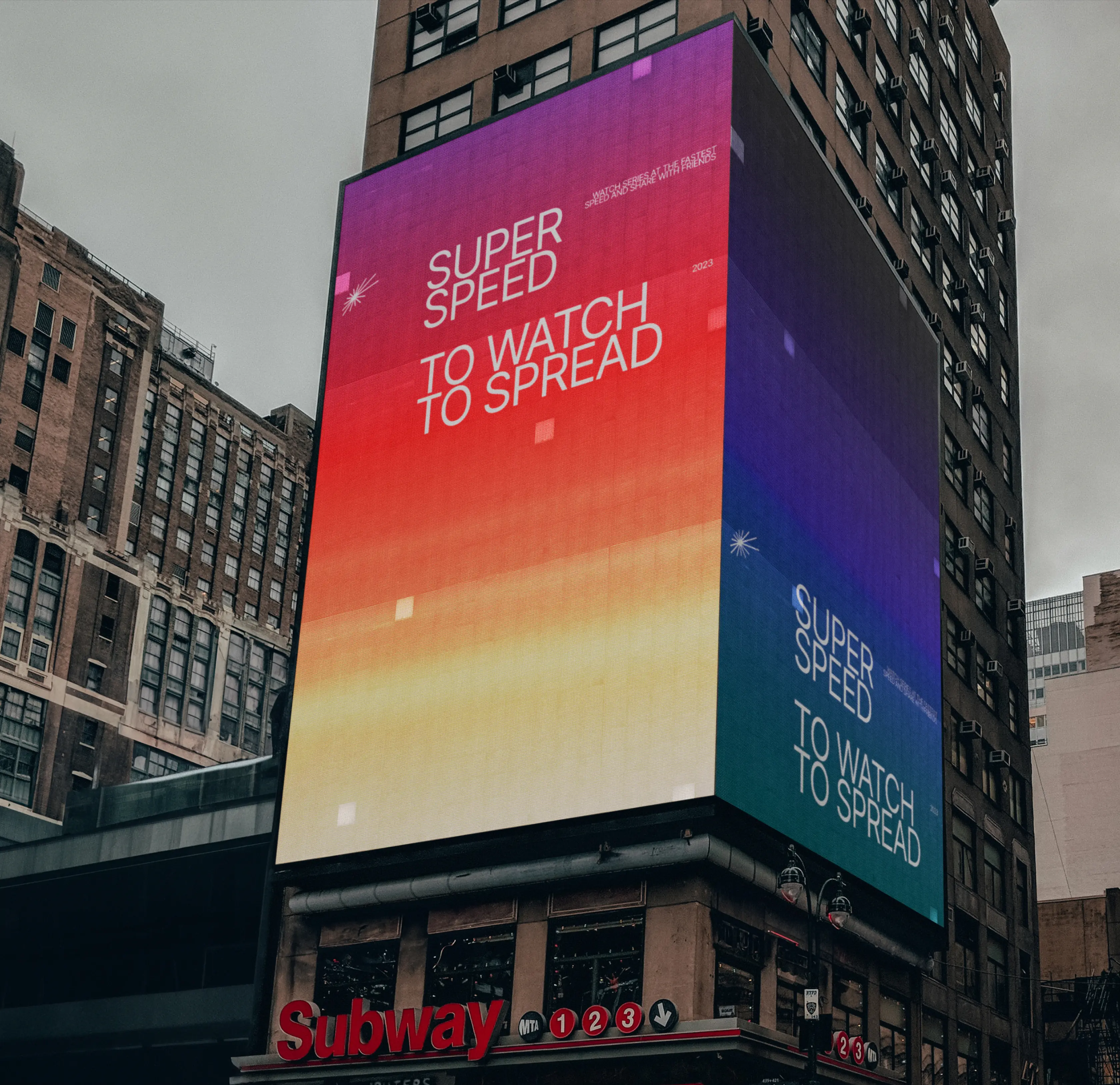
Created a flexible color and gradient system designed for dynamic brand expression
We built a color system that reflects the brand’s energy and adaptability. At its core are four primary colors: Deep Blue, Burning Red, Emerald, and Midnight Black. They are complemented by four accent shades: Purple, Yellow, Beige, and White expanding the visual range and allowing for versatile combinations.
On top of this palette, we developed a flexible gradient system that conveys speed and motion. Following the same grid principle as the logo, the space is divided into six sections, with transitions forming at the intersections.
Contrasting lines add dynamics and create a sense of refraction, turning gradients into a living visual element. As a result, the system remains recognizable yet constantly transforms, adding depth and energy to every piece of brand communication.
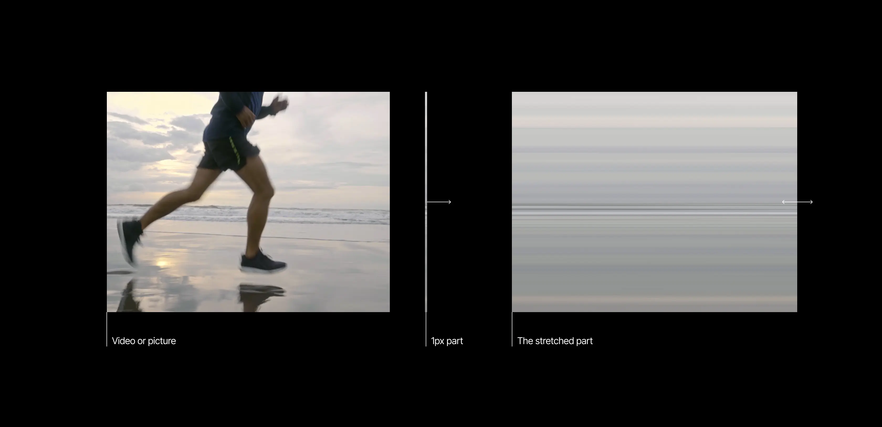
Created dynamic visuals that amplify motion and brand identity
To emphasize the idea of speed, we developed a technique for transforming images and video frames. A single pixel at the edge of the image is stretched outward, creating a continuous flow of lines and colors.
This effect turns ordinary photos and videos into dynamic backgrounds that visually reinforce the concept of motion. It strengthens the brand identity and adds uniqueness to any medium from promotional materials to digital interfaces.
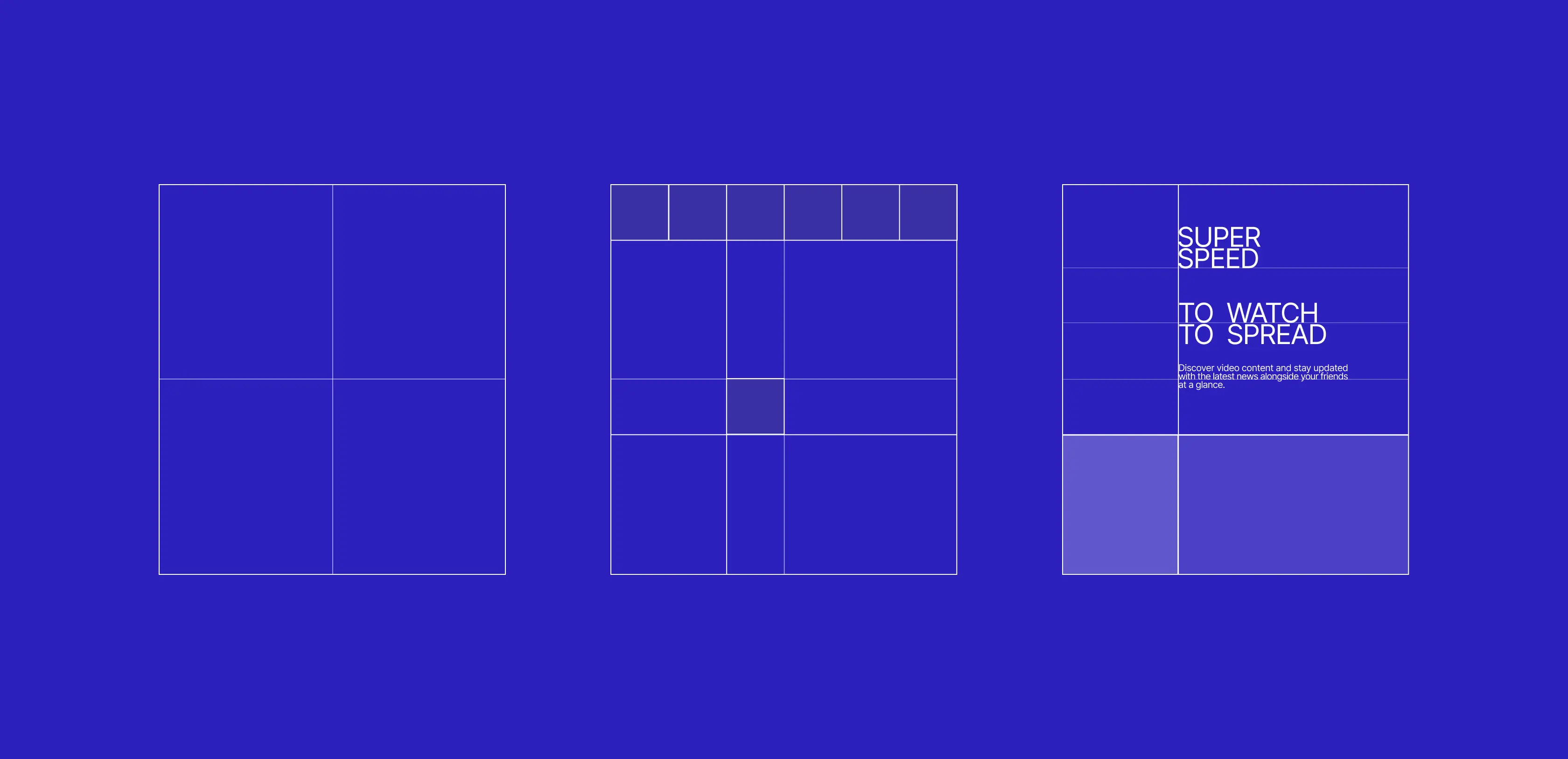
Designed a grid system to provide structure and scalable visual consistency
The grid became the foundation for layouts, continuing the logic embedded in the logo. Its principle is based on dividing the shorter side of the format into six parts and shifting the center, which allows for clear yet dynamic compositions.
This approach creates a grid of four main blocks that can be easily adapted for text, images, and graphic elements. The system ensures visual consistency, maintains a balance between speed and structure, and makes the brand’s visual language predictable and easy to scale.
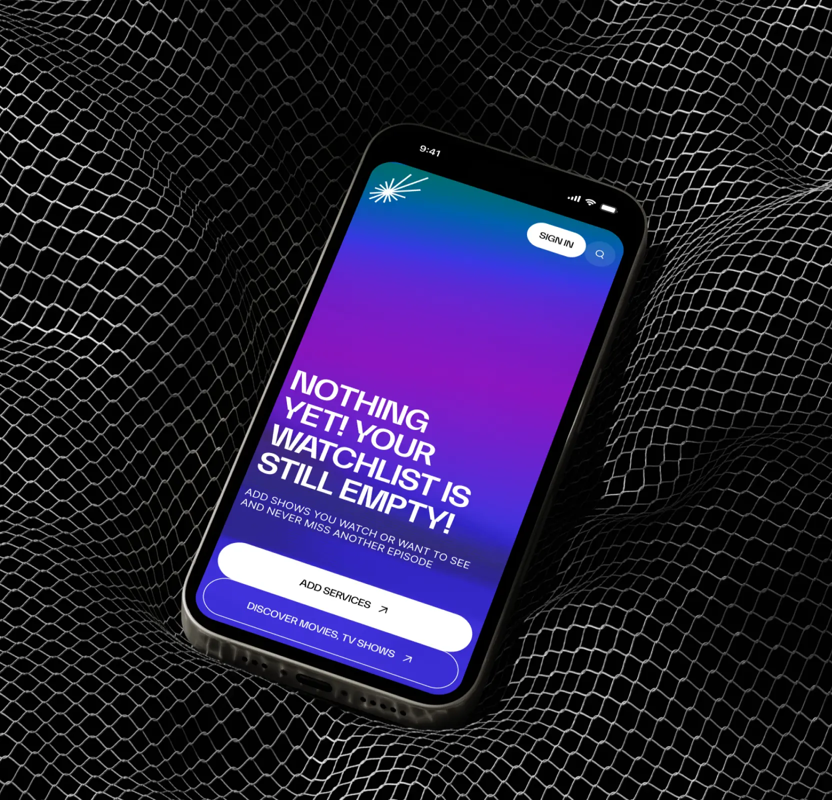
Created a brand book and applications for consistent, unified brand presence
The final stage was the creation of a comprehensive brand book that defined the rules of identity usage from the logo and grid system to the color palette and gradients. Based on it, we designed solutions for all key touchpoints.
In digital, this included interfaces, social media, and promotional materials. In physical applications, it covered outdoor advertising, print products, and merchandise. This approach ensures a unified brand perception and makes it recognizable in any context from the city streets to a smartphone screen.

AI & ML
Lazarev. agency offers comprehensive digital design services. Discover our range of related expertise supported by impactful case studies.
More Startups Cases
FAQ
What are the best strategies to create a modern and recognizable brand for a streaming platform?
We conducted thorough market research and competitor analysis to define Streaming Bar’s brand semantics. Using these insights, we developed the High Speed Stream visual direction, built a scalable identity system, and documented it in a comprehensive brand book. This approach ensures a modern, recognizable, and adaptable brand.
How can a logo communicate both motion and business value?
The Streaming Bar logo uses a burst-of-light metaphor, with radiating beams conveying speed and continuous flow. Beyond aesthetics, it signals scalability, momentum, and reliability — aligning brand perception with business growth potential.
What role does a flexible color and gradient system play in branding?
We created a color system with primary colors (Deep Blue, Burning Red, Emerald, Midnight Black) and accent shades (Purple, Yellow, Beige, White) combined with dynamic gradients. This system enhances visual energy, maintains recognition, and allows the brand to adapt across platforms and campaigns.
How can dynamic visuals improve user engagement on a streaming platform?
By transforming images and video frames — stretching pixels outward to create motion lines — we generated dynamic visuals that reinforce the sense of speed and flow. These visuals enhance the platform’s identity and make promotional and digital content more engaging.
Why is a structured grid system important for digital product design?
We designed a grid system based on the logo’s principles, dividing layouts into adaptable blocks. This ensures visual consistency, maintains balance between structure and motion, and simplifies scaling across digital and print applications.
How does a comprehensive brand book ensure cross-channel consistency?
Our brand book defines rules for logo use, color palettes, gradients, grids, and typography. It guides all applications — digital interfaces, social media, print, outdoor advertising, and merchandise — ensuring a unified brand perception from smartphones to city streets.
What are the key takeaways for building a scalable entertainment brand from scratch?
We began with thorough research and defined clear brand semantics to ensure the foundation of Streaming Bar’s identity was strong and relevant. From there, we developed a logo and visual systems that combined aesthetic appeal with tangible business value. Flexible colors, gradients, and grid structures were applied to create a brand that could adapt across platforms and contexts. Dynamic visuals were incorporated to enhance engagement and bring motion to every interaction. Finally, all rules and guidelines were documented in a comprehensive brand book, ensuring consistent brand expression across all touchpoints.


Hit me up! Let’s chat about your growth


