How we helped an online video platform maximize viewer engagement and revenue through analytics-driven design
Project:
the project
Streamingbar (rebranded as FLIXXE), a rapidly expanding online video platform, faced challenges in understanding user behavior, optimizing content offerings, and building a distinctive, scalable brand presence. While its content library was growing, the platform lacked actionable insights into audience engagement, geographic trends, and content performance. Administrators struggled to make informed decisions, and users experienced a generic interface that did not feel personalized or engaging.
Our mission was to design a solution that empowered both administrators and end-users. The goal was to create a dashboard that provided deep analytics, personalized content recommendations, and a cohesive brand identity, positioning Streamingbar as a leading, user-centric streaming service.
The Project’s
Discovery Phase
Turned data into strategy to enhance decision-making and personalization
Before the redesign, Streamingbar’s analytics were fragmented, making it difficult for decision-makers to extract actionable insights. The interface did not reflect the energy and speed of the platform, and users lacked personalized experiences that could drive loyalty. Our approach focused on transforming data into a strategic asset, creating an intuitive interface that allows administrators to act decisively and giving users a sense of personalization that enhances satisfaction.

The complete website redesign guide: strategy & launch
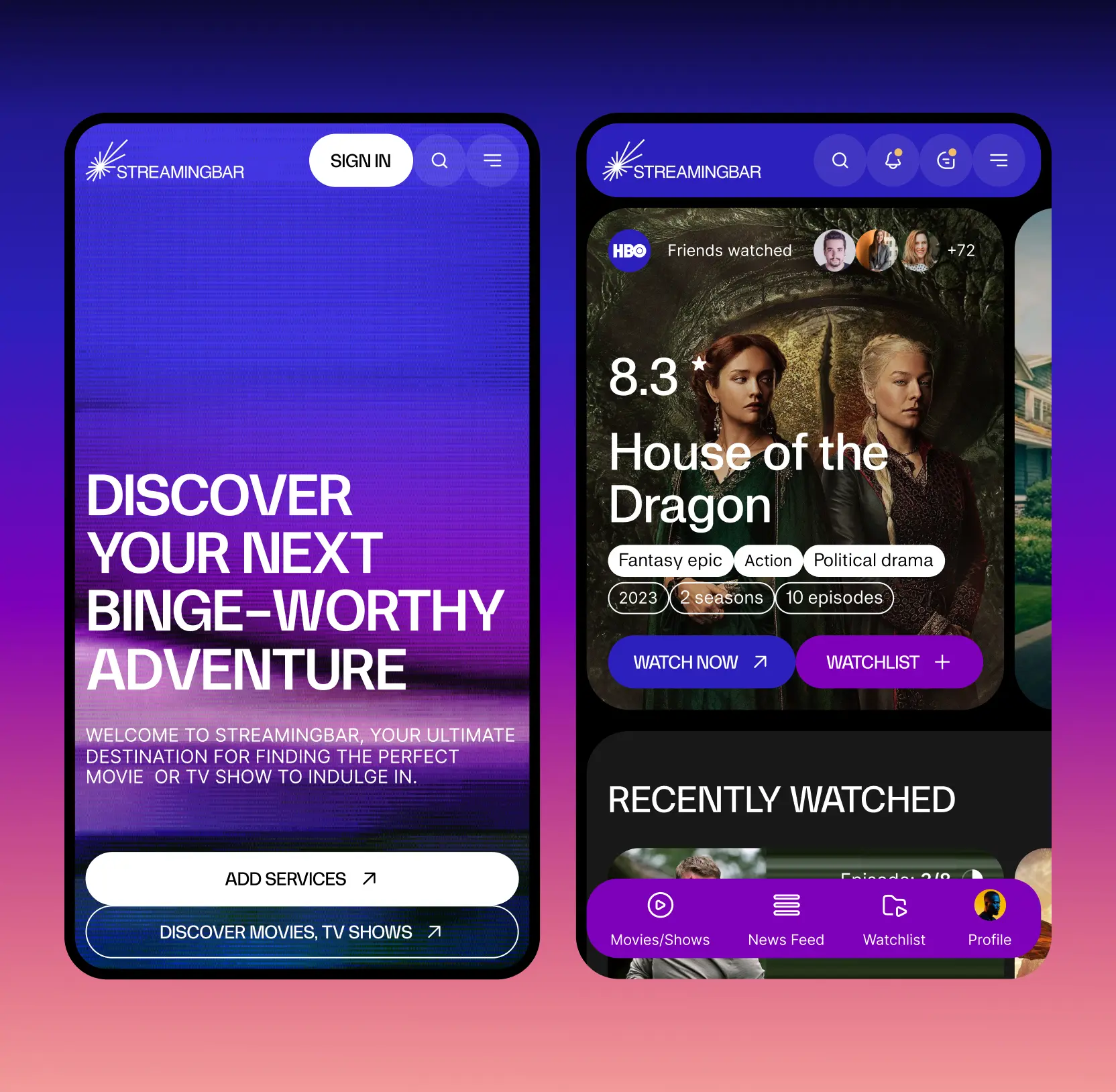
Empowered administrators with real-time insights
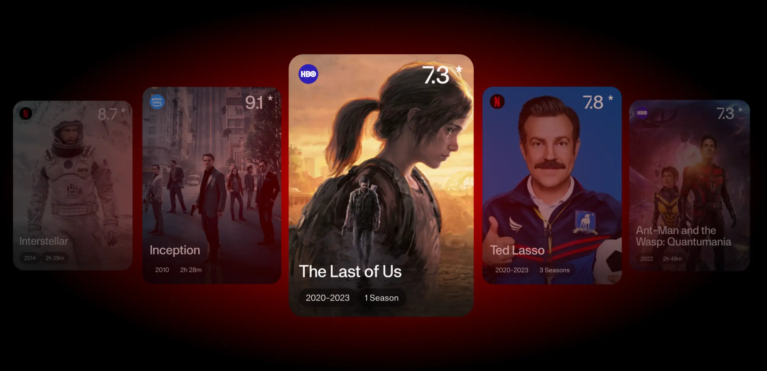
We developed a comprehensive, intuitive dashboard that consolidates all key performance metrics, highlighting engagement patterns, geographic trends, and top-performing titles. Administrators can immediately understand what content resonates most, optimize programming, and make marketing decisions based on real data. By providing clarity and actionable insights, the dashboard enables faster decision-making, reducing operational friction and increasing the platform’s responsiveness to user behavior.
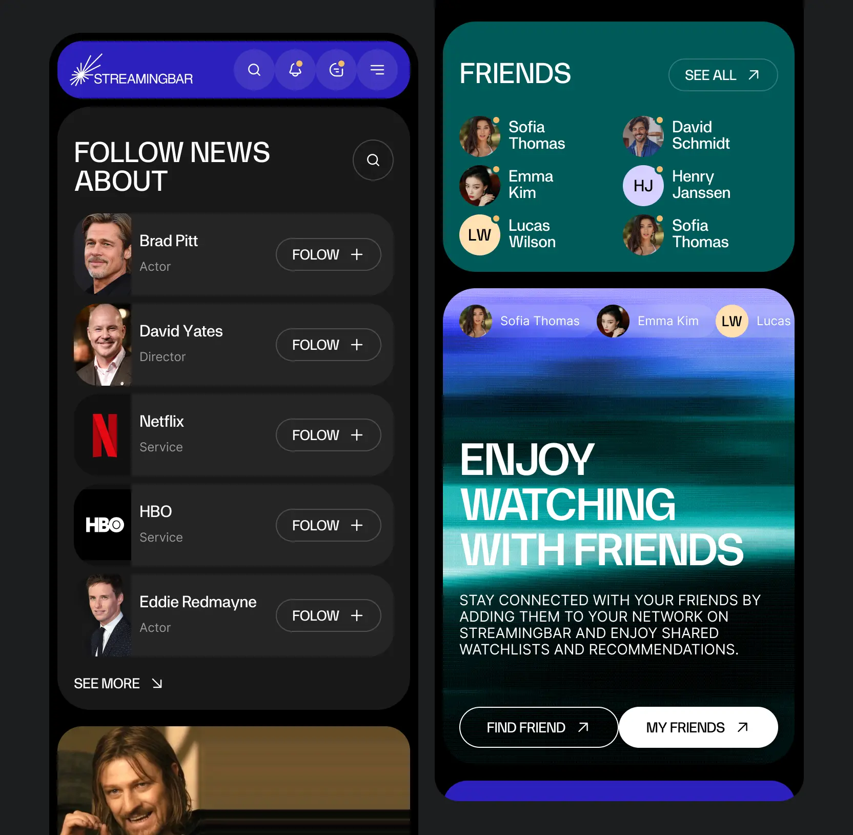
Added features that foster user connectivity
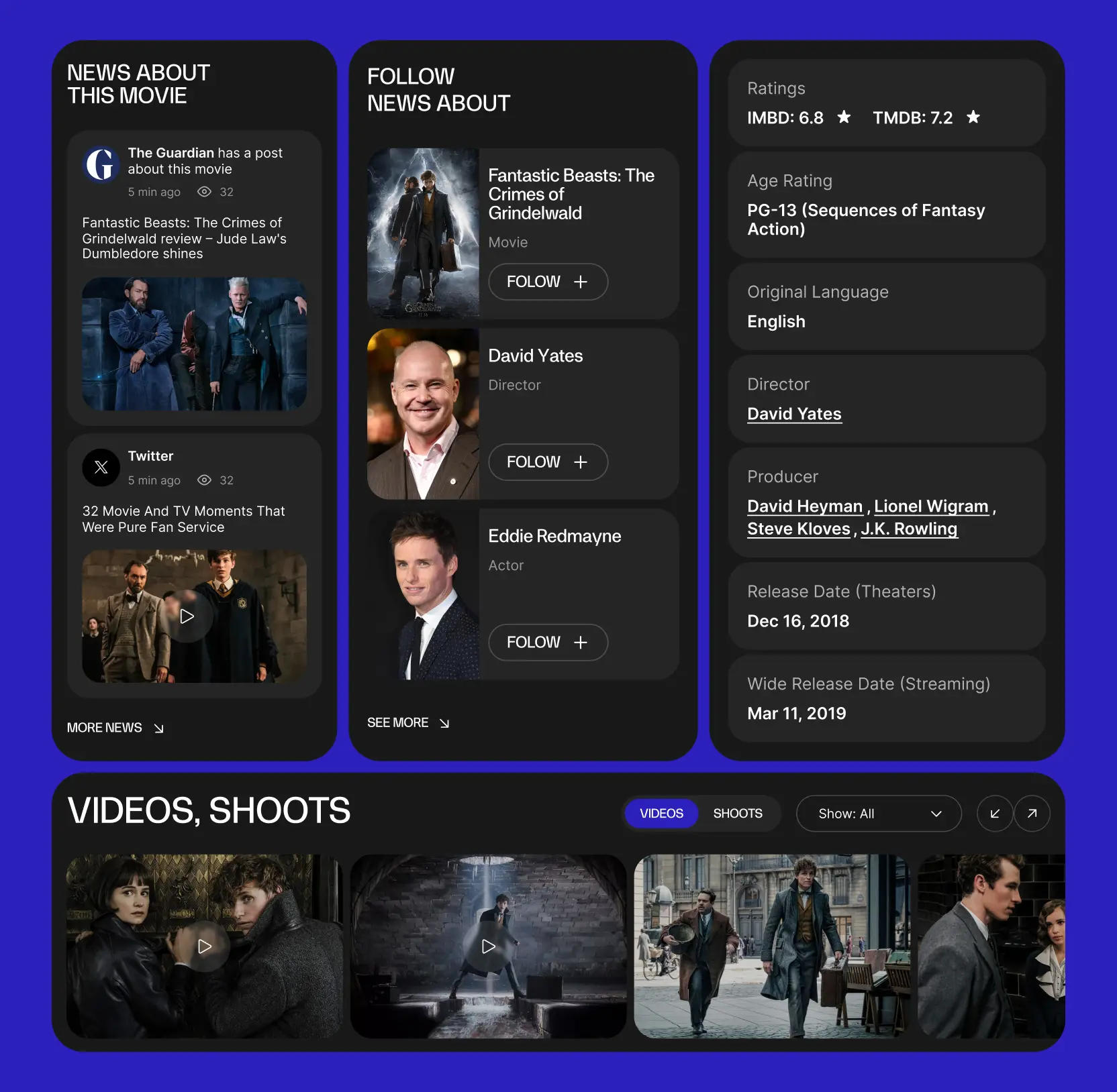
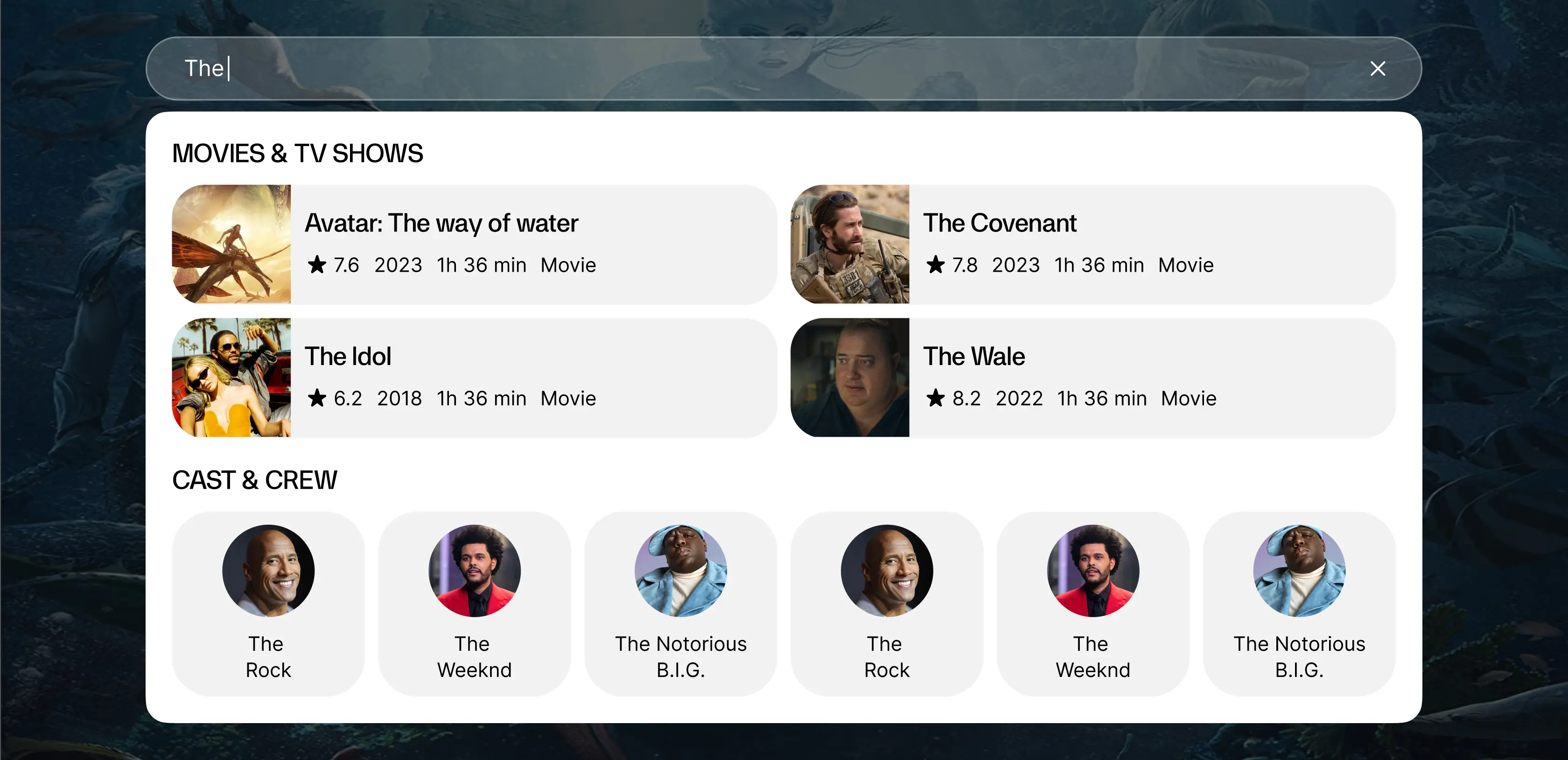
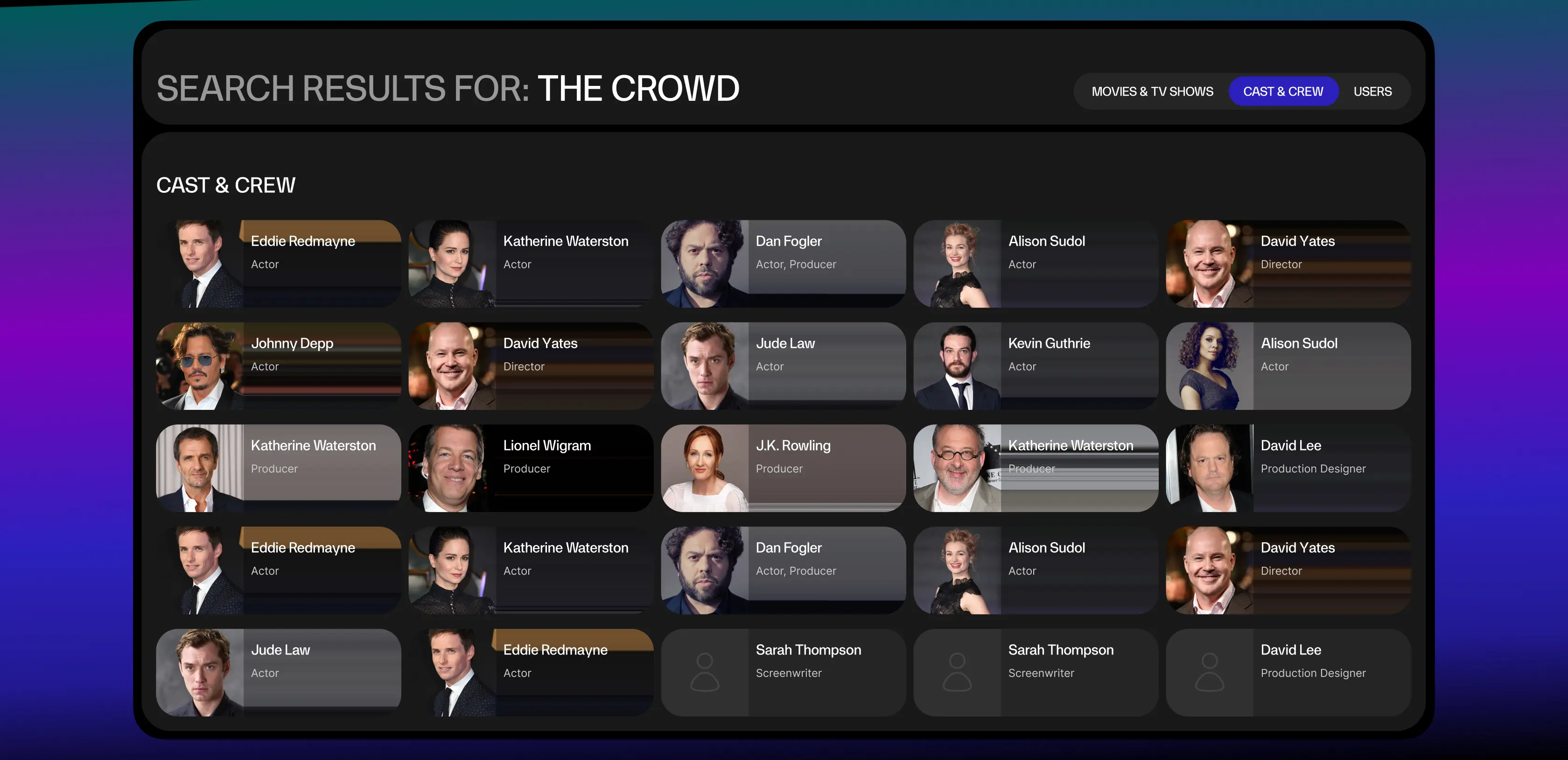
We strengthened user engagement on Streamingbar by integrating social features that encourage interaction and build a sense of community. The messaging system allows users to connect with friends, discuss their favorite movies and shows, and recommend content directly within the platform.
To keep users informed and spark conversations, we introduced a real-time news feed featuring trending updates and curated content from the world of cinema. This not only delivers timely information but also drives deeper engagement through shared discussions.
Together with personalized recommendations and interactive user stats, such social elements create a dynamic environment where users can connect, explore, and share their entertainment journey. This approach transforms Streamingbar from a basic streaming service into a vibrant, community-driven platform.

UX persona examples from real projects with practical tips


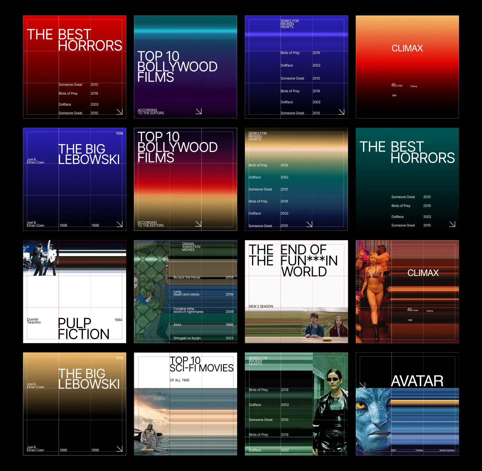
Crafted data-driven insights to enhance business strategy
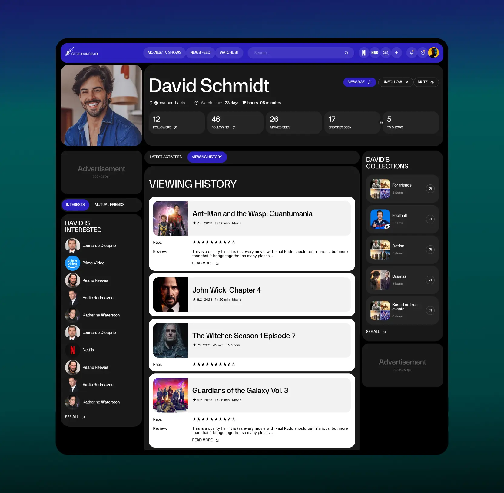
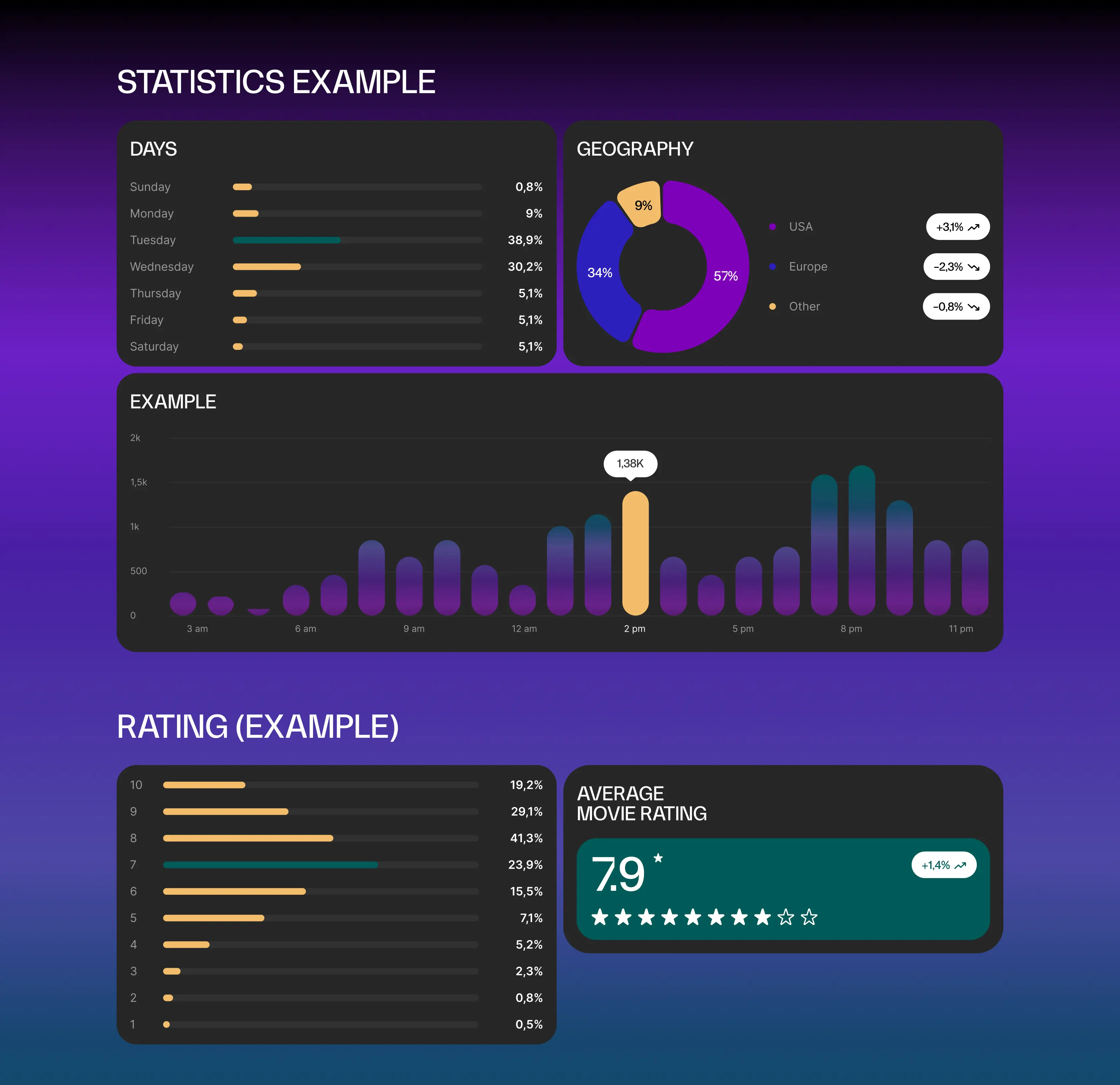
We built a comprehensive statistics page to give users and administrators clear insights into engagement and content performance. Key metrics, including followers, views, profile interactions, and watchlist saves are visualized through interactive graphs with filters for weekly, monthly, and yearly trends.
Beyond basic numbers, the dashboard reveals geographic distribution and viewing patterns, showing where and when content resonates most. Detailed movie statistics highlight top-performing titles and uncover audience preferences.
The data-driven approach turns analytics into a powerful tool, helping users personalize their experience and giving administrators the insights needed to refine platform strategies. As a result, Streamingbar stays relevant, engaging, and ready for continuous growth.
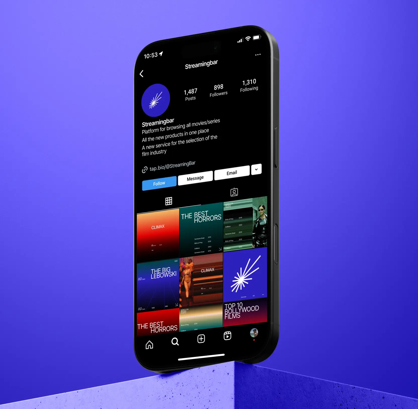
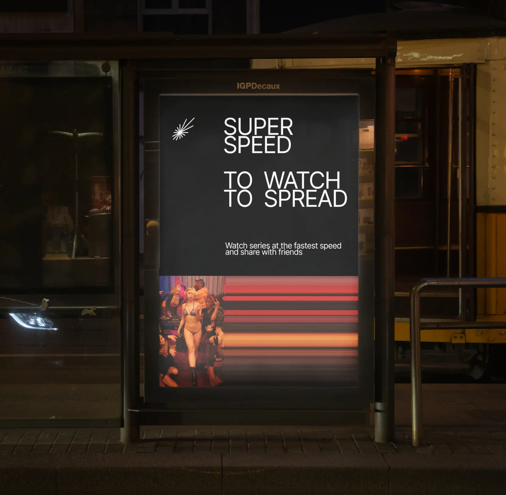
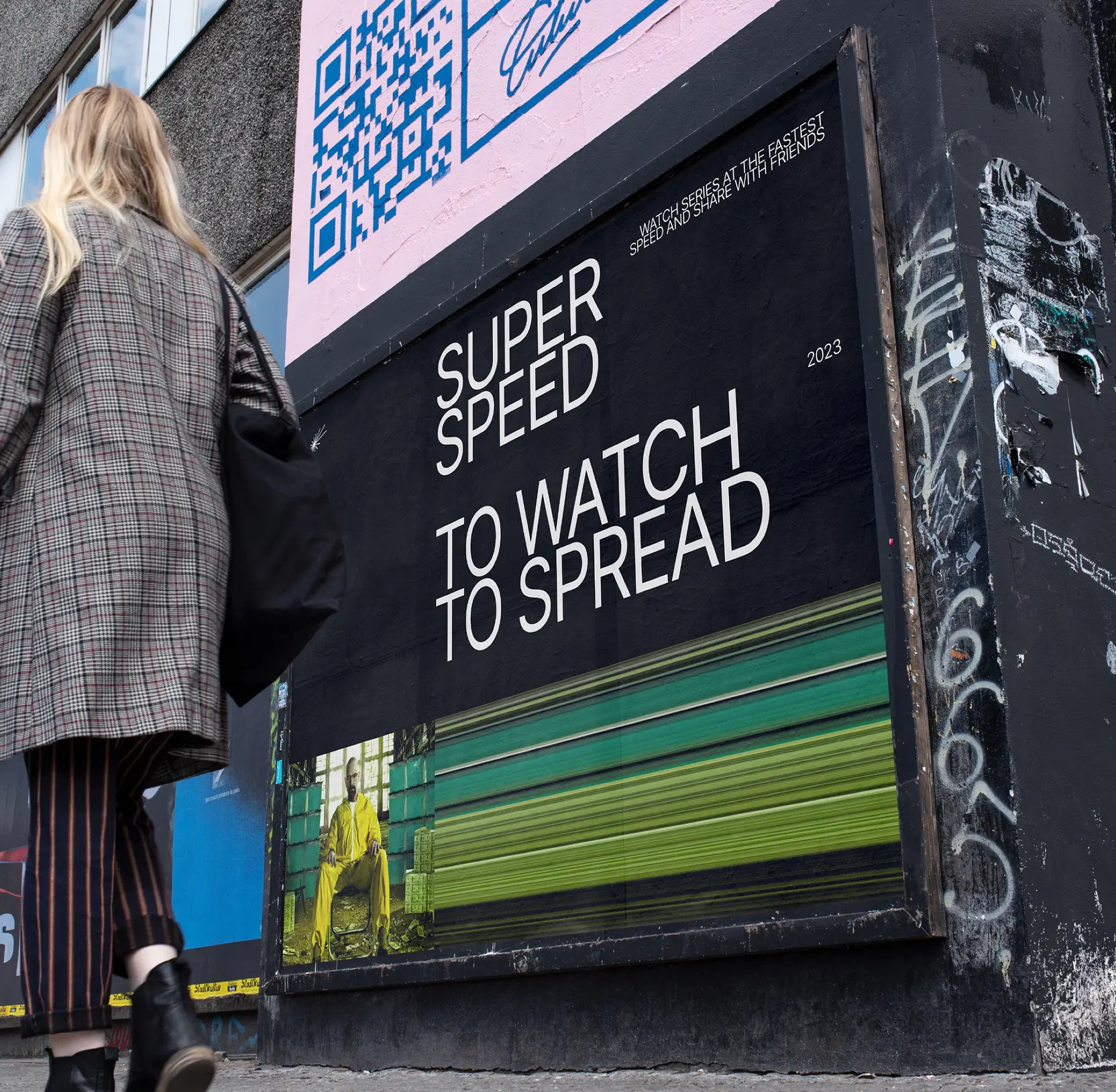
Built a unified brand that drives recognition and engagement
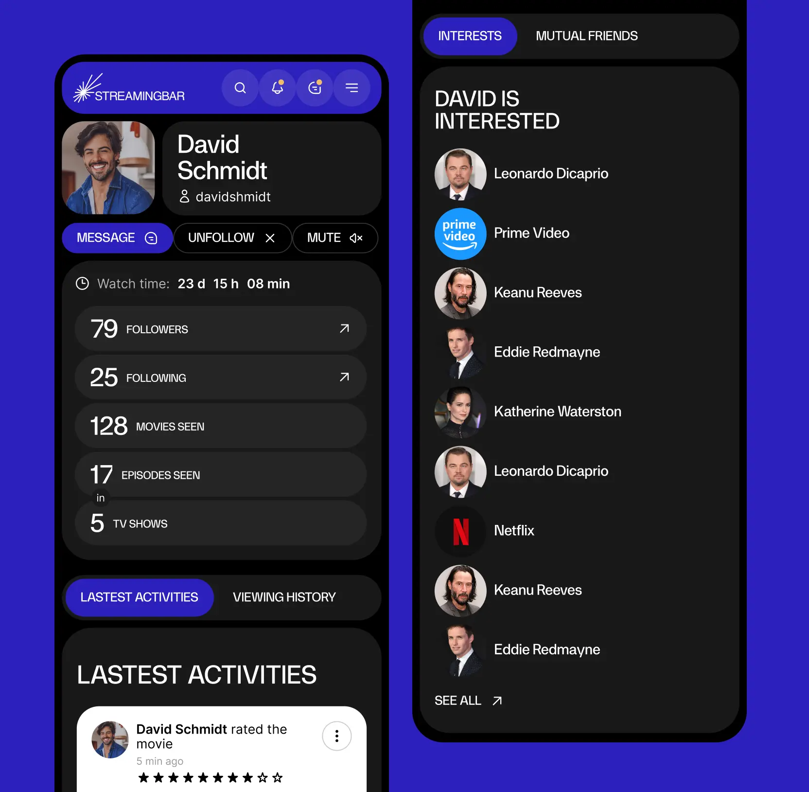
We structured Streamingbar’s interface by prioritizing the most-used actions, ensuring quick and easy access to key features. Based on user research, we introduced a news feed with the latest updates from the world of cinema and a messaging system that lets users connect with friends over shared interests.
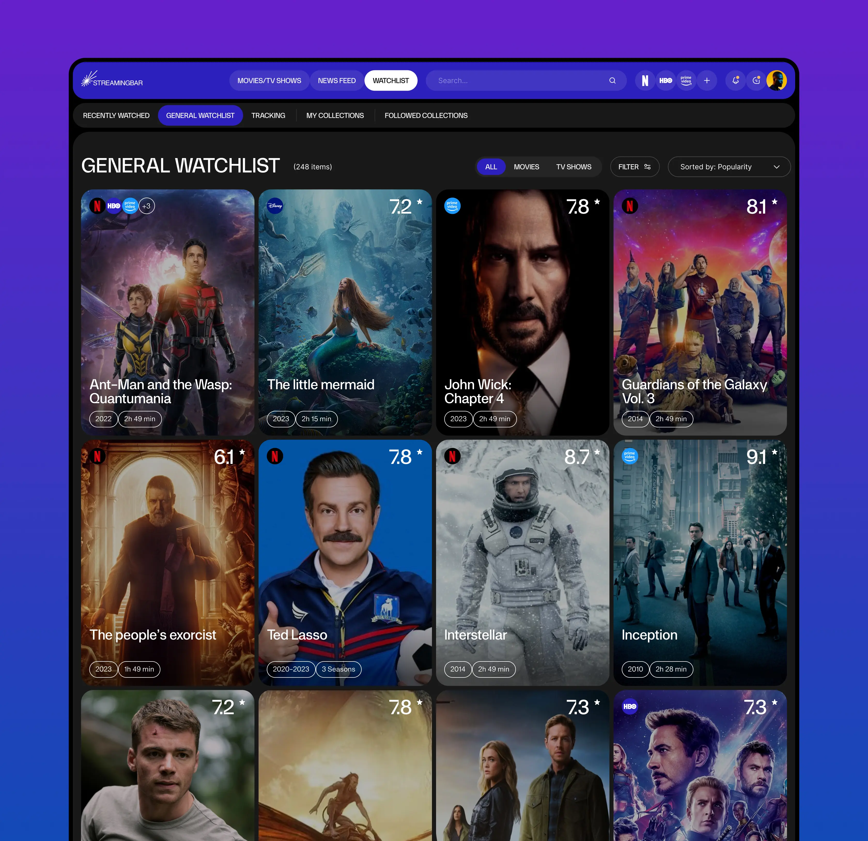
The user profile serves as a personalized hub where users can track their watch time, content consumption, collections, and viewing history. It is designed for both reflection and discovery, featuring detailed reviews, ratings, and tailored recommendations based on individual preferences.
We also designed the interface with scalability in mind, allowing for seamless, non-intrusive ad placement to support monetization without disrupting the user experience. This thoughtful structure creates a platform that is engaging, highly functional, and ready for future growth.


AI & ML
Lazarev. agency offers comprehensive digital design services. Discover our range of related expertise supported by impactful case studies.
More Startups Cases

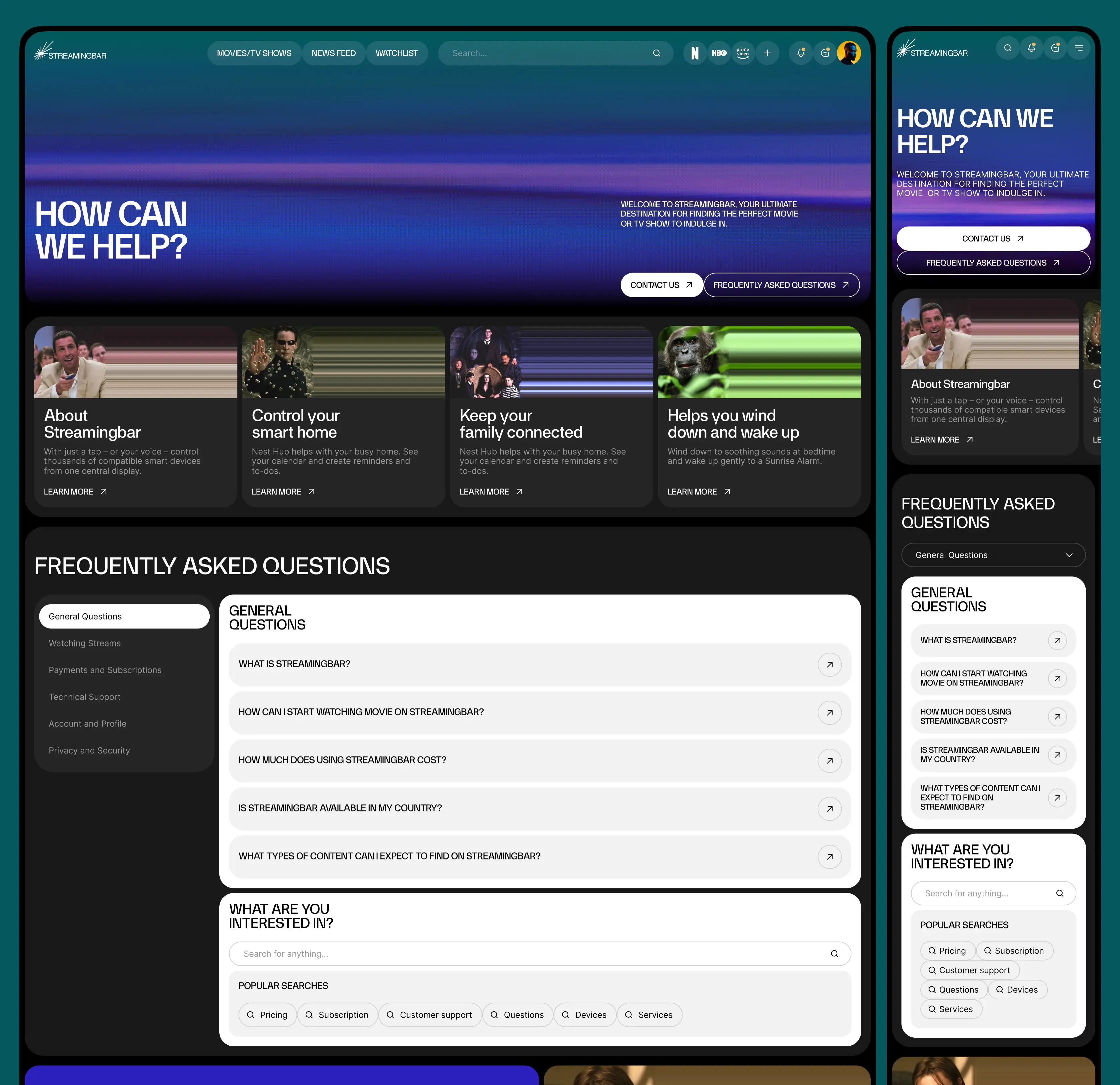
FAQ
How can streaming platforms use data analytics to improve audience engagement?
Streamingbar leverages a comprehensive, intuitive dashboard that tracks user behavior, viewing patterns, and geographic trends. This allows administrators to understand which content resonates most, personalize recommendations, and optimize programming. By turning analytics into actionable insights, the platform drives higher engagement and retention.
What strategies can help administrators make faster, data-driven decisions?
Streamingbar consolidates all key performance metrics into a single dashboard, providing instant clarity on top-performing titles, audience demographics, and viewing patterns. This enables administrators to reduce operational friction, optimize marketing campaigns, and respond quickly to audience preferences, ultimately boosting platform growth.
How can streaming platforms personalize content for different audiences?
By analyzing detailed movie statistics and user interactions, Streamingbar identifies content preferences and viewing trends. This data-driven approach enables dynamic personalization, ensuring each user receives recommendations tailored to their tastes, increasing session frequency and platform loyalty.
Why is a cohesive brand identity important for streaming services?
Streamingbar’s redesigned visual identity conveys speed, energy, and vibrancy, reinforcing a modern, dynamic brand. A consistent brand experience across all touchpoints builds trust with users, enhances perceived value, and helps the platform stand out in a competitive streaming market.
How does a data-informed design impact business growth for streaming platforms?
By combining user analytics with a clear, visually cohesive interface, Streamingbar enables both users and administrators to act on insights quickly. This design-driven strategy improves content discoverability, user satisfaction, and operational efficiency, directly contributing to subscriber growth and revenue.
How can streaming platforms retain users and reduce churn?
Streamingbar focuses on engagement through tailored recommendations, real-time insights, and a seamless user experience. Administrators can track performance and adapt content strategies, while the audience benefits from personalized suggestions and smooth navigation, creating long-term retention.
What makes Streamingbar’s dashboard a competitive advantage for streaming services?
Streamingbar’s dashboard combines analytics, engagement tracking, and brand cohesion in one platform. It empowers administrators to optimize content strategy, marketing efforts, and user experience simultaneously. The result is a highly responsive platform that adapts to audience behavior, ensuring continuous growth and strong market positioning.


Hit me up! Let’s chat about your growth


