How we helped a TravelTech company redefine flight search through comfort and clarity
Project:
the project
FCF is a flight search engine designed to help travelers find the best tickets fast with maximum comfort and minimum hassle.
Most flight platforms overwhelm users with clutter and complexity. FCF approached Lazarev.agency to change that – creating a clean, intuitive, and emotionally effortless experience that makes finding the right flight simple and smart.
The challenge was to balance rich functionality (filters, insights, reviews) with visual clarity across devices. Through deep UX research, we identified two key traveler types: budget-focused and comfort-driven and built a design that serves both with precision, personalization, and ease.
The Project’s
Discovery Phase
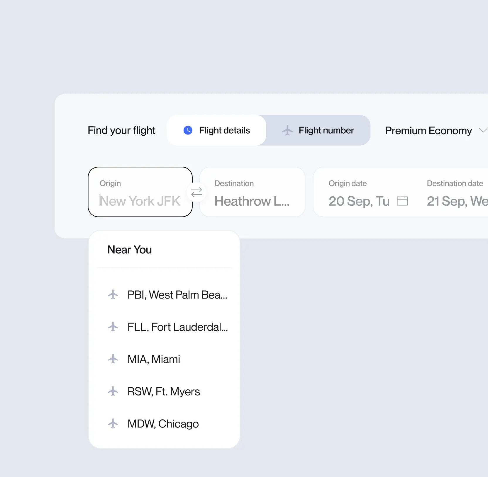
Crafted a functional start page that converts
Because flight bookings often happen on the go or at the last minute, FCF’s homepage needed to feel effortless.
We stripped away all visual noise, keeping the interface minimal and distraction-free, while still leaving space for new features and dynamic content.
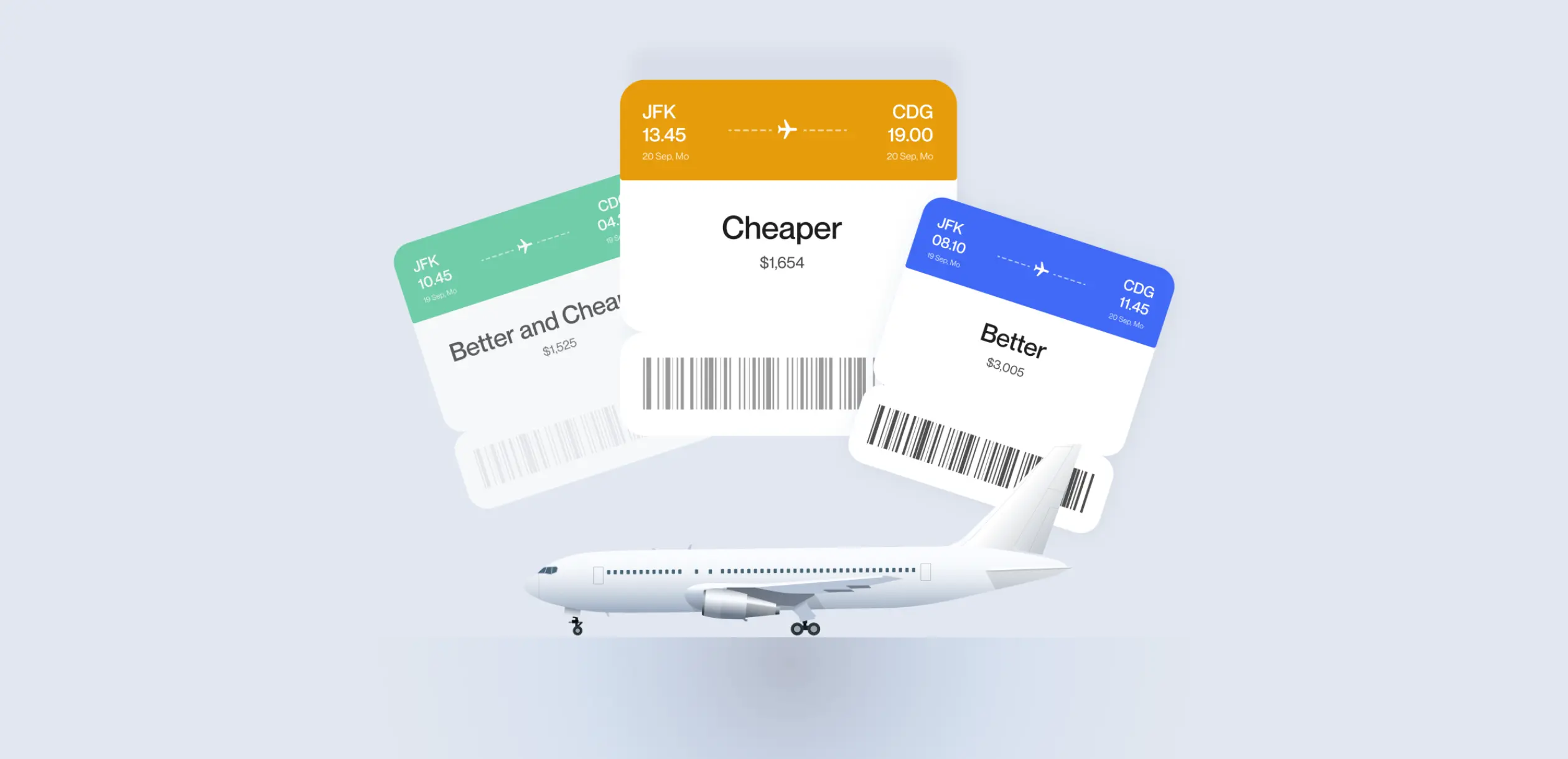
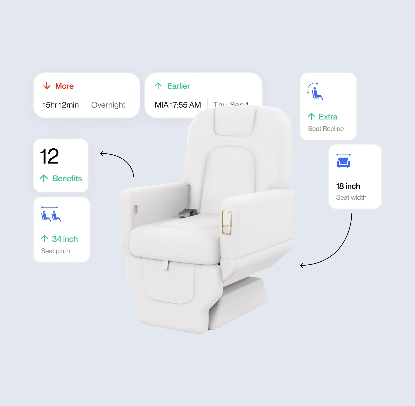
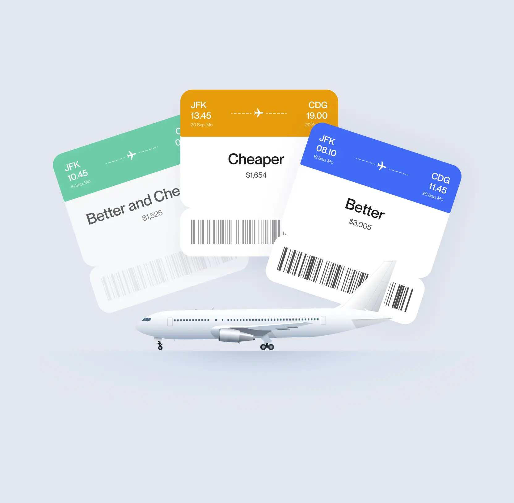
Unlike typical flight search engines, FCF doesn’t just compete on price. It emphasizes comfort and quality of experience. That’s why we incorporated comfort-centric UI elements such as visual comfort indicators, seat quality hints, and flexible filtering options right from the start page.
The result is the interface that feels as calm as it is capable, users instantly know where to look, what to do, and how to get there fast.

What travel & event UX/UI design mistakes are quietly killing your conversions?
Built a search experience for real travelers
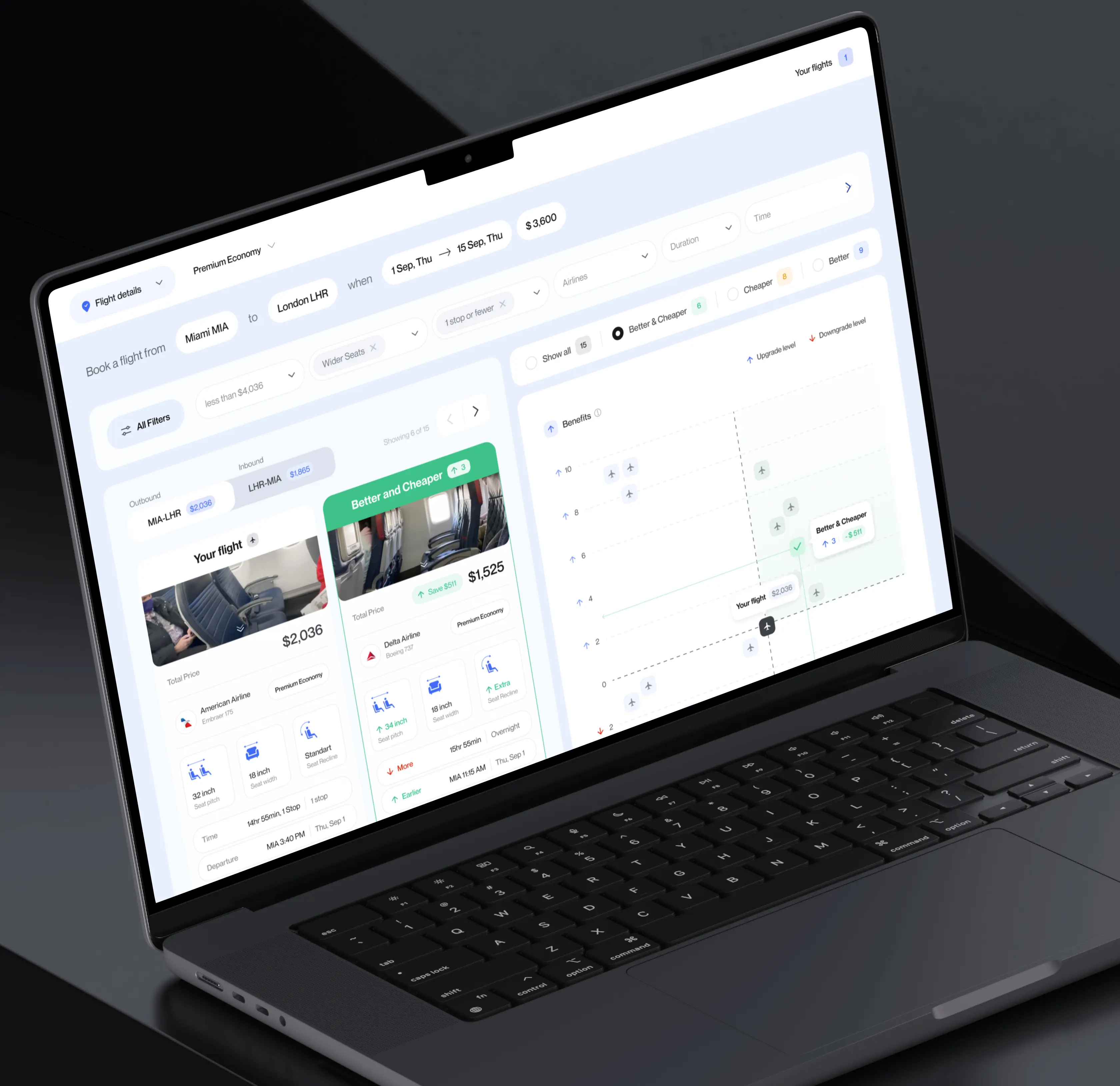
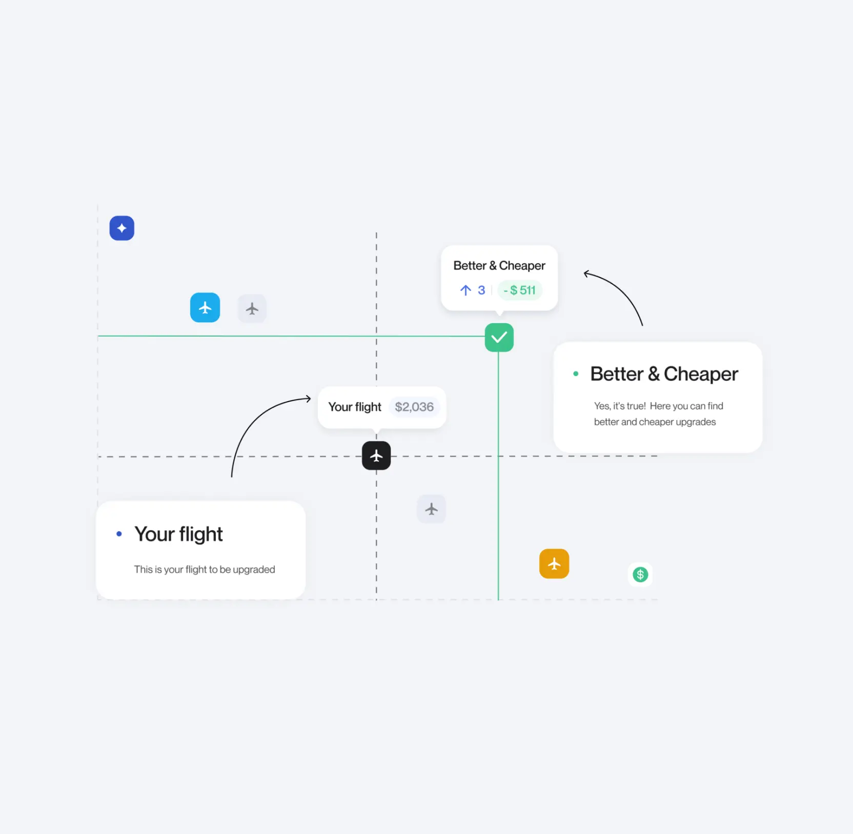
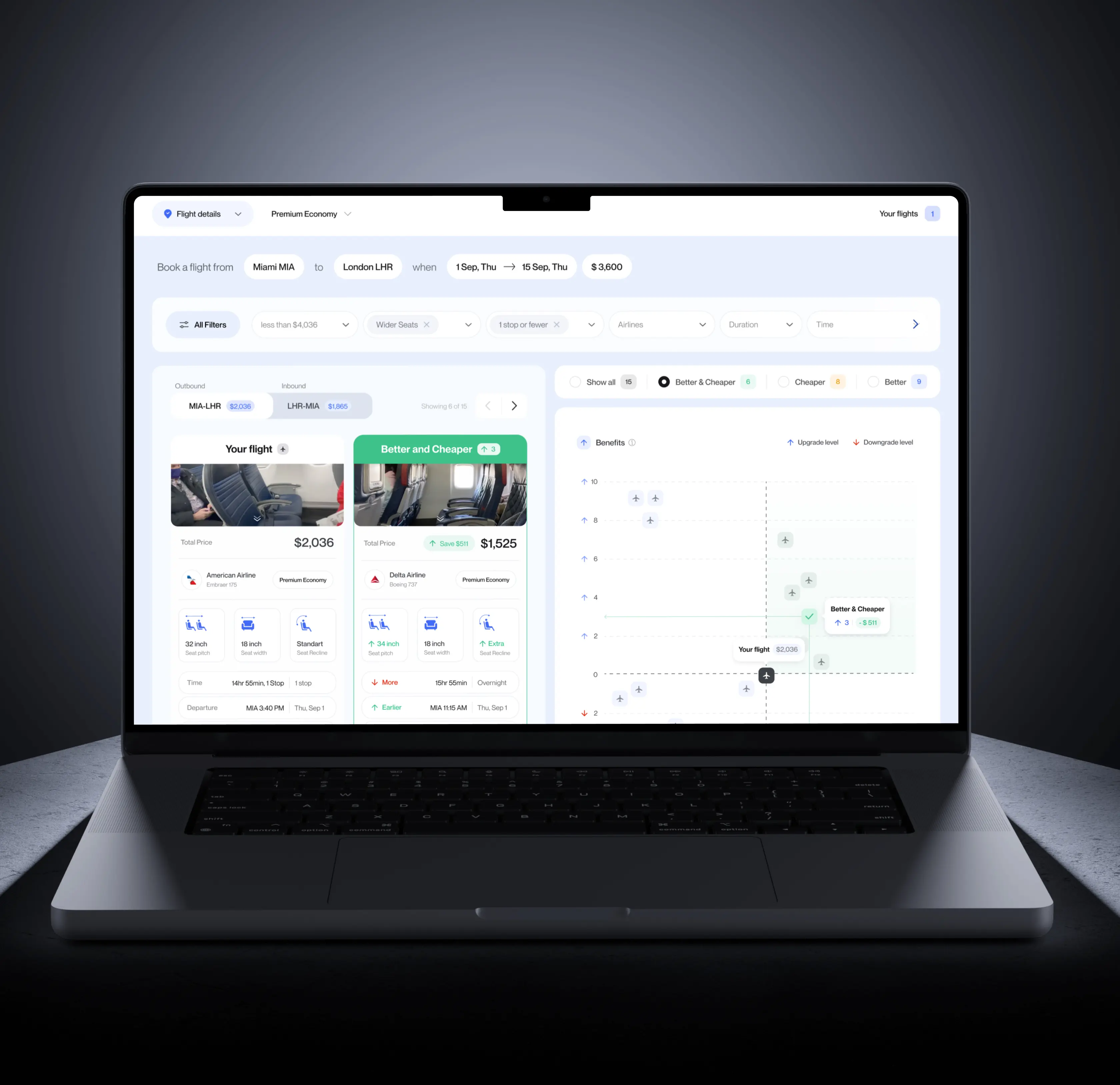
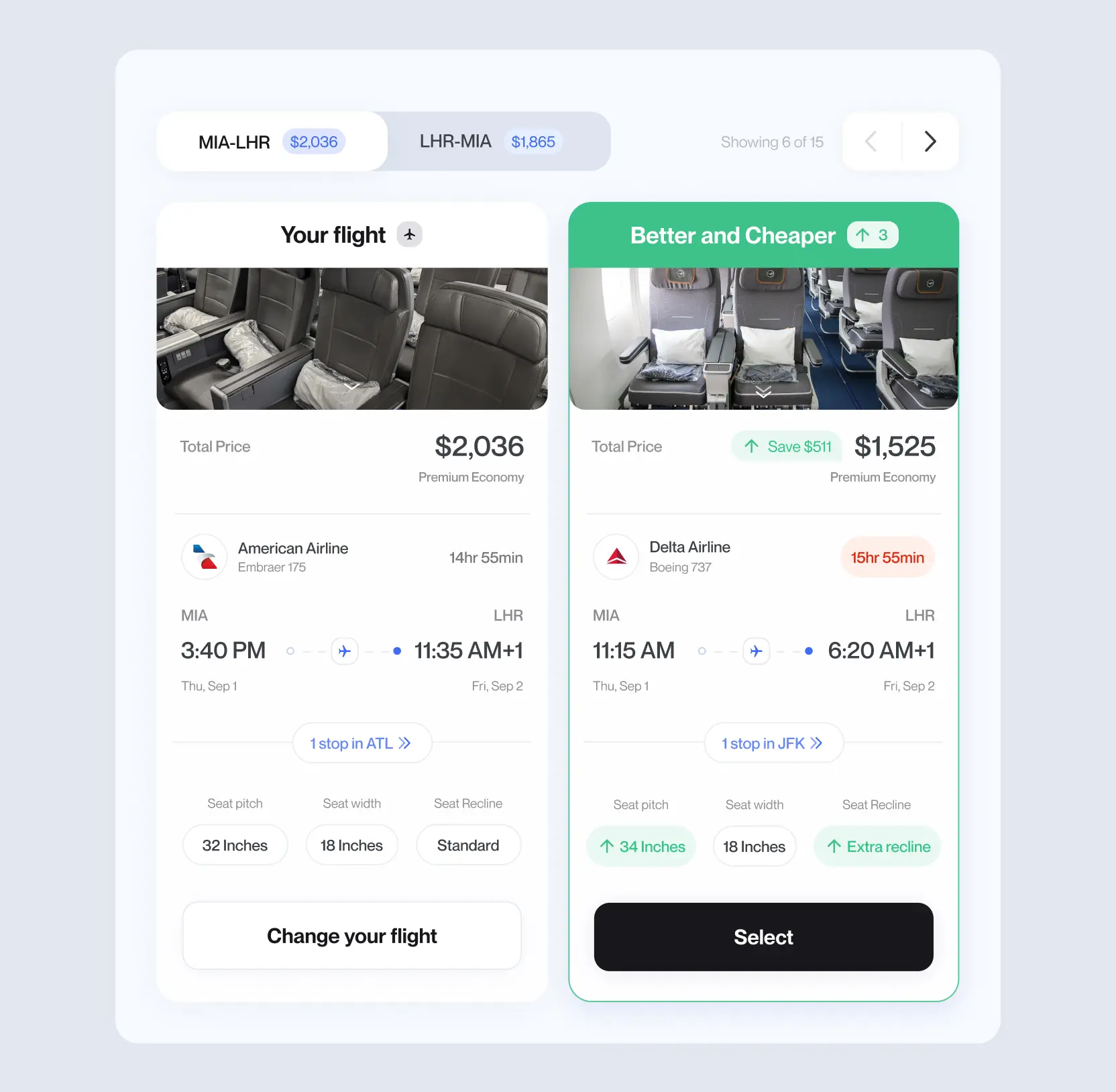
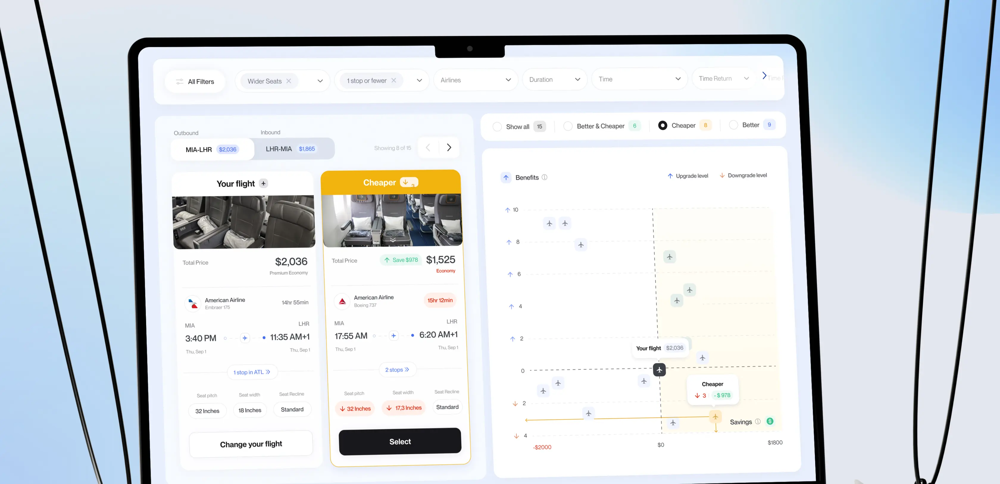
At the heart of FCF is its search and comparison flow. We crafted a system where users can refine their search by multiple parameters from layovers and duration to comfort level, airline reputation, and in-flight amenities.
Our team designed dynamic filters that respond in real time, ensuring every selection updates the results instantly.
The layout adapts smoothly to each traveler’s intent, showing essential data for quick decisions and offering deeper insights for those who want to explore more.
This approach reduces cognitive load and creates a fluid journey from search to selection.
Created a mobile experience that feels effortless
The majority of FCF’s traffic comes from mobile, so the mobile UX was treated not as an adaptation — but as a core product experience.
The Lazarev team developed a light-themed mobile interface featuring soft contrasts, airy spacing, and intuitive thumb zones. All core elements: search bar, filters, and results, fit neatly within a single screen, keeping users focused while maintaining access to advanced settings.
Every interaction was designed to feel instant and responsive, mirroring the speed users expect when planning trips on their phones.

Design-led mobile site optimization practices & wins from Lazarev.agency

AI & ML
Lazarev. agency offers comprehensive digital design services. Discover our range of related expertise supported by impactful case studies.
More Scaleups Cases
FAQ
How can UX design improve engagement in travel or flight search platforms?
A clear, intuitive UX reduces friction and helps users reach their goals faster. In FCF’s case, Lazarev.agency simplified the entire search flow from start page to results cutting distractions and cognitive load. This made the process effortless for both budget and comfort-focused travelers, improving engagement and completion rates.
What are the best ways to balance simplicity and functionality in digital product design?
The FCF project proved that simplicity doesn’t mean fewer features, it means better prioritization. We streamlined complex filters and reviews into a minimal, easy-to-navigate interface. Every element served a clear purpose, ensuring visual clarity without limiting options.
How can travel products personalize user experience without overwhelming them?
Personalization should be subtle and context-aware. At FCF, we used data-driven insights to tailor filters, highlight comfort options, and surface relevant flight details. This approach gave users control while keeping the experience calm and focused, increasing satisfaction and trust.
Why is mobile-first design critical for travel apps and platforms?
Most travelers search for flights on their phones. That’s why we treated FCF’s mobile version as a core product, not a secondary adaptation. The result was a light, responsive interface where all key actions: search, filter, compare fit neatly on a single screen, boosting usability on the go.
What are key UX challenges when designing a flight search engine?
The biggest challenge is balancing vast data with usability. FCF required integrating filters, comfort metrics, and pricing insights into a single flow, without creating clutter. Lazarev.agency solved this through dynamic filtering, real-time updates, and progressive data layering that kept the interface fast and intuitive.
How does data-driven UX research lead to better digital experiences?
In FCF’s redesign, user research was the foundation. By studying traveler behavior, we identified two core personas: budget-driven and comfort-driven. These insights shaped navigation, filter hierarchy, and visual tone, ensuring each user type felt understood and supported throughout the experience.
What business results can design-driven improvements bring to travel products?
A clear and functional design directly impacts engagement and conversion. For FCF, creating a seamless, research-backed user journey helped position the platform as both efficient and trustworthy, a combination that drives user retention, higher booking rates, and brand differentiation in a crowded market.


Hit me up! Let’s chat about your growth


