

Reviewed by: Lazarev.agency Travel & Event UX/UI Team
Last updated: November 2025
Relevant work: Ticketing & booking flows for travel platforms, event apps, and hospitality brands
Most travel and event platforms don’t suffer from “not enough traffic” — they suffer from UX friction at critical moments. The biggest conversion killers are mobile-unfriendly flows, aesthetic-only hero sections, fragmented booking journeys, weak personalization, and neglected branding, all of which erode trust and make it harder for users to complete a booking.
Key takeaways
- Mobile is your biggest opportunity and your biggest risk — rushed users on the go will not tolerate clunky flows.
- Hero sections that look great but don’t prioritize search, dates, and CTAs lose bookings.
- Fragmented, multi-page booking flows drain trust and patience, especially on mobile.
- Ignoring user intent and traffic source kills relevance; personalization is now table stakes.
- Inconsistent or generic logos and branding quietly damage trust at the most expensive click: the booking decision.
Why your travel & event UX/UI design might be hurting conversions
If your travel or event platform brings in strong traffic but conversions remain low, you’re not alone, and your UX/UI design is likely playing a bigger role than you think.
With AI search overviews and comparison engines sending increasingly “ready-to-act” traffic, even minor friction points can heavily influence what users do next.
In this article, we’ll break down five common but overlooked UX/UI mistakes in travel and event platforms and show how to fix them with practical, implementation-ready changes.
Mistake 1: Ignoring spontaneous, on-the-go mobile booking behavior
As of 2024, mobile devices are responsible for more than 65% of visits to online travel and event platforms.
That’s an enormous lost revenue stream for travel and event teams that still treat mobile as a “responsive afterthought.”
What’s going wrong?
- Pages look like shrunk desktop layouts, not flows designed for one-handed use.
- Multitasking users — checking dates between meetings or browsing events mid-commute — face:
- intrusive modals
- overloaded filter menus
- CTAs out of thumb reach
- Micro-frictions (slow feedback, cramped tap targets, jumpy layouts) break trust.
How to fix it
- Design dynamic sticky booking bars
Keep dates, people count, and “Book / Get tickets” visible and thumb-friendly at all times. - Use collapsible filter trays
Replace full-screen filter walls with drawer-style filters that open, adjust, and close without losing context. - Reduce modals; favor progressive disclosure
Only surface extra options when users signal intent (e.g., “More filters,” “Advanced search”). - Polish touch interactions
Responsive tap states, predictable transitions, and instant feedback signals that the product is reliable. - Prioritize layout around real user tasks
Organize content around “Find dates → Compare options → Confirm details,” not your CMS structure.
👉 Struggling with mobile drop-offs? See how we fix them in design-led mobile site optimization practices & wins from Lazarev.agency.
Mistake 2: Designing hero sections for aesthetics instead of action
There’s a fine line between a beautiful hero image and a conversion-killing one. In travel and event design, that line gets crossed a lot.
Immersive hero sections with full-screen videos and dreamy landscapes can absolutely inspire wanderlust — but if users can’t immediately search, choose dates, and see prices, you’re burning intent.
A recent Google study showed users form an impression of your interface in 17 milliseconds. Sites with low visual complexity and high prototypicality (i.e., “This looks like what I expected”) are seen as more trustworthy and appealing.
Look at top travel websites: they place the primary goal — search, booking, or event registration — front and center with:
- search bars above the fold
- sticky CTAs
- dynamic price previews
- real-time availability
- visible social proof
How to fix it
- Design your hero around the next action, not the nicest photo
Make the primary user task obvious: “Where,” “When,” “Guests,” and a clear “Search” / “Get tickets” button. - Swap purely scenic shots for value components
Use price modules, “Only 3 seats left” labels, or “4.8 ★ from 3,200+ reviews” instead of a static postcard image. - Use intent-aligned headers
Tailor messaging to “Last-minute city breaks,” “Family summer trips,” or “Tech conferences in Q1” based on segment. - Usability-test first impressions
Watch how users scroll, where their eyes land, and how long it takes them to find the booking action.
👉 Explore more essential UI principles behind products users trust in our UI design principles guide.
Mistake 3: Fragmented, trust-draining booking flows
Booking a trip or event should feel smooth and finite. Instead, many flows look like this:
Search → Package info → Send to external payment page → Wait for confirmation email → Hope it worked.
Along the way, users hit:
- long forms
- slow reloads
- confusing seat selectors
- unclear error states
By the time they reach payment, the emotional excitement is gone, replaced by uncertainty.
“Great travel and event UX/UI design removes any barriers in the user journey. When the process flows smoothly, users feel confident and are far more likely to complete their booking.”
{{Ostap Oshurko}}
How to fix it
- Compress the booking funnel into ~3 clear steps
For example: 1) Choose details, 2) Confirm options, 3) Pay & receive confirmation. - Add progress indicators
Show users exactly where they are (“Step 2 of 3: Passenger details”) and what’s left. - Enable save-and-resume
For complex itineraries or corporate bookings, let users come back without starting from scratch. - Minimize context switching
Keep booking within your ecosystem as much as possible. If you must redirect, maintain consistent branding and reassure users they’re still in a secure flow.
Mistake 4: Ignoring personalization by intent, source, or behavior
A user arriving from Instagram, an email campaign, and a Google flight search are not in the same mindset.
- Social traffic = exploring, dreaming, early-stage.
- Email subscribers = warm, mid-funnel, primed for offers or reminders.
- Search traffic from flight/hotel queries = high intent, near-booking.
Yet many platforms show the same static landing page to everyone.
Modern travel & event UX needs to:
- acknowledge where users came from
- remember what they did before
- shorten the distance between interest and action
How to fix it
- Adapt content by traffic source
- Instagram visitors: rich visuals, short highlights, simple “Explore dates” flows.
- Email subscribers: exclusive offers, saved trips, “Continue planning” prompts.
- Search visitors: direct access to search, dates, and booking with minimal distractions.
- Use location-aware defaults
Pre-fill city, currency, language, or region based on user location to minimize inputs. - Pre-fill filters and preferences
Returning users should see recent searches, saved trips, or preferred event types without re-entering everything. - A/B test journeys by segment
Run separate experiments for social, organic, and paid traffic to identify best-performing layouts and messages.
💡 Pro tip: Use geo-intent and behavioral insights to optimize search, ticket sales, and upsells. If you’re ready to go further, partner with AI consulting or AI UX design teams to implement personalization that triggers real “aha” moments rather than generic recommendations.
Mistake 5: Treating your logo and branding as an afterthought
When someone lands on your booking page from Google Flights or a social ad, they spend milliseconds checking, “Can I trust this?”
If your travel logo design:
- looks like a default template
- doesn’t align with the promise (neon gradients for a luxury retreat, cartoon font for an enterprise event app)
- appears blurry or illegible at small sizes
…you’re creating visual dissonance at the exact moment you need confidence.
“We’ve seen travel sites with gorgeous UI fall flat because the logo felt like an afterthought.”
{{Ostap Oshurko}}
Strong logos and identity systems:
- hold up at 32px, 64px, 128px
- feel consistent across desktop, mobile, and app icons
- support light/dark modes and overlays
- anchor the color system and visual hierarchy
How to fix it
- Design logos for real-world sizes, not just dribbble shots
Test legibility and recognition at 32px in nav bars, 64px in headers, and 128px in splash screens. - Ensure seamless integration across UI
See how the logo behaves in menus, loading states, confirmations, and mobile sheets. Avoid overly detailed marks that blur on scroll. - Run “brand consistency” checks in your UX research
Include logo + UI consistency as a research lens: does the brand feel coherent from ad to landing to checkout?
What the best travel & event platforms are doing differently
Top travel websites and event platforms don’t guess what users want. They test, observe behavior, and refine relentlessly.
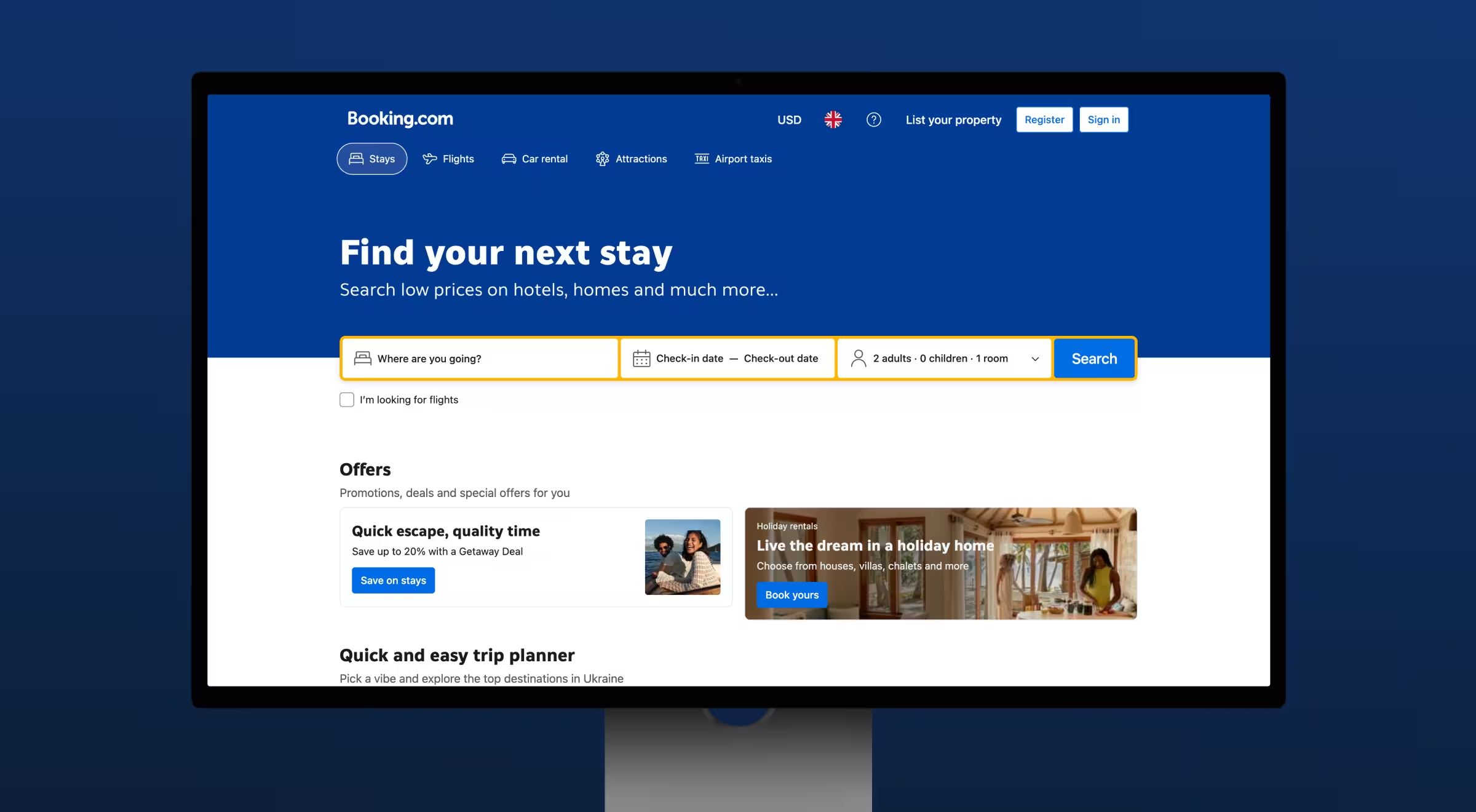
Booking.com keeps the path from search to booking brutally focused. Search is front and center, CTAs are always visible, and navigation feels obvious, not clever.
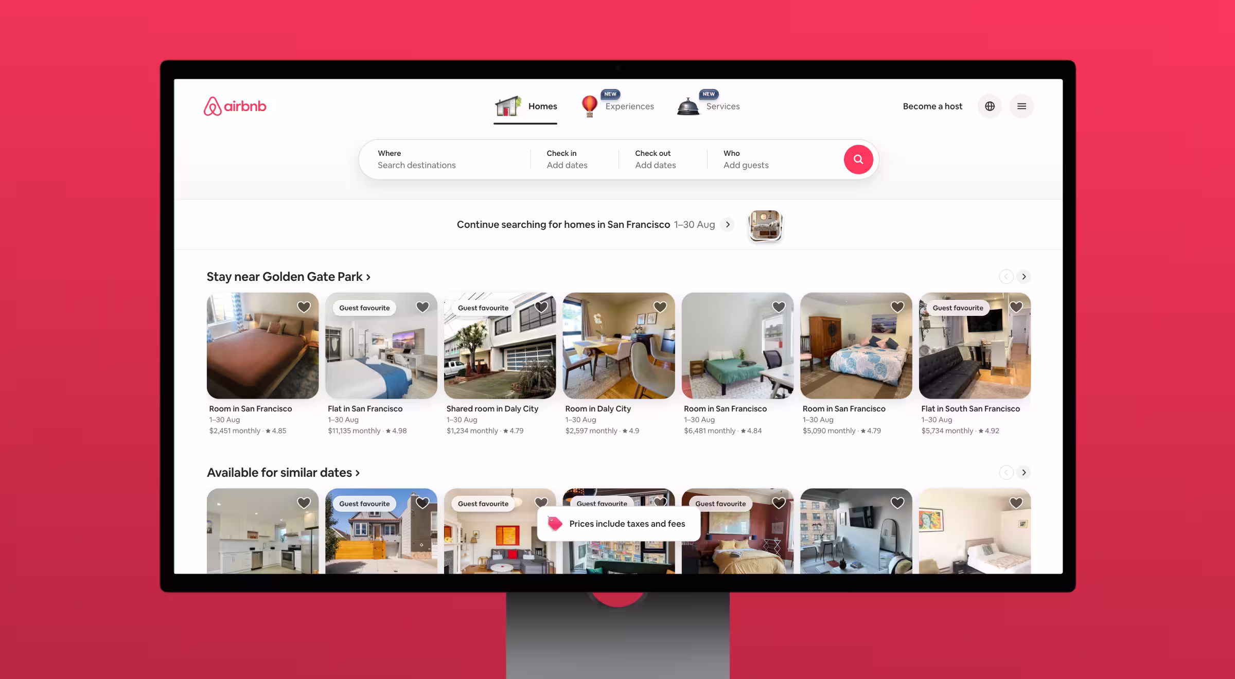
Airbnb personalizes travel UX by surfacing local attractions, saved stays, and contextual suggestions based on location, seasonality, and history.
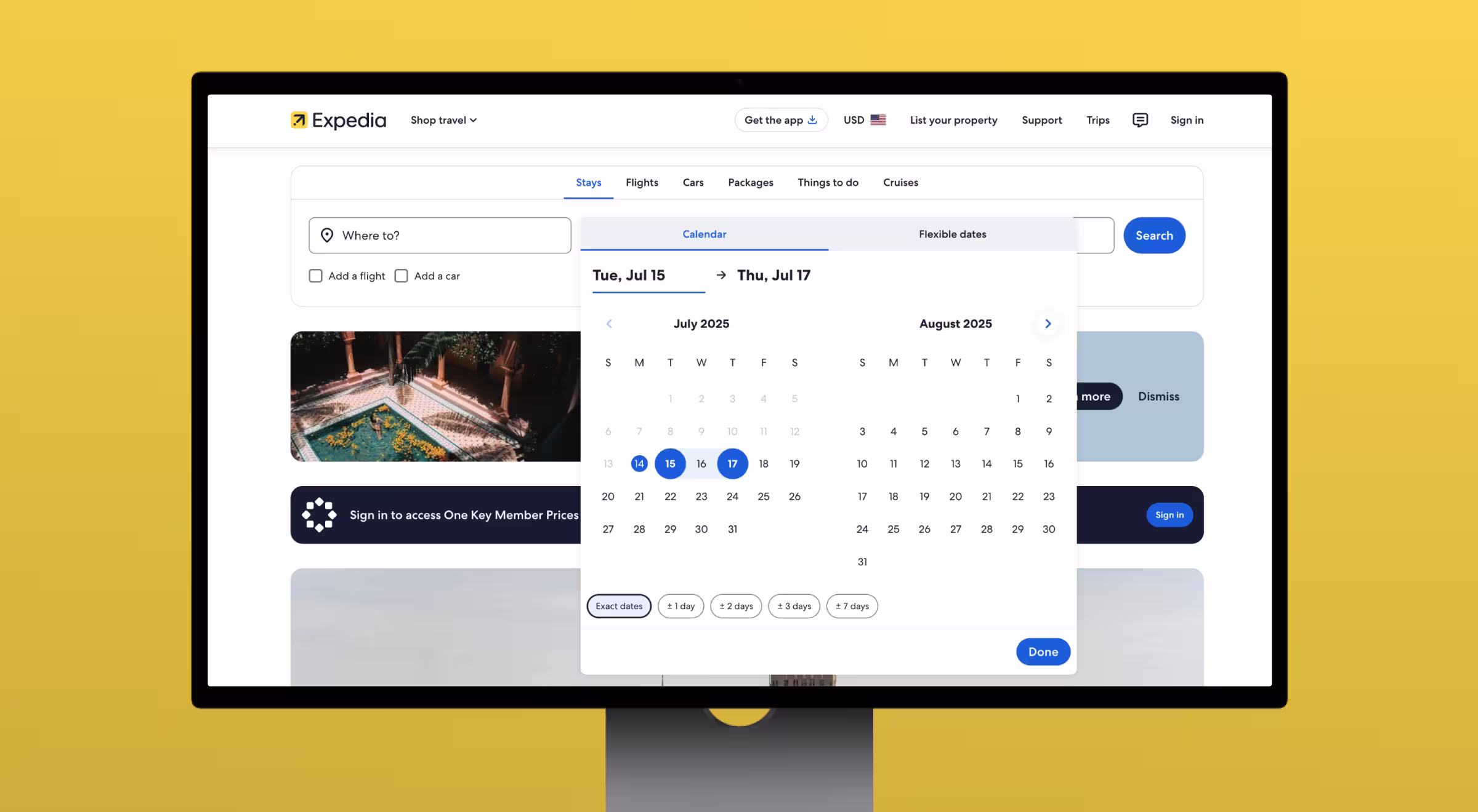
Expedia simplifies complex planning (flights + hotels + activities) into a coherent, multi-product booking flow with fast-loading inputs and real-time prices.
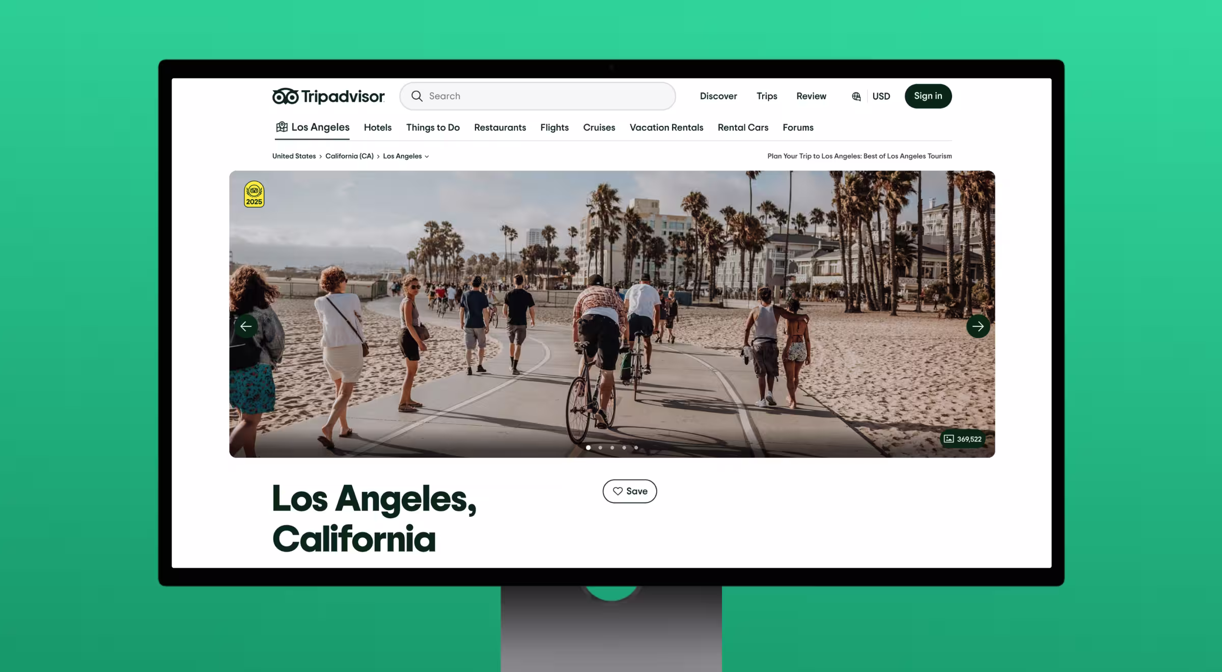
Tripadvisor builds trust through embedded reviews, ratings, and user photos right in the booking flow — users don’t have to leave to compare.
Behind these experiences are design and innovation consulting firms who understand that UI/UX is a revenue lever.
How Lazarev.agency redesigned a TravelTech search experience for clarity, speed & higher conversions
Most flight search engines overload users with options, noise, and decision fatigue. FCF — a fast-growing TravelTech platform — partnered with Lazarev.agency to reverse that pattern and build a search experience where travelers find the right flight faster and with less cognitive effort. Below are the core UX moves that aligned with the principles in this guide.
1. We turned the start page into a conversion engine
FCF’s original homepage suffered from the same issue many travel platforms face: beautiful visuals, but no immediate path to action. We rebuilt the page around clarity and intent:
- Stripped away decorative noise and surfaced a clean, functional search bar.
- Introduced comfort indicators, seat-quality hints, and flexible filters right on the start screen.
- Preserved space for dynamic components (price drops, last-minute deals) without clutter.
Impact: users instantly know what to do next, mobile bounce drops, and high-intent visitors move straight into planning.
2. We designed a search flow tailored to how real travelers decide
Search is the heart of every travel platform — and the biggest source of friction. Instead of burying filters behind modals or splitting key info across multiple screens, we:
- Built real-time, adaptive filters that update results instantly.
- Created layouts that support both quick scanners and deep comparers.
- Reduced cognitive load by highlighting meaningful differences (layovers, comfort level, amenities, airline reputation) instead of raw data dumps.
Impact: fewer drop-offs mid-search and a smoother path from browsing to choosing the right flight.
3. We treated mobile as the primary product
More than half of FCF’s traffic comes from mobile, so we designed with thumb-reach, pacing, and clarity as first principles. Our approach:
- Light theme, soft contrast, and airy spacing to reduce fatigue.
- A layout where search, filters, and results coexist on one screen — no context switching.
- Instant responses and smooth micro-interactions that signal reliability.
Impact: a mobile experience that feels fast, calm, and effortless — exactly what travelers expect when searching on the go.
🔍 Read the full case study.
Ready to turn browsers into bookers?
The gap between a pretty travel site and a high-converting one is wide — and expensive.
- fragmented booking flows
- aesthetic-only hero sections
- outdated mobile experiences
- missed personalization opportunities
- weak, inconsistent branding
These quiet issues chip away at your conversions long before anyone complains.
At Lazarev.agency, we design travel and event experiences that map to how people actually plan, compare, and book and to the metrics your leadership cares about: conversion rate, booking value, and retention.
👉 Explore our travel & event UX/UI solutions to see how brands stand out and scale.
👉 Reach out when you're ready to redesign key flows, align UX with intent, and turn more visitors into confirmed bookings.


.webp)


.avif)


