How we designed a B2B e-commerce website that boosts engagement and drives revenue

About
the project

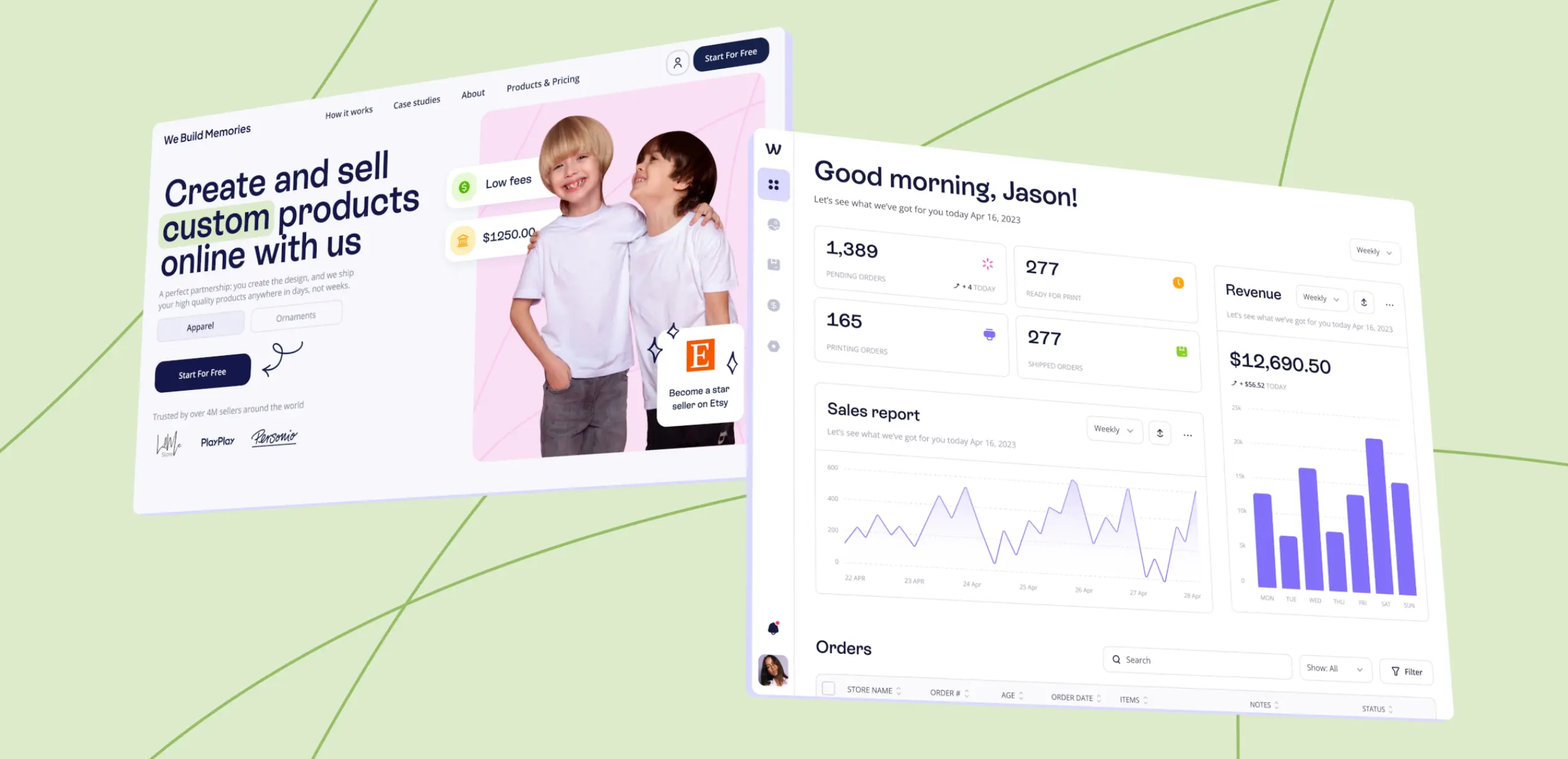
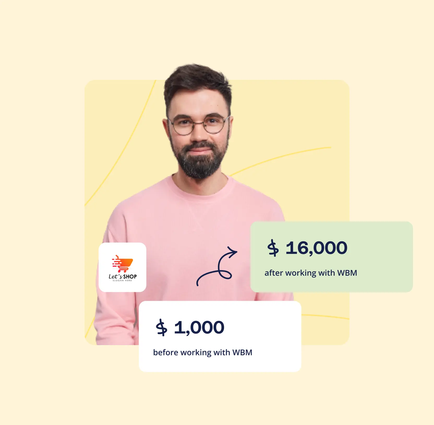
The client, We Build Memories, a top 5 Etsy seller known for custom baby clothing and Christmas ornaments, had built an impressive e-commerce presence. Yet, the project was held back by outdated branding and an overly corporate image that failed to connect with their niche audience. They needed more than just a design refresh, they needed a partner who could translate their market success into a modern, conversion-focused digital experience. 

They turned to Lazarev.agency to modernize their platform, streamline the customization process, and elevate their B2B presence in the printed baby clothing market, all while balancing professionalism with the warmth and personality their brand is known for.

Results

The redesign streamlined workflows, improved user satisfaction, and achieved measurable growth in engagement, conversions, and revenue.

25%

increase in time spent on site due to enhanced platform usability and visual appeal.

20%

improvement in conversion rates after redesigning the customization flow.

15%

growth in revenue, driven by a more intuitive and seamless user experience.

30%

reduction in user churn, thanks to an engaging and user-friendly platform redesign.

No items found.

The Project’s
Discovery Phase

No items found.
No items found.

Modernized brand to match market expectations

The platform itself automates key processes such as printing, packaging, and delivery allowing resellers to focus solely on what truly drives their business: creating designs and attracting customers. We revitalized the brand identity to strike a balance between professionalism and warmth, making it more attractive to both niche retail buyers and B2B partners. 

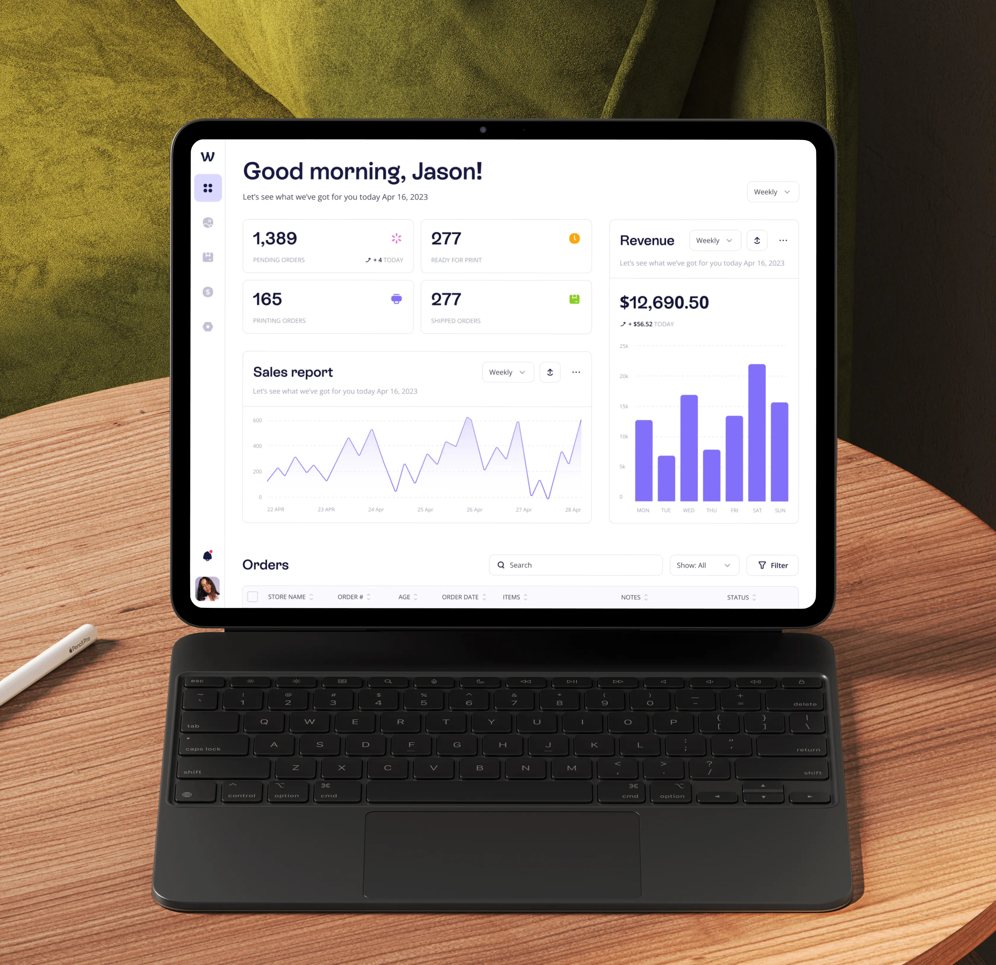
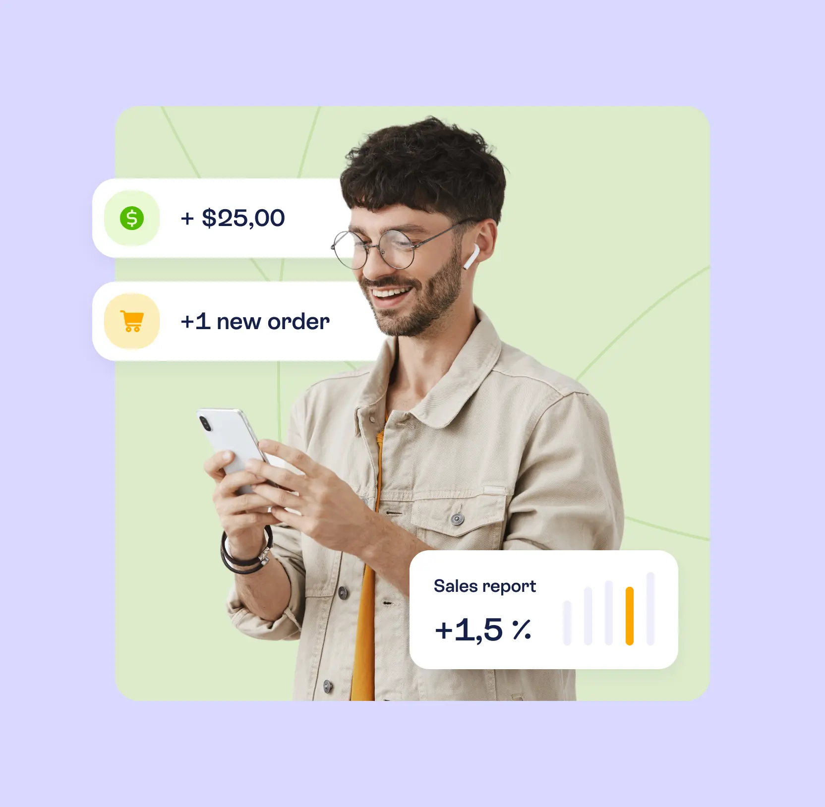
The client’s original interface was overly minimalistic, almost entirely text-based, offering little usability or guidance. We transformed it into a modern, sales-focused dashboard that prioritizes what matters most: earnings. Revenue is now prominently featured, with clear insights into sales performance and order status.

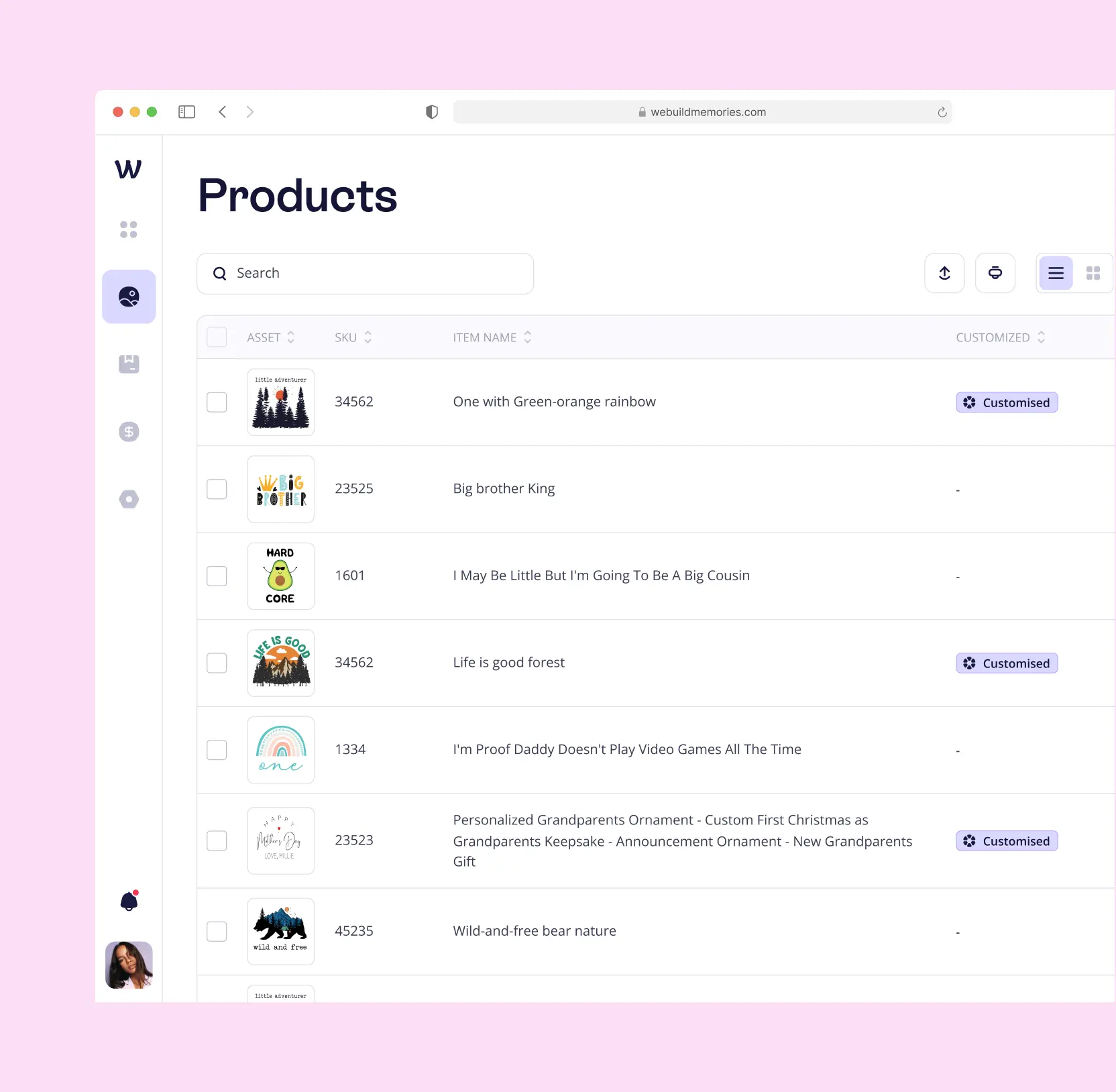
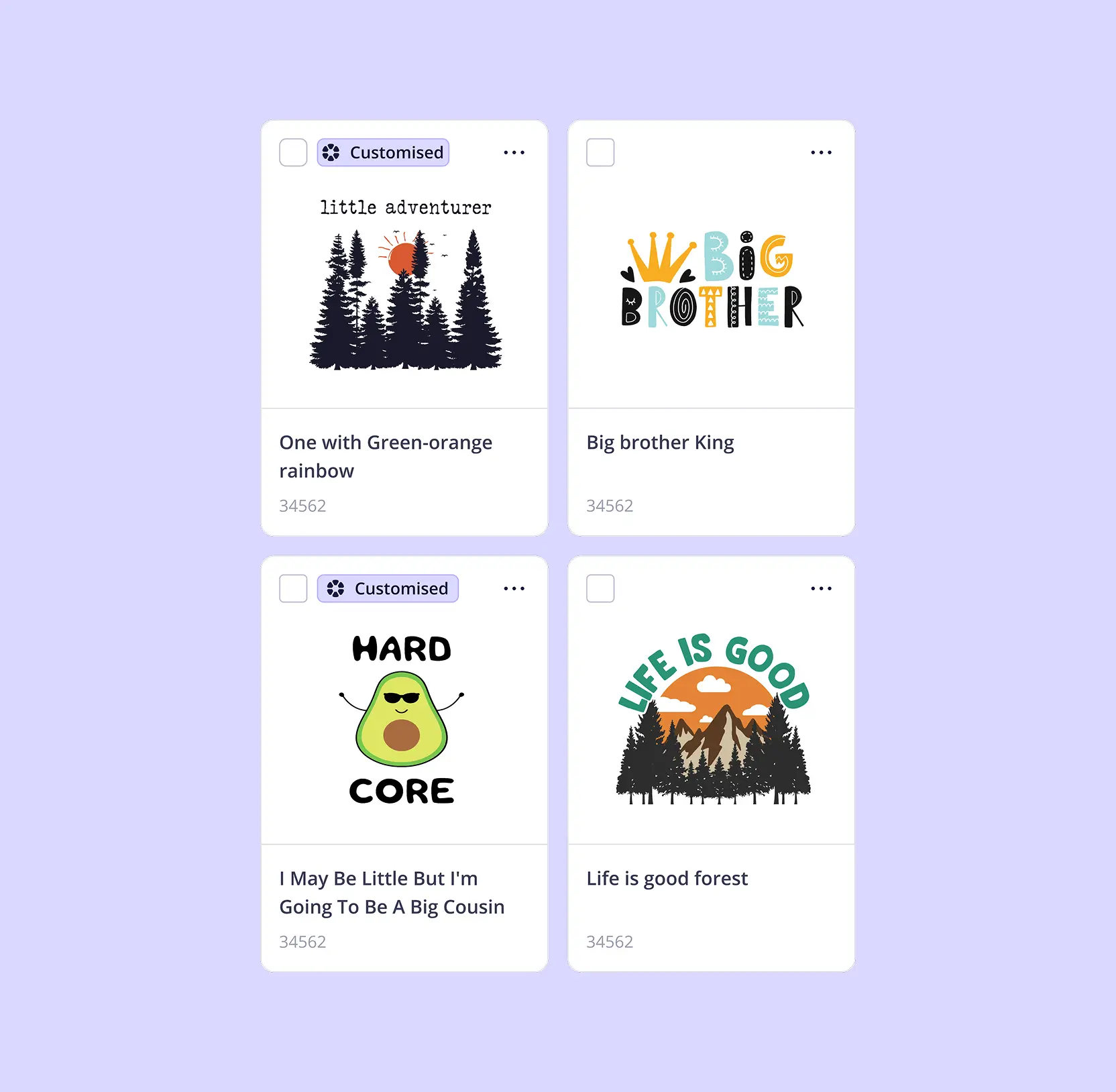
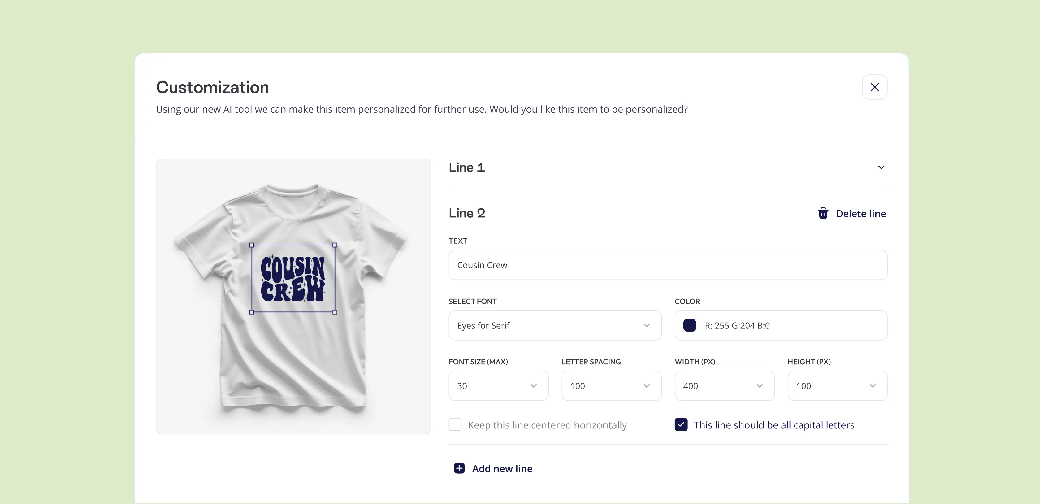
To make the platform scalable and accessible, we built a transparent, user-friendly product creation flow. Resellers can easily add new items, upload designs, and customize text, fonts, and colors, all with an instant preview. This simplified process reduces friction, enabling resellers to launch professional-grade products faster and grow their businesses without worrying about the operational complexities.

No items found.

Streamlined invoicing and order management for higher conversions

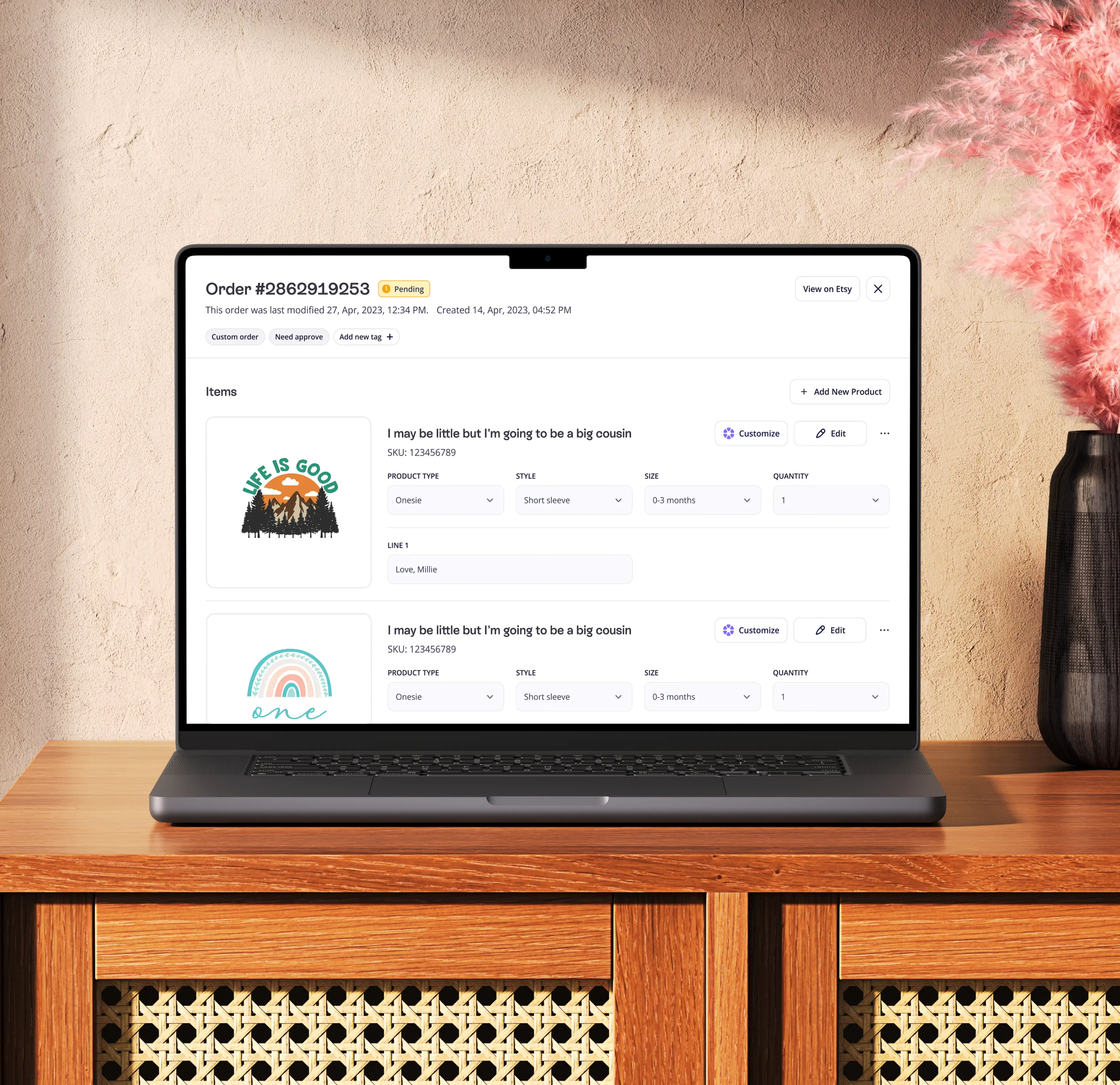
We simplified the order management process: resellers can now create orders in just a few steps, track their status, and manage delivery and returns directly within the platform. This provided full visibility and sped up order fulfillment.

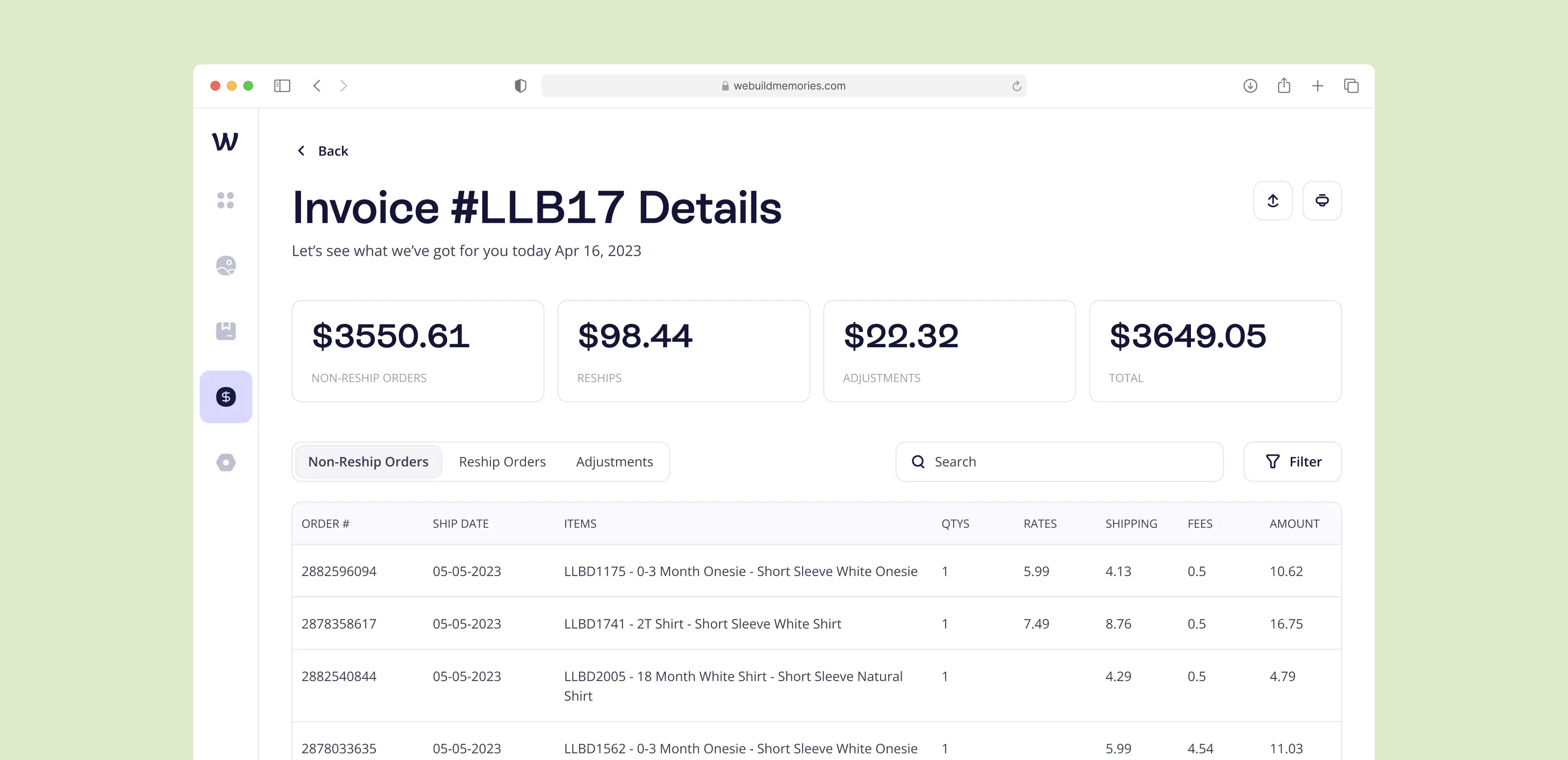
For finances, we introduced a module with invoices and payments. All bills both paid and pending are consolidated in one place, while a dedicated invoice page shows a detailed breakdown of costs and commissions. This eliminated the need for manual spreadsheets and made financial management clear and transparent.

Ecommerce website optimization tips from Lazarev.agency

No items found.

Enhanced platform usability to increase engagement

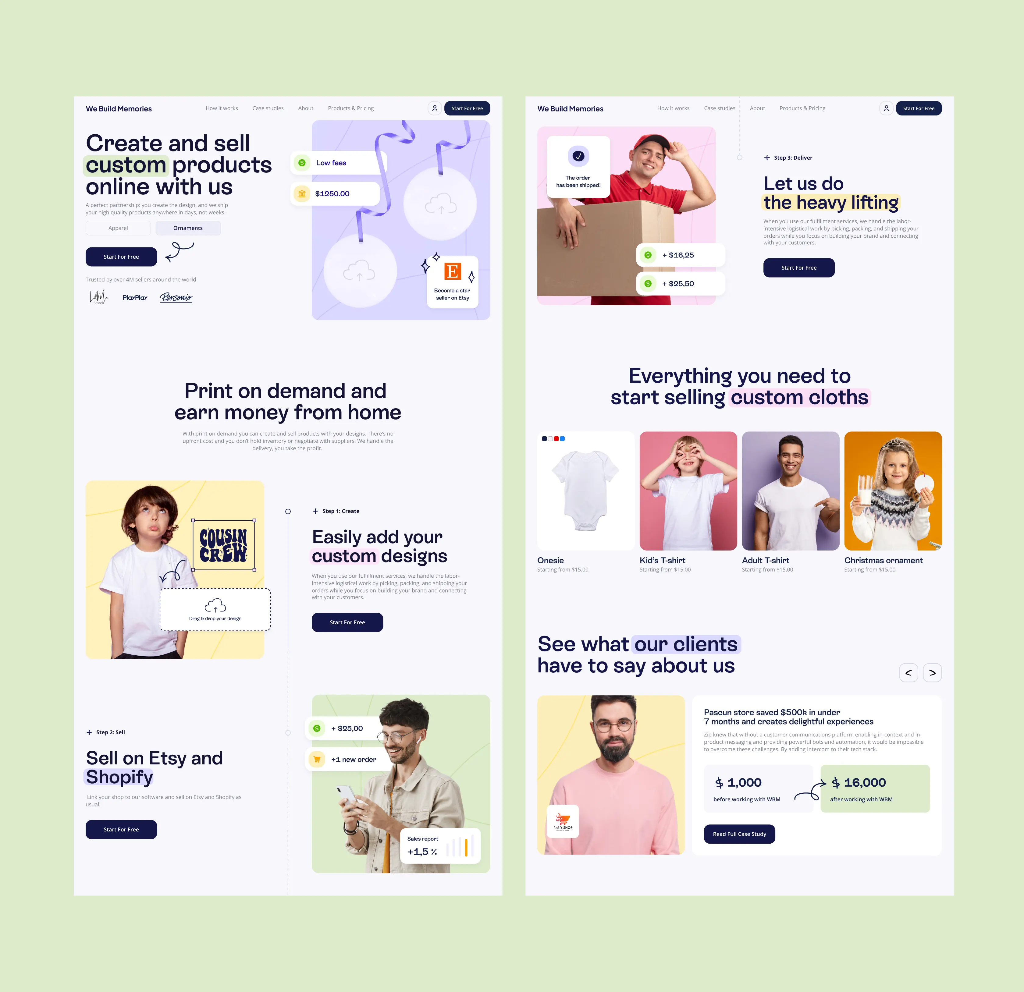
Originally, the client had no real landing page to present the platform’s value. We built one from scratch and transformed it into a powerful sales tool. The structure was simplified to highlight only the most important content, with bold call-to-action buttons that guide users directly to registration and sales.

To strengthen trust, we introduced a profit calculator that lets resellers instantly see their earning potential, and added success stories showcasing real growth achieved on the platform. Finally, we demonstrated how easy it is to start selling by breaking the journey down into just three steps: Create, Sell, Deliver making the value proposition clear and motivating users to take action.

No items found.

Created brand identity to boost recognition

The lack of a landing page and the almost text-based interface also meant the client had no cohesive visual language or recognizable brand presence. We developed a brand identity that balances playfulness and professionalism, tailored specifically for resellers in the children’s clothing niche.

Soft pastel tones reduce visual fatigue and create a warm, approachable atmosphere, while authentic product and lifestyle photography builds credibility and emotional connection. This new design system became the foundation for the brand’s digital presence, guiding users toward action, keeping them engaged, and reflecting the care and creativity of the children’s clothing market.

The result is a professional yet inviting visual language that differentiates the client from competitors, makes the brand accessible to new entrepreneurs, and increases conversions by turning passive visitors into active resellers and loyal customers.

No items found.

More Other Cases

FAQ

1

How can better UX design increase revenue in e-commerce platforms?

Improving UX helps users navigate, customize, and purchase products faster. For this client, a leading Etsy seller, Lazarev.agency simplified the product customization process and restructured the buying flow. This directly led to a 15% increase in revenue, showing how smart, conversion-focused UX upgrades drive measurable growth in DTC e-commerce.

2

What are effective ways to reduce customer churn in online stores?

Reducing churn means removing friction and boosting confidence at every touchpoint. Lazarev.agency’s redesign introduced clearer product customization steps, modernized branding, and improved backend transparency (e.g. order visibility). These changes led to a 30% drop in churn, showing how UX paired with operational clarity retains customers.

3

How should e-commerce brands balance playfulness and professionalism in design?

It starts with a brand identity that reflects the product’s emotional appeal and trustworthiness. For a niche baby product brand, Lazarev.agency crafted a playful yet polished visual system, welcoming for parents, while credible enough for B2B buyers. This balance helped reposition the brand without losing its personality.

4

Why is platform customization important for customer experience?

Customization drives personalization and loyalty. Lazarev.agency streamlined a previously clunky customization process into a frictionless UX flow. This not only improved customer satisfaction but also reduced cart abandonment, especially during high-stress seasons like Christmas when custom orders spike.

5

What’s the impact of backend UX improvements in e-commerce?

Backend systems are often overlooked, but they’re key to scaling. Lazarev.agency introduced a new platform for real-time order and delivery tracking. This empowered the business to improve fulfillment speed and customer service, resulting in a more trusted brand experience and fewer support issues.

6

How can branding influence B2B opportunities for consumer e-commerce brands?

For B2B growth, a consumer-facing brand must signal reliability and expertise. Lazarev.agency elevated the client's identity with a more polished, cohesive design system. This new branding made the company more attractive to wholesale buyers and B2B partnerships, unlocking new channels of revenue.

7

What are the best design strategies for seasonal product businesses?

Seasonal sellers need scalable systems and memorable branding to stay top of mind. Lazarev.agency focused on creating a flexible design foundation and intuitive UX that could handle seasonal traffic spikes. The result is a higher rate of repeat purchases and smoother operations during peak seasons.

Hit me up! Let’s chat about your growth

Kirill Lazarev
Founder of Lazarev.
Let’s talk
Your Custom Space is Almost Ready!!! <1 min

We’ve created this space specially for you, featuring tailored ideas, design directions, and potential solutions crafted around your future product.

Everything’s Ready!

Your personalized space is ready to go. Dive in and explore!

12%
Analyzing data...
Explore Now
Hey, your personal page is being crafted.
Everything’s Ready!
12%
Go
Your Custom Space Ready!!!

Recognizing that financial researchers utilizing Rhea need to process data and generate reports, we aimed to enhance their efficiency. Consequently, both text-based and widget results provided by AI can be seamlessly transformed into a report, with the added capability to edit the data.

UX for AI, Lazarev. digital product design agency

The command results are presented on a graphical interface through widgets. Accompanying CTAs are available to assist users in refining commands for processing the results further.

Widgets design for AI Fintech analysis app by Lazarev. product design agency

The Connect app also focuses on career growth and advancement. Therefore, we provided users with the option to send something akin to their digital business cards through the messaging system. This allows others to explore their skills and experience.

Messaging system for a mobile app designed by Lazarev. best design studio

We let users build their own schedule by picking their favorite sessions, workshops, and speakers. They can even export the schedule to their personal calendar for better organization.

Scheduling, event schedule for conferences, design by Lazarev. UI UX agency

Right there, we provided traders with the ability to compare various assets and observe how their value changed under the influence of news within different time periods. This feature facilitates making more informed decisions on investments.

A widget with the graph showing crypto asset comparison.

On the Matta marketplace, the availability of pricing information for products is contingent upon the intricacies of supply and demand.

To address this aspect of price absence, we gave buyers an ability yo request Price and Features Information (PFI). Upon making this request, the supplier will dispatch the PFI to the user via email and WhatsApp in PDF format.

Checkout design for an online marketplace

Similar to any marketplace, we've integrated a feature for adding products and suppliers to your Favorites. This allows buyers to receive notifications about product availability and save desired items for future purchase if the timing isn't right.

Digital product design for chemical marketplace

To enhance interactivity further, we made the decision to move away from providing users with only text-based instructions on how to address a particular issue.

Instead, we offered visual aids that accompany the text answers, helping users navigate the app and resolve their issues more swiftly.

Gamification design with dark UI elements for the Payoneer financial app.

Customers can ask the assistant any question, thanks to its neural network power, and it can even offer a weather forecast.

We made sure that the customer support section is accessible to everyone. If someone prefers not to or is unable to record their voice, they can use text input to pose a question, and vice versa.

AI-driven chat design by Lazarev. AI design agency

Brands need to connect any of the available wallets to mint NFTs. On the consumer side, though, individuals without a wallet can create a new one on the fly by using their email or social media. Alternatively, they can purchase NFTs using fiat currency and complete the entire transaction without any knowledge of Web3.

A graph showing the price history of an NFT, designed by Lazarev. design agency

We've implemented a personalized Customers section within Console, enabling collectors to manage customers who settle their debts through Collect. This empowers them with easy access to account data, detailed transaction insights, and the flexibility to provide customized payment solutions for individual cases.

Two desktop interfaces showing Customer's module within Tratta app

Central to our objectives was streamlining processes and boosting productivity for Console users. To accomplish this, we introduced highly customizable Settings. This empowers collectors to tailor the platform to their individual workflows and preferences. For instance, collectors can personalize settings to determine which features their customers will view in the Collect platform, including special offerings, discounts, and more.

Two desktop screens showing the Settings module of Tratta app

Each inventory management report is further fortified by the inclusion of the tenant's signature, solidifying the inspection process's validity and accountability.

A pop-up showing how to sign an inspection results once it was completed

To ensure a landlord's capability to substantiate claims against a tenant's deposit for damages, or vice versa, to verify that the damages are attributable to wear and tear, it is imperative that inspections exhibit the robustness required to endure legal scrutiny.In line with our approach, our inspections are comprehensive, incorporating intricate descriptions accompanied by photographic evidence.

A pop up showing how to add photos to an inspection of an apartment

To elevate user engagement and foster a deeper comprehension of the available apartments, we crafted the interactive house model within the "Selection of Apartments" section. This immersive experience empowers potential buyers to take a 360-degree tour, flipping between street and yard views with a simple toggle switch. As they hover their cursor or tap (for mobile users),  the house's specific sections illuminate, offering valuable insights into construction timelines and housing readiness. The interactive journey extends to selecting a floor and pinpointing a specific apartment with the help of a visual builder, simplifying the decision-making process and potentially increasing conversion rates.

An interface screen shpwing the 3D model of a complex and a widget that allows to switch between different complex's sections

For a more accessible experience, we've integrated a calendar widget right alongside the daily task list. A simple click takes users to a detailed breakdown of tasks, anything from completing quizzes to reading materials. This strategy keeps users within the app, providing a sense of encouragement and support rather than overwhelming them with excessive demands.

A mobile version of the Daily Actions page

We introduced an interactive widget at the top of the homepage, allowing users to track upcoming elections and assess their preparedness based on articles read, candidate knowledge, and quiz participation. By providing users with a clear measure of their readiness, the design solution motivates them to engage with educational content and explore candidate profiles while actively participating in quizzes.

Three states of the interactive widget on the homepage

Our solution was to design a switch that lets users transfer money to the fund’s international bank accounts. The website now offers the flexibility to contribute in multiple currencies (USD, UAH, EUR) using various payment methods tailored to the user's location. Donors can also donate through Paypal, support the fund on Patreon, or make donations in cryptocurrency.

Widgets displaying various donation platforms

An interactive payment widget responds with the organization founder, Serhiy Prytula’s phrases, every time a user enters any sum of money in the donation field. Such a solution proved to be efficient, encouraging more people to donate through the widget and increasing the average contributions by almost a quarter.

The mobile version of the donation page

One standout feature of Redbrain is the inclusion of price history and price forecasts directly on the product page. In line with Redbrain's dedication to delivering the best deals to consumers, we introduced a block that presents price trends from various retailers for easy comparison. Further below, we provide results generated by forecasting algorithms, helping consumers determine the optimal time to make their purchase.

The Price history section of the Redbrain website

Below the product imagery, consumers find essential product details like a comprehensive overview, rankings, and technical specifications. Given the pivotal role of product content in influencing consumer choices, we've enhanced the content display with interactivity and incorporated ample white space to ensure easy readability.

The scroll of the Redbrain page

This versatility in data presentation underscores our commitment to delivering a user-centric and highly functional interface, empowering users with diverse tools to effectively engage with critical information.

A map featuring an organized table filled with data

Following the analysis process, the resulting data  manifests on the interface. In the context of the Threat Area module, we have thoughtfully provided three distinct alternatives for data display: a map, table and integrated map and table together. A dynamic map presentation highlights the pertinent area, ensuring immediate focus.

Three screens featuring thread-level analysis

We paid special attention to the numbers, as this is what we can be proud of in spite of any difficulties. A minimum of text - a maximum of really important information.

The site offers a responsive view across mobile, tablet, and desktop. We provided the optimal searching experience while maintaining the site content regardless of the device.

The Awards section of the UkrainianPower website

We wanted to showcase the skateboards' benefits unobtrusively, step by step. To this end, we opted for interactive components that entertain people and educate them about the high-end technical specs and benefits like full customization.

 A page featuring a brief guide on using a compact control panel

The content flow seamlessly directed people towards the choice of deferred payment and customer reviews on the skateboards, instilling a sense of trust along the way.

A product webpage showcasing a motor controller replacement kit

We created a catching design style with contrasting colors, dynamic composition, and smart typography that bring visitors' attention to key elements.

An attention-grabbing widget spotlighting the advantages of 11Sight

The web calculator counts the cash back, given the number of invited users. It adds interactivity to the experience and evokes trust, showing commission transparency.

We've made tutor-student communication smooth. The “Questions” feature lets students pick teachers for paid inquiries. Additionally, students can step into the role of a tutor and provide answers to their peers' questions. Simplifying the tutoring process further, we've introduced the “Working Hours” section. This feature allows users to specify their platform availability, facilitating the system in finding suitable, available tutors.

Mobile screen displaying rate the teacher feature

For easy module and lesson navigation, we've created a side menu that opens and closes as needed. It also features a progress list with checkpoints, clearly indicating completed units and those remaining. In the “Learn” section, students can access both free and paid materials. They can study multiple materials on one topic, take quizzes, and move through to the next modules.

Interface showcasing the modules & lessons navigation

As we explored users' perspectives further, we discovered that some don't usually leave comments online due to not remembering all the details or being short on time. These insights led us to develop tags, making it easy for people to share their experiences at places they've been. This fresh idea replaced the old star rating system with tags, offering a simpler and friendlier way to express opinions.

The mobile screen showcasing the Tags functionality

Acknowledging the interconnected nature of workflows, we've introduced a powerful dependencies feature to further enhance the automation of the user experience. These dependencies establish a connection between two workflows, offering users the flexibility to select which workflow to link with. The types of dependencies include simultaneous start, immediate repeat and time delay.

Two compact pop-up windows to manage dependencies

Addressing the central challenge of managing recurrence, we aimed to create a seamless experience for setting repeated workflows. Our solution involves a full-page popup directly on the workflow page. It allows users to manage recurrences comprehensively, setting recurrence frequency, due dates, project durations, and more.

A full-screen pop-up interface for configuring recurring events

Our thoughtfully crafted input fields, controls, and CTA buttons distinguish themselves within the interface, all thanks to their skillful use of design accents and proportions. This approach not only enhances the interface's visual appeal but also boosts user efficiency.

An image showcases various screens, buttons, widgets, and design elements

In our quest to simplify the user experience and eliminate needless steps, we made the deliberate choice to incorporate a right-hand sidebar that opens when you click on a project task. This UX patterns conceal all non-essential information, preventing user overload, while prominently presenting the crucial details necessary for efficient project management.

The sidebar that appears when users click on a project task

The crisp UI design, featuring well-balanced proportions and a logical information structure, enhances readability and helps digest complex financial data.

Numerous screenshots of the Boel IT web product

Recognizing that Vessel Finance could potentially be utilized by less seasoned investors, we incorporated tooltips to explain the column headers. This  addition aims to enhance user understanding when calculating the benefits from vessels.

Desktop webpage displaying a table with year-on-year parameters

The product delivery schedule is presented on an interactive roadmap that advances on its own as visitors scroll through the section.

We present several ordering options to give existing and new customers the freedom of choice and help them make informed buying decisions through in-depth offerings explanations.

Speaking to a broad range of audience segments meant creating technical specs that give entry-level consumers just enough information and knowledgeable engineers - the ability to dive deep.

Through straight composition and powerful copy, we familiarize people with the uniqueness of the Inertia Wheels MAX and inspire them to experience the product in work.

We reimagined the resource center to become a hub of stories, use cases, educational articles, and videos to showcase the breadth of what's possible with the Inertia Wheels MAX.

Through rich interactions, 3D renders, and digestible copy, we show off the unique physical features of the Inertia Wheels MAX, drive demand, and encourage our audience to explore the product further.

Brands need to connect any of the available wallets to mint NFTs. On the consumer side, though, individuals without a wallet can create a new one on the fly by using their email or social media. Alternatively, they can purchase NFTs using fiat currency and complete the entire transaction without any knowledge of Web3.

The list of smart contracts on a green background

Brands need to connect any of the available wallets to mint NFTs. On the consumer side, though, individuals without a wallet can create a new one on the fly by using their email or social media. Alternatively, they can purchase NFTs using fiat currency and complete the entire transaction without any knowledge of Web3.

An assortment of crypto wallet options
No items found.
No items found.
00 FPS