How platform design gave Vessel Finance an edge in winning deal
Project:


the project
Why a strong vessel-finance tool kept losing to spreadsheets
Buying a cargo ship commits tens of millions of dollars, and Boel IT's Vessel Finance already had the engine to model that bet — financing structure, operating costs, and long-term profitability. What it lacked was a way in. Built years earlier with no attention to usability, the interface buried that power behind dated navigation, broken workflows, and walls of unstructured output. The cost showed up in behavior: a shipping analyst could rebuild the whole model in a spreadsheet faster than coax the answer out of the product, and that is what they did.
Boel IT brought in Lazarev.agency to close that gap. We rebuilt the product as one continuous decision. The work now stays inside the platform, where the calculation engine does it, with no more dropping into a spreadsheet because the interface got in the way.
The Project’s
Discovery Phase
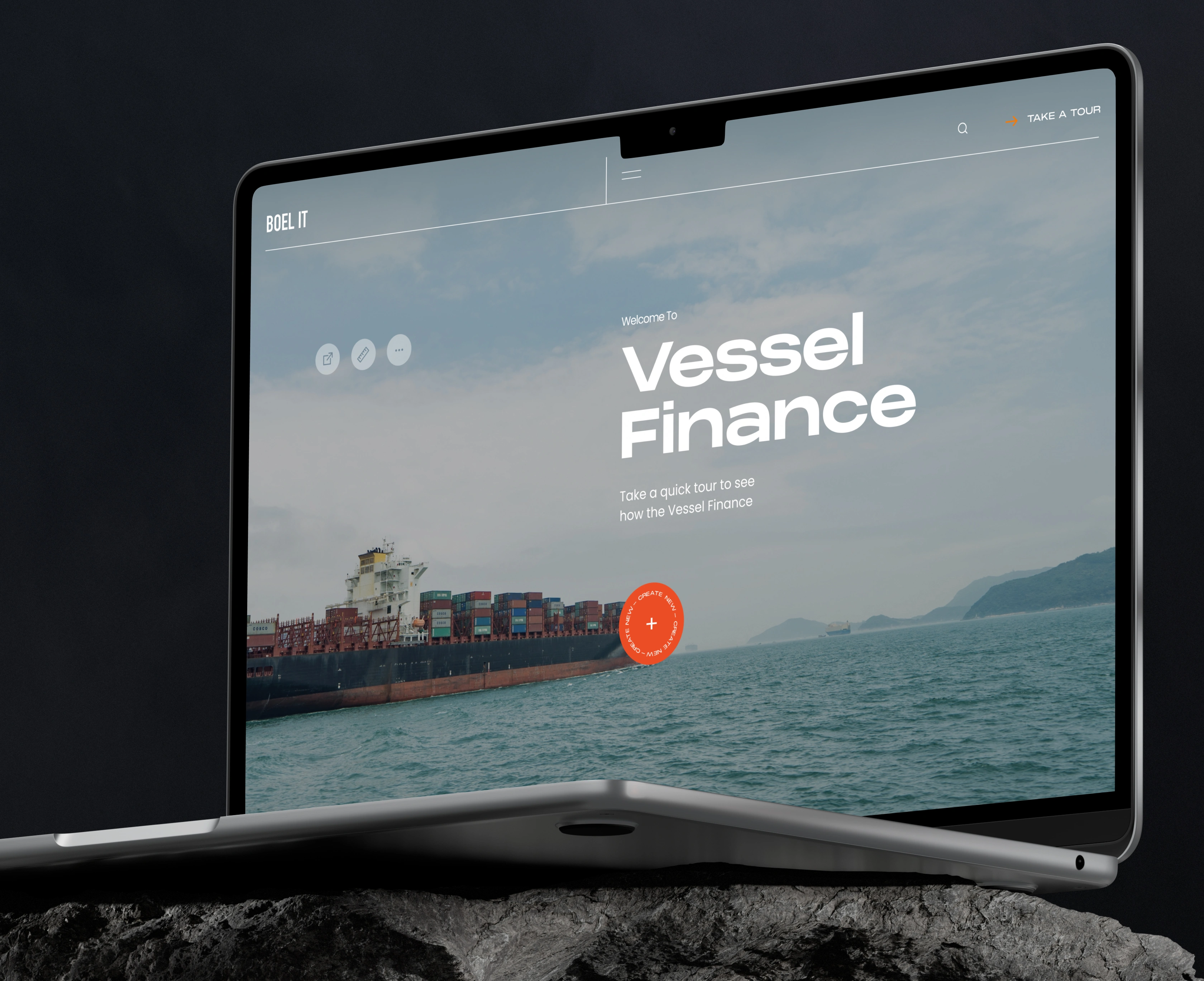
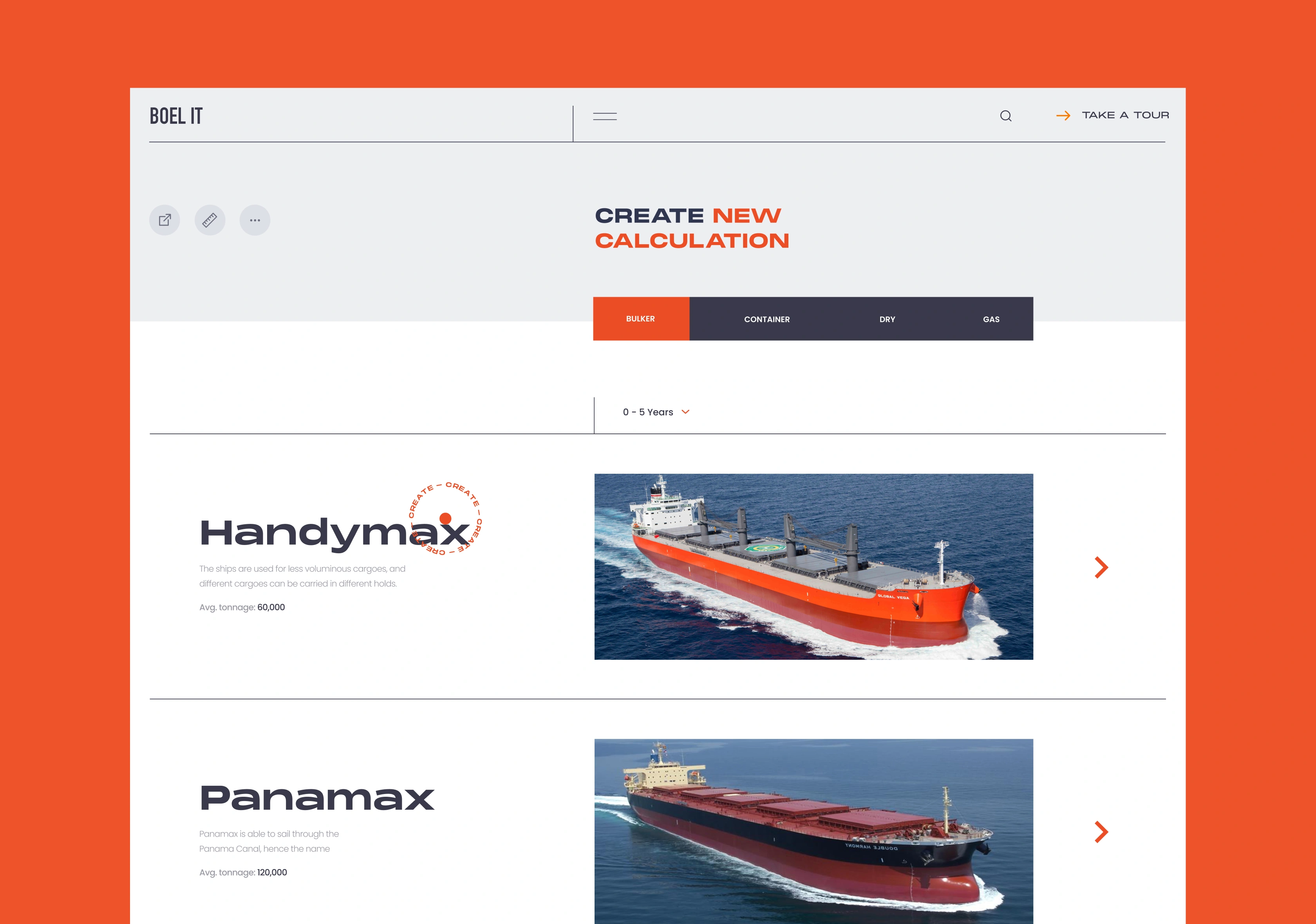
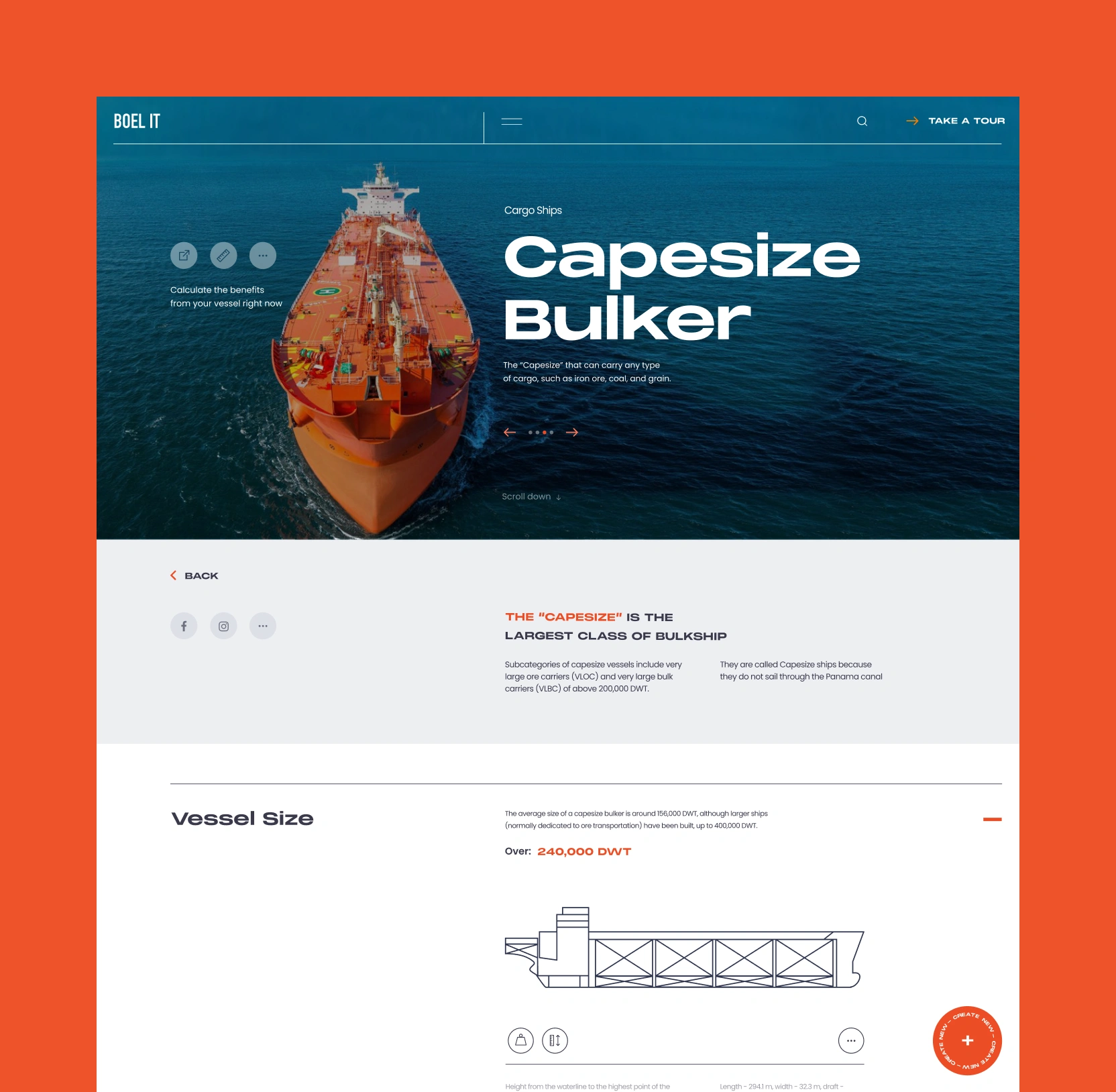
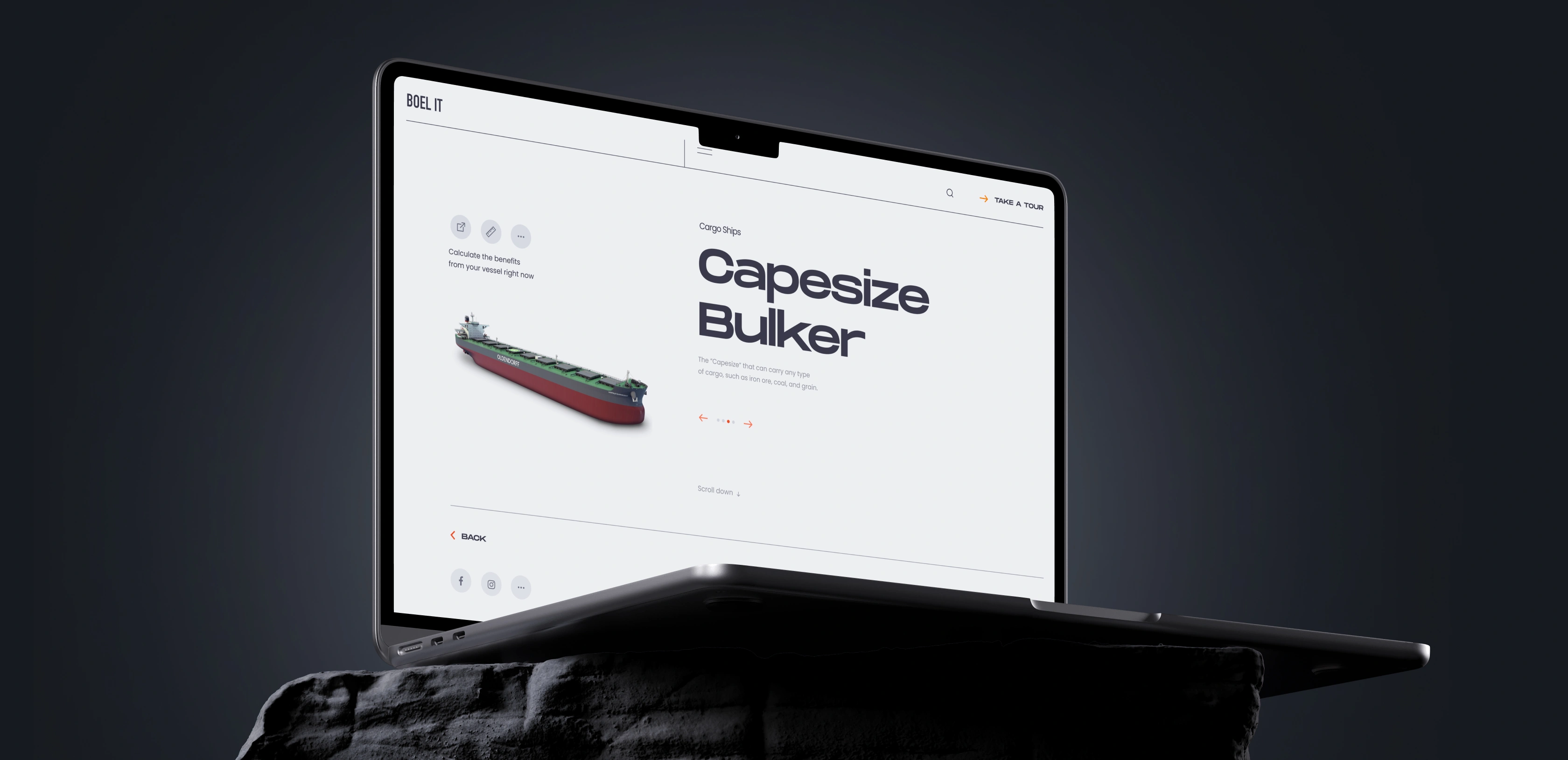
An entry point built around the buying decision
The old product opened on a plain list of vessel names. To get anywhere, an investor already had to know which ship they wanted — the list itself offered nothing to choose between.
We flipped the starting point. Now you begin with what you already know: the cargo you need to move. The platform then shows the vessels built for that cargo, each one a real ship with its key characteristics. You can swipe between vessels in the same class to compare size and capacity side by side. By the time you reach the financial model, you already know which ship you are testing.
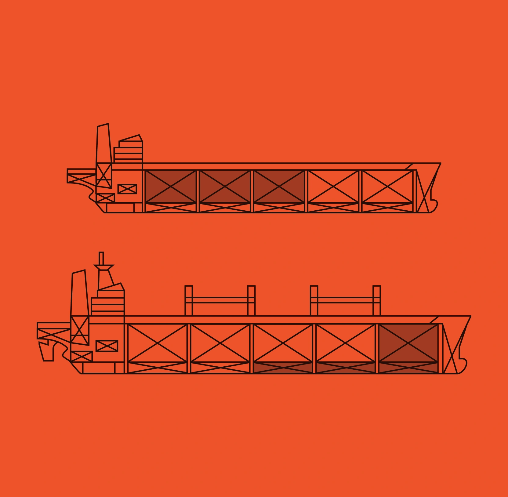
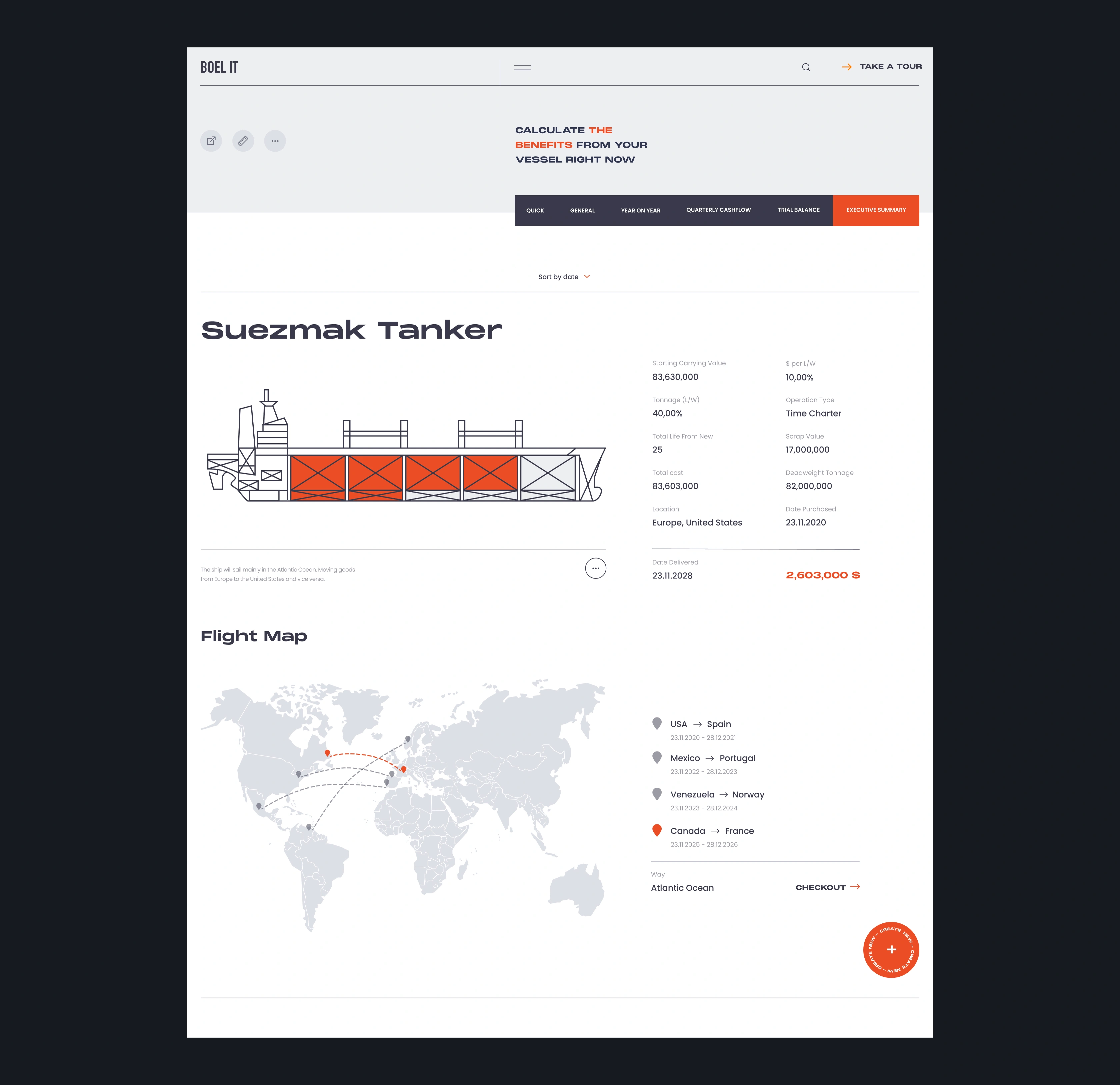
A clear view of every vessel in a class
A vessel acquisition commits tens of millions of dollars, and the class of ship sets the economics of the whole deal: how much cargo it carries and the size of vessel the investor is committing to. The old product made investors browse undifferentiated lists, where weighing those economics meant pulling figures from separate spec sheets by hand.
We built a selection to mirror how an acquisition decision gets made, giving investors a running start on the analysis where the old product gave them a wall to climb.

An executive summary for the moment of commitment
By the time an investor reaches the end, the analysis is done — what remains is the decision, and the old product made them dig through raw tables to find the figures it hinged on. The summary screen ends that. Projected returns, cost structure, and operating efficiency arrive as charts and a clear hierarchy, with the single number the decision rests on pulled out from the rest. This is the screen where someone signs off on a tens-of-millions commitment. Making the deciding figure impossible to miss is the difference between a confident yes and a deal left to stall.
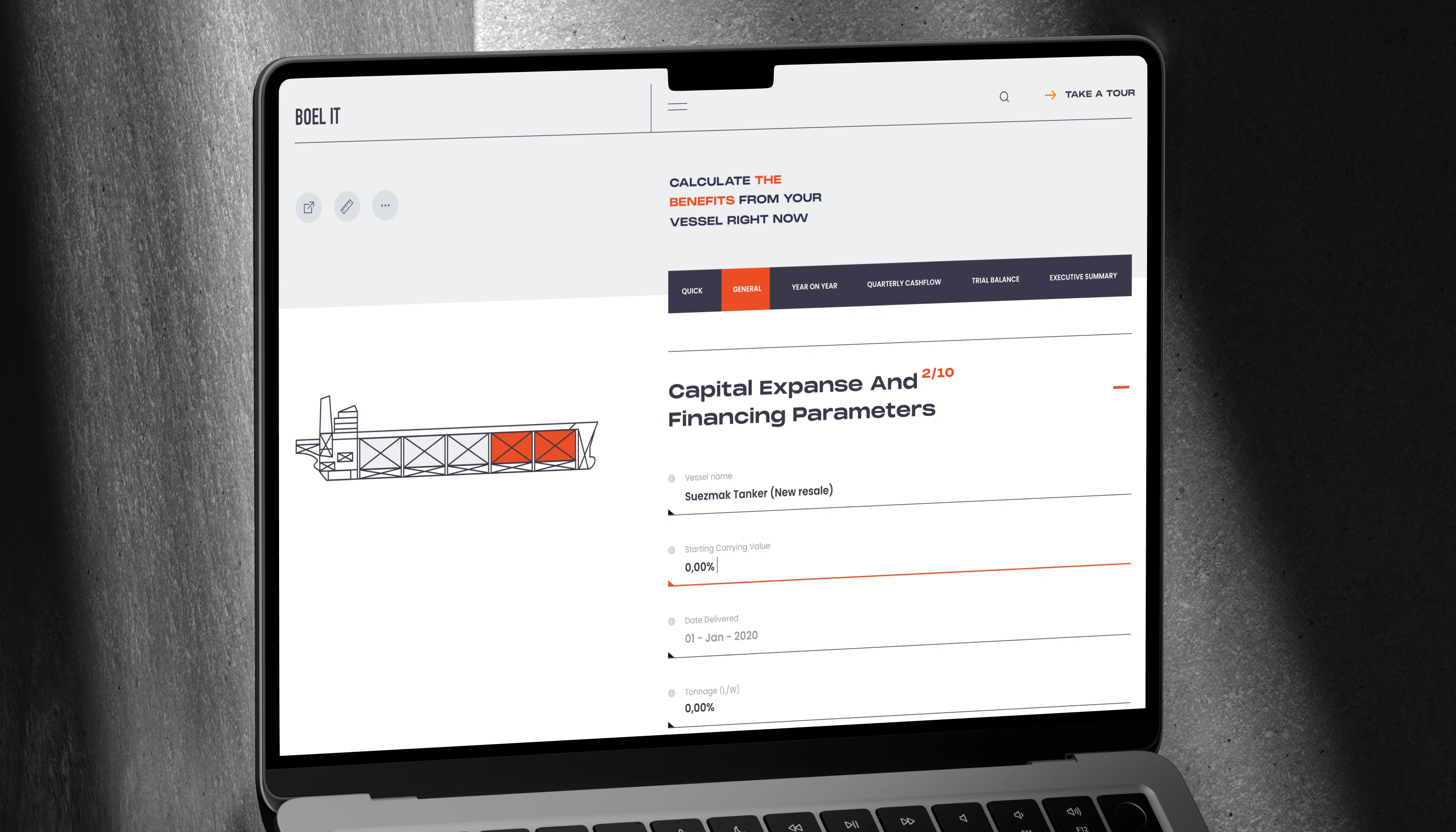
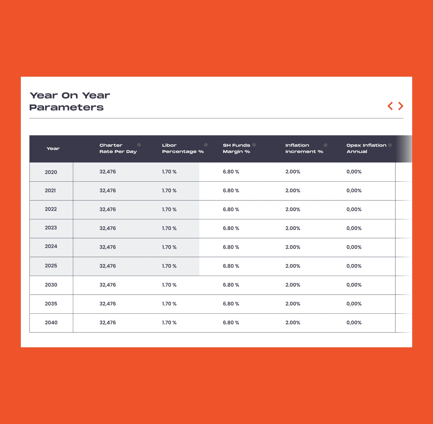
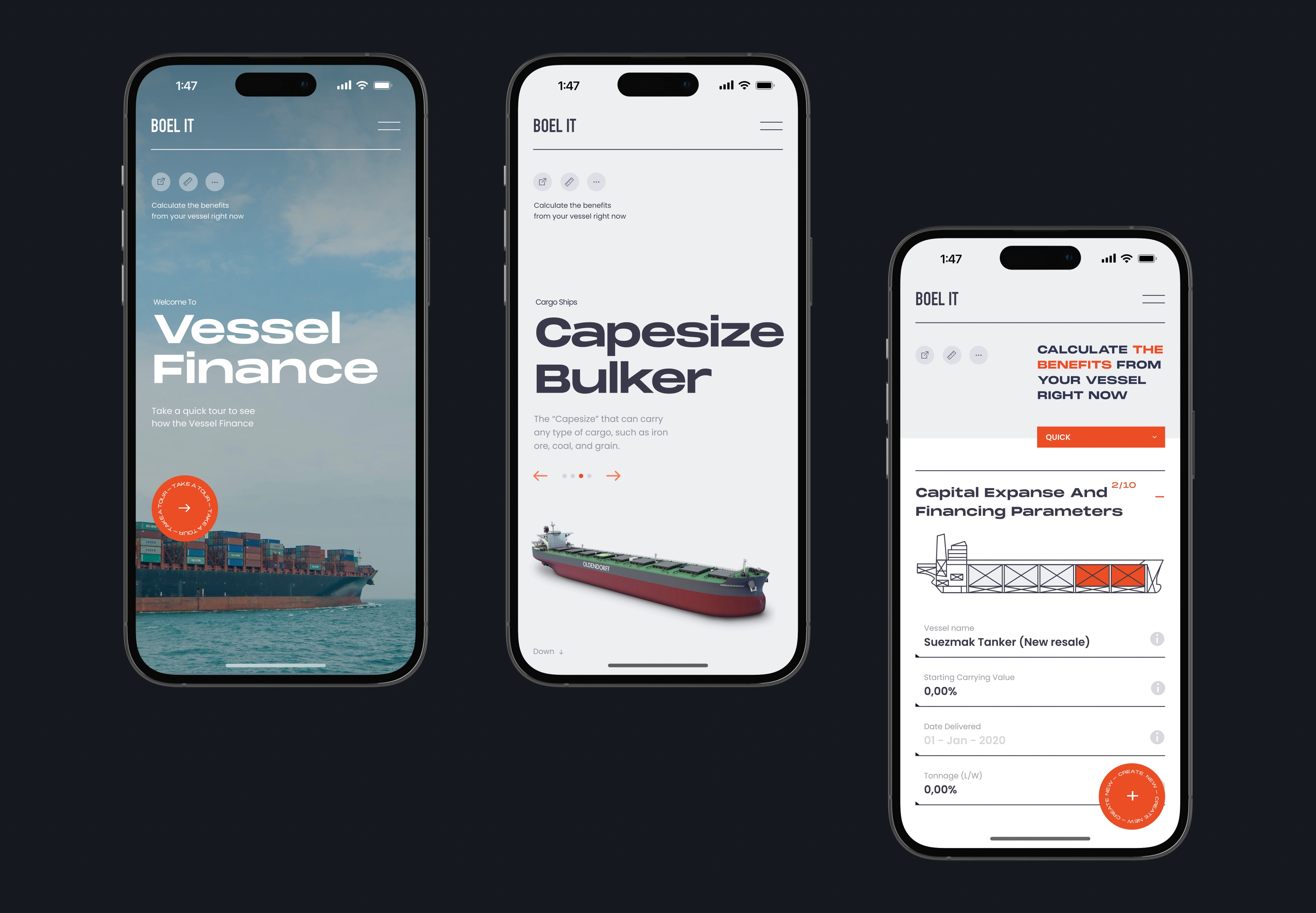
A guided path through high-stakes financial analysis
Vessel Finance weighs dozens of moving parts (financing terms, inflation, operating costs, market price swings) and the original product dropped all of them onto a single screen. That asked an investor to hold the whole model in their head before trusting any part of it, and many abandoned it and rebuilt the numbers by hand.
We broke the model into an ordered sequence, putting a related handful of decisions in front of the investor at each stage and giving a sense of how far through the analysis they have come. The dense output the model produces reads as an organized, navigable picture, not one overwhelming sheet. Investors stay with the model to the end and reach a result the business can act on.


AI & ML
Lazarev. agency offers comprehensive digital design services. Discover our range of related expertise supported by impactful case studies.
More Enterprises Cases


FAQ
How does logistics B2B platform design improve financial analysis tools for enterprise users?
Financial platforms fail when the interface forces users to interpret the data before they can use it. Good logistics design separates the calculation work from the presentation work. Vessel Finance's modeling engine didn't change, the redesign reorganized inputs by stage and added visual outputs so investors spend their time on decisions.
What UX strategies work for complex enterprise logistics platforms?
The most effective approach is to map where users lose context and fix those points in order. For Vessel Finance, the problems were at entry (no visual vessel exploration), in the modeling flow (all inputs on one screen), and at output (raw tables with no visual hierarchy). The design addressed each separately. Fixing all three at once would have produced a redesign with no clear logic.
How do data visualizations improve decision-making on logistics platforms?
Investors evaluating a vessel acquisition need to know whether the numbers tell them to buy, wait, or walk away. Raw financial tables require interpretation. Our solution added charts and a cash flow visualization tied to the vessel itself so the answer to that question is visible.
When should a shipping company invest in redesigning a legacy logistics platform?
When users are working around the platform. For Vessel Finance, the sign was users building parallel spreadsheet models because the interface was slower than doing the math manually. A logistics B2B platform design update is worth the investment when the cost of user friction exceeds the cost of fixing it. That threshold arrives faster than most product teams expect.
What does logistics B2B platform design should focus on for high-value acquisition decisions?
Bottom-of-funnel users have run the model and need to act on the result. BOFU logistics B2B platform design is about the executive summary screen: projected returns visible at a glance, cost structures presented as charts. For a multi-million-dollar vessel acquisition decision, the summary screen is where confidence forms. If the output looks uncertain or hard to read, investors go back to their spreadsheets.
How does responsive design affect adoption of enterprise maritime platforms?
Shipping executives make acquisition decisions between industry events, port visits, and board meetings. If Vessel Finance only worked well on a desktop, it would only get used when an investor was already at a desk, which is a fraction of the time acquisition analysis actually happens. The logistics B2B platform design for mobile keeps the full analysis intact on smaller screens because access at the right moment is more valuable than a perfectly optimized desktop experience users can only reach half the time.


Hit me up! Let’s chat about your growth


