How our redesign made Abu Dhabi University's depth clear for applicants and students
Project:
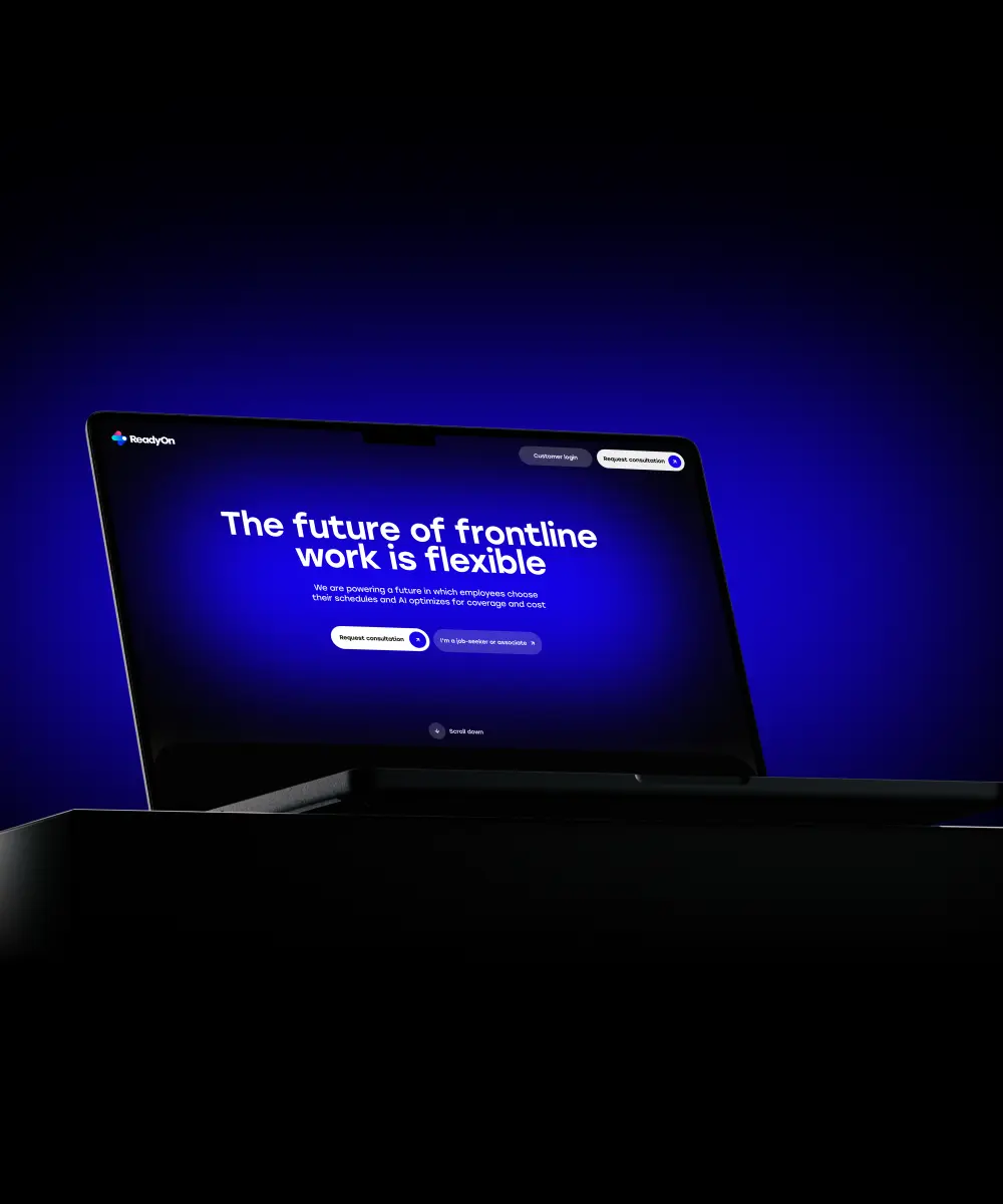
the project
Where a clearer design earns more applicants
A university competes for applicants and serves its current students on the very same screens. When those screens hide what people came for, the cost lands twice: prospects click away to a rival, and enrolled students burn time on tasks they should finish in seconds.
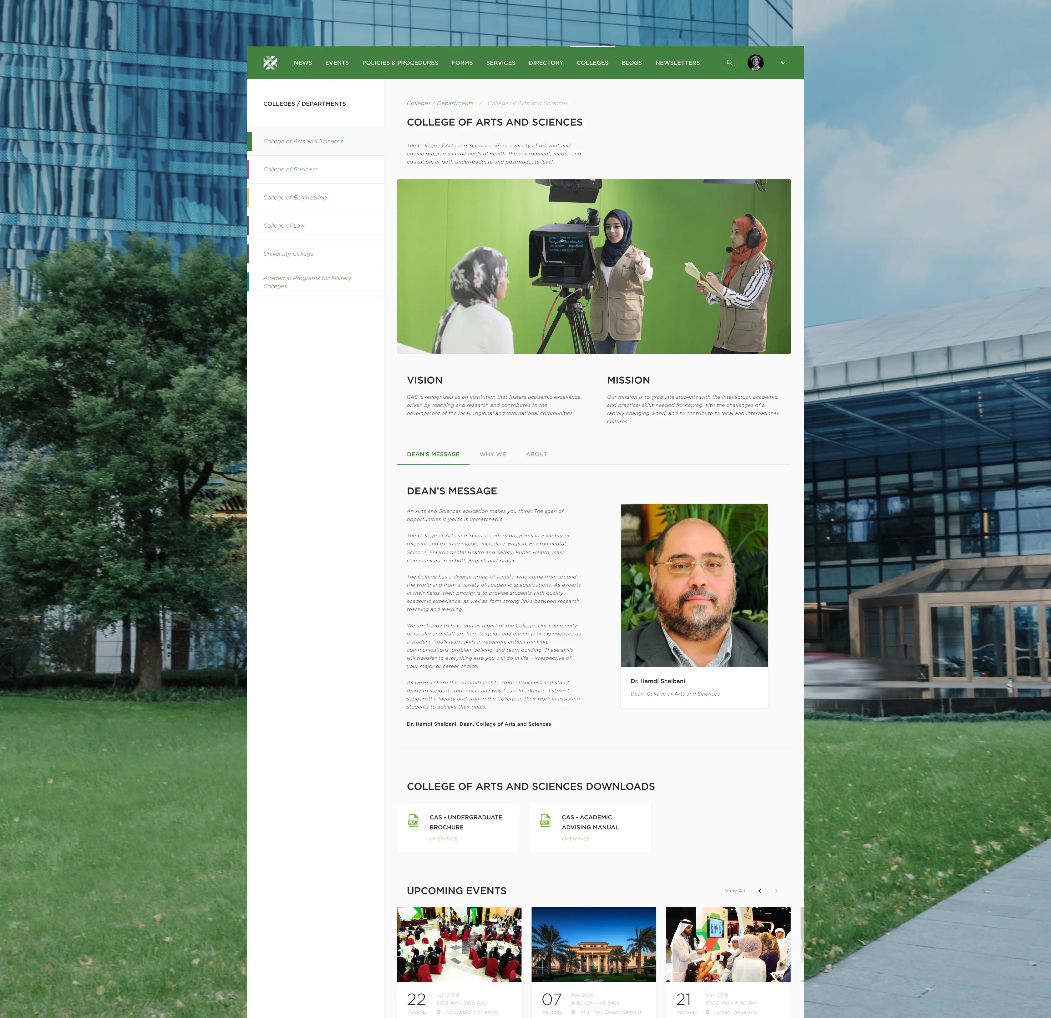
Abu Dhabi University had no shortage of substance: multiple colleges, programs, and campuses. The platform, though, kept it out of reach. Applicants could not compare programs without digging. Students moved between disconnected systems for routine work. Faculty content sat behind extra clicks. Online, a strong institution looked fragmented.
Lazarev.agency gave the university a platform equal to its depth. We split public-facing content from internal workflows, rebuilt navigation around how people move through the site, and carried the same logic into every section. The result reads as one coherent place: applicants reach the facts they weigh in a click or two, students handle daily work without detours, and the institution finally presents online with the clarity it always had on campus.
The Project’s
Discovery Phase
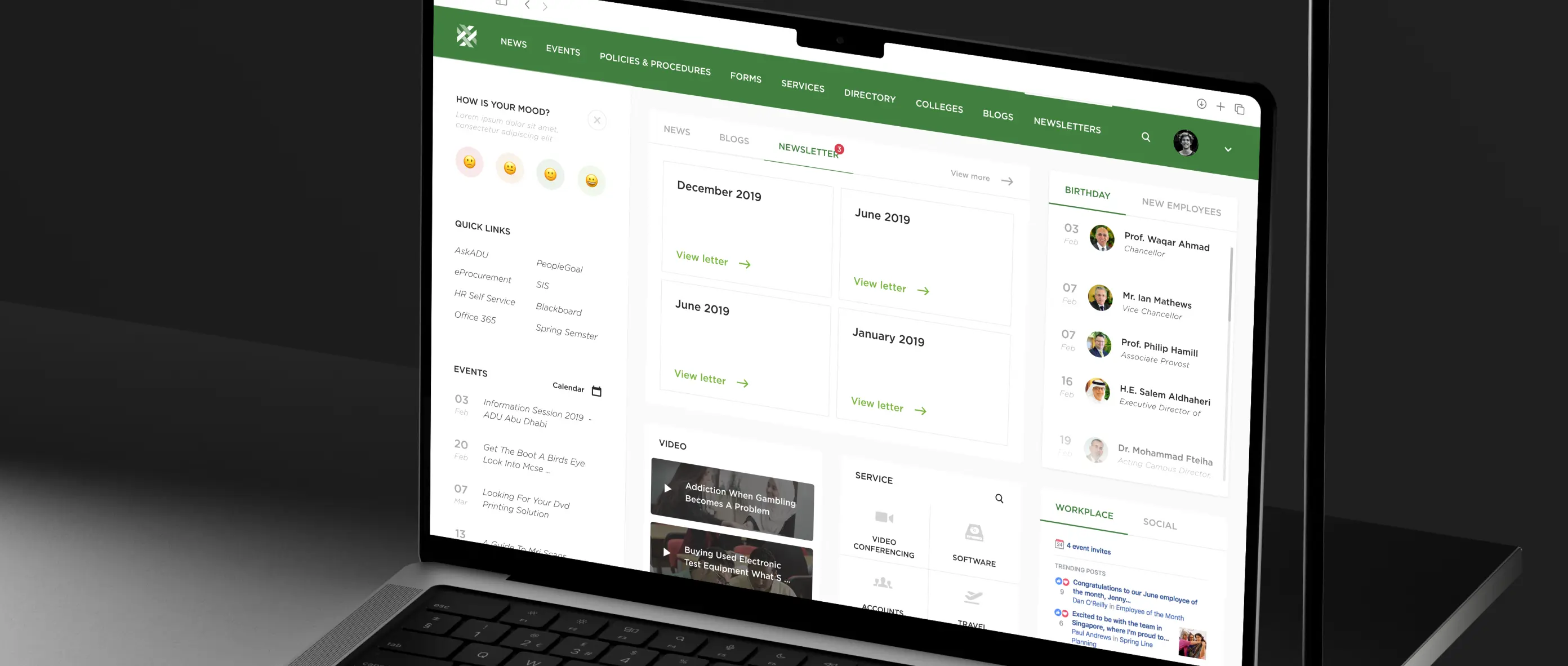
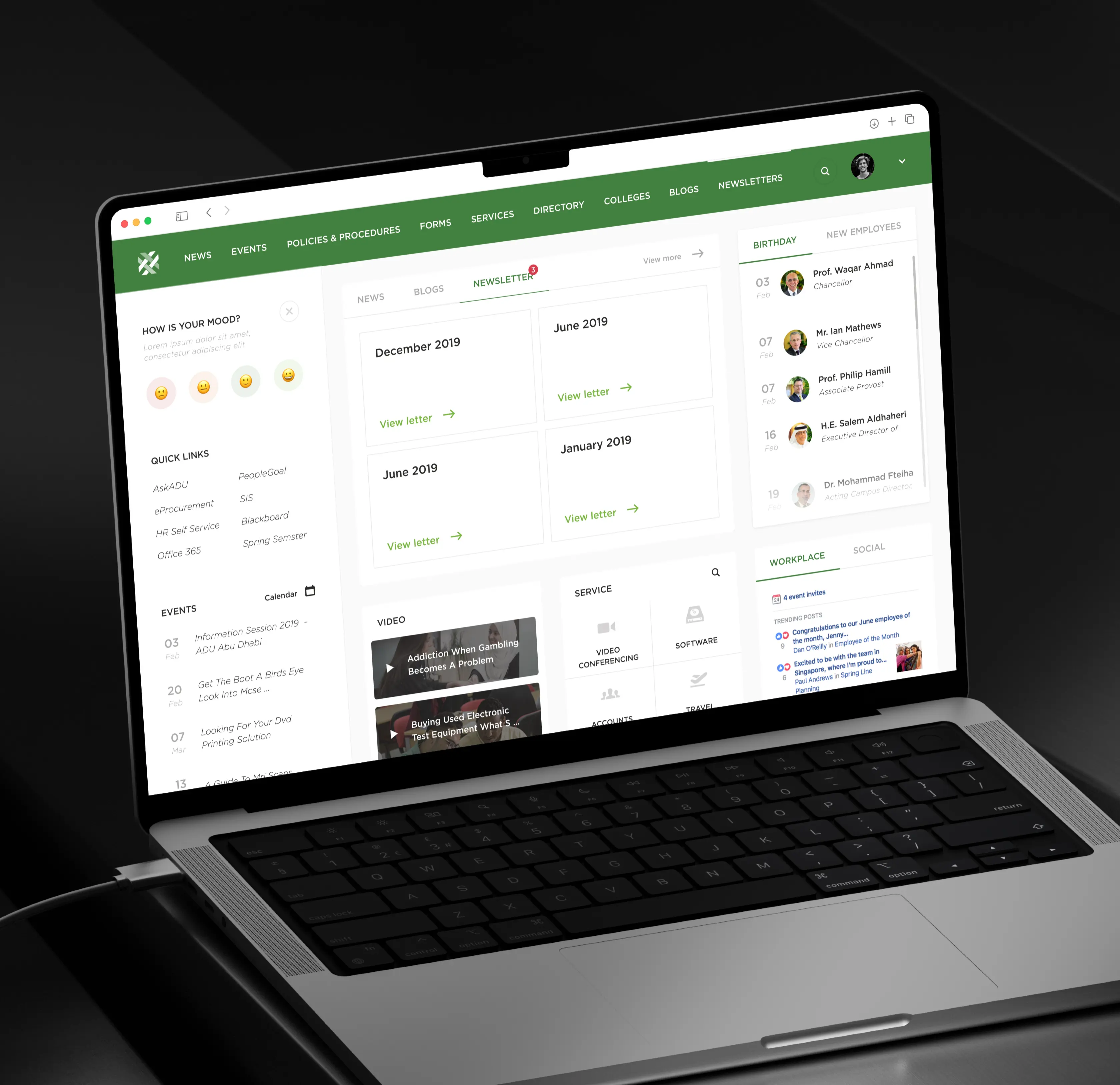
Structured the homepage as a unified information hub
We rebuilt the homepage as a working dashboard: news, events, newsletters, and services in a single space, with links to the systems students open every day (SIS, Blackboard, Office 365), a dated events calendar, and a services block organized by category. Now the homepage is where students begin their day rather than a page they pass through on the way elsewhere. Each task takes fewer detours, and students return to the platform for handy information.
.avif)
15 educational website design companies leading the edtech revolution

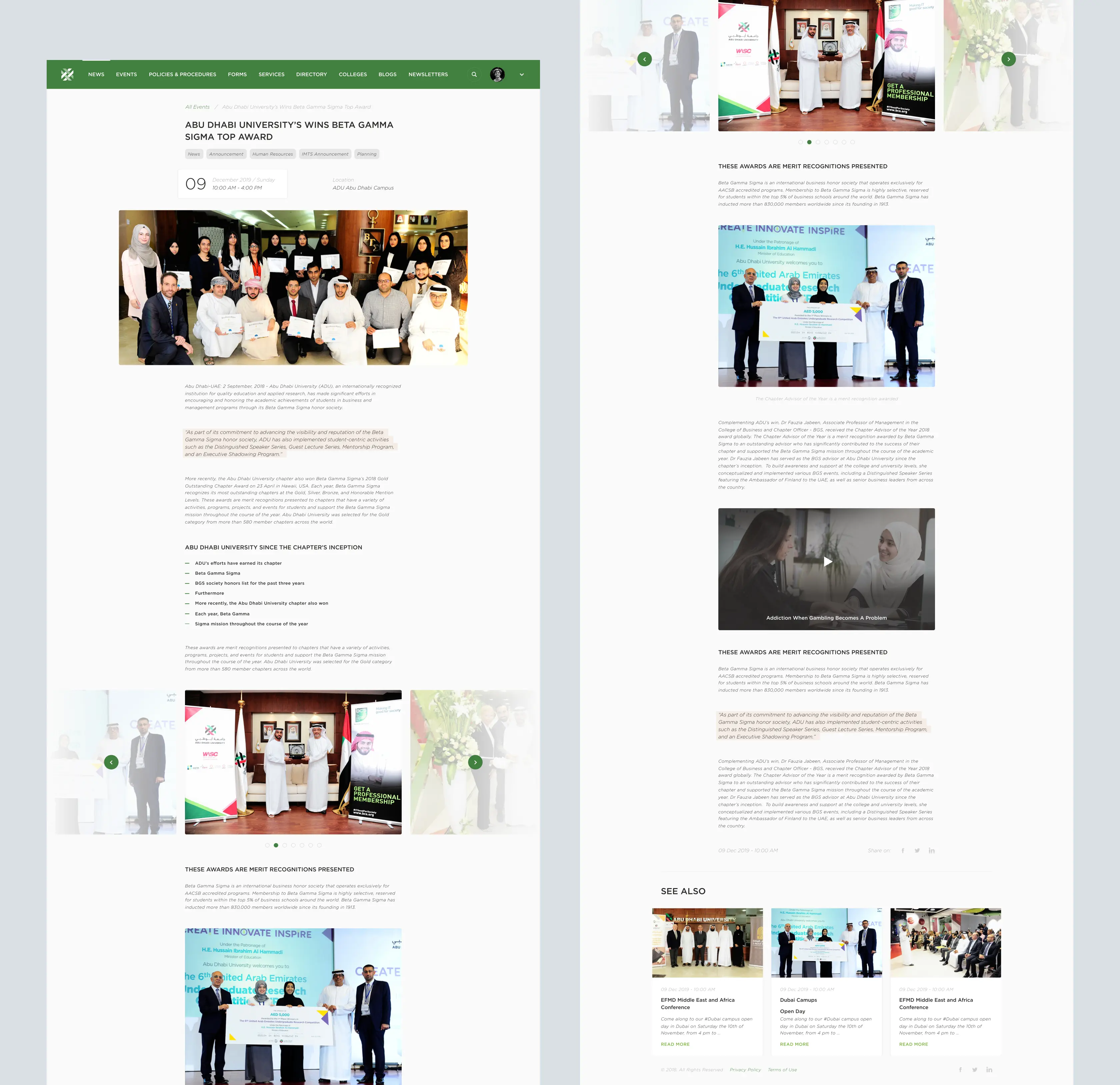
Designed a structured event browsing experience
A long, undifferentiated list is where event participation halts. Students skim it, see nothing useful, and close the tab. We turned the events page into a filterable catalog: date-forward cards, a calendar with a date-range filter, and event pages leading with title, date, time, and location. A dynamic, well-organized events page signals a campus worth engaging with, a real edge when the university competes for students' attention.
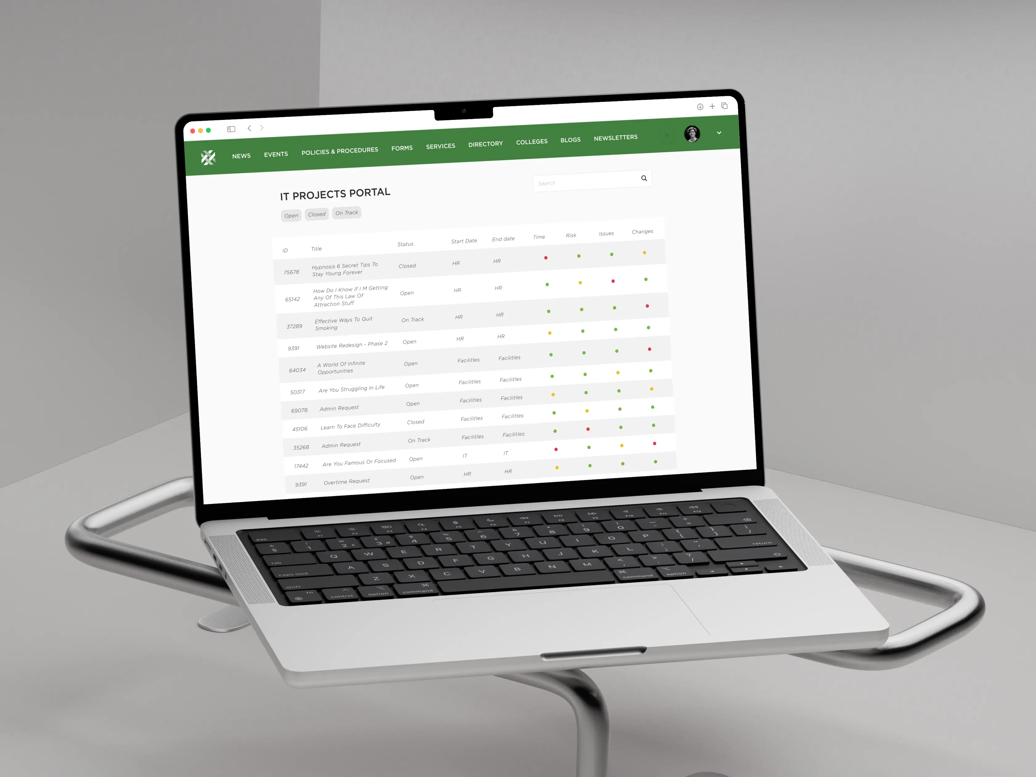
Made project tracking an actionable system
We built the projects portal around a single status table, with status, deadlines, risks, tasks, and changes in one view, plus detail pages pairing the essentials and participants with a prioritization plot. Staff grasp where things stand and decide what to act on without digging through documents. Work keeps moving, and the big picture stays visible alongside the details.

Built one consistent system across every section
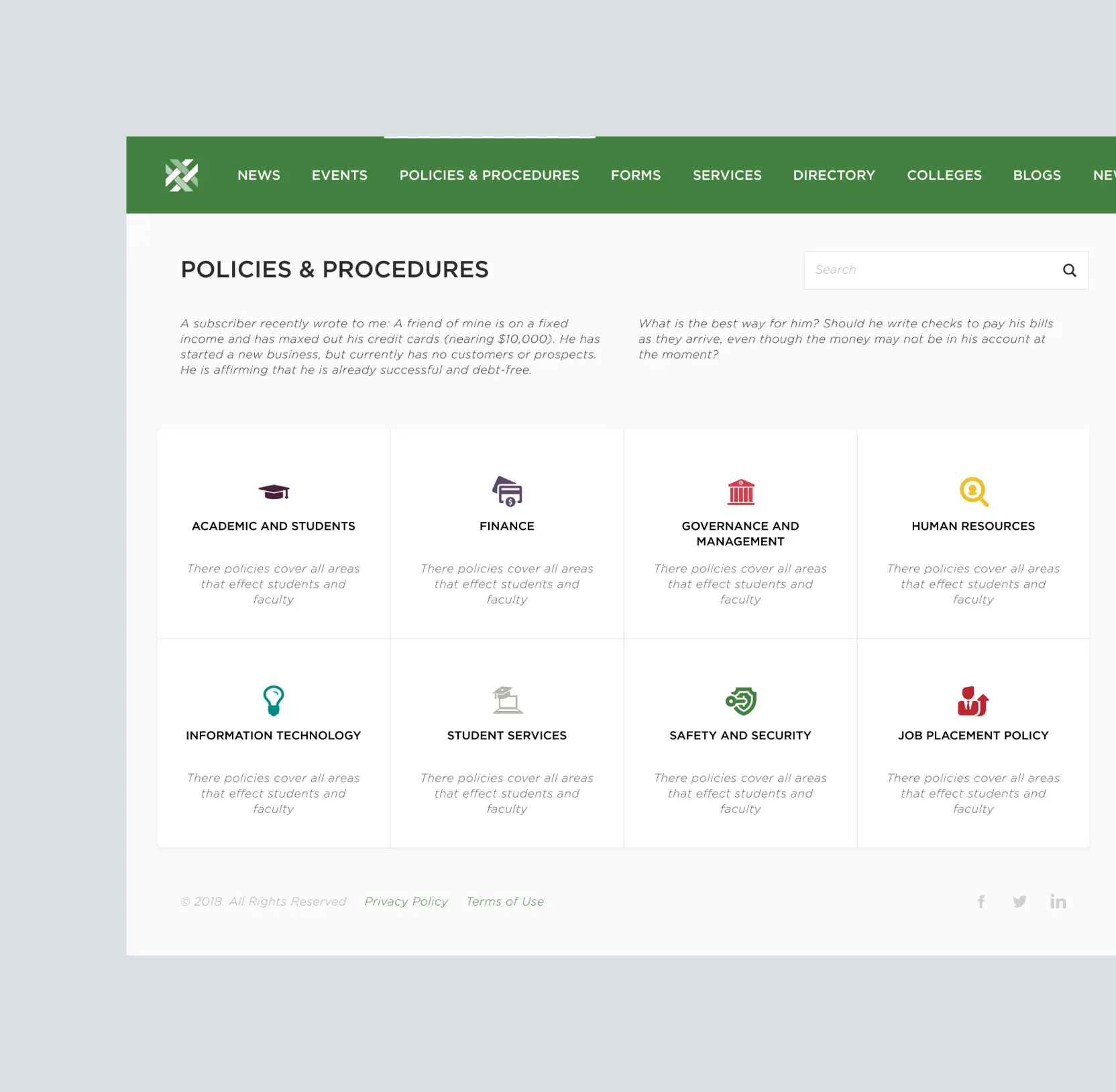
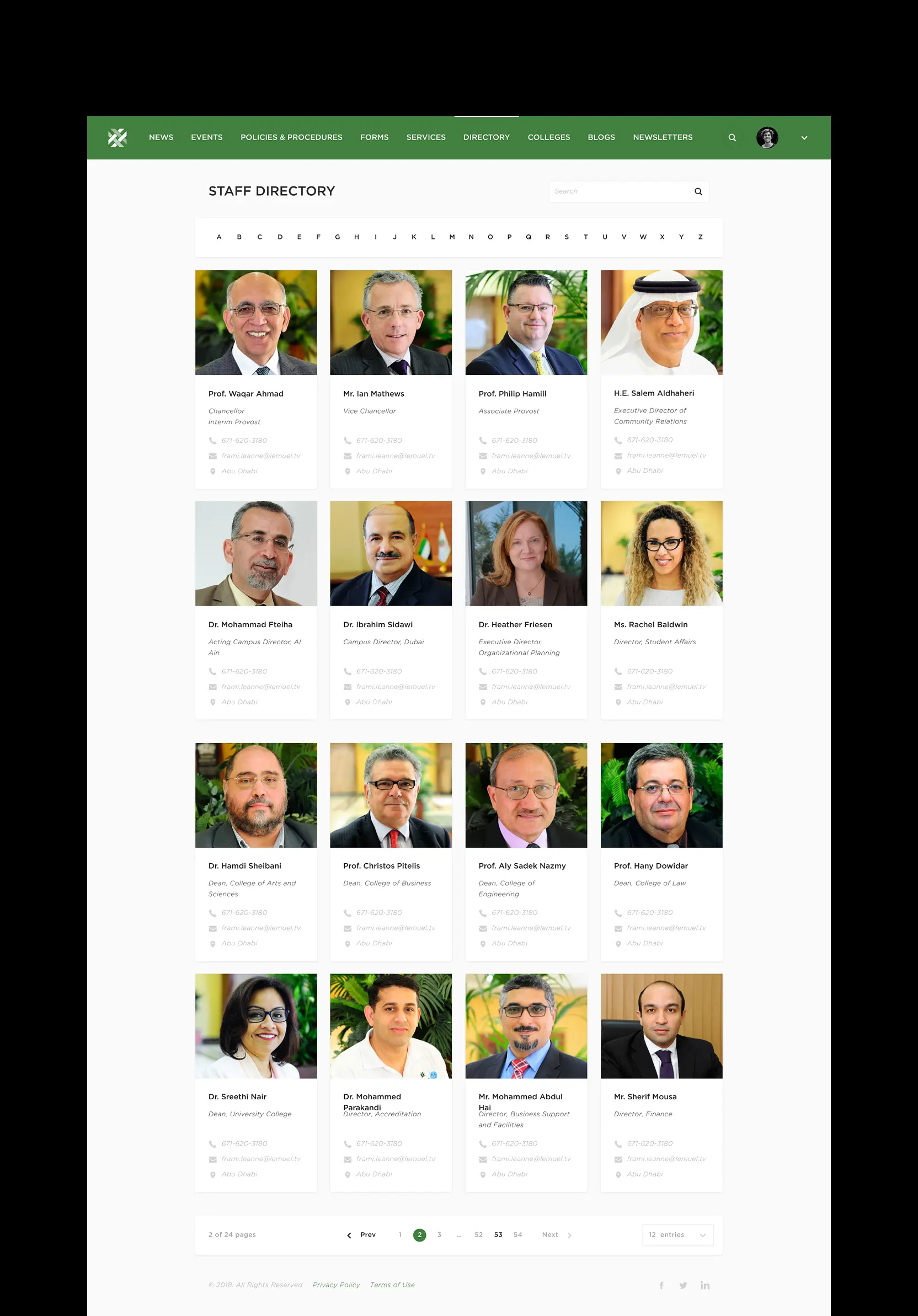
A design working on the homepage but breaking on a policy library or a college page isn't a system. It's a one-off. We extended the same approach across very different sections: policies, internal portals, college pages, document libraries, and dashboards, structuring each around its core use case. The platform absorbs large volumes of varied content while staying consistent and easy to navigate.

AI & ML
Lazarev. agency offers comprehensive digital design services. Discover our range of related expertise supported by impactful case studies.
More Enterprises Cases

FAQ
What are the best solutions to improve student engagement on a university digital platform?
Event visibility, centralized tool access, and structured content drive engagement. A filterable event catalog and a consolidated homepage hub increased interaction with university activities and cut down on missed opportunities for both enrolled students and the broader campus community.
How can universities reduce drop-off during program exploration?
Prospective students make fast comparisons across multiple institutions. If a program page requires three clicks to reach basic information, many leave before getting there. Simplified navigation and clear program structure let applicants compare options without getting lost. Separating marketing content from internal tools matters too. Mixing the two forces prospective students to filter noise at exactly the moment they should be evaluating, and that friction is often enough to send them somewhere else.
What features improve usability for enrolled students?
Once enrolled, students stop browsing and start doing: checking grades, accessing materials, finding deadlines, submitting forms. Disjointed systems turn simple tasks into multi-step ordeals. Centralized access to tools, quick links, and task-oriented design cut the time spent navigating. A homepage hub that consolidates updates, systems, and actions in one place removes the need to move between disconnected platforms for routine tasks students complete every single day.
How do you design a platform for multiple university audiences?
Separate use cases first. Prospective students need clarity and guidance. Enrolled students need speed and access. Faculty need structured information and tools. This project addressed each group with distinct flows.
What is the most effective way to structure university events online?
Long undifferentiated lists of events are where participation flattens. Users scroll briefly, find nothing immediately relevant, and leave. A card-based catalog with visible dates, categories, and filtering options solves this. Users scan quickly and find relevant events in seconds rather than minutes. Visible structure also signals to students that the university is active and organized, two things that matter more than most institutions realize when competing for attention on a busy campus.
What business impact does university digital platform design deliver?
Faster access to information, clearer applicant journeys, and reduced operational friction. These improvements support higher application intent, lower support costs, and better user satisfaction across students and staff.


Hit me up! Let’s chat about your growth


