How MARIEMUR doubled engagement with luxury fashion e-commerce UX design
Project:
the project
The hidden cost of a crowded catalog
MARIEMUR is a lingerie brand with more than 120 products across 14 categories, built around bold intimacy and self-expression. For a brand sold on how it makes people feel, the website is the showroom. It carries the entire first impression and, with it, the decision to buy or leave.
As the range grew, the showroom started working against the brand. Visitors landed on the homepage and were pushed straight into a dense catalog, and the sheer number of options stalled them. As a result, 73% of visitors left somewhere between the homepage and a product page. Every one of those visitors costs money to bring in, and they left before seeing a single product.
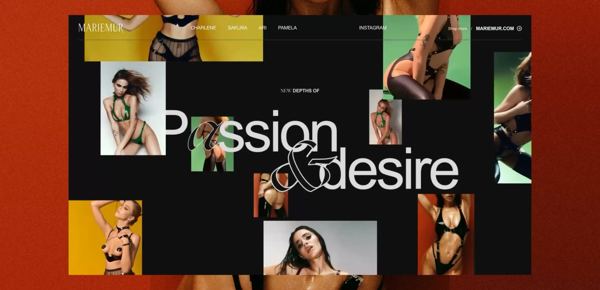
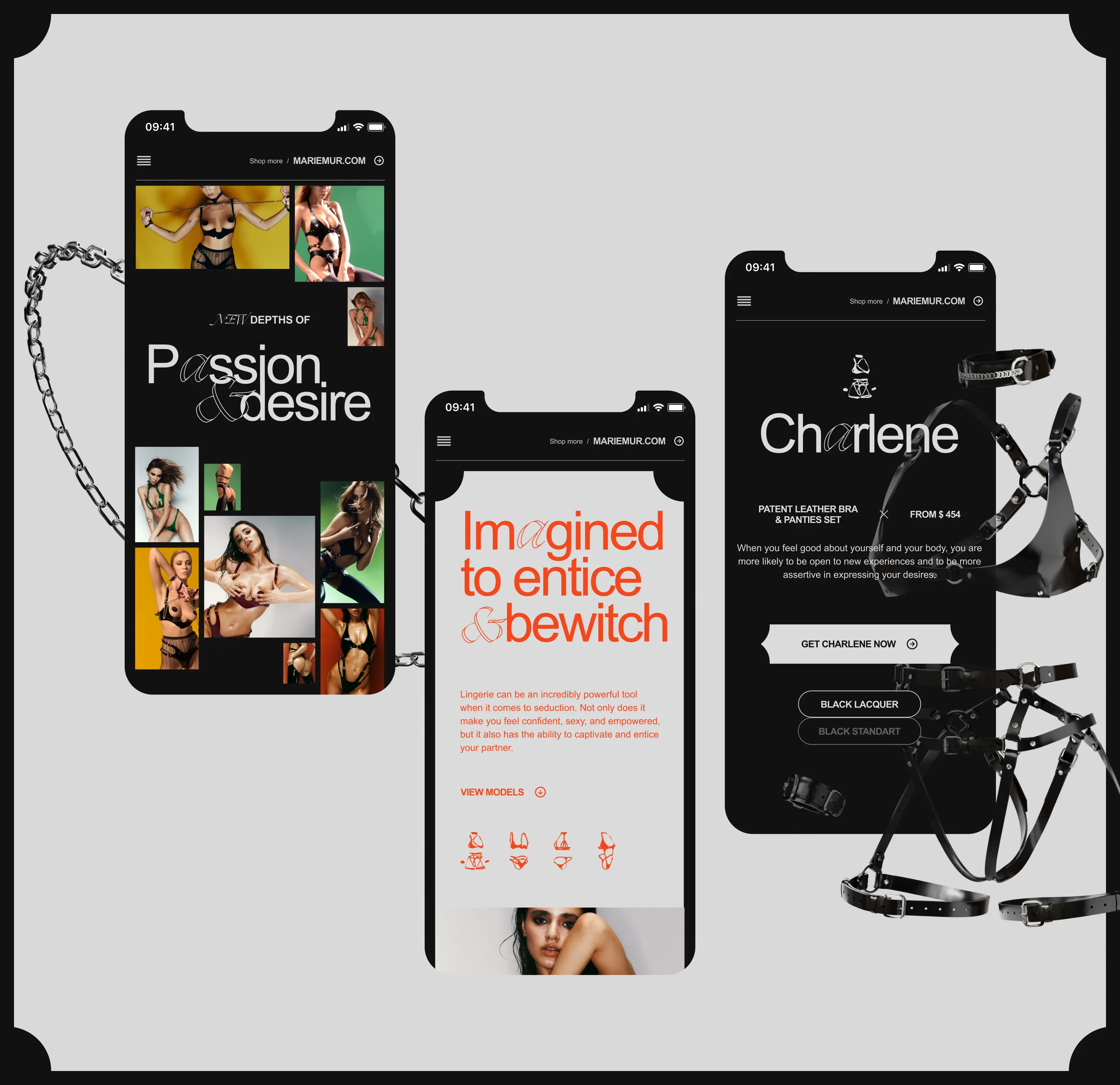
MARIEMUR partnered with Lazarev.agency to fix the structure. We built one immersive entry point around four exclusive sets: a curated bridge to turn arriving visitors into buyers. Engagement doubled, and passive browsers became active customers.
Here’s how we achieved this.
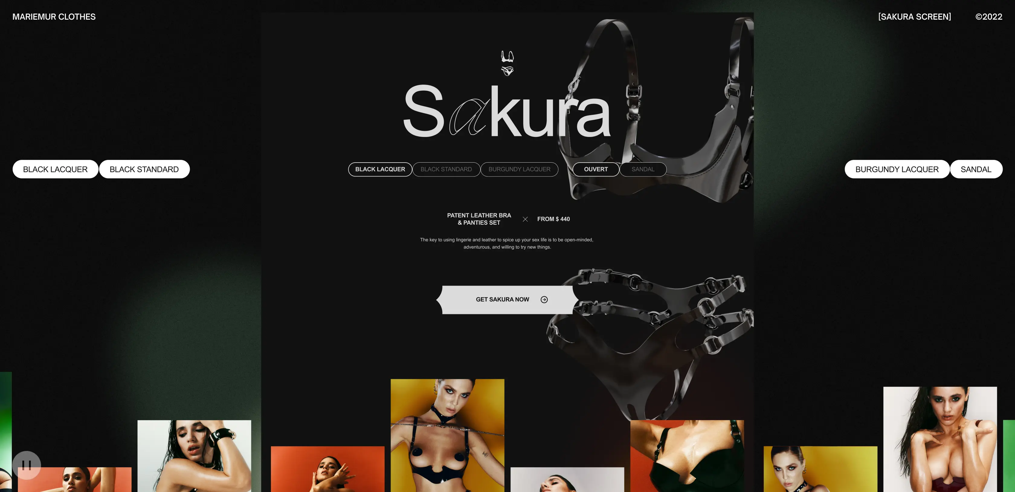
A guided entry point to stop catalog drop-off
A catalog showing everything forces every visitor to do the sorting, and most won’t. We replaced the open-catalog homepage with a single guided entry built around four exclusive sets, giving each arrival one clear path.
Visitors now move from landing to product with intent and no longer bail out, which is why engagement doubled, and the fall-off between homepage and product pages dropped sharply.
Increase in overall engagement.
Higher interaction with featured products and collections.
Faster mobile image load times, improving conversion potential.
The Project’s
Discovery Phase
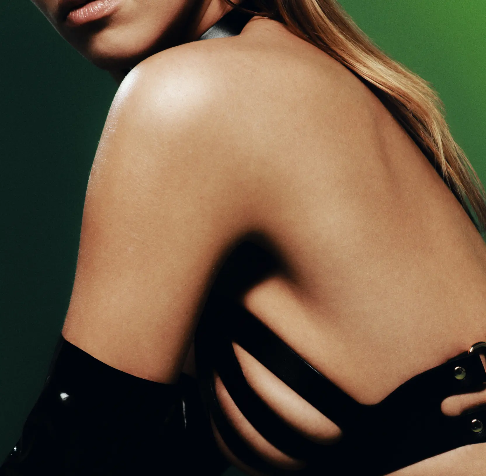
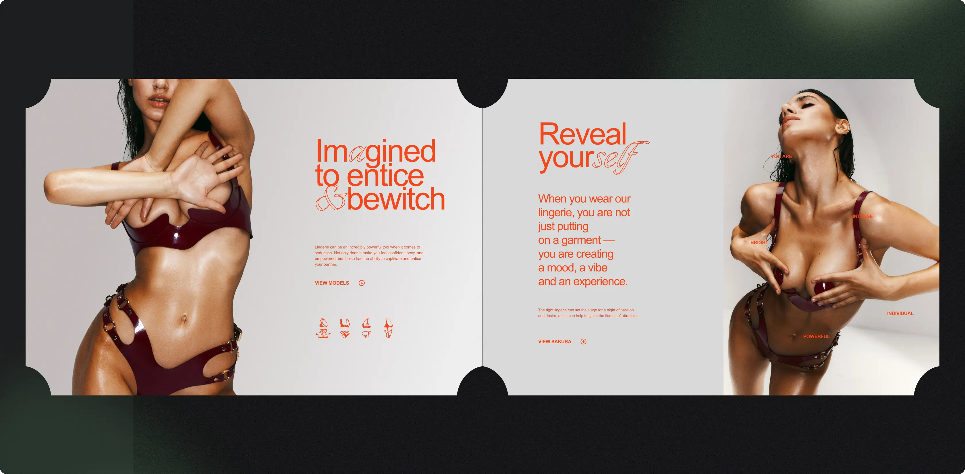
An immersive flow to deepen every visit
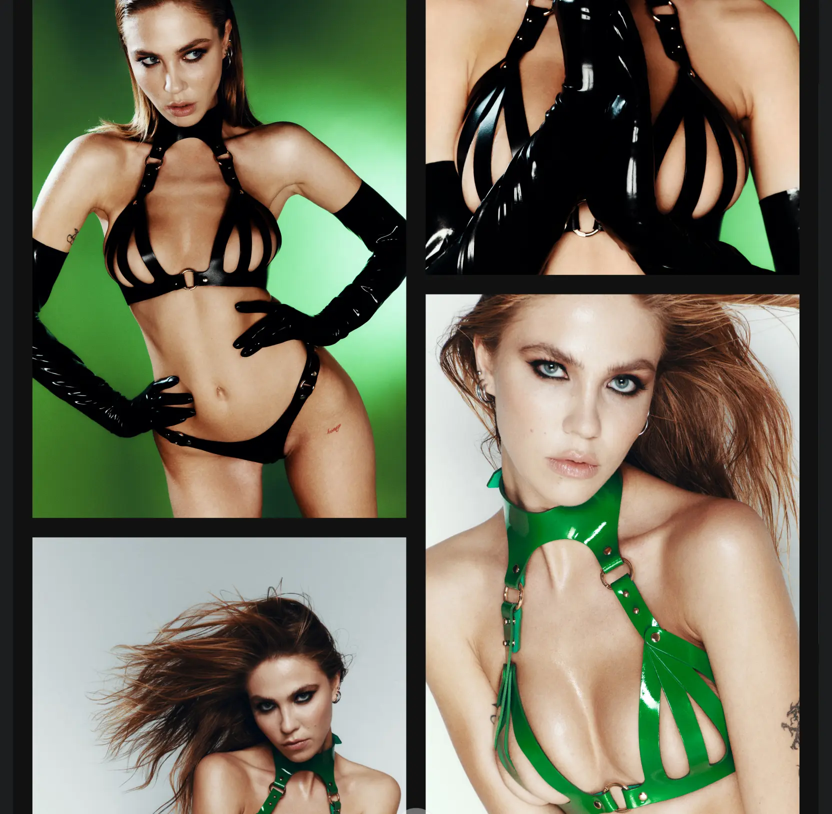
Most lingerie sites treat the visit as a transaction. MARIEMUR sells a feeling, and a flat product grid throws it away.
We designed browsing as a continuous, emotion-led sequence, guiding attention from one set to the next without competing distractions pulling visitors off track. People stop skimming and bouncing. They stay longer and reach the product page already wanting what’s on it. Time on site and session depth both rose (the early signals a purchase is about to happen).

Emotional website design: how to build digital products that users feel

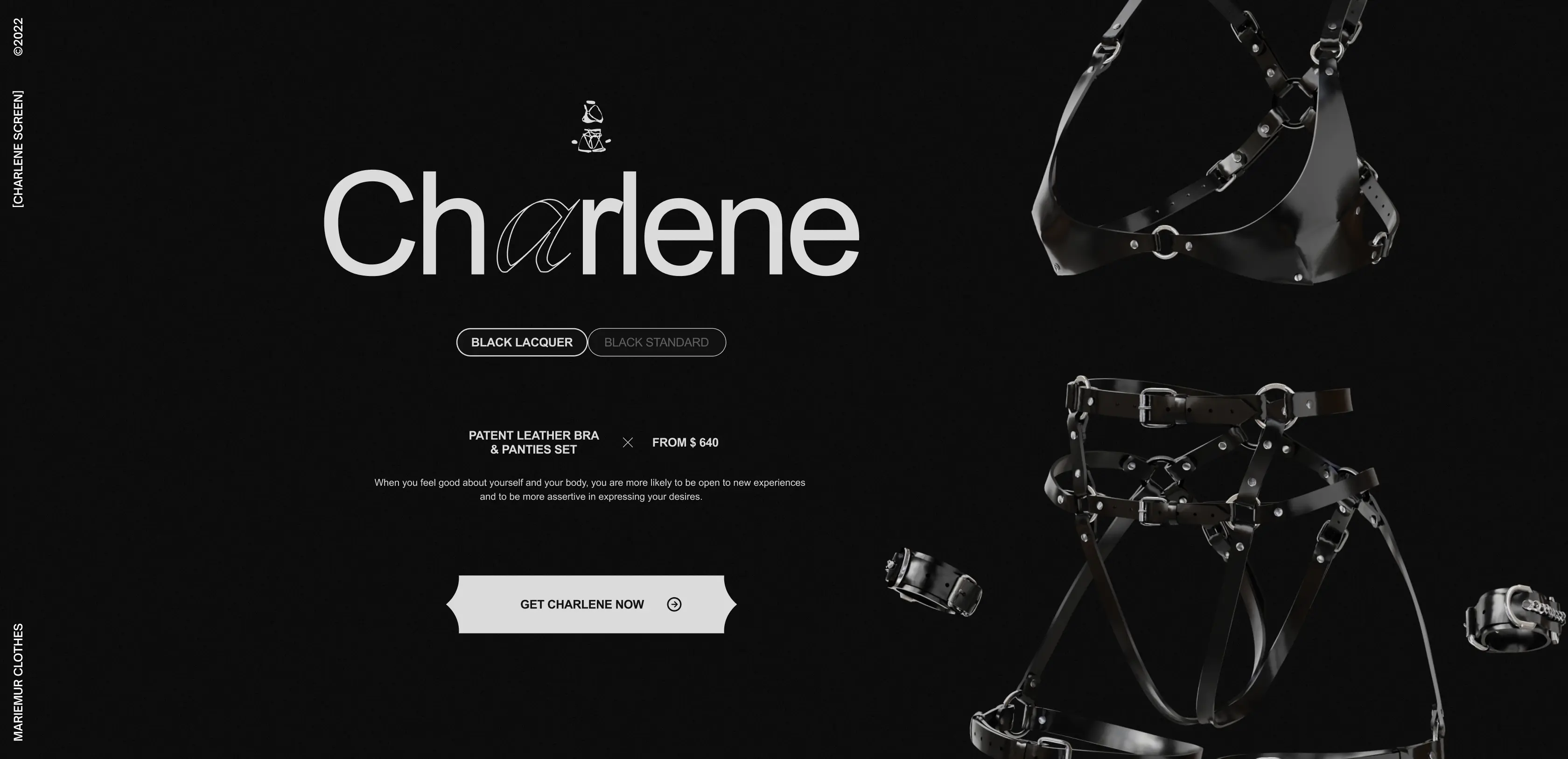
A product page built to convert
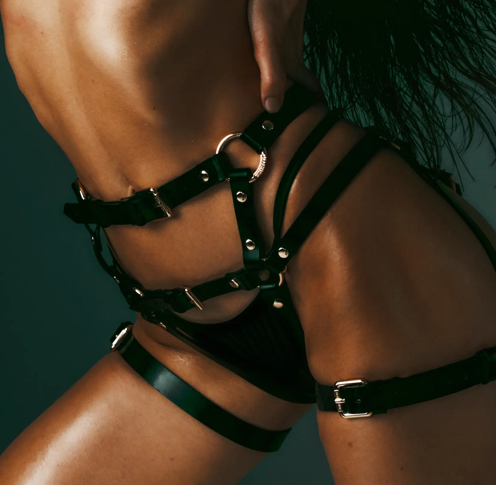
Dense specs and marketing copy bury the very things justifying a luxury price: the make, the materials, the details. We cut traditional product copy by 87% and kept only what drives a decision: name, price, components, and the options available. Then, we handed the rest to high-resolution imagery and interactive 3D models. Shoppers can inspect a set as closely as they would in a boutique. Fewer doubts at the moment of choice translate into a stronger intent to buy.
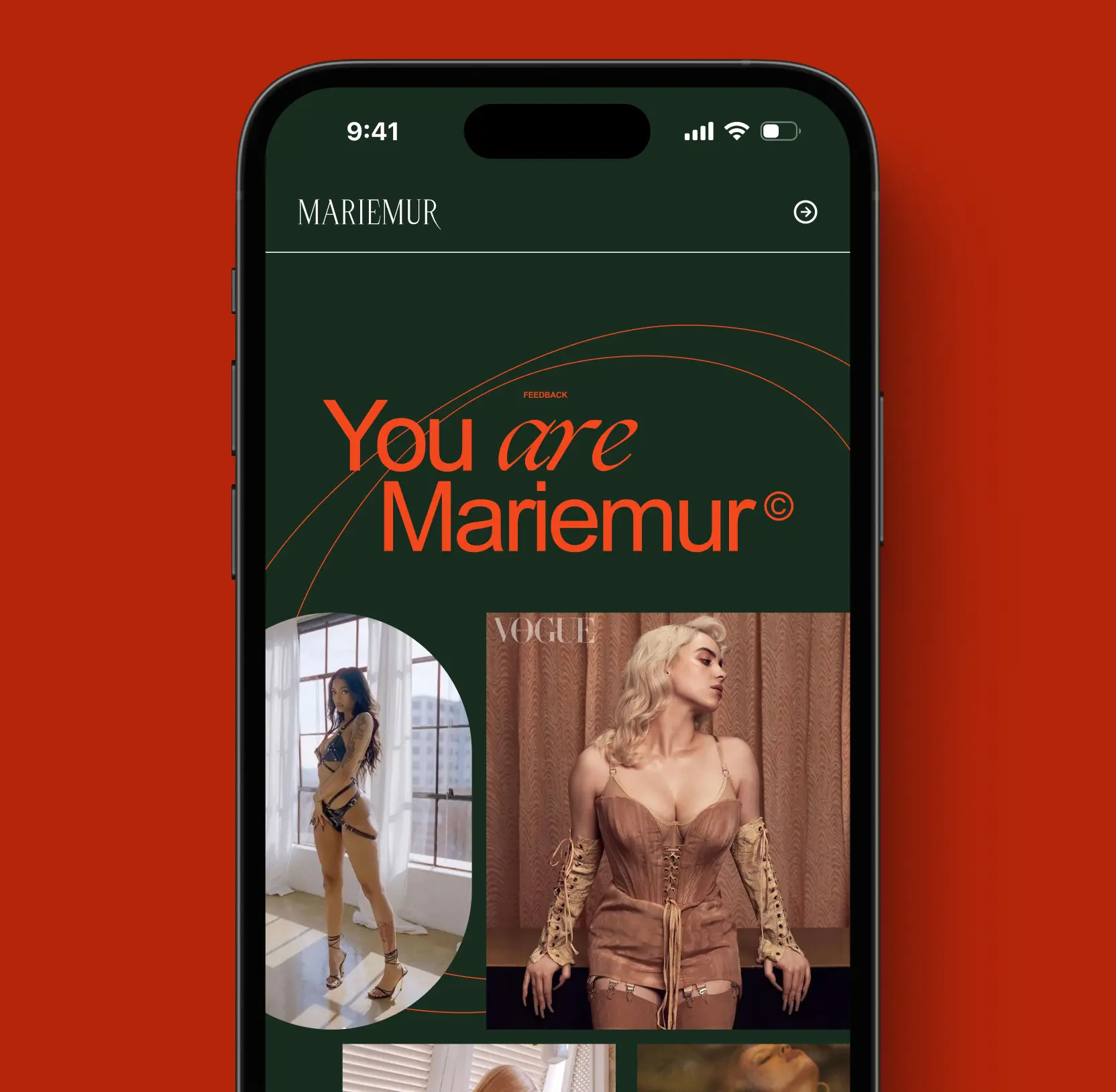
Brand awareness before the price tag
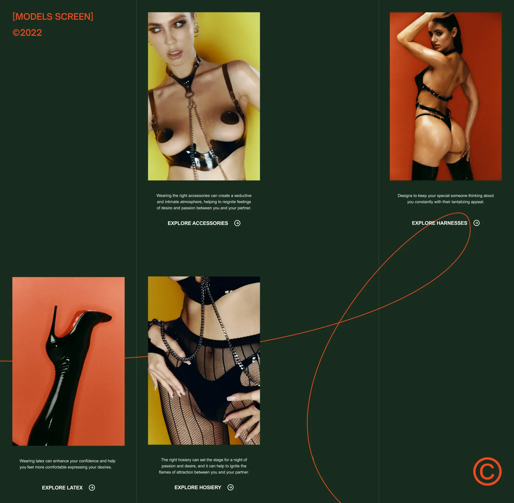
Visitors were hitting product pages cold, with no context and no reason to want the brand, and cold visitors don’t convert.
We moved brand narrative ahead of product exposure, giving prospective customers a feel for what MARIEMUR stands for before they see a price. Arriving warmed up, they explore the catalog and stay past the first product, carrying real intent into the stretch of the funnel where revenue is decided. Bounce fell, and more visitors reached the point of purchase ready to act.
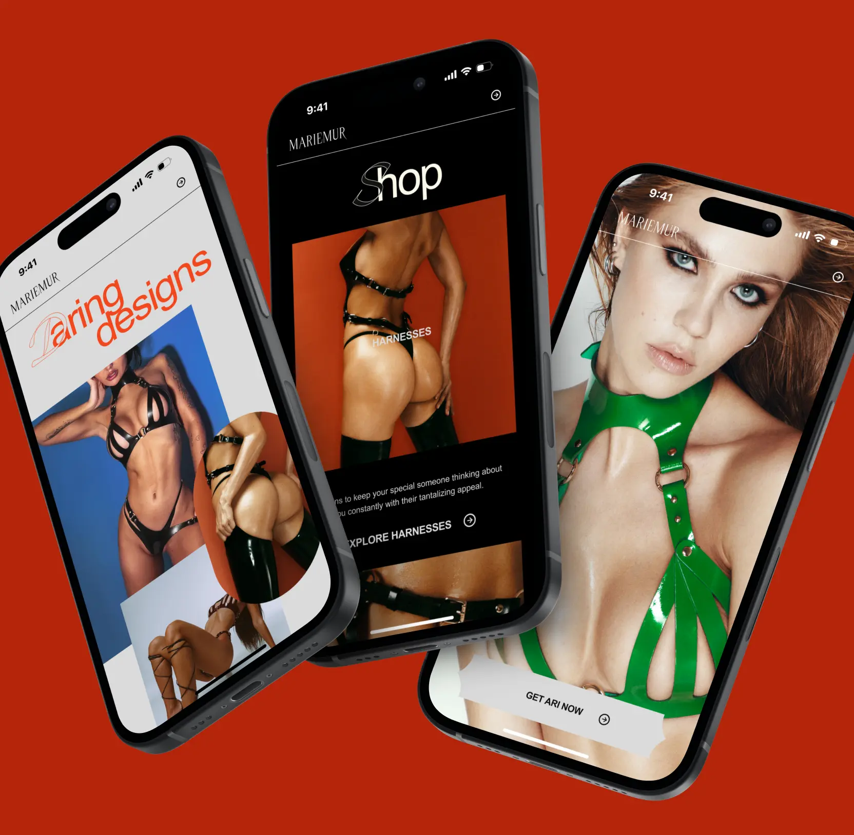
A mobile rebuild to recover lost revenue
Most traffic was mobile, yet the site was built desktop-first, leaving the largest share of visitors with the worst experience. We rebuilt mobile around how people hold a phone: primary actions sit in the natural thumb path, images load 40% faster, prices stay visible throughout to keep the cost from becoming a late surprise, and larger touch targets stop the mis-taps.
Each change removed a specific reason buyers were leaving. Mobile traffic now converts where it once stalled, recovering revenue the old layout was losing.

Mobile design: the ultimate guide to creating experiences

AI & ML
Lazarev. agency offers comprehensive digital design services. Discover our range of related expertise supported by impactful case studies.
More Scaleups Cases
FAQ
What are the best ways to increase engagement in luxury fashion e-commerce?
The most effective approach pairs structural focus with emotional positioning. In this luxury fashion e-commerce UX design case, we cut product overload, introduced a curated entry point, and rebuilt the journey around user behavior. Engagement doubled, and abandonment dropped sharply.
How can luxury brands reduce bounce rates on e-commerce websites?
Bounce rates climb when users face too many choices at once. By restructuring the journey, tightening the product hierarchy, and guiding visitors through a narrative flow, we cut friction at the top of the funnel and improved session depth. Structural UX architecture is the lever.
Does product curation improve e-commerce conversion rates?
Yes. A focused, curated selection reduces decision fatigue and sharpens intent. Here, showcasing four strategic products lifted engagement 2× and strengthened purchase-intent signals.
How does luxury fashion e-commerce UX design impact brand perception?
Luxury buyers commit emotionally before they commit money. By rebuilding the experience around identity and immersion over product volume, we raised brand perception while improving hard metrics like time on site and interaction depth at the same time.
Can 3D product visualization increase online sales in fashion e-commerce?
Interactive 3D visualization improves product understanding and reduces reliance on heavy copy. In our case, replacing 87% of traditional descriptions with high-resolution imagery and 3D models sharpened product clarity and lifted purchase intent.
What mobile UX improvements drive higher e-commerce conversion rates?
Mobile performance improves when the design reflects real usage. Thumb-zone actions, faster load times, persistent pricing, and larger touch targets cut friction and directly affect revenue. In this project, mobile conversion rose after a performance-led UX rebuild.
When should a fashion brand invest in an e-commerce UX redesign?
Consider a luxury fashion e-commerce UX design intervention when you see high abandonment between key funnel stages, flat engagement despite growing traffic, or a catalog getting harder to navigate. Structural UX work can unlock measurable gains without raising ad spend.


Hit me up! Let’s chat about your growth


