How GCF's redesign scaled analyst output 34% and brought valuations fully online
Project:
the project
Capacity gains from a workflow-first redesign
GCF is the platform analysts use to run SBA loan valuations: tracking projects, managing contacts, and monitoring each appraisal from intake to sign-off. The app had been inherited from an Access database, and it showed. Fields followed the order of a database storage, the calendar listed project numbers with no read on urgency, and the context of each engagement lived in someone's memory.
GCF partners with Lazarev.agency to reshape the product around how analysts think. We rebuilt the project list to surface status and ownership and gave the calendar a readable view of workload and deadline pressure.
Here's how the redesign cut setup time by 47% and brought each project to completion 2.7 days sooner.
More valuations, less time lost
The redesign let GCF's analysts take on more valuations without adding headcount. Within the first months on the rebuilt platform, the team set up projects faster, caught more errors before they reached clients, and moved each valuation to completion sooner.
Faster project setup.
Fewer errors after launch.
More valuations completed per analyst.
Shorter project turnaround time.
The Project’s
Discovery Phase
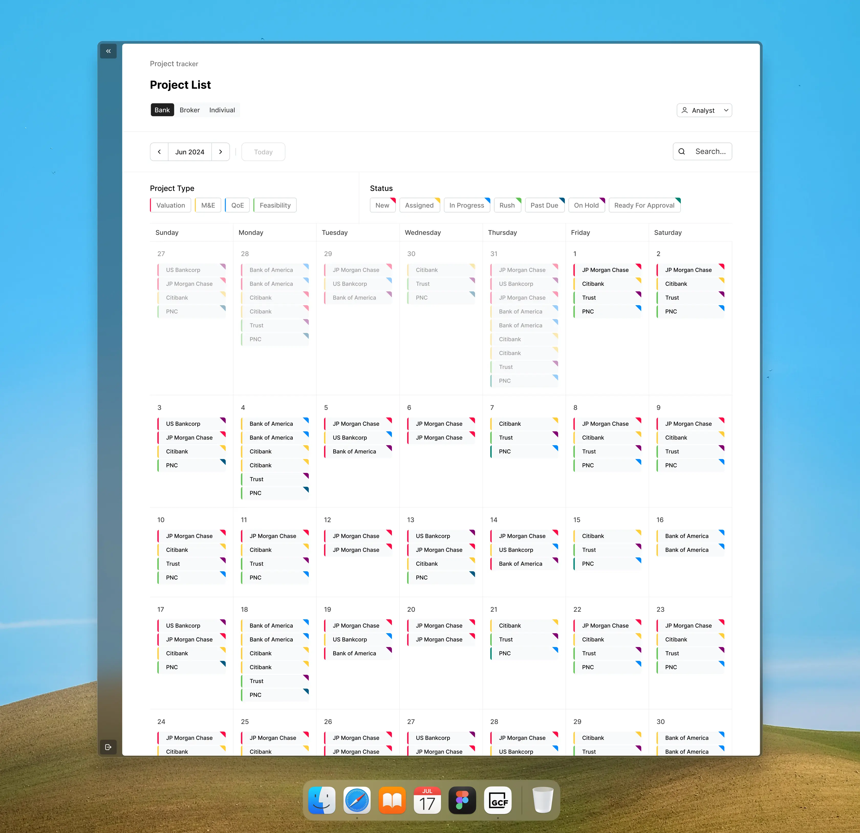
A project list built to set up valuations faster
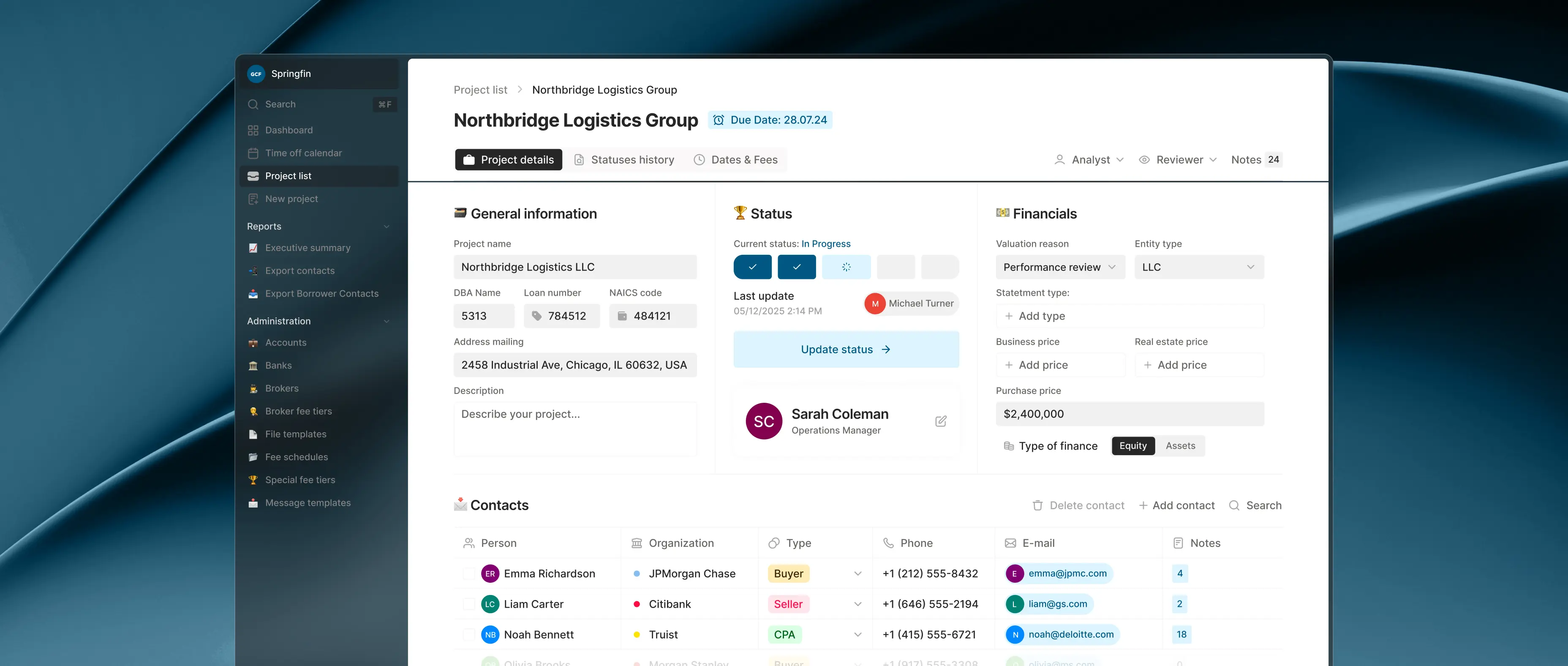
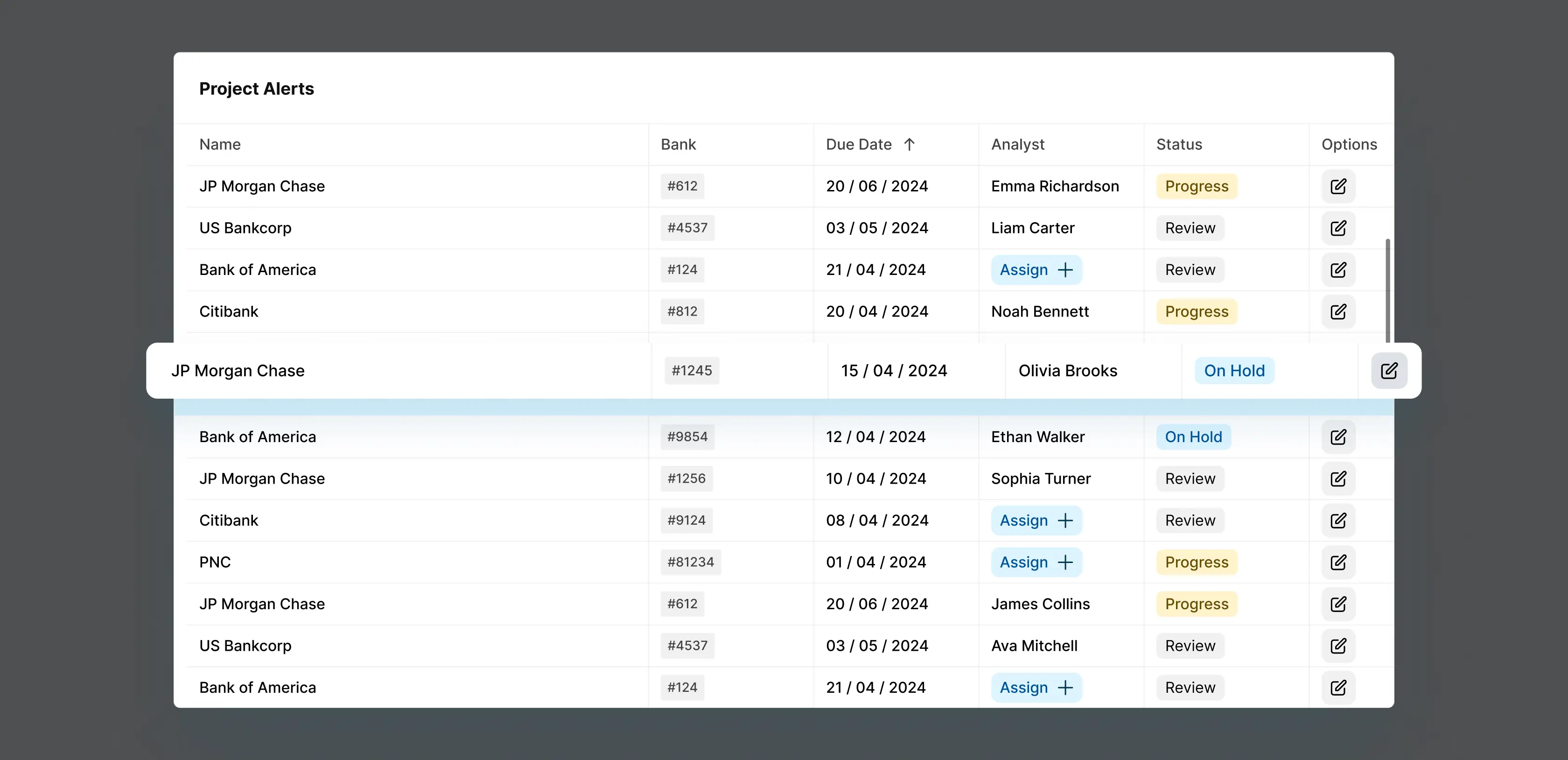
Before the redesign, opening a valuation meant reading raw database fields in storage order, with no sign of where a project stood or who owned it.
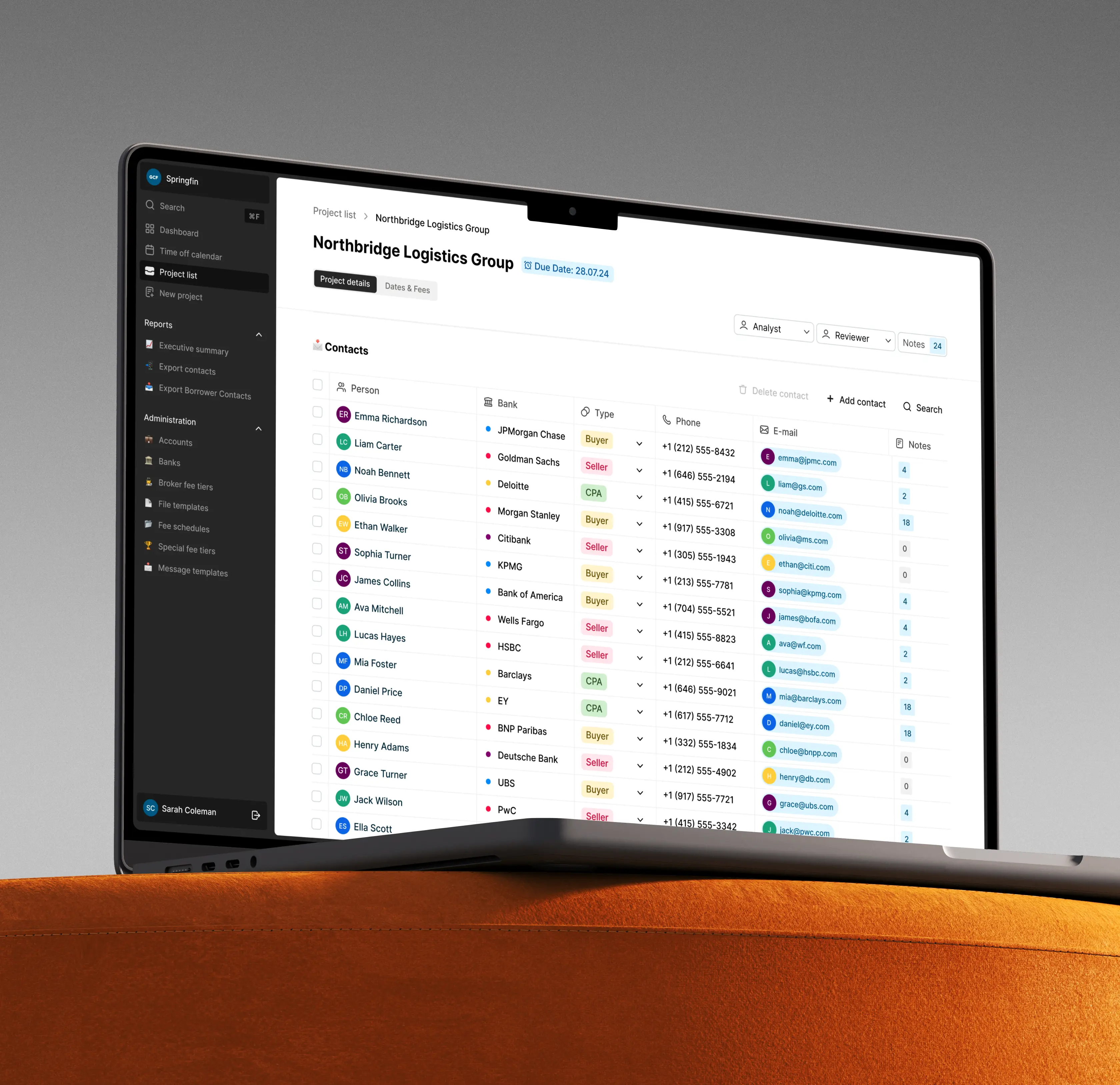
We rebuilt GCF's project list to carry that signal on the surface: every engagement shows its bank, due date, assigned analyst, and current status. As a result, a manager can read the full pipeline in one pass and claim unassigned work with a click.
The project view keeps live details in the main frame and moves fixed reference data into separate tabs. Together, these design decisions cut new-project setup time by 47%, and the hours once lost to navigation now go to completed valuations.
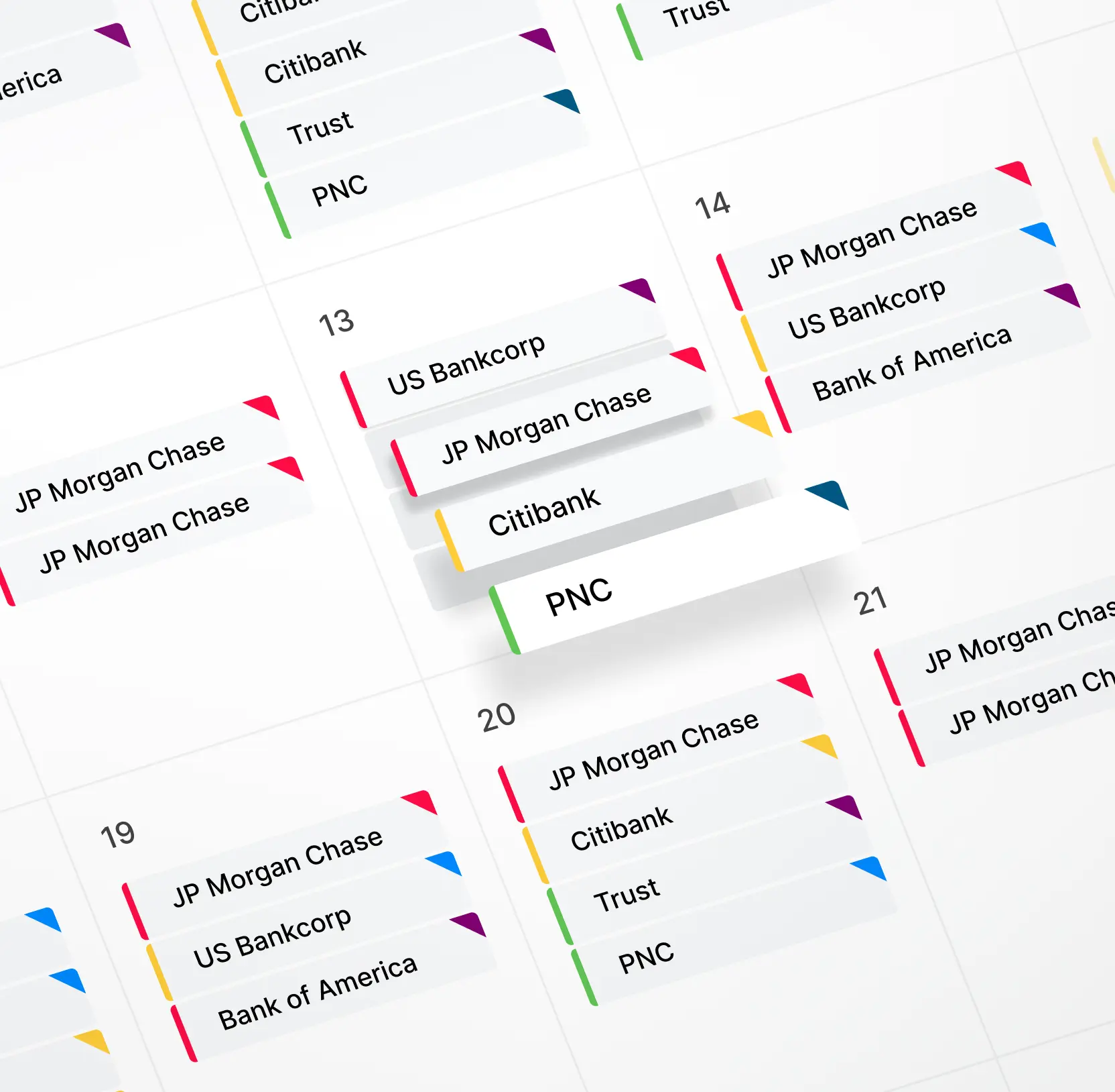
Rebuilt the calendar for real-time workload and urgency visibility
The original calendar showed only project numbers against dates, leaving a manager planning the week with no visibility into who was overloaded or which deadlines were closing in.
We rebuilt GCF's calendar to lay every project on a monthly grid, color-coded by status and filtered by analyst, project type, or institution. A manager sees the full team's load on one screen, spots the days stacking up, and drags a project to a new date to rebalance work on the spot. Deadline pressure shows up before it becomes a missed date, so projects keep moving, and turnaround stays tight.


AI & ML
Lazarev. agency offers comprehensive digital design services. Discover our range of related expertise supported by impactful case studies.
More Scaleups Cases


FAQ
How can UX design help financial services companies move away from paper-based or legacy database workflows?
Most financial services teams still rely on paper or Access workflows because digital tools rarely fit their practices. Interfaces misaligned with analysts’ mental models fail adoption. Lazarev.agency mapped GCF’s paper process, then structured status, data entry, and contacts around it. Analysts could adopt the platform immediately, proving digitization works only when it mirrors actual workflows.
What are the most effective ways to reduce errors in fintech applications through financial workflow platform design?
Errors in financial workflow tools often stem from interface design that ignores analysts’ real-world usage under time pressure. Critical data without hierarchy gets overlooked, and buried status indicators delay intervention.
In the GCF project, we applied financial workflow platform design principles: calculation fields were grouped logically, status updates became visually prominent, and color-coded cues highlighted urgency. This redesign reduced errors by 27%, proving that a platform aligned with analyst decision-making drives accuracy and operational efficiency while supporting rapid adoption.
How does redesigning a project management dashboard improve analyst productivity in valuation or appraisal businesses?
Analyst productivity in valuation businesses is constrained by how quickly someone can move between project context, financial data, and status updates without losing their place. Legacy systems built on database logic rather than workflow logic force analysts to navigate between screens for the information they need simultaneously. A well-designed dashboard surfaces the right data at each stage of the valuation process without requiring unnecessary navigation.
What should fintech companies consider when redesigning a tool built on an existing design system or component library?
Building on an existing design system is a constraint most fintech product teams underestimate. The temptation is to work around the system's limitations by introducing custom components, but this creates long-term maintenance problems and slows developer implementation. The more effective approach is working within the system's component structure while updating visual variables: typography, color, spacing, and iconography.
How can calendar and scheduling interfaces be redesigned to improve resource allocation in project-heavy financial businesses?
Calendar interfaces in financial and valuation businesses carry more operational weight than most product teams appreciate. When analysts and managers can't read workload distribution, project types, and deadlines at a glance, resource allocation decisions get made on incomplete information and bottlenecks form before anyone notices them.
What business outcomes can a valuation or appraisal firm realistically expect from investing in a workflow UX redesign?
The measurable outcomes from a workflow redesign in valuation or appraisal businesses fall into three areas.
First, capacity: when analysts spend less time navigating a confusing interface, they complete more work in the same hours. In the GCF project, monthly valuation completions increased by 34%.
Second, error reduction: a logically structured interface with clear visual hierarchy catches mistakes before they become client-facing problems. GCF saw a 27% reduction in errors after the redesign.
Third, onboarding and setup speed: when data entry is organized around how analysts think rather than how a database stores records, new projects get set up faster. GCF reduced project setup time by 47%.
How does Lazarev.agency approach UX design for complex B2B financial tools where users have deep domain expertise?
Domain experts need interfaces that match their workflow. Lazarev.agency redesigned GCF Valuation by starting with the existing wireframe, reducing navigation overhead, making status updates visible, and organizing data around decision-making. Analysts could use the tool fluently from day one, setting a benchmark for B2B financial workflow platform design.


Hit me up! Let’s chat about your growth


