

What if your product team stopped guessing what users want and started knowing?
What if, instead of brainstorming around a whiteboard, you had a living, breathing profile of your users that evolved with your product? What if those personas didn’t sit in a dusty doc, but directly shaped onboarding flows, dashboards, and conversion-critical screens?
Lazarev.agency’s team doesn’t treat UX personas as marketing fluff. We treat them as high-impact design tools anchored in data, validated through research, and constantly updated to reflect real behavior.
In this guide, we share real UX persona examples from projects in fintech, non-profit, and B2B tech, showing how these profiles helped reduce churn, sharpen UI decisions, and unlock new product growth. If you're ready to move beyond assumptions and design with clarity, start here.
Key Takeaways
- UX personas reduce assumptions and guide evidence-based design decisions.
- A strong persona brings clarity to product scope, priorities, and features.
- Real-world persona use helps shape adaptive, user-aware interfaces.
- Lazarev.agency uses custom personas to boost engagement, reduce drop-off, and uncover hidden user needs.
What Makes a UX Persona Useful for Us?
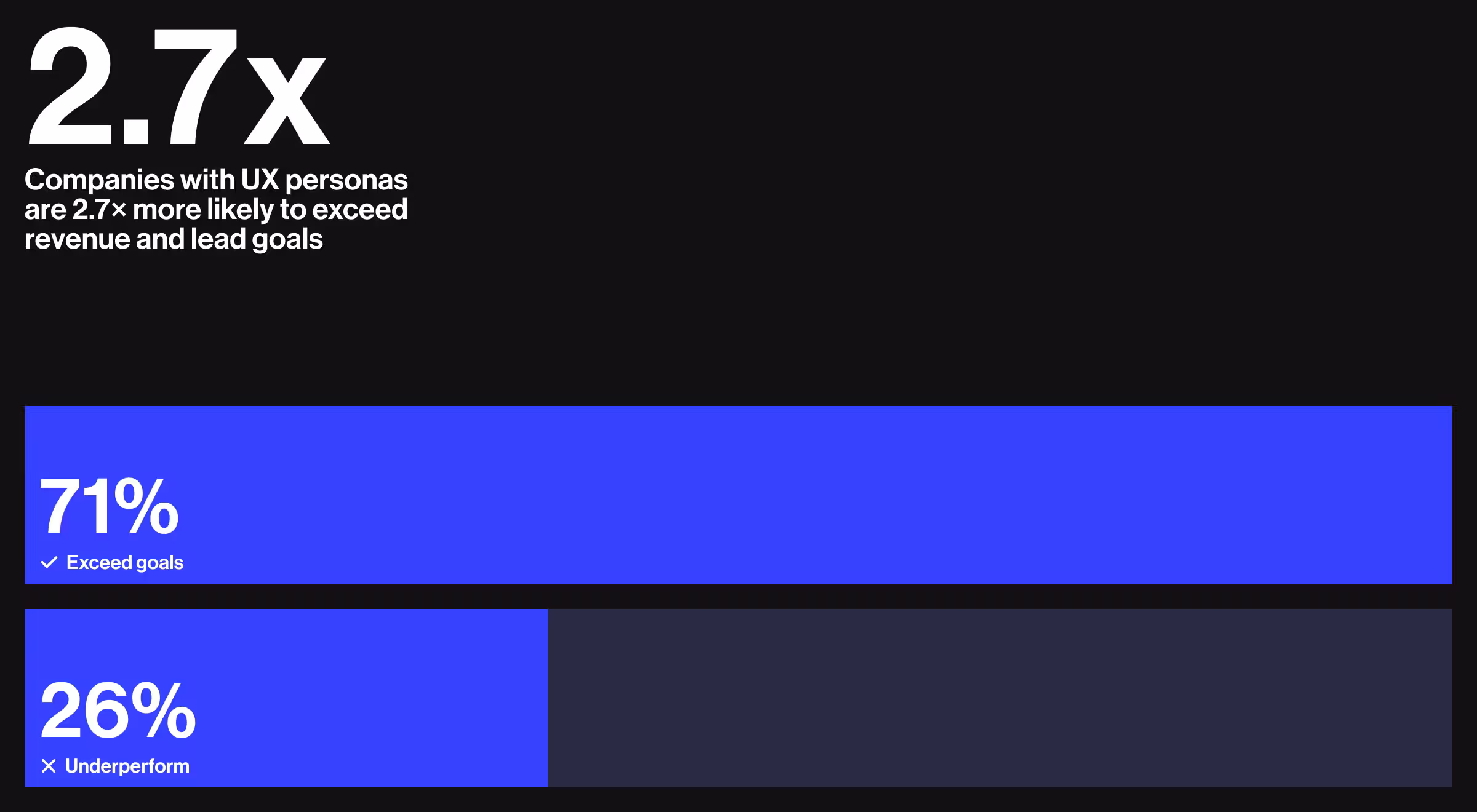
In user-centered design, UX personas serve as vital tools for aligning product strategies with real user needs. A 2024 benchmark summary shows that 71% of companies that exceed revenue and lead goals have formally documented personas, while only 26% of under-performers do the same. That demonstrates a clear link between UX personas and business success.
But what are personas in UX design? In short, they’re research-based representations of target users.
Good personas reflect real behavioral patterns and user motivations, rather than rely on assumptions or generic marketing profiles. They emerge from UX research, combining functional needs with contextual insights.
UX personas allow teams to:
- Understand core user journeys
- Prioritize features with empathy
- Align business goals with real user expectations
Static personas quickly lose relevance. We keep them dynamic by treating them as living documents — refreshing with new data from analytics dashboards, quarterly user interviews, and in-product behavior metrics. This rolling update loop ensures each UX persona reflects current motivations and pain points, making it a reliable compass when the product or market shifts.
Persona UX Strategy: Why Real Data Beats Assumptions
Every product team has assumptions about users. But they rarely hold up in the real world. UX personas are meaningful for product management and UX design only if they are based on actual data. That’s the key to creating user-centered designs that truly resonate with the target audience.
An effective persona UX strategy replaces guesses with real data:
- What users say vs. what they do
- Where users struggle or drop off
- What truly drives action tied to user intent or business goals
By turning UX research into actionable personas, our team focuses on outcomes that improve user experience and product performance. This means:
- Reducing feature bloat
- Eliminating UX dead zones
- Building context-aware workflows
“Without research-backed personas, you risk designing around team opinions not users’ needs.”
{{Ostap Oshurko}}
Real UX Persona Examples from Lazarev.agency
Let’s explore user persona examples that shaped three real-world products across sectors.
Designing for Political Engagement
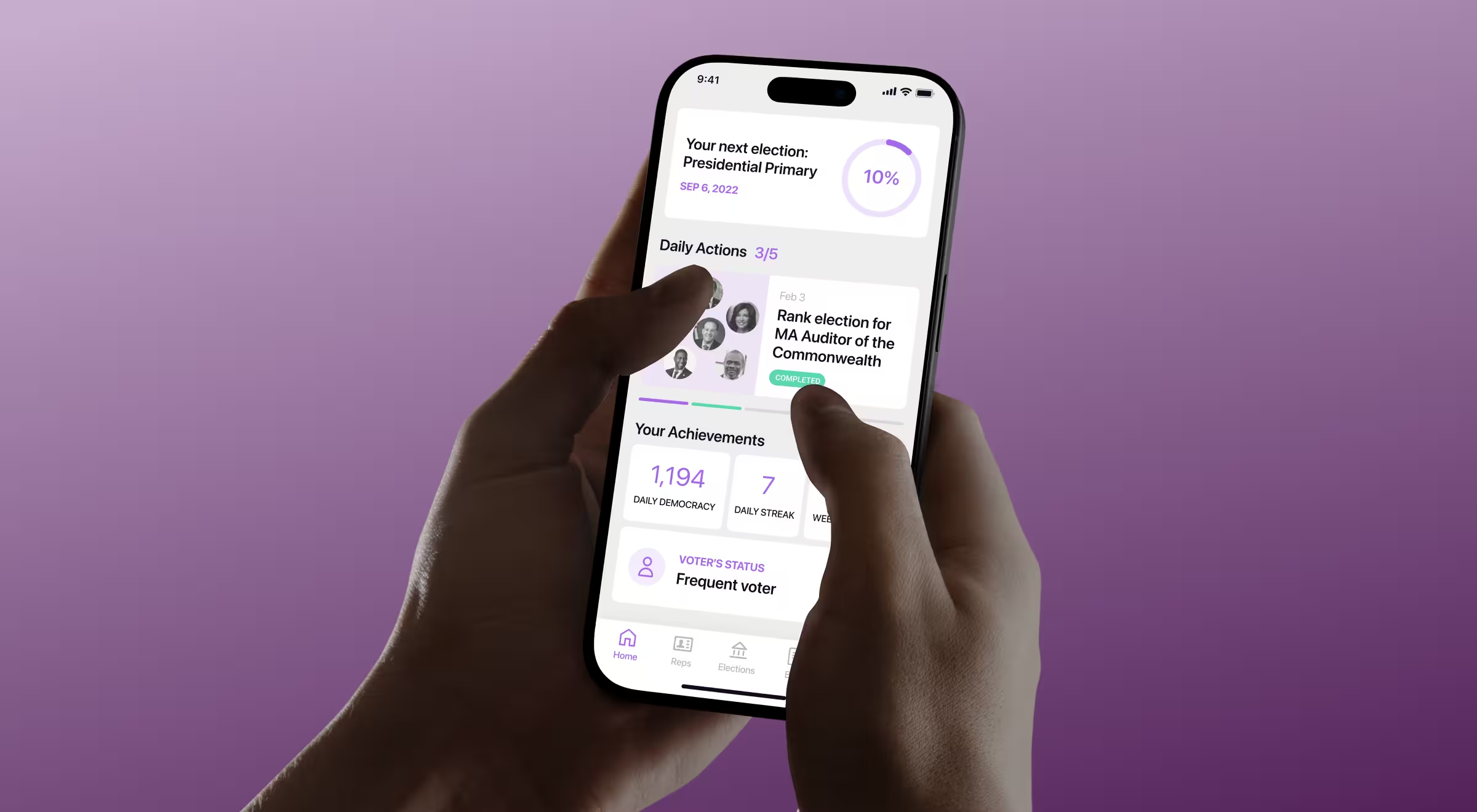
During the discovery phase for Activote, a civic tech platform, we distilled our research into a single, high‑impact archetype.
UX persona example — “Time‑Pressed First‑Time Voter”:
Demographics: 23 – 35 y.o. urban professionals in their first post‑college job, moderate income.
Background: Social‑issue aware but has never voted in a midterm; finds election rules and timelines confusing.
Primary goal: Learn info to vote, and why each issue matters — all in under five minutes.
Motivations: Civic pride, desire to support community causes, preference for concise app‑based learning.
Pain points: Scattered election information, unclear issues, fear of making an uninformed choice.
Preferred channels: Mobile apps, social feeds, short push notifications.
Tech proficiency: Comfortable with fintech, ride‑sharing, and news apps; expects friction‑free UX.
Hobbies: Podcasts, local volunteering, sports.
Grounded in this persona’s goals and constraints, we shaped our work around next UX moves:
- Vote ready dashboard counts down to the next election, shows polling‑place details, and sends timely reminders.
- Gamified achievements (achievements, daily tasks) turn participation into shareable wins that boost motivation.
- Optimized onboarding trims account setup, so first‑time voters reach core content fast (to compare: the last version forced users to spend about 15 minutes).
- Mobile‑parity design keeps every desktop function one tap away on phones — crucial for on‑the‑go users.
"A voter shouldn’t need a manual to make informed choices. The persona-driven approach helped us prioritize clarity over noise."
{{Ostap Oshurko}}
Building Trust for Global Transactions
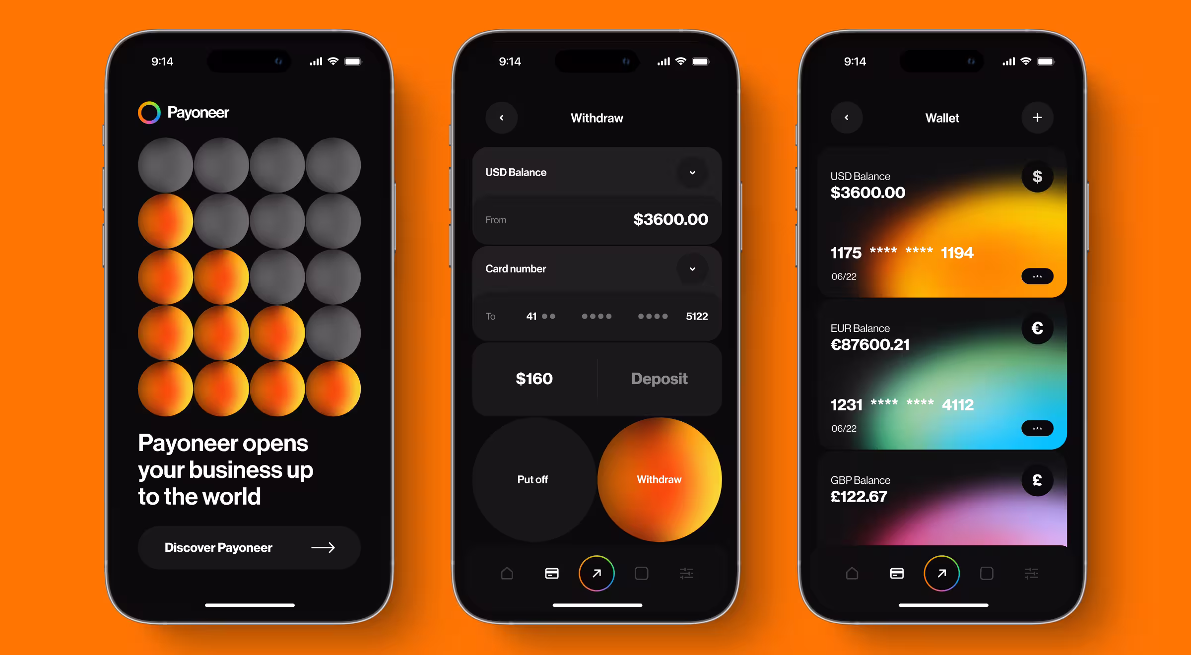
Lazarev.agency helped redesign a global fintech platform onboarding and transaction experiences to support rapid scale and improve user clarity.
UX persona example — “Cautious Operator”:
Demographics: 40–55 y.o. finance or operations leads at mid-size European and LATAM B2B marketplaces; steady income, family-focused.
Background: Seasoned accountants/controllers responsible for hundreds of monthly cross-border payouts and supplier onboarding.
Primary goal: Clear every international payment on time, within budget, and in full regulatory compliance.
Motivations: Maintain spotless audits, protect vendor trust, and secure small FX savings that add up at scale.
Pain points: Shifting regulations, volatile exchange rates, and manual SWIFT tracking that drains hours each month.
Preferred channels: Web dashboards for day-to-day, CSV/Excel exports for month-end, email alerts for exception handling.
Tech proficiency: Advanced spreadsheet and ERP users; cautious adopters of new fintech tools until risk controls are proven.
Hobbies: Practical, routine hobbies such as weekend cycling, home DIY projects, and reading finance news.
During the UX discovery phase, we prioritized transparency and accessibility, crucial for financial tools handling high-stakes transactions:
- Interactive multi-currency wallet — each card instantly changes color by currency, giving finance leads a quick visual cue and reducing errors when juggling multiple accounts.
- Instant conversion calculator inside the Send-Money flow shows live FX rates and fees before confirmation, removing guesswork from high-value transfers.
- Data-rich home dashboard — balances, recent transactions, and spending analytics now surface on the first screen, so operators track funds at a glance.
"When money moves globally, trust becomes the UI. Our personas helped define where that trust breaks and how to design around it."
{{Anna Demianenko}}
Enhancing Project Management at Scale
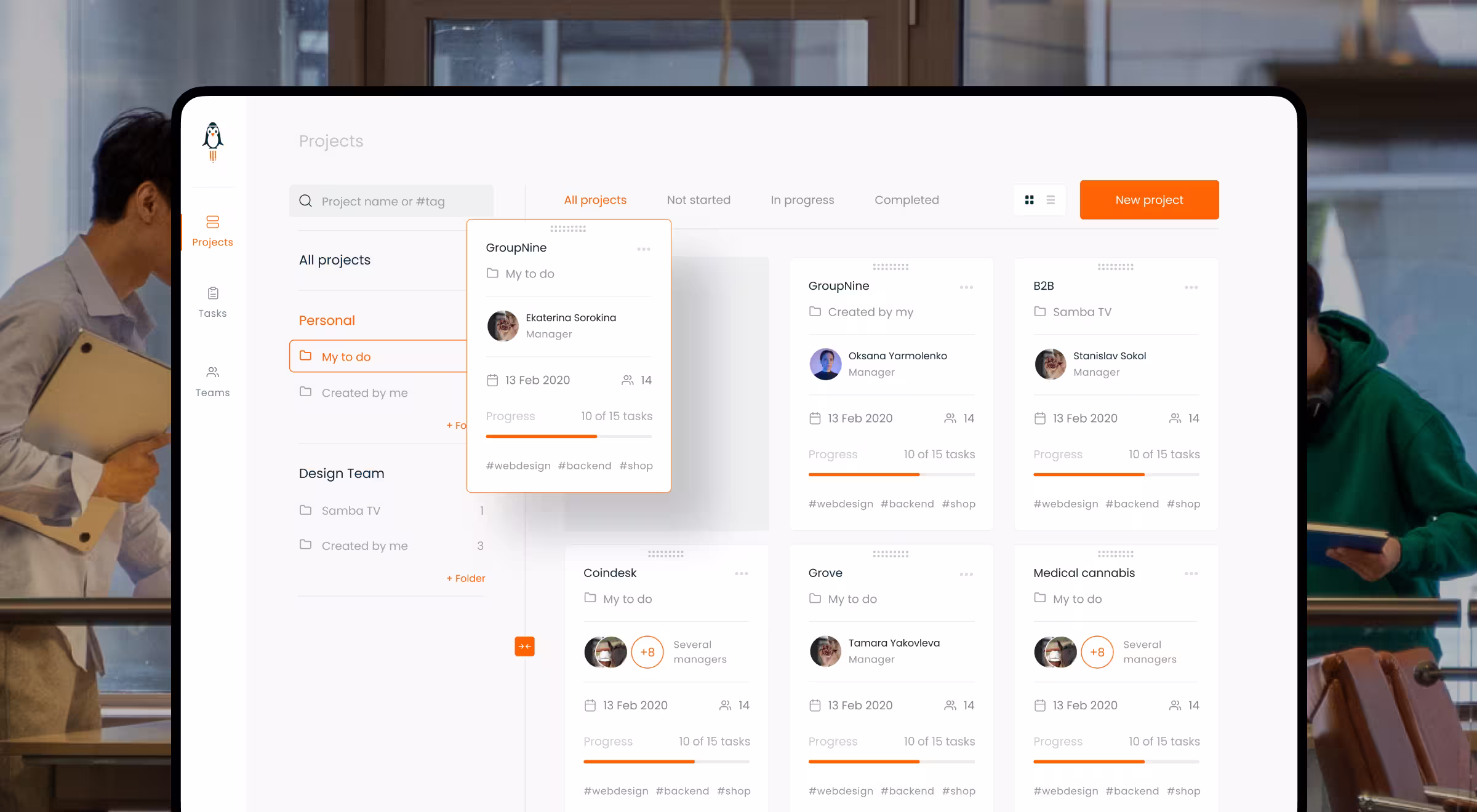
Our redesign for a B2B project‑management hub GoPingu focused on turning a feature‑heavy MVP into an interface that stays intuitive even as workloads grow.
UX persona example — “Multi‑tasking Project Manager”:
Demographics: 28–38 y.o. product or project managers in distributed SaaS startups; urban, career-driven, moderate-to-high income.
Background: Oversees multiple agile squads across time zones, juggling feature backlogs, investor updates, and user feedback loops.
Primary goal: Keep tasks, deadlines, and stakeholder communication in one place so nothing slips during rapid release cycles.
Motivations: Ship on schedule, avoid context-switch fatigue, and maintain clear visibility for execs and dev teams alike.
Pain points: Fragmented tools (Slack, Jira, Sheets), late-night stand-ups, duplicate status reports, and information silos.
Preferred channels: Web kanban boards for planning, mobile push for blockers, async video for demos and retrospective summaries.
Tech proficiency: Comfortable with API integrations, low-code automations, and AI assistants for drafting release notes.
Hobbies: Active lifestyle and professional upskilling — indoor climbing, attending product meetups, binge-listening to UX podcasts.
Based on the insights from UX persona, we implemented the following UX enhancements:
- Kanban layout + List view speed up adoption by mirroring familiar patterns and cut bounce rate.
- Inline‑editable project card groups progress, deadlines, and status, so PMs update details directly on the dashboard.
- Team module lets leads add or remove members and balance workloads on a single screen.
- Mobile‑parity design retains core desktop UX, enabling full task control from any device.
“When status, context, and ownership fit into a single glanceable panel, delivery speed turns into a metric the team can actively optimize.
{{Anna Demianenko}}
These focused improvements show how persona‑driven UX decisions translate into fewer context switches, faster updates, and smoother scaling for project‑heavy teams.
How Personas UX Research Supports Scalable Design
Scalable design starts with deeply aligned personas. At Lazarev.agency, we use personas UX research to ensure the design logic remains intact even as products grow, teams scale, and features evolve.
When personas reflect behavioral intent rather than surface-level traits, teams can confidently localize experiences, introduce new flows, and adapt to edge cases.
All without disrupting the core user logic.
Our UX research team builds personas into every stage of the product roadmap:
- Qualitative and quantitative data shape initial user models
- Personas evolve in sync with product iterations
- Teams revisit and refine personas on a quarterly basis
This cycle keeps design decisions anchored to user behavior, making interfaces:
- Responsive to shifting user patterns
- Grounded in real-world context
- Aligned with long-term product value
We treat personas as dynamic design tools — a system that scales alongside the product and keeps user relevance at the center of every release.
Designing UI Persona for Visual Clarity
Sometimes, a UI persona must go beyond functionality to shape perception, trust, and cognitive load. According to the Nielsen Norman Group, minimizing cognitive load is essential for users to complete tasks efficiently and make confident decisions within an interface.
Take a global fintech platform — a product where clean UI wasn’t enough. The goal was to build trust and clarity in a complex financial setting. Persona insights helped shape layout, copy, and flow with confidence in mind.
When used strategically, UX personas:
- Help teams align faster
- Translate research into practical decisions
- Reduce design misfires and rework
More than documents, they are catalysts for focus and clarity.
🔍 Pro Tip: Effective UI personas focus less on demographics and more on decision-making. Ask yourself: what would help this user feel confident clicking “Submit”?
Tools and Templates for Creating User Personas
Many teams rely on purpose-built tools and templates that support a clear, repeatable process and keep insights actionable.
Useful resources include:
- User persona template builders like Miro’s UX Persona Template or Figma Community files that outline clear goals, pain points, behaviors, and decision triggers for specific segments. Great for aligning remote teams quickly.
- User research tools such as Hotjar, Maze, and Lookback for running moderated interviews, collecting session recordings, and spotting behavioral patterns behind clicks.
- Persona generators like UXPressia or MakeMyPersona by HubSpot help turn qualitative insights into structured profiles fast, especially useful for product teams working under tight deadlines.
- Visual frameworks like Empathy Maps in Notion, FigJam, or Miro provide a deeper psychological lens into typical user thinking, feeling, seeing, and doing — excellent for team workshops.
- Prototyping exercises like role-play scenarios or “day in the life” storyboarding help test early personas before committing to features, especially effective during MVP planning or design sprints.
When documented clearly, your customer personas become powerful internal references that align teams and inform decisions across strategy, design, and delivery.
Want to Create Personas That Drive Product Outcomes?
At Lazarev.agency, we don’t build UX persona examples that gather dust. We embed them into research, design, and delivery guiding decisions that improve clarity, reduce rework, and support long-term scalability.
Looking to sharpen your product with UX personas that guide real outcomes?
Expect our team to go through the fire of user research, design, and product testing with you. We challenge assumptions early, ask the right questions, and align design choices with proven user insights. Contact us and let's bring your vision to life!


.webp)


.avif)


