How enterprise workforce platform design boosted job applications and streamlined hiring process
About the project
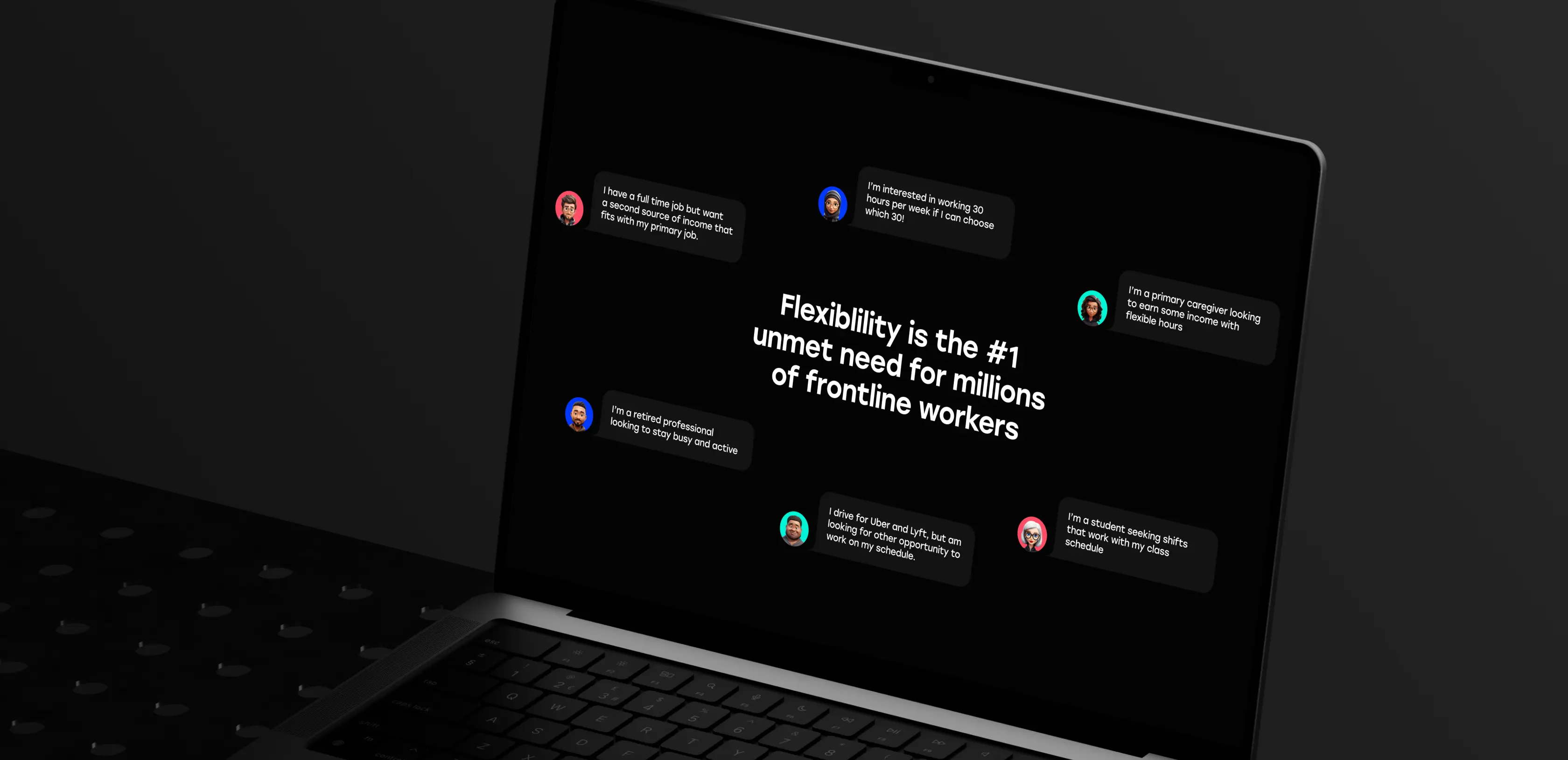
Establishing a compelling digital presence is essential for attracting both enterprise clients and flexible workers. ReadyOn, a platform revolutionizing how enterprises hire and manage frontline workers through flexible work arrangements, needed a modern website that would reflect their innovative approach and appeal to multiple audiences simultaneously. They partnered with Lazarev.agency to apply enterprise workforce platform design, creating a digital experience worthy of the future of frontline work.
Developed a cohesive visual strategy that reflects modern workforce innovation
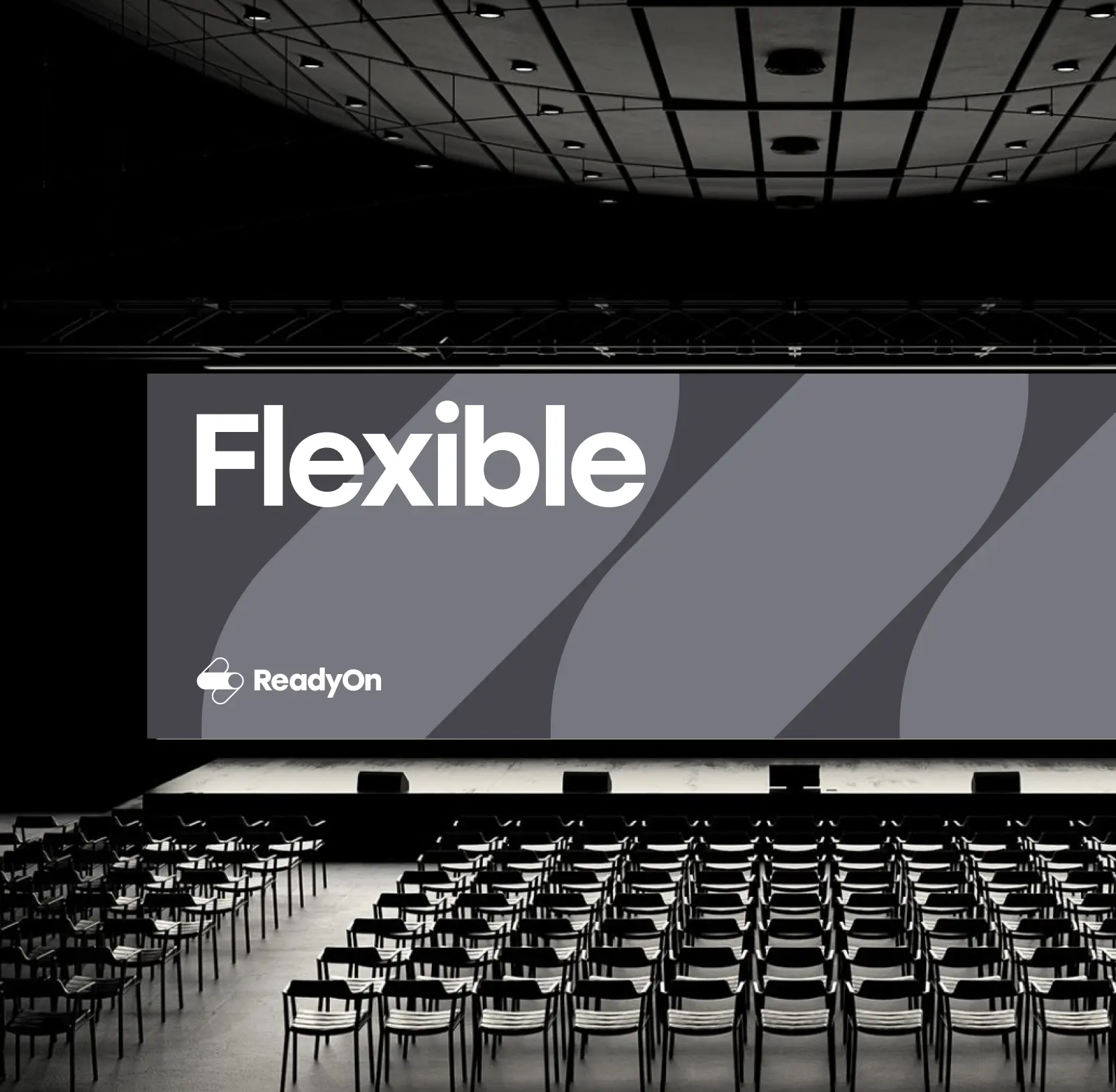
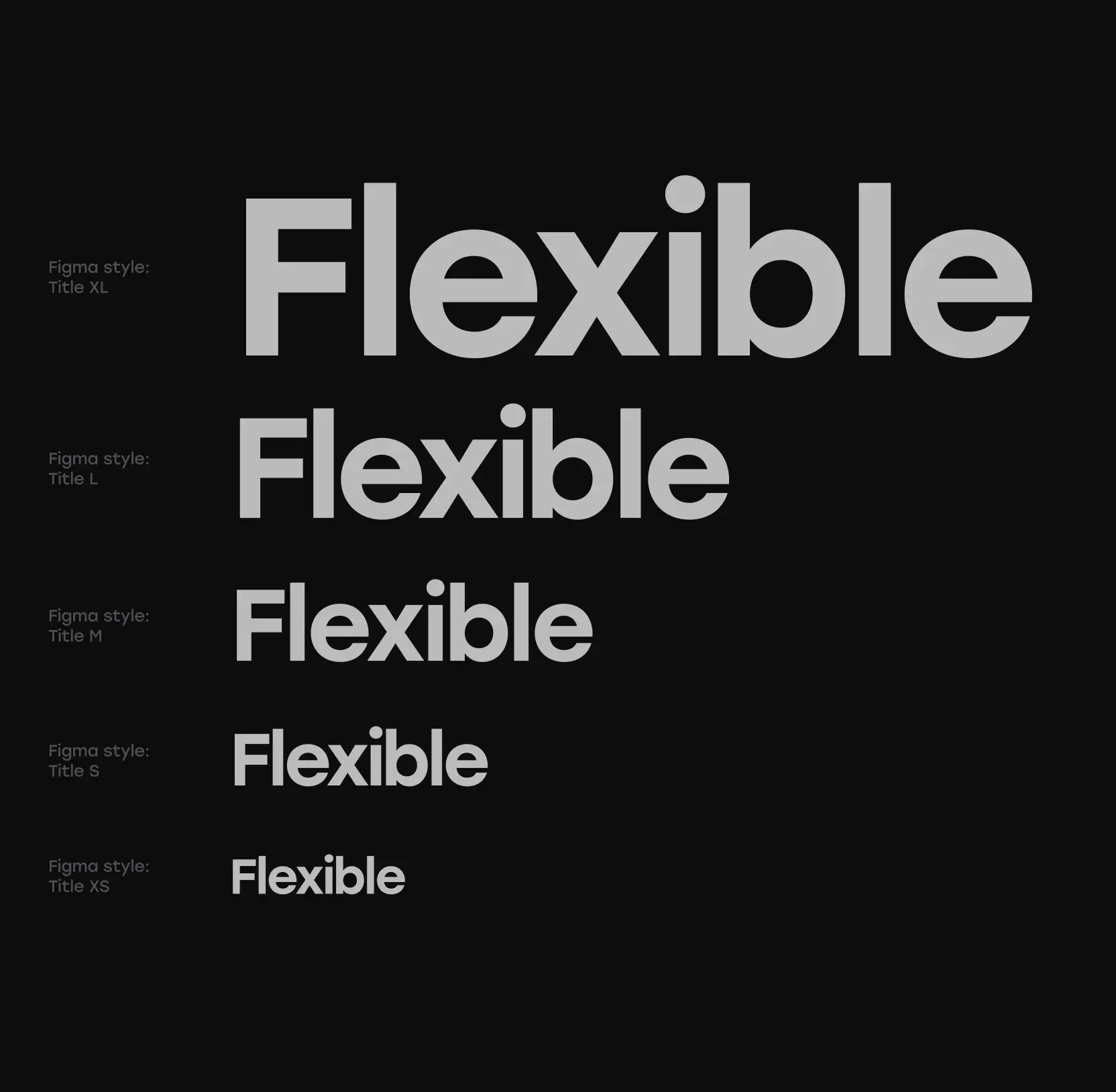
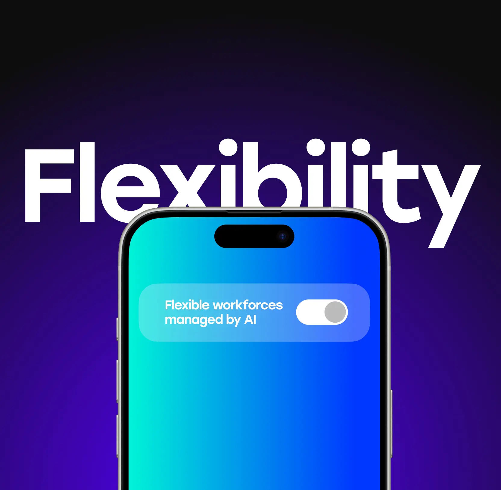
We crafted a comprehensive visual language using enterprise workforce platform design principles that positions ReadyOn as a forward-thinking platform for the future of frontline work. The design system balances professionalism for enterprise clients with accessibility and approachability for frontline workers, creating a unified brand identity across all digital touchpoints.
10 design system companies behind enterprise-grade UX
Redesigned the start page to optimize user accessibility and engagement
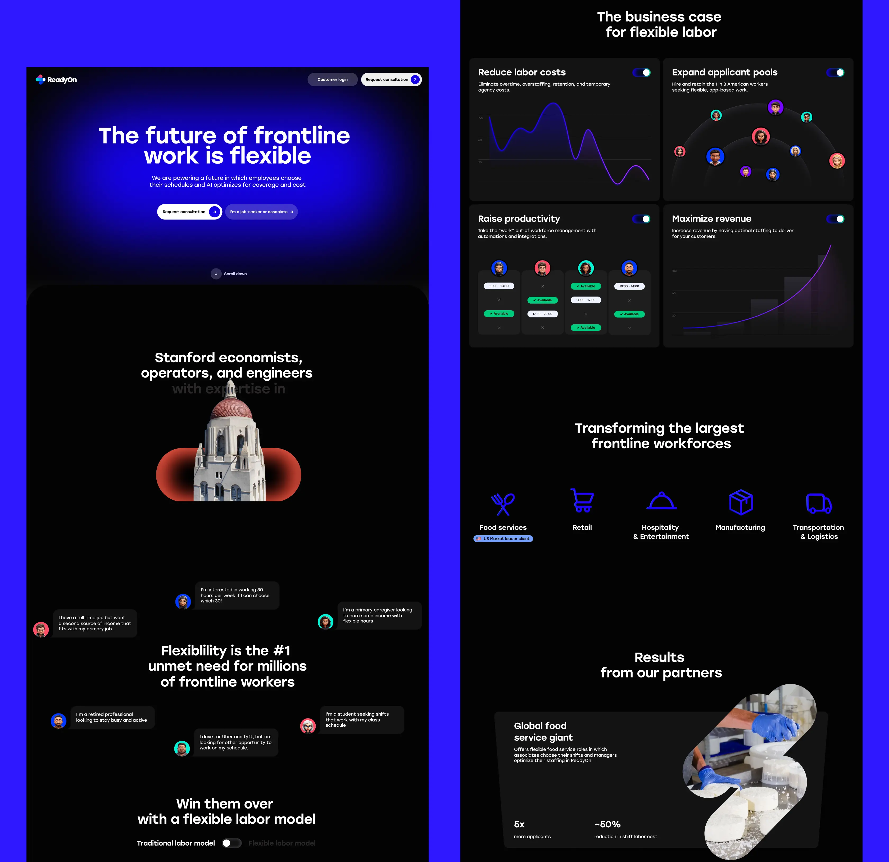
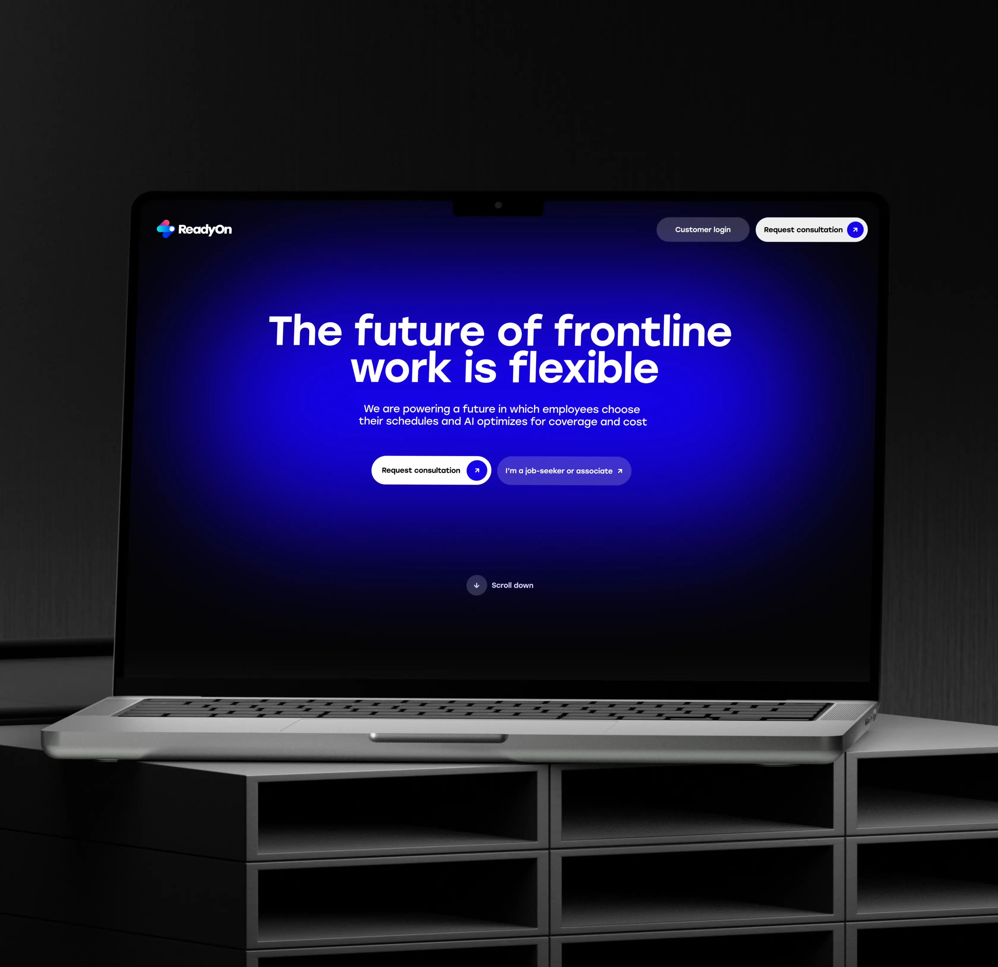
We completely restructured the homepage to ensure accessibility for all users, including those with disabilities or using assistive devices. By implementing WCAG standards and creating an intuitive navigation system, we removed barriers and made it easy for both enterprise clients and workers to understand ReadyOn's value proposition immediately.
Designed visual solutions highlighting the platform's job board capabilities
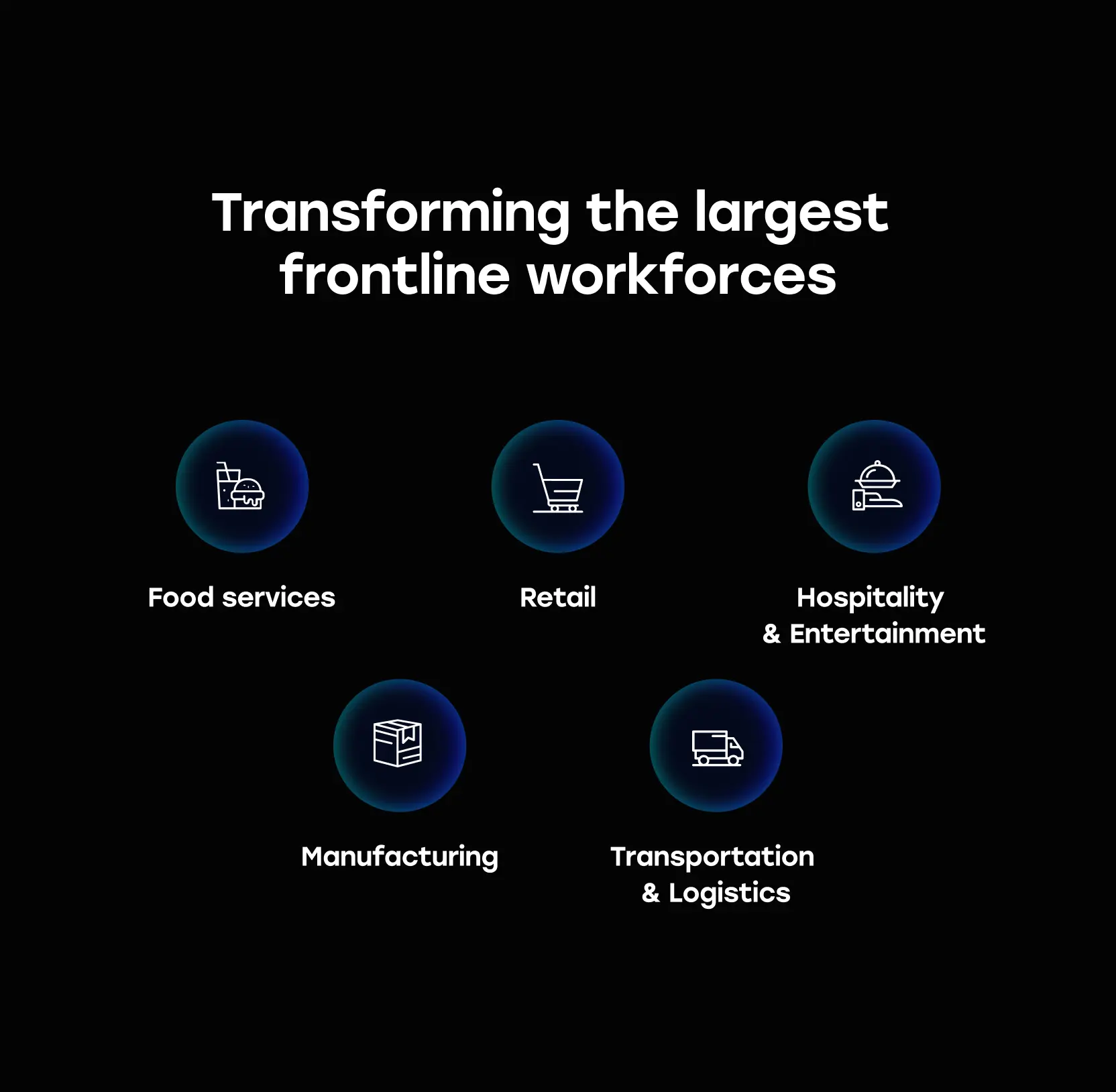
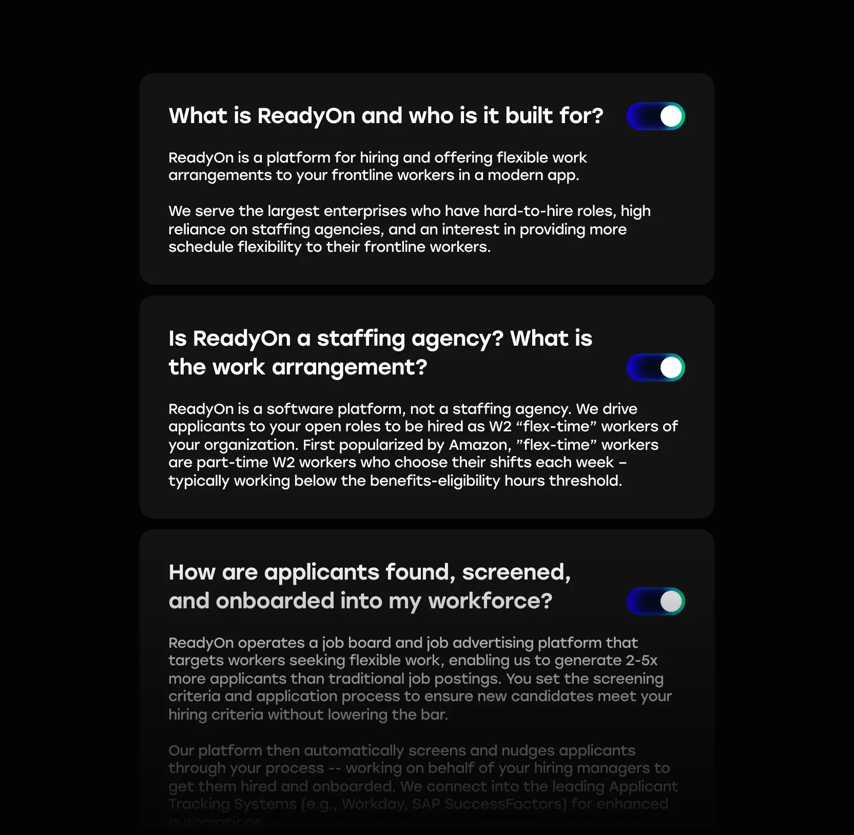
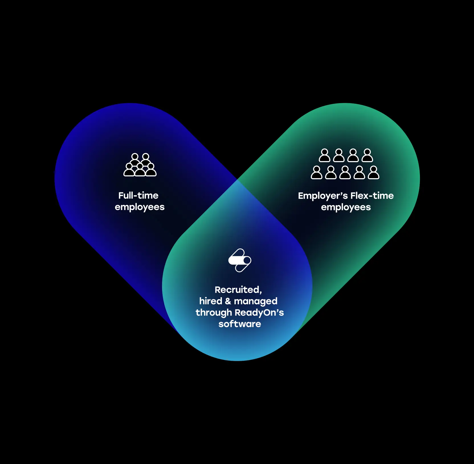
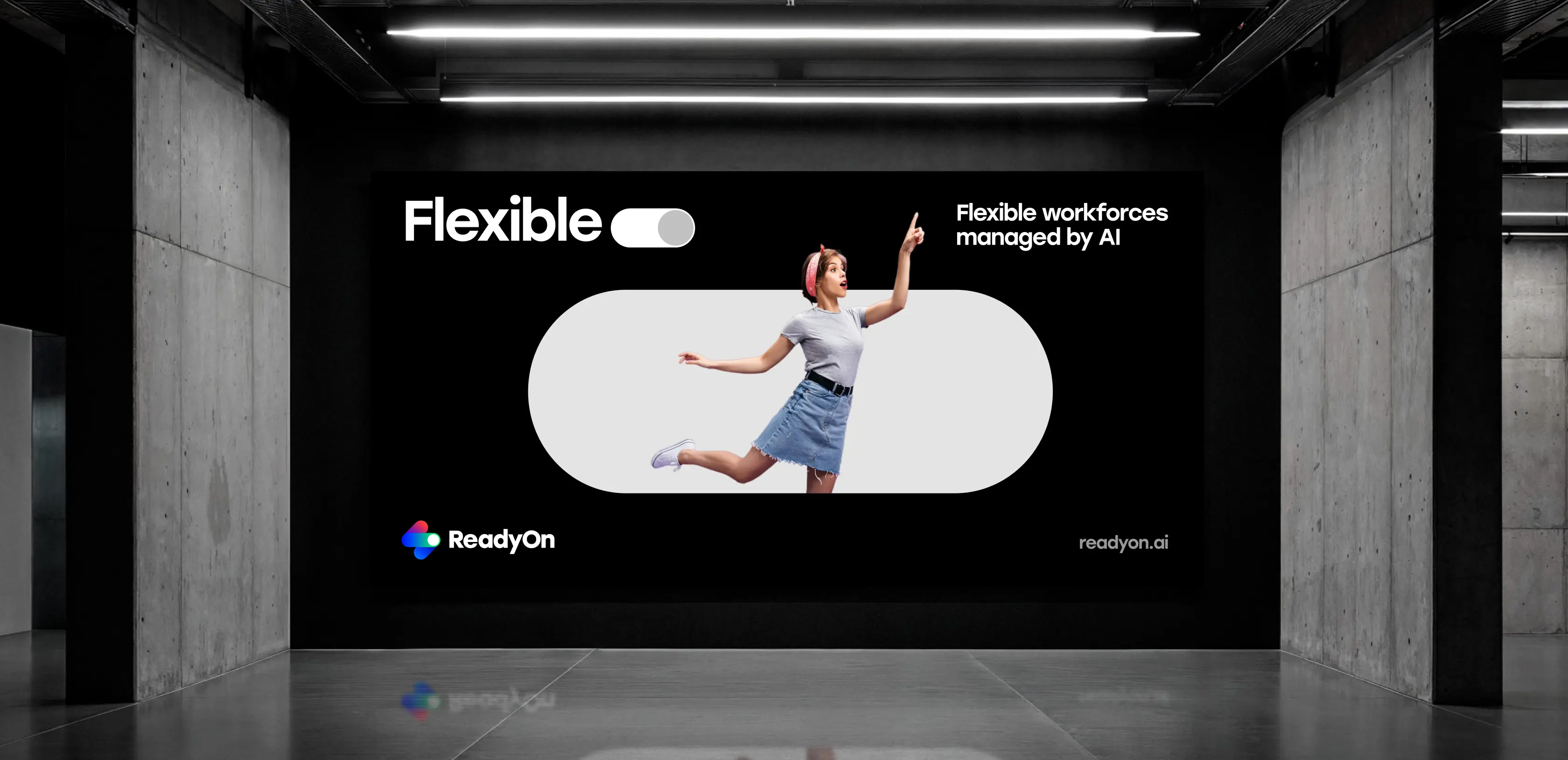
We created engaging visual representations of ReadyOn's job advertising platform and its ability to generate 2-5x more applicants than traditional postings. Dynamic layouts and clear information architecture, crafted with enterprise workforce platform design, showcase how the platform targets workers seeking flexibility while maintaining high hiring standards for enterprise clients.
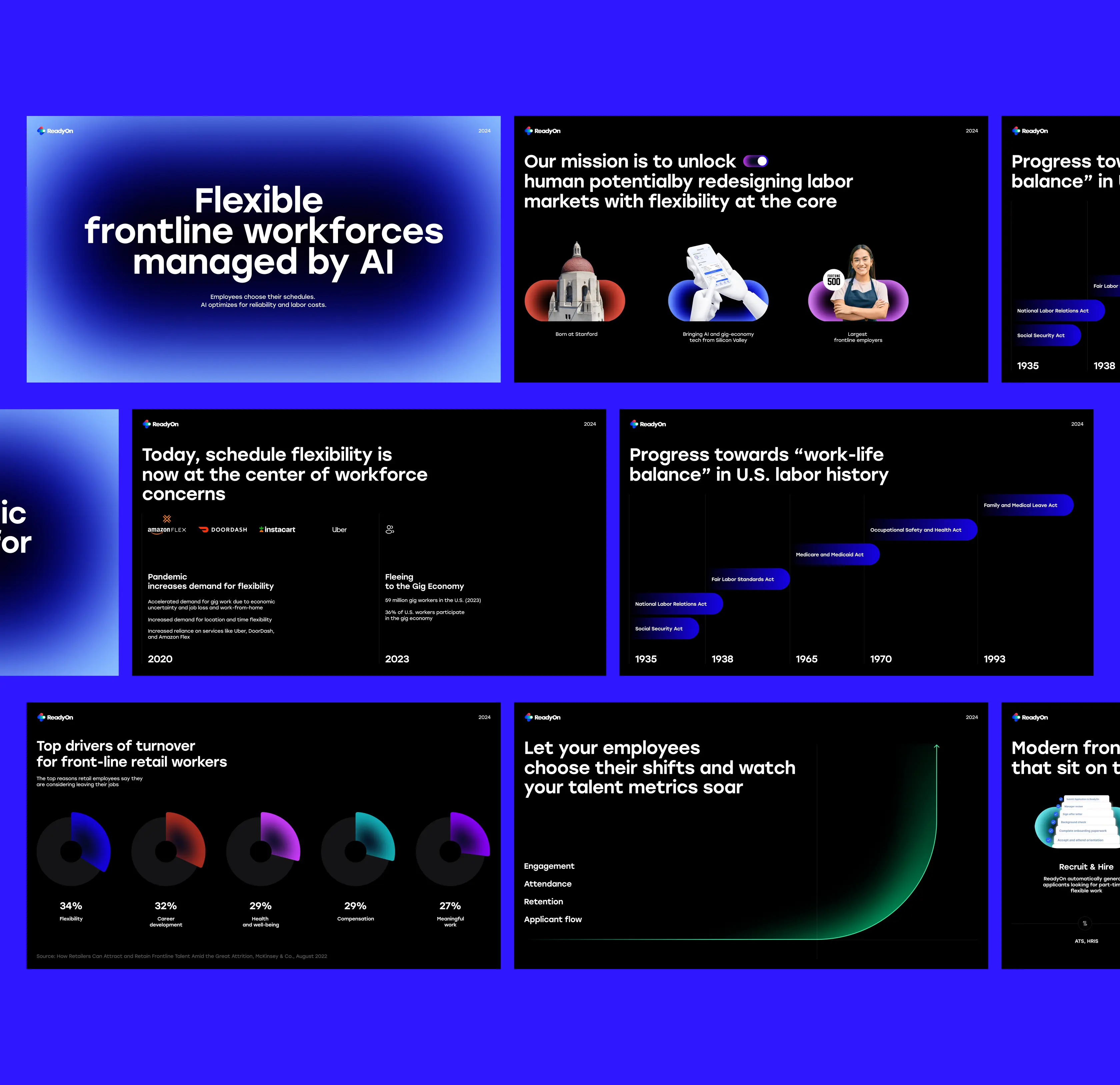
Built compelling results presentation through interactive slidedecks
We developed interactive presentation materials that clearly communicate ReadyOn's impact and success metrics. These slidedecks effectively demonstrate the platform's value proposition, featuring key statistics, client success stories, and the automated screening process that saves hiring managers valuable time.
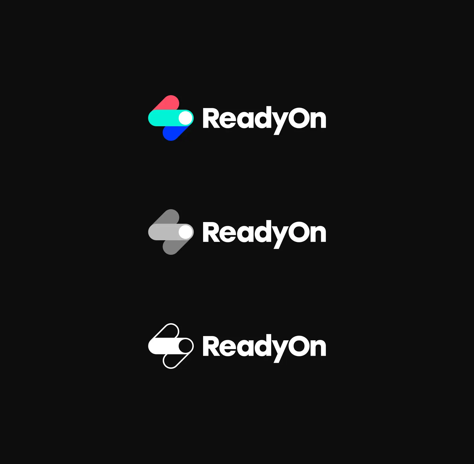
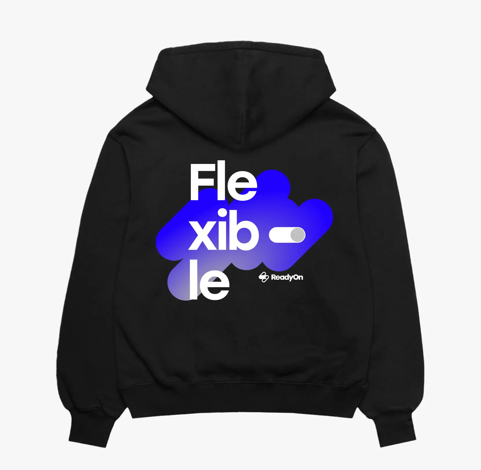
Established a strong branding foundation for market differentiation
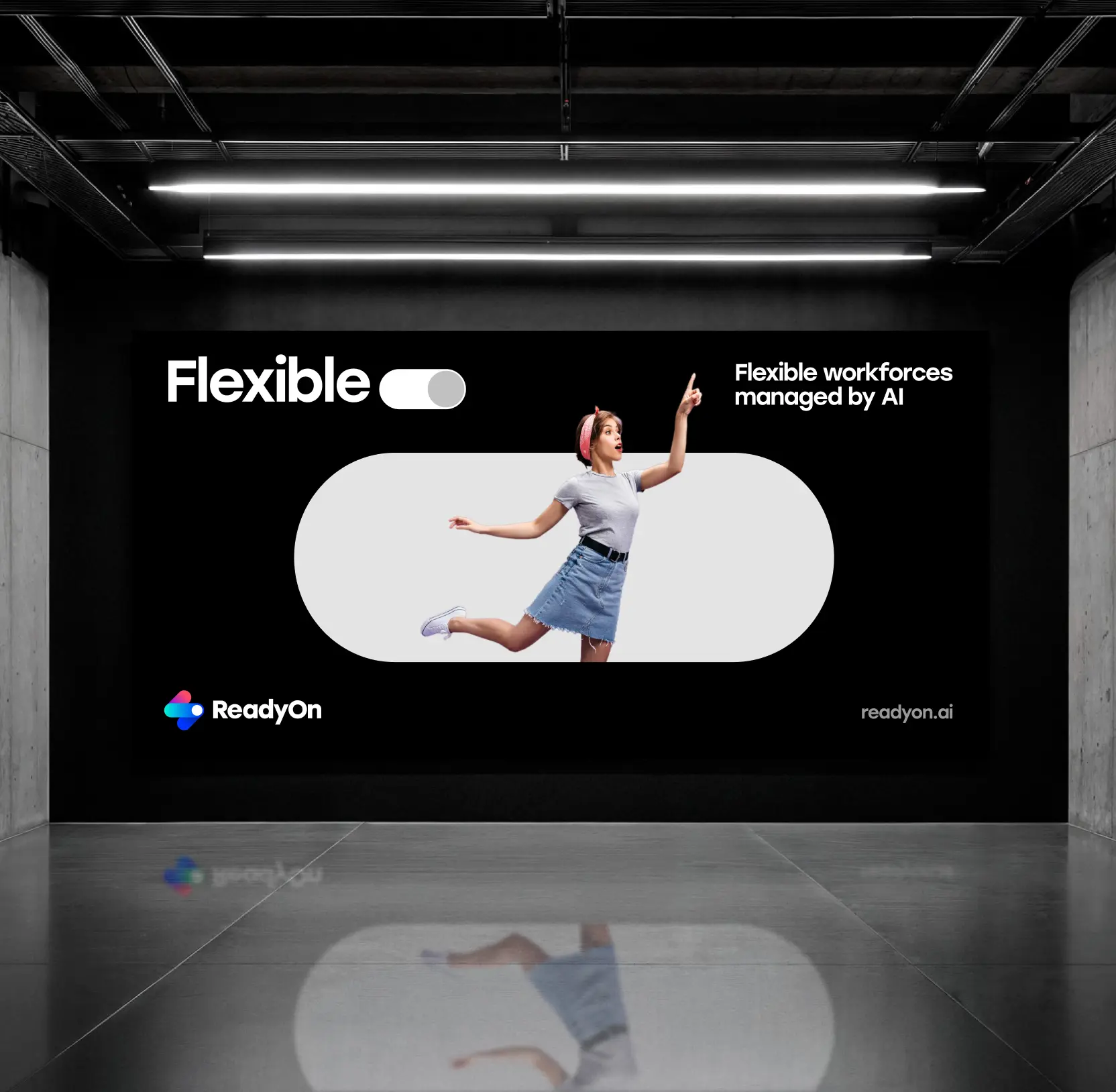
We created a distinctive brand identity that sets ReadyOn apart in the crowded workforce management space. The branding emphasizes innovation, flexibility, and reliability, core values that resonate with enterprises seeking modern solutions for hard-to-hire frontline roles and their reliance on staffing agencies.
Frequently asked questions
Common questions
about this topic
What makes ReadyOn different from traditional staffing solutions?
ReadyOn combines a modern job board targeting flexibility-seeking workers with automated screening and hiring workflows. The platform generates 2-5x more applicants than traditional postings while integrating with leading ATS systems to streamline the entire hiring process for enterprise clients.
How does accessible web design benefit workforce platforms like ReadyOn?
Implementing WCAG accessibility standards ensures that frontline workers of all abilities can access job opportunities without barriers. This inclusive approach expands the talent pool while demonstrating corporate commitment to diversity and equal opportunity, which resonates with modern enterprise values.
Why is dual-audience messaging important for B2B2C platforms?
Workforce platforms must appeal to both enterprise buyers and end-user workers. Effective dual messaging addresses the distinct needs of hiring managers seeking efficiency and workers seeking flexibility, ensuring both audiences find relevant value propositions without confusion.
How do visual solutions showcase complex platform capabilities?
Strategic visual design breaks down technical features like ATS integrations and automated screening into easily understandable concepts. Dynamic layouts, clear information hierarchies, and engaging graphics help both technical and non-technical stakeholders quickly grasp platform value.
What role does branding play in differentiating workforce management platforms?
Strong branding establishes market position and builds trust with enterprise clients making significant technology investments. Distinctive visual identity that emphasizes innovation and reliability helps platforms stand out in crowded markets while signaling commitment to modern workforce solutions.
How do interactive slidedecks support B2B sales processes?
Interactive presentation materials provide sales teams with compelling tools to communicate value propositions, success metrics, and platform capabilities. Well-designed slidedecks make complex information digestible and memorable, supporting enterprise decision-making processes.
Why are ATS integrations important to highlight in platform design?
Enterprise clients rely on existing HR technology stacks, so demonstrating seamless integration with platforms like Workday and SAP SuccessFactors reduces perceived implementation risk. Clear presentation of these technical capabilities accelerates sales cycles and builds confidence.
More cases like this
Related cases you
might find useful
How we helped Accern design an AI research product that powered $40M growth and acquisition
Discover how we helped Accern build a powerful AI research tool for analysts and VCs, setting new UX standards now used by AI leaders across industries.
How Lazarev.agency helped Dynascale attract new leads and build an engine for profit growth
See how Dynascale overcame growth challenges with strategic brand revamp & enterprise-grade UX by Lazarev.agency.
How we helped a complex AI SRE tool website boost customer acquisition
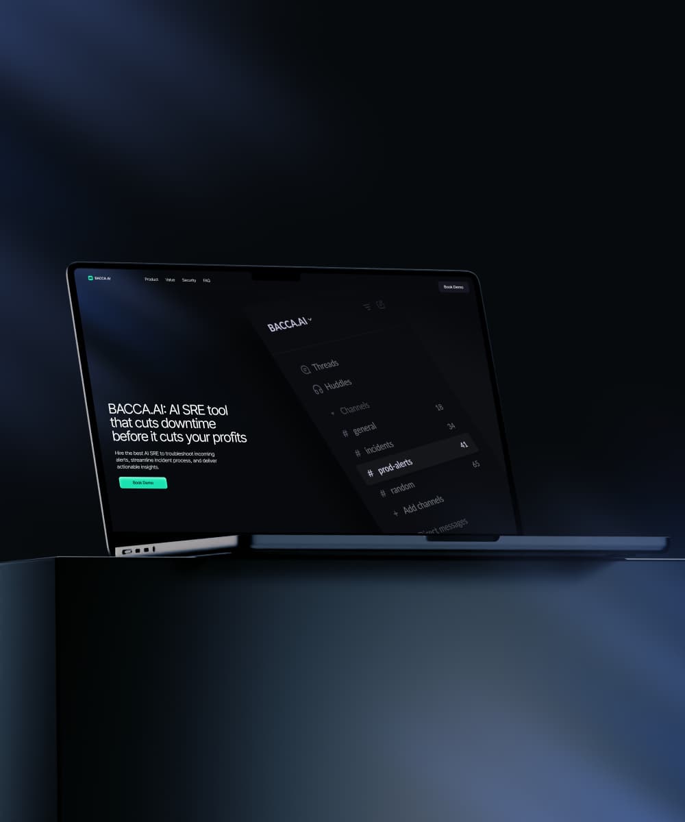
See how Lazarev.agency transformed Bacca AI's complex tech into a compelling story that boosts SRE platform sales.
Let's talk about your AI adoption challenge
Tell us where adoption stalls. You’ll hear back from a senior product and UX lead with a practical action plan.