Skip to content
Let's talk
Home
Cases
Flikair

How our logistics platform design fixed Flikair's costliest bottleneck

About the project

The hidden price of slow shipment decisions

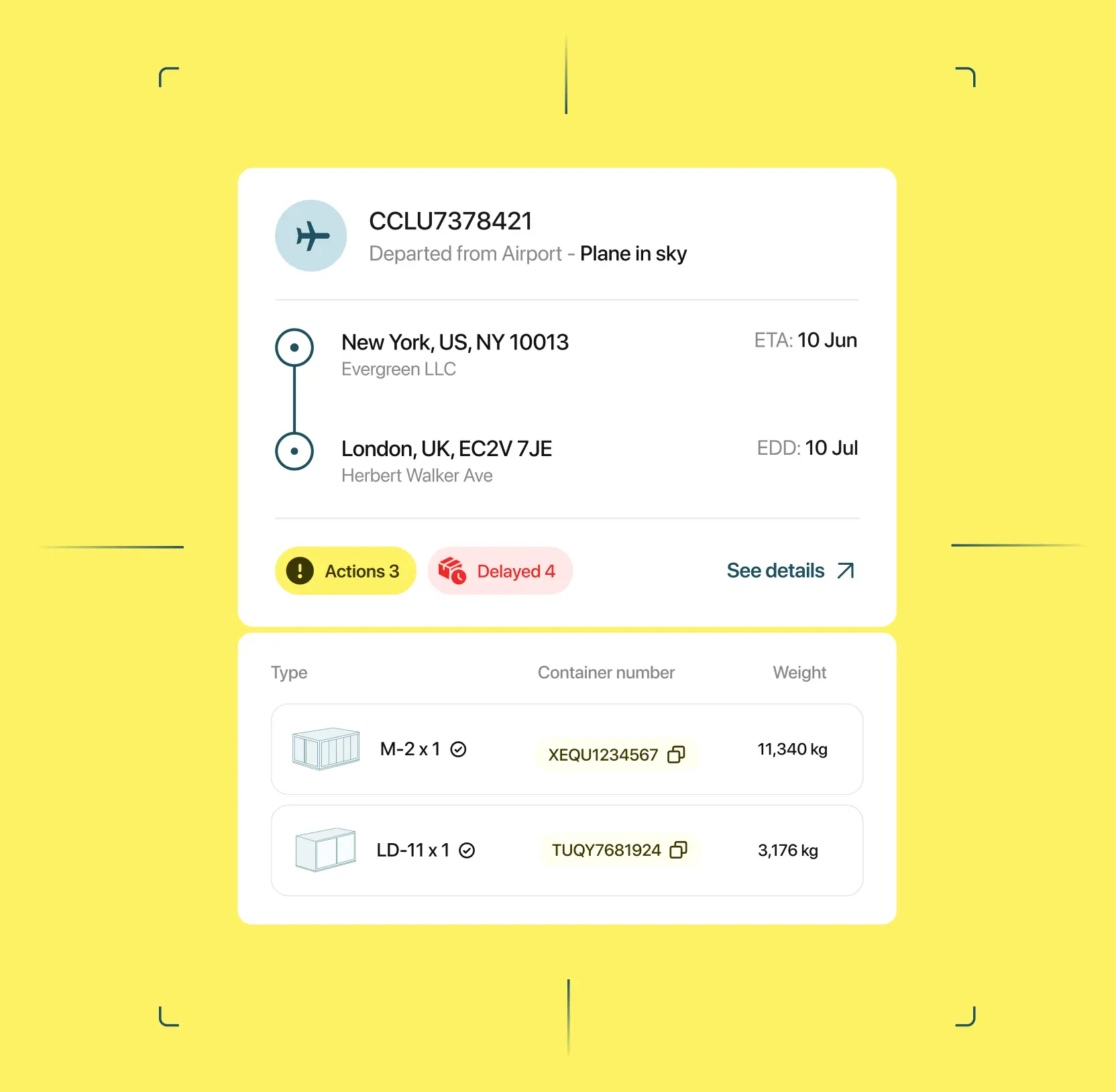
In logistics, every slow decision has a price. A delay spotted an hour late becomes a penalty fee. A shipment tracked across three disconnected systems is a client call no one can answer. For the professionals Flikair serves, fragmented tooling was a lost revenue.

Flikair set out to integrate the entire shipment lifecycle into a single system. The existing structure, however, did not reflect how logistics teams work. Critical data was scattered across screens, and tracking updates lacked clear prioritization.

Flikair partnered with Lazarev.agency for a logistics platform design built around one goal: faster, safer decisions at every stage of a shipment. Here’s how we achieved it.

One design language to launch features faster

Flikair's roadmap is bigger than its current product, and every new module risks looking and behaving like a disconnected tool. 

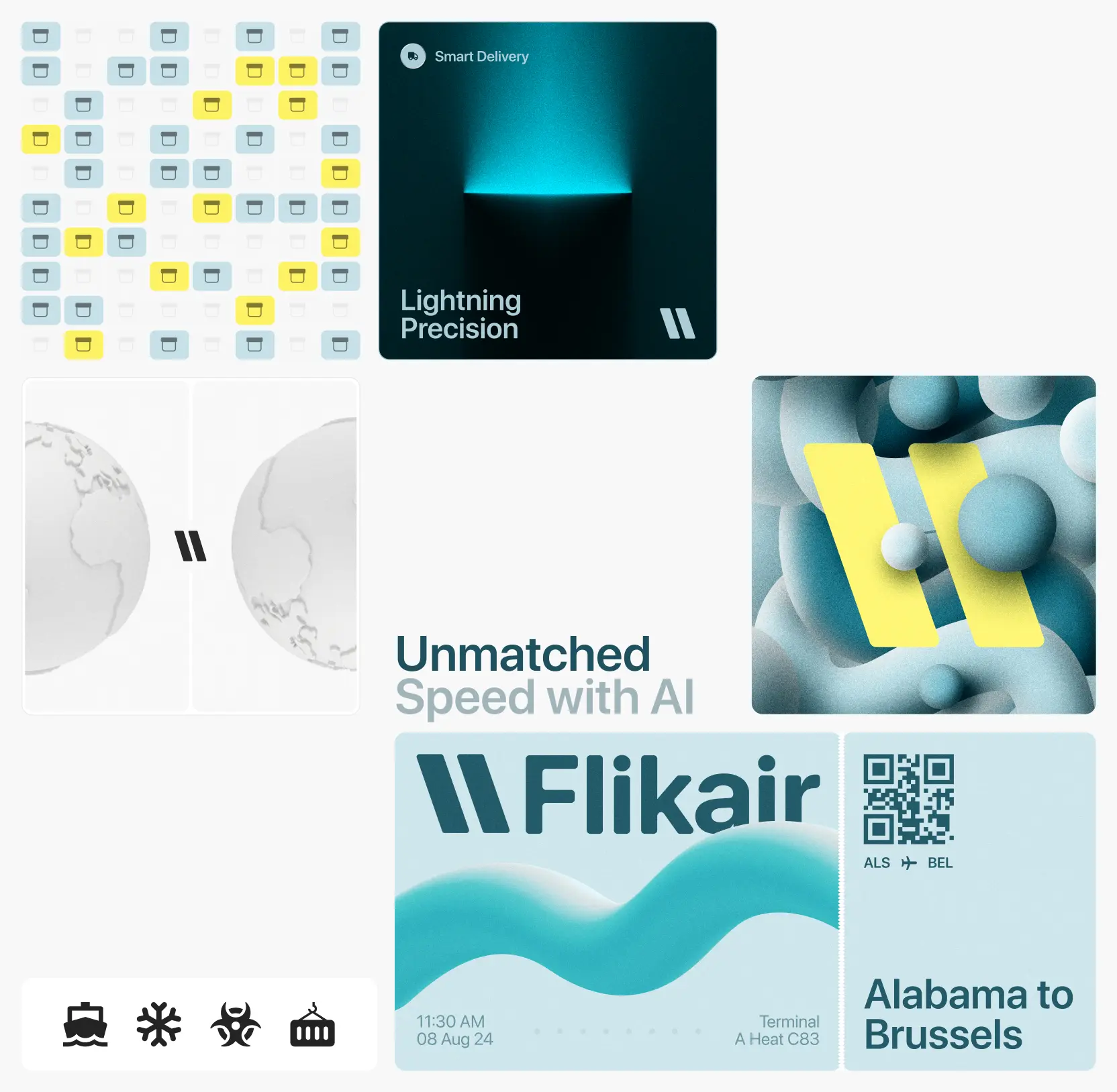
We built a design system: a shared library of components, patterns, and rules covering desktop, tablet, and mobile. New screens are now assembled from proven parts, so features reach users sooner, and the product stays consistent across every device. For a platform selling reliability, looking coherent on every screen is part of the sales pitch.

Abstract illustration of a glossy blue magnifying glass on a soft blue background, symbolizing research, product discovery, and strategic exploration.

27 May 26

Design systems 101: why every growing product needs one

A dashboard to catch delays before they cost money

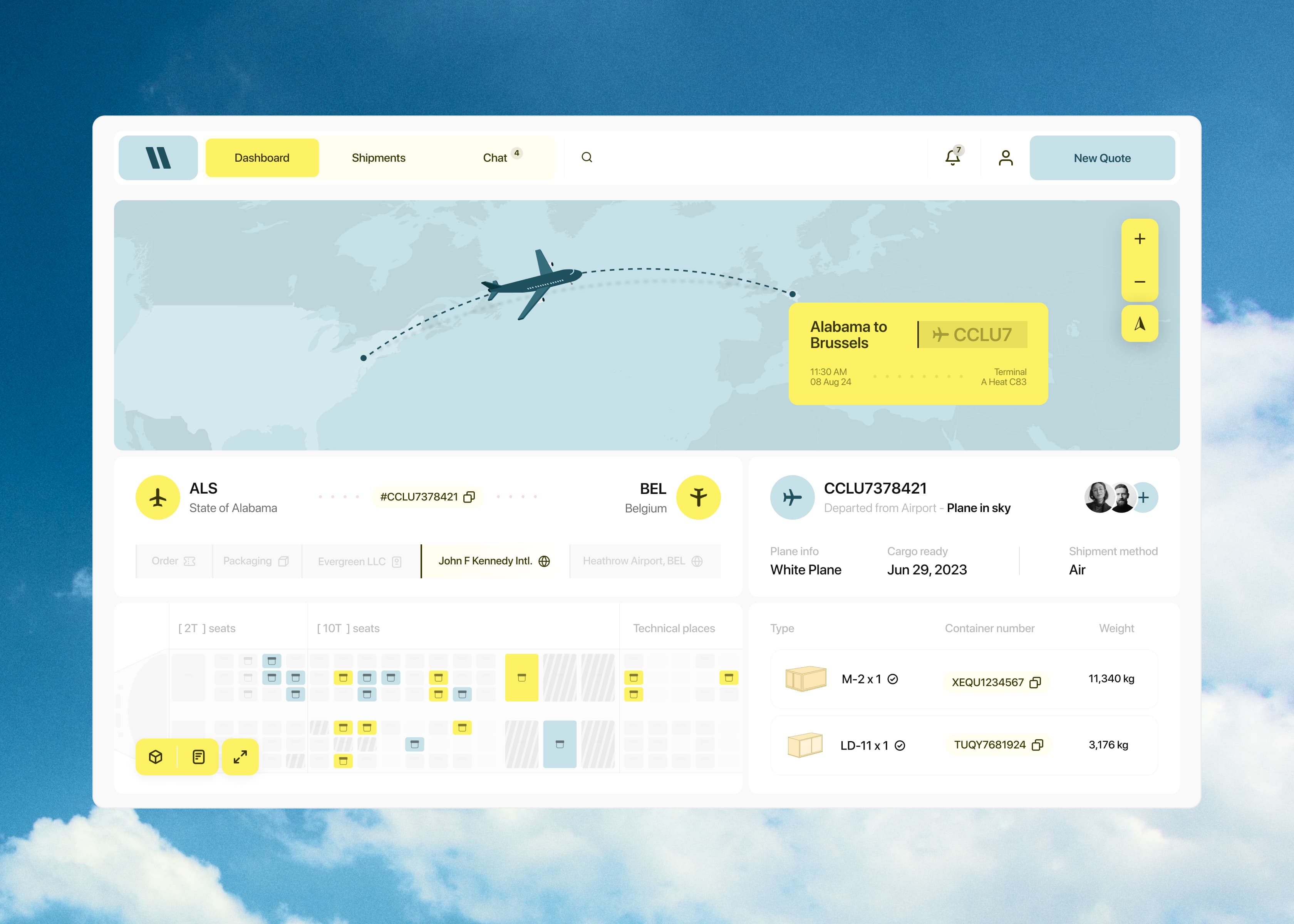
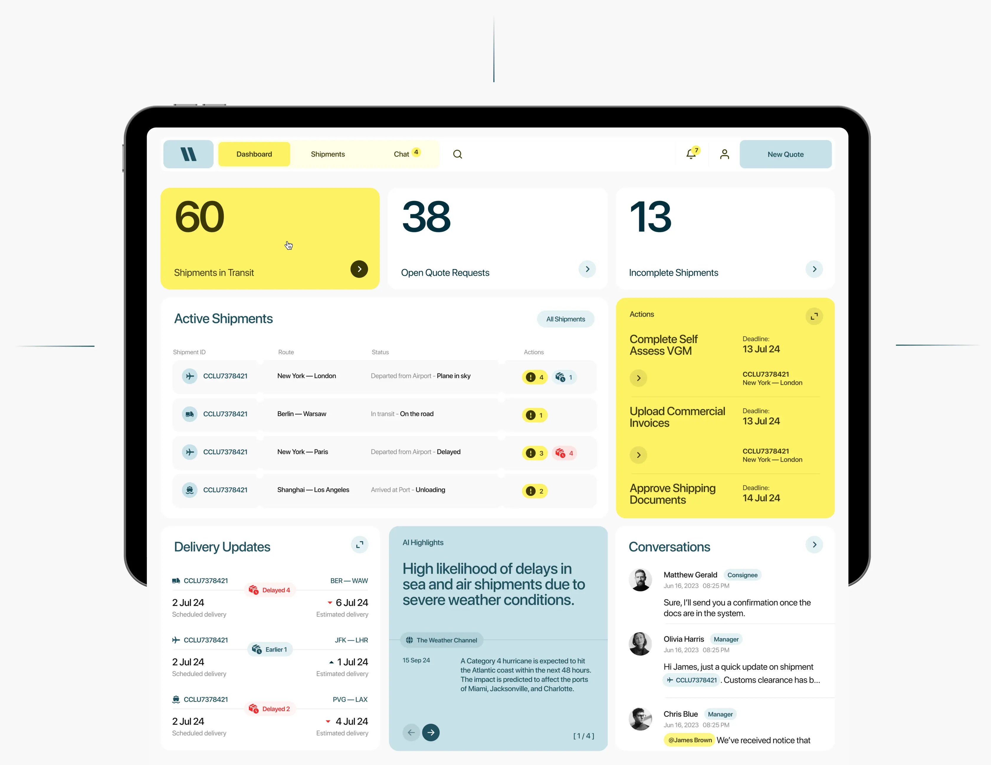
A delay noticed late can mean a missed connection, a penalty clause, or a client moving to another forwarder. We rebuilt the dashboard as an operational command center that ranks information by urgency. Shipments at risk, approaching deadlines, and pending actions stand out first, whereas routine updates run steadily in the background. Teams now assess dozens of active shipments in seconds and go straight to the one needing intervention.

Modern analytics dashboard UI with charts, metrics, and data visualization

10 Mar 26

What makes a great dashboard design?

Accurate setup at the desk, full control in the field

Most shipment problems are born at setup: a wrong container type or a misjudged route surfaces weeks later as a dispute or a customs hold. 

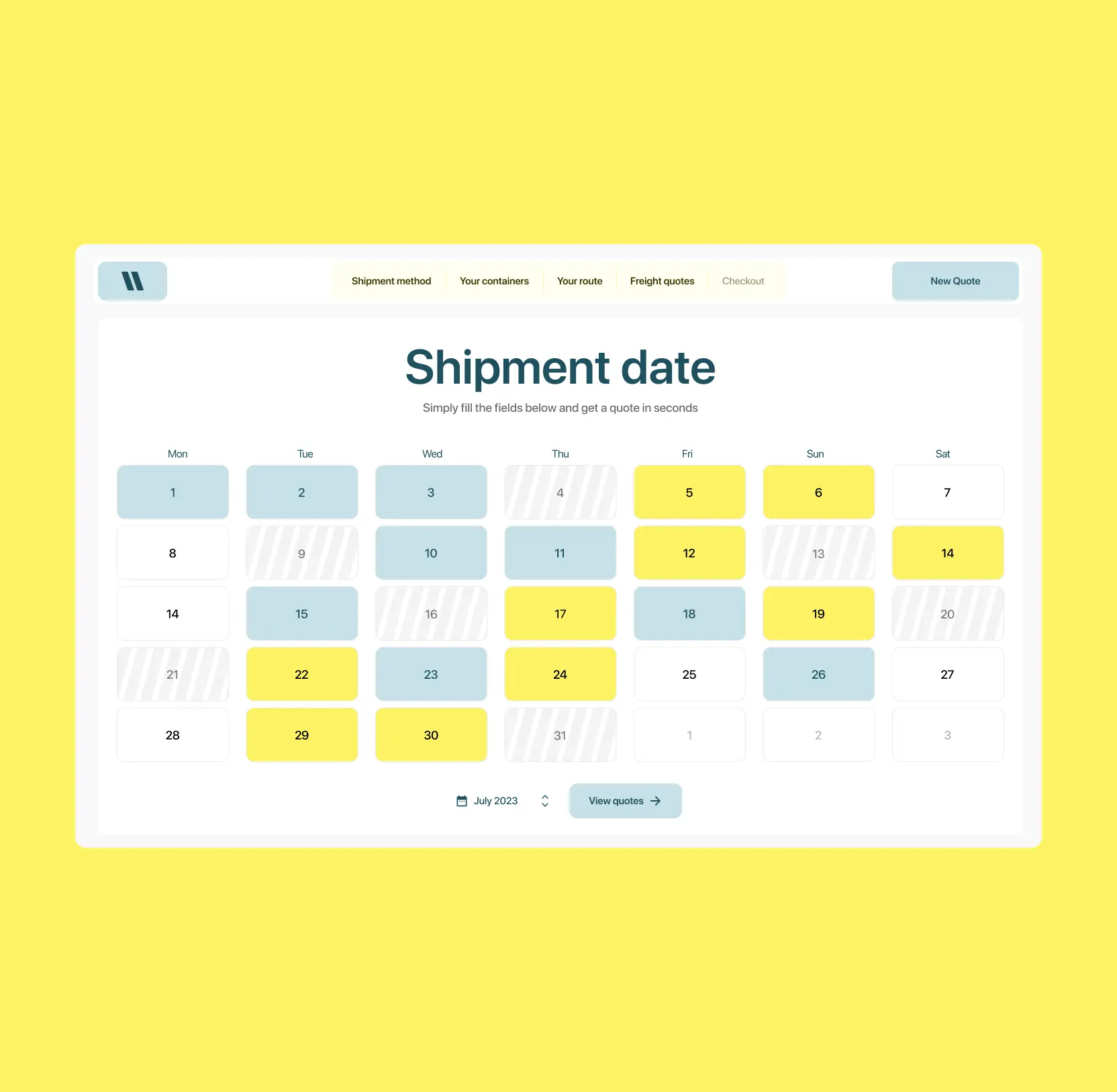
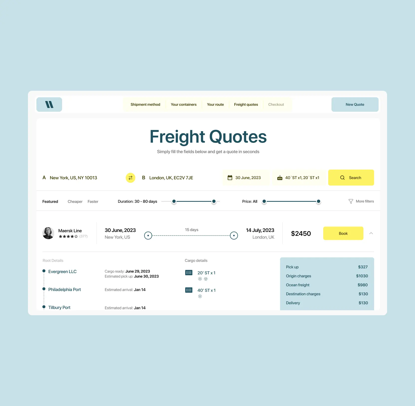
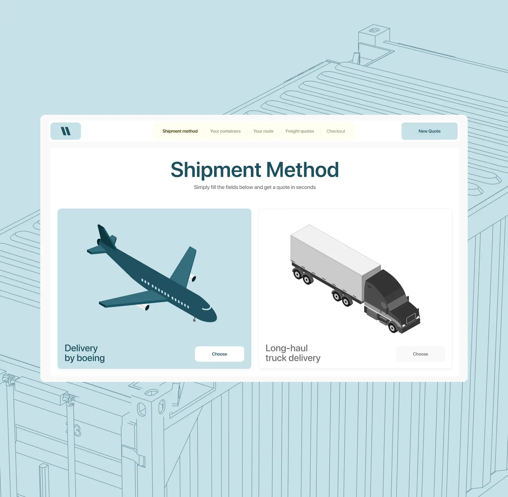
We rebuilt the configuration as a short sequence of steps mirroring how a shipping decision is made: method, containers, route, date, then comparable freight quotes with full cost breakdowns. Each step asks a clear question, so orders go in right the first time and fewer errors travel downstream into the operation.

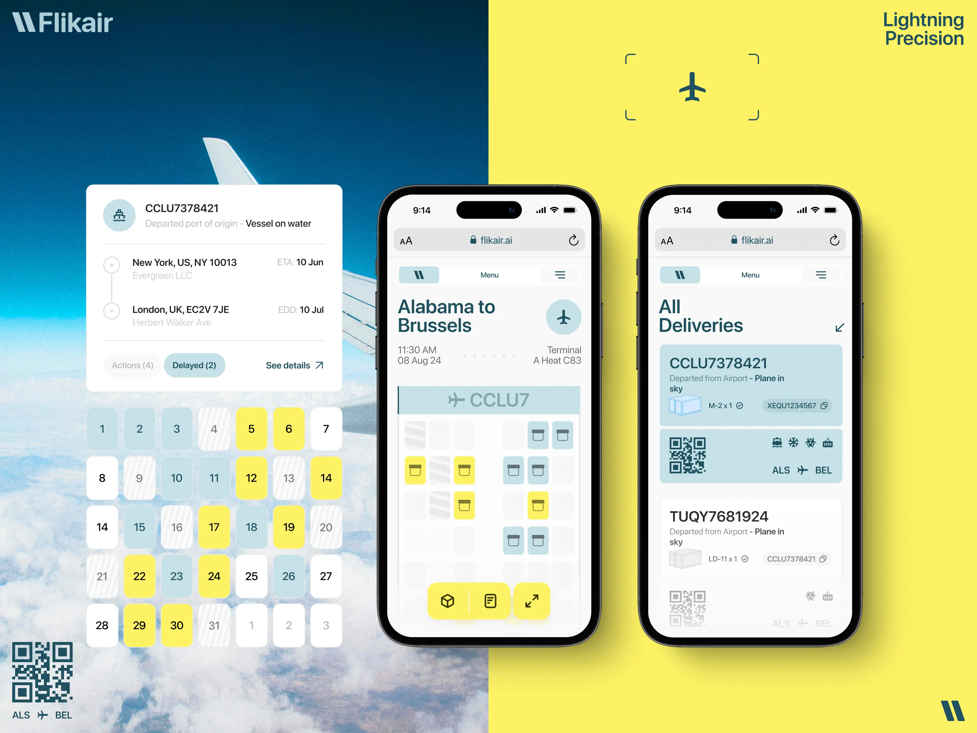
The work does not stop at the desk, so neither does the platform. The mobile experience lets users handle any problems on the spot, in transit or at the terminal — a critical decision to ensure shipments stay on schedule rather than waiting for someone to get back to a laptop.

AFROTECH mobile app interface on smartphone screen displaying trending news article with modern dark UI design

29 Sep 25

Design-led mobile site optimization practices and wins from Lazarev.agency

Frequently asked questions

Common questions
about this topic

How does logistic platform design reduce operational friction?

Effective logistic platform design aligns the interface with real shipment workflows. By structuring dashboards, embedding documentation into context, and prioritizing critical tracking data, teams can act faster with fewer errors.

Why is shipment tracking UX critical in logistics software?

Tracking must highlight exceptions and milestones rather than display raw data. Clear segmentation of shipment stages allows logistics professionals to react quickly to disruptions and maintain delivery reliability.

How can better documentation workflows improve shipment efficiency?

Integrating documentation directly into shipment views eliminates context switching and reduces administrative delays. This improves processing speed and lowers the risk of compliance issues.

Why is mobile-first design important for logistics platforms?

Logistics teams operate in dynamic, mobile environments. Mobile-first logistic platform design ensures access to tracking, documents, and status updates in real time, improving responsiveness and operational continuity.

What makes a logistics dashboard effective?

An effective dashboard prioritizes urgency, surfaces risk indicators, and allows rapid scanning of multiple shipments. Clear hierarchy and structured segmentation improve oversight and decision speed.

When should a logistics company redesign its digital platform?

Redesign becomes necessary when shipment data feels scattered, teams rely on workarounds, or operational speed is limited by interface friction. Structural UX improvements can unlock measurable efficiency gains.

How does structured design support platform scalability?

A consistent design system prevents visual and functional fragmentation as features expand. This ensures clarity, maintainability, and smoother product evolution over time.

More cases like this

Related cases you
might find useful

AI & data

Media

August 10, 2026

Voice AI video editor app design: how we shipped Elva's brand, onboarding, and agentic editing flow

Lazarev.agency designed Elva, a voice-first AI video editor — brand, UX, UI, onboarding, monetization — as one launch. Webby Winner, Best Visual UI in AI.

View case
Elva's video picker screen surrounded by floating glass bubbles with chromatic aberration

Edtech

August 6, 2026

How our redesign made Abu Dhabi University's depth clear for applicants and students

Abu Dhabi University had depth, but its digital experience hid it. Lazarev.agency redesigned the platform around the needs of applicants, students, and faculty, transforming a fragmented ecosystem into a unified digital campus where information, services, and opportunities are easier to find and act on.

View case
Minimalist green cover design featuring an abstract woven geometric emblem centered on a solid background.

Commerce

August 3, 2026

How we helped a premier fine wine retailer boost add-to-basket rate by 65% with a mobile-first redesign

Explore how Hedonism Wines boosted add-to-basket rates 65% with mobile-first redesign & improved UX.

View case
Logo of Hedonism Wines featuring a stylized figure enjoying wine amidst grapevine motifs, with the brand name prominently displayed.

Let's talk about your AI adoption challenge

Tell us where adoption stalls. You’ll hear back from a senior product and UX lead with a practical action plan.

Response within one business day

Talk to us
Explore our services