

You open your platform, coffee in hand, ready to check how things are going. And you instantly regret it. The dashboard looks like someone threw every metric they’ve ever loved onto one screen and called it a day. You scroll and mutter, “Who designed this thing?” (Probably someone who forgot that dashboards are supposed to make sense).
Bad dashboards annoy users. More so, they quietly sabotage entire businesses. They bury opportunities under confusion and make even good products feel broken.
At Lazarev.agency, an AI UX design agency, we’ve seen the damage, and we’ve fixed it. For years, our team has been engineering dashboards for SaaS, fintech, Web3, and beyond. We know exactly how the right design turns unstructured data into detailed insights.
In this article, we’ll explore why dashboard design defines success, map out how to nail it, and share the UX principles that make up efficient dashboards.
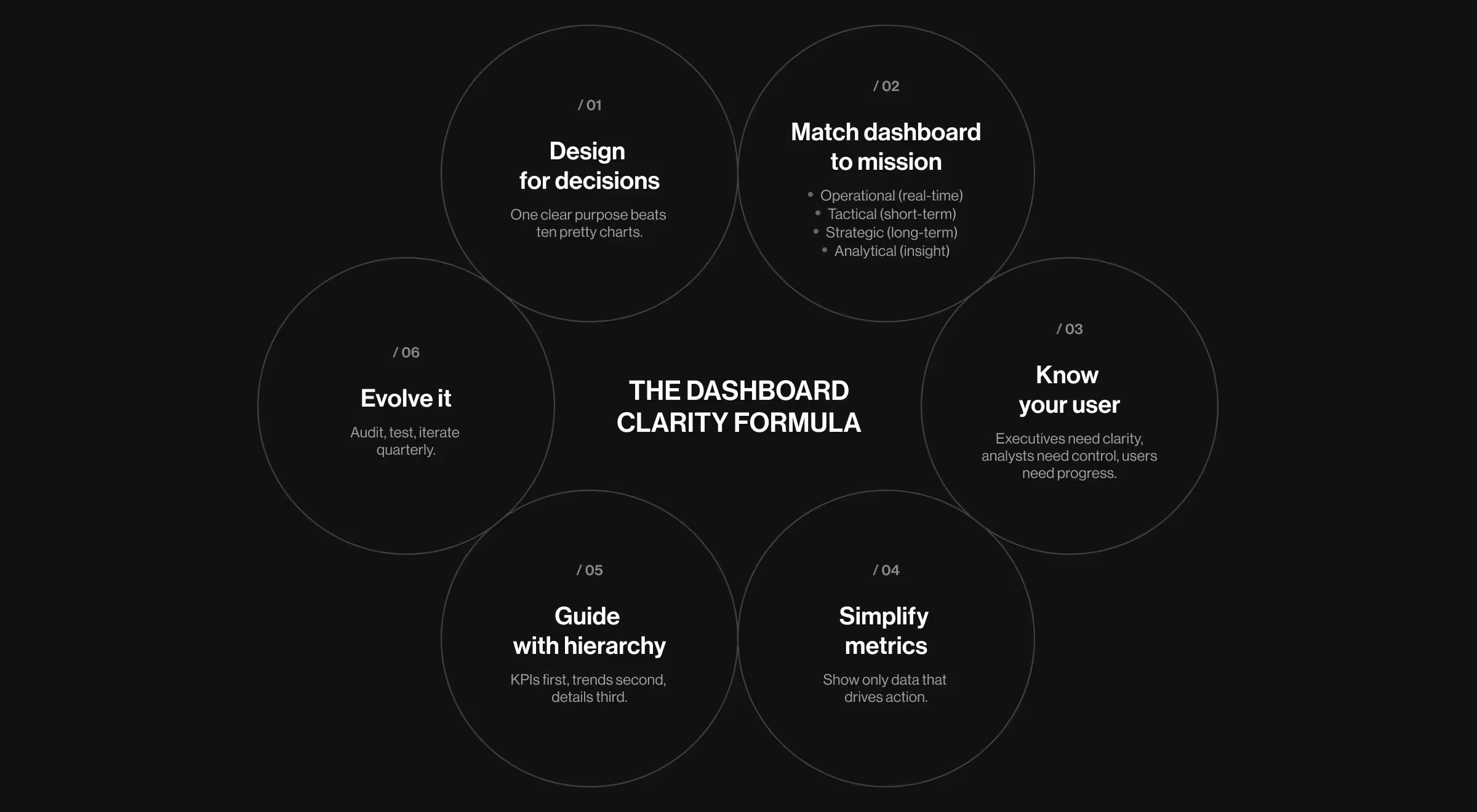
Key takeaways
- Design for decisions. Clarity, hierarchy, and context beat “more charts” every time.
- One purpose per dashboard. Nail the core job (operational, tactical, strategic, or analytical) and cut the rest.
- Iterate your dashboard like a product. Run quarterly UX audits and evolve layouts with usage data.
- Lazarev.agency is a digital product design agency that knows what works in dashboard design. After years of designing dashboards for SaaS, fintech, and Web3 leaders, our team has mastered the art of using data to guide real decisions.
Why the right dashboard design defines your product success
Most dashboards are built for data. They check the usual boxes — charts? Sure. KPIs? Naturally. A tasteful gradient or two? Why not.
But that’s exactly the problem. When dashboards focus on data instead of people, things start to break. Users spend too much time guessing. Teams argue. Founders fly blind.
A real dashboard, on the other hand, is the page where your product earns trust. So, what does a strategic dashboard look like for you, your team, and your users? Let’s dive deeper.
For you, the business owner
A dashboard is your daily status report minus the time drain. One glance, and you should know:
- Are we growing or stalling?
- Which key metrics deserve attention and which data points are vanity noise?
- Where’s the next decision hiding?
Think of it as your co-founder in visual form: always alert and brutally honest. A tactical dashboard design connects your goals to actual behavior, showing what happened and why.
💡 Pro tip: Treat your dashboard as a conversation. If it doesn’t spark informed decisions, it’s a dead asset.
For your team
Here’s where the magic happens: alignment.
The best dashboards replace scattered reports and endless meetings with one crystal-clear source of truth. Product, marketing, operations — all speaking the same data language. It’s accountability without micromanaging.
💡 Try this: Run weekly reviews using only dashboard data. Watch how it refocuses priorities and trims visual noise. When design is clear, teams move faster. And speed, as you know, compounds like interest.
For your users
Now, let’s toss the perspectives. To users, your dashboard is the product. It’s the first impression and the reason they come back.
A great dashboard makes them feel capable and in control. Poorly designed dashboards do the opposite. And no one sticks with something that makes them feel incompetent.
Your dashboard should:
- Reduce cognitive load.
- Highlight personal wins.
- Offer the next best step without shouting.
It’s experience design disguised as analytics. The only difference is you’re not displaying numbers. You’re showing progress.
💡 Tip for SaaS founders: Track your “time to first insight”. That is, how long it takes a new user to grasp your product’s value through the dashboard. Cut that time in half, and you’ll likely double retention.
Here’s how our Design Lead at Lazarev.agency, Anna Demianenko, explains the power of a strategically engineered dashboard:
“When we worked on We Build Memories, a B2B e-commerce platform, the client’s old dashboard was technically fine but emotionally flat.
Users (mostly B2B resellers) couldn’t instantly see how their business was performing. Profit data was hidden, orders were presented in a largely fragmented way, and success felt invisible.
We redesigned the dashboard around what mattered: revenue and growth. Earnings took center stage, order flows became visual, and every interaction gave users a sense of progress. As a result, the revenue grew by 15%, the user engagement went up 25%, conversions increased by 20%, and a 30% drop in churn followed.
But the real win was this: resellers started checking their dashboards daily. Not because they had to, though, but because they wanted to. And that’s what a good dashboard does.”
Dashboard design best practices: your 7-step roadmap to a spot-on dashboard
Designing a dashboard isn’t about cramming charts onto a screen and calling it “data-driven.” It’s about building an intelligent interface that bridges product goals, user needs, and business outcomes.
The process takes discipline and strategy. Miss the mark, and your product becomes a graveyard of “insights” nobody acts on.
Here’s the roadmap that separates dashboards users check daily from those they abandon after the first login. At Lazarev.agency, we follow these 7 steps to design strategic products. Now, you’ll see how.
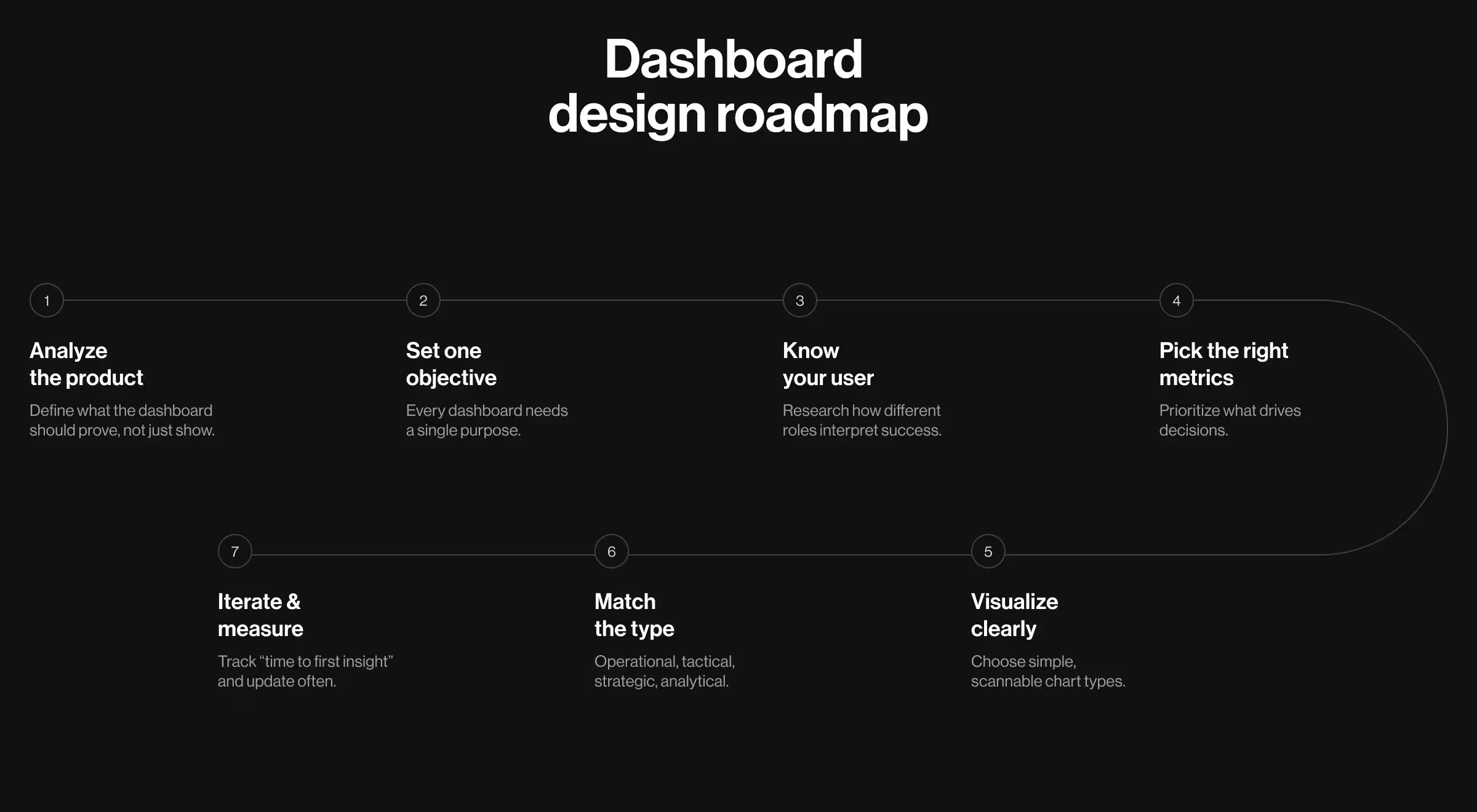
1. Analyze your product
Before you design a single widget, zoom out. You can’t create a dashboard in isolation. You need to understand what your product promises before deciding what your dashboard should prove.
A dashboard should serve your product’s narrative, not compete with it. That means anchoring your design in a product roadmap and a vision board that clarify what success actually looks like.
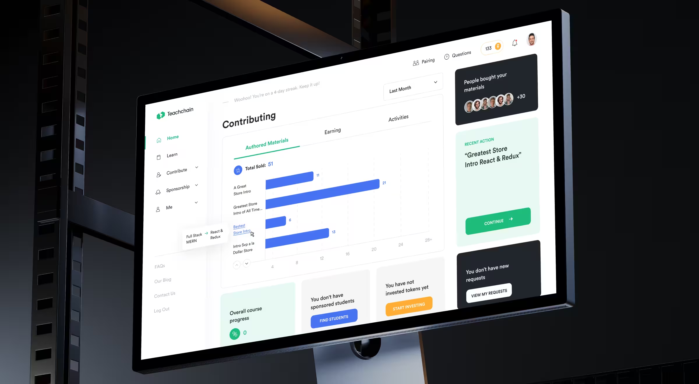
💼 Case-in-point: Lazarev.agency’s team followed this principle when designing Teachchain, an edtech platform with three distinct user types: contributors, students, and sponsors. By mapping each user’s journey, our team transformed a generic platform into an engaging learning ecosystem.
💡 Pro tip: Start your dashboard process with a “vision board” that lists what your users should feel after using it. The emotional outcome guides the design far better than a list of features.
2. Determine your core objective for the dashboard
Every dashboard must have one dominant reason to exist. One. Before anything else, ask what’s the core objective of your dashboard:
- Is it tracking team performance?
- Monitoring real-time operations?
- Providing executive overviews?
Pick one and design ruthlessly around it.
A clear objective shapes everything: information hierarchy, chart types, and even color logic. Without it, your dashboard becomes a Frankenstein of metrics. It’s technically impressive, yet strategically useless.
💼 Case-in-point: Accern.Rhea, an AI-powered financial research tool, came to Lazarev.agency with an objective to help analysts move from fragmented reports to actionable insights.
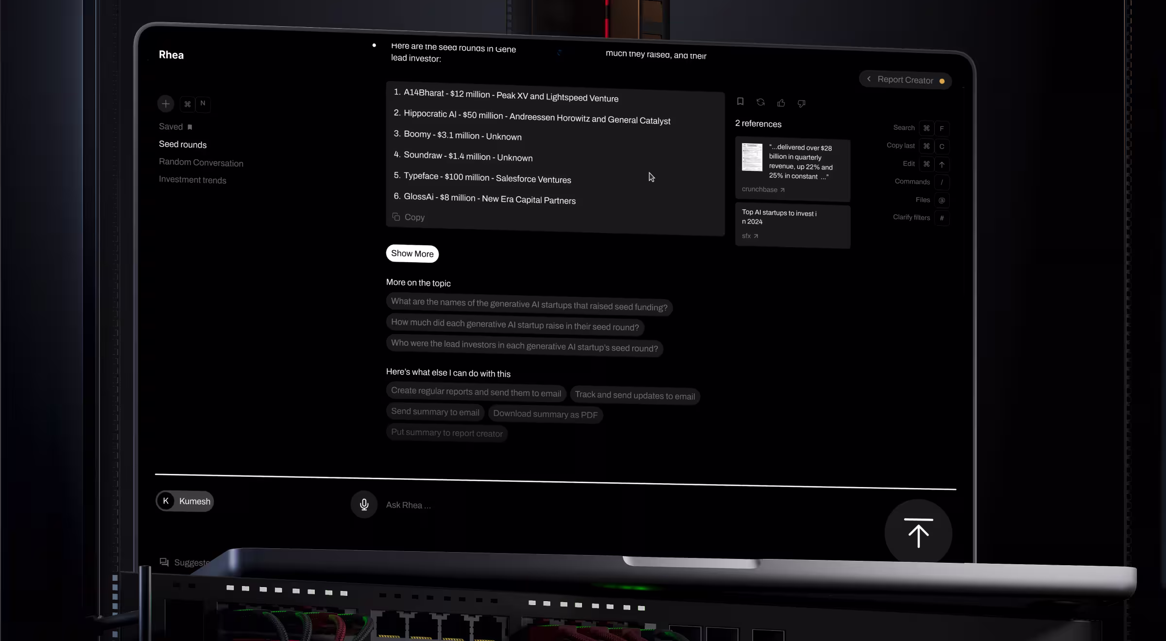
We identified a single objective: turn passive data into active intelligence. The result was a hybrid GUI + prompt interface that let analysts query complex data and visualize answers instantly. The clarity of purpose shaped every design decision and helped Accern raise $40M+ and move from Series B to acquisition.
💡 Pro insight: A focused dashboard should answer one recurring question without extra clicks. If users have to dig or filter endlessly, your objective is fuzzy.
3. Know your user
You’re not designing for yourself. What’s obvious to an analyst might look alien to an executive.
Knowing your user means knowing their patience level, their pain points, and how they define “useful”.
- Conduct user interviews to learn how your specific audience views success.
- Build user journeys showing what actions they take after looking through data.
- Create UX personas based on the gathered insight.
Teams often skip these steps, assuming all users expect the same from the product. That’s how you end up with dashboards that make analysts yawn and executives panic.
💼 Case-in-point: In Tratta, a fintech debt-collection platform, Lazarev.agency redesigned the admin console around real workflows.
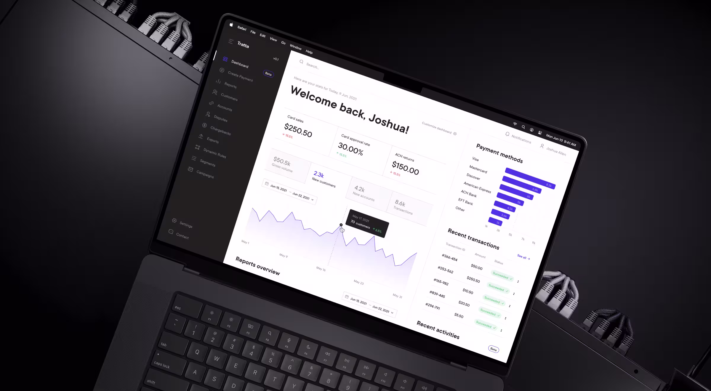
Collectors wanted one thing. And it was speed. So the team restructured the dashboard to surface balances, transactions, and account reports. Each module could be customized, giving users control over their workspace. As a result, the redesign tackled cognitive overload, increased productivity, and led to better revenue trends.
4. Consider the metrics to be displayed on the dashboard
Metrics are the voice of your product. But if you let too many speak at once, nobody hears the message.
The best dashboards prioritize metrics that lead to decisions over those that merely fill space. Ask these before you pick a metric:
- Does it represent performance or just activity?
- Can the user act on it directly?
- Does it connect to your business objectives?
💡Pro tip: For every “what,” add a “why”. If you can’t explain a metric’s relevance in one sentence, it doesn’t belong.
5. Build the right visualization for the right metric
The best data visualization is the one that disappears. Users shouldn’t have to decode charts. They should get them.
💼 Case-in-point: Blockbeat, a crypto-news and market terminal, traders needed to track sentiment, news, and market shifts simultaneously.
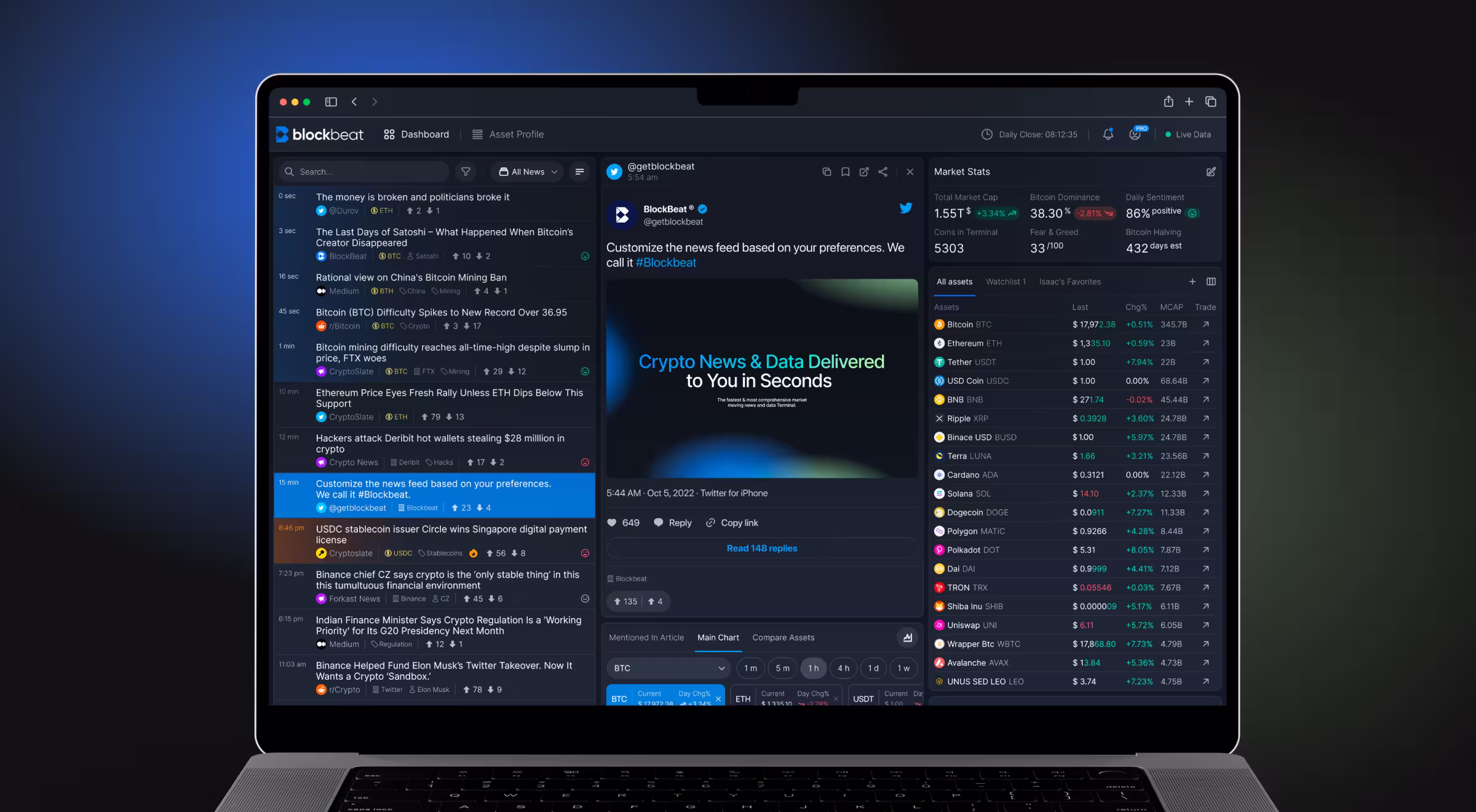
Lazarev.agency designed a three-column dashboard: live news feed (left), article preview (center), and market statistics (right). This dashboard layout matched traders’ natural scanning pattern. Thus, it gave them the clarity to react fast. We also integrated AI-driven tags and customizable widgets to let users tailor the data to their own trading rhythm.
6. Choose the most relevant type of dashboards
Different dashboards serve different purposes. Here’s the quick logic behind when to use which one.
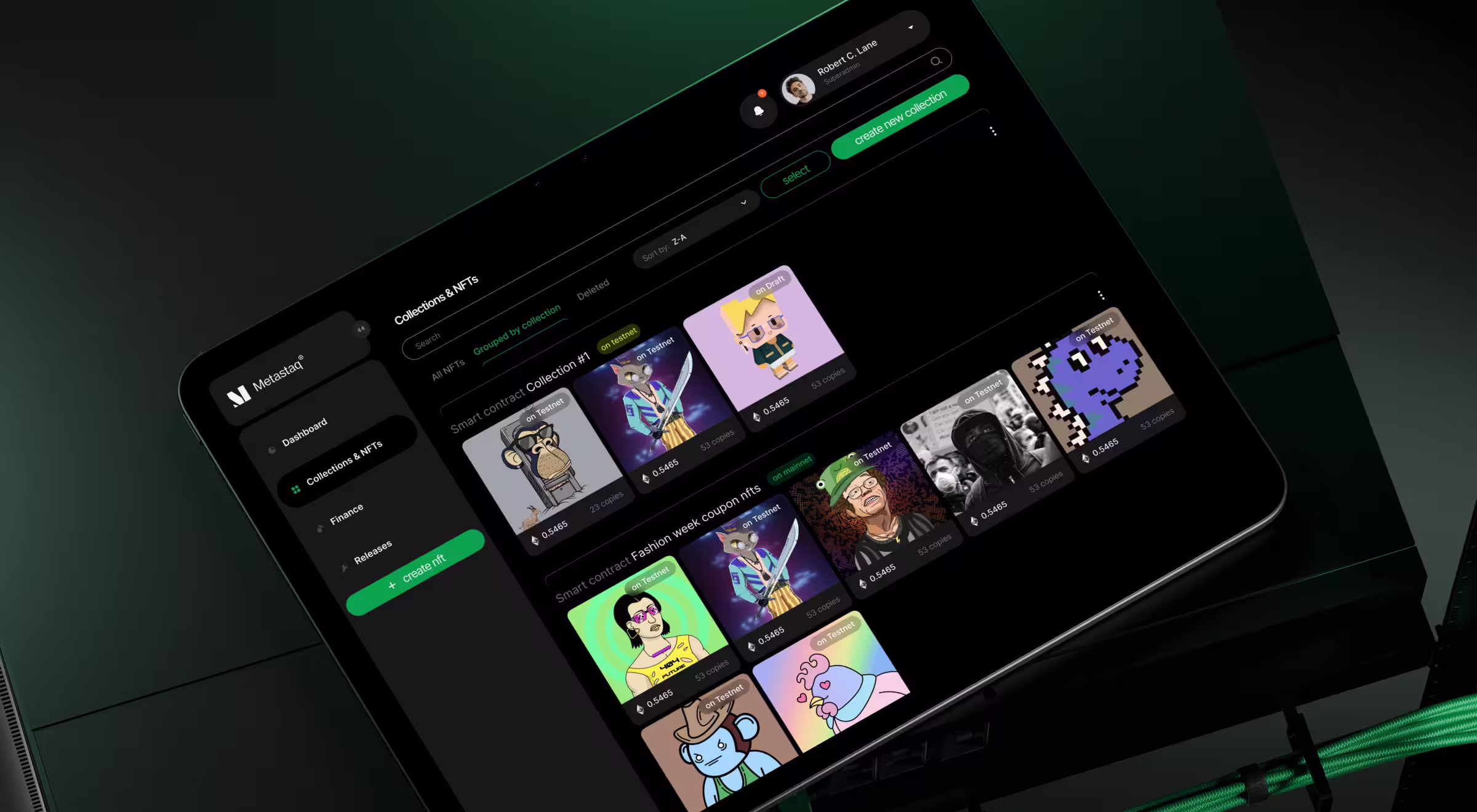
💼 Case-in-point: In Metastaq, a B2B Web3 platform for NFT minting, Lazarev.agency designed a hybrid NFT dashboard combining operational and analytical elements. Creators could monitor NFT sales performance in real-time, while executives could analyze performance across collections and transactions. By merging these two dashboard types, Metastaq helped clients like IUIGA grow NFT sales by 130%.
💡 Advice from Lazarev.agency: Always match the dashboard type to your user’s time horizon. Traders think in minutes, executives in quarters.
7. Iterate for sustained progress
A dashboard is never “done”. Business evolves, important metrics shift, and user expectations change. Regular iteration keeps the business intelligence dashboards useful and credible.
How to keep the design fresh:
- Track usage analytics (heatmaps, click paths).
- Gather periodic feedback — what confuses, what delights?
- A/B test new layouts or visual hierarchies quarterly.
💼 Case-in-point: Lazarev.agency continuously refined Accern.Rhea post-launch to identify redundant features and track how analysts interacted with the AI input field. The result was a dashboard that matured with its users.
What you need to know about dashboard layout and cognitive flow
You’ve seen it and not even once: charts fighting for attention and users squinting to find what actually matters. Here, the problem is hierarchy. The lack of it, to be exact.
The best dashboards feel intuitive because they’re engineered around how the human brain naturally processes information.
This section breaks down how to think like a product designer. With these dashboard design tips at hand, you’ll know how to construct invisible cognitive flows and guide the user's eyes and focus toward what matters most.
1. Start with the mental map
Before opening Figma, start in your user’s head. How do they expect key information to appear? What should they see first, second, and never have to scroll for?
Effective dashboard design follows mental models. Here’s how to build that mental map:
- Define the “First 5 Seconds”. What should users instantly grasp?
- Prioritize by emotional value. What relieves anxiety, builds trust, or signals control? Those go first.
🧠 Example: In Lazarev.agency’s Blockbeat project, traders scan for news → context → price. The design followed that exact flow: left column for real-time headlines, center for article preview, right for market data.
2. Account for 3 layers of visual hierarchy
Hierarchy is about rhythm. You’re composing visual tempo: what captures attention and what fades back.
Think of hierarchy as three levels of visual importance:
- Primary (The North Star) – Your key performance indicators, essential metrics, or main trends. Bigger, bolder, higher on the page.
- Secondary (The Context) – Supporting additional data: comparisons, ranges, or charts that identify trends and support the primary point.
- Tertiary (The Detail) – Tables, filters, and drill-downs should be visible only when needed.
🧠 Pro insight: At Lazarev.agency, when designing Metastaq’s NFT management dashboard, we put collection performance front and center, while wallet balance and billing data were minimized and placed at the top and bottom. Users got the essentials first, context second, and control third.
3. Build for an invisible UX layer
Humans don’t read dashboards line by line. They scan in predictable patterns (usually F-patterns or Z-patterns) depending on the content type.
Think of cognitive flow as a user’s invisible path through data. To design for it:
- Lead the eye with contrast and alignment. Bright or saturated elements should only appear where you want attention.
- Use white space as oxygen. Dense layouts feel heavy. In parallel, open layouts are perceived as more intelligent.
- Mirror decision logic. Arrange data in the same order decisions are made: see, assess, act.
- Respect scanning habits. Place critical KPIs top-left, explanations mid-screen, and secondary details at the bottom.
🧠 Example: In Accern.Rhea, Lazarev.agency designed an AI dashboard that blended chat-style queries with visual reports. Analysts’ gaze moved naturally from the prompt input field (question) to the visualized output (answer) to action shortcuts.
4. Audit your layout like a product designer
Try this quick test before you ship:
- Blur the screen. What stands out first? If it’s not the key KPI, your hierarchy’s off.
- Run a “no labels” test. Hide text. Can users still guess what’s important based on placement and weight? If not, redesign.
- Check the eye path. Record a quick eye-tracking session (even with a team member). If they zigzag wildly, your layout’s not intuitive.
- Count decisions per view. Each dashboard should support one major decision per screen. Two max.
🔍 Want to go deeper? The guides below show how the same principles adapt when dashboards drive real decisions, handle financial risk, or surface AI-generated insight:
- Dashboard UX design: a practical breakdown of how to structure metrics and hierarchy so dashboards lead to clear, confident decisions.
- Crypto dashboard design: how trust, clarity, and perceived control are engineered into dashboards where mistakes are expensive.
- AI dashboard design: five proven UX principles from live AI products, focused on guiding users from questions to actions without cognitive overload.
Design that thinks before you do
A dashboard is the bridge between what’s happening and what to do next. Design it right, and users feel in control. Design it wrong, and they feel overwhelmed.
At Lazarev.agency, an AI product design agency based in the San Francisco Bay Area, we’ve built dashboards for AI startups, fintech systems, and Web3 ecosystems, each one proving that design can’t just show data. It has to shape behavior.
If your dashboard makes users pause, it’s already too late. Let’s make them act instead. Get in touch to build the dashboard that drives your business forward.


.webp)


.avif)

