

If you’ve ever scaled a digital product, you’ve likely experienced at least one of the following:
- A landing page that doesn’t quite match the app.
- A new feature looking slightly “off”.
- Developers asking for clarifications on spacing and states.
- Designers rebuilding components that already exist — well, somewhere.
At first, these inconsistencies seem minor. Even manageable.
But as the business grows, they multiply. And what began as small deviations slowly but surely becomes systemic misalignment.
In most cases, the root cause is the absence of a strategic design system — a foundation that aligns design, engineering, and product decisions under one coherent logic.
In this article, we look at what a design system is, how to diagnose whether your product has outgrown ad-hoc design, what a comprehensive system includes, and how to build one methodically.
Key takeaways
- Screens are outputs. Systems are infrastructure. Build the system first, or scale chaotic components.
- Operational strain is the real trigger. Inconsistency becomes structural as teams grow.
- Design maturity drives financial performance. Structured design correlates with stronger long-term returns.
What is a design system?
“We’ve had dozens of client consultations begin the same way: ‘We need smart digital product design. When someone opens our app or landing page, it should feel aesthetically riveting from the very first interaction. And we need that result fast.’
We get it: the ambition is valid, and the urgency is understandable. But visual impact without structure? Well, to say the least, it’s unsustainable.
The truth is, you cannot have screens without a design system. Screens are instances of the system. You build the system first — even if it’s minimal — and then apply it to screens. The alternative is scaling chaos.”
{{Kirill Lazarev}}
Every product interface is built from decisions: colors, spacing, components, patterns. When those decisions are not structured, each new screen starts with a fresh negotiation around basic concerns.
A design system makes things flow in a determined direction. It formalizes those decisions so they can be reused time and again to ensure consistency across the product’s ecosystem.
🔍 Learn about 7 UI design principles behind a strategic design system in our Lead Designer’s expert article.
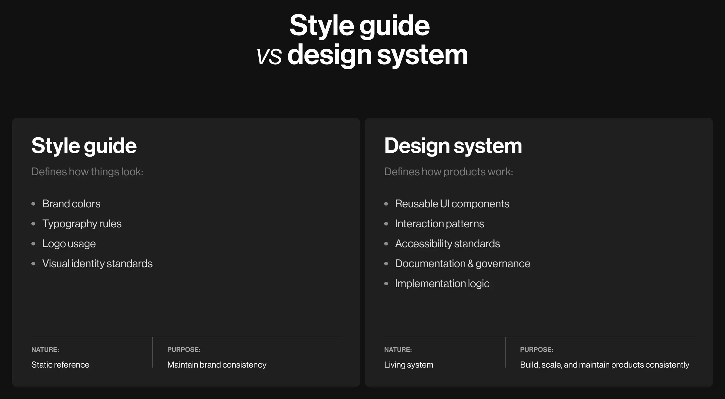
Now, many equate a design system with a style guide. The distinction matters.
A style guide documents visual standards: brand colors, typography rules, logo usage. It defines how things should look. By nature, it is mostly static, and that stability is intentional.
A design system goes further. It includes reusable patterns, documentation, accessibility standards, governance rules, and implementation logic. It defines how products are built, used, and maintained.
What are the signs you need a design system for your business
Most teams do not decide to build a design system because it sounds strategic. They do it because operations start to strain.
Early on, inconsistency is manageable. Small teams can reach consensus through conversations. Developers resolve edge cases in Slack. The system feels coherent enough.
Then growth enters the room.
More features mean more variations. More designers — in-house, outsourced — introduce more interpretation. What once felt flexible turns out to be unstable.
What follows in this section is a practical diagnostic tool. Read each sign operationally:
- If it happens occasionally, you are dealing with normal growth.
- If it happens regularly, you have structural misalignment.
- If it is slowing roadmap execution, you likely need a system.
The goal is reclaiming operational control. When your team spends more time reconciling inconsistencies than building value, the product has outgrown its ad-hoc structure.
Assess your current state against these signals:
- Designers produce inconsistent components. Buttons vary. Modals behave differently. Spacing shifts between features.
- Design-to-dev handoff becomes negotiation instead of documentation.
- New features take longer because teams rediscover existing solutions.
- Designers ask, “How did we solve this last time?” Institutional memory replaces system logic.
- The team scales, but shared foundations do not. More designers amplify inconsistency if shared foundations do not exist.
- You are preparing for an IPO or acquisition, where operational maturity is scrutinized. A governed system signals scalability and control.
If several of these patterns persist, your product is likely operating without a scalable design foundation.
What elements of a design system ensure sustainable growth
A comprehensive design system is a structured framework. It aligns visual language, interaction logic, documentation, and governance into one operational layer.
“A real design system is living architecture. It integrates new product requirements without compromising the existing structures. It evolves with intent, protects consistency, and embraces innovation. That equilibrium — control without rigidity — is what separates a scalable system from a superficial UI kit.”
{{Kirill Lazarev}}
Below is a breakdown of key components of a mature design system. When these 5 layers work together, teams can build new features without renegotiating the fundamentals each time.
💡 Once a product ships AI features, the system needs components for them, and how AI patterns enter a design system covers which ones to add first.
How to build a design system: Lazarev.agency’s methodology
Many product teams approach design systems reactively, only after inconsistency becomes visible. The stronger approach is structural — and follows the same logic as a sound product discovery process: study what already exists before designing what comes.
Start by defining the scope. Then, assign ownership, align design and engineering teams, and set specific success criteria.
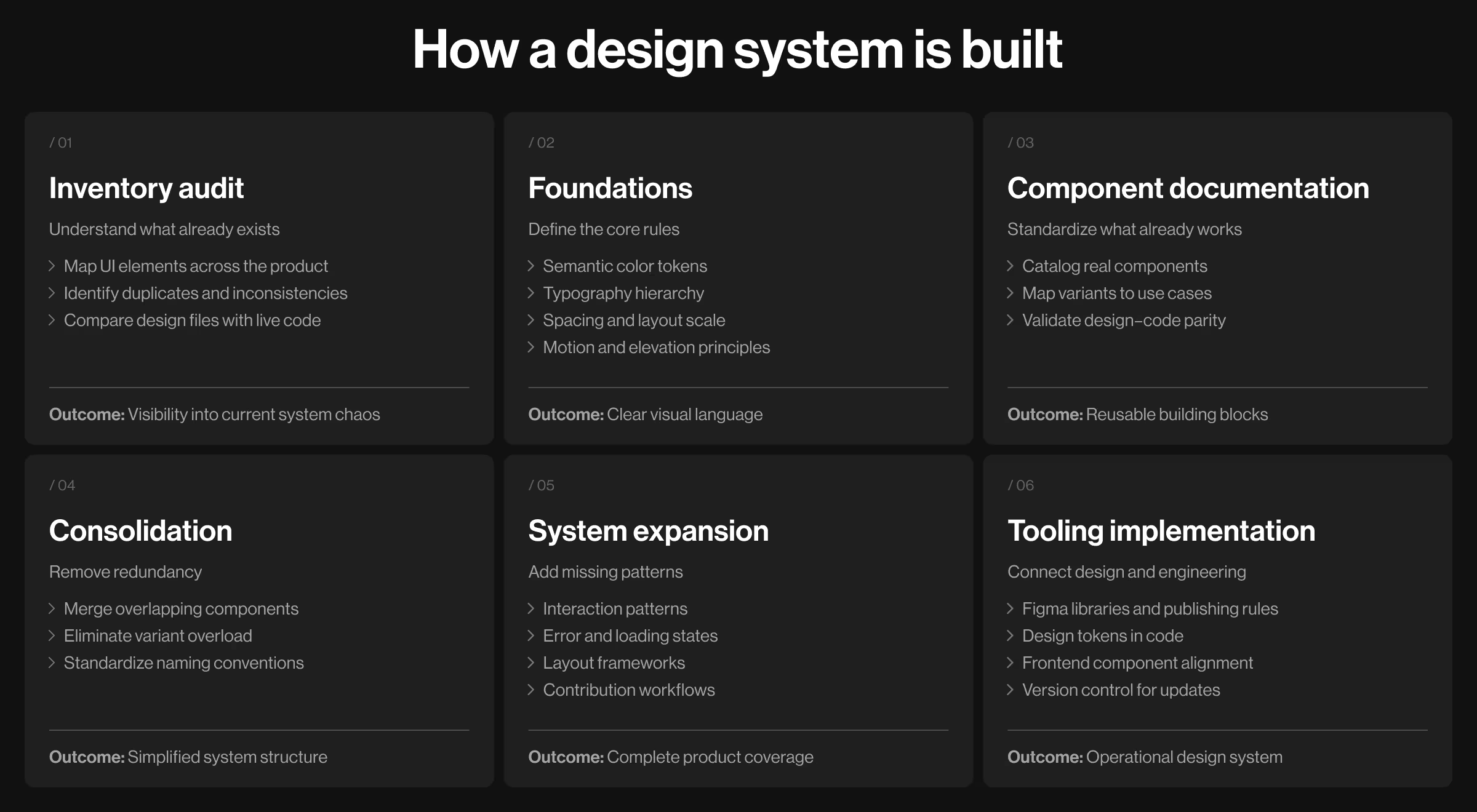
At Lazarev.agency, we treat building a sustainable design system as a digital transformation project — and apply the same logic we use for a phased product redesign. Our methodology reflects this mindset: stabilize existing elements, define foundations, minimize undue complexity, and only then expand.
Phase 1. Inventory audit
Before introducing anything new, you must first understand what already exists. We call this the forensic phase — a process that uncovers structural inconsistencies that have built up over time.
Core steps to focus on:
- Map all UI design elements across the product
- Identify duplicated components and visual inconsistencies
- Document spacing deviations, color misuse, typography drift
- Compare Figma files with live production code
- Analyze edge cases and legacy screens
💡 Expert insight: The audit should be behavioral and technical. Review how components behave in real states: hover, disabled, loading, error. Often, inconsistency hides in these states rather than in the base components.
Also assess technical debt. If design tokens are hardcoded in CSS across dozens of files, system implementation will require a deeper refactoring strategy.
Phase 2. Define foundations
Foundations are the non-negotiables of your visual language. This phase requires decision-making discipline. Ambiguity at the foundation level multiplies downstream.
Core steps to focus on:
- Establish semantic color tokens (primary, success, warning, neutral)
- Define typography hierarchy with clear scale logic
- Standardize spacing increments
- Clarify elevation and layering rules
- Align motion principles with brand identity
💡 Expert insight: Avoid defining foundations purely visually. Tie them to a specific purpose. A color should represent meaning — interactive, attention-grabbing, destructive, informational.
When working on RedBrain, we applied this exact logic to the primary CTA. Instead of choosing a color because it was “on-brand”, we defined its function first. The primary CTA needed to:
- Command attention without overwhelming the interface
- Signal decisiveness and confidence
- Stand apart from secondary actions
- Maintain accessibility contrast standards
- Scale across multiple product pages without losing visual priority
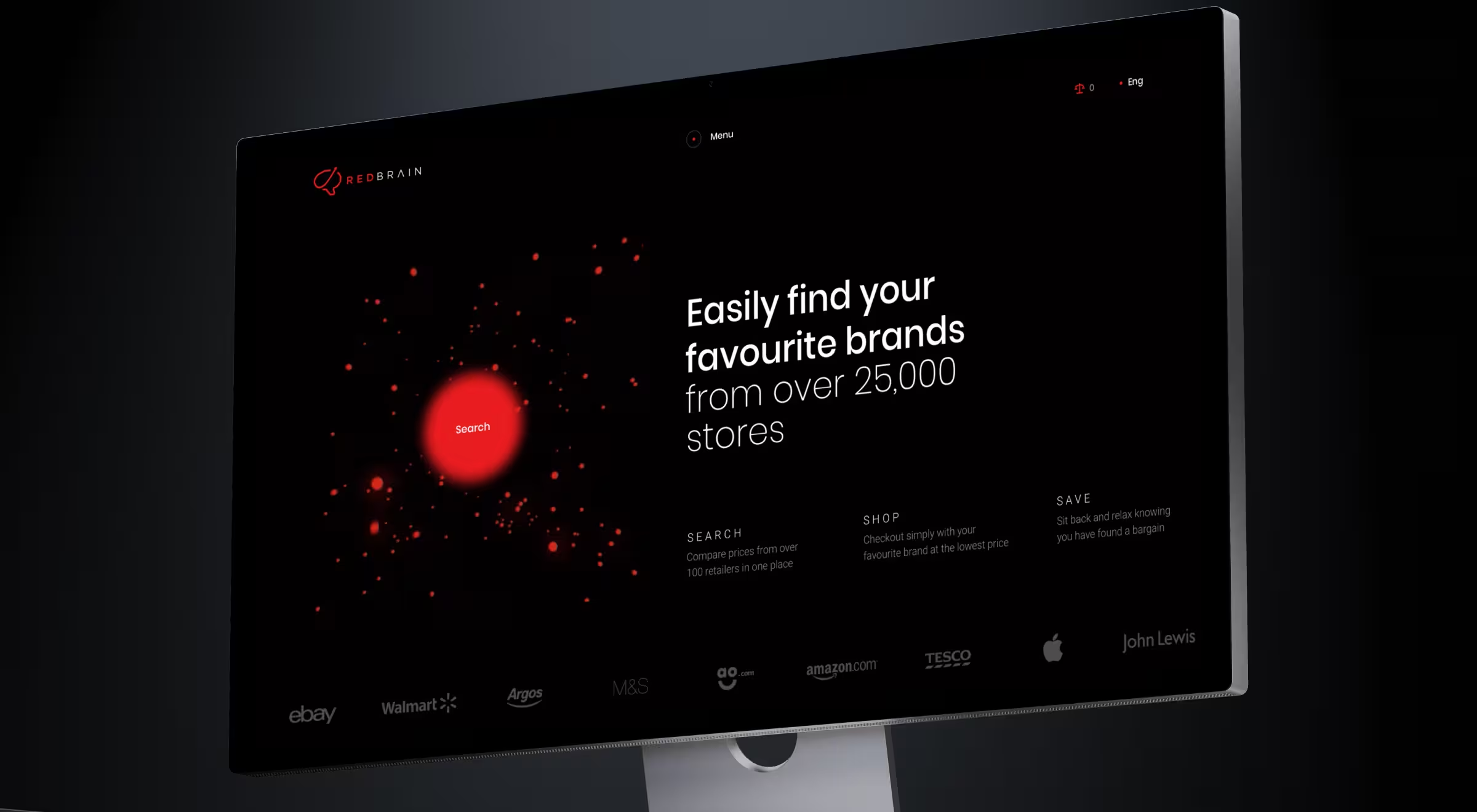
We structured the CTA color as a semantic token. Its role was defined as conversion-driving action, and the visual treatment followed that role.
Phase 3. Document current components
Reality first. Reinvention second.
Don’t rush to invent new components prematurely. Extract and standardize what the product already uses (provided it aligns with the newly defined foundations).
Core steps to focus on:
- Catalog real components used in production
- Identify variant overload
- Map each component to actual use cases
- Audit implementation consistency between design and code
💡 Expert insight: Resist the urge to redesign everything immediately. A system gains adoption when it respects existing usage patterns.
Evaluate components through three lenses: reusability, scalability, and behavioral transparency. A component that looks appealing but cannot scale across edge cases is not system-ready.
Phase 4. Consolidate and clean
Consolidation is where discipline matters most. Unfortunately, this is the most underestimated phase.
Teams often resist removing components because each one “serves a purpose”. In reality, many exist due to historical context.
Core steps to focus on:
- Merge overlapping components
- Eliminate unnecessary stylistic variations
- Standardize naming conventions
- Reduce redundant states
- Align structure with frontend architecture
💡 Expert insight: Variant explosion is one of the most common system failures. Consolidation requires principled trade-offs. Not every historical decision deserves preservation.
This is also the phase where naming standards must be formalized. Ambiguous naming creates confusion in both Figma and codebases.
Phase 5. Expand systematically
Only after consolidation should expansion begin.
Expansion must follow product strategy. A system does not grow because it can. It grows because the evolving product structure demands it.
Core steps to focus on:
- Introduce missing interaction patterns
- Define loading and error states
- Document layout patterns
- Align accessibility standards
- Establish contribution workflows
💡 Expert insight: Expansion should be demand-driven. Avoid building components “just in case”. Build when repeated use cases justify formalization.
Pattern documentation is especially critical. Many teams focus on components but ignore structural patterns like multi-step forms and dashboards.
Contribution workflows are no less strategic. Without clear rules for how new components are proposed and approved, the system will fragment again.
Phase 6. Implement in tooling
A design system only works when it lives across environments.
Core steps to focus on:
- Structure Figma libraries with controlled publishing
- Translate design tokens into CSS variables
- Align component logic with frontend frameworks
- Define synchronization cadence between design and engineering
💡 Expert insight: Parity between design and code is essential. A system that exists only in Figma stays there.
Design tokens should be centralized and programmatically consumed by engineering. Version control is equally important. Updates to tokens or components must follow release processes similar to product updates.
How design systems save money
Without a design system, teams solve the same problems on repeat: components are redesigned, states are re-specified, and the “re-” list goes on. Now multiply that across dozens of releases. Even a focused UX design sprint loses momentum when the team relitigates basic decisions every cycle.
The money teams save is money bad design would otherwise burn, and design debt compounds faster than the technical kind.
Data insight: The market rewards companies that treat design as infrastructure. McKinsey found that companies in the top quartile of its Design Index outperformed their peers by 32% in revenue growth and delivered 56% higher total shareholder returns over 5 years.
With a design system, repetition means reuse. Here is where the ROI shows up.
This compounding effect is part of why the best app design examples feel coherent across every screen and platform — the system is doing the heavy lifting behind the scenes. The savings compound across 3 dimensions:
- Immediate gains. Faster feature delivery. Fewer clarification cycles. Reduced rework.
- Scaling efficiency. Parallel teams working within shared constraints. Cleaner collaboration between design and engineering.
- Long-term structural control. Global updates via tokens. Predictable evolution. Lower cost of redesign initiatives.
The larger your product surface area, the higher the return. A design system reduces repetition. And repetition is expensive.

.avif)