Your product works. The functionality is solid. Users can navigate every feature without friction. Yet they leave. They don't come back. They don't tell their friends.
So, what is happening? Well, your product doesn't make them feel anything and they leave. Users bounce between other websites in seconds, functionality alone won't cut it. Humans make decisions based on emotions. That gut feeling when someone first lands on your site determines success or abandonment.
This is where emotional website design comes in, creating products that resonate emotionally, evoke emotions, and build the kind of emotional connection that turns casual users into loyal customers.
Key takeaways
- 95% of decisions are emotional. Users don’t just want functionality, they want to feel trust, excitement, or pride when interacting with your product.
- Three layers of emotional design matter. Visceral (first impression), behavioral (during use), and reflective (after use) drive lasting engagement.
- Positive triggers beat friction. Smooth flows, thoughtful visuals, and delightful micro-interactions turn routine tasks into memorable experiences.
- Design for specific emotions. Match emotional responses to product goals — calm for wellness apps, confidence for FinTech, energy for playful brands.
- Emotional design drives ROI. Lazarev.agency, an AI product design agency, boosted retention by 42% with a gamified, emotionally intelligent product journey.
What does emotional design actually mean?
Don Norman, the godfather of user experience design, broke down emotional design into three processing levels: visceral, behavioral, and reflective. Each one matters.
- Visceral emotions hit immediately. That visceral response when someone sees your interface for the first time the colors, the layout, the visual rhythm. It's instinct. The design elements either feel right, or they don't.
- Behavioral processing happens during use. How the product responds. Whether people interact smoothly or hit frustration. This is where design choices either support the user experience or sabotage it.
- Reflective emotions come after. The sense of accomplishment. Pride. The deeper level means users attach to your product after they've used it. This is where brand loyalty lives.
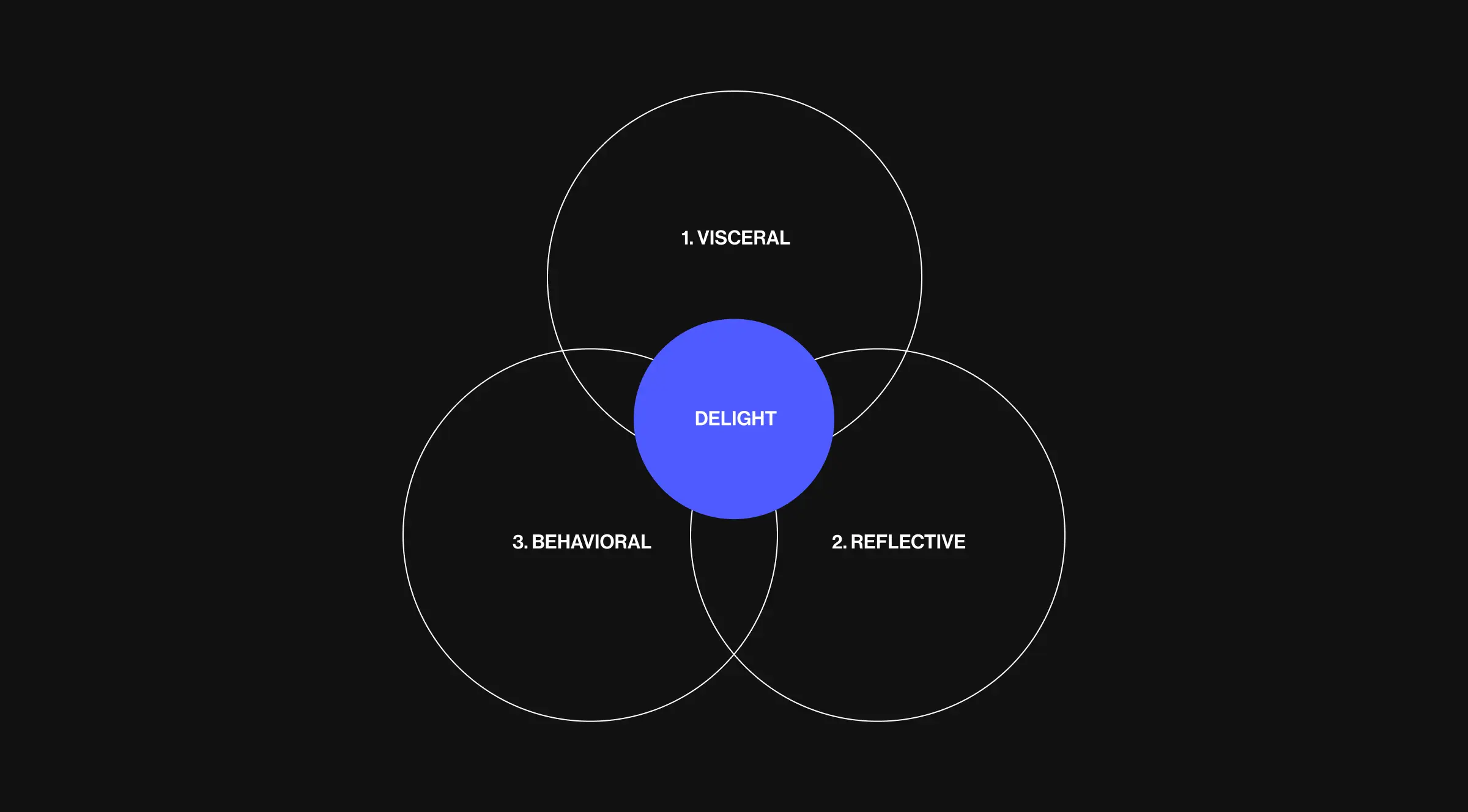
Most teams focus on usability and call it a day. That's table stakes. Emotionally intelligent design addresses all three levels and that's what separates digital products that survive from ones that dominate a crowded market.
Why users feel nothing and how to fix it
According to Harvard Business School research, 95% of all decisions people make are based on emotions. And your task is to allow people to feel what you are trying to offer them.
Pain point #1: your design doesn't evoke the right emotions
Every design evokes emotions whether you plan for it or not. The question is: are they the emotions you want?
Negative emotions like frustration, confusion, or anxiety kill engagement. Positive emotions like trust, excitement, or calm keep users coming back. The difference is intentional emotional triggers built into every interaction.
So, how to create a positive emotional response:
- Design for specific emotions tied to your product goals. A mental health app needs calm and trust. A fun and playful brand selling to Gen-Z needs energy and surprise. A FinTech tool needs confidence and control.
- Use visually appealing interfaces that align with the emotions you're targeting. Color psychology, typography, spacing all of it compounds into emotional impact.
- Build user friendly flows that remove friction. Every unnecessary click, confusing label, or hidden feature creates negative experiences. Allowing users to move through your product effortlessly creates positive associations.
Pain point #2: you're not creating a memorable experience
Users don't remember features. They remember how you made them feel. A memorable experience happens when design taps into the human experience. That means designing products that acknowledge emotions, validate them, and guide users through them.
Take error messages. Most sites treat errors like system failures. Emotionally intelligent design treats them like human moments, a chance to ease frustration, add personality, and maintain trust even when something breaks.
✅ Great example: Slack's error screens don't just say "404." They're witty, calming, and remind users the company understands the annoyance. That small moment builds a deeper connection.
Pain point #3: you're designing only for completion
Most UX design focuses on getting users from Point A to Point B as fast as possible. That's important. But engagement is about how users feel during the journey.
This is where emotional design separates good products from powerful tools that people actually want to use.
So, how emotional design drives engagement:
- Layer in emotional triggers that reward progress badges, animations, celebrations. These aren't gimmicks. They're cues that make users feel accomplished, motivated, or proud.
- Create moments that evoke excitement. Micro-interactions, transitions, surprising details these turn routine tasks into experiences users remember.
- Focus on positive experience over pure efficiency. Sometimes the fastest path isn't the most satisfying. Building in moments of delight animation, thoughtful copy, small surprises creates stronger engagement than shaving off two seconds of load time.
How to build emotionally intelligent design into your product
It is time to discover how to integrate emotions into your design. We don’t want to sound like someone with only theoretical knowledge, so let’s learn based on our actual case study.
When psychologist and motivational speaker Alla Klimenko approached us, she came with a clear belief: happiness is a practice. Built daily. Shaped by mindset and habit.
Together, we created Happiness — a gamified, 6-week digital journey designed to help people reshape their routines, rethink their perspective, and find balance between work and life.
This case shows exactly how emotional design drives real business outcomes.
To deliver real change, the experience had to keep people engaged for six full weeks the time it takes to form a new habit. That meant building more than a course, but a commitment.
Our team leaned into behavioral psychology and built a gamified system around it. Six key gamification elements, each crafted to drive momentum, reward consistency, and make progress feel tangible.
.webp)
Start with a deep understanding of your users' emotions
You can't design for emotions you don't understand. Run user research that goes beyond "what users do" and digs into "how users feel."
Ask about frustration points. Ask about moments of pride. Ask what makes them anxious, excited, or confident when using similar products. These insights become the foundation for designing products that resonate emotionally.
“For Happiness, we identified the core emotional barriers: people felt overwhelmed by self-improvement, skeptical about digital solutions, and afraid of failure. They needed to feel capable from day one. So we designed the onboarding to feel effortless, clear, and motivating. Right away, users choose personalized, happiness-driven tasks. No barriers. Just instant progress that feels good and keeps them coming back. This is where emotional connection begins. Users see a path built for them. That sense of personalization creates a deeper connection and makes the user perceive the product as something designed specifically for their human experience.”
{{Oleksandr Koshytskyi}}
Map emotional triggers to user journeys
Every step in your product should evoke the right emotions for that moment.
Onboarding should create trust and excitement. Core features should deliver satisfaction and control. Checkout or completion should evoke accomplishment and positive reaction.
Don't leave emotions to chance. Design them into the flow the same way you design functionality.
In Happiness, getting people to commit to a 6-week journey meant showing them the value before they even signed up.
We designed a promo site that didn't push a product, it built belief. Focused on momentum, emotion, and the lifestyle Happiness stands for, it sparked curiosity and made the idea of change feel possible from the very first click.
The promo wasn't just visually appealing, it was emotionally intelligent. Every section built trust, addressed pain points, and made users feel understood before they even entered the app.
Use design elements that create visceral responses
Color, typography, spacing, animation — all of these are powerful tools for shaping how users feel.
Warm colors evoke excitement and energy. Cool tones create calm and focus. Rounded corners feel friendly. Sharp edges feel precise. Smooth animations feel premium. Janky transitions feel cheap.
These aren't subjective preferences. They're psychological patterns that shape the visceral response users have the moment they land on your site. Next on how we applied this in Happiness.
To deliver real change, the experience had to keep people engaged for six full weeks, the time it takes to form a new habit. That meant building more than a course, but a commitment.
Our team leaned into behavioral psychology and built a gamified system around it. Six key gamification elements, each crafted to drive momentum, reward consistency, and make progress feel tangible.
This wasn't about adding points for the sake of it. Every design choice focused on creating a positive emotional response that made users want to return. We designed for visceral emotions (bright, encouraging visuals), behavioral flow (effortless daily tasks), and reflective processing (users seeing their growth over time).
Color-coded progress calendars. Leaderboards. Badges. Ratings. Progress stats. Each element triggered specific emotions – accomplishment, competition, pride, momentum. The result was users didn't just complete tasks. They felt invested in their progress.
Design for positive associations
Think beyond the transaction. Every interaction is a chance to build an emotional level relationship with your users.
Celebrate small wins. Use encouraging copy. Add unexpected delight, whether that's a playful brand voice, a satisfying animation, or a thoughtful detail that shows you care. These moments don't just improve user satisfaction, they create strong emotions that turn customers into advocates.
In our work with the project, to turn happiness into habit, we built a system that rewards consistency. Six core gamification elements kept users engaged across the full 6-week journey.
As the product evolved, we layered in more interactivity, more feedback, more reasons to come back. Small celebrations for streaks. Encouraging messages on tough days. The result was a 42% increase in retention and a product people made part of their everyday routine.
The product brought in millions in revenue and became a daily ritual for thousands learning to stay happy. Through ongoing design iterations, we evolved the platform into something smarter and more engaging, reshaping the business and setting the stage for long-term growth. This is what happens when you design for positive associations instead of just functionality.
Test for emotional impact
Traditional UX testing measures task success and time-on-task. Emotional design testing measures how users feel.
Use sentiment analysis. Ask users to describe their experience in their own words. Watch for facial expressions during sessions. Track engagement metrics that signal emotional investment: time spent, return visits, referrals. Good design works. Emotional design makes users feel something worth coming back for.
Throughout the Happiness project, we didn't just test whether users could complete tasks. We tested whether they felt motivated, accomplished, and emotionally connected to their progress.
We tracked return rates. Daily engagement. Completion rates for the full 6-week program. And most importantly how users talked about the experience.
The data showed what we designed for: users weren't just using the app. They were emotionally invested in it. That emotional investment is what drove the retention increase and turned the product into a multi-million dollar business.
Implement and launch
After the product launch, continuously monitor user feedback to understand the emotional impact of your design. Use this data to make further improvements. Incorporating these steps in product design ensures that emotions are considered at every stage, creating products that truly resonate with users on an emotional level. By systematically applying principles of emotional design, designers can create engaging, emotional products that stand out in the market and provide users with an enriching emotional design UX.
Case studies & examples
Successful cases of emotional design include Apple's product designs, which focus on the reflective level, and Duolingo's emotion UI, which uses characters and interactivity to make learning a language fun and engaging. Here are some examples of emotional design at play.
Threadless
Threadless is a canvas brought to life by a symphony of artists from around the globe. Using this platform, artists can sell the T-shirts they have created. Each garment is a pledge to the artistry that adorns it, promising to leave a memorable imprint on both the wearers and the creators.

Threadless elevates the ordinary with a sprinkle of emotional design that infuses your shopping spree with delightful humor. Imagine this: every time you find a tee so unique it screams "take me home," and you hit that "Add to cart" button, something magical happens. You're greeted by a cart that isn't just a cart. It's a friendly companion with a hearty appetite, beaming as it tells you, "1 item added to my cart-y belly! I’m still hungry."
Squarespace
Squarespace is a website builder, providing a streamlined, effortless journey to creating your online presence. But in a sea of similar offerings, what sets Squarespace apart?

A visit to the home page says it all with striking simplicity: "Everything to sell anything." And then, Squarespace sweetens the deal with an offer you can’t overlook, a free website trial that doesn’t even ask for your credit card details.
Why emotional design is a must-have
Ten years ago, emotional design was a nice-to-have. A way to stand out. Today, it's the baseline for creating products that succeed.
Users have infinite options. They'll only engage with products that give them a positive experience. The ones that make them feel understood, valued, or excited.
Your competitors are figuring this out. The startups raising millions are building emotional connection into their core product strategy. The enterprises seeing user satisfaction and brand loyalty skyrocket are the ones redesigning with emotional intelligence at the center.
Ready to build a product that users actually feel connected to? At Lazarev.agency, your AI UX design agency, we design digital products that resonate emotionally, drive engagement, and turn users into advocates. From startups launching MVPs to enterprises relaunching legacy products, we bring emotionally intelligent design to every project.
Let's create something that makes your users feel something worth coming back for.


.webp)