
.avif)
When a tap can trigger financial transactions, the margin for confusion is zero.
In the US finance industry, teams ship on mobile devices where users juggle financial information, approvals, KYC, and risk in seconds. The apps that win make complex choices feel safe, legible, and fast.
This article distills 5 repeatable patterns for fintech app design grounded in actual user behavior so teams can translate them into user journeys that drive conversion, user retention, and customer loyalty.
Key takeaways
- Trust is a UX outcome: visible control, clear states, and plain language beat slogans.
- Onboarding is a funnel so optimize KYC like checkout to lift overall user satisfaction.
- Purposeful guidance helps users navigate complex financial data without hiding risk.
- Accessibility and inclusive copy broaden reach across devices and contexts.
Revolut: clarity and control build confidence
What they do: Revolut’s strongest move is surfacing context at the moment of decision. Exchange previews, fee breakdowns, and reversible actions increase user confidence. Security is present yet lightweight: biometric login, instant alerts, card freeze, and card blocking are never more than one screen away.
.avif)
Why it works: The pattern scales to other financial applications — pair every critical action with a short explainer, a visible confirmation, and an easy undo. That balance of speed and transparency reduces user pain points and improves user satisfaction in high-stakes flows.
✅ Apply it
- Show deltas and fees inline for money transfers and currency exchange.
- Confirm what changed and how to reverse it, not only “Success.”
- Use progressive disclosure so power users interact deeply without overwhelming newcomers.
Monzo: behavior-shaping mechanics that educate users
What they do: Monzo’s Pots, round-ups, and celebratory moments are not vanity. They reinforce healthy user behavior (saving, categorizing, budgeting) through micro-feedback. When fintech app users see weekly progress toward financial goals, the product teaches itself.

Why it works: For US banking app teams, the takeaway is targeted guidance: replace generic gamification with context-aware nudges that guide users at decision points (e.g., “You’re $18 closer to your goal,” “Set a limit for recurring payments”). This improves user engagement without fluff.
✅ Apply it
- Tie micro-rewards to key user scenarios: finishing security setup, hitting a weekly savings target, clearing upcoming payments.
- Use clear data visualization for account balances, spending categories, and trends so users understand the impact at a glance.
- Keep language direct and inclusive — plain language reduces support load and increases user trust.
PayPal: familiarity lowers perceived risk
What they do: PayPal wins on recognizability and consistent cues across different channels. The lesson for fintech app design and development is to front-load credibility where risk is perceived: connect-bank, payout, or identity checks.
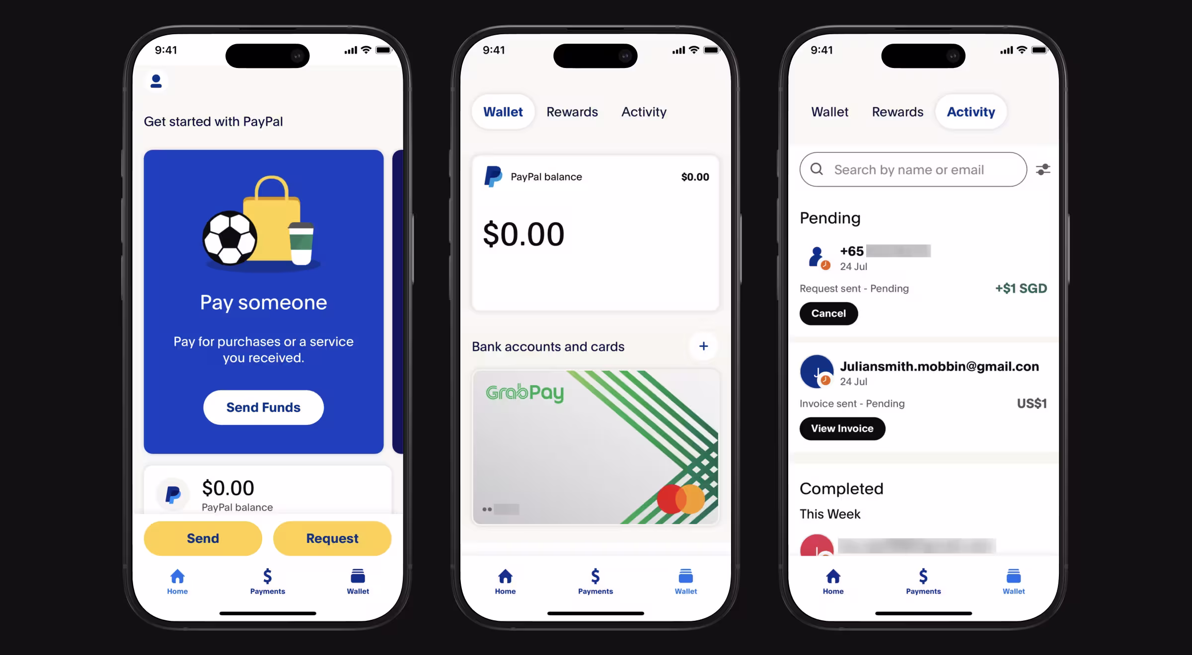
Why it works: Place assurances and partner information adjacent to actions. In UI/UX design, these comfort cues are interface elements as vital as buttons: readable issuer names, masking rules for financial data, and clear escalation paths. This is the best practice applied to trust.
✅ Apply it
- Place security badges and legal boilerplate near commit actions, don’t bury them in help.
- For financial applications, use consistent error/at-risk states, so users can predict outcomes across screens.
- Add short, high-signal tooltips for data sharing, settlement timing, and limits to keep user flow smooth.
Robinhood: simplify the complex, own the trade-offs
What they do: Robinhood lowered barriers to complex financial information with crisp charts and direct CTAs for better comprehension.
Why it works: When executing orders, show order type in one line, cost/fee previews, and settlement timing. Make risk explanations adjacent to the button. This is UI design that reduces cognitive load while preserving detail for those who seek it.
⚠️Caution: Oversimplification and operational gaps invite scrutiny. In 2025, the SEC announced $45M in combined penalties related to Robinhood’s brokerage operations — proof that design must pair with governance.
✅ Apply it
- Pair charts with short, sensible copy and visual design that keeps critical information legible.
- Offer expandable “What happens if…?” without forcing a new route. Keep app UI stable.
- Treat design process artifacts (states, tokens, microcopy) as reusable assets to ensure consistency across different devices.
Nubank: inclusive UX expands market reach
What they do: Nubank’s growth hinged on accessibility for first-time digital banking users: clean IA, short flows, and jargon-free screens.
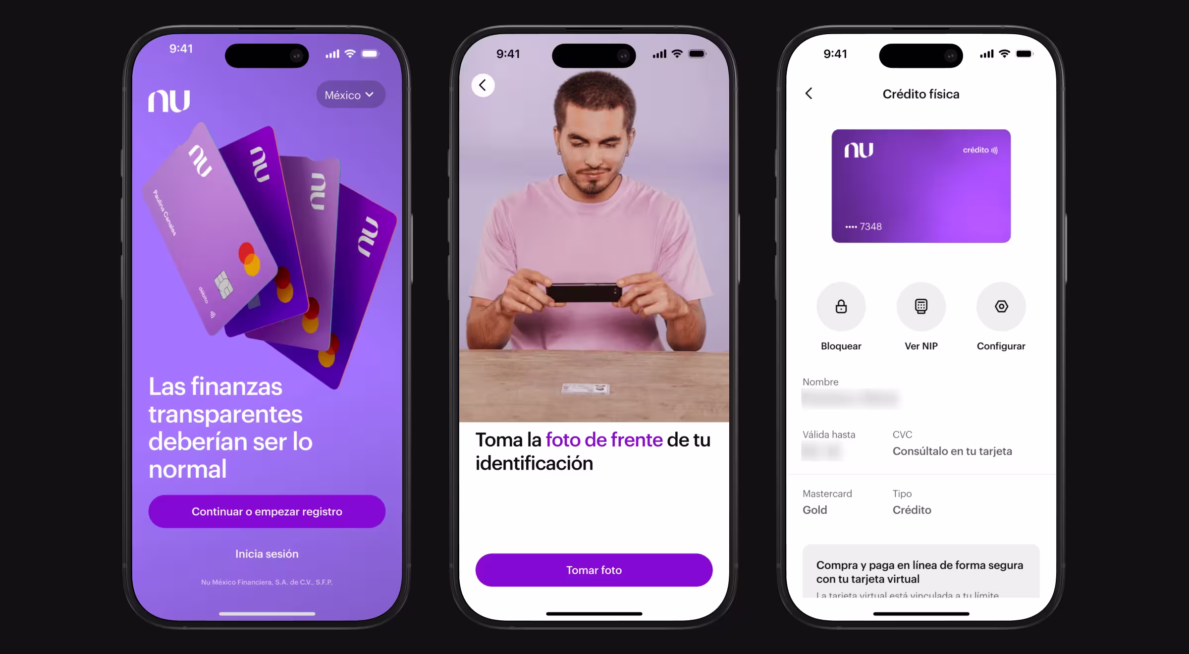
Why it works: For US teams, this is a reminder that user expectations vary widely. Instead of assuming expertise, build flows that scale from first-time to expert users. Inclusive copy and WCAG-aware components improve overall user satisfaction for diverse audiences and contexts.
✅ Apply it
- Use tested tap targets, contrast ratios, and intuitive interfaces to reduce banking usability struggle.
- Localize copy, avoid idioms, and provide inline explanations that educate users without paternalism.
- Keep financial apps coherent across edge cases so the whole process feels reliable.
Five patterns to operationalize in your roadmap
1. Trust by design
Make safety visible and effortless. Use biometric login, inline fee explanations, and proactive alerts. Confirmation patterns should emphasize what changed and provide easy access to reversal. This is where fintech user experience meets governance.
2. Onboarding as a funnel
Treat KYC as conversion. Dynamic doc requests, save-and-resume, and time-box prompts reduce fallout. Documented edge-flows prevent dead ends. Measurables: step completion, abandon reasons, help-center spikes. These diagnostics reveal user pain points and user flow gaps.
🔎 Next steps: for a step-by-step approach to framing assumptions and mapping competitors before shipping, see our article: “How to run a competitive analysis in UX design that drives growth”.
3. Guidance that teaches
Replace abstract tips with context cues: progress trackers, progress bar for verification steps, and milestone summaries. When users see what’s next, they act faster. Done right, guidance improves user retention and reduces regret-driven reversals.
4. Clarity for complex tasks
For complex processes like disputes or cross-border financial transactions, use structured clear data visualization and plain language. Preview outcomes and fees, keep financial information and financial data readable at small sizes on mobile devices. Chart legibility beats visual appeal for comprehension.
5. Inclusive defaults
Design for range: assistive tech, low bandwidth, ESL readers (English as a Second Language). Build microcopy libraries for financial applications so teams ship consistent, legally-vetted text. Treat accessibility as a growth lever — put users first and build user trust over time.
💡 Pro tip: Create a reusable “explainability component” that attaches to high-risk actions (trades, payouts, data sharing). In one tap, it answers: what’s happening, why it matters, and how to undo. Shipping this component early yields valuable insights from research and reduces avoidable support tickets.
From initial concept to shipped value
Operational excellence is how fintech application ideas become durable products.
- In discovery, user research with scenario-based tasks uncovers mismatches between user expectations and flows.
- In delivery, maintain a system of UI states (success/pending/error/at-risk), content patterns, and accessibility tokens.
Keep instrumentation tight: funnel analytics by step, regret metrics (reversals, cancels), and comprehension checks. This is a fintech UI design that scales across squads without losing coherence.
What to measure
- Completion rates for key user scenarios (KYC, money transfers, card controls).
- Comprehension of fees and timings for complex financial data screens.
- Time-to-value for new users managing financial tasks like setting limits or scheduling recurring payments.
- Sentiment shifts that indicate rising user confidence and user engagement.
Trust, speed, and clarity in fintech app design and development
Leaders in financial apps remove uncertainty at the exact moment risk feels high. If your next sprint focuses on control, disclosure, and inclusion, you’ll convert more first-time users and retain more power users without bolting on all the functionality in one release.
Let’s design the fintech product your users trust with their money. We, Lazarev.agency, the best AI design agency for fintech products, are here to help you.
Explore our fintech solutions and UX/UI design services. Or contact us!


.webp)


.avif)

