

Speed isn’t the only thing driving logistics forward. Clarity is.
Behind every on-time delivery, there’s more than just horsepower and good routing. There’s a hidden force quietly keeping operations efficient: smart UX/UI design. From dashboards that cut decision time in half to mobile apps that work in the warehouse at 2 AM, design choices directly shape how fast, accurate, and scalable your logistics business can be. In this guide, we uncover the five core UX/UI principles powering the industry’s top platforms and how you can apply them to your own.
Key Takeaways
- An intuitive dashboard is at the core of UX UI for this sector and should distill complex information using data visualization.
- Every user has different business needs: Drivers, dispatchers, and supply chain managers need tailored interfaces that share valuable insights needed for their specific business processes.
- To give your design the competitive edge, you need to translate real-time updates into actionable insights.
Core Principles of Great Logistics UX/UI Design
The US Postal Service processes and delivers on average 23.5 million packages each day. Behind that staggering number, there’s a finely tuned website and app that incorporates thoughtful logistics UX/UI design to keep things moving.
In the logistics industry, you often deal with existing systems that offer complex solutions for business operations that hinge on efficiency. Here’s what you must prioritize in UX/UI design to enhance efficiency.
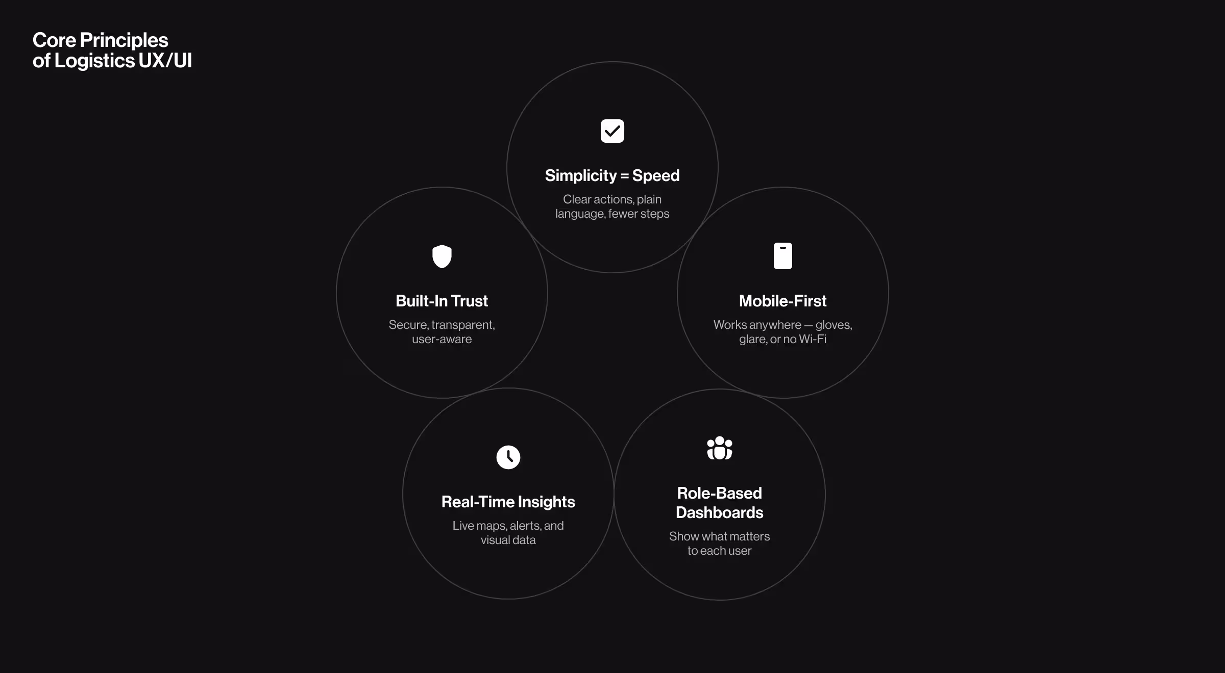
1. Simplicity and Speed
About four out of 10 online shoppers prioritize delivery speed. As such, users must be able to access and understand information faster than their local pizza joint’s delivery times. It practically needs to be instant. This means designing platforms with:
- A clear, visual hierarchy where the main actions stand out
- Plain language that avoids jargon
- Minimal steps to complete common tasks such as assigning a delivery or scanning inventory
💡Pro Tip: To reduce user input, use smart defaults (e.g. most-frequent driver or nearest warehouse) and predictive recommendations (e.g. auto-suggest routes based on similar past deliveries) to pre-fill forms.
2. Mobile Responsiveness
Logistics professionals rarely sit behind their desks all day. Like their fleet, they’re on the move, busy completing activities like checking inventory levels, packaging products, and overseeing warehouse management to ensure operations run smoothly.
A mobile-responsive design ensures that your application will adapt seamlessly across devices to give users full functionality wherever they are. This means UI design that:
- Supports efficient data entry on smaller screens
- Works under various lighting conditions, such as warehouses with bright, artificial light and after-hours, outdoor deliveries in low-light conditions
💡Pro Tip: Design and test your mobile UI in real-world conditions — harsh lighting, gloves-on usage, spotty connections. Simulate these scenarios during prototyping to ensure your interface stays readable, responsive, and frustration-free when it matters most.
3. User-Centered Workflow Design
The logistics industry involves various key players like warehouses, distribution centers, and shipping companies. Each of these organizations has unique needs and procedures. You need to understand these processes, often complex, and user expectations.
"For us, user experience is what always goes first. The actual users are the ones who should control the paradigm and not the agency or even the client’s vision. Getting the insights from the market and then putting them as key pillars for product information architecture - this is what differentiates average from the remarkable user experience."
{{Kirill Lazarev}}
As such, UX/UI design for the logistics industry should accommodate role-based customization in its dashboard design. This way, different logistics professionals like supply chain managers and fleet operators can easily access the data most relevant to their role.
For example, a fleet operator is interested in real-time navigation, while warehouse management needs real-time tracking of inventory levels.
Take Ninja Delivery — a standout, but simple, example of how you can apply user-centered design in logistics. The application creates an order list and includes the shelf name to cut back the time couriers need to spend on searching for the ordered products.
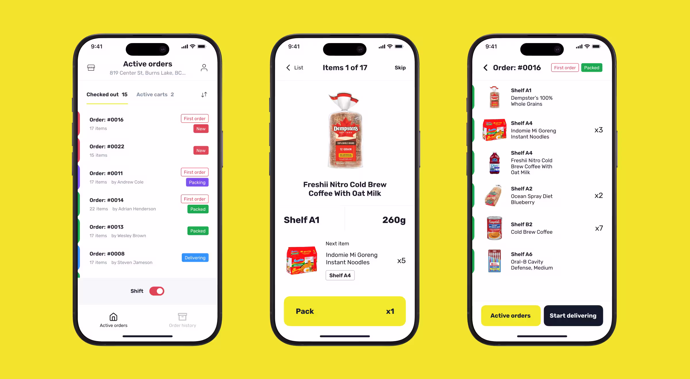
This small detail optimizes the packaging process, helping Ninja Delivery to deliver orders within 10 minutes in the Toronto and Waterloo regions.
4. Real-Time Data Visualization and Data-Driven Insights
In a space where speed and efficiency are the two main criteria for measuring customer satisfaction, users need access to historical data to predict time frames, fuel usage, the required resources, and potential disruptions.
Your users also depend on accurate, live data to track shipments, manage fleets, or respond to disruptions as they unfold.
Instead of simply displaying all the data, UX designers can use elements like:
- Charts to show, for example, monthly trends for easier comparison
- Live maps to outline routes
- Status indicators to show the overall progress in the delivery process
- Heat maps to visualize demand across regions
Data visualization like this helps to break down complex information and minimize cognitive load. These types of features can also be used to prioritize time-sensitive data and send notifications about critical events like delivery delays.
Heads up, this will be one of the trickier parts of UX/UI design. Data issues, like quality and availability, are one of the top three challenges at supply chain companies. Nearly four out of 10 organizations (38%) feel that it’s also the reason why they struggle to scale their AI technology integration.
For example, Ukravtodor’s dashboard is built around critical data such as regional errors and station malfunctions. As live updates are used to monitor each station and region, real-time notifications can alert users to critical problems that need urgent attention.
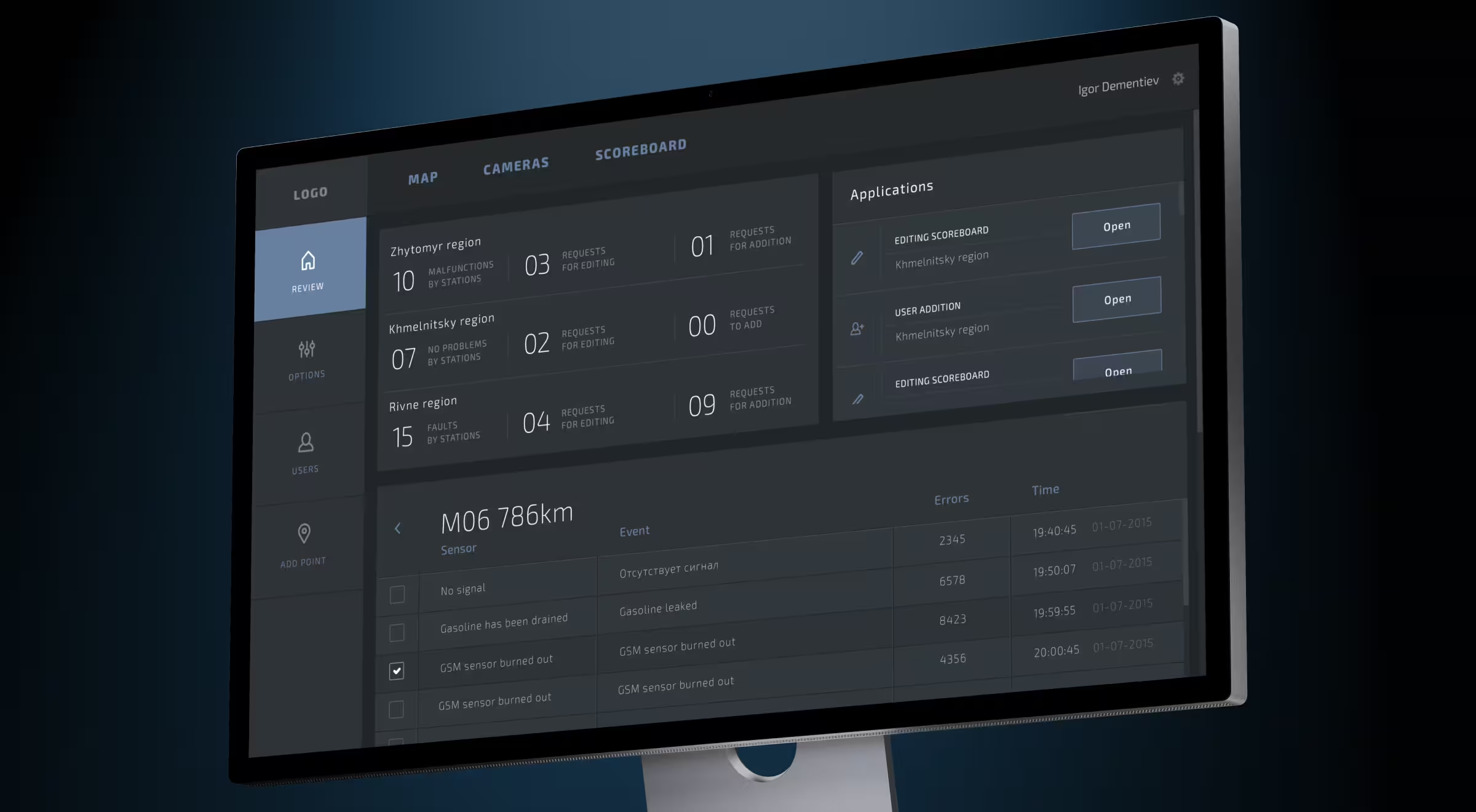
Then, to help with long-term planning, Ukravtodor integrates maps and camera feeds as well as graphs. With these feeds, users can gain an overview of the road network to help with maintenance and traffic, while graphs are used to visualize weather and road conditions.
💡Pro Tip: Using a light color palette for your interface and bold typography for important data points like shipment details will create a clear visual language.
5. Data Security
Logistics platforms handle vast amounts of sensitive data. This includes personal details like customers’ contact and payment information as well as confidential company data such as vendor pricing and planned routes.
To build a platform that communicates a trustworthy brand identity, UI/UX design must:
- Display security badges
- Alert users to suspicious account activity
- Share warning prompts before a critical action, like sharing live location data
“The user experience will not only encompass the user’s behavior within a given context but directly impact the user’s conclusions about the feature, product, or business overall.”
{{Kirill Lazarev}}
Logistics Design Is About Making Data Useful
One of the first steps to ensuring seamless operations is to create digital productions that reduce friction. As logistics operations depend on accurate numbers, your UI/UX design will need to prioritize data display.
That said, data only becomes useful when it’s displayed in a user-friendly manner. Effective UX/UI design goes beyond simply making up-to-date data available, but turns it into real-time insights.
Curious to see how these principles can be combined? Our logistics solutions create compact dashboards to streamline operations. Let’s talk about your next UI/UX design project.


.webp)


.avif)


