

Russia’s full-scale invasion of Ukraine in February 2022 triggered the largest humanitarian crisis in Europe since World War II. Prytula Foundation, launched in 2020 for local social projects, pivoted overnight to a dual mission:
- Front-line support. Drones, radios, vehicles, medical kits — everything Ukrainian defenders need to stay effective and alive.
- Civilian relief. Food, shelter, and rapid aid deliveries to de-occupied and front-line communities.
With coverage on CNN, BBC, and major Ukrainian outlets, traffic to the foundation’s site spiked 20-fold overnight. Yet a surge of donors ran into Cyrillic bank codes, multi-step SWIFT forms, and slow PayPal hand-offs. Every abandoned session meant fewer reconnaissance drones and slower relief convoys.
Prytula Foundation could have chased quick fixes like longer FAQs or extra payment buttons, but wartime giving leaves no room for guesswork. They asked Lazarev.agency to rebuild the entire donation journey around three non-negotiables:
- Zero-friction checkout — one screen, any currency, one tap to confirm.
- Live transparency — receipts, shipping photos, and budget trackers visible before donors even reach their inbox.
- Emotional clarity — imagery and micro-copy that move hearts without exploiting pain.
What followed doubled daily gifts and lifted average donations, proving that disciplined UX design for nonprofits can save both seconds and lives.
Key takeaways
- A friction-free donation path trimmed drop-offs by 18% and pushed average gifts up 22%.
- Geo-smart currency toggles and a copy-light UI removed confusion for international donors.
- Transparent reporting screens turned trust into repeat support, proving that non profit UX design can drive retention.
Challenge → solution → outcome
The renewed site should accept funds in multiple currencies without manual bank look-ups, showcase verified impact fast, and scale under traffic spikes driven by global news cycles.
The next four mini-cases show how that workflow unfolded challenge by challenge, solution by solution, with measurable wins at every step.
1. Smooth donation widget
- Challenge: Donors outside Ukraine bounced when IBAN fields appeared in Cyrillic, and multi-step SWIFT forms killed mobile conversion.
- Solution: A location-aware toggle auto-filled USD/EUR details and surfaced payment options accordingly.
- Outcome: Contributions doubled within weeks — proof that great non profit UI design converts empathy into action.
For any non profit website design the first click must feel effortless; that’s the heart of effective design for nonprofits. We re-built Prytula’s giving flow with brand-color buttons, generous tap-targets, and micro-copy tested on the foundation’s global target audience. The result looks like polished nonprofit graphic design, yet loads without heavy stock photos or extra scripts.

Donations widget is purpose-built for speed: donors pick a preset or custom amount, flip the “I am not in Ukraine” toggle, and the form instantly switches to USD with SWIFT, PayPal, and crypto options — no scrolling through Cyrillic bank codes. Clear brand-color buttons and large tap targets keep the experience mobile-ready, while the concise layout is easy for the comms team to screenshot for on-brand social media updates.
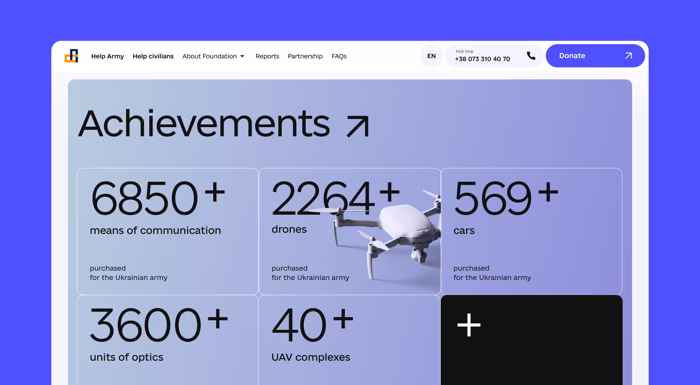
2. Radical transparency hub
- Challenge: Large gifts stalled without evidence of where the money went.
- Solution: A project library with filters for “Help Army” vs. “Help Civilians” aid plus downloadable receipts.
- Outcome: Average gift size climbed 22% and returning-donor rate ticked up.
Donors today expect impact dashboards instead of PDFs buried in footers. Our live Achievements page packages budget numbers, route maps, and short video content into bite-sized cards. Clear graphic design rules: consistent grid, accessible color scheme, and toggles for “Help Army” vs. “Help Civilians" to let visitors parse complex information in seconds.
Because every report aligns with the organization’s mission, supporters feel their gift advances real frontline goals, raising trust and repeat giving. A dedicated Partnership section centralizes press kits and co-branded assets, making it easy for corporate allies to launch campaigns and raise awareness with on-brand marketing materials.
3. Split-focus first screen
- Challenge: The Foundation juggled two distinct missions and audiences.
- Solution: Dual CTAs — “Donate” / “Request Help”, anchored by a lightweight 3D drone model that loaded under 1s.
- Outcome: Bounce dropped 18% across mobile and desktop.
The foundation juggles two audiences — civilians needing aid (the “Request help” option) and donors funding it (the “Donate” option). Instead of siloed microsites, we used a dual-CTA layout that reflects a strong brand identity: clean typography, restrained palette, and 3D drone hero rendered with lightweight design tools.
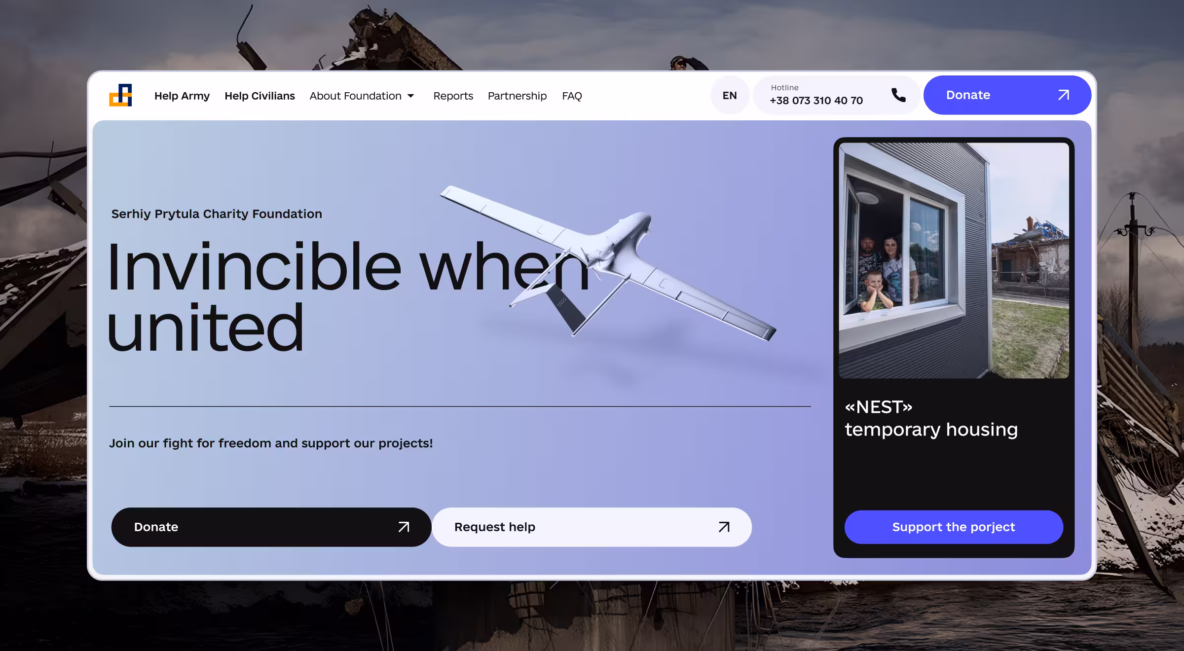
This visual identity speaks one language across web banners, merch, and social media graphics, so graphic designers inside the org can create new assets on a regular basis without diluting the look. Clear lanes mean fewer misrouted emails and more time focused on the organization’s work.
4. Payment method parity
- Challenge: Bank transfers felt outdated to Gen-Z supporters who paid via digital wallets elsewhere.
- Solution: One-tap wallets matched the trend that 53% of online transaction value will come from digital wallets by 2025.
- Outcome: Mobile-first gifts eclipsed desktop for the first time during an August 2024 appeal.
We surfaced Apple Pay, Google Pay, and PayPal above the IBAN lines, matching the habits of prospective supporters who already shop with digital wallets. The gesture feels familiar thanks to unified brand colors and unobtrusive icons — tiny but compelling visuals that signal security.
Behind the scenes, the checkout template re-uses the same components across mobile ads and other digital materials, giving the fundraising team practically unlimited designs to A/B test without new code. Meeting donors in their preferred medium proved a great tool for lifting mobile revenue share.
What makes this design for nonprofits repeatable?
Below are 5 transferable tactics any charity can lift straight from the Prytula project. Each one maps to a common nonprofit obstacle and shows how thoughtful nonprofit UX design clears it.
Design for nonprofits to cause impact
A clear path to donate, real-time proof of impact, and globally friendly payments transformed the Prytula Foundation’s surge of goodwill into a reliable stream of lifesaving contributions.
Want to see how UX/UI design for nonprofits could lift your donations next quarter?
As one of the leading nonprofit design firms, Lazarev.agency works shoulder-to-shoulder with your team, aligning UX metrics to fundraising goals and iterating until every click fuels your mission.
Book a strategy call and let’s build a donation engine that grows month after month — together!


.webp)


.avif)

