

What makes users stay, trust, and come back? Is your design doing more than just looking good? The global UX market is on fire – projected to soar from $427.3 million in 2024 to over $1.03 billion by 2032 (Fortune Business Insights). That’s a massive leap, fueled by brands realizing one truth: exceptional user experience is the ultimate differentiator.
In a landscape where competition is growing as fast as user expectations, it’s no longer enough to blend in. You need design that speaks, connects, and builds trust – because in this new era, experience is everything.
Key Takeaways
- Product design covers the full journey – from concept to market success. UX design zeroes in on making the user’s interaction seamless and satisfying.
- Product designers think big: strategy, business goals, and long-term growth. UX designers focus on creating intuitive, enjoyable experiences that users love.
- Product designers work across departments – engineering, marketing, and business. UX designers dive deep with researchers and devs to perfect the user flow.
- Product design blends UX tools with roadmaps, analytics, and business modeling. UX design leans into wireframes, prototyping, and usability testing.
- Both roles aim to build successful products, but product designers shape what to build and why, while UX designers define how it should feel and function.
What Makes Product Design Different from UX Design?
The design industry represents a fundamental shift in how we approach digital product creation. Unlike traditional graphic design that focuses primarily on visual appeal, product design operates across the entire product lifecycle, giving designers influence over strategy, development, and business outcomes.
This shift requires a completely different approach to design thinking. Product design interfaces must communicate complex business strategies and technical constraints in ways that feel natural and intuitive – even to users who have no experience with your specific domain.
Product Designers Vs. UX Designers: Key Differences
Product designers focus on the complete product ecosystem, while UX designers focus specifically on optimizing user interaction and satisfaction. This distinction creates different career paths and skill requirements:
- Product designers think strategically about what to build and why it will succeed in the market
- UX designers concentrate on how users will interact with existing products and services
- UI designers specialize in creating sleek interface elements and visual design components
- Visual designers focus on the aesthetic aspects of the user interface
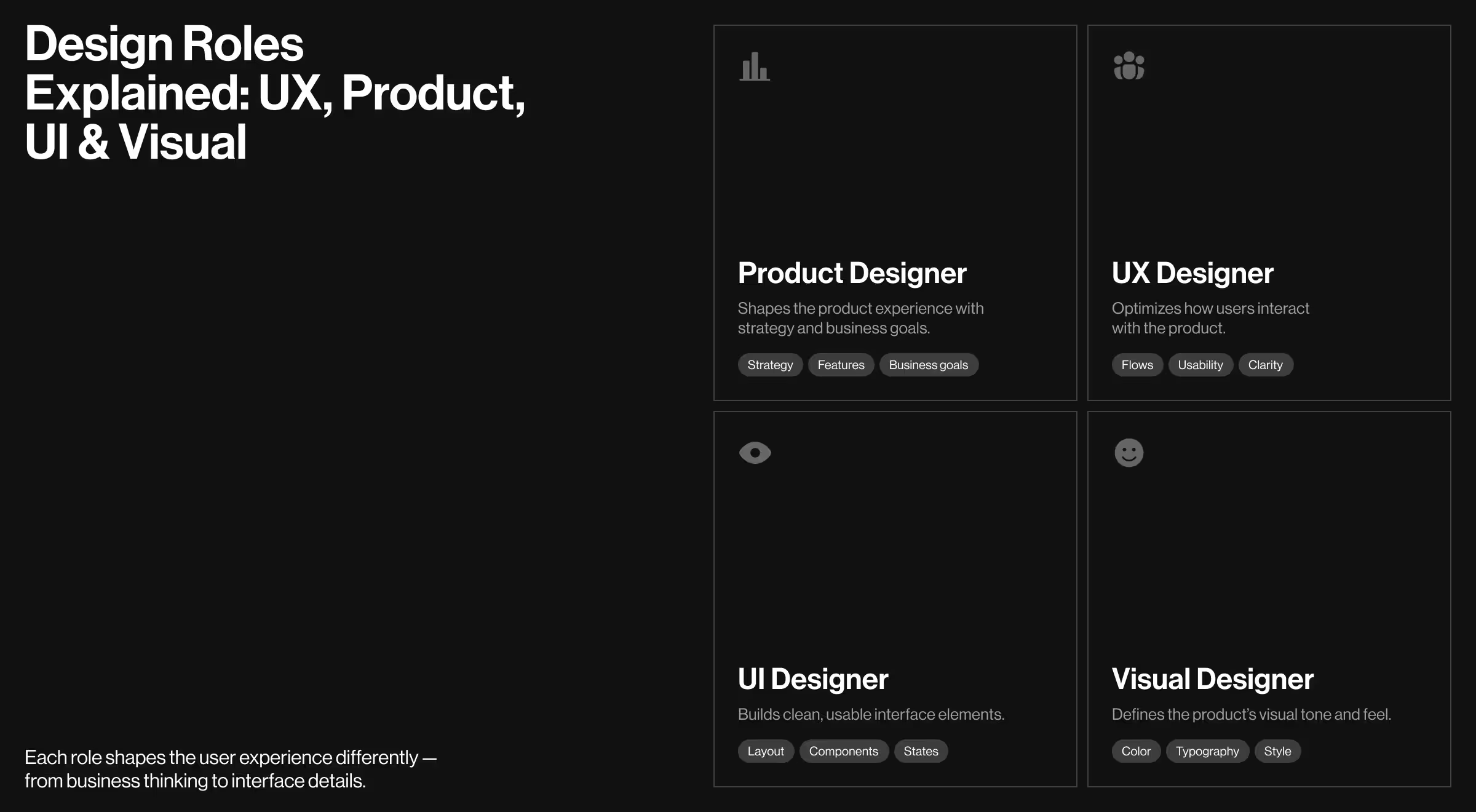
While both roles aim to create great user experiences, their focus and responsibilities differ:
- Product Designers take a big-picture approach. They’re involved in the entire product lifecycle—from defining business goals and market fit to shaping features and working across teams. Their role blends strategy, design, and growth thinking to deliver a complete product.
- UX Designers focus specifically on how users interact with the product. They conduct research, create user flows, test usability, and refine interfaces to make sure the experience is smooth, intuitive, and enjoyable.
In short: product designers decide what to build and why, while UX designers focus on how it should work and feel. Both are essential to creating successful, user-centered products.
Balancing Strategy with User Needs
The biggest challenge in product design isn't just making interfaces usable – it's designing solutions that serve both user needs and business objectives simultaneously.
Your design approach needs to:
- Break down complex business logic into simple user interactions
- Use data to validate design decisions
- Provide clear value propositions without overwhelming users
- Create scalable solutions that grow with your business
While UX designers focus primarily on usability and user satisfaction, product designers must also address unique concerns around market positioning, technical feasibility, and business viability – all while maintaining an elegant, trustworthy user experience.
"The most successful product designers don't just solve user problems – they create new opportunities that align user value with business growth."
{{Oleksandr Holovko}}
The Business Integration Factor
This fundamental integration requires design elements that communicate value at both user and business levels – what we call "strategic design architecture."
Effective strategic design architecture includes:
- Value visualization: Making complex business models visually comprehensible to users
- Journey optimization: Providing complete transparency about user progression and business conversion
- Decision support: Creating interfaces that guide users toward valuable actions
- Growth facilitation: Maintaining design patterns that support scaling and expansion
"Product design must communicate value and reliability at every touchpoint. Users need to feel immediately satisfied while businesses need to see measurable results. This requires not just visual polish, but a comprehensive value narrative throughout the entire product experience."
{{Oleksandr Holovko}}
This value narrative is particularly critical because product decisions often have long-term implications. Unlike traditional design projects where changes can be implemented quickly, product design decisions affect development roadmaps, market positioning, and user expectations. Design must support sustainable growth through careful planning, user validation, and business alignment.
Core Principles of Product Design
Product design is the art and science of creating solutions that are both functional and delightful for users. At its heart, successful product design balances user needs, business goals, and technological possibilities.
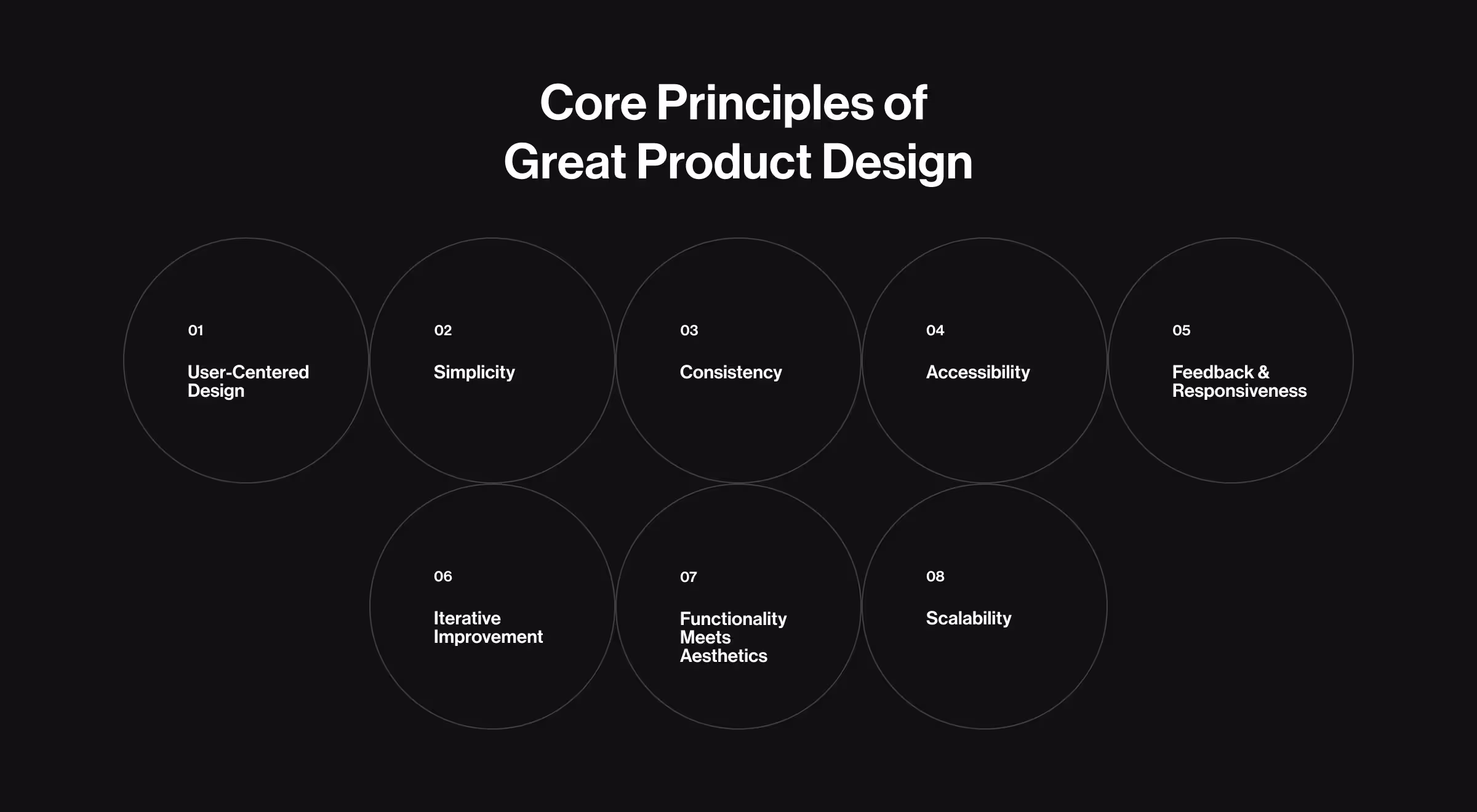
1. User-Centered Design
Design with empathy. Understand your users’ needs, pain points, and behaviors to create products that truly solve problems. Steve Jobs once said that design isn’t just about aesthetics — it’s about how something actually functions.
✅ Quick Win: Conduct user research early and often. Use interviews, surveys, and usability testing to gather real feedback.
2. Simplicity
Keep it simple. The best designs are intuitive and reduce unnecessary complexity. Every element should serve a clear purpose.
💡 Pro Tip: Challenge every feature and design element – does it add value or just clutter? Remove what isn’t essential.
3. Consistency
Create a cohesive experience across your product by maintaining consistent visual elements, interactions, and language.
“Develop and follow design systems or style guides to ensure consistency across all touchpoints.”
{{Oleksandr Holovko}}
4. Accessibility
Design for everyone. Your product should be usable by people with diverse abilities, ensuring inclusivity.
💡 Solution: Follow accessibility guidelines (like WCAG), use clear contrasts, provide keyboard navigation, and support screen readers.
5. Feedback & Responsiveness
Give users clear, timely feedback on their actions to create confidence and reduce errors.
✅ Quick Tip: Use visual cues, animations, and notifications that acknowledge user interactions and guide next steps.
6. Iterative Improvement
Design is never finished. Embrace a cycle of prototyping, testing, learning, and refining.
🔍 Expert Advice: Release minimum viable products (MVPs), gather user data, and continuously iterate based on insights.
7. Functionality Meets Aesthetics
A beautiful product is important, but usability should never be sacrificed for looks. Aim for a balance where form complements function.
💡 Pro Tip: Prioritize user flows and interactions, then layer on aesthetics that enhance the experience.
8. Scalability
Design products that can grow and adapt over time without losing quality or usability.
✅ What Works: Plan architecture and design components to be modular, flexible, and easy to update as needs evolve.
The Product Design Process
Designing successful products requires a structured design thinking process that addresses the unique challenges of balancing user needs with business objectives.
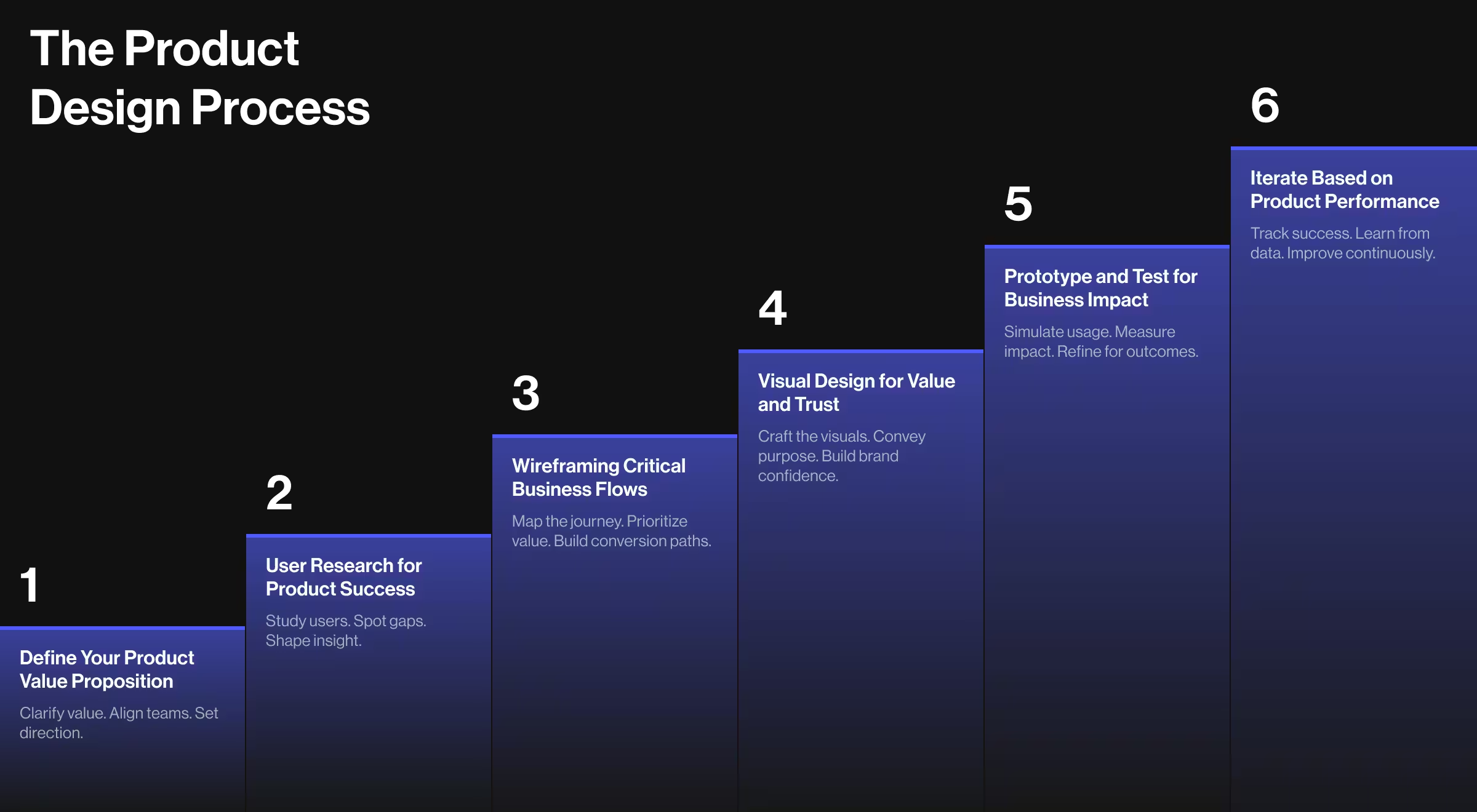
Step 1: Define Your Product Value Proposition
Before diving into design development process, clarify what issues your product solves and how it creates value for both users and your business. Are you building a productivity tool, an entertainment platform, a business solution, or something entirely new? Your core value proposition will guide your design decisions.
Work closely with your product and marketing teams to identify:
- Your target audience and their experience level with similar solutions
- The key actions users need to complete to receive value
- How your product differs from competitors in meaningful ways
- The core business model that sustains your product
✅ Recommendation: Create user personas that balance user pain points and business goals, focusing on things like how often they use the product, how much they’d pay, and how likely they are to grow as customers – not just their UX preferences.
Step 2: User Research for Product Success
Product design user research requires approaches that account for both user satisfaction and business viability. Traditional usability testing is often less relevant than understanding user value perception, willingness to pay, and long-term engagement patterns. Effective product research focuses on:
- Value recognition spectrum: Mapping users from problem-unaware to solution-committed
- Business model acceptance: Understanding users' comfort with your monetization approach
- Engagement sustainability: Determining how users perceive long-term product relationships
- Growth behavior analysis: Identifying how users become advocates and contributors
These specialized research dimensions help you design products that meet users where they are in their journey while supporting business objectives.
💡 Pro Tip: Conduct "value journey ethnography" by observing how users currently solve the problems your product addresses. Their existing behaviors reveal opportunities and constraints that can inform your product strategy.
Step 3: Wireframing Critical Business Flows
When creating wireframes, start by mapping the most important user journeys that create business value, focusing on:
- User onboarding and activation process
- Core value delivery interactions
- Conversion and monetization touchpoints
- Retention and engagement loops
- Growth and referral mechanisms
💡 Pro Tip: When wireframing, pay special attention to moments where user value aligns with business value. Your interface must clearly communicate mutual benefit to create sustainable user relationships.
Step 4: Visual Design for Value and Trust
The visual language of your product should reinforce value, innovation, and reliability. Consider these elements:
- Color palette: Choose colors that convey your brand values while supporting usability. Blues build trust, greens suggest growth, while accent colors highlight valuable actions.
- Typography: Select fonts that balance modern aesthetics with readability across all user contexts. Clear hierarchies help users navigate toward valuable interactions.
- Iconography: Develop custom icons for product-specific functions that communicate value intuitively and consistently.
- Data visualization: Create clear presentations of user progress, business metrics, and value realization.
Step 5: Prototype and Test for Business Impact
Test your designs with real users to ensure your interface drives both satisfaction and business results. Focus on:
- Time to value realization for new users
- Conversion rates for key business actions
- Long-term engagement and retention patterns
- Growth behavior and referral likelihood
💡 Pro Tip: Use tools like Mixpanel or Amplitude alongside user testing platforms to gather feedback on both user experience and business metrics, paying close attention to moments where user and business value align.
Step 6: Iterate Based on Product Performance
Once your product is live, monitor both user satisfaction and business metrics to understand how design impacts success:
- User activation and engagement rates
- Conversion funnel performance
- Retention and churn patterns
- Revenue and growth metrics per user segment
Use these insights to continuously refine your interface for better user satisfaction and business performance.
Design Elements That Define Great Product Experiences
The most successful products share certain design characteristics that enhance both usability and business performance.
Interactive Elements That Respond to User Progress
Great product interfaces provide immediate feedback about user advancement and value realization:
- Progress indicators for complex workflows
Example: TurboTax shows a step-by-step tracker so users always know how close they are to filing.
- Achievement systems for valuable behaviors
Example: Duolingo uses streaks, XP points, and badges to reward consistent language practice.
- Clear confirmation for successful actions
Example: Shopify shows a celebratory screen after a successful product launch or sale, reinforcing user momentum.
- Helpful guidance when users encounter obstacles
Example: Figma offers contextual tooltips and quick actions when users seem stuck, enabling smoother design flow.
These elements keep users engaged and progressing toward valuable outcomes.
Real-Time Value Presentation
Product users need to see ongoing benefits to maintain engagement. Effective designs include:
- Progress dashboards and achievement displays
Example: Fitbit provides a daily dashboard showing steps, activity, and progress toward health goals.
- Usage analytics and improvement metrics
Example: Grammarly gives users a weekly performance report showing words written, errors corrected, and vocabulary improvements.
- Benefit realization visualizations
Example: Notion uses animated checkmarks and streak counters to show project completion or consistency in daily planning.
- Comparative performance indicators
Example: Spotify Wrapped gives users personalized annual summaries, comparing their listening behavior to others in their region or globally.
When presenting this data, focus on user value and progress rather than overwhelming users with every possible metric.
Responsive Design for Cross-Platform Engagement
Mobile usage across all product categories continues growing, with mobile users often showing different engagement patterns than desktop users. Your product must work seamlessly across devices, adjusting for:
- Different interaction patterns and attention spans
- Varying contexts of use and time availability
- Different feature priorities on different devices
- Platform-specific engagement opportunities
🔍 Quick Win: Design your mobile experience to focus on your highest-value interactions first. This "value-first" approach ensures you prioritize what truly matters for product success.
Get Inspired: Learning from Top Product Design Examples
Slack
Slack revolutionized workplace communication by transforming complex organizational coordination into remarkably simple team interactions. Their design success stems from several key product innovations.
Interface Breakthrough: The Channel Paradigm
Slack's most significant contribution was distilling complicated organizational communication into straightforward "channel" and "direct message" metaphors. This seemingly simple design choice conceals extraordinary business complexity:
- Communication visualization: The channel-based interface creates an intuitive mental model for team organization
- Context preservation: Subtle but clear organization of conversations by topic and team
- Notification management: Making information overload manageable through smart filtering
- Integration ecosystem: Presenting third-party tools in user-benefit terms rather than technical specifications
"Slack's genius was creating what I call 'organizational compression' – hiding the complexity of enterprise communication behind an interface so simple it feels like consumer messaging," notes Stewart Butterfield, Slack co-founder.
Design Analysis
Slack's color system uses purple and teal as primary brand colors – choices that help it stand out in enterprise software while feeling approachable. The interface employs substantial white space and consistent interaction patterns, focusing attention on communication content. Typography is clean and hierarchical, with system notifications clearly subordinate to user conversations.
Spotify
Spotify's design challenge was creating an interface that could handle millions of songs while helping users discover music they'd love.
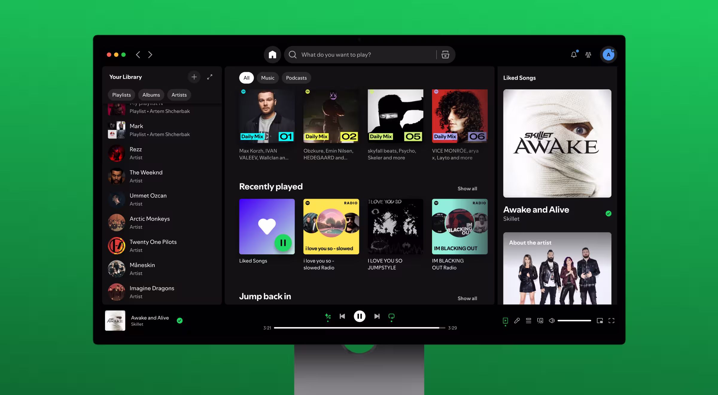
Interface Breakthrough: The Discovery Algorithm Visualization
Spotify's recommendation interface represents one of the most sophisticated yet approachable algorithmic presentations in consumer software:
- Personalization transparency: Algorithm recommendations presented as curated playlists with clear explanations
- Exploration encouragement: Interface patterns that balance familiar content with discovery opportunities
- Social integration: Seamless sharing and social proof elements that drive engagement
- Context awareness: Different interface modes for different listening contexts and moods
"Our design philosophy centers on making algorithmic recommendations feel human and personal," explains Gustav Söderström, Spotify's Chief Product Officer. "Every interface element serves both user discovery and business objectives."
Design Analysis
Spotify employs a distinctive dark interface with green accents that have become instantly recognizable, creating brand differentiation in a crowded market. The interface uses dynamic content layouts that adapt to user behavior and preferences. The design successfully balances information density with simplicity – a difficult achievement that required extensive user research and iteration.
Airbnb
Airbnb demonstrated how trust-building design principles can transform peer-to-peer marketplace experiences, creating confidence between strangers in high-stakes transactions.
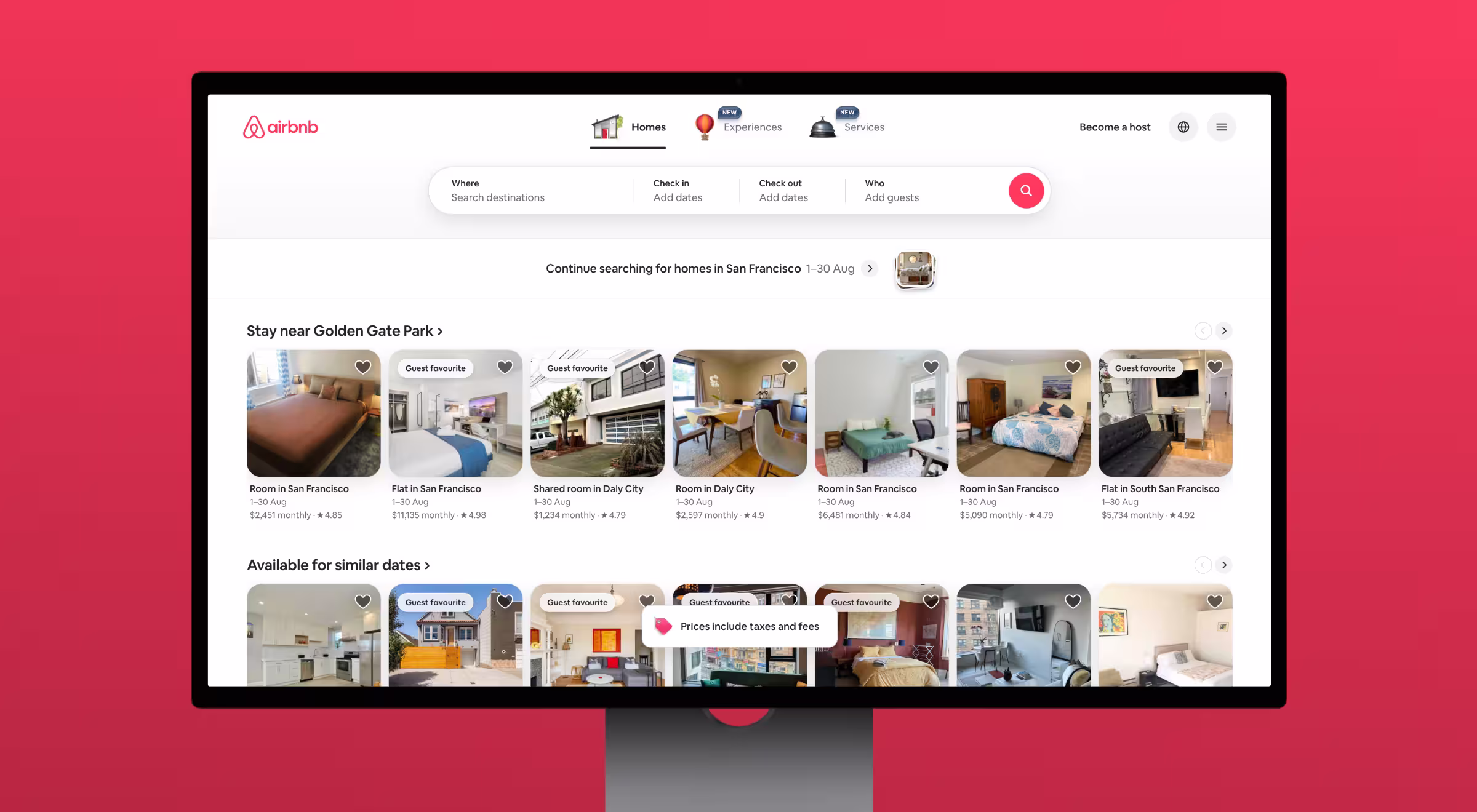
Interface Breakthrough: The Trust Visualization System
Airbnb pioneered comprehensive trust-building through design:
- Host and guest verification: Visual systems that communicate safety and reliability clearly
- Review integration: Presenting social proof in contextually relevant ways throughout the experience
- Quality indicators: Using photos, descriptions, and ratings to build confidence before booking
- Communication facilitation: Interface patterns that encourage positive interactions between users
Design Analysis
Airbnb uses warm, inviting colors and photography that emphasize experiences over transactions, creating emotional connections to travel destinations. The interface employs subtle trust indicators throughout the experience, from verified badges to review highlights. Typography and layout create a premium feel that justifies higher prices while maintaining accessibility.
Product Design That Delivers – See What We Did for Accern
Lazarev.Agency specializes in creating custom product designs that stand out in competitive markets while driving measurable business results. Our focus on user-centered design combined with business strategy gives every product its unique value proposition in the marketplace.
Our approach combines deep user research with proven business principles, creating interfaces that work for both new users and experienced customers. We've helped 500+ companies establish themselves as market leaders through thoughtful, value-first design.
One of our most comprehensive product design projects was for Accern, an AI-powered financial research platform. This project illustrates our approach to solving complex product design challenges that balance user needs with sophisticated business requirements.
Accern faced a classic product design problem: how to make powerful AI technology accessible to financial professionals without requiring technical expertise. The interface needed to:
- Abstract away AI complexity while maintaining analytical power
- Create workflows that fit existing research processes
- Deliver sophisticated analysis through intuitive interactions
- Provide enterprise-grade functionality with consumer-level usability
The Solution: A Progressive Disclosure Design System
We created a comprehensive design system with several innovative components:
- Simplified query interface: A natural language input system that translated complex financial questions into AI parameters
- Dynamic results presentation: Adaptive visualizations that presented AI analysis in contextually relevant formats
- Workflow integration: Seamless connection between research discovery and report creation
- Learning assistance: Progressive feature disclosure that helped users discover advanced capabilities over time
Design Innovations
Several specific design elements proved particularly effective:
- AI transparency: We developed unique "analysis tracking" that showed users how AI reached conclusions, building trust in automated recommendations
- Context switching prevention: The interface maintained user context across different research phases, reducing cognitive load and improving efficiency
- Smart defaults: Rather than requiring users to configure complex settings, the interface learned from usage patterns and suggested optimal configurations
Measurable Results
The design transformation delivered exceptional results:
- User adoption: Accern successfully onboarded financial professionals from major institutions, proving the interface successfully bridged the complexity gap
- Efficiency gains: Users reported 40% reduction in research time while maintaining analytical depth
- Business growth: The improved user experience contributed to successful funding rounds and market expansion
Let's Build Your Product Vision Together
Your design decides if users stay and your product succeeds – no matter what you're building.
Contact Lazarev.Agency today to discuss your product design project. Share your vision with us, and we'll develop a comprehensive design strategy that balances user satisfaction with business growth, helping your product stand out in competitive markets.


.webp)


.avif)


