
WellSet partnered with Lazarev.agency to rethink its user experience across all audiences, resulting in a 75% increase in engagement, a surge in user retention, and over 500,000 active users.
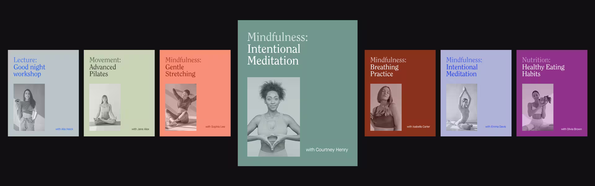
WellSet, a digital wellness studio offering on-demand and live sessions in over 20 holistic practices, partnered with Lazarev.agency to rebuild its experience from the ground up. The goal: make wellness content easier to access, more personal, and worth returning to.
When a great library gets lost in a bad layout
WellSet had the content. Expert-led yoga, breathwork, acupressure, meditation, all backed by evidence. But the old interface buried it in friction. Users couldn’t personalize their path, navigate easily, or build lasting habits.
Employers saw low engagement. Employees dropped off. Individual users stopped logging in. Everyone needed a reason to stay and keep coming back. That’s where Lazarev.agency came in.
Results redesign brought to our client
WellSet’s new experience transformed a passive content library into an active, daily-use wellness platform and the data shows it:
- 75% increase in user engagement
- 30% boost in user retention
- 500K+ active users and growing
- $3.1M+ raised post-launch for product expansion
Lazarev.agency designed a platform that feels like wellness
Our job during website redesign was to build an experience that mirrors what the product promises: clarity, calm, consistency. We:
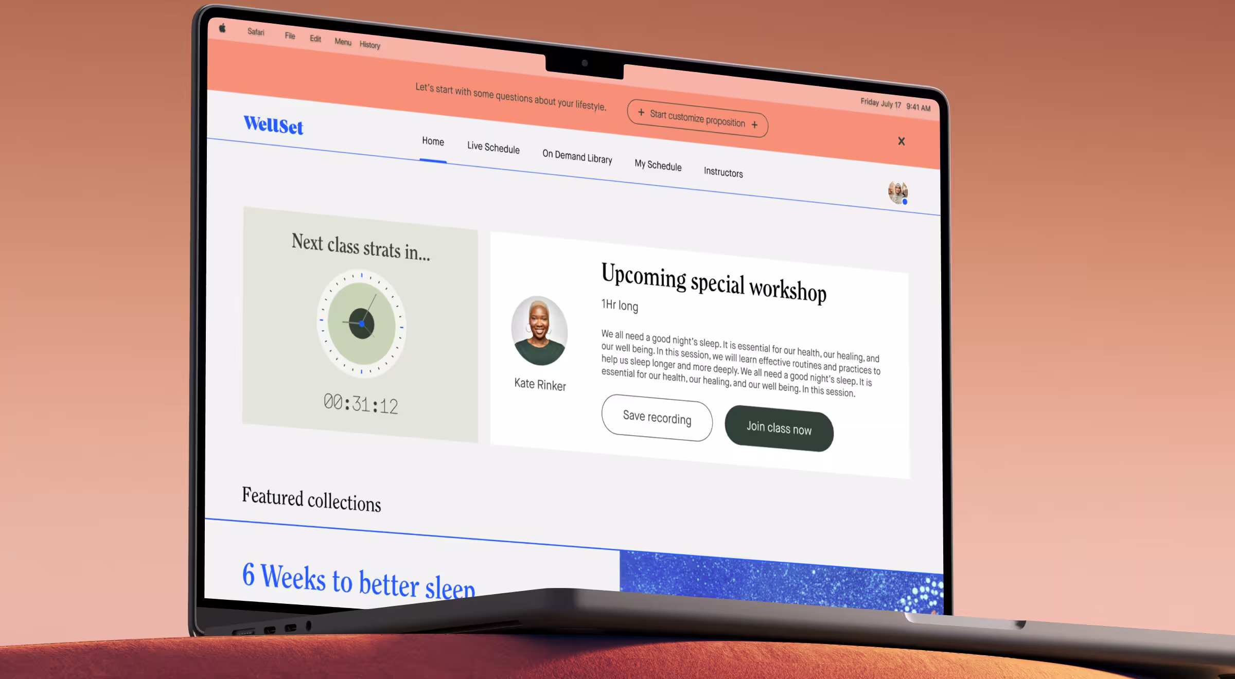
- Rebuilt the wellness hub with intuitive navigation and instant access to live or on-demand sessions.
- Tailored journeys for every user role — from enterprise managers to individual subscribers.
- Integrated smart recommendations that adapt to personal goals, session history, and habits.
- Added visual progress tracking to reinforce consistency and motivation.
- Introduced a calming visual system with soft palettes and open layouts that reduce cognitive load.
- Built-in community features to support connection, streaks, and session discovery.
- Live session calendar that makes joining and scheduling frictionless.
“Users return for clarity, progress, and relevance. That’s what we designed into WellSet.”
{{Anna Demianenko}}
Where retention begins with experience
WellSet needed a better experience. With the right flows, feedback loops, and visual tone, Lazarev.agency helped turn intention into action. Now, the healthcare product design feels as good as it performs and users keep coming back.
🔍 Read the full case study.


.webp)


.avif)


