UX patterns from 10 best fintech websites every product team should use

AI research dashboard interface on tablet — dark mode financial data visualization designed by Lazarev.agency for Rhea by Accern, showcasing conversational AI and real-time market insights
Summary

Looking for the best fintech websites to benchmark before your next redesign?

We analyzed 10 stand-out fintech products to surface the UX patterns that turn first-time visitors into power users.
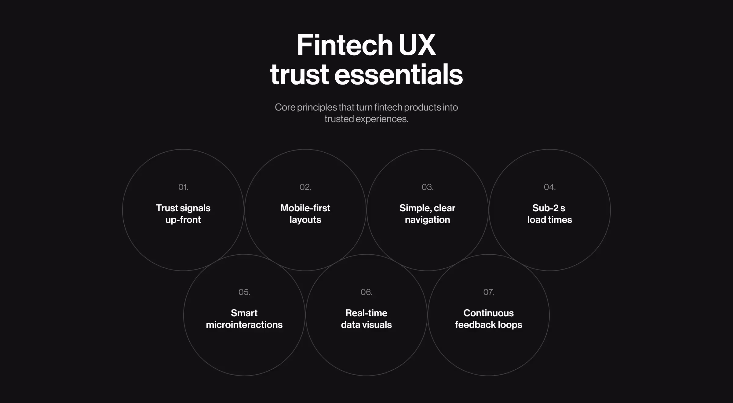
Key takeaways

  • Professional, trust-first design separates best fintech websites from pretty-but-risky brochures.
  • Mobile-first performance and sub-2 s load times win impatient users, and regulators tracking accessibility.
  • Data-rich visuals and plain-English copy jointly turn complex numbers into decisions.
  • Pair real-time personalization with crystal-clear CTAs; sites like Blockbeat prove relevance boosts watch-list engagement.

Why UX makes or breaks fintech trust

Fintech UX trust essentials infographic showing seven core design principles — trust signals, mobile-first layouts, simple navigation, fast load times, microinteractions, real-time data visuals, and feedback loops — by Lazarev.agency

Money is emotional; one micro-friction in onboarding and users will abandon you.

That’s why effective fintech web design rests on a handful of non-negotiables:

  • Trust signals up-front — regulatory badges, HTTPS, and transparent pricing convince new users your platform is reliable.
  • Mobile-first layouts are mandatoryover 70% of fintech traffic is phone-based in 2025.
  • Intuitive navigation trims cognitive load for mixed audiences — retail investors, data scientists, and financial institutions alike.
  • Sub-2 s load times protect retention — every 500 ms delay can cut conversion by up to 7% in the financial industry.
  • Motion microinteractions and subtle animations add polish without compromising speed, making complex dashboards feel human.
  • Real-time data visualization converts raw numbers into insight, while personalized web experiences boost relevance and stickiness.
  • Continuous user-feedback loops (analytics + moderated sessions) keep the site aligned with evolving market expectations.
“Good fintech UX turns regulation into reassurance and complexity into a couple of clear taps.”
{{Oleksandr Koshytskyi}}

10 fintech sites and what they nail

We scored each site on:

  1. First-paint speed
  2. Clarity of value prop within 5 seconds
  3. Navigation depth to core action (open account, start trial, etc.)
  4. Visual hierarchy & accessibility
  5. Conversion pathways (CTA density, social proof)

And here are the best picks for you to consider:

Segment Brand (Site) Stand-out UX moves
Developer APIs Stripe Code-snippet hero, docked docs nav, dark-mode toggle for devs working at night.
Quantillium API-ready JSON samples inline and a motion-driven hero that turned a raw-data product into a 30% uplift in data accessibility and 32% longer sessions.
Neobanks Revolut Live rate widget + regional pricing auto-detect.
Chime Zero-jargon copy and a single CTA “Get Started” on every fold.
Wise Real-time fee calculator that updates as you type.
Investing & Data Robinhood 80:20 dark/light mode adoption by default, reducing eye-strain complaints.
Accern Rhea Hybrid prompt + widget interface lets analysts drag AI-generated insights straight into reports, fueling an 8-figure acquisition.
Crypto & Web3 Coinbase First-screen onboarding estimate (“< 5 min to verify”).
Blockbeat News-first dashboard with hover-to-preview articles; personalized watchlists keep traders in one tab.
BNPL & Pay-Later Klarna Gamified loyalty levels visualized as a progress bar; reduces drop-off at checkout.

🔎 Read our article for a deeper dive into the best fintech UX design practices for scaling!

Common UX patterns worth copying

The best fintech websites share a handful of design moves that consistently build trust, speed up onboarding, and nudge visitors toward conversion without friction. We distilled the tactics below from ten high-performing platforms; use them as a checklist before you lock your own wireframes:

  • One dominant CTA per fold – All 10 sites avoid competing buttons.
  • Conversational microcopy – Stripe’s form labels read like a human, not legal fine-print.
  • Skeleton loaders – Wise and Coinbase show animated placeholders to mask API latency.
  • Context-aware dashboards – Rhea surfaces only the widgets an analyst needs for the current query.

🔍 Pro tip: Run a five-step remote usability testing session on your pricing page, then pipe the recordings into a tree testing tool — mis-click clusters reveal IA gaps you won’t catch in analytics alone.

Comparison matrix: UX feature vs. business goal

Use this cheat-sheet to see which UX patterns from leading fintech websites drive Trust, Activation, and Retention and why they work.

Feature Trust Activation Retention Why it works
Real-time fee calculator ★★★ ★★ Removes uncertainty and signals transparency before signup.
AI-tagged content filters ★★ ★★ ★★★ Makes large data sets easy to navigate, boosting relevance.
Developer-first docs navigation ★★ ★★★ ★★ Speeds integration for tech teams, reducing onboarding friction.
Gamified loyalty tier ★★ ★★★ Rewards repeat usage with status, perks, and visible milestones.
Instant identity verification (KYC) ★★★ ★★ Builds immediate credibility while shortening account setup.
Personalized financial dashboard ★★ ★★ ★★★ Delivers tailored insights, keeping users engaged long term.
Goal-based savings tracker ★★ ★★ ★★★ Turns abstract goals into visual progress, motivating return visits.
One-click recurring payments setup ★★ ★★★ ★★ Reduces steps to first transaction, boosting early adoption.
Interactive onboarding tour ★★★ ★★ Shows value quickly, guiding users to first success moment.
Proactive fraud alerts ★★★ ★★ Increases safety perception and fosters ongoing trust.
Customizable reporting & exports ★★ ★★★ Fits diverse business needs, encouraging long-term platform use.
In-app support chat with live agents ★★★ ★★ ★★ Resolves issues fast, reassuring users during key decisions.

Mistakes to dodge in UX web design

Even polished fintech interfaces can leak trust and revenue when small details go unchecked. The following traps surfaced repeatedly during our teardown — skip them early and you’ll save weeks of rework and countless support tickets later.

  • Over-personalization creep — Don’t request salary data on step 1.
  • PDF dead-ends — Quantitative users bounce when forced to download reports; Quantillium keeps everything in-browser JSON.
  • Dark-mode abuse — Blockbeat’s charts retain high contrast; many rivals don’t, causing ADA-grade issues.

Framework applied to real projects

Selecting fintech web design tactics in a vacuum rarely works.

Before we jump into the three in-depth Lazarev.agency’s case studies below, here’s why they matter: each shows how conscientious fintech web design turns complex data into actionable insights users pay for, no matter if it's an AI-generated research or a real-time crypto intelligence.

Case 1: Accern Rhea — AI-driven research terminal

AI research dashboard showing seed funding rounds in generative AI startups across Europe with visualized bar chart — designed by Lazarev.agency for Rhea by Accern, highlighting financial data visualization and conversational AI UX

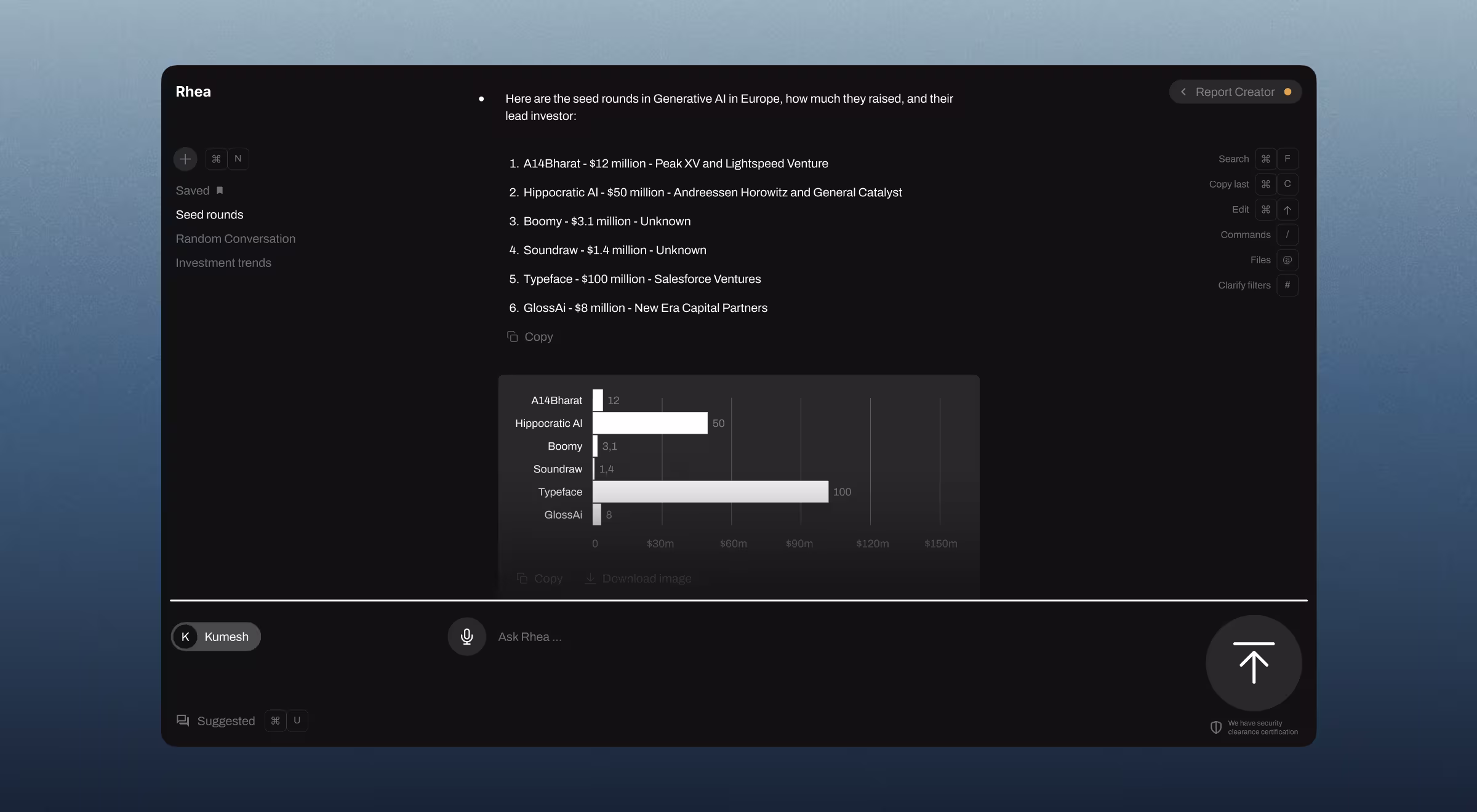
Accern is a U.S. NLP company that turns unstructured news into investment signals for analysts and VCs. Analysts were juggling chatbots, spreadsheets, and PDFs — context vanished the moment they switched tabs.

We built a hybrid interface that blends prompt-based AI with dynamic widgets in a split screen: charts, footnotes, references, and drag-and-drop snippets all surface inline.

Rhea pushed Accern from Series B to an 8-figure acquisition and helped the company raise $40 M+ along the way.

Case 2: Blockbeat — real-time crypto news & trading hub

Crypto analytics dashboard UI for Ethereum on Blockbeat — real-time DeFi and market cap visualization with live trading data, price charts, and performance metrics — designed by Lazarev.agency

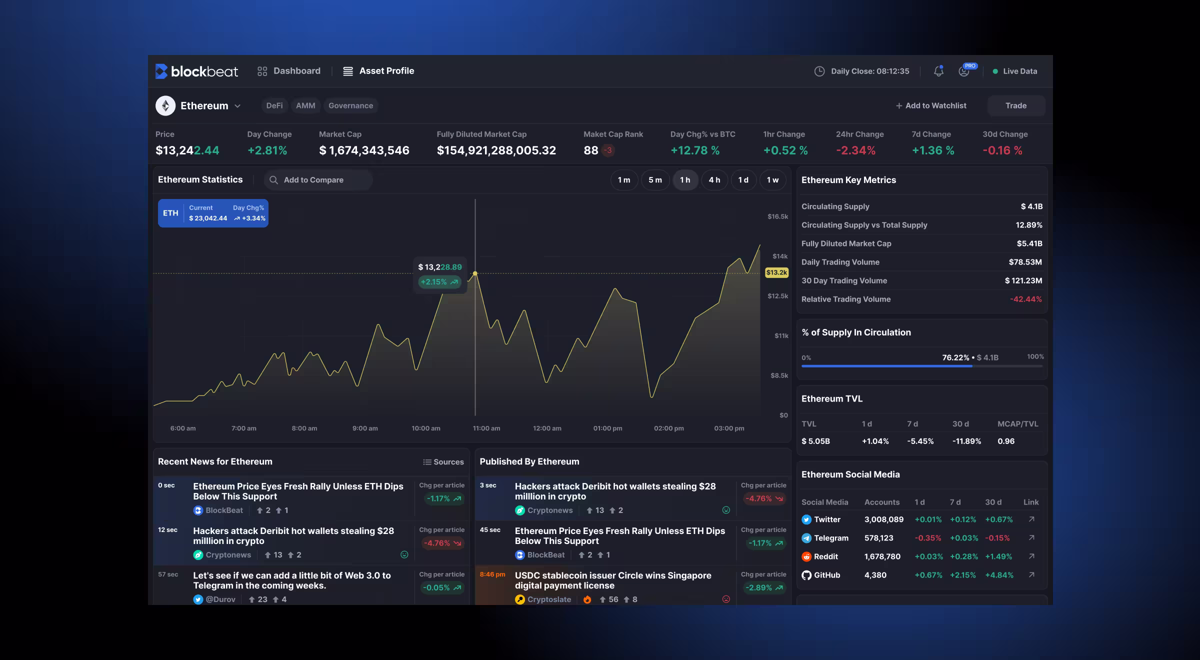
Blockbeat is a Web3 startup that streams AI-tagged news and market stats to active crypto traders. And traders needed only one screen to filter signals from noise as prices moved.

We built a hover-to-preview news feed, customizable watchlists, and data widgets that update in real time, all stitched into a dashboard designed for split-second decisions.

Client analytics show longer on-page sessions and faster trade setups, with users citing “all-in-one clarity” as the top benefit.

Case 3: Quantillium — global financial filings API

Quantillium website hero section showcasing global financial data API platform — blue earth visualization with network lines and bold headline ‘Setting the Standard for Global Financial Data,’ designed by Lazarev.agency

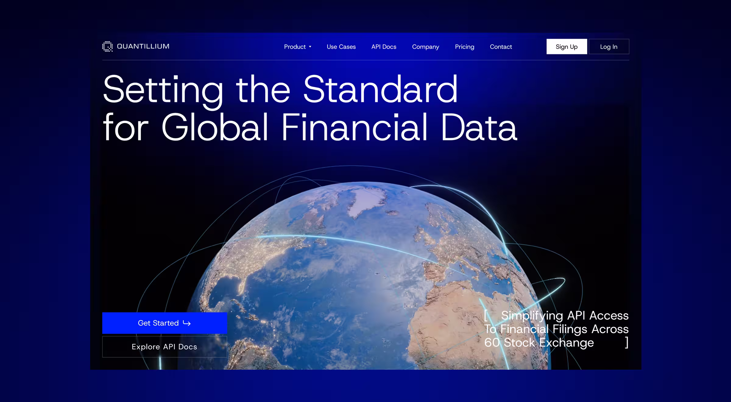
Quantillium provides developer-ready JSON access to regulatory filings from 60 exchanges across 58 countries. Its raw-data brand felt opaque; developers struggled to see the API’s power at a glance.

We built motion-led storytelling, 3D visuals, and live code snippets that let engineers preview responses without leaving the page.

After launch, average session duration jumped 32% and visits to API docs grew 18%, signalling stronger developer engagement.

🔎 Want more insights? Check out our Payoneer case study!

Your path to insight-powered growth

Great fintech solutions work as conversion engines. Identify the riskiest assumption, select the leanest method to validate it, and let real-user evidence shape design.

Each pattern above shows how deliberate UX choices (speed, clarity, adaptive interfaces) translate into measurable gains, from Quantillium’s and Blockbeat’s longer sessions to Rhea’s acquisition-level traction.

Ready to turn your site into a trust-building growth lever?

Book a strategy call with Lazarev.agency’s fintech UX team.

We’ll audit your funnel, prototype improvements, and ship designs that move revenue.

No items found.
No items found.
No items found.
No items found.

FAQ

/00-1

What makes a successful fintech website design in 2025?

A successful fintech website blends intuitive navigation, futuristic aesthetics, and cutting-edge technology to help financial institutions and new users understand complex financial products. The best fintech websites use clear design elements, vibrant colors, and interactive elements to build user trust while keeping functionality and performance a priority.

/00-2

Why is intuitive navigation critical for fintech website UX?

In the financial industry, products and services can be inherently complex. Intuitive navigation helps users from first-time visitors to seasoned clients find relevant information, tools, and pricing without friction. The best fintech website designs reduce cognitive load, making it easy for potential customers to take the next step.

/00-3

What fintech innovations are shaping website functionality today?

From market data solutions for financial institutions to dynamic credit and post-trade automation, fintech platforms are embedding more technology directly into their websites. United Fintech, for example, offers cutting-edge finance technologies that improve transaction speed, reduce costs, and enhance infrastructure for banks and buy-side participants.

/00-4

How can fintech websites integrate automation to improve services?

Fintech solutions increasingly automate regulatory reporting and compliance processes, using RegTech to eliminate bottlenecks. Workflow automations streamline operations for buy-side and sell-side participants, while full post-trade process automation reduces systemic risks and frees teams to focus on strategy.

/00-5

How do fintech websites use design to reflect brand and build trust?

A fintech website design should reflect the brand’s positioning whether futuristic, secure, or client-focused. Design elements like modern typography, accessible layouts, and data visualization tools signal credibility. The homepage is critical: it should clearly communicate services, solutions, and the value proposition in seconds.

/00-6

What role do interactive elements play in fintech website design?

Interactive elements such as calculators, dashboards, and live data feeds help users connect with the platform in real time. They turn static web design into a dynamic experience that allows financial technologies to be demonstrated visually, improving user trust and increasing engagement.

/00-7

How can fintech websites stay relevant in a rapidly evolving industry?

The fintech industry evolves fast, with new startups, companies, and technologies disrupting all financial sectors. A successful fintech website stays relevant by regularly updating blogs, publishing case studies, and integrating new design examples that reflect current trends and innovations.

/00-8

Why should fintech websites focus on mobile responsiveness?

With financial industry users increasingly accessing tools via mobile devices, mobile-first design ensures functionality and security remain intact across all screen sizes. Top fintech websites adapt typography, interactive tools, and data displays for smaller screens without losing clarity.

/00-9

How do fintech news and trends influence website design?

FinTech news websites and industry research highlight shifting trends, security expectations, and new technologies — all of which inform web design updates. United Fintech’s partnerships with state-of-the-art fintechs are an example of how platforms evolve to offer better solutions to organizations worldwide.

/00-10

What UX patterns should every fintech product team adopt?

The best fintech website designs consistently use:

  • Clear onboarding flows for new users
  • Transparent pricing and service details
  • Secure sign-in processes to protect data
  • Accessible navigation for different target audiences
  • Data-driven content that supports informed decisions

These patterns not only improve customer trust but also strengthen business positioning in a competitive financial industry.

Read Next

Miami city skyline at sunset with palm trees in the foreground — modern urban landscape used as header image for Lazarev.agency’s Miami web design services page

31 Miami web design companies compared head-to-head

3D render of autonomous delivery robot with six wheels and black-white body on green background — futuristic robotics product visualization designed by Lazarev.agency

Robotics-powered 3PL raises $106M in Series C funding following Lazarev.agency redesign

News & digests
Weekly design & tech digest 3D cube poster for October 20–24, 2025

Weekly design & tech digest | Week of October 20–24, 2025

News & digests
Weekly design & tech recap 3D cube poster for October 13–17, 2025

Tech & design recap | Week of October 13–17, 2025

News & digests
Downtown Tampa skyline at dusk featuring illuminated high-rise office buildings and waterfront architecture

Which Tampa web design companies fit your business? 15 top picks to choose from

Web design
Futuristic glass 3D structure symbolizing AI and digital transformation in product design by Lazarev.agency

8 UI best practices you should consider in 2025

UX/UI design
3D digital folders transferring files, symbolizing cloud data storage and management

Financial data infrastructure company increases data accessibility by 30% after redesign by Lazarev.agency

Industry UX/UI playbooks
Your Custom Space is Almost Ready!!! <1 min

We’ve created this space specially for you, featuring tailored ideas, design directions, and potential solutions crafted around your future product.

Everything’s Ready!

Your personalized space is ready to go. Dive in and explore!

12%
Analyzing data...
Explore Now
Hey, your personal page is being crafted.
Everything’s Ready!
12%
Go
Your Custom Space Ready!!!
00 FPS