

Does your CRM feel like a data dump?
The issue often traces back to CRM dashboard design.
A well-designed dashboard turns noise into clarity and prompts the next right move for sales, marketing, and support. Your teams quickly see what matters and where to focus.
Most teams run commercial CRM software. This guide is for product leaders, RevOps, and teams who need a decision-ready dashboard layer inside a CRM, or a light bespoke dashboard on top of it to make the CRM a single source of truth across revenue work.
Key takeaways
- Treat dashboards as products. Measure success by how fast people adopt them and make decisions.
- Start from roles. Executives, sales reps, marketers, and support all need their own defaults and drill-downs.
- Tell a story. Show system health, changes, trends, and clear next steps. Skip the endless metric walls.
- Mix now with then. Blend real-time signals with historical context, and show data freshness and ownership to keep trust strong.
What a CRM dashboard really does
A CRM dashboard is a single surface for revenue work.
It shows where you are and what to do next.
Make your CRM the single source of truth for every team. If the built-in screens miss what you need, add a small custom dashboard on the same data.
The dashboard can pull only the signals that matter for revenue decisions (pipeline health, handoffs, and risk), while leaving ticket handling in the systems built for it.
When designed well, it:
- reduces cognitive load with clear hierarchy and minimal chrome;
- shortens the path from “I see” to “I act,” via filters, drill-downs, and contextual actions;
- aligns teams by sharing a consistent definition of key performance indicators (KPIs) and their owners.
Layout should follow how people actually scan. Eye-tracking research highlights an F-pattern with strong top-left priority, so place primary KPIs and global filters where attention lands first.
Legibility also matters at scale: adhere to WCAG 2.1 contrast ratios and pair color with labels, icons, or patterns to keep critical information clear for every user.
A well-designed dashboard communicates key information with a quick overview on a single screen, then offers detailed insights one click away.
When to customize or build a thin layer:
- Your pipeline, territories, or approval flows diverge from standard reports.
- You need a unified view across CRM plus marketing/support tools via APIs.
- Permissions and auditability require a tailored layout and definitions to sustain trust.
Why many CRM dashboards fail
CRM programs miss targets more often than teams expect. A cross-study analysis pegs the CRM failure rate at 55%, and Salesforce highlights recurring causes like weak strategy, process gaps, and poor adoption.
Most failures start with clutter, weak hierarchy, and shaky data trust:
- Clutter and overload. Too many KPIs with equal weight compete for attention. When presenting data, mix key metrics with detailed tracking intentionally, otherwise all the data turns into noise.
- Weak visual hierarchy. Primary KPIs don’t live where eyes land first, the logical information hierarchy breaks.
- No role-based tailoring. A CRO needs forecast risk and performance metrics, a rep needs today’s actions and relevant information.
- Data trust issues. Unlabeled delays, mismatched definitions, and missing owners erode confidence. Surface freshness (“last updated 2 min ago”), data sources, and KPI owners so users can make informed decisions.
“Dashboards earn trust when every pixel either clarifies meaning or drives the next step. Anything else is debt.”
{{Kirill Lazarev}}
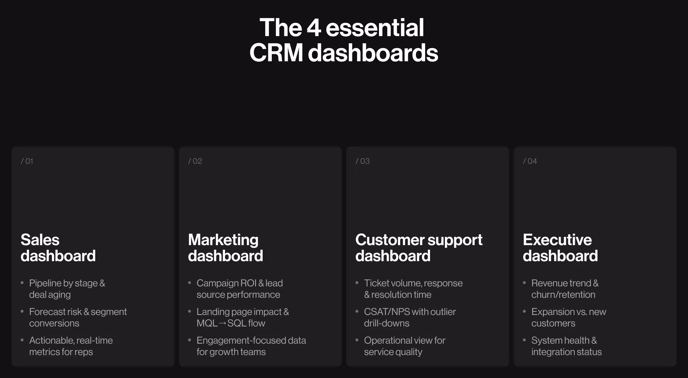
4 types of CRM dashboards you need
These four dashboards cover daily operations and executive oversight:
- Sales CRM dashboard. Today’s tasks, pipeline by stage, aging deals, forecast risk, and conversion by segment. Include one-click drills to opportunity lists and real time data indicators. This is an operational dashboard that should display key data a rep can act on.
- Marketing dashboard. Campaign ROI, lead source performance, landing page contribution, and MQL→SQL flow with cohort filters. Use data points that tie to user engagement and business growth.
- Customer support dashboard. Ticket volume, response and resolution times, backlog aging, and CSAT/NPS with links to outlier conversations. Treat this as an operational dashboard with clear graphs and visual cues.
- Executive dashboard. Revenue trend, new vs. expansion, churn/retention, top risks, and system health (data freshness, integration status). This leans toward an analytical dashboard that provides a comprehensive overview for patterns and risk.
🔍 Great dashboards reduce cognitive load and surface intent, a philosophy central to our dashboard UX design approach.
What best CRM dashboards have in common
They start with a single question per role — “What should I do now?” — then compress time to action. In practice, the best CRM dashboards show:
- direction (trend),
- urgency (thresholds),
- and proximity to the goal (targets).
All with drill-downs that never orphan the user from context.
The dashboard UI uses a consistent design language, responsive design, and white space that guides the eye to the most important information on one screen.
CRM dashboards examples to model
These are custom, role-specific dashboard layers built on CRM data, bespoke views that sit on top of your tools.
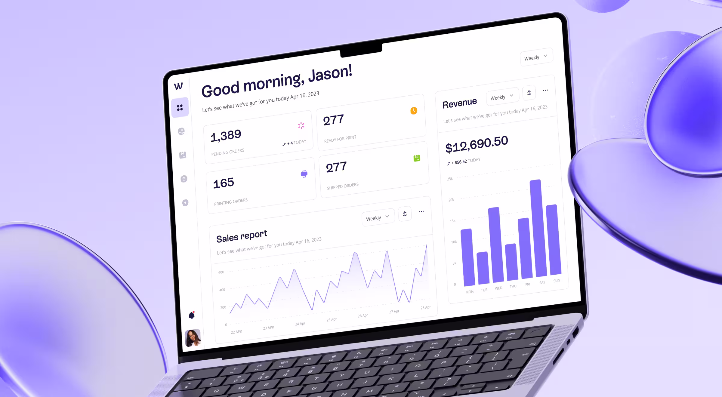
- We Build Memories (B2B ecommerce): a sales-focused console that elevates revenue, order status, and invoicing clarity turning operational sprawl into a growth surface with relevant performance metrics.
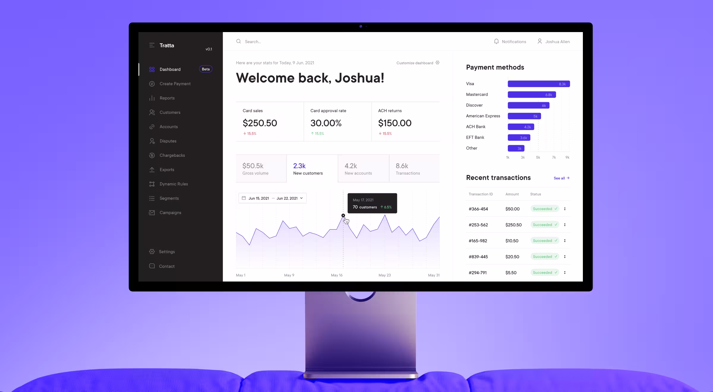
- Tratta (fintech operations): a flexible admin console where users customize modules, charts, and widgets, then generate reports they actually use for a smooth user experience.
Use these as CRM dashboards examples to guide layout, emphasis, and drill-down paths for your own product and CRM software.
🔍 Look for more examples in our portfolio.
10 best practices for CRM dashboard design
Filter your CRM dashboard ideas through the practices below to keep the UI lean and decision-ready:
- Prioritize clarity over volume. If a KPI doesn’t inform a decision or action, remove or demote it. Dashboards are not merely databases! Dashboards tend to work best when the display focuses on key information and a quick overview.
- Design for roles and moments. Default states, filters, and time ranges should mirror the user’s daily cadence (morning standup, end-of-week review, monthly forecast). Interactive elements like hover tooltips, sort, and saved views help different kinds of users get to the same goal faster.
- Optimize layout for scanning. Place the “north star” metrics top-left and align secondary groups for left-to-right, top-to-bottom flow (F/Z patterns help). Use visual cues and color coding sparingly to highlight risk or thresholds.
- Balance real-time with history. Real-time indicators without baseline invite overreaction, history without freshness hides risk. Pair sparkline trends with “updated” labels and SLA badges so the dashboard offers both trajectory and status at a glance.
- Instrument drill-downs. Every high-level tile should link to a filtered table or detail view with persistent context (date range, segment, owner). That structure supports detailed tracking without crowding the single page overview.
- Choose chart types with intent. Line charts and line graphs communicate change over time, bar charts compare categories, pie charts belong only to simple part-to-whole stories. Keep various charts readable with clear labels and consistent scales.
- Design for accessibility. Use minimum 4.5:1 contrast for text and 3:1 for large text/UI components. Avoid color-only encoding — add shape, labels, or patterns. Offer dark themes where environments demand lower luminance, and keep the color palette consistent across modules.
- Mobile matters. Sales and support often work on mobile. Ensure a responsive design that keeps tap targets generous and preserves a logical information hierarchy on smaller breakpoints.
- Build for delivery speed. UI/UX teams can prototype the dashboard UI in Figma. UI kits from the Figma community speed up component consistency and help create a well structured dashboard for a web app with complex data and multiple variables.
- Expose data ownership. Show KPI definitions, owners, and data sources in an inline help drawer. Trust is a design feature that leads to data driven decisions.
💡 Pro tip: Write micro-briefs per role before pixels — one paragraph that names 3 primary decisions the dashboard must accelerate. Build only for those.
Designing for the human brain is a key
People scan. Diagonally. They don’t parse like robots. Respect preattentive processing — prefer position, length, and angle over decorative color for quantitative comparisons.
For anomalies, use restrained color highlights and motion only when it conveys meaning (e.g., a gently pulsing SLA breach).
Choose charts that present key information cleanly, keep graphs uncluttered, and make sure the dashboard communicates a bird’s eye view before deep dives.
🔎 For a deeper dive into visual hierarchy and scanning behavior, see our guide on the Gestalt principles of design. It explains how proximity, similarity, and grouping help dashboards communicate at a glance.
About layout patterns. The F-pattern and its relatives explain why the first row of tiles and the left column do disproportionate work. Put KPIs and global filters there, place secondary diagnostics below the fold so users can get a comprehensive overview and then explore example segments.
On color and alerts. Guardrails matter more than palettes. Define thresholds, then use consistent iconography and labels to show risk states. Color complements the message and highlights the most important information, while labels carry meaning for all users.
It’s time to implement
If you’re planning a redesign or migration, consider:
- UX audit services → for decision-ready diagnostics.
- UX/UI design services → for scalable components and design systems.
- UX research services → for task analysis and KPI definitions that reflect real workflows.
Unsure which services you need to turn ideas into a working CRM dashboard design?
Let’s talk!
Partner with Lazarev.agency, your AI product design agency, to design and test a CRM dashboard that ships fast and scales with your pipeline!


.webp)


.avif)

