

Turning backend power into frontend clarity unlocks stronger product adoption, longer sessions, and developer confidence.
Quantillium, a financial data infrastructure company powering real-time access to global stock exchange filings, partnered with Lazarev.agency to revamp its digital experience. The result: a 30% boost in data accessibility, a 32% increase in session duration, and a stronger foothold in the competitive fintech market.
Financial data, reframed for the people who use it
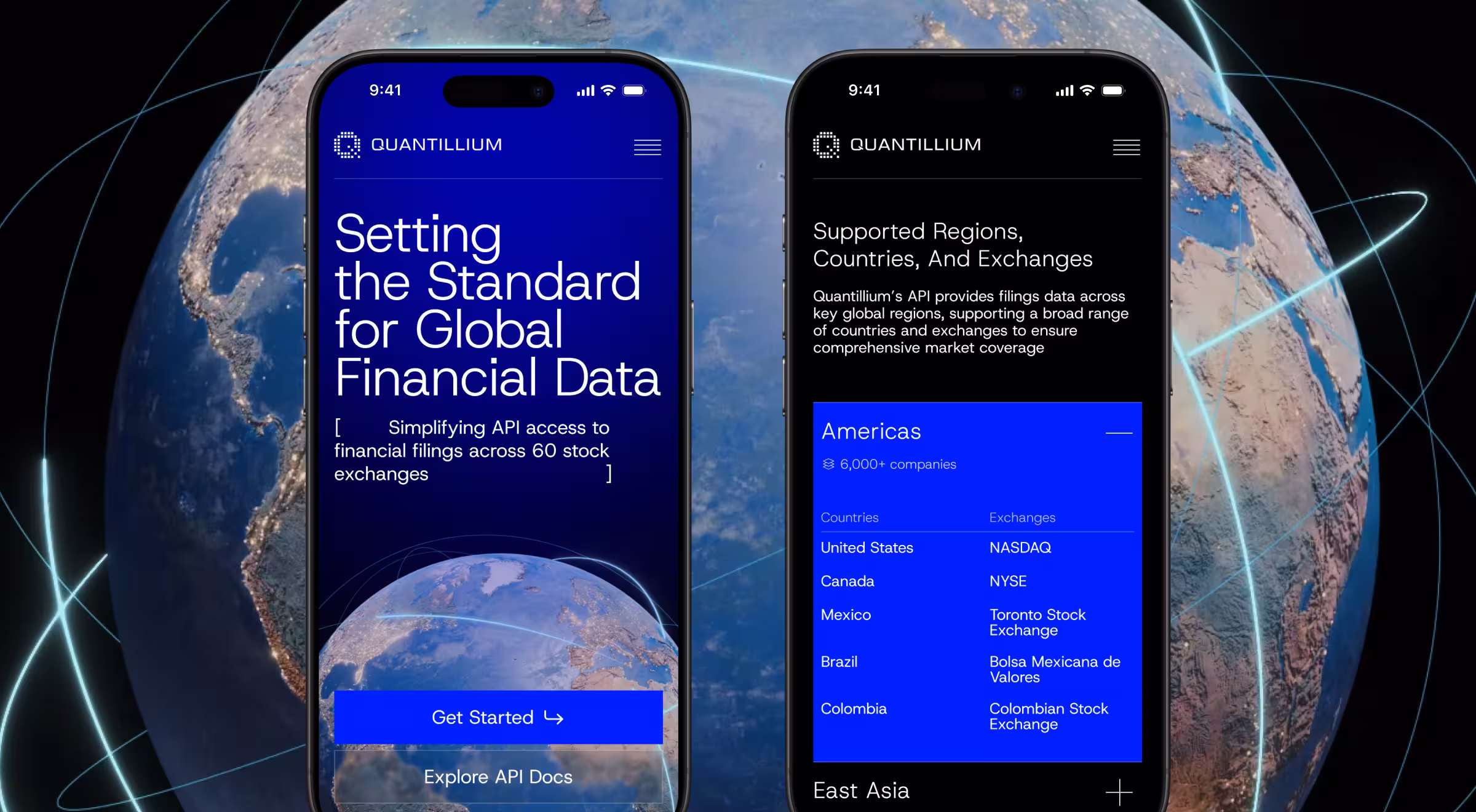
Quantillium serves a sharp, technical audience – developers, data teams, financial analysts, fintech founders. The product was already strong under the hood: a unified API offering real-time access to filings across 60+ global exchanges.
The problem was in the frontend that didn’t reflect that depth. There was no clear narrative, no obvious value path, and no visual identity that signaled trust or precision.
Quantillium came to Lazarev.agency to fix that with a complete rethink of how the brand shows up and how the product gets adopted.
The numbers behind Lazarev.agency brought
- +30% increase in data accessibility across key product areas
- +32% average session duration, driven by better engagement with core documentation and product sections
- Increased API documentation traffic from new developer audiences
- Higher brand trust among fintech teams and product stakeholders
We built the site developers actually want to use
We designed with one goal: make the fintech product’s complexity feel approachable and its value obvious. Our deliverables:
- Built a developer-first product page that prioritizes real questions: What can I build with this? How do I start? Why does it matter?
- Reorganized content flow to surface relevant information faster, from product specs to API docs.
- Created a motion-enhanced experience with 3D visuals and scroll-triggered animations that communicate structure, speed, and scale.
- Developed a visual system that feels as exacting and intelligent as the platform itself modern, confident, minimal.
- Simplified access to API documentation so developers can move from interest to integration without getting stuck.
“Design’s job here was to clarify. We took something powerful and made it immediately usable and trustworthy.”
{{Oleksandr Koshytskyi}}
Fintech design that brings confidence
Quantillium’s new experience proved a key point: no matter how strong the backend, adoption happens on the frontend. We helped turn a complex infrastructure product into something users understand, trust, and build on fast.
The redesign brought that precision to the surface, making the product easier to understand, faster to adopt, and harder to overlook. Now, financial teams rely on it.


.webp)


.avif)

