The digital audience nowadays is overwhelmed with information, impatient, and used to getting exactly what they want — instantly. With shrinking attention spans and feeds full of dopamine triggers, content-rich platforms face a harsh reality: if users can’t find value fast, they’re gone.
Our UX/UI design team has seen this play out across media-heavy products. Below we unpack three cases that prove how precise media content UX/UI design helps users explore more, stay longer, and find faster what matters the most.
Key takeaways
- Effective website content design guides users through mixed media (text, video, events) without cognitive noise.
- Pattern-rich navigation and smart filters raise time-on-page and cut bounce paths.
- Clear, reusable design systems let editorial teams launch new verticals fast.
- Persona-driven decisions keep the interface evolving with user expectations.
3 media-rich website content examples from Lazarev.agency
1. Multi-format storytelling for AfroTech
AfroTech came to us with a classic content-scaling dilemma. Daily tech articles, live-streamed conference keynotes, and a fast-growing community hub all lived on separate islands. Readers bounced between microsites, lost context, and rarely subscribed. Our goal was to unify every touchpoint without drowning users in choices.
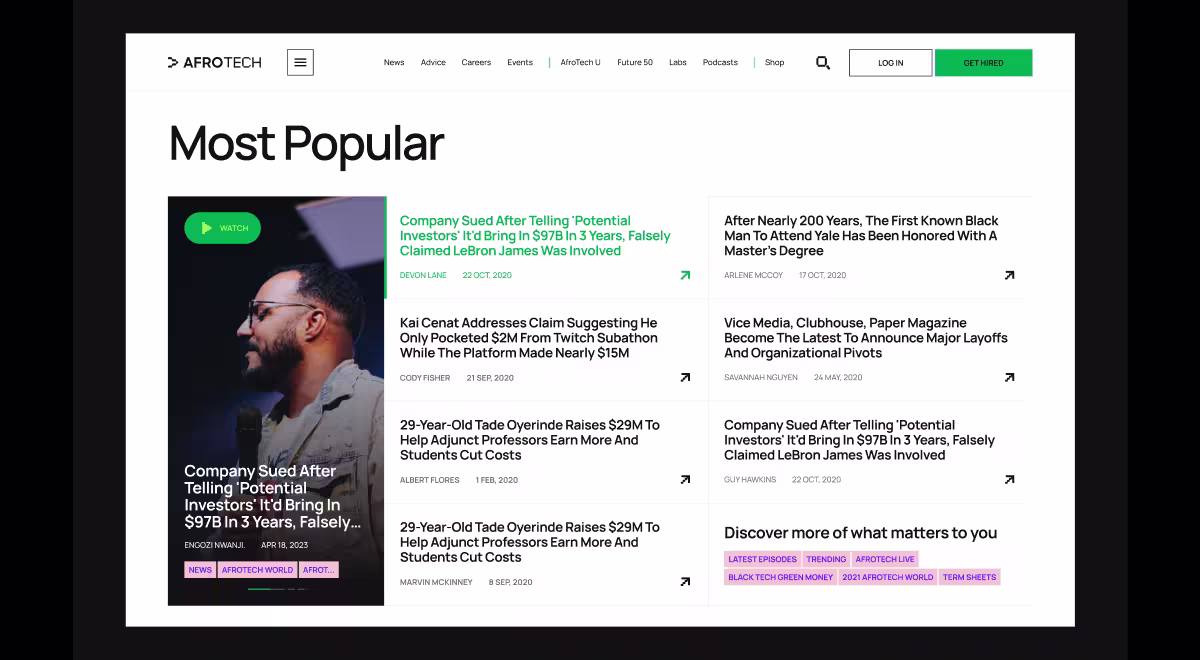
What we’ve made to improve the AfroTech retention rate:
- Dual-column feed that combines headline cards with a real-time video pane, so visitors can scan news while a keynote streams alongside. Users stay informed and entertained in one view.
- Topic filters (AI, Web3, funding) now sit above the fold and re-query the feed instantly, letting readers jump between content clusters with a single tap.
- Universal “Subscribe” CTA that appears right below the hero banner and repeats in the main nav, steadily turning casual readers into newsletter leads.
- Responsive grid for article pages which adapts long-form pieces, videos, and author bios to any screen, boosting mobile time-on-page.
“Rich content means nothing if discovery lags. Our job was to tighten that first click to first insight gap.”
{{Ostap Oshurko}}
These refinements turned a fragmented content ecosystem into a single, scroll-friendly journey. Engagement rose because every element, from filters to video panes, now works as a signpost.
🔍 Pro Tip: Heat-map and session-recording tools often reveal “cold zones” just below the fold — areas users ignore once they start scrolling. Review similar content design examples to decide where anchors will have the most impact. NNGroup, for example, recommends placing visual anchors (sub-headings, pull quotes, or inline media) every 400–600 px to renew attention and guide the eye.
2. Content page design for AI-curated digests on VTnews.ai
VTnews.ai set out to solve a modern reader’s challenge: global headlines break by the minute, yet most people have only a few spare pockets of attention. The product’s NLP engine already grouped related stories, but the interface had to balance rapid scanning with on-demand depth, so every content page design decision focused on progressive disclosure.
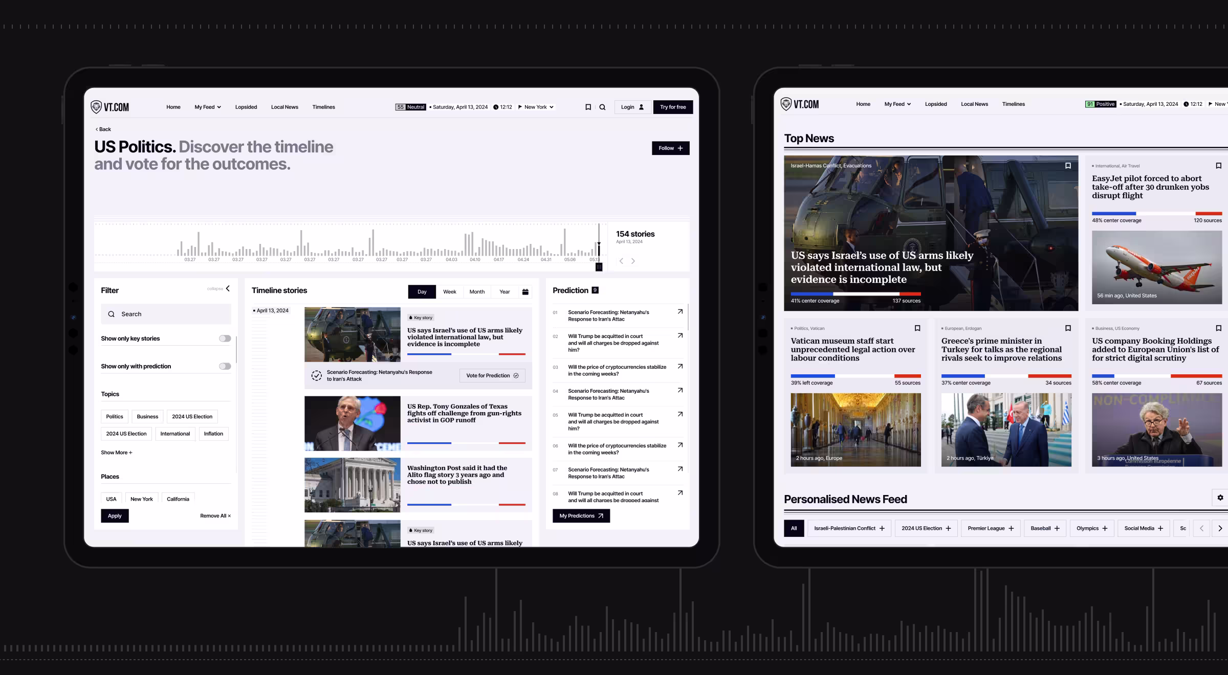
In order to help “unbias” VTnews.ai and address their retention problems, we’ve introduced:
- Contextual “Read-More” timeline that turns each bite-size capsule into a vertical chronology, so readers can backtrack developments without hunting through search pages.
- Custom Digest Builder which lets power users choose sectors, sources, and delivery frequency, shifting consumption from passive skimming to targeted research.
- Volatility markers to color-code capsules by impact, helping readers triage attention when hundreds of updates compete for focus.
“AI surfaces raw data; design extracts meaning. Capsules became anchors readers trust when they need to dive deeper.”
{{Anna Demianenko}}
🔍 Pro Tip: Keep micro-summaries under 60 words and pair them with a clear affordance (chevron, “More” label, or gentle card lift) to signal expandability. This maintains rhythm for scanners while inviting engaged readers to explore further.
3. Multimodal content hubs for Pika AI
Pika AI set out to rethink search by mixing classic engine usability with an AI assistant that curates and rearranges results on the fly. The UX brief: keep the interface instantly familiar while making the AI layer impossible to miss.
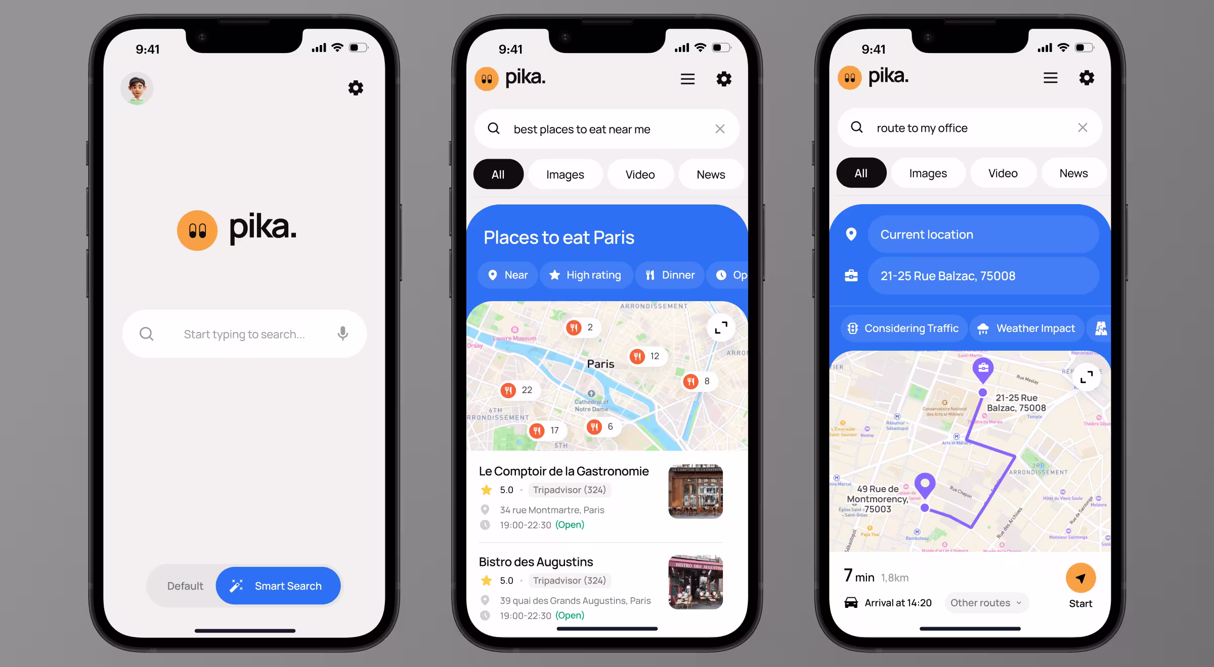
To enhance user experience with Pika AI’s search engine, we’ve implemented:
- Clean “zero-distraction” search page that mirrors familiar search patterns, then places a brightly accented AI chat widget directly beneath the bar to invite deeper queries.
- AI chat system to refine results in conversation, guide users through follow-up questions without starting a new search.
- Dynamic SERP with block-based widgets now arranges news, video, quotes, and images by relevance, following an F-pattern that matches natural eye-tracking.
- Consistent mobile experience which preserves the same design system and keeps the AI chat widget front-and-center on smaller screens.
These choices prove that thoughtful website content design can surface AI power without sacrificing familiarity.
“By folding the AI assistant into the first screen, we turned curiosity into immediate, guided exploration.”
{{Anna Demianenko}}
🔍 Pro Tip: Place the AI assistant directly below the search bar, inside the primary results zone. Eye-tracking research shows users scan pages in an F-pattern, concentrating their first fixations across the top horizontal band. Elements positioned there gain the strongest early attention.
Lazarev.agency’s tips for applying media content UX/UI design
Designing for content-heavy platforms means building systems that evolve with user needs. The following principles help translate media content UX/UI design into lasting engagement:
- Map real discovery paths
Study website content examples in your niche and trace how visitors move from the homepage to their first meaningful read or watch. Note every click, hover, and hesitation. This visual path shows where curiosity stalls and where you need stronger signposts. - Build skim layers for restless readers
Add decks, capsule summaries, inline pull-quotes, or hover previews so users can gauge value in seconds. When a summary earns a click, the full article already feels familiar, reducing bounce risk. - Design with modular building blocks
Treat hero blocks, topic chips, CTA banners, and media embeds as interchangeable pieces. A modular system lets editors spin up new landing pages or promo hubs without calling the dev team, keeping release cycles tight and design language intact. - Refresh personas before assumptions expire
User motivations shift with market cycles and cultural trends. Revisit persona data each quarter: update goals, pain points, and preferred channels. Then realign filters, navigation labels, and CTAs to match those shifts, preventing gradual UX drift.
Ready to optimize your content experience?
Elevate your content into conversion. Request a full-site UX review and see how refined navigation lifts engagement, leads, and ad yield.


.webp)


.avif)