
Since October 31, 2023, Google indexes the web mobile-first — the endpoint of a shift that began in 2016 and started rolling out broadly in 2018. If the mobile version is what Google sees first, it should be what your product team designs first, right?
That’s how mobile first web design becomes a strategy: define the revenue task, decide what loads first, and place actions where the thumb lands.
We use it as a lens for product decisions: what matters most, what loads first, and which actions deserve the thumb’s attention.
Key takeaways
- Start with the core journey and content hierarchy, then scale up. Don’t “shrink down” desktop UI.
- Pair strategy with engineering: performance budgets, touch-first patterns, and accessibility win on mobile and lift conversions everywhere.
- Use mobile first web development to align design, copy, and code around the same constraints and KPIs.
- Ship with telemetry: test on real devices across different mobile devices, track Core Web Vitals, and iterate.
From web design for mobile devices to a mobile first design strategy
“Web design for mobile devices” often means retrofitting layouts. A strategy mindset is different:
- Define the value-driving task (book, pay, confirm).
- Strip the path to the essential features.
- Expand responsibly for larger screens without changing the core flow.
This is where mobile first web development helps: it aligns product, content, and engineering around real constraints: limited space, one-hand use, slower networks, and varied screen sizes. That’s how decisions stay clear and defensible.
And the result is a tighter model that scales. A mobile first design strategy then makes the rules explicit:
- Hierarchy — what appears and loads first.
- Primary action — where the thumb lands by default.
- Success criteria — speed, completion, and error tolerance.
💡 Pro tip: Write microcopy before UI. Short, specific copy exposes what must be visible at step zero and what can move to progressive enhancement later.
Why this approach earns trust
Touch targets, response times, and visual stability are not “nice to have.” WCAG defines minimum target sizes for pointer inputs, and Google’s Core Web Vitals tie load speed and interactivity to user experience. Cite the bar, then design to beat it.
A simple example makes this clear:
- Pass scenario: Each button (Close, Save, Cancel, Export, Push) is large enough — around 44–58px wide — and separated vertically and horizontally so no targets overlap. Users can tap confidently without hitting the wrong action.
- Fail scenario: Buttons of the same size are stacked too tightly. The required 24px spacing isn’t respected, so touch zones overlap. This means a single tap might trigger the wrong control, creating errors and frustration.
That’s why spacing and target size are as important as aesthetics. It’s not just about the look of a button, but whether someone can reliably press it in motion, outdoors, or one-handed.
“Designing small first is less about pixels and more about priorities. If it’s not essential on a phone, it probably isn’t essential at all.”
{{Danylo Dubrovsky}}
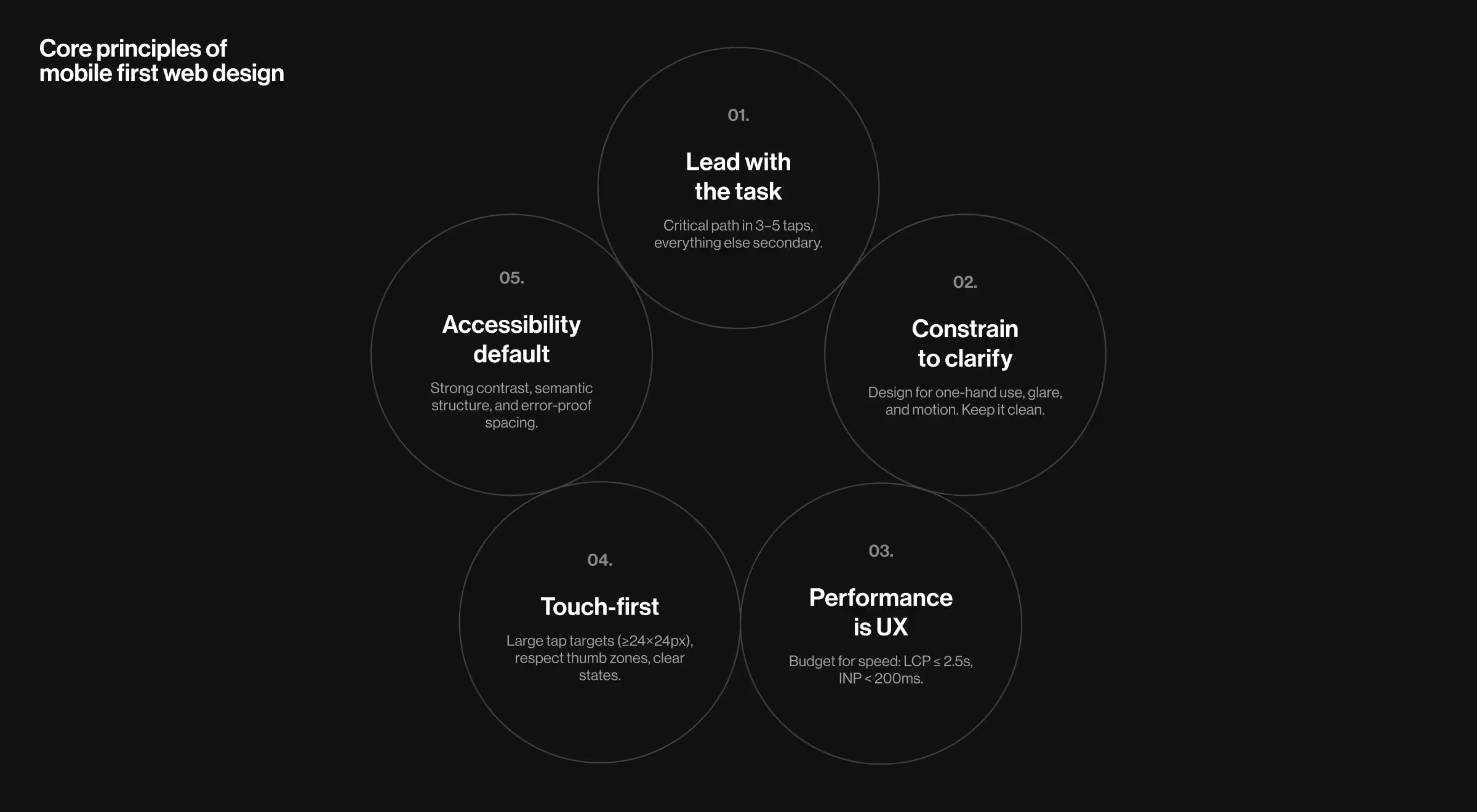
Core principles and mobile first design best practices
A mobile-first lens sharpens reasoning first, and only then — the layout. Use these principles to make better trade-offs and create mobile friendly design without clutter:
- Lead with the core task. Map the critical path in 3–5 taps. Anything that doesn’t move the task forward becomes secondary navigation, a collapsible detail, or a later step. Favor clear visual hierarchy over decorative elements.
- Constrain to clarify. Constraints reveal structure. Design for one-hand reach, ambient glare, and stop-and-go contexts (metro, line, couch). Prioritize signal over decoration, prefer progressive disclosure to crowded screens and maintain generous white space for a clutter free layout.
- Performance is UX. Budget for speed early: compress large images, inline critical Cascading Style Sheets (CSS), defer non-blocking scripts, and keep the above-the-fold Document Object Model (DOM) lean so important elements load quickly. Track Largest Contentful Paint (LCP) and Interaction to Next Paint (INP) to catch regressions — aim for LCP ≤ 2.5s and INP < 200ms across real devices.
- Touch-first interaction. Design generous interactive elements and clear states (pressed, focused, disabled). Respect thumb zones; avoid edge-to-edge actions that collide with OS gestures. WCAG 2.2 recommends at least 24×24 px targets (larger is safer).
- Accessibility by default. Maintain contrast, visible focus, and semantic structure. Touch target guidance and spatial separation help prevent accidental taps for all users, not only those with motor impairments, resulting in a more consistent user experience.
💡 Pro tip: Treat each screen’s first 1,000 ms like premium real estate. Load the primary action and its dependencies first, everything else can wait. Avoid disruptive pop ups that block the path.
🔎 If you want to see how these mobile-first rules play out in production environments, our article on mobile site optimization walks through concrete examples and wins.
Mobile first responsive web design: how it fits with responsive design
Responsive techniques determine how layouts adapt; mobile-first determines what earns the top of the stack.
Start with a solid single-column flow on smaller screens, then progressively enhance with breakpoints for comparison views or expanded tables.
Mobile first + responsive pairing gives predictable behavior for users and a sane model for teams shipping responsive websites weekly.
Mobile first design examples from the real world
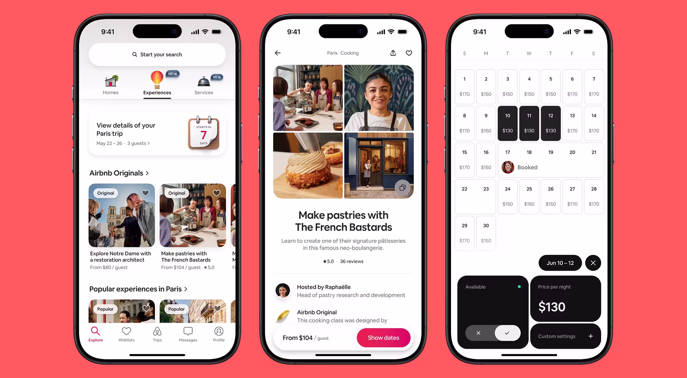
Airbnb streamlines the journey to three essentials: place, dates, guests, then progressively reveals filters and details. It proves that clarity plus pacing beats encyclopedic screens.
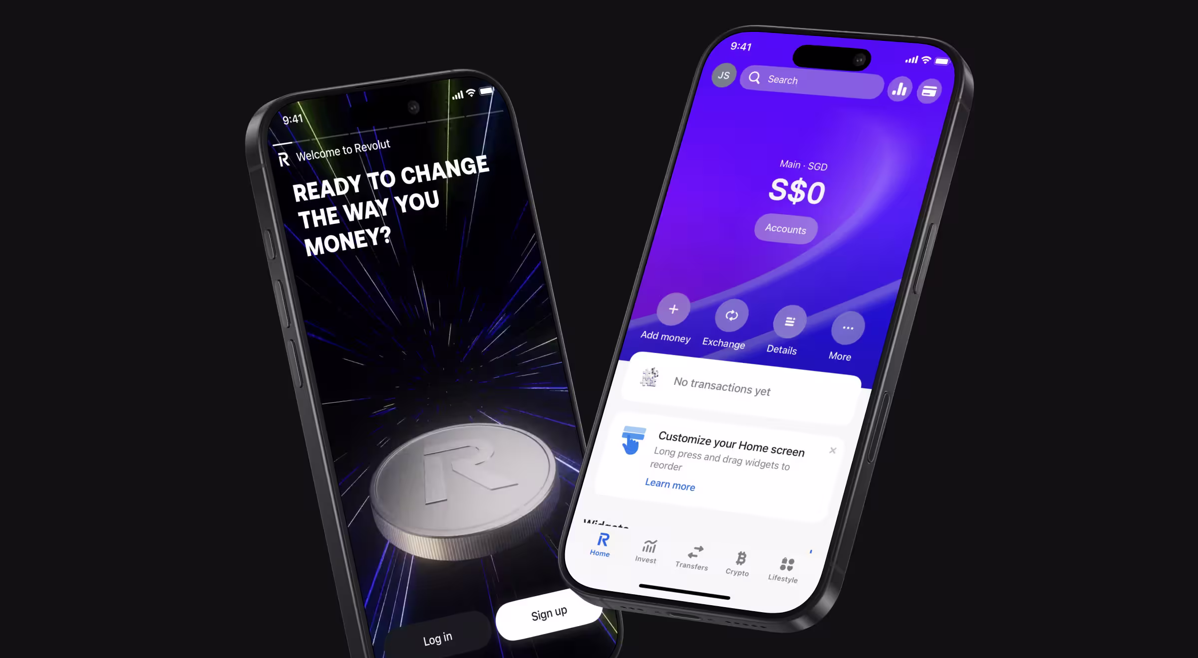
Revolut leans into one-hand banking patterns: primary actions are thumb-reachable, amounts are legible on mobile screens, and risky actions get explicit confirmation. The product reads like focused tools rather than a dense control panel.
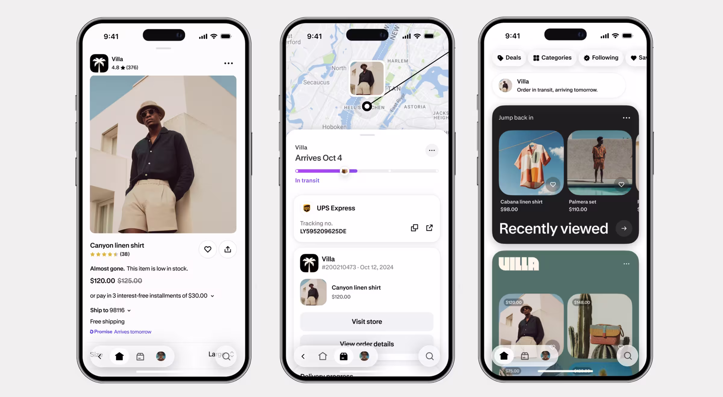
Shopify favors commerce primitives — clear CTA hierarchy, readable price + variant blocks, and fast media. Merchants can run operations on the go, while customers get less ceremony between browsing and buying.
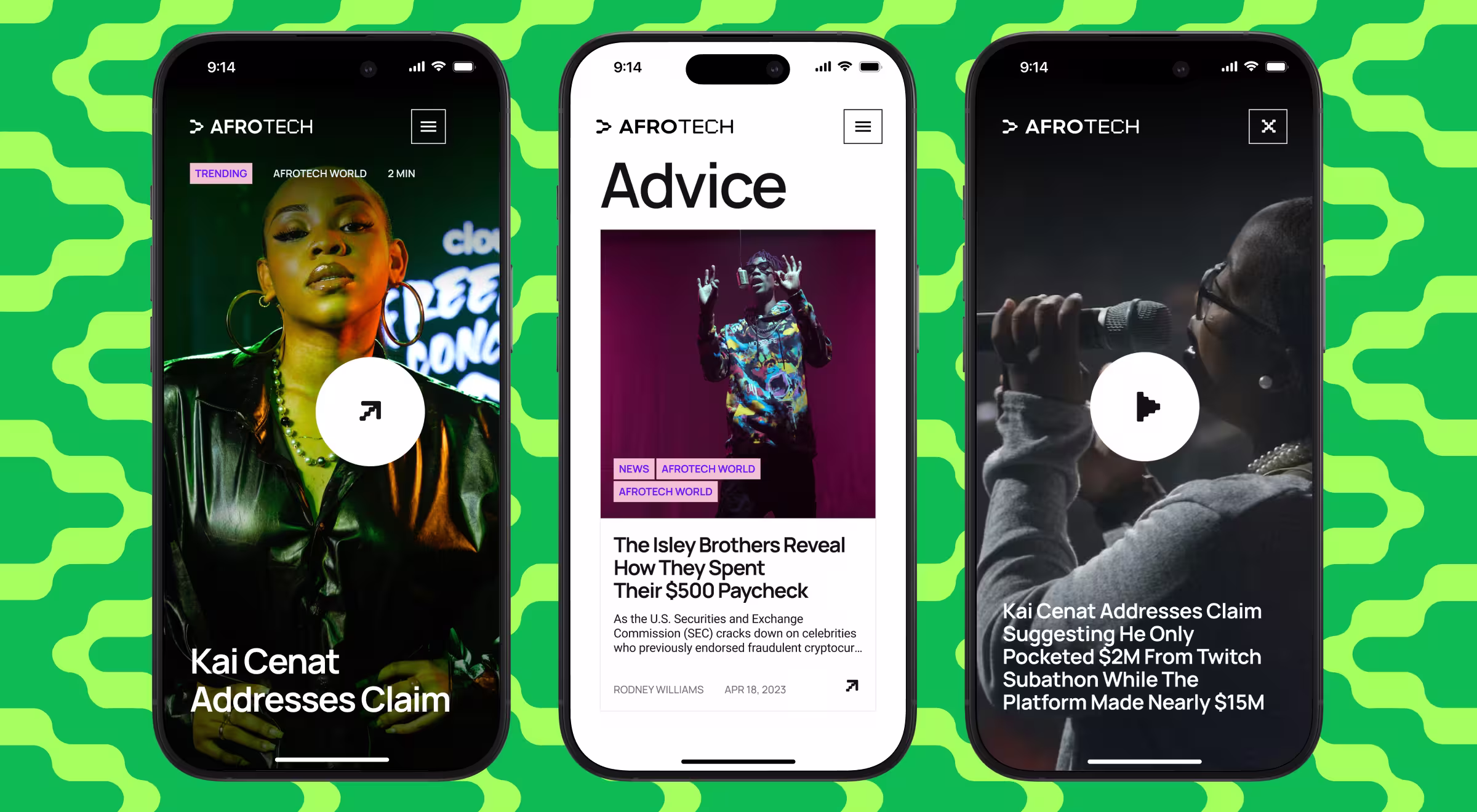
With a large share of traffic coming from mobile, AfroTech prioritized a responsive experience on phones — clear content hierarchy, legible typography, and fast media. The result is a mobile flow that feels focused in motion, then scales up cleanly on the desktop.
🔍 Patterns like pacing, thumb reach, and progressive disclosure work because they build reliable habits. Our article on 30-day mobile retention dives into the mechanics.
Building a mobile first design strategy for your business
A mobile first design strategy is only real when it’s operational. Use this section to turn ideas into artifacts, owners, and metrics, so teams ship the same mobile-first decisions sprint after sprint.
- Turn strategy into artifacts. Create three lightweight docs: a one-page content-priority table (what shows and loads first), a signed performance budget with Largest Contentful Paint (LCP) and Interaction to Next Paint (INP) targets per key route, and mobile flows with copy locked.
- Assign ownership and service levels. Name a Designated Responsible Individual (DRI) for each stream: design (flows and tap targets), content (microcopy and error states), engineering (performance and telemetry). Define service-level agreements (SLAs) for time to first balance, error-recovery time, and support response on failed payments.
- Codify patterns in the design system. Move touch target sizes, focus/pressed states, spacing, and motion into tokens and components. Add usage notes (e.g., “place the primary action in the thumb zone,” “avoid edge-swipe conflicts”) so teams don’t re-debate basics.
- Instrument before you optimize. Map events and fields for completion, drop-off, mis-tap rate, and Core Web Vitals. Set alerts on outliers. Publish a weekly dashboard of key performance indicators (KPIs) and a rollback plan if metrics regress.
- Stage the rollout with guardrails. Launch behind a feature flag to 5–10% of users, compare completion and error rates, then ramp. Keep a decision log: what shipped, what moved the metric, what didn’t. Add desktop enhancements only after mobile KPIs hold.
“A good mobile-first spec reads like a contract: what loads first, what the thumb taps, and what cannot regress without a conversation.”
{{Oleksandr Holovko}}
🔍 If you’re looking for partners who already operate with this level of mobile-first rigor, explore our list of the best product design companies building products users can’t put down.
Make mobile first web design your product strategy
Invest in mobile first web design once, and it pays back across platforms with faster paths, fewer errors, and updates that automatically adapt to new screen sizes and different devices. This also supports healthier website traffic and web traffic coming from mobile.
Need a partner to architect, design, and ship mobile-first flows that convert?
Contact us to scope a sprint and start with wireframes and a performance budget.


.webp)


.avif)