

Reviewed by: Lazarev.agency Product Strategy Team
Last updated: December 2025
Expert sources: Adjust (global D1/D7/D30 retention benchmarks), Mixpanel (cohort retention analysis), Userpilot & CleverTap (cohort dashboards), Lazarev.agency case studies (Happiness, WellSet, Activote)
To boost mobile app retention, product teams must fix week-one leaks: shorten onboarding, show value on the first screen, make the next step obvious, and build a simple return rhythm with schedules, reminders, and visible progress. Then they need to track D1/D7/D30 retention, time-to-value, sessions per user, and core-loop completion in cohorts and review these metrics next to ARPU, churn, and payback.
Key takeaways
- Fix the first session. Cut onboarding steps, show a clear value preview on screen one, and track D1 retention by onboarding completion.
- Make “what’s next” unmissable. Home = state + one tap to proceed; compress time-to-value to minutes.
- Ritualize return. Use schedules, reminders, streaks, and progress widgets to bring people back into the core loop.
- Measure what matters. Use D1/D7/D30 retention, time-to-value (TTV), sessions per user, and core-loop completion as your core metrics.
- Tie it to money. Read these metrics alongside ARPU, churn, and payback; run 30-day experiments and keep changes that move both retention and revenue.
Many mobile apps fail because users abandon them right from the start. If people don’t stay through week one, everything else leaks: cohorts shrink, revenue per user stalls, and re-engagement becomes an expensive tax.
Users often churn at onboarding, on the home screen, and between sessions. We’ll show in practice how teams can raise mobile app retention by fixing places where users drop the most — and how to track the lift. This article offers a compact, field-ready checklist on mobile app retention you can run in design reviews and sprints.
Why retention matters
Retention determines whether acquisition dollars compound or leak.
Cohort-based retention curves are the backbone of any growth forecast; they convert new-user cohorts into future Monthly Active Users (MAU) and revenue projections. Mixpanel’s documentation frames retention as critical to sustainable growth and provides the canonical cohort view for measuring “returning to value.”
App retention rate benchmarks consistently show steep early drop-offs — the Adjust user-retention guide reports typical global medians around D1 ≈ 26%, D7 ≈ 13%, D14 ≈ 10%, and ~7% by D30 (directionally similar year over year). Poor early retention means you’re paying to reacquire attention you already bought.
Where users drop and how to think about it
People exit when value is unclear or momentum breaks. Use this checklist to spot the primary cause first.
- Onboarding friction. Too many steps or early account asks → users bounce before tasting value.
Fix in one line: cut a step and show a value preview on screen one. - Home without progress. No visible “what’s next” → sessions don’t repeat.
Fix: put state + one tap at the top (resume / next task). - Long time-to-value. The “aha” sits five screens away → new users never reach it.
Fix: prefill defaults, batch choices later; measure minutes to first value. - Weak return loop. No schedule/reminder → people forget to come back.
Fix: add schedules, reminders, and streak/progress cues. - Dead-end analytics. Totals without cohorts/paths → leaks stay invisible.
Fix: switch to cohort views and path analysis for week 1.
Bridge to fixes: identify the first screen that must prove value, make the next action unmissable, and instrument every hop until users reach it.
🔎 For more insights on how user engagement is working and how to increase app retention, read our article on how to increase user engagement.
User retention strategies for mobile app: case-backed plays by behavior segment
Below are user retention strategies for mobile apps organized by behavior segment (onboarding, progress/rituals, content/utility loops) and tied to measurable KPIs.
1. Onboarding friction
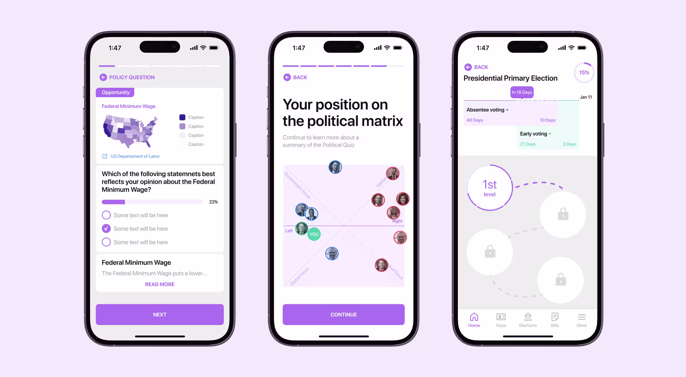
Activote (civic engagement): The team found that users spend 15 minutes in the app and then often don’t return due to an overloaded onboarding. They reduced steps and highlighted new value immediately; the homepage was rethought around a top-of-screen “Am I Vote-Ready?” widget and a personalization flow that suggests the next action. That reframes the first session from paperwork to progress.
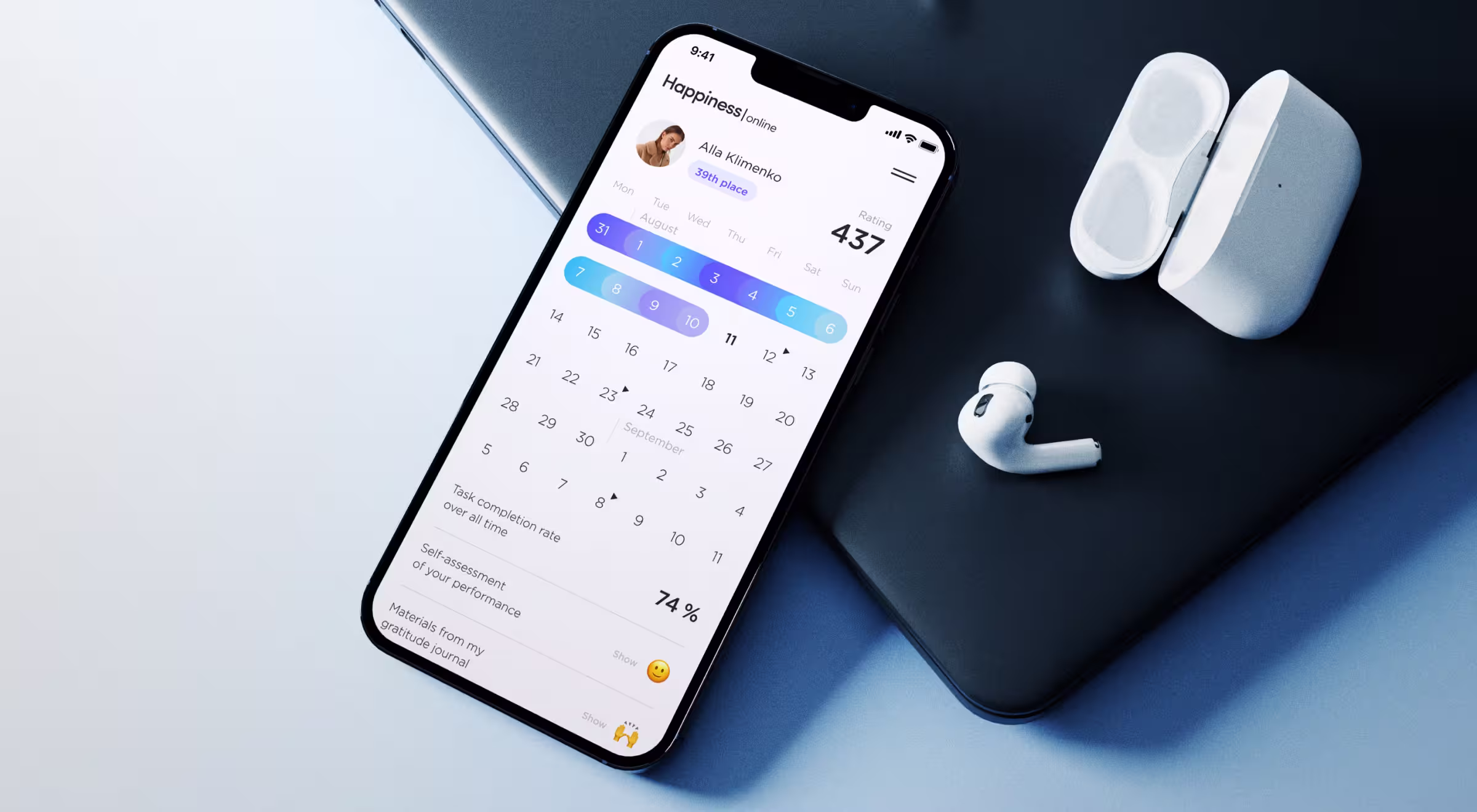
Happiness (mental health): The narrative “Happiness starts with the first tap” frames the onboarding philosophy. Early microcopy minimizes perceived setup and front-loads value; post-launch, the platform reported a +42% increase in user retention.
What to instrument: first-session completion rate; time-to-value (TTV); % of users reaching the first “meaning” event before minute 3; D1 for users who completed onboarding vs those who didn’t (delta should be material).
🔍 If you want to go deeper into designing onboarding that gets users to value in minutes, not days, explore our guide on how to design new customer onboarding, a step-by-step framework teams can ship immediately.
2. Progress visibility & ritual hooks
Happiness: The mobile-first product leans on progress-first UX with gamification elements like color-coded progress calendars, leaderboards, badges, ratings, and progress stats that keep goals visible on the home and drive repeat sessions — the exact combo that correlates with sustained use.
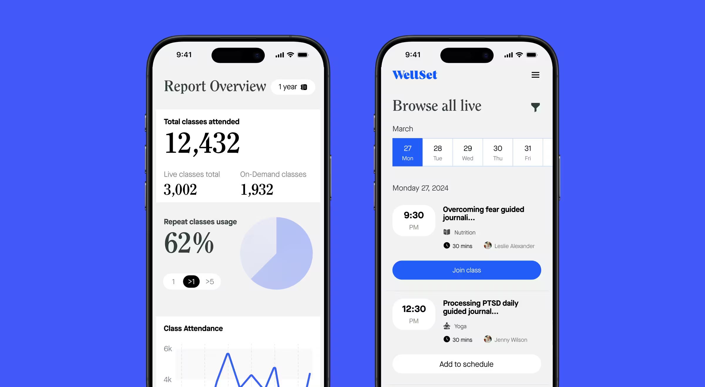
WellSet (digital holistic health studio): Schedules, “Join class/Add to schedule,” live-class timers, and personal collections create a rhythm users can follow back into the core loop. The case also reports 500K+ active users and a 30% boost in customer retention after redesign.
What to instrument: sessions/user per week; % users with ≥1 scheduled item in the next 7 days; reminder open→join conversion; “tiniest progress” nudge impact (e.g., partial goal states that invite completion).
3. Content/utility loops
WellSet: The loop is explicit: discover → schedule or join → attend → save to a Collection → recommendation for the next class. UI affordances (“Join class”, “Add to schedule”, “Save recording”) and timers for upcoming events remove decision overhead and anchor a recurring habit. Track loop completion rate and time-to-next-session; those are precursors to D7/D30.
Activote: The “Vote-Ready” widget personalizes the next best action from the first screen. Treat widget interaction → checklist completion → share or plan-ahead as your loop; look for rising % of users who complete the loop twice within 14 days.
User retention strategies mobile app problem → solution patterns you can ship now
- Onboarding → show value earlier
Problem. Long forms before any payoff.
Solution. Move one value preview (checklist, unlocked content, starter data) to step one. Delay non-critical fields; ask only what changes the experience right now. - Home → make the next step obvious
Problem. Users land and hesitate.
Solution. Put “summary of state + one tap to proceed” at the top (e.g., next lesson, next task, resume button). Default focus to the primary job. - Time-to-value → compress
Problem. Aha requires five screens.
Solution. Remove a step; prefill with sensible defaults; batch choices later. Track median minutes to the first value event. - Return loop → ritualize
Problem. People forget to come back.
Solution. Add schedules, reminders, “resume where you left off,” and streak/progress cues that acknowledge tiny wins. - Copy & micro-states → reduce uncertainty
Problem. Users don’t know if an action succeeded.
Solution. Clear labels, confirmations, and visible system status; never hide error context.
💡 Pro tip: If a widget on home can’t be described as “label → value → action” in one breath, move it deeper.
🔍 If you want to go deeper into mobile-first wins that actually move retention and conversion, explore our breakdown of design-led mobile site optimization practices packed with real patterns we’ve shipped for clients.
Mobile app retention metrics and how they tie to money
Leaders need a short list they can review weekly:
- N-day retention. For a Day-0 cohort, the share that returns and performs your qualifying action on Day N.
- Time-to-value (TTV). Median time from first open to the first “aha” event.
- Sessions per user (early window). Frequency during the first 7–14 days.
- Core-loop completion rate. Percentage who complete the sequence that defines value.
- Revenue linkage. Track ARPU and churn for cohorts with improved early behavior.
When these mobile app retention metrics improve in weeks 1–4, revenue becomes more predictable and payback gets shorter.
Bring analytics and app retention rate benchmarks together: use Mixpanel or Amplitude to baseline N-day retention and run cohort-based experiments; compare movement against category benchmarks.
Measurement that avoids false positives
- Use cohort views, not only totals. Track each weekly cohort through D1/D7/D14/D30.
- Segment by onboarding completion, channel, platform, and first action taken.
- Instrument the path from first open → value event; note where most users exit.
- Pair quant with qual (session replays, intercept surveys) only on the exact screens with leaks.
How to increase app retention: a 30-day plan you can run now
This section explains how to increase app retention in four lightweight, sequential sprints you can execute with a small team.
Week 1 — find the leaks
- Define “retained.” Agree on the one event that marks value (purchase, core action, or second session).
- Audit onboarding impact. Split D1/D7 by onboarding completion.
- Map drop-offs. Chart flows to pinpoint exits (onboarding step, first home, pre-action).
- Measure TTV. Track the share that reaches the first “aha” and how long it takes.
Week 2 — ship first-session wins
- Remove one step from onboarding; move a value preview earlier.
- Put a single, unmissable next action at the top of home.
- Add the first reminder/timer tied to the core loop.
- Re-run D1; note movement for “completed onboarding” vs. others.
Week 3 — ritualize return
- Surface progress (streaks/checkmarks/% complete) and “resume.”
- Enable one-tap re-entry from push or in-app prompts.
- Track sessions/user and core-loop completion vs. baseline.
Week 4 — tie to money & decide
- Compare ARPU and churn for improved cohorts vs. baseline.
- Keep what moved D7; iterate on the rest.
- Set the next 30-day target and document the few changes that made the biggest difference.
🔍 If you’re looking for partners who can help you ship these retention wins faster, explore our list of the 11 best app designing companies.
Want to treat retention as your design outcome?
Need a partner to turn these plays into shipped UX and measurable lifts?
Explore our mobile app design services and, if you want research-backed experiments from day one, our usability testing services as well.
Contact us now and we’ll audit your funnel and propose a practical 30-day retention plan!


.webp)


.avif)

