
The maritime industry moves on margins: fuel prices, charter rates, maintenance costs. When those data points live in a cluttered spreadsheet, even seasoned analysts struggle to see patterns. That pain triggered the complete redesign of Vessel Finance, Boel IT’s web-based calculator designed to help model capital scenarios.
We applied a data driven design approach to transform the tool from a table overload into an insight powerhouse while preserving every formula business stakeholders relied on. We swapped walls of spreadsheet cells for an interactive canvas where a visualized ship model reacts to every input. The result keeps all the numbers but turns them into a narrative users can navigate in seconds.
“The Lazarev.agency team visualized complex financial data on a clear interface and simplified the process of modeling capital costs, a solution that was recognized by the Red Dot Awards.”
{{Anna Demianenko}}
Key Takeaways
- A data-driven approach beats guesswork. Collecting data like user interviews, analytics, and usability testing at every step turns raw tables into actionable insights.
- Visual anchors accelerate user engagement. Ship-class galleries and real-time KPI cards help users identify patterns instantly, reducing cognitive load without sacrificing data depth.
- Progressive disclosure keeps complex inputs manageable. Phase-by-phase forms and inline tooltips let new users focus on one decision at a time, while power users retain full control.
- Mobile parity is no longer optional. A responsive grid, thumb-sized controls, and KPI snapshot mode ensure a consistent user experience for reviewing scenarios on the go.
Why Data-Driven UI Matters in Heavy B2B Workflows
Design decisions based on assumptions are outdated and risky. They lead to mismatched interfaces, user drop-off, and wasted development cycles. According to McKinsey, companies that use customer behavior data effectively outperform peers by 85% in sales growth and 25% in gross margin.
Data-driven UX/UI design offers a grounded path forward by aligning product logic with real behavior. UX/UI designers at Lazarev.agency use behavioral analytics, real-time user insights, and contextual research to create interfaces that support user intent and reduce friction across the entire interaction flow.
Key Pain Signals We Logged
- Too much data, too little guidance. Interviews and heuristic reviews showed that new users needed external help to finish the first calculation.
- Mobile abandonment. Web analytics reported a significant share of mobile traffic, but the desktop-only grid broke on small screens, hurting user engagement.
- Delayed feedback loops. Users changed inputs, hit Calculate, then waited for a page reload cooling momentum and misinterpreting data.
“Great data-driven UX happens when the interface catches up to user habits — or better yet, stays one step ahead.”
{{Anna Demianenko}}
These findings framed every UX/UI design decision, from component hierarchy to Google Analytics events for post-launch tracking.
From Raw Tables to Actionable Data-Driven Insights
Vessel Finance is a platform operating at the intersection of finance and logistics, built to help model and evaluate long-term capital scenarios in maritime shipping. When approaching Lazarev.agency, Boel IT had a promising MVP and a massive challenge: how to make financial literacy tools more engaging.
Numbers alone don’t motivate action. The real task was to create an experience that feels simple, personal, and worth engaging with, especially when the underlying data is complex.
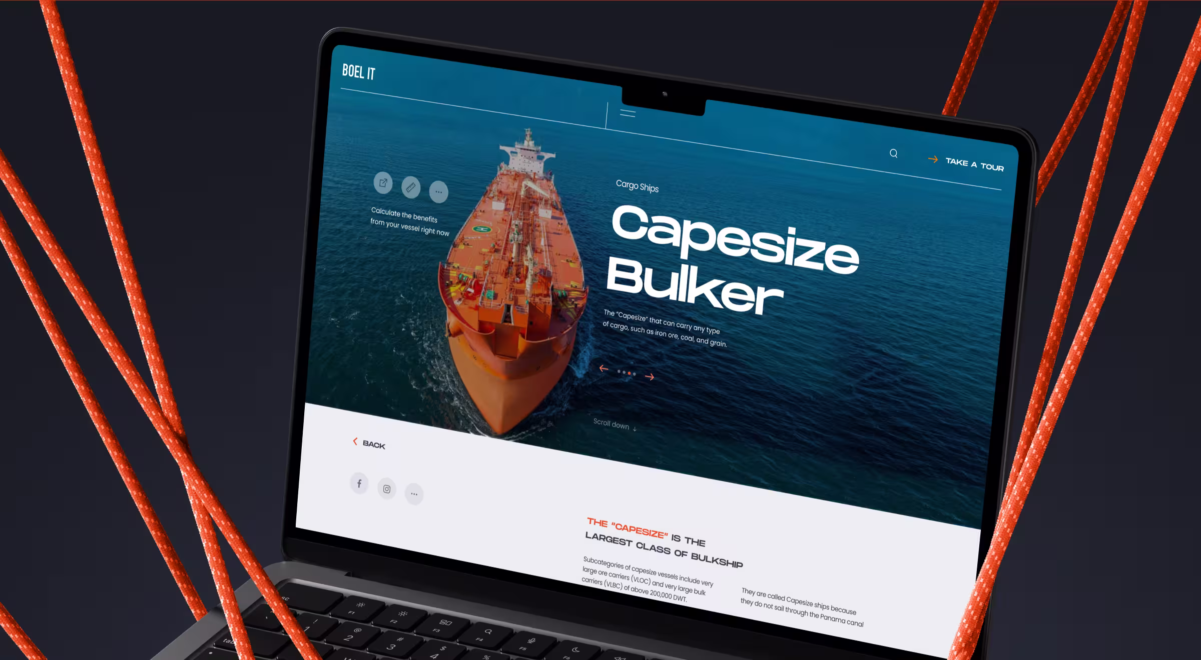
Visual Anchors Replace Abstract Rows
Before the redesign, analysts picked vessel classes from a text list. We swapped that for an interactive gallery: photo thumbnails with class names and DWT hints. Selecting a card refreshes a spec panel — starting value, tonnage, scrap value — and the outline ship graphic updates in real time. The visual shortcut lets users grasp scale and economics at a glance without scrolling through raw tables.
“Raw numbers are easy to track. Patterns that shift behavior — that’s what makes or breaks product decisions.”
{{Anna Demianenko}}
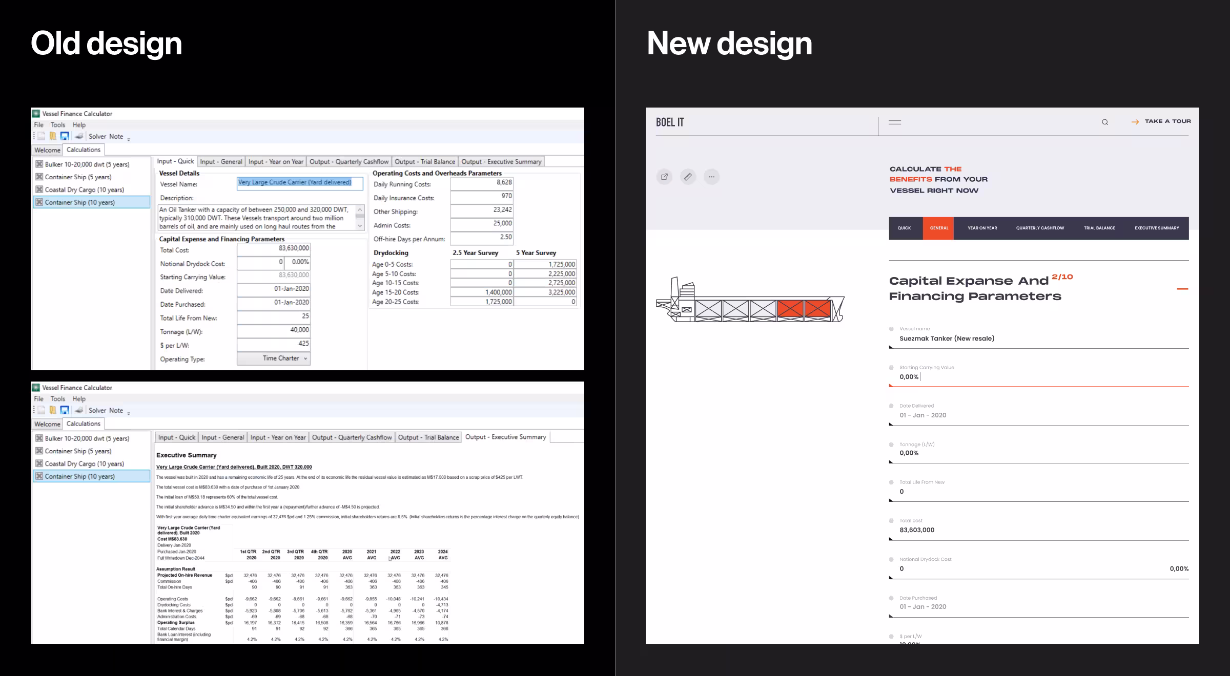
Progressive Data Entry Lowers Cognitive Load
Inputs unfold step-by-step across tabs such as Quick, General, Year on Year, Quarterly Cash-flow, Trial Balance, and Executive Summary. Within each tab, related fields are grouped under headers like Capital Expanse, Operating Costs, and Dry Docking to keep the form readable. Inline tooltips clarify niche maritime terms; the design team gathered qualitative data from support tickets to prioritize which terms needed help. Early usability testing showed noticeably fewer onboarding questions, validating a user-centric experience.
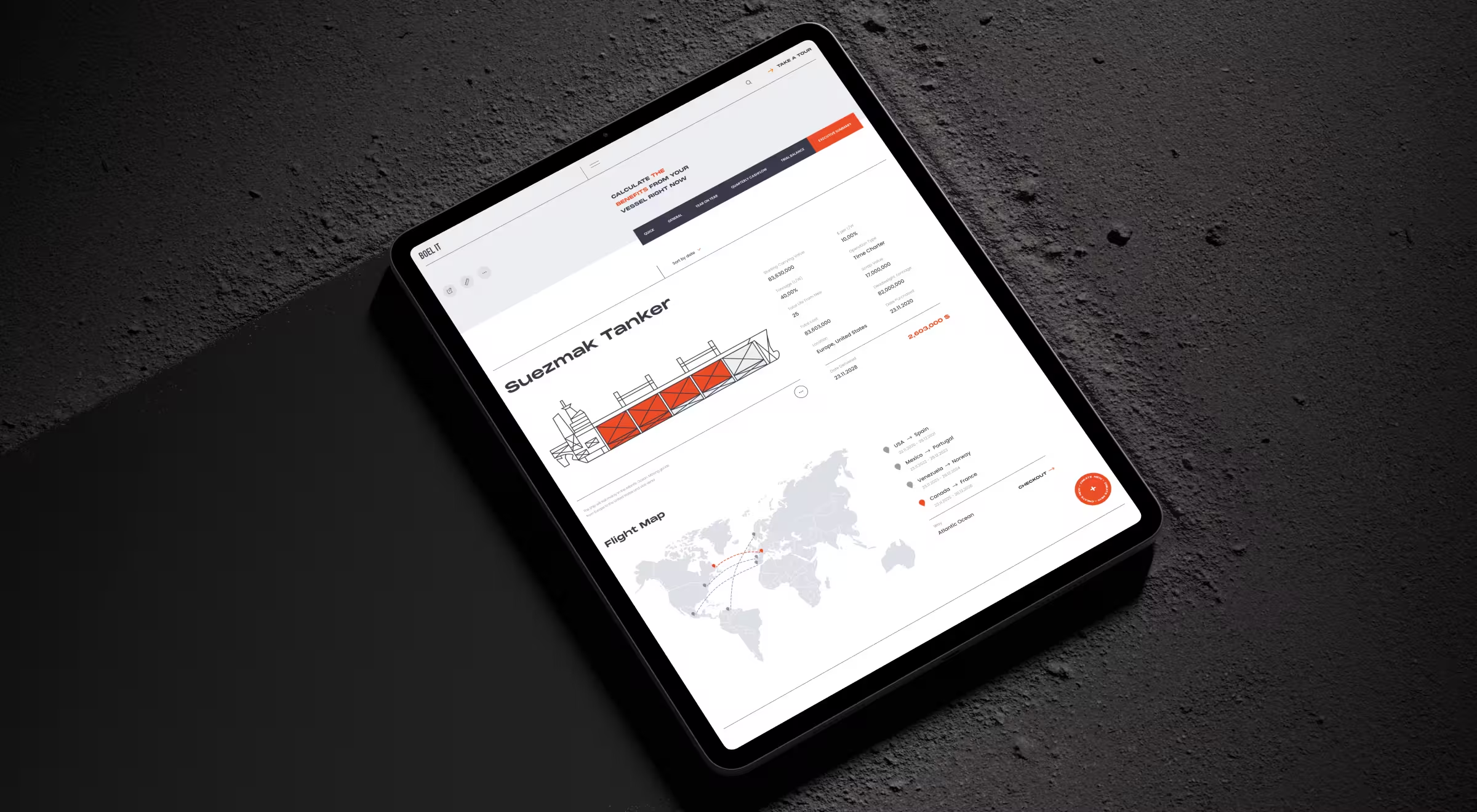
Real-Time Scenario Timeline
Changing a figure immediately redraws the Year-on-Year table and updates key numbers in the spec panel. Analysts watch cash-flow and pay-back figures shift in real time, turning each input tweak into a clear, data-driven insight. Internal tracking confirmed the refresh stays smooth even on mid-tier laptops, so users don’t lose focus waiting for a new result.
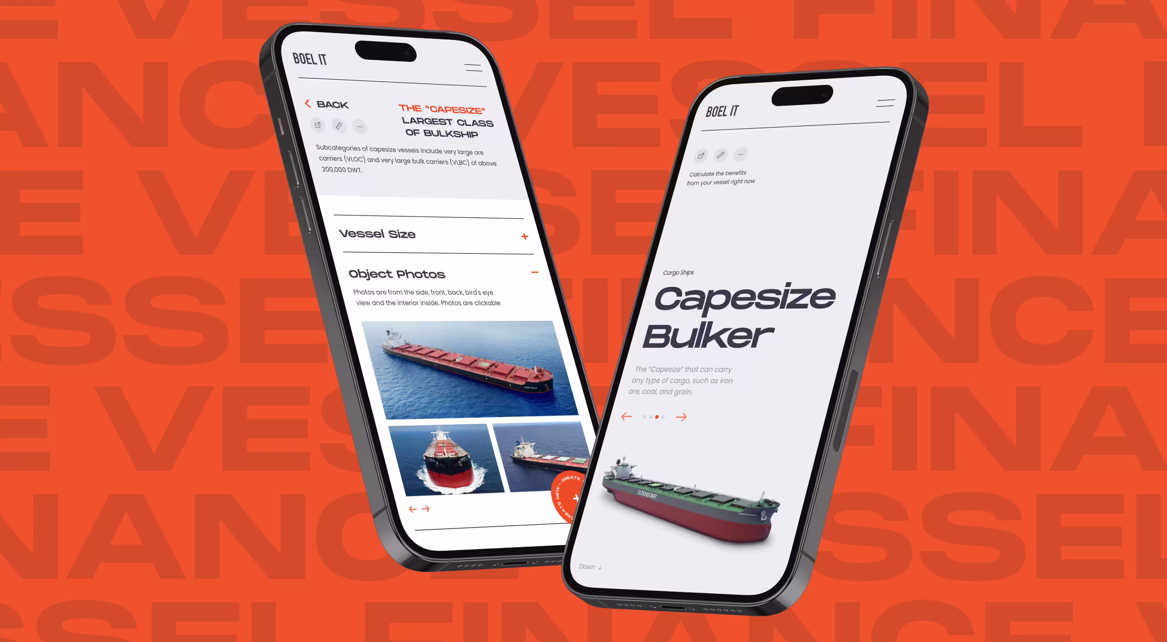
Responsive Grid & Thumb-Sized Inputs
The desktop layout rearranges gracefully on phones: input cards stack into a single column, while progress tags and tooltips remain within thumb reach. Tap targets follow the 48-pixel rule, so analysts can adjust fuel-cost scenarios right on deck without pinching or zooming — a practical blend of data-driven design and real-world constraints.
Building Feedback Loop with Analytics Data
Redesign is only the midpoint of a data-driven product cycle. To keep the calculator aligned with real user needs, the team set up a continuous feedback loop that turns live usage signals into the next round of UX refinements:
- Data collection. Custom events log every field focus, slider move, and tab switch, giving the design team fresh analytics data to guide each sprint.
- User testing cadence. Every release ends with three remote sessions that blend quantitative metrics (time-on-task) and qualitative insights (think-aloud notes).
- Iterate and release. Findings feed straight into the backlog, so every update aligns with business objectives and real user needs.
Impact the Client Can Feel
While no single metric tells the full story, day-to-day feedback from Boel IT’s finance team points to three clear wins after launch:
- Faster onboarding. New users now learn the tool from a two-page annotated walkthrough instead of digging through multi-tab spreadsheets.
- Mobile in the field. Port-side managers open calculation links on their phones rather than exporting PDFs back at the office.
- Smoother review calls. A live KPI strip lets finance officers guide senior stakeholders through “what-if” scenarios without screen-share detours.
Together, these improvements translate into tangible day-to-day efficiency for the finance teams who rely on the calculator.
Data-Driven Web Design Checklist
The matrix below distills the lessons from Vessel Finance into five audit questions any design or product team can run against its own data-heavy tool. Pair each question with the suggested analytics or UX tool, and you’ll have a starter kit for continuous, data-driven improvement.
Lessons for Products with Calculators
Data-dense calculators pose the same pitfalls across industries: too many inputs, unclear feedback, and mobile blind spots. The takeaways below capture what our team learned on Vessel Finance and can guide design crews facing similar complexity:
- Data driven UX design thrives on collaboration. UX designers, data analysts, and domain SMEs must share a single metrics board; otherwise, teams misinterpret data.
- Too much data is as harmful as too little. Prioritize data-driven insights over raw tables; hide rarely used inputs behind an Advanced toggle.
- User research never stops. Regular user interviews and field studies prevent feature drift and keep the product aligned with business objectives.
- Mobile isn’t optional. Even niche B2B audiences consult numbers on the move; responsive rules and thumb patterns protect user satisfaction metrics.
- Prototype quickly, measure relentlessly. Multivariate testing beats personal preference when optimizing for clear user journeys.
Decision-Grade UX for Complex Tools
Complex capital models shouldn’t feel complex. Let that sink in.
When millions ride on a forecast, analysts deserve an interface that surfaces insight the moment a variable changes. That’s what our team delivered for Vessel Finance, and what we bring to every data-heavy engagement.
As a B2B design agency, we pair deep user research with live analytics and multivariate testing to turn rows of numbers into interactions stakeholders trust. From audit to launch, we map business objectives to measurable UX wins, then iterate until the data says “stop.”
Interested in seeing where your own tool is leaking confidence and cash? Let’s start the conversation. We’ll map a data-driven redesign that sharpens calculations and shortens every approval cycle.


.webp)