

UX strategy is a long-term plan for aligning user needs with business outcomes. It’s defined before design starts and measured after launch.
For AI-native products, UX strategy goes deeper and covers the layer most teams overlook: inference-time behavior, failure modes, guardrails, and how users regain control when the model is slow or wrong.
If you're a Head of AI, Head of Product, or enterprise SaaS product leader moving a pilot toward commercial rollout, this article gives you the operating system: a UX strategy framework, a five-step research process, the four extra layers AI products need (articulation, trust, control, monetization), the pitfalls killing adoption, and how Lazarev.agency applies the approach across live AI products.
Key takeaways
- UX strategy for AI products is the adoption layer. 95% of enterprise gen AI pilots return zero, and over 30% of gen AI projects get abandoned after POC. The success of any AI transformation initiative depends on the UX layer above the model.
- AI UX strategy adds four layers to traditional UX. Articulation, trust, control, and monetization. Skip one and adoption vaporises before rollout.
- AI product design earns industry recognition when it ships. Elva, the voice-first AI video editor Lazarev.agency designed, won the 2026 Webby People's Voice Award for Best Visual Design AI.
- UX for AI products scales adoption fast. VTnews.ai onboarded 85,000 users in its first month, with 90% confirming the platform helped them avoid information bubbles.
UX strategy vs. UX strategy for AI: what AI products want you to do differently
Every strong digital business runs on a UX strategy. It keeps every product decision tied to real user needs and real business outcomes. It’s the key reason interfaces earn revenue at all.
The business case has been documented for two decades. Forrester's long-running benchmark places the return on UX investment at roughly $100 for every $1 spent, a directional figure still useful as a ceiling for what good experience design can return.
With AI products, the impact of UX strategy is even more pronounced.
Here's why. A conventional SaaS product comes with a predictable interface and users who eventually learn the mechanics. An AI product challenges those assumptions:
- Users express intent.
- The model reasons, selects, and produces.
- Outputs are probabilistic.
- Failure states break trust.
And the articulation barrier, i.e., the gap between what a user wants and what they can ask for, is the biggest blocker to adoption. Nothing in the model stack solves it. This is the un-automated layer, and UX strategy is the only discipline operating inside it.
The data on AI products specifically is brutal:
- 95% of enterprise gen AI pilots produce zero return, MIT Media Lab reports.
- At least 30% of gen AI projects are abandoned after proof of concept, per Gartner, with poor data quality, weak risk controls, and unclear business value being key causes.
- Only 26% of companies have built the capabilities to move AI past pilot stage into tangible value, according to BCG.
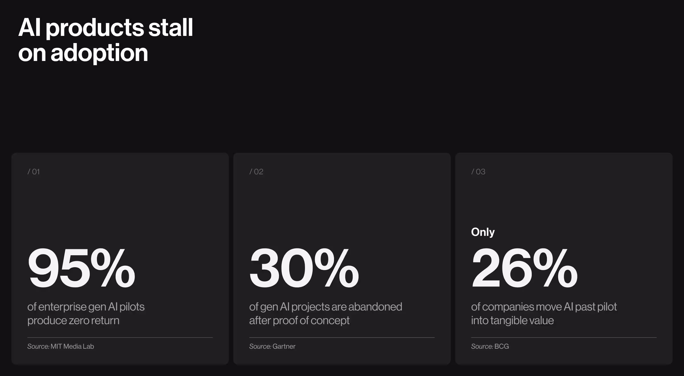
One pattern cuts across all three numbers. AI reaches capability and stops. UX strategy is how you move past that point.
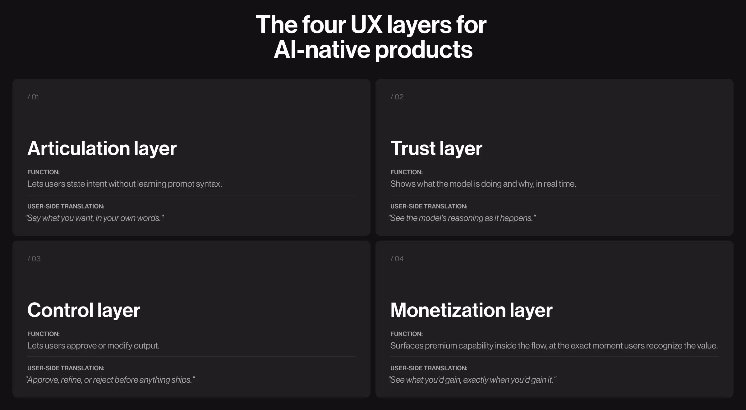
UX strategy for AI keeps the fundamentals (aligning user needs with business goals) and adds four layers generic UX strategy never needed to handle:
- The articulation layer lets users state intent without learning prompt syntax.
- The trust layer shows what the model is doing and why, in real time.
- The control layer lets users approve or modify output.
- The monetization layer surfaces premium capability inside the flow, at the exact moment users recognize the value.
UX strategy for AI-native product in practice
Elva is the proof case, now Webby-winning. It’'s a voice-first AI video editor producing finished, social-ready clips from raw camera-roll footage without a single manual edit. Conventional editors ask users to learn a tool. Elva asks them to express a desire. The brief required something only AI-native UX strategy can deliver: trustworthy "zero taps" eligible for monetization from the first second.

Lazarev.agency designed all four layers as one connected system:
- Articulation. A voice-first interaction model. Users speak a request ("make a travel reel from last weekend") and the AI handles the downstream reasoning. No timelines, no taps, no prompt syntax.
- Trust. An expressive blob persona gives the model a face and makes every processing state readable, so users always see where the AI sits in its reasoning.
- Control. An agentic flow with clarifying questions, draft-and-approve patterns, and visible preference learning. Users shape every output.
- Monetization. A context-aware storefront surfaces premium features organically inside the editing flow, at the exact moment their value lands, always alongside free alternatives.
The approach earned public recognition: the 2026 Webby People's Voice Award for best Visual Design AI. As Kirill Lazarev put it after the win: "Good UI is what makes AI usable." On AI products, the UX strategy decides whether the model finds adoption or gets abandoned. Elva is what the first outcome looks like, shipped end-to-end.
UX strategy framework: 6 components to make it work
A UX strategy keeps six things aligned at once: business outcomes, user evidence, instrumentation, cross-team ownership, build-ready handoff, and measurement. The components below cover all six. Each one is paired with the failure mode it prevents and the signal showing it's working.
1. Business alignment
Business alignment means every design decision traces back to a named business outcome — revenue, feature adoption, retention, time-to-value, or time-to-decision.
What goes wrong: Design ships based on executive taste or the subjective "industry best practice". The team ends up defending a beautiful onboarding flow in a Quarterly Business Review (QBR) without a number attached to it.
What to check before the next sprint:
- Can the design lead name the metric this screen is built to move?
- Is this metric already instrumented in product analytics?
- If the number doesn't move in 90 days, who is accountable for the call to revert or iterate?
It's working when: Your Head of Product can walk the board through the UX roadmap using revenue and adoption numbers.
2. User understanding
Validated research means interviews, behavioral data, user feedback, synthetic user simulations, and the edge cases sales brings back from enterprise demos.
What goes wrong: Teams research the happy path and ship. For AI products, it doesn’t work. If you want to make the AI value visible, start with the layer that decides whether the product earns trust: what users do when the model is slow, wrong, or blocked.
What a full research plan covers:
- Generative research (interviews, field studies) for new problem spaces
- Evaluative research (usability tests, A/B tests) for existing flows
- Behavioral analytics for what users do
- For AI products: synthetic user simulations against realistic or synthetic data — inference-time behavior tested before engineering builds
It's working when: Every shipped feature has documented user evidence attached.
3. Data and feedback
Events, funnel instrumentation, and in-product feedback belong in the first Figma file.
What goes wrong: Analytics arrives late. By the time the dashboard exists, no one remembers what question each event was meant to answer, and the team is blind to AI feature adoption when the C-suite asks.
What to instrument before the first screen ships:
- Activation events (first-value moments)
- Drop-offs at each state, including loading, empty, partial, uncertain, error, and override
- AI-specific signals: when users accept, override, retry, or abandon a model output
- Qualitative feedback surfaces inside the product
It's working when: When someone asks "why is AI adoption flat?" the team opens a dashboard.
4. Team collaboration
The strongest strategies are co-owned by product, engineering, AI, and go-to-market, with a single accountable lead.
What goes wrong: Design ships a strategy deck. Engineering reinterprets it. GTM tells a third version in the demo. The product feels like three different teams built it (because they did).
What to put in place:
- One brief per initiative, signed off by product, engineering, AI, and GTM leads
- Documented trade-offs at every structural decision
- A single accountable lead holding scope and outcome
- Weekly working sessions
It's working when: Your demo story, product UX, and sales deck use the same words for the same features. At Lazarev.agency, we run this as a "temporary design cofounder" model — one partner holding the line across functions so product, AI, and engineering ship from the same brief.
5. Execution framework
A strategy that can't be handed to engineering is a pitch deck. The execution framework is what engineers can implement without reverse-engineering intent.
What goes wrong: Designers hand off ideal-scenario Figma files. Engineering gets blindsided in sprint planning by states nobody designed: loading, empty, partial, uncertain, error, override. For AI products, guardrails and fallback behaviors surface in production at 2 a.m.
What a build-ready framework includes:
- Core flows plus every state engineering has to support
- Design tokens and components tied to your existing system
- For AI products: guardrails, human-in-the-loop patterns, fallback behaviors, and latency budgets per interaction
- Handoff documentation written in the naming conventions your team already uses
It's working when: Engineering estimates come back the same week.
6. Outcome measurement
An eval harness is the set of success metrics and behaviors tested before launch, tracked after launch, and revisited every quarter.
What goes wrong: Teams ship AI features, declare victory on roadmap slides, and discover a few months later that usage is shallow.
What the default eval harness covers:
- Task completion and time-to-value
- AI feature adoption across four stages: aware, tried, used weekly, embedded in workflow
- Time-to-decision or time-to-insight in the workflows the C-suite cares about
- QBR-ready proof of impact — numbers you can show an enterprise client without a slide-making crunch
It's working when: Your next QBR runs on live product data. The AI story writes itself.
UX research process end-to-end: 5 steps every digital product needs
The five steps below describe the research process any digital product moves through on its way to market, whether it's a consumer app, an enterprise tool, a SaaS platform, or an AI-native product. The specifics shift with the product (which failure modes you probe, how you measure success), but the sequence itself holds.
This is the foundation. What AI-native products additionally demand on top of it is covered in detail in the next section.
Step 1. Set research goals and business questions
Before running a single interview, answer one thing: what are you trying to learn? A vague "understand our users" brief produces vague findings. Sharp questions produce sharp insights.
Ask goal-driven questions like:
- Why do free users hesitate to upgrade?
- What features keep loyal users coming back?
- How to increase MQL to SQL conversion?
Pro tip: Tie each question to a business outcome (retention, free trial to paid conversions, expansion, support deflection) so the research earns its place on the roadmap.
Step 2. Run a UX audit of what exists
For any product already in the market, the audit comes before the interviews. A UX design audit evaluates the current product against heuristics, accessibility standards, analytics signals, and user feedback.
For greenfield products, run a competitive audit instead: pick three to five comparable products and evaluate them against the same criteria. Either way, the audit is diagnostic. It tells you where to point the rest of the process.
A strong UX audit covers:
- Heuristic evaluation (Nielsen's 10, UI design principles)
- Accessibility check against WCAG 2.2
- Analytics review (funnels, drop-off points, time-on-task)
- Support ticket patterns and user review themes
- Competitive benchmarks for comparable products
Pro tip: Accelerate the competitive half of the audit with AI. Prompt: "Act like a UX strategist. Analyze the top three competitors of [your product]. Compare their onboarding flow, messaging, and overall experience. Where are the strengths, weaknesses, and opportunity gaps?"
Step 3. Run primary research with target users
By this point you know what you're trying to learn (Step 1) and what the product looks like today (Step 2). Step 3 is where you put the product in front of the people it serves.
Two methods do most of the work: user interviews and usability testing. Run them in sequence, and each one sharpens the other.
3.1. User interviews
Interviews uncover the goals and decision criteria invisible to analytics. Keep sessions open-ended and focused on behavior:
- Focus on recent behavior: "the last time you did X" gets real answers
- Probe workarounds — every workaround points to a product gap
- Record jobs-to-be-done language in the user's own words for later synthesis
Eight to twelve interviews per user segment surface the dominant patterns. More interviews, diminishing returns.
3.2. Usability testing
Usability testing shows how your target audience uses the product. This is where assumptions break and surprises arrive.
Testing formats:
- Moderated: you guide and ask follow-ups
- Unmoderated: users run through solo; you review later
- Remote: easier to scale, good for diverse users
- In-person: best for complex flows or physical products
Focus on what clicks, where users stall, and which assumptions fail under real use. Record sessions; patterns become visible on the second or third review.
Pro tip: Pair the two methods to stress-test your working UX persona. When the findings don’t match who the team thinks you're designing for, the persona needs updating before the next research round.
Step 4. Synthesize findings into insights and a product roadmap
Raw notes aren't a strategy. Synthesis is how observations become decisions.
Synthesis methods:
- Affinity mapping: cluster similar quotes and behaviors into themes
- Journey mapping: visualize user steps and UX barriers
- Pain point ranking: score issues by frequency and severity
- Opportunity mapping: plot where user needs and business goals overlap
An AI product launch roadmap looks different from a SaaS roadmap for exactly this reason. A traditional roadmap sequences features against release dates. An AI product roadmap sequences model behavior, data collection, and UX against adoption milestones, because the product keeps learning after launch.
Pro tip: We've documented the full approach in AI product roadmap 2026: how to build one with a training-loop method, which walks through sequencing research findings against model iteration, data flywheels, and adoption gates.
Step 5. Keep testing after you ship
Research doesn't end at launch. Implementation testing confirms whether the changes worked.
Continuous research moves:
- Prototype tests before full engineering commits
- A/B tests on live traffic to compare variants
- Cohort analysis to track behavior over time
- Longitudinal studies for retention and long-term impact
Pro tip: For AI products, add model-specific observability: where the AI fails, and where users override suggestions. These signals feed straight back into step 1 for the next research cycle — the loop never closes.
4 extra UX layers for AI-native products
The five steps above apply to any digital product. AI-native products need a second scaffold on top of them: four UX layers specific to systems users can't directly operate. Without these layers, even a technically excellent product can still fail adoption.
Layer #1. Articulation
If users have to learn prompt syntax, they won't. People think in fragments: incomplete sentences, ambiguous goals, half-formed questions. The articulation layer is where every UX move meets them in their own language.
Core moves:
- Clarifying questions when intent is ambiguous
- Example prompts and smart suggestions to avert the blank-page problem
- Input patterns accepting voice, text, and structured commands in one field
How this showed up in Pika AI. Asking mass-market users to learn prompting is unrealistic. We designed Pika around the familiar search paradigm users have worked with for years: a search bar with an AI chat widget positioned immediately below, accentuated with vibrant color to invite engagement without forcing it.
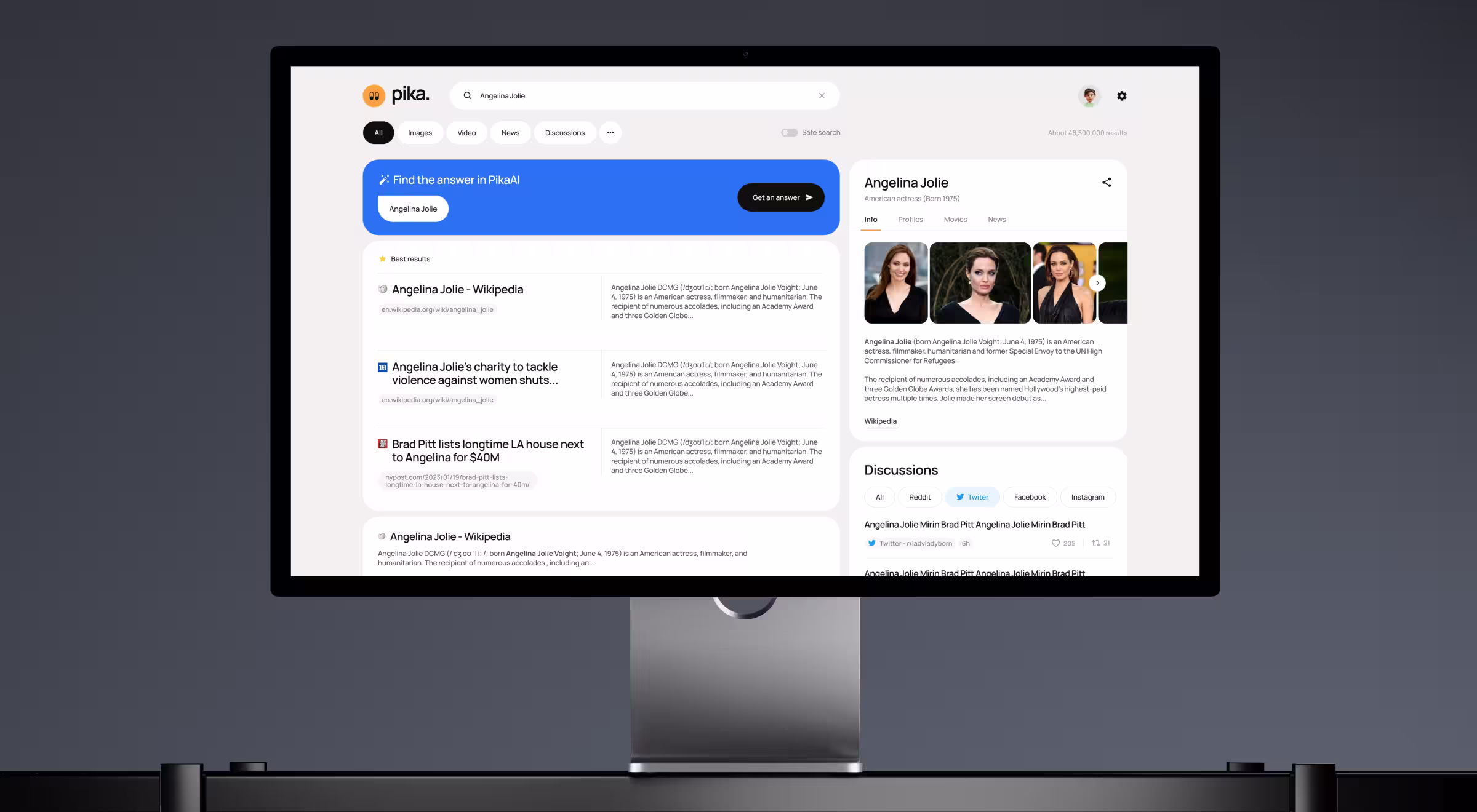
Users can search the way they always have, or they can drop into AI chat for deeper queries. The articulation barrier never exceeds what they already know, and the AI feels like an extension of search.
Layer #2. Trust
Users won't act on AI output they can't interrogate. The trust layer makes the model's reasoning visible at the moment the user decides whether to rely on it.
Core moves:
- Source attribution for every claim or generated answer
- Confidence signals (explicit or implicit) so users know what to verify
- Real-time processing states showing the model's activity
How this showed up in VTnews.ai. A news platform promising unbiased coverage has to prove it. We built a real-time bias scale into every story, with three-perspective overviews covering left, center, and right-leaning media, and coverage-distribution bars showing which outlets are amplifying an event and which are ignoring it.
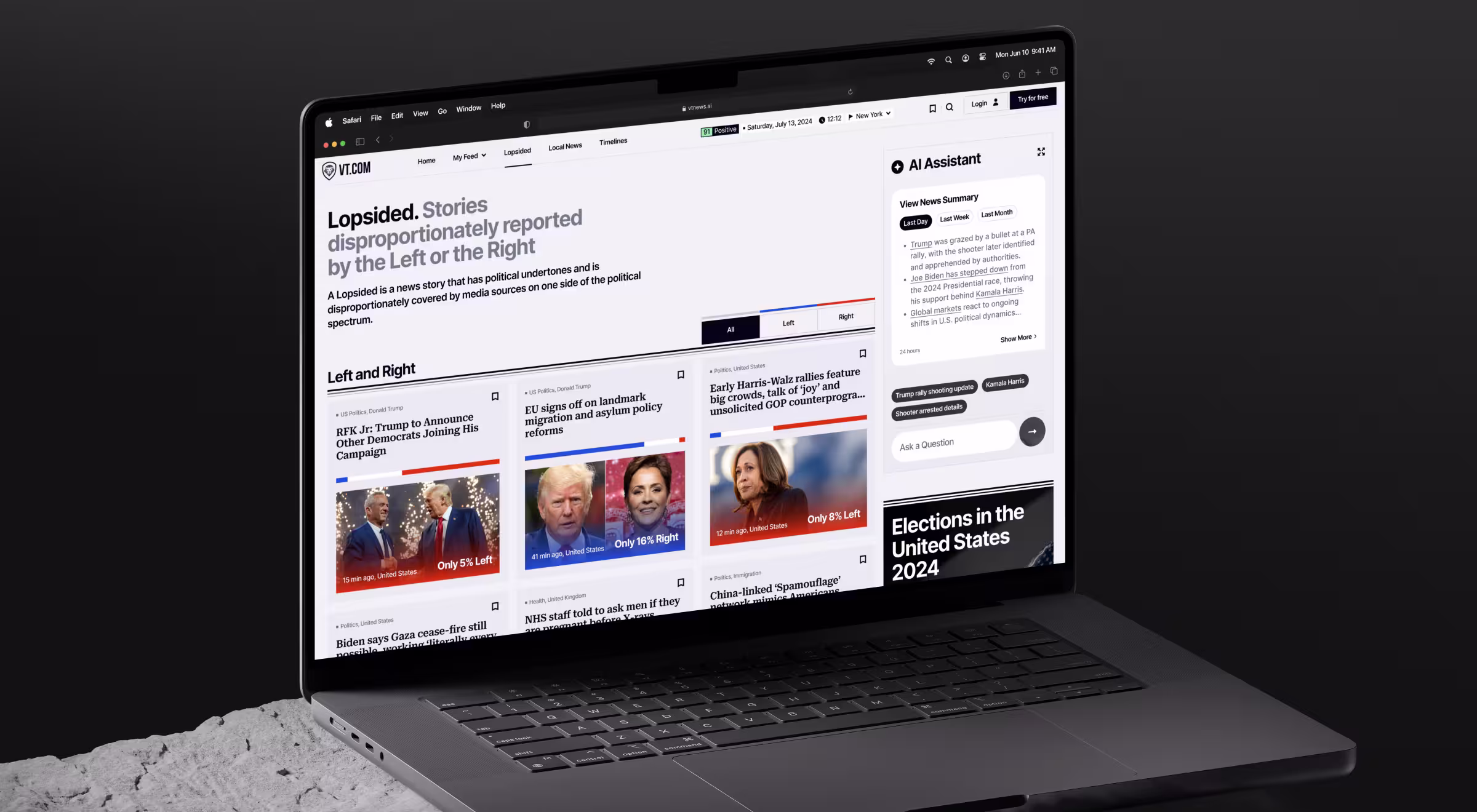
The AI's reasoning sits on the interface as a readable layer. Users can check the math on any given headline. As a result, 90% of users confirmed the platform helped them avoid information bubbles, and 85,000 users onboarded in the first month post-launch.
Layer #3. Control
AI output arrives as a draft. The control layer gives users the levers to accept, refine, or reject what the model produces before it commits to action or gets shared.
Core moves:
- Draft-and-approve patterns for generative output
- Inline editing and conversational refinement (full regenerations only when the user asks for one)
- Explicit opt-in for consequential actions: send, publish, pay, delete
- Preference learning the user can see and correct
How this showed up in Accern's Rhea. Financial analysts need to direct an AI toward a specific answer. We designed Rhea's adaptive natural-language communication system to ask clarifying questions when a query is unclear and surface suggestions when results come back noisy. We also expanded the standard chat field into a multi-purpose command line so every interaction stays user-driven.
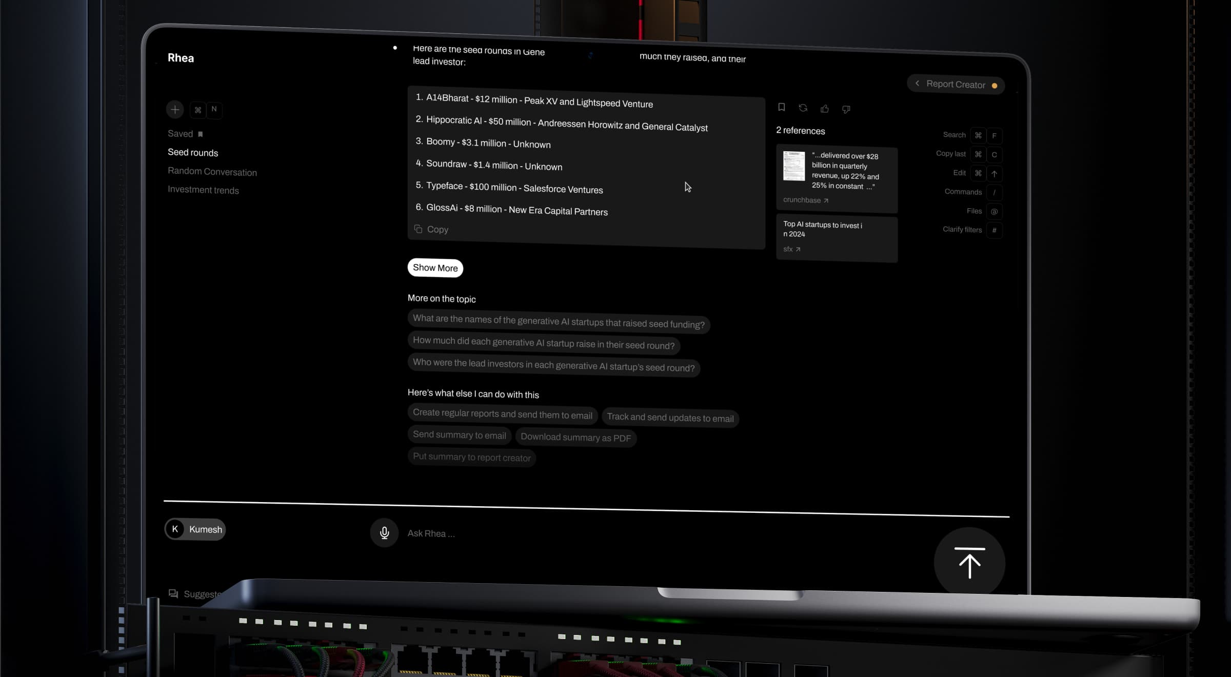
That’s how Rhea became the catalyst for Accern's leap from Series B to an eight-figure acquisition, with $40M+ raised across our multi-year partnership.
Layer #4. Monetization
Most AI products hide monetization behind a settings tab, thus eroding conversion. The monetization layer threads premium capabilities into the workflow, so the user sees what they'd gain exactly when they'd gain it.
Core moves:
- Context-aware upsells tied to specific in-flow moments of value recognition
- Premium features previewed alongside free alternatives, so the trade-off is visible
- Every monetization touchpoint doubles as a product demo
How this showed up in Elva. We designed a context-aware storefront for surfacing upgrades inside the editing flow. When a user's video could benefit from a premium filter or licensed audio track, Elva presents the upgrade at exactly the right moment, alongside free alternatives.
Every monetization touchpoint doubles as a product demo, and the upgrade question shifts from "which plan am I on?" to "I can see what I'd get, and I want it".
Traditional UX strategy vs AI-native UX strategy
For Heads of AI and Design Leads who want the distinction on one screen, here’s a side-by-side view of traditional vs AI-native UX strategy.
- Traditional UX asks: "How do we reduce friction in a flow users already know?"
- AI-native UX asks: "How do we shape a flow users have never seen before, run by a system users can't fully predict, so they trust it enough to come back?"
The five research steps stay constant. The four layers above are what AI-native products build on top of them.
Common pitfalls in AI-native UX strategy and how to fix them
Even seasoned product teams make strategic mistakes when the product is AI-native. Four failures show up over and over, and none of them are about the model itself. They're about how teams plan, measure, ship, and collaborate around AI.
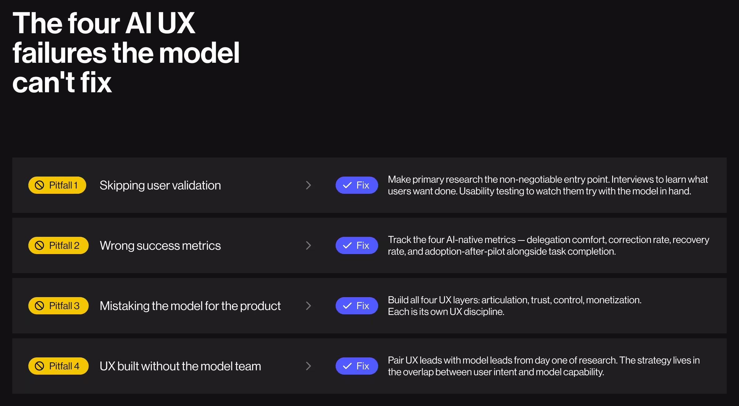
Pitfall 1. Skipping user validation
The fix. Make primary research the non-negotiable entry point: interviews to learn what users are trying to get done, usability testing to watch them try with the model in hand.
AI products doing this well:
- GitHub Copilot ran in closed technical preview for more than a year before general availability, specifically to learn which completion patterns developers would accept and which ones felt intrusive.
- Perplexity built inline citations on every claim.
Pitfall 2. Wrong success metrics
The fix. Measure what matters for AI products:
- Delegation comfort: how much of the workflow users are willing to hand off
- Correction rate: how often users modify or reject model output
- Recovery rate: what percentage of weak outputs get repaired in one refinement
- Adoption-after-pilot: the MIT NANDA failure point, tracked explicitly
AI products doing this well:
- GitHub publishes data on Copilot tracking acceptance rate of suggestions per developer, a direct proxy for trust and utility generic engagement metrics would miss.
- Anthropic and OpenAI evaluate interface-level AI quality using acceptance rate and harmful-output correction rates alongside retention, with the AI-specific metrics treated as primary.
Pitfall 3. Mistaking the model for the product
The fix. Build all four UX layers. Each layer is a different UX discipline.
AI products doing this well:
- Notion AI launched with all four layers visible: prompt starters at every text block (articulation), citations for AI-generated content (trust), accept/regenerate controls per output (control), and AI bundles tied to Notion paid plans with contextual upgrade cues (monetization).
- Linear's AI features (auto-drafts, suggestions) live inside the existing product flow with no separate "AI section." Every interaction stays in context, and the user never has to switch modes to use the model.
Pitfall 4. UX built without the model team
The fix. Pair UX leads with model leads. UX defines what the user wants to feel. The model team defines what's technically possible. The strategy lives in the overlap.
AI products doing this well:
- OpenAI's ChatGPT product team works in tight collaboration with the model training team, which is why prompt guidance and UI affordances update in lockstep when the underlying model changes.
- Anthropic ships Claude features (Projects, Artifacts, Agent Skills) as joint model-and-interface launches, with interface patterns designed against the specific capabilities of each model release.
None of these pitfalls require a smarter model to fix. They all require sharper UX strategy across the four layers AI-native products depend on.
Want your UX strategy to work and win?
Great models don't survive a bad UX. If articulation is vague, trust cues are missing, control is absent, or monetization breaks at scale, users walk. We see the pattern across every AI team moving fast with a broken UX layer underneath.
Lazarev.agency builds the layer underneath. Elva won a 2026 Webby. Accern's Rhea helped close an eight-figure acquisition. VTnews.ai hit 85,000 users in its first month. Pika AI shipped with a trust layer built in.
If you're moving an AI product from PoC to paying users, we're the team to ship it with. Book a strategy call, and we'll map the UX layer your product needs next.


.webp)


.avif)


