
Most "dashboard UI examples" roundups are screenshots with captions. Pretty interface, brief description, next slide. Nobody walks away knowing what to build differently.
This article is structured around a different premise. Each example exists to expose one specific UI decision, the kind of component-level choice most teams make by instinct, under deadline, without stopping to ask whether instinct is right. A dashboard can look finished the moment you add enough charts. Yet, finished and functional are not the same thing.
Key takeaways
- The chart type of your UI dashboard design must match the question being asked.
- Density calibration requires knowing the end user.
- Empty states, stale data, and failed fetches are core UI design problems.
The UI decisions every dashboard requires
Before the examples, a vocabulary check. Four decisions appear in every dashboard UX design project, and most teams make them badly.
- Number card vs. sparkline vs. full chart: Use a number card for a quick status check, a sparkline to show trend direction, and a full chart only when comparing specific points or categories. Overusing full charts makes dashboards visually tiring.
- Table vs. bar chart: Bar charts reveal patterns at a glance; tables give exact values. Pick the right format to reduce mental effort, for example, a bar chart quickly shows which sales rep is behind quota.
- Information density: More data competes for attention. Daily operations dashboards can be denser than executive overviews. Adjust density based on user and session length.
- Typography hierarchy: Size, weight, and color guide the eye. A 32px semibold metric value with an 11px medium-gray label shows where to look first. Without hierarchy, users scan randomly and miss key numbers.
🤓 Want to know how to structure dashboard data and build interfaces users actually trust and adopt? Dive into the dashboard design guide.
5 UI design dashboards with well-executed decisions
Great UI dashboards are the result of deliberate, well-executed decisions. Every spacing choice, color cue, data hierarchy, and interaction pattern is intentional, and the same holds across the ten product UIs we take apart here.
The best dashboards reduce cognitive load, guide attention, and help users act faster without thinking twice.
Below are five UI design dashboards where smart decisions created a clear, usable experiences.
1. Fractal Protocol
Fractal Protocol is a digital marketing platform with a DeFI protocol dashboard. Users manage multiple collateralized positions simultaneously, each with its own balance, debt, interest rate, and health factor.
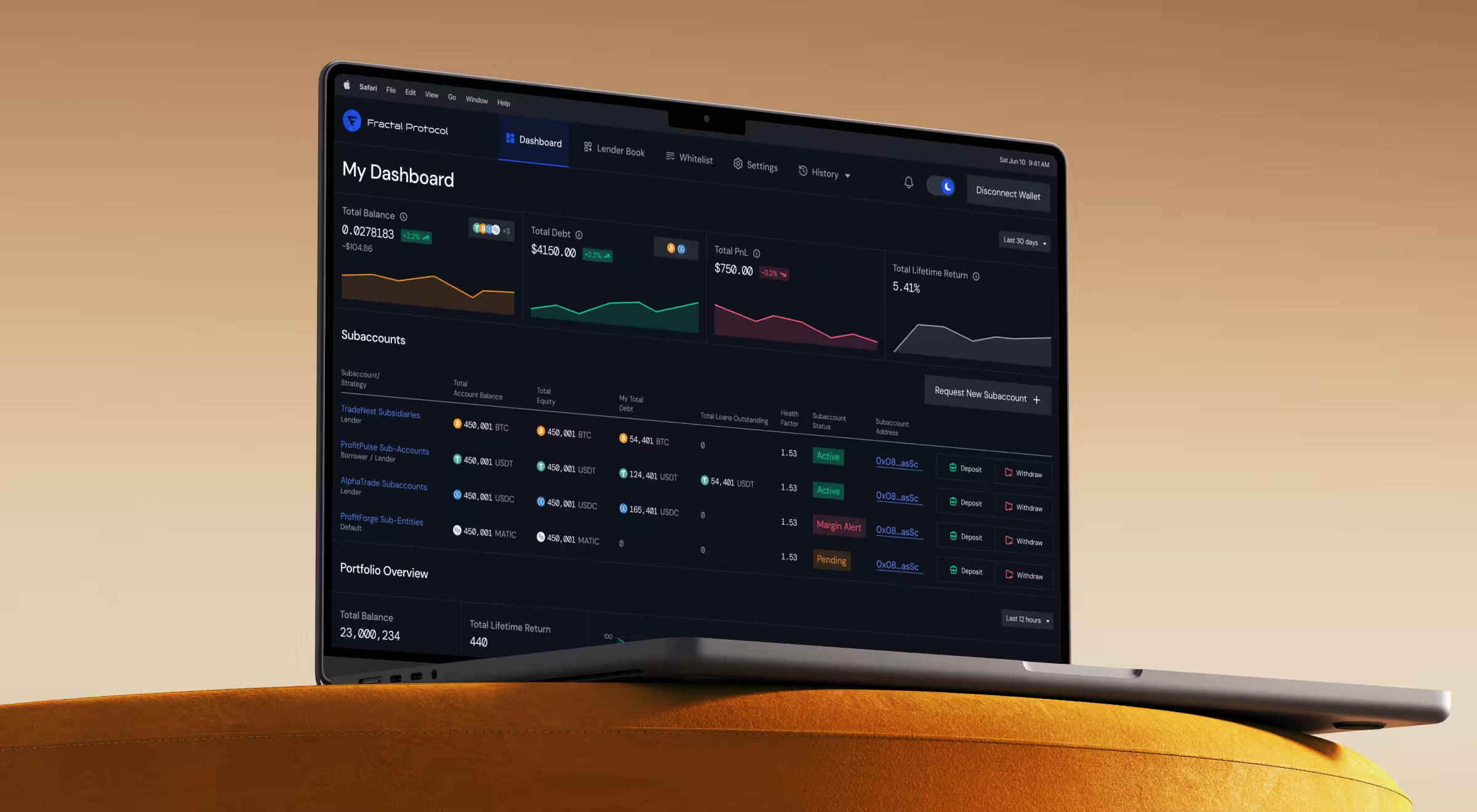
The UI problem: How do you show price, volume, debt, and risk in one view without the screen collapsing into noise?
Solution: Lazarev.agency, a UI/UX design agency, embedded sparklines directly into the KPI cards. Each card (Total Balance, Total Debt) carries a micro-graph showing directional trend without axes or labels. Color on the sparkline matches color on the percentage delta below it: green line, green arrow. The user reads trend and direction in the same visual unit without moving their eye to a second component.
The Health Factor column in the position table uses strict semantic color: green for active, red for margin alert. No amber states, no intermediate warnings. For a lending protocol where a position crossing a threshold triggers liquidation, ambiguity is a liability.
What it teaches: Density calibration is a risk management decision. Pack too little and the trader misses context. Pack too much and critical alerts disappear into visual noise. Sparklines inside cards are a reliable way to hold both status and trends in a single component without adding a second chart to the layout.
2. Fusion Power (Solardrive)
Solardrive Dribbble case study has an example of a CRM dashboard for a solar energy company. Users include sales managers tracking installations, leads, and workforce data across regions.
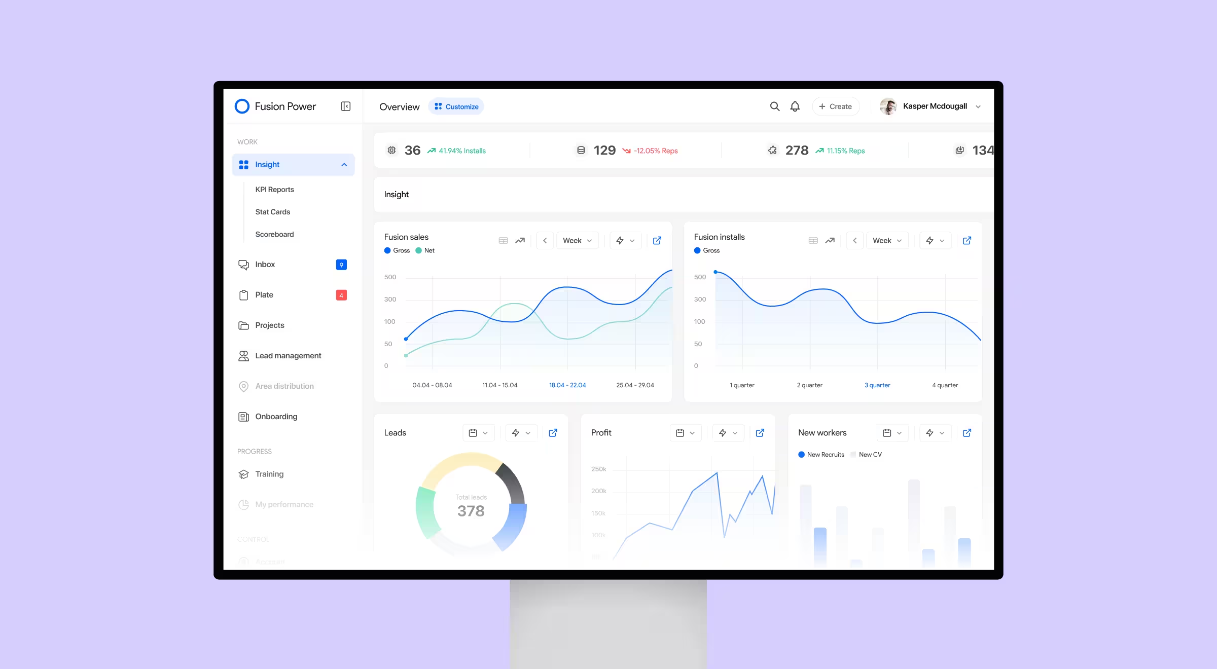
The UI problem: Three different metric types: trend data, proportional data, and categorical comparison data, all need to live on the same screen without every section looking identical.
Solution: Lazarev.agency team used three different chart types, each matched to its data's structure. Area charts for Fusion Sales and Installs, smooth curves suited to long-term trend visibility. A donut chart for Leads, with the total count centered inside the ring, the right call when the question is "what share of leads came from each channel?" and the user also needs the absolute number at a glance. Bar charts for New Workers, where the comparison is between discrete categories: new recruits versus submitted resumes. Different structures, different visual forms.
What it teaches: A management dashboard built on a single chart type is a warning sign. Area charts obscure categorical differences. Bar charts obscure trend shape. Donut charts work for proportions and fall apart for time series. Matching the visualization to the question being answered is the job.
3. Codify (Steep App)
Steep App is a business intelligence tool for product and marketing teams, a textbook case of SaaS dashboard design where several roles read the same screen. Multiple users access the same data simultaneously and discuss findings in context.
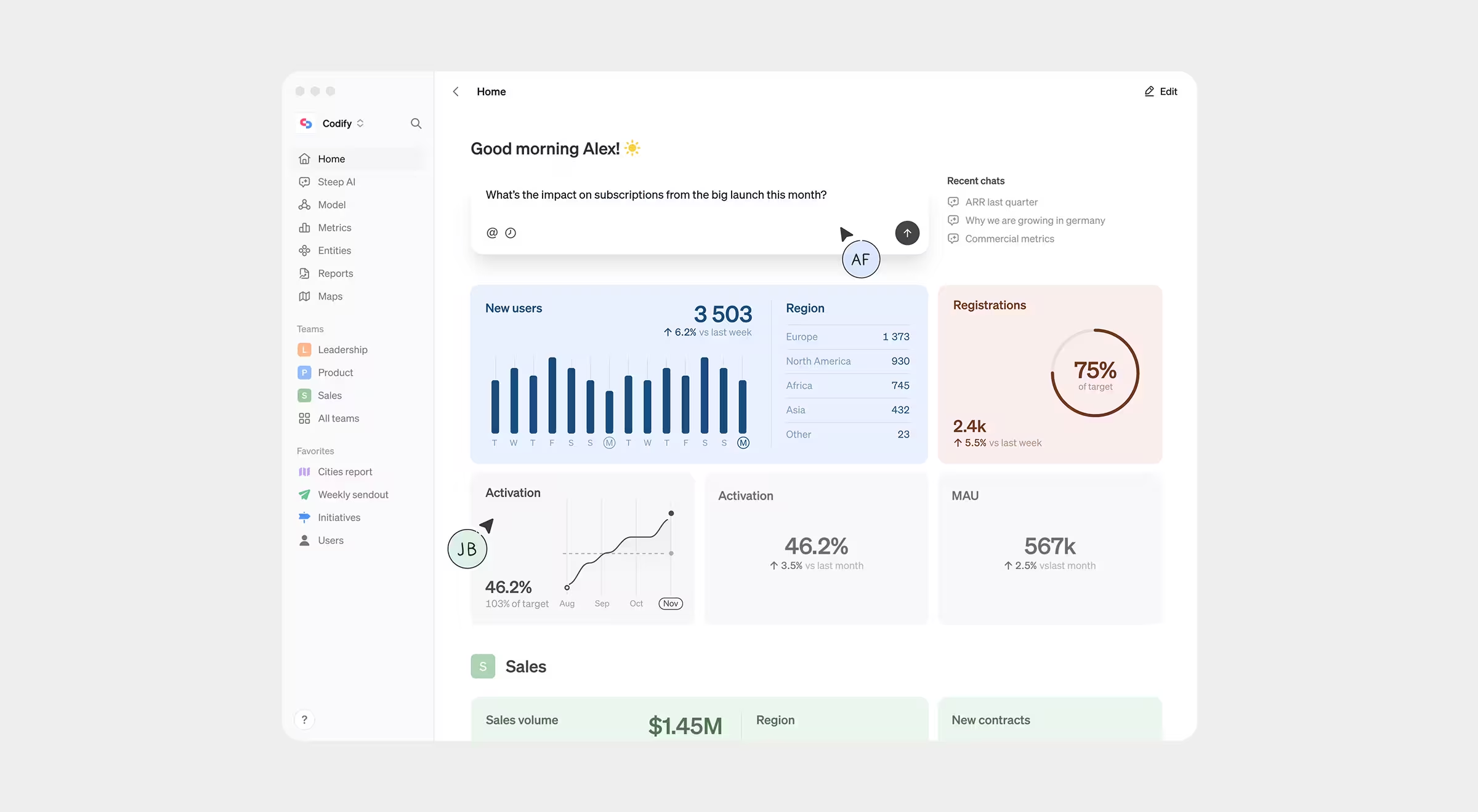
The UI problem: When a metric like Activation Rate or Monthly Revenue needs to be read by both an analyst and a non-technical product manager, how do you design the number card so both users extract the right information fast?
Solution: Every card follows an identical four-part structure: title → primary figure → delta → sparkline. No card breaks the pattern. A target line appears on the Activation chart as a dashed horizontal: 65% without a benchmark is just a number. With the target line, it's a decision prompt.
Color groups cards by semantic category: blue for user metrics, green for financial metrics, so repeat users can navigate by color before reading a label. The interface also includes natural language querying at the top of the screen: users type "What's the impact on subscriptions..." and the system pulls the relevant data.
What it teaches: The four-part structure: figure, delta, label, sparkline, works because it answers four different questions in a fixed reading order. Break the structure on even one card and users have to re-learn how to read it. Consistency at the component level is what makes a data-dense UI feel fast.
4. Midday
Midday is a financial management tool for small businesses and startups. Users check burn rate, revenue, and expenses, often with anxiety attached to the task.
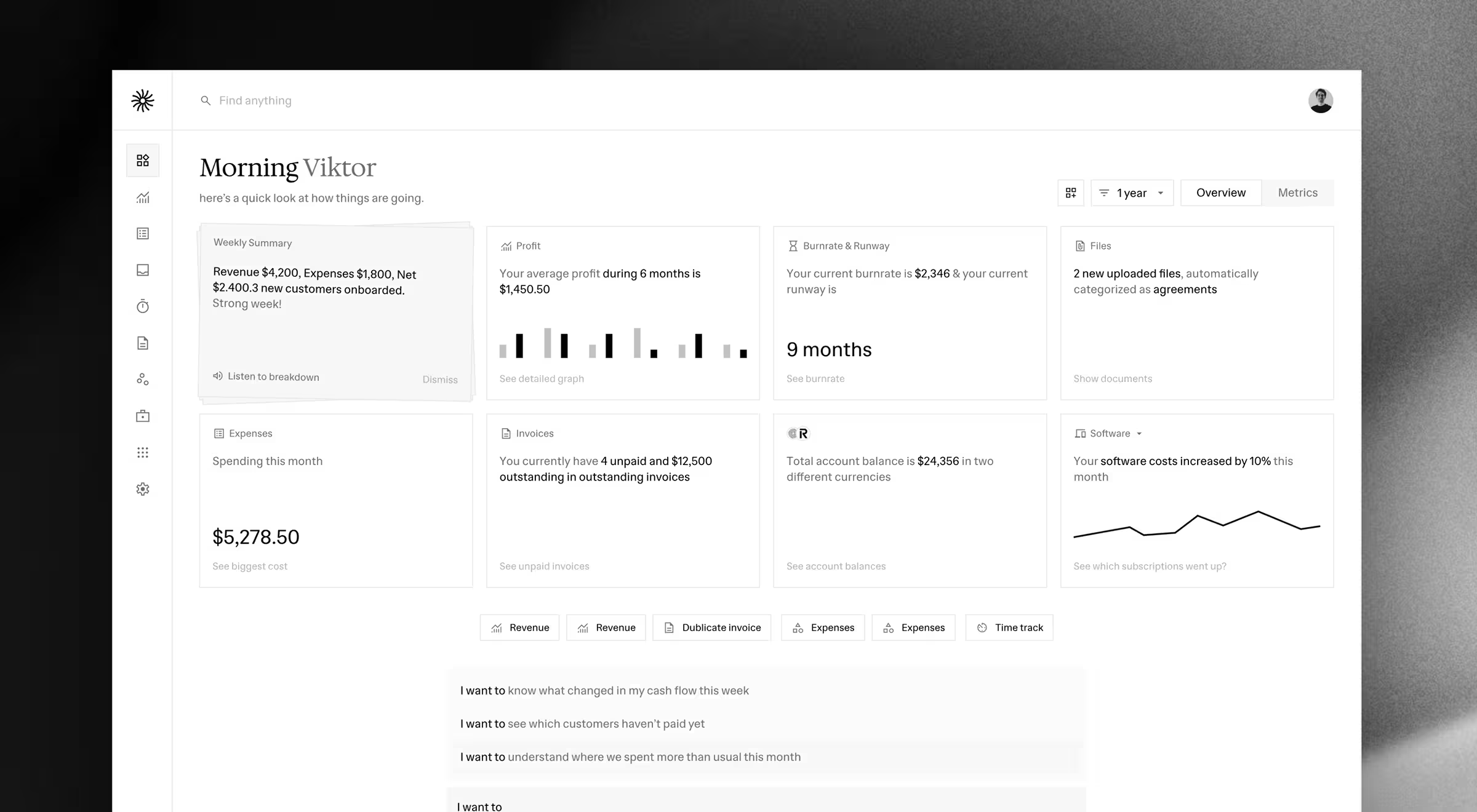
The UI problem: How do you present financial data clearly when the user is emotionally stressed?
Solution: Midday removes almost every visual element and lets typography carry the entire structure. The contrast between the two typefaces creates hierarchy without borders, dividers, or color. The user reads the summary block first (a natural language recap of the week), then moves to specific numbers, then to the command bar at the bottom.
What it teaches: Typography hierarchy does the same structural work as layout and color, it directs the eye through a sequence. In a financial dashboard, where users bring stress to every session, removing visual noise reduces cognitive load before the user reads a single number.
5. Linktree Analytics
Linktree lets creators, influencers, and businesses share all their important links through a single, customizable URL, and has grown to tens of millions of users worldwide, they recently reported to have 50 million + users globally. Its analytics dashboard tracks link clicks, traffic sources, audience locations, and device types, giving users actionable insights to optimize content, understand their audience, and grow engagement.
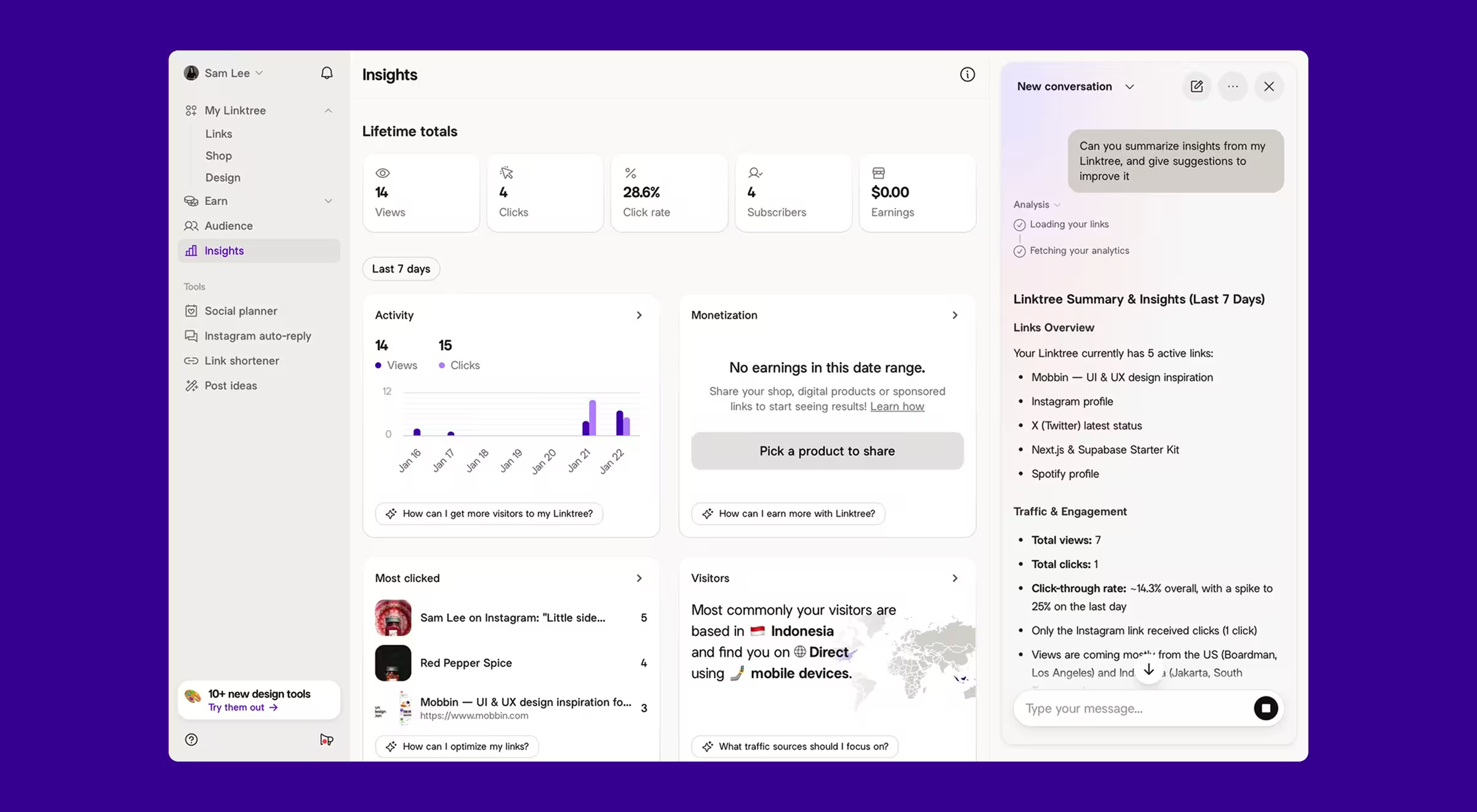
The UI problem: Creators need to know which specific link performed best. Exact values matter more than trend shape.
Solution: The "Most clicked" section uses a ranked table with real thumbnails and favicons alongside the numbers. The choice is deliberate. A bar chart would show relative performance at a glance but obscure the exact click count the creator needs to make content decisions. The table shows the precise figure, the link title, and a visual identifier (favicon or image) so the user scans by recognition.
Geographic data gets the opposite treatment. Country-level visitor data appears on a map with flags. When the question is "where is my audience broadly distributed?" pattern recognition beats precision. When the question is "how many clicks did this specific link get?" precision beats pattern.
The dashboard also includes an AI panel on the right side, contextual analysis pulling insights from the user's own link and traffic data, presented as readable text. The charts stay on the left. The interpretation lives in the panel.
What it teaches: Table vs. chart is a precision question. Ask what decision the user makes with the data, then choose the format. Exact comparisons go in tables. Shape and distribution go in charts. Using a bar chart when the user needs specific numbers forces them to estimate and estimation errors become bad product decisions.
🤖 See how to level up your design architecture with smarter AI dashboards.
What these UI dashboard design examples have in common
They succeed because every component-level decision was made for a specific user making a specific decision at a specific moment:
- The Fractal Protocol sparkline is there because a DeFi trader needs trend direction while managing multiple positions simultaneously.
- The Midday serif headline is there because a stressed founder needs to feel like they're reading a summary.
- The Linktree table is there because a creator needs exact click counts.
- The Steep App four-part card structure is there because both an analyst and a non-technical product manager need to extract the right information from the same screen.
- The Solardrive mixed chart types are there because a sales manager tracking installations, leads, and workforce data is asking three structurally different questions and each one demands a different visual answer.
The lesson you should take from these examples is "use sparklines when your user needs trend direction without the space or cognitive budget for a full chart."
Three UI mistakes you avoid at all costs
Small design missteps can slow users down, create confusion, or hide critical insights. Avoid these three common pitfalls to keep your dashboard clear, usable, and resilient.
Chart overload
The most common dashboard mistake is reaching for a visualization when a number or a table would do the job faster. Charts take longer to read than numbers. They require the user to map visual position to value mentally. Use them when pattern recognition is the task. For everything else, a well-designed number card with a delta is faster and clearer.
Broken density
A cluttered dashboard rarely happens because each component decision seemed reasonable in isolation, and nobody assessed the screen as a whole. Review density at the layout stage, before any component gets finalized.
Missing states
A 2025 IBM IBV report found 43% of COOs cite data quality as their top priority, with many organizations losing millions annually to poor data. Yet most dashboards ignore missing, empty, or stale data. New users hit empty states, and backend timeouts create failed fetches. Designing for these states is what makes a dashboard resilient instead of fragile.
Your dashboard works, but does it help?
The objection we hear most from product teams in San Francisco and across the Bay Area is: "Our engineers can build the components, we just need it to look right." The honest answer: component-level decisions are product decisions.
Across fintech, SaaS, healthcare, and edtech projects, the pattern holds. A technically complete dashboard can still fail its users at the component level — it's a big part of why nobody opens the KPI dashboard despite the work behind it. If your team is making these decisions by instinct, the risk is a product nobody uses.
We're happy to look at what you've built and give a straight read on where the UI designs are working and where they're not.

.avif)