
The dashboard shipped. Interactive charts, smooth data visualizations, real time data – all appear to work perfectly. And yet adoption is flat, leadership is asking questions, and the design team is absorbing blame for a problem they didn't create.
Bad KPI dashboard design is rarely the only one to blame. The real culprits are wrong metrics and the wrong audience. We have gathered real-life examples to show what a good KPI dashboard should look like and what you should fix first.
Key takeaways
- Wrong metrics and wrong audience decrease adoption before design ever can. No amount of polished data visualizations can save a dashboard built for the wrong stakeholder or cluttered with useless metrics like website traffic and social media followers.
- The decision-frequency test is your scoping framework. Match each dashboard to how fast its audience makes decisions: a sales rep needs real-time data on today's pipeline; a CFO needs 12-month performance trends and revenue growth context.
- Metric strategy must come before dashboard design. Choosing which KPIs appear above the fold, defining a single source of truth, and linking KPIs to business goals are product decisions, if done wrong, the design becomes irrelevant.
What is a KPI dashboard and what should it include?
A KPI dashboard is a decision surface. It should have one screen and provide one fast answer. Remember: it is not a reporting tool. The distinction matters because most teams build the latter and wonder why nobody uses it. Here's how the layers stack:
- Raw data with every transaction, event, click, and timestamp sitting in your database.
- Key metrics pulled from raw data: total revenue, active users, churn rate.
- Critical metrics, the subset of key metrics tied to an actual business decision.
- Actionable insights from critical metrics with enough context to tell someone what to do next.
Most dashboard UX designs stop at key metrics. Effective KPI dashboards go two levels deeper. The distinction between "here's the data" and "here's what you should do about it" is exactly where adoption flanks.
A sales manager checking pipeline health needs three numbers: deals in stage, average deal size, and days-to-close. Hand them 22 charts, and they open a spreadsheet instead.
🤓 Want to know how to design dashboards that make complex data understandable? Check our article.
Why most KPI dashboards fail even before the design starts
Dashboards often fail before a single pixel is designed. Screens get cluttered with every possible metric, KPIs that actually drive decisions are ignored, and there’s no single source of truth. One study even found that when usability and user needs were overlooked, only 28% of intended users accessed a dashboard even once.
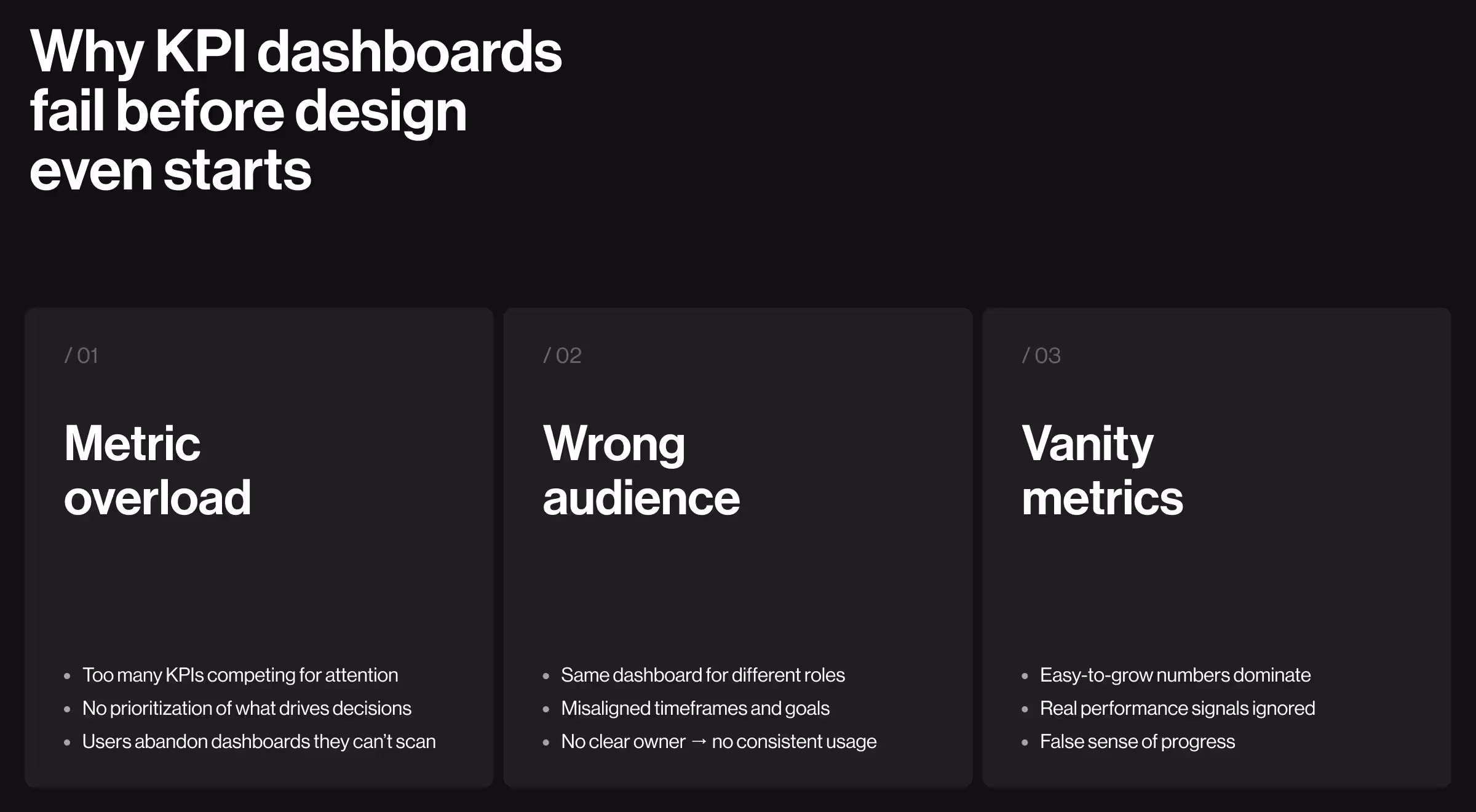
1. Too many metrics with no real use
When everything looks equally important, nothing is. Dashboard scope tends to become an additive problem until the screen is a cluttered dashboard where the single most critical metric competes visually with website traffic and social media followers. Yet, users can only process five to nine elements in working memory, so dashboards exceeding this number of KPIs will soon face an engagement drop.
Imagine: a B2B SaaS company ships an executive KPI dashboard with 34 data points on the main screen. The CEO stopped opening it after two weeks. They need one number, net revenue retention, but finding it means scrolling past inventory levels, support ticket counts, and three variations of monthly active users. The data was all there, yet the dashboard failed anyway.
2. Wrong audience
A sales dashboard built for a sales manager is not the same as a sales dashboard built for a VP of Sales. Neither works for a CFO reviewing financial health.
- The manager needs today's pipeline.
- The VP needs this quarter compared to last quarter.
- The CFO needs revenue mix, margin, and forecasted risk.
Build for the wrong stakeholder, and you get a dashboard nobody owns, and eventually, nobody opens.
3. Vanity metrics masking real signals
Website traffic is easy to show growth in. Conversion rates tell a harder story. So teams track traffic, feel good about the numbers, and miss the fact customer acquisition costs have been climbing for six months. Nobody notices until a board meeting gets uncomfortable.
Customer lifetime value and revenue growth are hard metrics, they reflect the company's performance in ways no one can spin. But, really effective KPI dashboards must be built around the hard ones.
The five dashboard types and what belongs in each
Every B2B company eventually needs five distinct dashboards. Each serves a different intended audience, runs on a different decision cadence, and tracks a different set of key performance indicators.
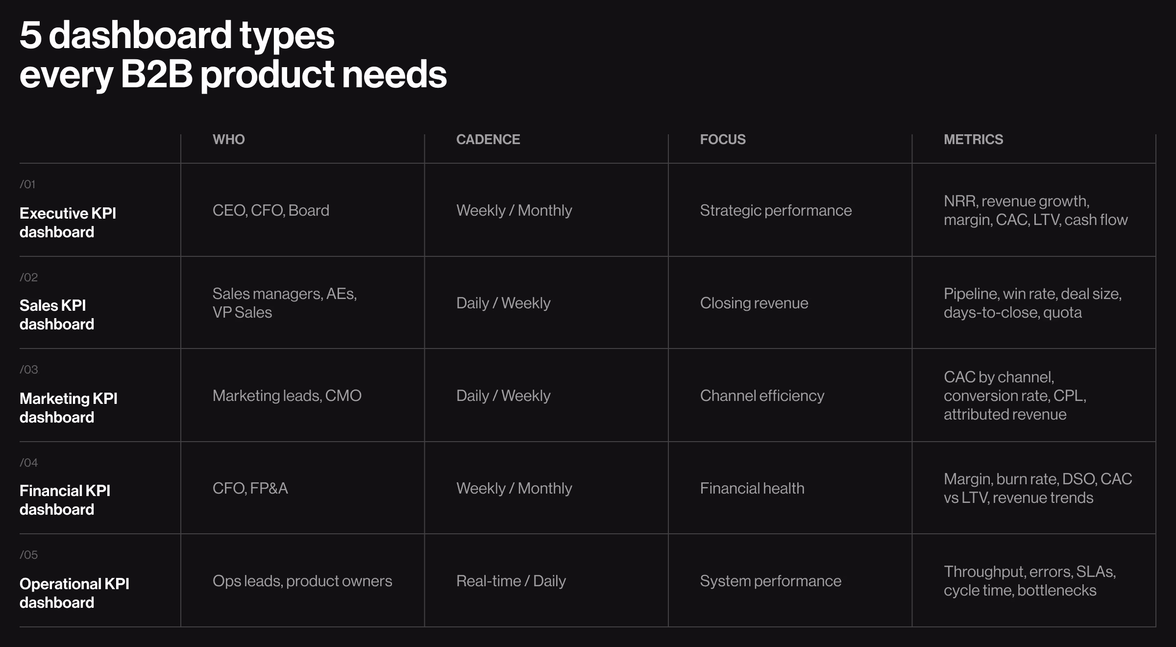
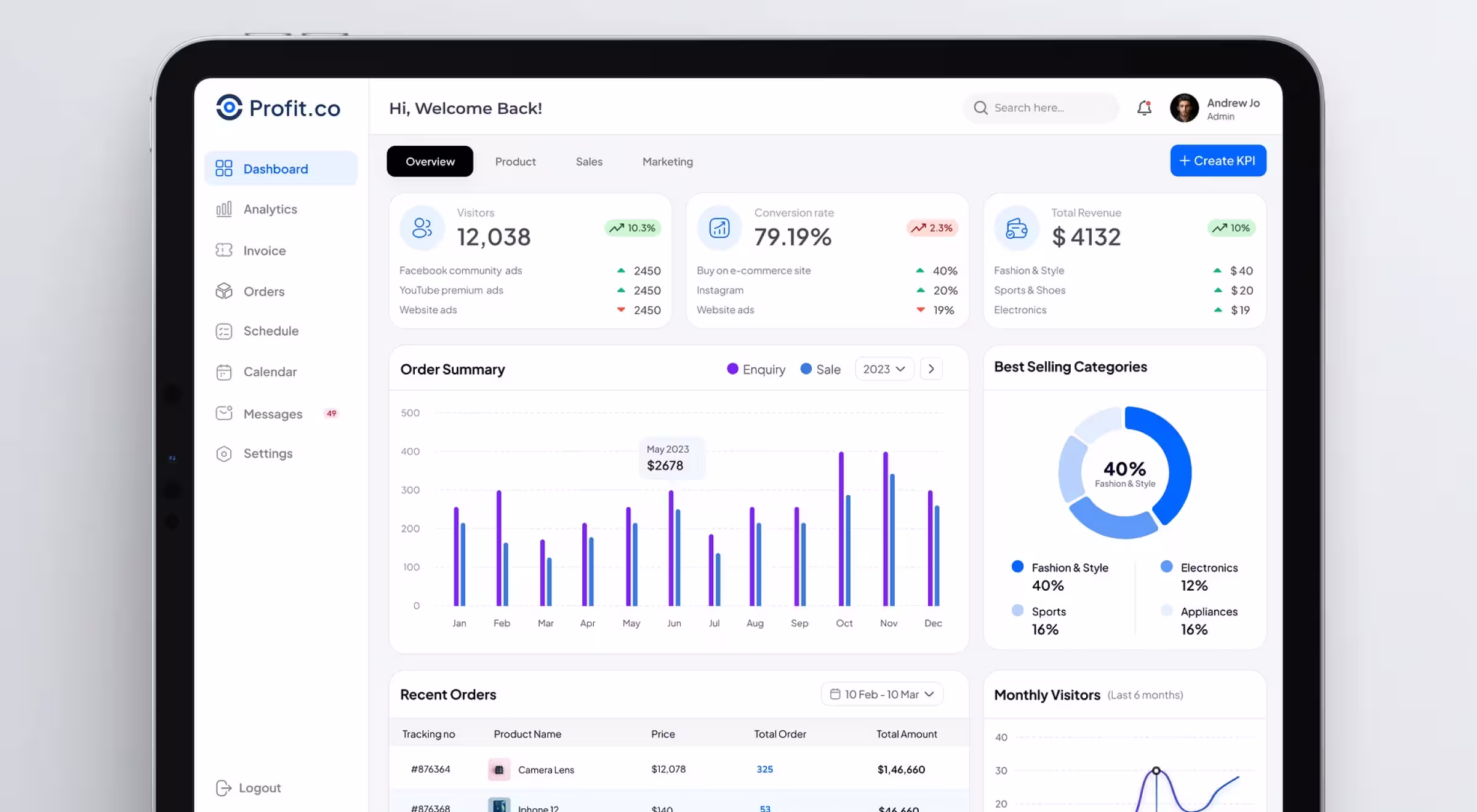
Executive KPI dashboard
Who uses it: CEO, CFO, Board
Cadence: Weekly or monthly
Core question: Are we moving toward our strategic goals?
Key metrics here: net revenue retention, revenue growth rate, gross margin, customer acquisition costs, customer lifetime value, operating cash flow.
Nobody at this level needs ticket resolution times or session durations cluttering the view.
Profit.co's dashboard is a useful real-world example. The top level shows three KPIs, with segment breakdowns directly beneath each, a CFO sees Total Revenue and immediately sees the split across product lines, without drilling into a secondary screen. One fewer click is one more decision made.
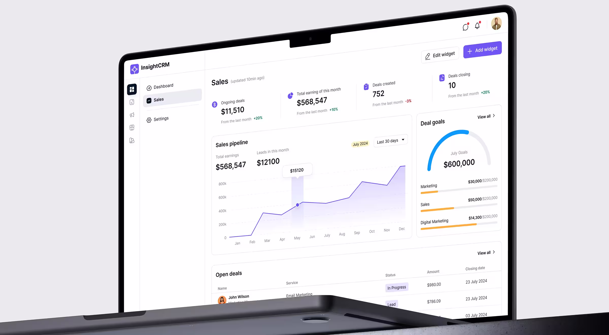
Sales KPI dashboard
Who uses it: Sales managers, AEs, VP of Sales
Cadence: Daily or weekly
Core question: Where does the team focus today to close the quarter?
Sales teams need a pipeline by stage, lead generation volume, win rate, average deal size, days-to-close, and quota attainment by rep.
InsightCRM's dashboard handles this well – a gauge chart showing progress toward a $600,000 goal sits beside segment breakdowns by team, so a manager sees in two seconds whether to intervene or let the team run.
🤖 Curious how to design smarter AI dashboards? Learn more here.
Marketing KPI dashboard
Who uses it: Marketing managers, growth leads, CMO
Cadence: Daily or weekly
Core question: Which channels are working, and where should the budget shift?
A marketing KPI dashboard lives on customer acquisition costs by channel, conversion rates, lead generation volume, cost-per-qualified-lead, and marketing-attributed revenue.
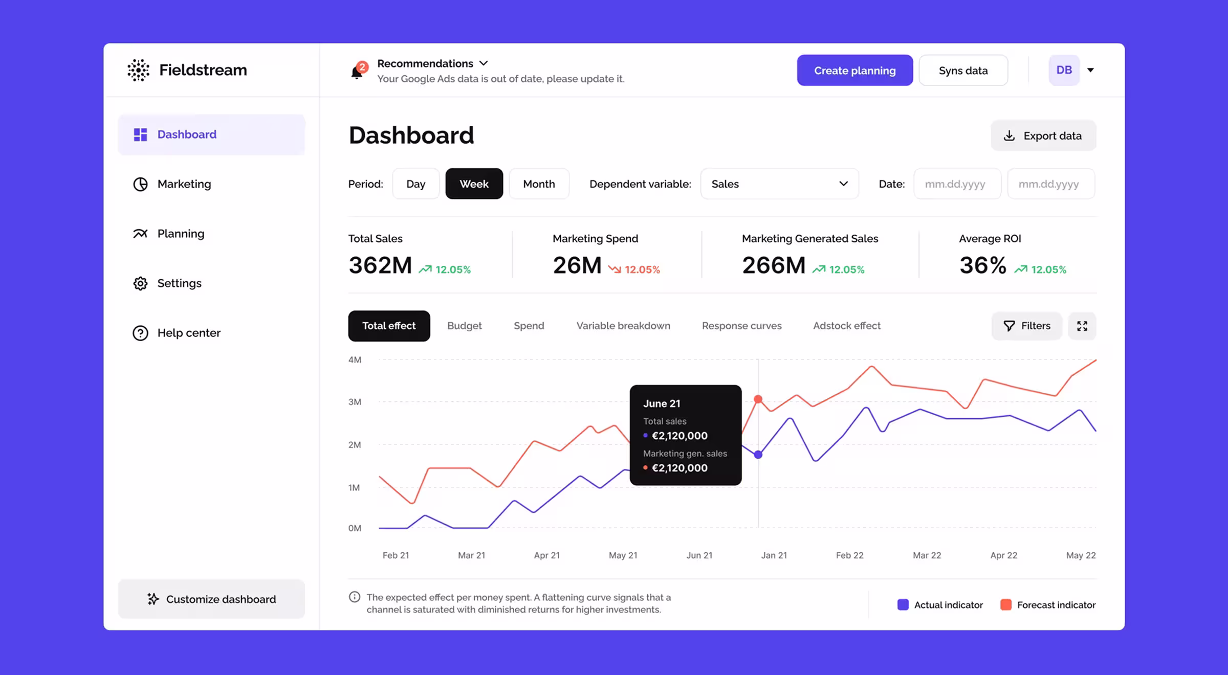
The Fieldstream dashboard layers forecast versus actual indicators on the same chart as marketing spend versus total sales, you can see immediately whether a budget increase is generating proportional return or hitting diminishing returns.
Financial KPI dashboard
Who uses it: CFO, controllers, FP&A teams
Cadence: Weekly or monthly
Core question: Is the business financially healthy enough to support planned investments?
Financial health requires both historical data and real-time data on the same screen, you need to see where you are and where you've been to make confident projections.
Gross margin, operating margin, revenue growth, cash burn rate, days-sales-outstanding, and the customer acquisition costs versus lifetime value ratio all belong here — exactly the kind of dense metric set where disciplined data dashboard design keeps the screen readable.
For GCF, a financial services firm specializing in valuations for institutional clients, Lazarev.agency created a dashboard built upon the logic analysts use during valuation. Progress is mapped across clear stages, so anyone can understand project status at a glance without digging through layers.
The Dates & Fees screen was restructured around decision-making. Important deadlines stand out, related calculations sit together based on real usage, and role labels make relationships between clients and counterparties obvious.
Operational KPI dashboard
Who uses it: Operations leads, team managers, product owners
Cadence: Real-time or daily
Core question: Where are the bottlenecks, and what breaks if nobody acts now?
This is where operational efficiency gets measured directly. Throughput, error rates, inventory levels, time-to-resolution, cycle times, SLA compliance are the metrics driving continuous improvement on the floor.
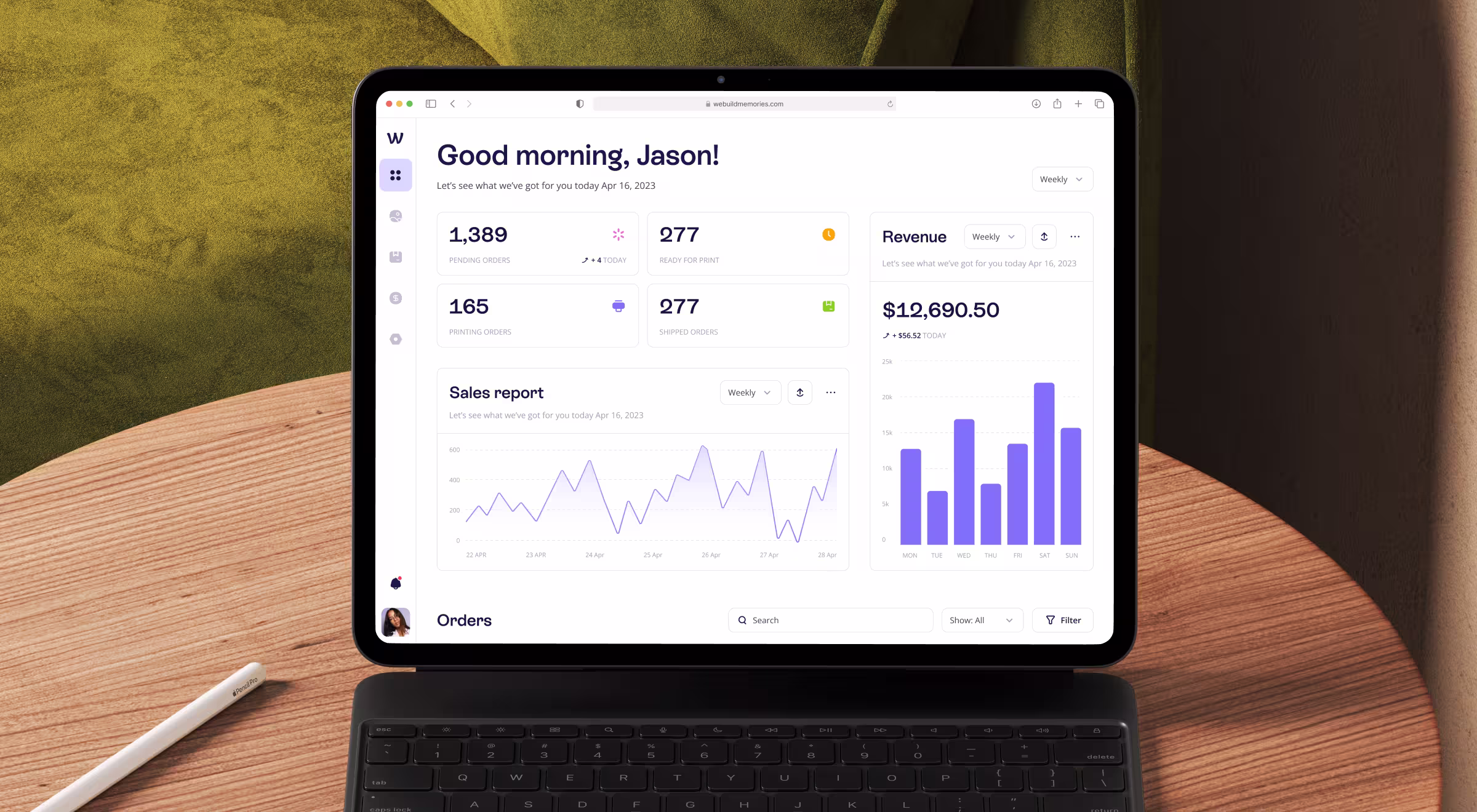
The We Build Memories CRM, which Lazarev.agency designed, is a clean operational dashboard example. Four status cards at the top: Pending, Ready for Print, Printing, Shipped, let an operations manager identify bottlenecks at a glance. 277 orders in Ready for Print while only 40 are actively printing? Someone needs to start the machines and the CRM dashboard makes it impossible to miss.
Which metrics your KPI dashboard should have
The test is blunt: does this metric change your decision?
Revenue is $2.3M this month. By itself, that number tells you nothing. Revenue is $2.3M this month, down 8% from last month and down 14% year-over-year, now you have a decision to make.
Metrics with real decision power:
- Revenue growth: the trajectory of your business.
- Customer acquisition costs: whether growth is financially sustainable.
- Customer lifetime value: whether the business model works at scale.
- Customer satisfaction scores: a leading indicator of retention before churn shows up in the numbers.
- Operational efficiency ratios: where time and money are leaking.
Metrics without decision power:
- Website traffic without conversion context.
- Social media followers without a revenue connection.
- Feature usage counts without retention or expansion ties.
- Headcount without productivity data alongside it.
🤓One practical test: if a metric went up 20% and you still don't know whether to hire, cut, or invest, it's a vanity metric. Remove it from the primary view.
Mapping KPIs to the audience: the decision-frequency test
The framework is simple: match each dashboard to the cadence of decisions its audience makes.
Same underlying business data, but three entirely different dashboards. All three are correct because they're built for how people work.
✅ Pro tip: Before scoping any dashboard, ask yourself: “What decision does this person make, and how fast do they need to make it?” Everything else flows from the first answer.
Scoping decisions before the design file opens
These choices belong to a Head of Product. Get them wrong, and no amount of good dashboard design can recover the situation.
- What goes above the fold? The single most critical metric for this audience, with its trend indicator. It must be one number, big enough to read in a glance. Everything else gets a dedicated section or a drill-down.
- What gets its own view versus a drill-down? If a metric drives daily decisions, give it a primary view. If it answers a follow-up question, it belongs one level deeper. For example, from Lazarev.agency experience with the Insticator's dashboard, which puts Time on Site Uplift and User Engagement Rate at the top, led indicators for the publisher's future revenue.
- How do you handle multiple data sources? One owner per metric. If revenue flows from Stripe and from a manual spreadsheet, decide which is the source of truth before design starts. Mixing data sources without clear attribution destroys trust in the entire dashboard, and once stakeholders stop trusting the numbers, they stop opening the dashboard.
- When do you show historical data versus real time data? Strategic dashboards need historical data: year-over-year comparisons, performance trends going back 12 to 24 months. Operational dashboards need real time data with a visible timestamp. Both needs on the same screen usually means the intended audience is poorly defined. Fix the audience problem first.
Get these right and dashboard design becomes a translation layer, turning clear decisions into easy-to-understand visuals.
How Lazarev.agency approaches KPI dashboard design
Every engagement starts with metric selection and audience mapping. Hold a real conversation about which five numbers drive decisions for your stakeholders right now.
The clients we work with always arrive with the same framing: "We have all the data. We just need it designed." The honest answer is harder to hear: design without a clear KPI strategy produces a beautiful dashboard nobody acts on. A data-driven culture comes only from better decisions about which charts matter.
The Fieldstream, GCF, and We Build Memories dashboards referenced here work because our AI UX team made hard calls about hierarchy, audience, and metric selection before a pixel was placed. Design made those decisions legible.
We help B2B platforms create a KPI dashboard their teams open, act on, and trust. Metric strategy first. Dashboard design second. Always in order.
Give us a call, and we will design a KPI dashboard which shows you the data you need to know in seconds.


.webp)


.avif)