
Every user arrives at your interface with intent. They have a task in mind or a problem they believe your product can solve. But instead of moving forward, they pause. What comes next is a vicious circle of scanning, clicking, going back, and trying again. As a result, what should feel obvious starts to feel like a burden.
This burden has a name — poor navigation UX.
Most products lose customers when the path to value is unclear or too demanding to figure out. And the more features you add, the worse it gets.
In this article, we uncover how navigation works: from core principles to real patterns, decision frameworks, and mistakes that derail conversion.
Key takeaways
- Navigation UX is not UI. It’s the system shaping how users think and move inside your product.
- The best navigation combines structure, wayfinding, and contextual guidance into one cohesive system.
- Fixing navigation is a strategic decision: align it with your core user journey.
Why navigation UX matters
Navigation UX is one of the most critical layers of your product’s digital experience. With countless alternatives just a click away, users won’t wait to be understood. Capturing their intent early and responding to it instantly is what earns and keeps their attention.
Users don’t explore products out of curiosity. They evaluate them fast, often subconsciously, based on how easily they can move and act. Navigation is what enables or blocks this flow.
The data reinforces how little room there is for error:
- According to Google, 53% of visits are abandoned if a page takes longer than 3 seconds to load — speed sets the baseline, but navigation determines whether users stay once the page loads.
- Forbes reports that, on average, users view only 55% of a page — users don’t scroll endlessly, they rely on navigation for quick access to deeper content.
- Data from Clutch shows 38% of users focus on layout and navigation on the first visit, while 42% leave due to poor functionality — navigation is among the earliest signals of product quality.
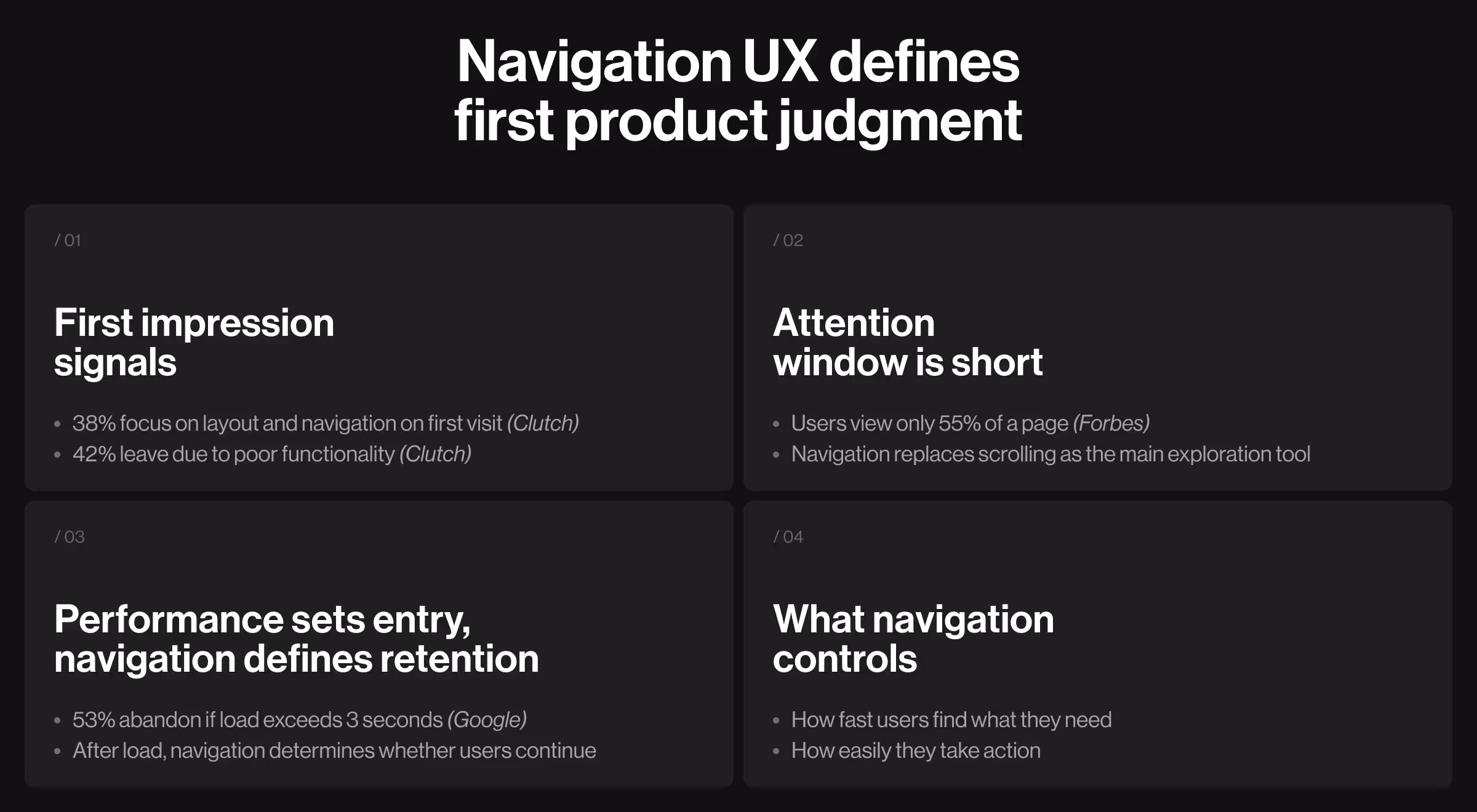
These numbers highlight a clear pattern: users expect to be guided to the product’s value rather than to search for it.
At its core, navigation UX defines how users:
- Understand where they are
- Identify what’s available
- Move toward completing a goal
From a business perspective, navigation has a direct impact on three performance metrics:
- Conversion — how quickly users reach key actions.
- Retention — whether they return to your product and continue their journey.
- Feature adoption — whether they want to seek value beyond the obvious paths.
When navigation works like an invisible guide, users are empowered to explore your product. When the user journey is confusing, they pause to think whether sticking around is worth it. That moment of creeping hesitation is a common precursor to disengagement and, more often than not, abandonment.
Types of UX navigation patterns and best use cases for each
Navigation UX is a system of decisions. And like any complex structure, it can be approached from different angles. You can design it through the lens of structure (information architecture), behavior (user flows), or user interface design (menus, tabs, layouts).
In practice, this means combining multiple navigation patterns, each solving a unique problem: orientation, exploration, accessibility, and execution. Below are the core patterns, structured by how they function and where they create the greatest impact.
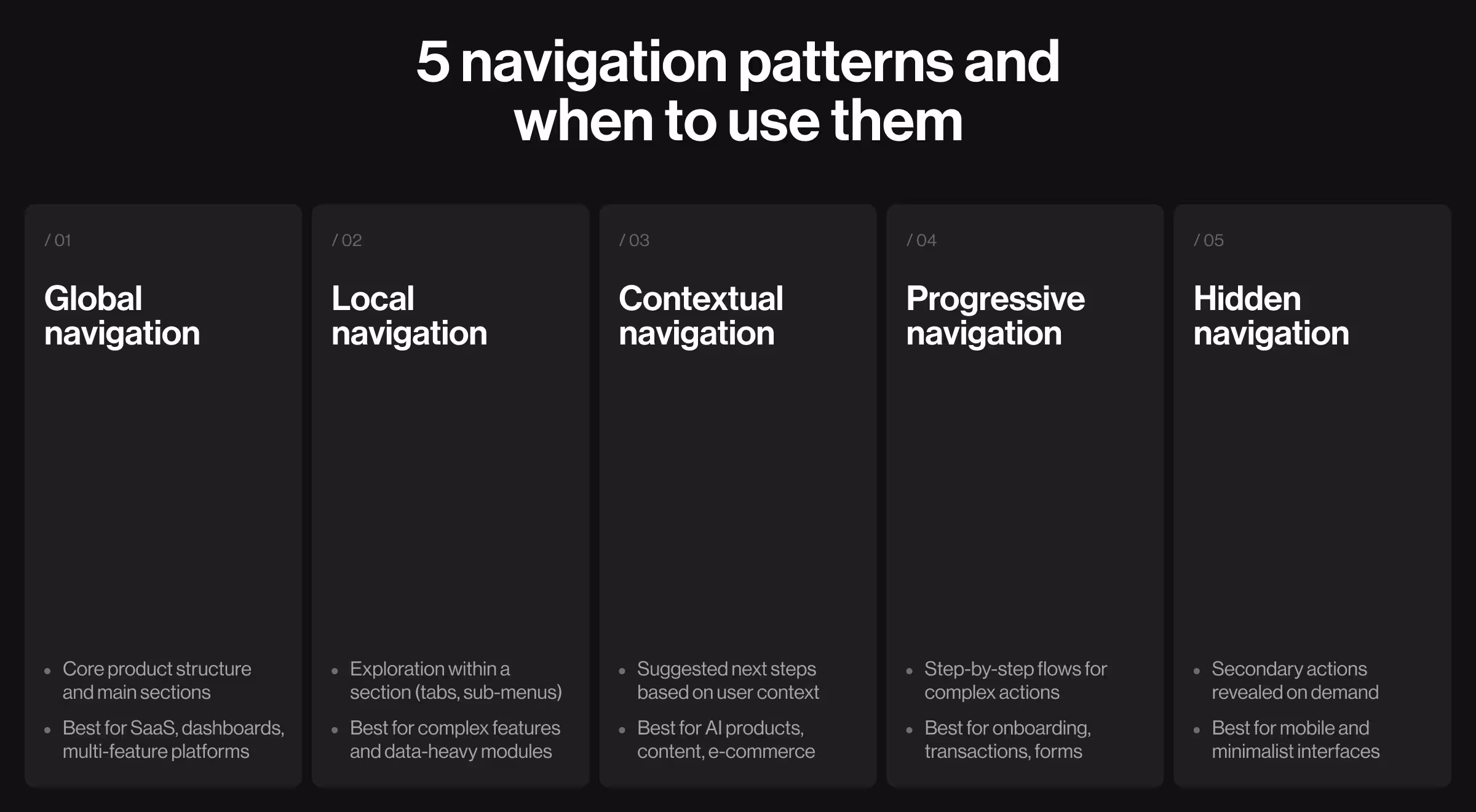
1. Global navigation
Global navigation defines the primary structure of a product. It’s the persistent layer users rely on to move between core sections. This is what users see immediately when they land on your product, e.g., a top bar or a sidebar.
✅ What it does:
- Provides constant access to the main product areas
- Anchors user orientation across the entire experience
- Establishes hierarchy at the highest level
🎯 Where it works best:
- SaaS platforms
- Dashboards and analytics tools
- Multi-feature ecosystems
🧩 Design considerations:
- Limit primary categories to avoid scanning fatigue
- Use predictable navigation labels (“Dashboard” sounds clearer than “Command Center”)
- Keep placement consistent across all screens
- Prioritize high-frequency actions
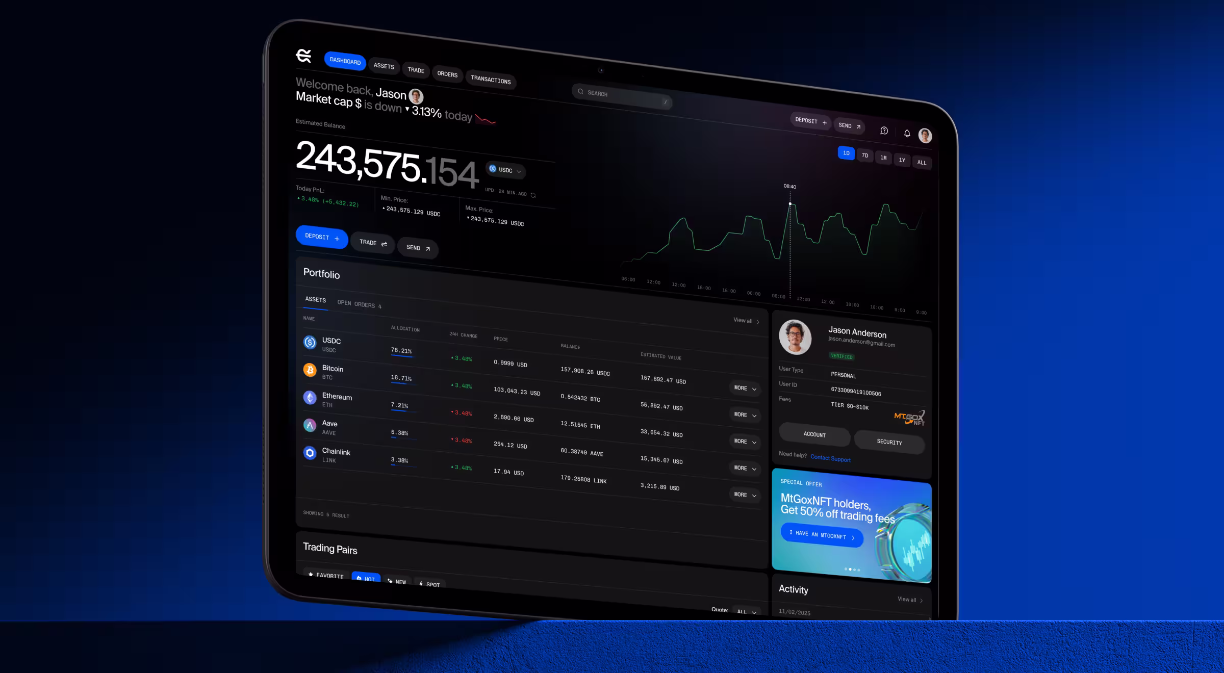
Practical example: In EllipX, the original product used both top and sidebar navigation, which considerably fragmented the UX flow. We consolidated everything into a single top-bar navigation by grouping functions and moving secondary actions into a user menu. This reduced confusion and freed up space for high-density financial data, making the product more intuitive and efficient.
2. Local navigation
Local navigation operates within a section. It helps users explore related features without losing context. You typically see it as secondary navigation elements, e.g., tabs (“Overview / Analytics / Settings”) or secondary sidebars inside a module.
✅ What it does:
- Organizes content inside a specific area
- Allows deeper interaction without switching sections
- Supports feature-level exploration
🎯 Where it works best:
- Complex feature sets
- Data-heavy platforms
- Modular product experiences
🧩 Design considerations:
- Use tabs for shallow structures and side menus for deeper ones
- Keep 3–5 options visible at once — anything more requires grouping with meaningful labels
- Clearly distinguish active states (underline, italics, color, bold)
- Keep terminology consistent with global navigation
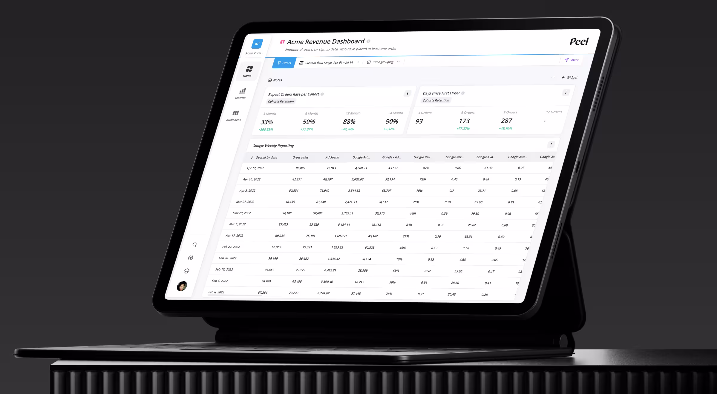
Practical example: In the Peel analytics platform, users struggled with an unstructured navigation system. We re-architected it by grouping features into three primary categories and separating secondary tools like search and settings pages. A revamped navigation system improved discoverability and significantly reduced time to insight.
3. Contextual navigation
Contextual navigation appears within the interface itself. It adapts based on what the user is viewing or doing. It shows up as “Related items”, inline links, smart prompts, or recommended actions embedded in the UI.
✅ What it does:
- Suggests relevant next steps
- Enables exploration without leaving the current context
- Reduces reliance on primary navigation
🎯 Where it works best:
- Content platforms
- E-commerce
- AI-driven products
🧩 Design considerations:
- Tie suggestions directly to user intent
- Limit options to 2–4 high-relevance actions
- Place near natural decision points (end of article, below product, after action)
- Use visual hierarchy to differentiate from primary content
Practical example: In VTnews.ai, we designed contextual navigation through AI-generated prompts and topic-based interactions. Users can explore news stories, jump into discussions, and access related insights directly from the page they’re on. This shifts behavior from passive reading to active exploration.

4. Progressive navigation
Progressive navigation is the prerequisite for a positive user experience. Rather than exposing everything at once, it guides users through a controlled flow. You see this in onboarding checklists, multi-step forms, checkout flows, and setup wizards.
✅ What it does:
- Breaks complex processes into manageable steps
- Reduces cognitive overload
- Improves completion rate
🎯 Where it works best:
- Onboarding flows
- Financial transactions
- Multi-step forms
🧩 Design considerations:
- Show progress clearly (e.g., “Step 2 of 5”, progress bars)
- Keep each step focused on a single task
- Allow backward navigation without losing data
- Pre-fill or automate inputs where possible
Practical example: Stripe’s onboarding uses progressive navigation to guide users through account setup and identity verification. Each step is isolated, clearly labeled, and supported with contextual help, which makes a complex financial setup feel manageable.
5. Hidden navigation
Hidden navigation prioritizes minimalism by keeping options out of sight until needed. In practice, this includes hamburger menus, swipe gestures, expandable panels, or “more” menus.
✅ What it does:
- Reduces visual clutter
- Keeps interfaces clean and focused
- Reveals actions on demand
🎯 Where it works best:
- Mobile devices
- Minimalist products
- Secondary or infrequent actions
🧩 Design considerations:
- Never hide primary actions
- Use familiar patterns (hamburger, ellipsis, swipe) to avoid confusion
- Combine with visible navigation for critical flows
- Keep interaction consistent (same gesture = same outcome)
Practical example: Instagram combines visible bottom navigation with hidden gesture-based interactions (e.g., swipe between stories, long-press menus, hidden options in messages). This keeps the interface minimal while still enabling advanced interactions for experienced users.
Elements of navigation UX: structures, menus, wayfinding tools, and contextual elements
The patterns above define how navigation behaves. Here, we’ll focus on the concrete UI elements that bring those patterns to life.
“Navigation UX is a combination of structural components (search bar, menus), orientation tools (breadcrumbs, indicators), and interaction layers (dropdowns, gestures). Designing intuitive navigation means orchestrating these layers into a cohesive system reflective of your product’s complexity and aligned with how users think and act.”
{{Anna Demianenko}}
Below is a structured comparison of the most widely used navigation elements: what they are, when to use them, and the trade-offs they introduce.
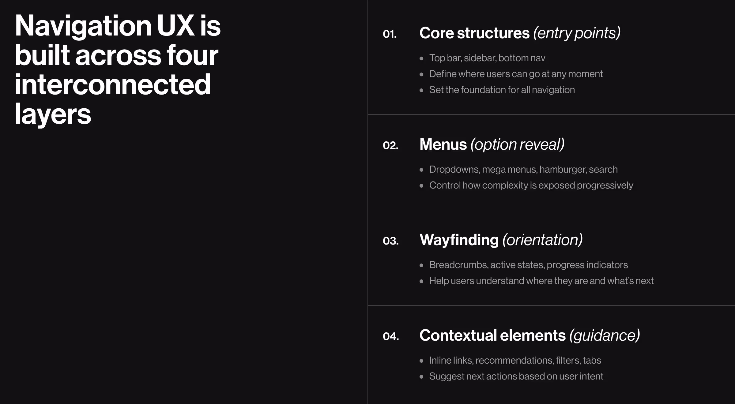
1. Core navigation structures (primary access layers)
This layer defines the entry points into your product. It answers a simple but critical question: Where can users go at any moment?
Should this layer be weak, everything downstream, like menus, flows, and discovery, breaks. Strong navigation starts here by giving users a stable, always-available map of the product.
💡 Practical insight: Choose the structure based specifically on product depth. If your product grows beyond 5–7 sections, top navigation alone will collapse. This is where sidebars and hybrid systems work best.
2. Menu types (interaction and expansion layers)
If structures define where users can go, menus define how options are revealed. This layer is about progressive disclosure: showing just enough to guide decisions without overwhelming users.
💡 Practical insight: Menus should scale with complexity. If users need to “hunt” inside your menu, your structure (not your UI) is the problem.
3. Orientation and wayfinding elements (user awareness layer)
Smooth navigation is not only about moving forward. At its best, navigation ensures users can progress with a clear awareness of where they are, what they’ve done, and how to go back.
The core objective of this layer is to reduce hesitation. Without it, even well-structured products feel confusing.
💡 Practical insight: Users should never need to stop and think “Where am I?” If they do, your navigation system is incomplete.
4. Contextual and adaptive navigation elements (dynamic layer)
This is where navigation becomes intelligent and responsive. Instead of forcing users to search, the interface suggests what matters next.
💡 Practical insight: Contextual navigation is where you shape user behavior. Don’t wait for users to search — anticipate what they need next. Place actions exactly where decisions happen (after reading, after clicking, after completing a task).
Common navigation UX mistakes and how to fix them
Most teams don’t notice the problem with their product’s UX because menus are there, and everything seems accessible (at least at first glance). But under the surface, users are second-guessing every click and missing key actions.
Here, we discuss the most common navigation mistakes eroding performance and show how to fix them with strategy-driven UX solutions.
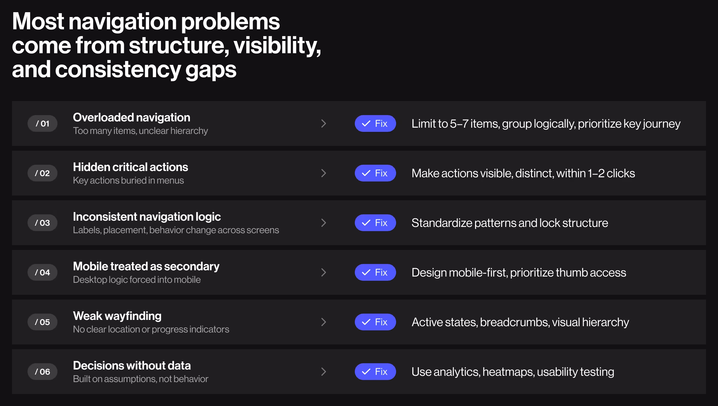
1. Overloaded navigation
What happens: Menus become a dumping ground for features. Every team wants visibility, so navigation grows into 10–15 items with vague labels and no hierarchy whatsoever.
🟩 How to fix it:
- Cap primary navigation at 5–7 items max
- Group secondary items under clear parent categories
- Ensure interface elements have descriptive labels
- Use progressive disclosure we’ve already talked about
Expert tip: When teams can’t align on what belongs on the product roadmap, everything gets promoted to the top level. The solution must be strategic. Define the single primary user journey driving revenue (other KPI), and structure navigation around it. Everything else should either support this path or be intentionally deprioritized.
2. Hidden critical actions
What happens: Key actions (e.g., “Upgrade,” “Create,” “Checkout”) are buried inside menus or secondary screens in the name of minimalism.
🟩 How to fix it:
- Make primary actions visible and visually distinct
- Use contrast, size, and placement to convey importance
- Keep critical actions within 1–2 clicks from entry points
- Pair global navigation with contextual CTAs
Expert tip: High-performing products treat primary actions as navigation anchors. They are persistently visible and often repeated across key screens. If users need to look for a revenue-driving action, it’s already too late. The goal is to make action-taking feel like the natural next step.
3. Inconsistent navigation logic across screens
What happens: Navigation behaves differently across pages. When menus move and labels change, users refuse to keep up with inconsistency and abandon your product.
🟩 How to fix it:
- Standardize navigation patterns across the entire product
- Lock placement (top, sidebar, bottom) and interaction rules
- Use a design system with strict navigation guidelines (our design system 101 will be of help here)
Expert tip: Users spot the slightest evidence of inconsistency almost immediately. Every sign of it forces the brain to switch from “to-do” mode to interpretation mode — an extra task no one’s excited to take on. That’s why treating navigation patterns as a unified infrastructure is key. Once established, it must remain stable even as features evolve.
4. Mobile navigation as an afterthought
What happens: Desktop navigation is compressed into a hamburger menu without rethinking behavior.
🟩 How to fix it:
- Design mobile navigation separately from desktop computers
- Use bottom navigation for primary actions
- Keep key actions within thumb reach zones
Expert tip: Mobile sessions are much shorter and more goal-driven. Approach mobile navigation as a distinct task-execution layer. If a feature is critical, it should be accessible within one tap. Mobile UX thrives on intentionality and speed.
5. Poor wayfinding strategies
What happens: No breadcrumbs, weak active states, unclear page hierarchy.
🟩 How to fix it:
- Always show active states in navigation
- Add progress indicators in flows
- Reinforce hierarchy visually (spacing, typography)
Expert tip: Solid product orientation gives users confidence to continue exploring. Without it, every action feels risky. Strong wayfinding systems establish a sense of control: users always know where they are and what’s next. This is especially critical in complex or high-stakes environments (fintech, AI tools, enterprise systems), where uncertainty derails engagement.
6. Designing navigation without data
What happens: Navigation decisions are based on assumptions or trends.
🟩 How to fix it:
- Track click paths, drop-offs, and heatmaps
- Analyze top user flows and bottlenecks
- Run usability tests focused on task completion
- Iterate based on real behavior
Expert tip: The best way to evaluate navigation is through behavioral data. Look for signals like repeated clicks and drop-offs at decision points. These patterns reveal where navigation is slowing users down and what needs optimization. A design system audit can complement this by exposing where navigation breaks at the system level.
Treat navigation UX as your product’s OS
Navigation is the invisible threat holding your product together.
When it works, users stick around because they’re empowered to explore and learn more about what your business has to offer. When navigation doesn’t meet user expectations, even the best features feel inaccessible.
As products grow in complexity, especially AI-driven ones, navigation becomes the difference between usable and overwhelming.
If your product is expanding, your navigation system should evolve with it. Have a look at our portfolio to explore how our Lazarev.agency team designs usable, AI-ready navigation systems that keep products intuitive as they grow.
For a more personalized debrief on how to make your product’s UX easy to navigate, reach out here.


.webp)


.avif)