.avif)
"Strategic personalization is the only real moat in AI products. Once the interface adapts to how each user actually works, they stop shopping for alternatives."
{{Kirill Lazarev}}
For years, personalization meant a "Recommended for you" carousel and a first-name email. The model underneath was thin, and the stakes were low, so a bad recommendation cost nothing. Machine learning changed both. A product can now infer what a user wants from thousands of signals and reshape the interface around one person. The power of such scope cuts both ways: the same model that surfaces the perfect next action can also trap someone in a narrow loop, surface something they never wanted seen, or decide on their behalf without asking and get it wrong.
Deciding how much personalization to build into an AI product is a product leader's call and a design lead's craft all at once. This guide covers all three angles: what personalized and predictive UX are, why they drive revenue and retention, the machine learning components beneath the surface, the seven patterns worth building, and more.
Let's dig in.
Key takeaways
- Personalized UX is a data and trust problem before a visual one. The interface is the last mile. The work is in the signals you collect, the predictions you rank, and whether the user can see and correct them.
- Predictive UX raises the ceiling and the risk. Acting before the user asks removes steps when the prediction is right and erodes trust fast when it's wrong, so confidence and reversibility have to be designed in.
- Overpersonalization is the failure mode killing the effort. Narrow feedback loops, opaque decisions, and privacy overreach are why most personalization programs stall, so the guardrails matter as much as the recommendations.
Why personalized user experience matters in 2026
TikTok is the clearest proof that personalized UX is a business strategy in its own right. Its entire product is a recommendation system: the For You feed gives every user highly personalized content recommendations, learning from each swipe. That single personalized surface carried the app past 1 billion monthly active users by 2021, according to TechCrunch.
The same logic now reaches far beyond social media platforms. Personalized UX indicates whether a product is built for the person using it or for a faceless average. And the difference shows up directly in revenue and retention, because users trained by the best consumer products read a generic experience as one that hasn't kept up.
- 71% of consumers expect companies to deliver personalized interactions and 76% get frustrated when that doesn't happen, according to McKinsey.
- Companies that grow faster drive 40% more of their revenue from personalization than their slower-growing counterparts, per the same McKinsey research.
- 86% of business leaders expect a shift from reacting to customers toward predicting what they want, and 89% say AI-driven personalization will be critical to their success over the next three years, according to Twilio's State of Personalization 2024.
- The global hyper-personalized tech market is projected to reach USD 144.7 billion by 2033, according to Grand View Research.
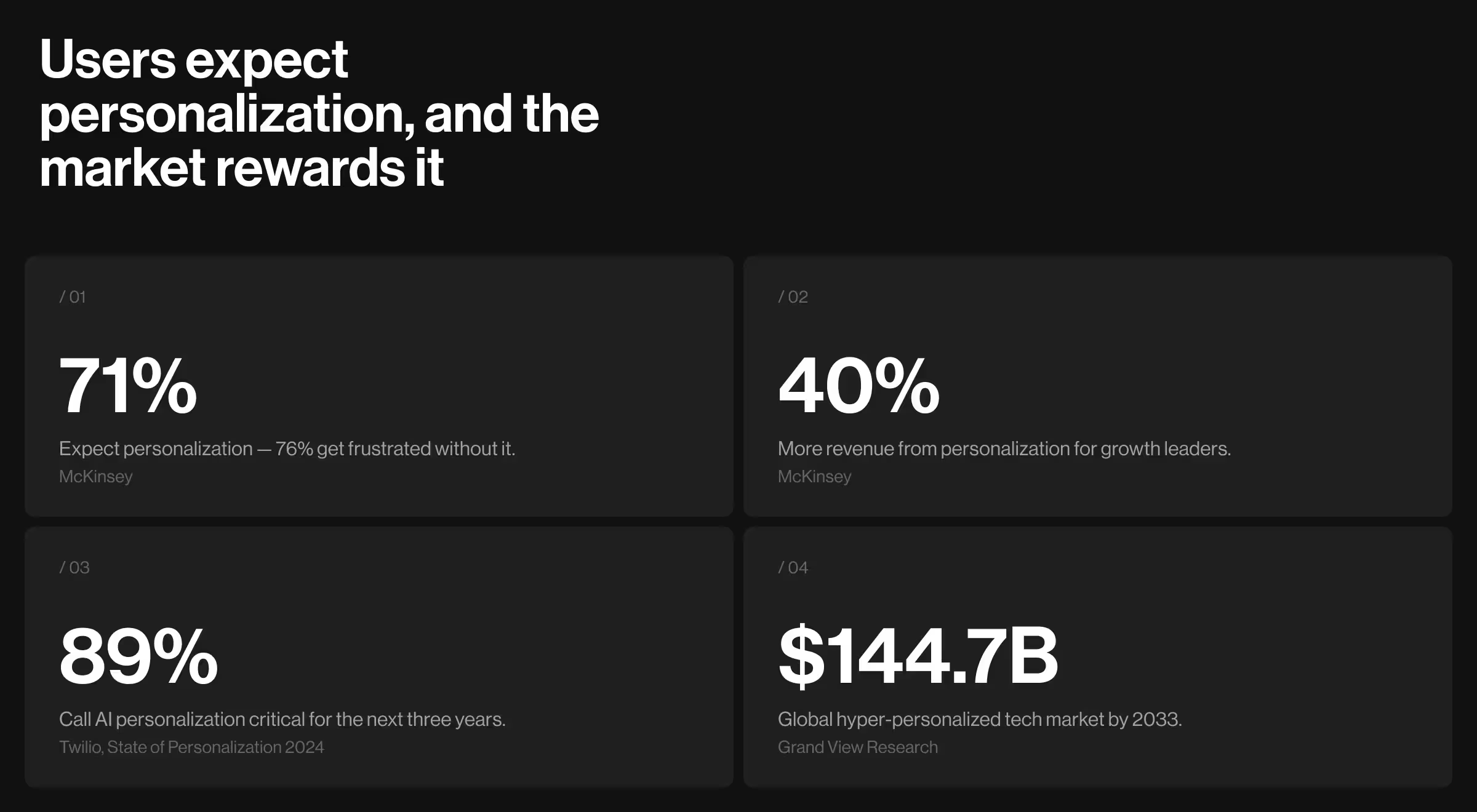
The numbers point one way: personalization is expected, and it drives the fastest growth. This momentum is both the opportunity and the trap, since every one of those forces pushes teams to personalize harder than their trust and data foundations can support, which is how overpersonalization starts.
Static UX vs personalized UX
Most published UX advice assumes a static interface: every user sees the same screen, the same defaults, and the same navigation, and the designer's job is to make that one layout work for everyone.
Personalized user experience starts with a different assumption. The interface is assembled per user from model outputs, the "right" screen changes with context and history, and the design has to account for predictions that are useful, occasionally wrong, and different for every person.
The distinction means a static product fails when the fixed layout doesn't fit a user's task. In parallel, a personalized product fails when it provides a confident recommendation from a shallow signal, narrows the user’s options until the product seems smaller than it is, or it acts on a prediction the user never wanted. The table below maps these differences.
In one line, static UX perfects a single screen for everyone, while personalized UX designs the next best action for each person, the confidence behind it, and the recovery for when it's wrong.
How personalized UX works: the machine learning components
Personalized UX runs on four components working as a loop:
- Signals capture what a user does and prefers.
- A model turns those signals into a prediction.
- The interface delivers that prediction where the user can act on it.
- Feedback from that action retrains the model.
Machine learning UX design is the discipline of shaping all four so the loop improves the experience without slowly degrading it. Microsoft's Guidelines for Human-AI Interaction codify much of the design work here, be it making clear what the system can do to support efficient correction or learning from user behavior.
Now, let’s consider each component at a time.
1. The signals user personalization runs on
Signals are the raw inputs a personalized system learns from, and their quality sets the ceiling for everything downstream. Three kinds carry most of the weight:
- Behavioral signals are what the user does, such as clicks, dwell time, purchases, and skips.
- Contextual signals are the situation, such as device, time of day, and location.
- Declared signals are what the user tells you directly through preferences, onboarding answers, and explicit feedback.
Signal collection is where personalization and privacy first collide, so collect enough to be useful and stay honest about what you gather.
Build rule: Collect only the signals a user would expect you to use.
2. The model turning signals into predictions
The prediction layer is the machine learning model that ranks options and estimates what the user most likely wants next. This is where a recommendation engine, a ranking model, or a large language model (LLM) does its work, and where product teams decide what the system is optimizing for.
A model tuned only for engagement will maximize clicks while making the product worse, so the target metric is a design decision as much as a data-science one. Managed services such as Amazon Personalize package the ranking and recommendation machinery, and the discipline stays the same whichever you use.
Build rule: Define the prediction, the confidence threshold, and the fallback for when confidence is low.
3. The interface where predictions surface
The machine learning UI is the surface where a prediction becomes something the user can see, act on, or ignore, and it's the layer most teams underinvest in. A perfect model with a confusing interface returns nothing, whereas a modest model presented with clear reasoning and easy controls can still deliver an excellent experience. This is the last mile where machine learning becomes a product people experience.
Build rule: Decide how each prediction shows up, whether an inline suggestion, a ranked list, or a pre-filled field, and keep its confidence and its off-switch visible.
4. The feedback loop that keeps it learning
The feedback loop is the component that carries a user's response back to the model, so the next prediction is better informed. Every accepted suggestion or dismissed recommendation is a training signal.
The risk lives here too, since a loop that only rewards engagement narrows what it shows until the user is stuck in a bubble. Google's People + AI Guidebook dedicates a chapter to feedback and control for this reason, because a personalized system earns the right to keep learning only when the user can steer what it learns.
Build rule: Decide what counts as a positive signal, how fast the system adapts, and how a user resets it when it drifts.
Seven personalized UX patterns and the design rule behind each
Personalized UX comes down to seven recurring patterns. Each one addresses a specific way personalization creates value or fails, and the named products in the sections that follow are the clearest examples of each at work.
Most of these surface on the home screen first — see how apps use the home screen.
The overview below is the map. The sections after it go deep on each.
1. Recommendations that rank a catalog to the individual
Recommendations are the pattern for ranking a large set of options by predicted relevance so the user finds the right one without scanning everything. This is personalization in its most familiar form, and it's where the recommendation engine earns its keep: a catalog too big to browse becomes a short, ordered list that fits the person.
Netflix and Spotify built retention on this pattern, ranking vast libraries down to a handful of confident picks and giving the recommendation a reason ("Because you watched…"). The reason is doing real work: it turns an opaque guess into a transparent one the user can trust or dismiss.
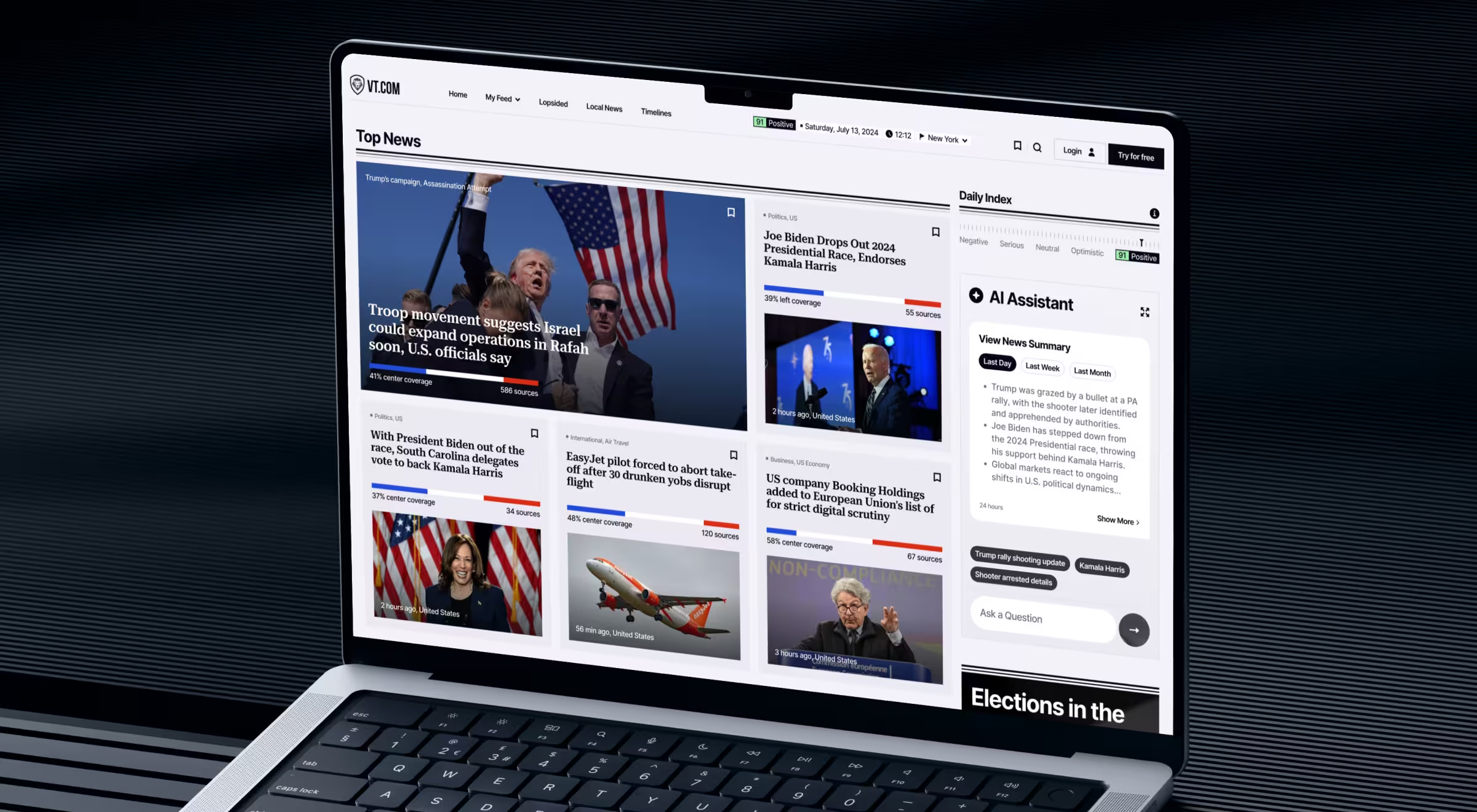
Practical insight from Lazarev.agency's portfolio: We built this pattern into VTnews.ai, the unbiased news platform our team designed with Patrick Bet-David. Readers get a feed tuned to them by 100-plus thematic filters, location, and saved topics, with each story paired with a bias scale and a three-perspective summary that shows why it surfaced. After launch, 85k users onboarded in the first month, and 90% said the platform helped them step outside their information bubble.
✅ Design principle: Show why each recommendation was made and give the user one control to tune it.
2. Predictive defaults that remove steps
Predictive defaults are the pattern for pre-filling or pre-selecting the option the user most likely wants, so a multi-step task collapses into a confirmation. This is predictive UX: the best default is one the user barely notices because it's simply correct. The risk is a confidently wrong default the user has to notice, undo, and redo, which costs more trust than a blank field ever would.
✅ Design principle: Pre-fill only high-confidence predictions, and make every default a one-tap correction.
3. Predictive text and autocomplete that finish the thought
Predictive text is the pattern for suggesting the next word or reply so the user writes faster with less effort. It's one of the most widely used forms of predictive design because the value is immediate and the cost of a wrong suggestion is near zero, since the user just keeps typing. The design challenge is staying helpful without hijacking voice or breaking flow.
Grammarly and Google's Smart Compose in Gmail set the bar here, offering completions the user can accept with one keystroke and ignore with none.
✅ Design principle: Make accepting a suggestion one keystroke and declining it cost nothing.
4. Predictive search that matches intent early
Predictive search UX is the pattern for anticipating what a user is looking for before they finish typing, ranking, and completing the query. It matters because search is where intent is highest, and patience is lowest, so every character the system can save and every typo it can forgive moves the user to the result faster. Weak search treats the query as a literal string; strong predictive search treats it as an intent to be matched.
Site-search platforms like Algolia and the search on Amazon show this pattern at scale: autocomplete that predicts the full query and results ranked by what this user is likely to want. The perceived speed comes as much from the prediction as from the raw query time.
✅ Design principle: Predict and complete the query, forgive typos, and rank results by likely intent over literal match.
5. Adaptive interfaces that reshape around the user
The adaptive interface is the pattern for changing the layout, navigation, or surfaced tools based on who the user is and what they do, so the product fits the individual's job. This is the fullest expression of personalized UX and the hardest to get right, because an interface moving under the user can disorient as easily as it can help.
"Designers can't draw every screen anymore. With LLMs, the use cases are infinite, so the deliverable is a modular system the model can assemble."
{{Kirill Lazarev}}
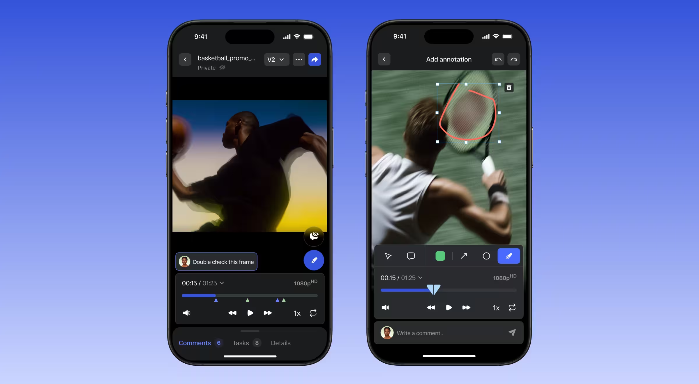
Practical insight from Lazarev.agency's portfolio: We applied this in StreamWork, a video productivity platform with dashboards adaptive to each role. Creatives open on the tasks and assets awaiting review, managers on campaign status and bottlenecks, and clients on what needs their sign-off, so one interface becomes a focused, different product for every user.
✅ Design principle: Adapt from a stable core, keep every change legible, and let the user pin what they rely on.
6. Transparency and control that earn the right to personalize
Transparency and control is the pattern for showing the user why the system personalized something and letting them change it, converting a black box into a relationship. This is the pattern that separates helpful personalization from the creepy kind, because the same recommendation lands differently when the user understands its basis and can correct it. Trust in a personalized product is built at the moment of the prediction, in the open.
"Nobody owes your model their trust, and no disclaimer buys it. Show users where every answer came from, let them fix it on the spot, and trust turns into retention no rival can out-model or copy."
{{Kirill Lazarev}}
The Nielsen Norman Group makes the same point in its personalization guidance: give users visibility and control, because personalization done to people rather than with them backfires. A "Why am I seeing this?" label and a one-click way to tune or reset the model are what let personalization scale without tipping into overpersonalization.
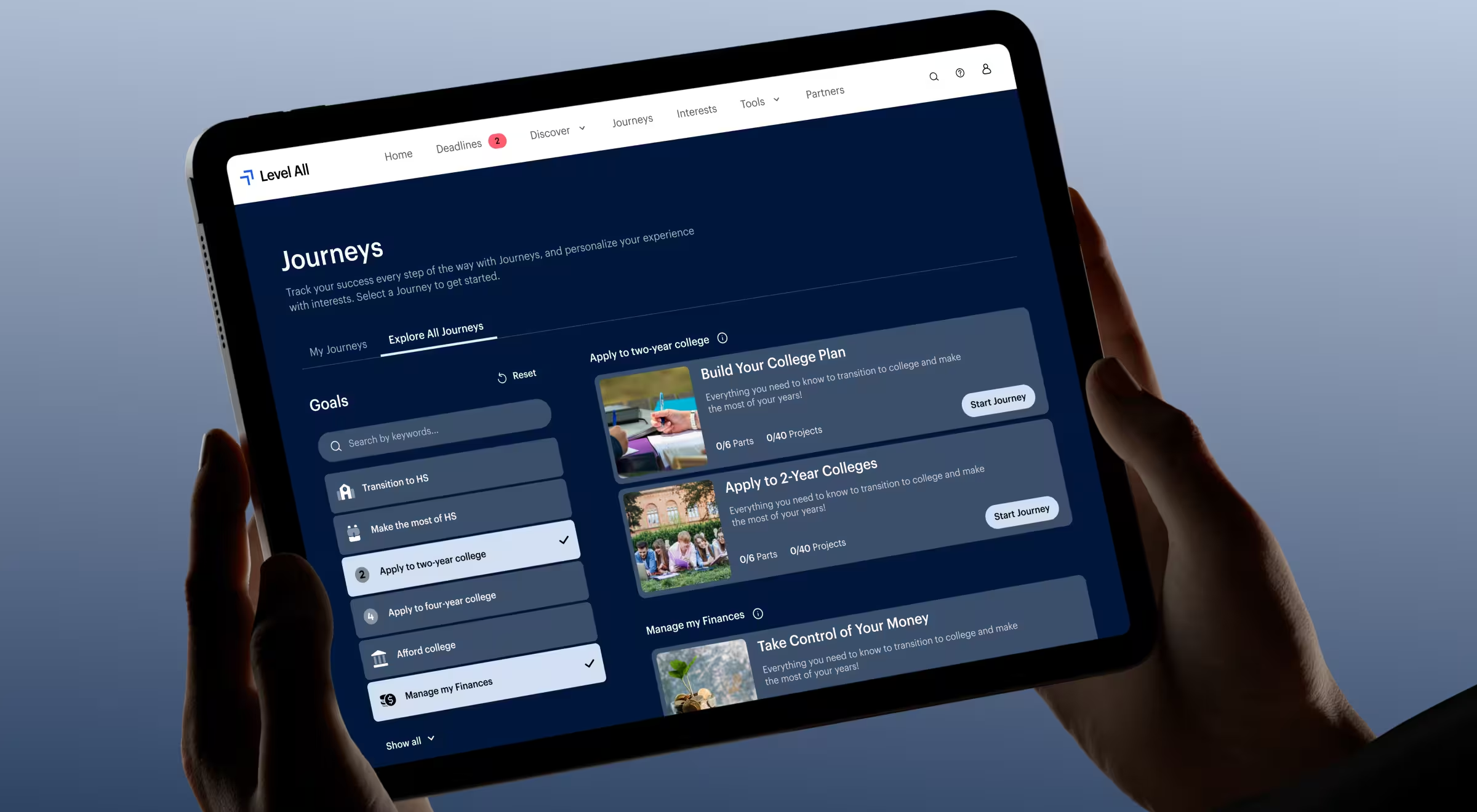
Practical insight from Lazarev.agency's portfolio: We designed this into Level All, an edtech platform where students control their own personalization. Every profile is editable, so a learner can update their school, graduation year, or career interests, and each edit immediately redirects the recommendations, keeping the content aligned as their goals shift across the academic lifecycle.
✅ Design principle: Attach a plain-language reason to every personalized decision and a control that lets the user correct it.
7. Cold-start onboarding that personalizes before you have data
Cold-start onboarding is the pattern for delivering a good first experience to a user the system knows nothing about yet, before any behavioral history exists. It matters because the first session is when a personalized product is at its weakest, and a new user is at their most skeptical. The job is to bridge the gap between zero data and enough data to personalize well.
Strong onboarding captures a few declared preferences, leans on popular and safe defaults in the meantime, and learns fast from the first handful of actions. The goal is a first session that already looks considered, so the user gives the system the second session it needs to get good.
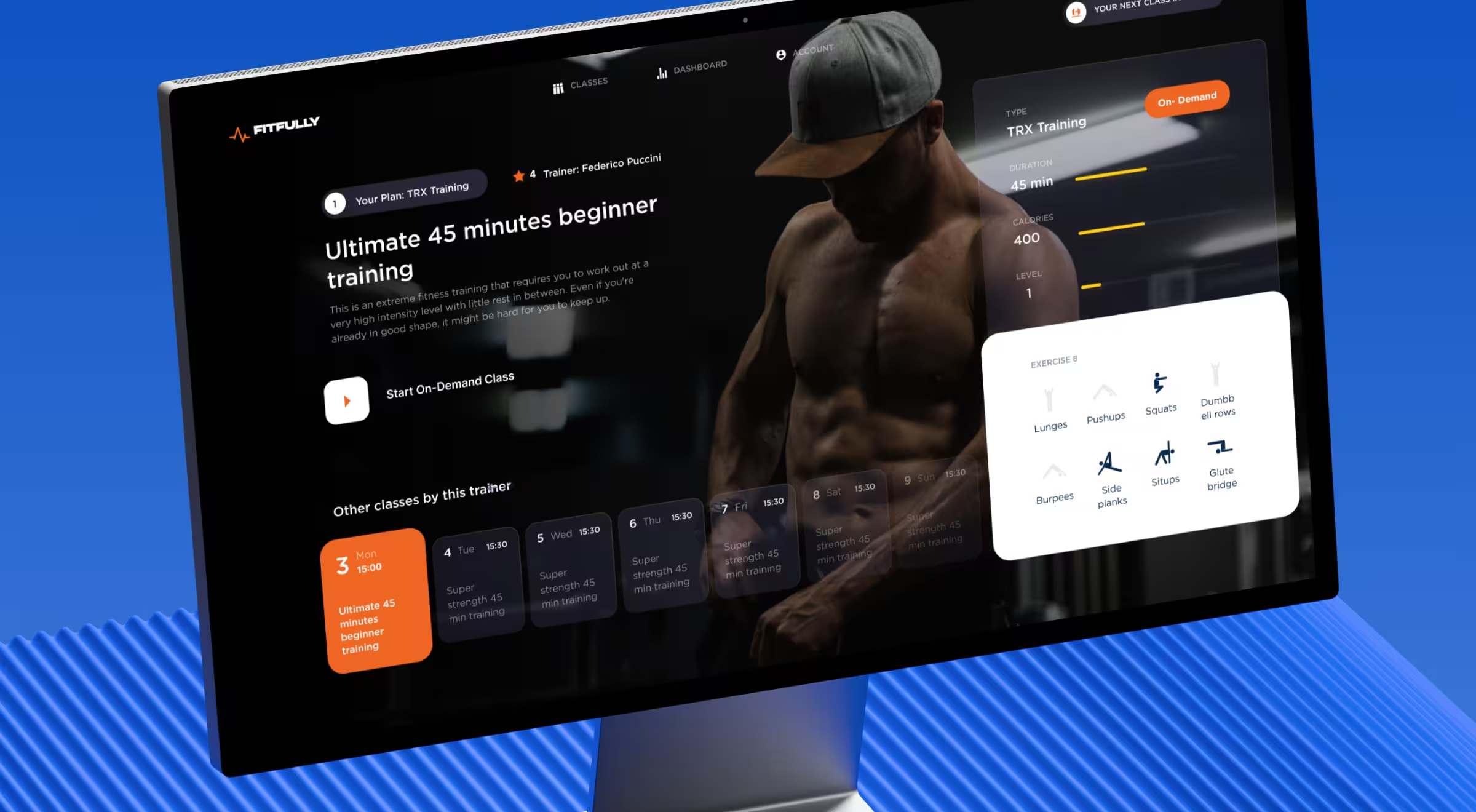
Practical insight from Lazarev.agency's portfolio: We built this into Fitfully, a live fitness platform where onboarding works as an exchange. A short, numbered flow gathers goals, training level, and body details, a profile card fills in as the member answers, and a note explains why each field is asked, so the flow ends on a personalized plan and a booked first class.
✅ Design principle: Ask for a few high-value preferences up front, fall back to safe popular defaults, and learn visibly from the first actions.
Common failure modes
Personalized products fail in a handful of predictable ways, and each surfaces only once real users with real histories and real privacy expectations start interacting with them.
This is not a hypothetical risk: Gartner predicted 80% of marketers who invested in personalization would abandon the effort. Five failures do the most damage.
- Overpersonalization. The system uses data the user didn't expect it to have, or narrows the experience so aggressively that it comes across as invasive, and the reaction is distrust.
- The cold-start gap. A new user with no history gets a broken or empty personalized experience, so the product's first impression is its weakest one.
- Opaque decisions. The user can't see why something was recommended or predicted and has no way to correct it, so a single wrong guess reads as the system being broken.
- Filter bubbles. An engagement-optimized loop keeps narrowing options until the product looks smaller than it is, and the usage metric climbs while real value falls.
- Pre-acting without a safety net. A predictive action fires on a low-confidence guess with no easy undo, and one costly mistake teaches the user to distrust every prediction after it.
Every one of these traces back to a design decision about signals, confidence, transparency, or control, which is why deliberate machine learning UX design is what keeps them out of production.
Make personalization your moat
The products that win with personalization treat it as a way to fit the user. Collecting more data is easy. Yet, earning the right to act on it is the hard part, and the difference is almost always design. When a personalized system removes a step, surfaces the right option, and shows its reasoning, it becomes the thing a user won't give up. When it acts on data they didn't expect and can't correct, it becomes the reason they leave.
That gap is a design opportunity, and it's the layer competitors can't copy with a weekend of model tuning. A few principles we design around at Lazarev.agency:
- Personalize the task itself. Adapt the work the user came to do, and leave the decoration alone; moving the furniture around isn't personalization.
- Design the feedback loop first. Decide what counts as a positive signal and how a user resets it before you ship the first recommendation, because the loop is what compounds or corrupts.
- Earn trust with provenance. Show the reason behind every personalized decision at the moment the user acts on it, so confidence is built in the open.
- Measure repeat use over session time. A rising engagement number can mean a user is stuck in a loop, so treat retention and task success as the real scoreboard.
"If a user has to prompt six times to get an answer, your time-on-product metric goes up, and your product is still failing. Our job is to reduce prompts."
{{Kirill Lazarev}}
Design personalization people trust
Personalized UX is a product decision before it's a design deliverable, and it's one any serious team can get right. Get the signals, predictions, transparency, and control working together, and personalization becomes the reason people stay and come back. With the right digital design partner, a personalized user experience is well within reach, and the teams who reach it turn personalization into the advantage competitors can't copy.
Lazarev.agency has designed AI-native products since 2017, across 30-plus AI products and $500M-plus in funding raised by the teams we've worked with. We design recommendation, prediction, and adaptive-interface experiences the same way we design the rest of an AI product: signals, failure modes, and trust surfaces first, then the interface tying them together.
If you're deciding how much personalization belongs in your product, or you have a personalization layer failing to earn trust, book a product and AI UX strategy session and we'll pressure-test it with you.