With AI taking over the technology world, enterprises across industries face growing pressure from customers and investors to prove their value.
In the SaaS market, the only way to handle such pressure is by granting users a clear view of the product’s performance through a strategic SaaS dashboard design.
Below, we uncover actionable dashboard design practices for sustainable SaaS product performance and show how real-life products thrive when these principles form the foundation of their digital presence.
Key takeaways
- A SaaS dashboard is a decision system. Its primary job is to reduce time-to-insight and guide users toward meaningful action.
- Focus on data-backed signals. Limit KPIs to what drives action. Layer supporting data progressively to avoid overwhelming users. Clear hierarchy and KPI prioritization define whether users understand your SaaS product or get lost in the ill-structured system.
- A dashboard must evolve with users. What works for onboarding fails for power users unless the system adapts.
7 actionable dashboard design practices for sustainable SaaS product performance
Designing dashboards for SaaS products requires a different mindset than designing for marketing websites or transactional apps.
“In most digital products, success is a matter of a completed action. If your users made the purchase or signed in (depending on the prioritized CTA), the dashboard has done its job. In SaaS, user retention is the chief KPI. Users return to evaluate performance, validate outcomes, and adjust decisions based on the insights your product’s dashboard highlights. From this perspective, it’s safe to say SaaS UI is a recurring environment for thinking and acting.”
{{Anna Demianenko}}
The difference Anna describes elevates the importance of strategic dashboard design for SaaS products.
A SaaS dashboard must minimize cognitive load across repeated sessions and help users build confidence in the system. The following practices reflect how high-performing SaaS dashboards are designed to sustain product performance.
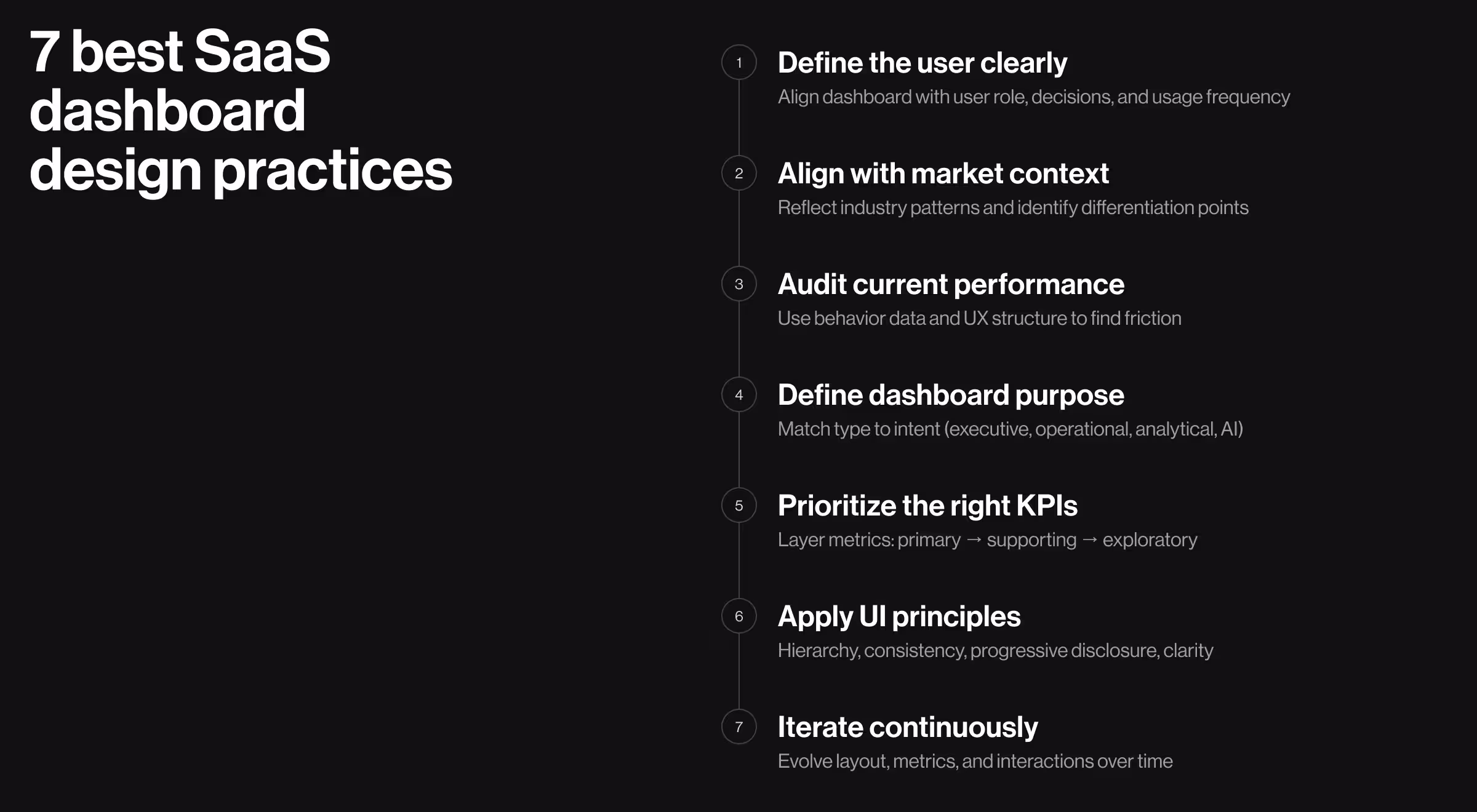
1. Understand your users
Every dashboard serves a specific user with a specific responsibility.
A founder tracks growth signals. A product manager monitors feature adoption. An operations lead looks for bottlenecks. Without a clear definition of your target audience (TA), dashboards do nothing more than accumulate features and dilute focus.
To define your target audience, clarify:
- What decisions the user is responsible for
- How often they interact with the dashboard
- Their familiarity with data and tools
✅ Why it matters: Improves the clarity of new customer onboarding and shortens the time users need to reach meaningful insights.
🔎 Explore the risks of skipping UX research in our dedicated blog.
2. Understand your market
According to CB Insights, around 4 in 10 startup failures can be traced back to weak product–market fit (PMF). In most cases, the problem is the absence of a clear understanding of who the product serves and why it matters. A misaligned dashboard only amplifies this gap, making value harder to perceive.
Analyzing your market means studying:
- Competitor dashboards
- Emerging standards (e.g., explainability in conversational AI interfaces)
✅ Why it matters: Aligns the dashboard with familiar mental models while creating opportunities to outperform competitors through strategic design solutions.
🔎 Learn what makes market + UX research the duo your product needs to succeed.
3. Assess your current product performance
Before introducing new design decisions, evaluate what already exists. This step requires a careful design system audit to identify areas for improvement.
Key areas to assess:
- Behavioral analytics (where users pause or drop off)
- UX structure (navigation clarity, hierarchy, readability)
- Design system (interaction logic, scalability)
✅ Why it matters: Creates a stable foundation. Ensures the dashboard operates as a cohesive system rather than a set of fragmented screens.
🔍 Our suggestion here is to look beyond surface metrics. Ensure your team has a strong understanding of key B2B SaaS numbers to implement the most relevant design decisions for your product.
4. Determine the dashboard’s purpose for your TA
A single dashboard cannot serve multiple intents with the same accuracy. Each dashboard should answer a clearly defined question for a clearly defined user.
The following classification of dashboards implies a different layout, data density, and interaction model:
1. Executive dashboard — overall business performance:
- Focus: high-level KPIs, targets vs actuals
- Structure: summary-first (top-line metrics, then drill-down)
- Interaction: minimal; quick scanning, optional deep dive
- Design cue: clarity first
2. Operational dashboard — immediate issues requiring action:
- Focus: real-time status, alerts, anomalies
- Structure: prioritized issues first (what needs attention now)
- Interaction: fast filtering, quick actions, status updates
- Design cue: urgency and visibility
3. Tactical dashboard — short- to mid-term performance optimization:
- Focus: team-level metrics tied to ongoing goals (weekly/monthly targets, conversion rates)
- Structure: goal-oriented (metrics grouped by objective or workflow stage)
- Interaction: moderate; track progress, adjust inputs
- Design cue: direction and accountability
4. Analytical dashboard — deeper investigation of trends:
- Focus: patterns, comparisons, correlations
- Structure: layered exploration (filters, segments, drill-downs)
- Interaction: high; users manipulate data to find answers
- Design cue: flexibility and depth
5. AI dashboard — assisted insights and recommendations:
- Focus: predictions, anomalies, suggested actions
- Structure: insight → explanation → action
- Interaction: validate, refine, or act on AI outputs
- Design cue: trust, transparency, and explainability
✅ Why it matters: Having a clear purpose aligned with users’ needs helps define a relevant structure and interaction patterns for the product’s dashboard.
5. Agree on the KPIs for the dashboard to highlight
With too many KPIs displayed on the dashboard, users struggle to identify what matters. Featuring irrelevant metrics is just as problematic. If the wrong KPIs are prioritized, decisions become misaligned with business goals.
Select KPIs based on:
- Strategic objectives
- User responsibilities
- Frequency of decision-making
Then structure them as three layers:
- High priority metrics made immediately visibile
- Supporting metrics for contextual understanding
- Exploratory data accessible through interaction
✅ Why it matters: Users rely on dashboards to prioritize attention. Poor metric hierarchy leads to confusion.
6. Apply relevant UI design principles
UI design determines whether users understand data or struggle with it.
Key principles include:
- Visual hierarchy directs attention to prioritized metrics
- Progressive disclosure helps introduce additional information gradually
- Consistency lowers learning effort across sessions
- Spacing and contrast improves readability and scanability
- Microinteractions provide feedback and reinforce actions
For AI-driven dashboards, an additional principle is critical: visibility of logic. Users need to understand how the outcomes they see have been generated.
✅ Why it matters: Even the right data becomes ineffective if presented poorly. When applied properly, UI design principles can substantially improve comprehension speed and increase confidence in the system.
7. Iterate and evolve
As features expand and market dynamics shift, the way people interpret and act on data changes. Hence, your SaaS dashboard should evolve with the market, the product, the users, and the business.
Refine continuously:
- Dashboard layout
- KPI prioritization
- Interaction patterns
✅ Why it matters: Early-stage users explore, whereas power users expect speed and customization. A static dashboard locks you into assumptions made at one point in time, while your users keep evolving.
🔍 Evolving a SaaS product means adapting to both internal and external change. While UX performance metrics keep the product structurally sound, tracking key SaaS trends ensures it stays competitive.
Dashboard design examples from live SaaS products
Real dashboards reveal what theory hides.
Each product below operates in three different environments. And while the constraints of each industry vary, the requirement stays the same: users must understand what’s happening and act without hesitation.
These case studies from our portfolio show how strategic UI decisions solve product problems. Let’s explore them one at a time.
1. Tratta
Tratta’s dashboard illustrates how financial SaaS products can deliver dense information in a format optimized for speed and repeat use.
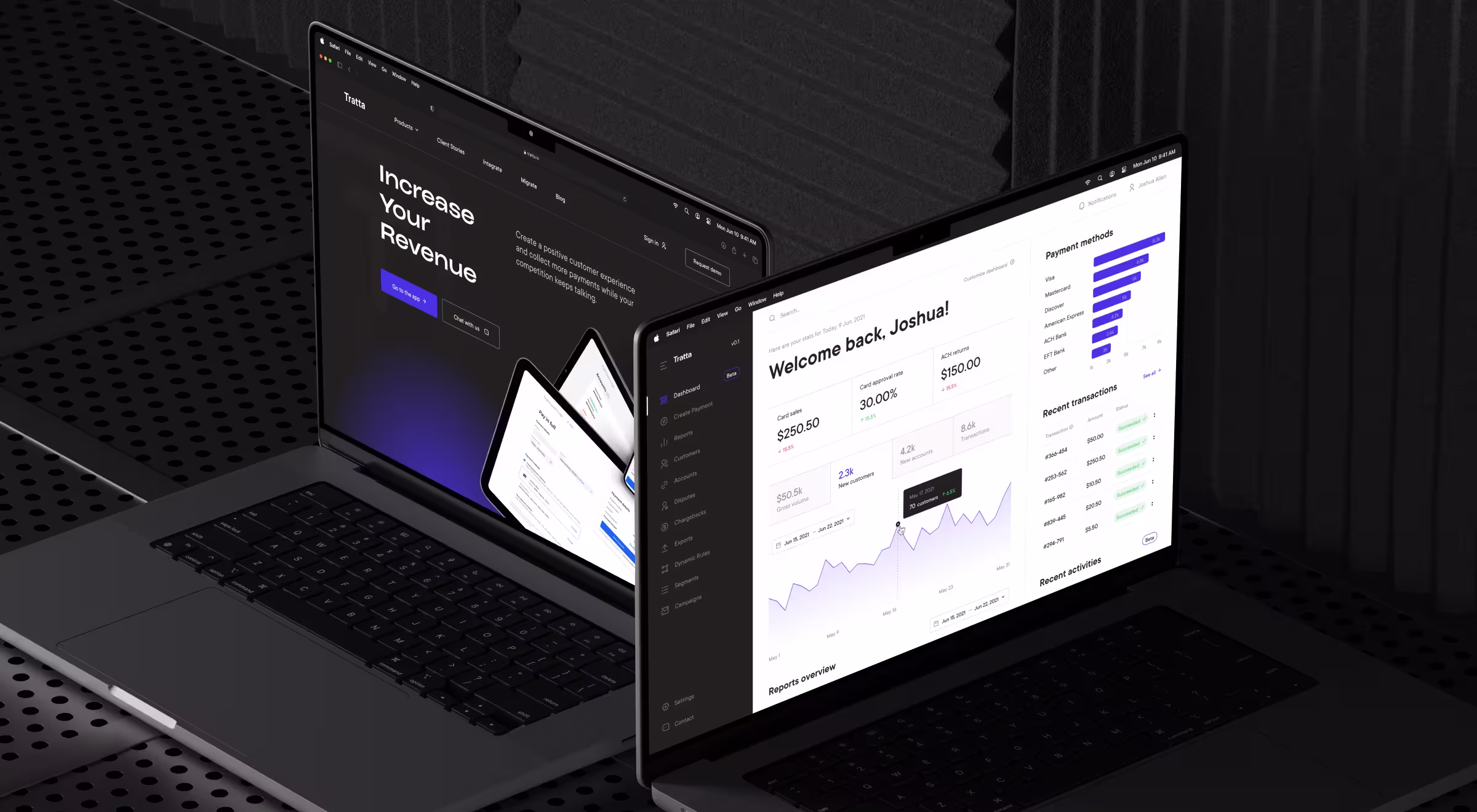
Our team focused on designing a flexible decision environment for collectors and payment organizations. The revamped dashboard has been integral for this shift, as it helps users manage transactions and monitor accounts from one place.
🧩 Key UI/UX decisions behind the dashboard design:
- Vertical hierarchy optimized for sequential scanning. The dashboard follows a strict top-to-bottom structure: context → timeframe → key metrics → trends → detailed transactions. Each layer answers a different user question.
- Time context in the core workflow. The date range selector anchors reporting and transaction analysis, which ensures all metrics reflect relevant insights within a defined period.
- Embedded micro-trend visualizations within metrics. KPI sections feature lightweight line charts. It adds temporal context without increasing visual weight.
- Continuous flow between summary and detailed data. The transition from high-level metrics to “Recent transactions” happens within a single scroll. No additional navigation interrupts the experience.
💼 Have a closer look at how our redesign of Tratta’s debt settlement platform strengthened its usability and opened new revenue streams.
2. Customer City
Customer City’s dashboard is a command center where teams manage performance and coordinate daily execution across roles. The dashboard structures work as actionable layers guiding users from insight to action.
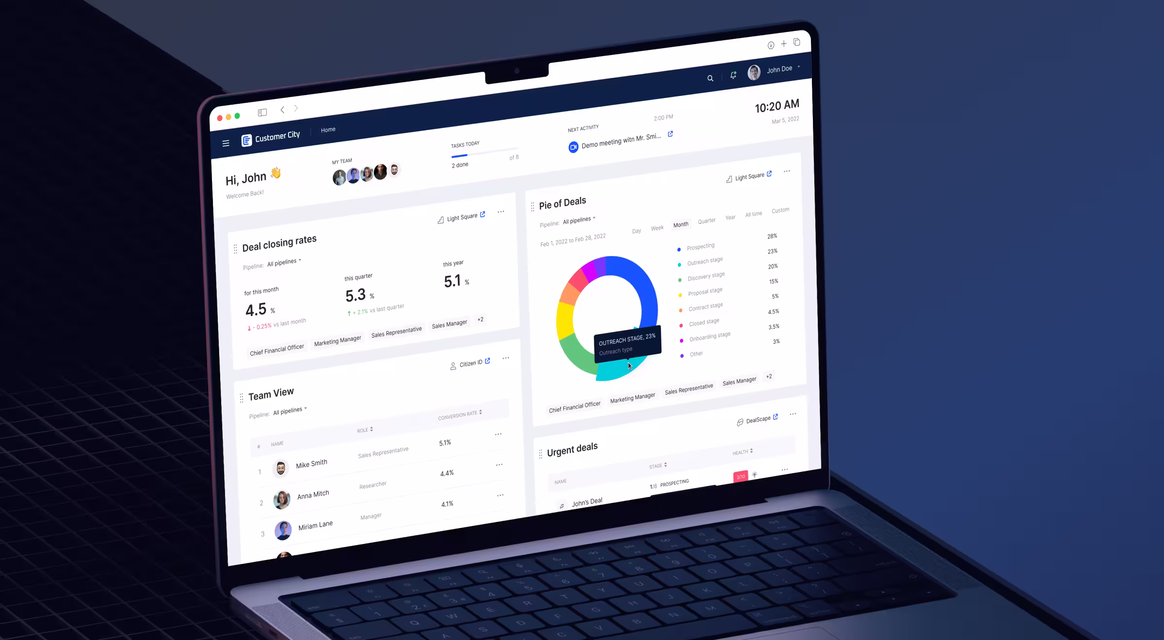
🧩 Key UI/UX decisions behind the dashboard design:
- Execution-first layout focused on active work. Sections like “Urgent deals” surface live pipeline activity with deal stages and progress indicators.
- Multi-block modular structure for parallel workflows. The dashboard combines several functional blocks: team performance, deal tracking, chart insights, and task views. Each block supports a different operational layer within the same screen.
- Table-first design optimized for scanning and decision-making. Structured tables dominate the interface, displaying users, roles, and performance metrics in a clean, sortable format.
- Role-based segmentation enabling cross-functional alignment. The interface reflects multiple stakeholders — finance, marketing, sales — within a unified system. Each role interacts with the same data through a relevant lens.
- Selective use of visualization for quick summaries. Charts such as the donut visualization support high-level understanding but do not dominate the interface. This UI decision demonstrates how visualizations can complement decision-making without replacing operational clarity.
🔍 Explore in more detail how Customer City’s redesign helped boost the platform’s online presence.
3. Fractal Protocol
Designing for DeFi means designing for decisions under risk.
Users are managing capital amid volatile market conditions where delays cost money. The interface must surface risks instantly to ensure users can make well-informed decisions in time.
Fractal Protocol’s dashboard follows a strict UI structure. It allows users to read the system and act on it simultaneously.
🧩 Key UI/UX decisions behind the dashboard design:
- Multi-layered layout separating strategy, monitoring, and execution. The interface has three clear zones:
- Left panel: account metrics and positions
- Main canvas: performance chart
- Top bar: actions and controls (trade, lend/borrow, export).
- Persistent account context for financial awareness. Key indicators such as total balance, equity value, health factor, and margin fraction remain fixed in the left panel. These metrics define risk exposure and portfolio health at all times.
- Hierarchical grouping of critical data for faster interpretation. Information is represented through logical blocks: Account Summary, DeFi Position, and Realized Performance. Each block focuses on a specific dimension of the system, be it balance, yield, or outcomes.
- Dark UI optimized for data density and prolonged usage. The interface uses a dark theme with controlled highlights to reduce visual fatigue and emphasize key signals.
Strategic color hierarchy supports extended sessions and improves readability in data-heavy environments. - Action-driven top navigation for immediate execution. Primary actions such as Trade, Lend/Borrow, and Export CSV are positioned in the header and are always accessible.
- Inline status indicators for system and position feedback. Elements such as “Active” status, wallet connection, and loan confirmation messages provide continuous feedback on system state.
🔍 For a more comprehensive digest of how we transformed this digital marketing platform into a user-centric solution, consider our dedicated case study.
Win your market with a strategic SaaS dashboard design
SaaS dashboard design is an umbrella term for strategic UX/UI solutions tailored to your product’s industry and target audience. Developing a dashboard for a fintech app differs from setting the foundation for a site reliability engineering (SRE) platform.
What remains true for every enterprise player is the role of a clear UX strategy and a solid grip of industry trends. And keeping up with it all puts your in-house team under undue pressure.
That’s where hiring an expert design team comes in handy. A specialized SaaS design agency will help your product strike the right note with your audience and become irreplaceable in the long run.
Interested in securing a strong design base for your SaaS product? Reach out to our team for a personalized consultation.


.webp)