If you’ve found yourself questioning why MQL-to-SQL conversion rates stagnate or why customer acquisition costs keep rising, the issue likely lies in the growth model itself.
Business strategies get deeply embedded in workflows. Once that happens, reconsidering them often feels disruptive. Yet maintaining an outdated model comes with a far greater price.
“After working with dozens of clients across industries, we’ve noticed that sales-led and market-led approaches — essentially conventional frameworks — still guide many organizations. Marketing builds the story, sales closes the deal, and the product arrives later to prove the story was true.
In innovation-driven markets, that logic doesn’t hold up well. Users are far less interested in being convinced. They want to see the value for themselves without any mediation.
That’s exactly what product-led growth enables. The product becomes the first and most persuasive touchpoint. People judge the product value on its own merits, and not on what the ads say.
Design defines the verdict here. It helps users understand the product in minutes and decide to stay (or leave).”
{{Kirill Lazarev}}
In this article, we explore how design determines the success of a product-led business model. When users evaluate the product before speaking to a sales team, the interface becomes responsible for explaining the product and guiding adoption.
Key takeaways
- In PLG, the interface replaces the sales pitch. Users evaluate the product before speaking with sales, so UI/UX must communicate value instantly.
- Self-serve design drives adoption. Progressive disclosure, intuitive affordances, empty states, and contextual guidance enable exploration without training.
- Value-first interfaces convert usage into revenue. Products succeed when users experience real value before encountering pricing or upgrade prompts.
What PLG means for design
Product-led growth (PLG) is a business model in which the product itself drives conversions and optimizes bounce rates. It fundamentally changes how design drives business outcomes — the interface becomes the primary acquisition and conversion tool.
💡 Data insight: Companies that structure their growth around product usage outperform competitors focused on traditional SaaS models. OpenView found that PLG leaders grew at roughly 50% year-on-year, more than double the growth rate of traditional SaaS companies at 21%.
Here’s how our Lead AI UX Designer, Anna Deminanenko, explains the growing popularity of PLG:
“PLG is nothing but a natural extension of a broader industry-wide transition, which is particularly resonant for SaaS enterprises. To stay competitive, businesses must prioritize scalable growth approaches, including AI-driven solutions. And product-led growth is a key framework for that.”
PLG contrasts with earlier approaches where product adoption depended on human explanation. In sales-driven organizations, prospects rely on demo presentations and onboarding sessions to understand the product. Marketing-led companies emphasize positioning and messaging to persuade buyers before they enter the product environment.
PLG rewires these conventional paradigms. The product experience is the main source of understanding. Users sign up, explore the interface, and evaluate the product through their own actions. In other words, users encounter the interface before any formal sales conversation.
This way, design determines:
- the speed at which users understand the product
- the ease with which new users reach meaningful outcomes
- how clearly the product communicates its capabilities
- how naturally users adopt new features
Treat onboarding as the key UI feature
“Product-led growth implies that you want your product to be easy to use and easy to get value from.” — Zeynep Inanoglu Ozdemir, CMO at Atlassian.
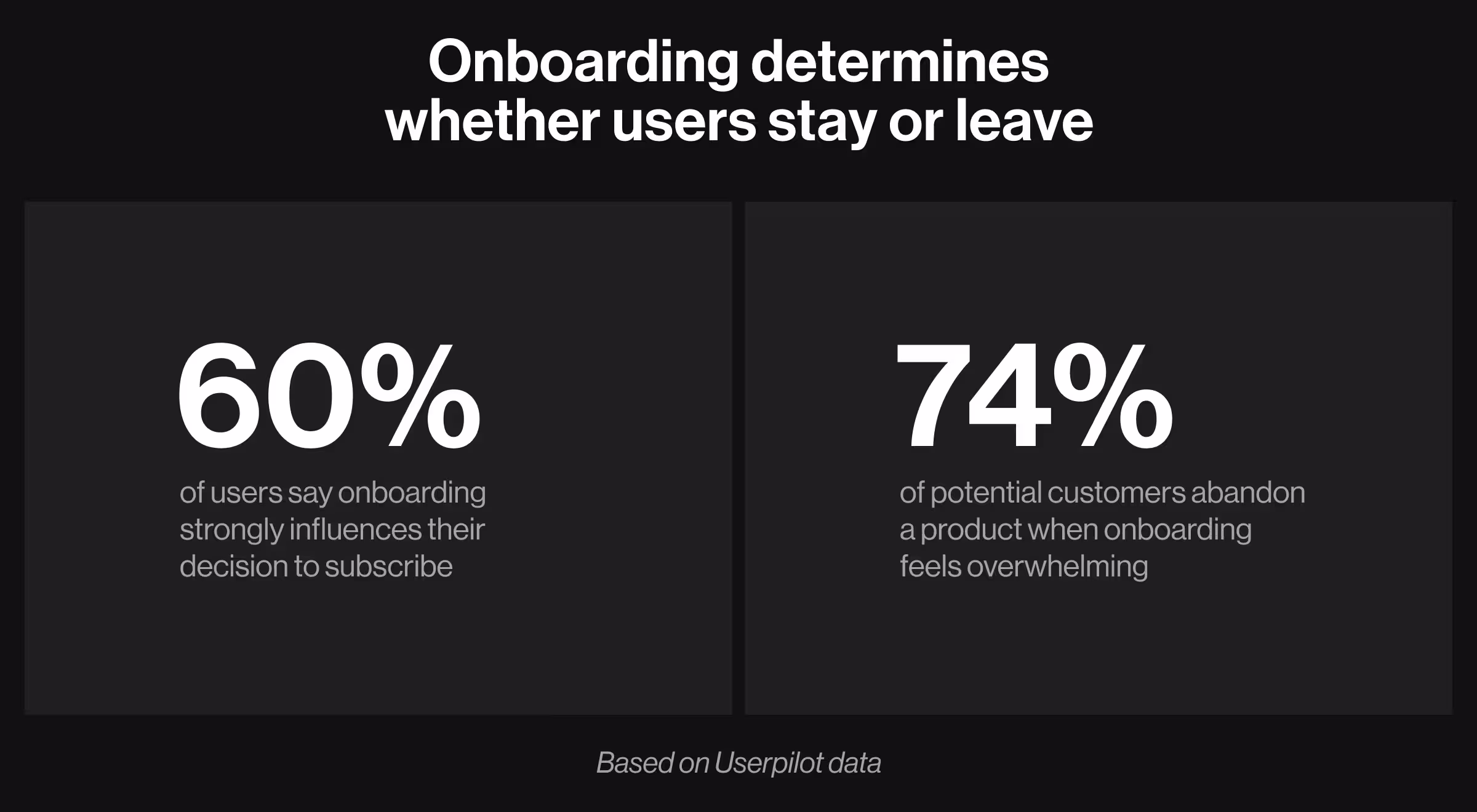
In product-led companies, onboarding determines whether a user becomes a customer. The product has only a short window to demonstrate value before the user leaves. There is no sales conversation to provide context and no onboarding specialist to guide the experience. The interface must perform that work.
The numbers illustrate how decisive this moment is. According to Userpilot, more than 60% of customers say onboarding plays a key role in their decision to subscribe to a product. At the same time, 74% of potential customers abandon a product if the onboarding process gets overwhelming.
🔍 Explore our new customer onboarding playbook for a deeper understanding of fundamentals.
The good news is that the onboarding performance is measurable. Product teams can analyze what helps users progress and what causes them to drop off.
Key indicators include:
- Onboarding completion rate — the share of users who finish the initial setup flow.
- Drop-off points — where users abandon the onboarding sequence.
- Time-to-first-action — how quickly users perform a meaningful interaction.
- Time-to-value — how long it takes before users experience the product’s core benefit.
These metrics reveal whether the onboarding design helps users reach value or delays it.
Designing for self-serve adoption
For users to adopt products without approaching sales reps, the interface must guide exploration without being overwhelming. This requires careful attention to discoverability and progressive learning.
🔍 Leading the industry means accounting for innovation. These 2026 UI design trends will help you build a pioneering digital product.
The following design principles help products remain approachable while still supporting sophisticated functionality.
Several successful PLG products illustrate this approach.
- Figma encourages exploration by allowing users to interact with tools immediately. The interface reveals complexity gradually as users begin creating.
- Notion uses templates and examples to help users start quickly. Instead of tutorials, the product encourages experimentation through ready-made structures.
In both cases, design lowers the cognitive effort required to begin using the product.
Build the value-first interface to maximize PLG
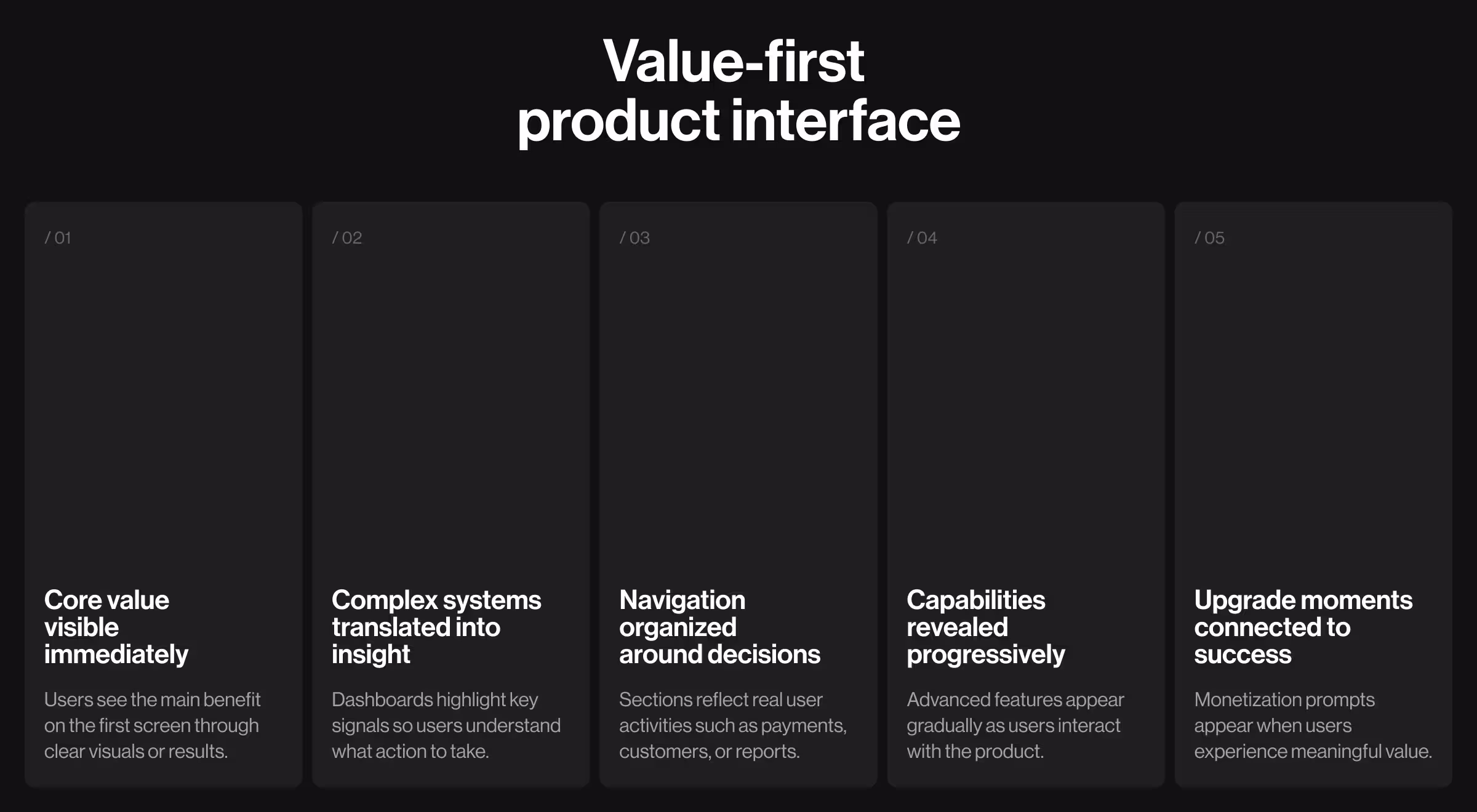
In product-led companies, the interface must demonstrate usefulness before asking for commitment. Users decide whether to continue using the product based on what they can accomplish in the first minutes of interaction. Design determines whether the product communicates value clearly enough to justify that deeper adoption.
A value-first interface organizes the product around outcomes. Each screen answers a simple question: What does the user gain from this interaction?
Below are the proven design practices that make this possible.
1. Surface the core value immediately
The first product screen sets the tone for the users’ next steps. If the interface delays value behind technical descriptions or dense specifications, users struggle to understand why the product matters.
Effective PLG interfaces prioritize demonstration over explanation.
The redesign of the Riptide e-commerce experience illustrates this principle. The interface highlights the skateboard itself through dynamic visuals, allowing visitors to understand the product’s appeal right away.
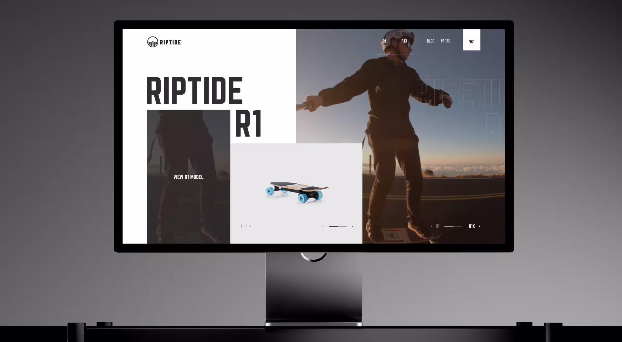
This approach reduces cognitive effort and shortens the path from curiosity to purchase intent.
✅ Implementation tips:
- Prioritize the outcome users seek
- Replace long descriptions with experiential demonstrations
- Limit the first screen to the most persuasive signals of value
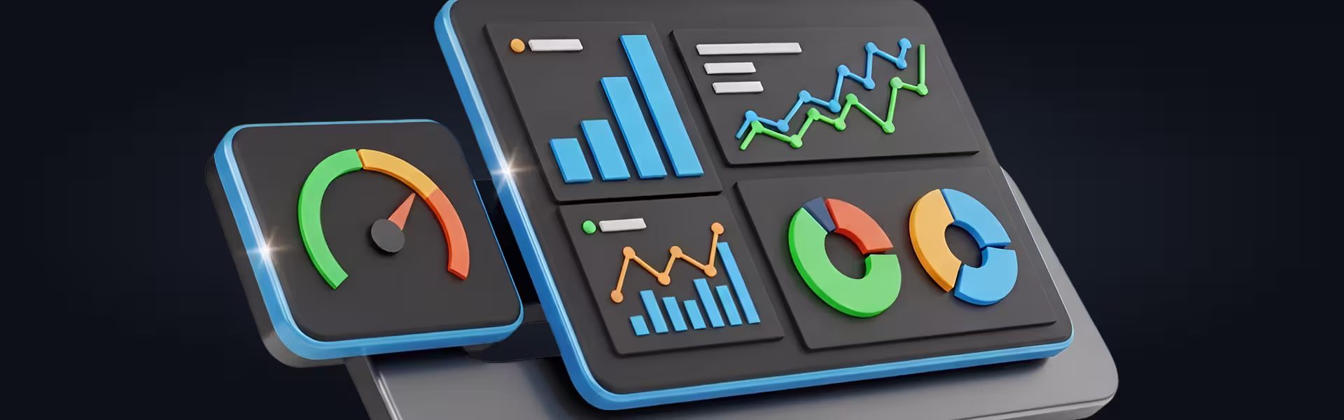
2. Translate elaborate systems into immediate insight
Products that process large volumes of data often overwhelm users. A value-first interface converts complexity into actionable insight.
In the Thorn energy management platform, the interface aggregates operational data into a centralized dashboard where key consumption metrics and system performance indicators are highlighted visually.
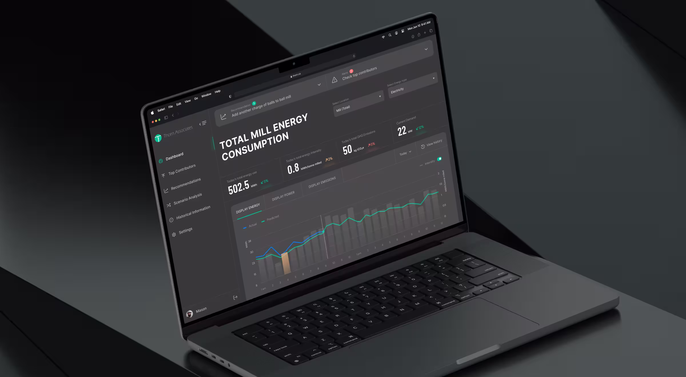
✅ Implementation tips:
- Structure dashboards around decisions users must make
- Use visual hierarchy to highlight key indicators
- Emphasize interpretation rather than raw data display
🔍 Have a closer look at the effective dashboard UX design practices behind high-performing products.
3. Design navigation around decisions
Many digital products structure navigation around internal architecture. This forces users to translate technical terminology into practical actions.
A value-first interface reverses this logic. Navigation reflects the decisions users want to make.
Stripe’s dashboard provides a clear example. Its primary navigation includes sections such as Payments, Customers, Invoices, and Reports, with each category corresponding to a practical business activity.
This structure reduces cognitive effort during exploration. Navigation built around decisions also improves feature discovery. Capabilities appear within workflows that match user intent. When users navigate through tasks such as reviewing payments or analyzing revenue, they naturally encounter related features.
✅ Implementation ideas:
- Organize navigation around the core user actions
- Replace technical terminology with outcome-oriented labels
- Map each navigation category to a specific user goal
- Validate navigation structure through task-based user research
4. Reveal capability progressively
Value-first interfaces avoid overwhelming users by presenting everything at once. Capabilities appear gradually as users become more engaged with the product.
This approach allows users to understand the product through use. Each interaction introduces new possibilities and helps them expand their workflow step by step.
The Peel redesign illustrates this approach through improved tables, filters, and modals. Enhanced functionality, such as sorting, filtering, and contextual interactions, appears naturally as users analyze data, allowing them to expand their workflow without learning the entire system upfront.
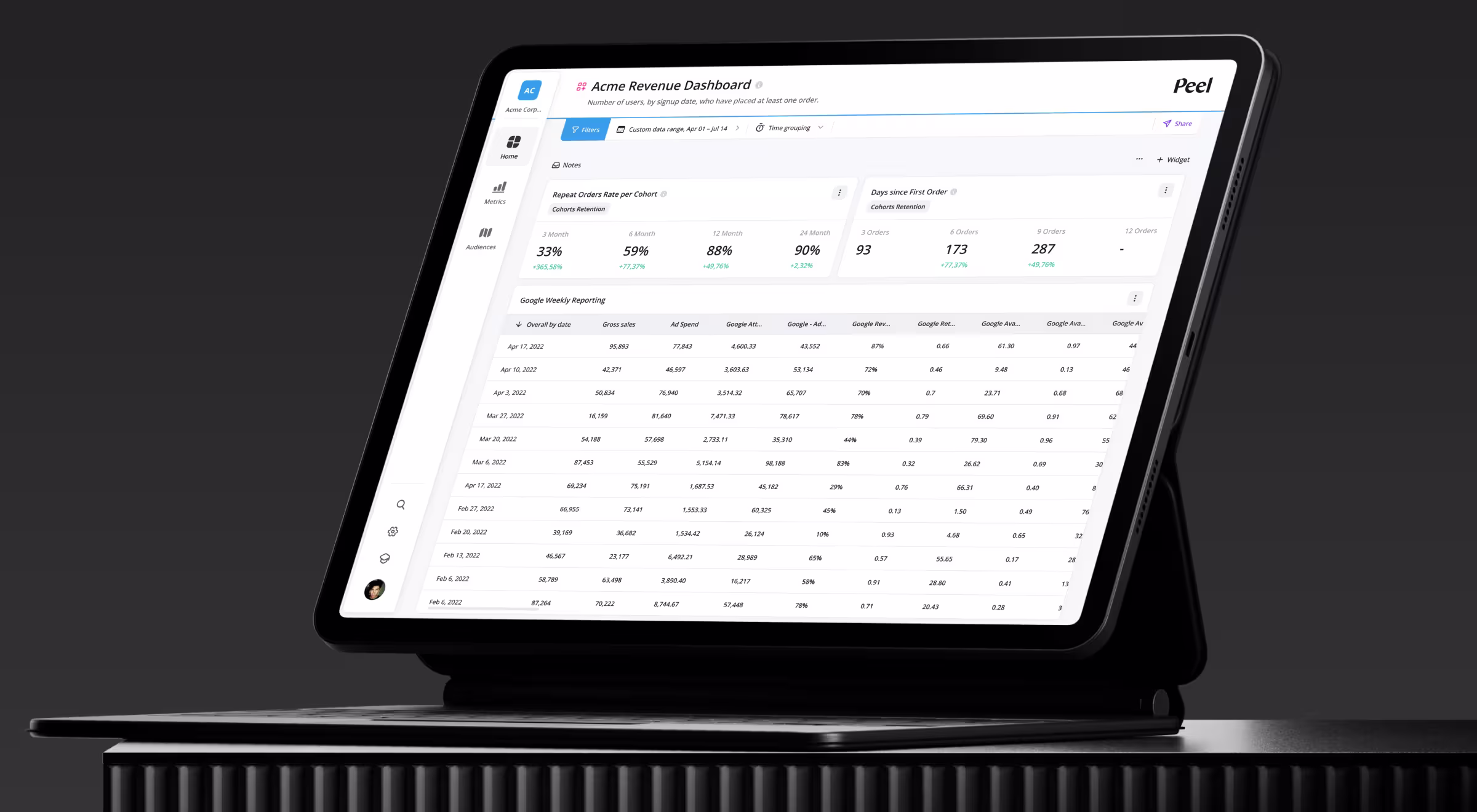
✅ Implementation ideas:
- Introduce advanced functionality only after core actions
- Use contextual controls instead of global menus
- Expand capabilities through progressive interaction
5. Design upgrade moments around user success
In product-led products, monetization follows value, which is the core of strong free trial to paid conversions. Upgrade prompts should appear at moments when users recognize the product’s usefulness.
Analytics products often present upgrades when users attempt to access advanced insights or larger datasets. At this point, the upgrade represents an extension of an already successful workflow.
✅ Implementation ideas:
- Trigger upgrade prompts after meaningful usage
- Explain the benefit of upgrading through contextual messaging
- Connect paid features to user progress
Product-led growth starts with an interface design
In traditional organizations, design supports marketing campaigns and sales conversations. In PLG companies, the interface performs many of those roles itself.
Designed well, a product explains its capabilities, guides users toward success, and encourages deeper adoption without continuous human intervention.
However, transitioning to a PLG model requires rethinking onboarding flows, interface architecture, analytics, and the entire path from first interaction to paid usage. Many companies underestimate how much design expertise this shift demands.
If your organization is considering a move toward PLG, start with when external design expertise becomes valuable. If you’ve already decided to delegate design to outsourced specialists, reach out to our team for personalized consultation.


.webp)


.avif)