
Every second your product’s dashboard hides the story behind the numbers is a second your users hesitate.
And in the fast-moving SaaS market, hesitation equals churn. That’s why dashboard UX design has become a board-level conversation for data-driven companies.
Our UX team keeps getting asked the same question: “How do we turn messy data streams into instantly actionable visuals?” Well, this article answers it, backed by a real dashboard we’ve designed, and the thinking behind every screen.
Key takeaways
- A great dashboard is a decision surface that answers one core question per view.
- Motion and micro-interactions guide attention when complexity is high.
- Story-first content hierarchy can raise users’ average session time.
- The right dashboard layouts scale from mobile tiles to wall-mounted war-rooms without redesign debt.
Why dashboard UX design needs its own playbook
Traditional UI patterns break when every component fights for pixel-level priority. A dashboard must compress KPIs, context, and next-best actions into what cognitive-load research calls the “glanceable zone”. That means:
- Progressive disclosure — start high-level, drill on demand.
- Semantic color — red only if something must be fixed now.
- Latency budgeting — every card should render < 100 ms, even on flaky Wi-Fi.
“A dashboard succeeds when it shows the pulse of your product before support feels the heartbeat.”
{{Kirill Lazarev}}
Dashboard best practices our UX team often applies
Here’s a quick reference to the dashboard best practices that consistently turn cluttered data into clear decisions:
3 dashboard UI examples to learn from
Browse the dashboard UI examples below to see our playbook in action across three different data-driven products.
🔎 Looking at how AI reframes research, flows, and handoffs? Explore our work on Product Experience Design in the Age of AI.
Mozayix — data & risk dashboard
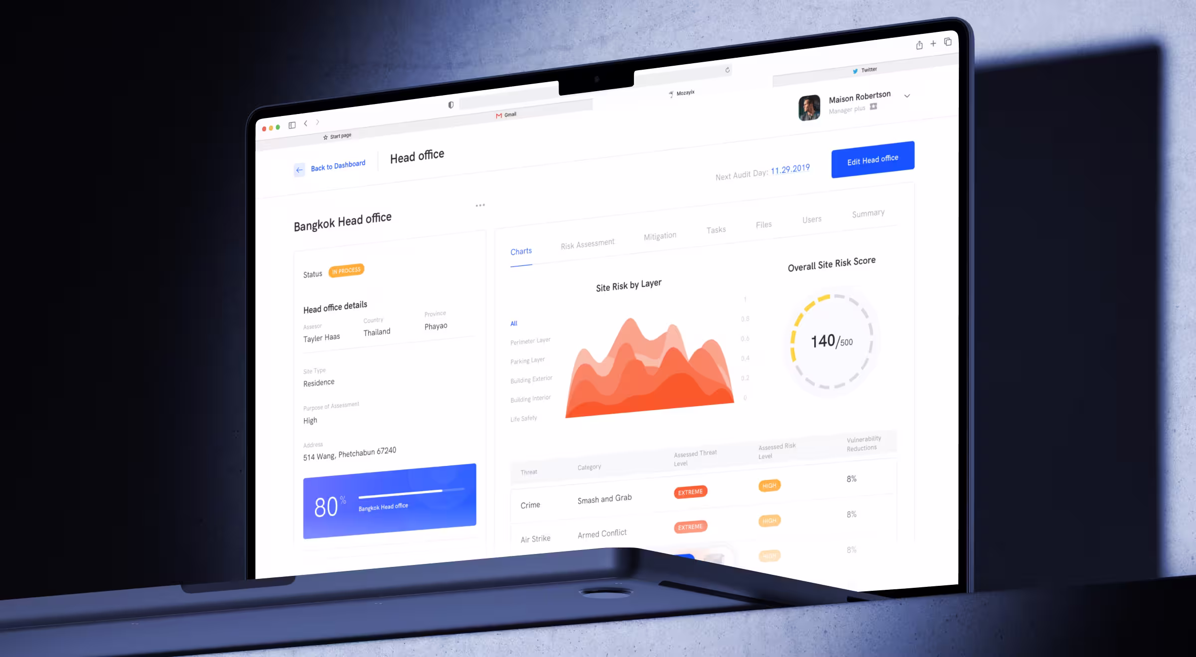
Mozayix is an enterprise risk and security consultancy. The product introduces a data dashboard as the central hub: it surfaces projects, security events, risk assessments, and quick status at a glance.
The dashboard layout highlights Security Events and Latest Notifications, supports incident reporting in a transparent, filterable table, and groups distinct project initiation flows (SRA and SSS) under Projects. The product also provides dedicated dashboards for each project.
Approach:
- Central hub. One screen brings together all necessary information for managers.
- Incidents & events. Report incidents and review them in a clear, filterable table for fast triage.
- SRA/SSS flows. Separate initiation paths for Security Risk Assessments and Security Site Surveys, unified under Projects.
- Per-project dashboards. Each project has its own dashboard for focused oversight.
Impact: A single place to review ongoing work and recent changes; incident reporting and review consolidated in one table; structured project initiation for SRA/SSS; and per-project dashboards for data-heavy contexts that keep oversight focused as the portfolio grows.
Stripe Dashboard — payments & ops console

The Stripe Dashboard design shows business charts at a glance and links you to deeper areas like Payments, Payouts, Disputes, Customers, and Balance, plus product-level analytics (e.g., Billing, Radar). You can also customize charts on Home.
Approach:
- Clear navigation from summary. From Home you can quickly move into Payments/Transactions, Disputes, Customers, Payouts/Balance, and Reports.
- Find anything fast. Dashboard search spans customers, invoices, payouts, products, and connected accounts; for advanced analysis, Sigma lets you query Stripe data with SQL in the Dashboard.
- Team + mobile continuity. Invite teammates with appropriate roles; the mobile app lets you view metrics, track/manage payments and customers, and initiate payouts on the go.
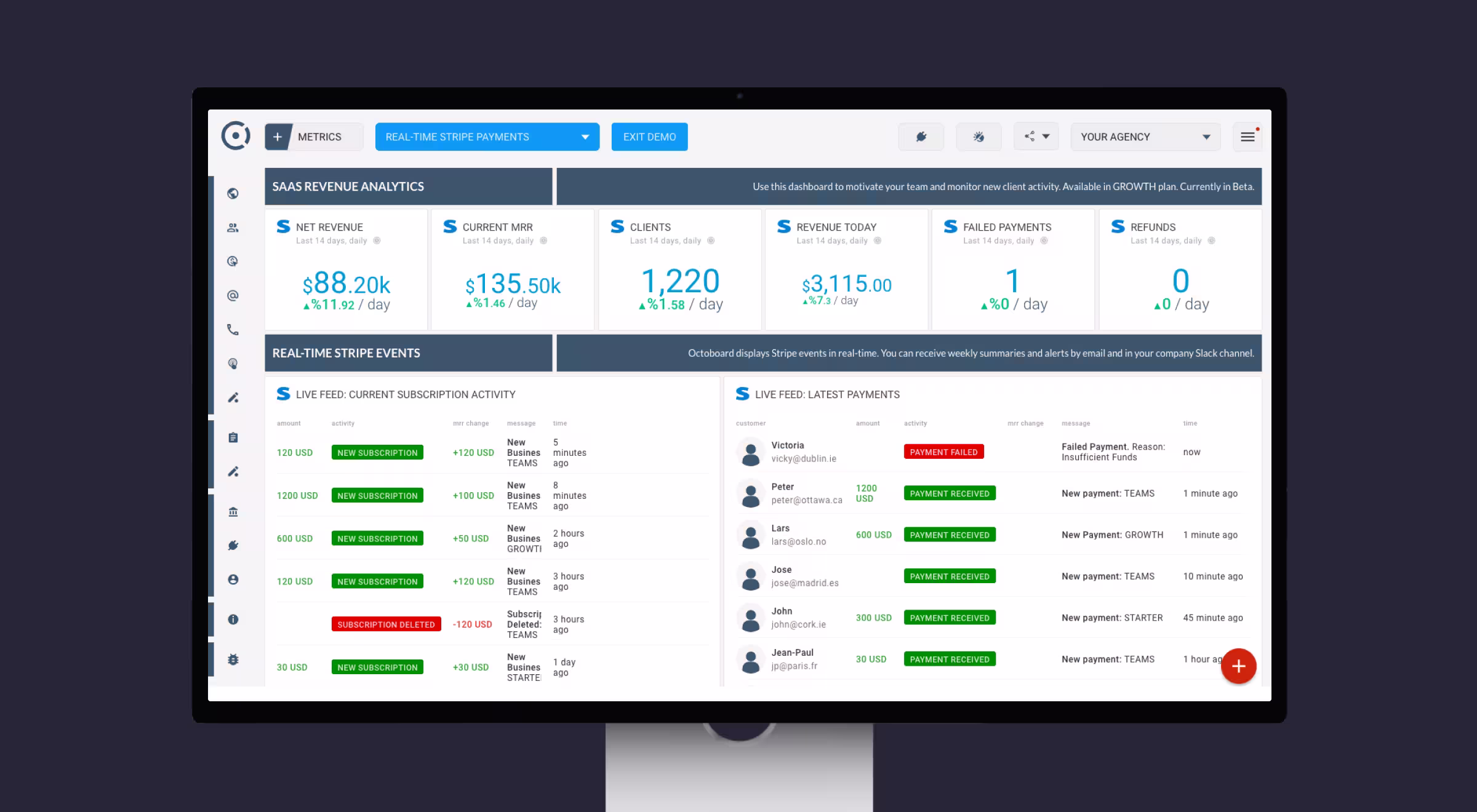
Impact: A single console to monitor payments and related operations, with fast navigation to core objects and a mobile companion when you’re away from the desk.
Slack Analytics — workspace usage dashboard
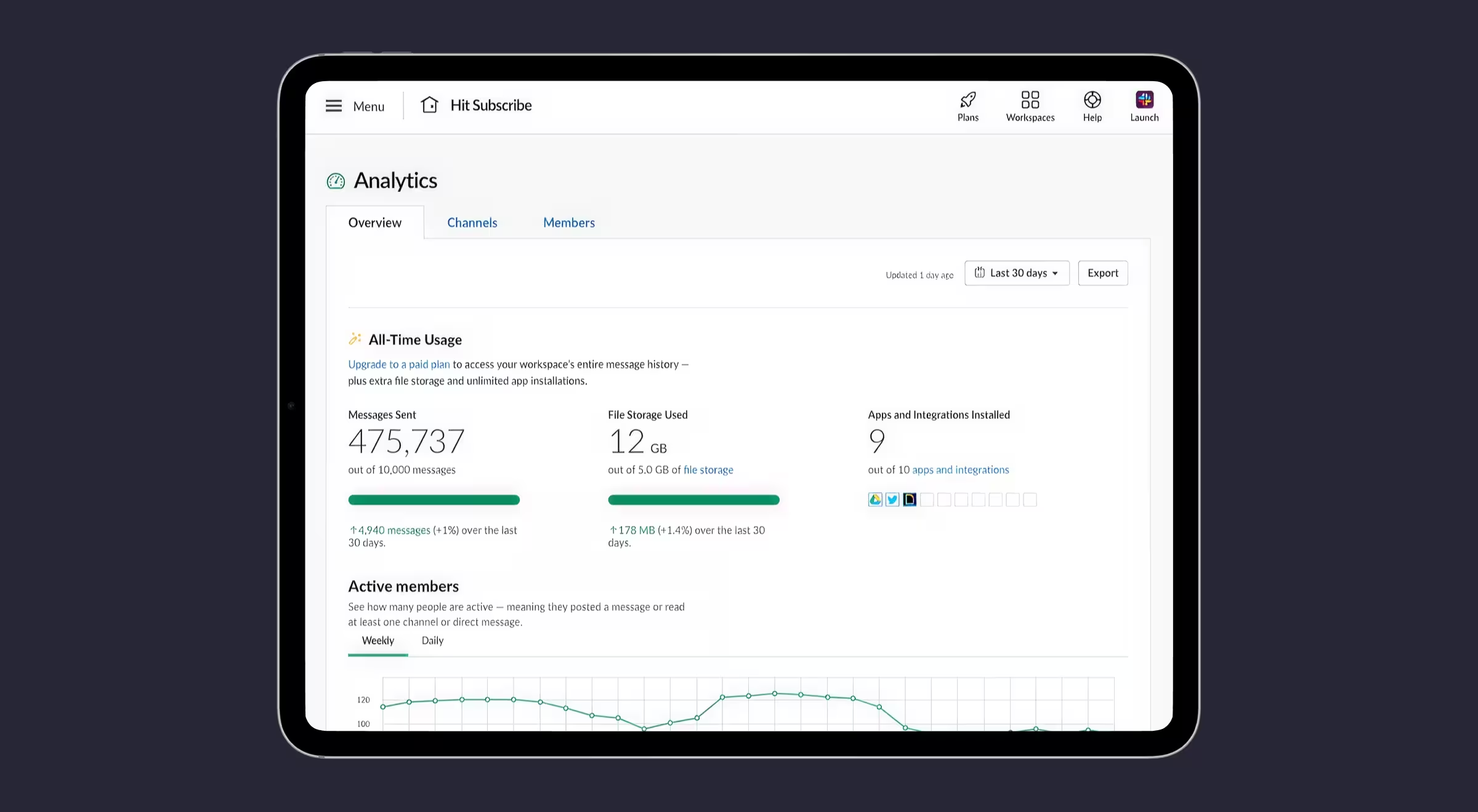
Slack Analytics gives admins a consolidated view of how the workspace is used. Access it from Tools & settings → Workspace analytics; tabs include Overview, Channels, Members, and AI, with adjustable time windows. Availability depends on plan and permissions.
Approach:
- Summary first, then segments. The dashboard UI groups information across Overview/Channels/Members/AI so teams can scan adoption before diving deeper.
- Clear time windows & definitions. Metrics define periods (daily/weekly/monthly) and break down where people read/send messages across public channels, private channels, and DMs; some channel analytics are enterprise-only.
Plan- and role-gated access. Many analytics are available on paid plans only; org-level dashboards and member analytics require specific permissions/roles.

Impact: A common place to understand adoption and activity trends with consistent definitions, plus controls to scope access by plan and role.
How to choose the right dashboard UI layouts
“Good data visualization lowers cognitive load; great visualization accelerates decisions.”
{{Oleksandr Koshytskyi}}
Choosing a dashboard layout isn’t about picking tiles vs. tables. The right dashboard choice is about mapping decisions to screen real estate. The wrong layout can bury urgent signals, while the right one can shave hours off operational cycles. Below you may find Lazarev.agency’s tips on how to approach it.
1. Start with decision depth.
List the questions your users ask most often. Each unique question is a candidate for its own layout. Operational dashboards should answer “What’s happening right now?” in a single glance, while analytical dashboards should enable “Why did this happen?” through filters and drilldowns.
2. Match layouts to user roles and rhythms.
Executives need a pulse check: clean metrics, anomaly alerts, trend arrows. Specialists need diagnostic depth: sortable tables, multi-layer charts, and query fields. Map layouts to the cadence of their work — the CFO checks once a week, while the support lead checks hourly.
3. Design for context-switching.
Most dashboards fail because users juggle multiple systems. Choose layouts that reduce mental friction: surface anomalies visually (semantic color, motion cues), cluster related KPIs together, and allow drilldowns without forcing tab-hopping.
4. Scale from pocket to wall.
Dashboards live on mobile screens, desktop monitors, and 80-inch war-room displays. Layouts that break outside their original frame create redesign debt. Favor grid systems and adaptive modules that scale up or down without loss of clarity.
5. Validate with time-to-answer.
A dashboard isn’t successful if it looks clean but takes three minutes to interpret. Benchmark each layout against a “time-to-answer” metric — how long it takes a user to act on the data. If it’s over 30 seconds, revisit the hierarchy.
💡 Pro tip: Build a “layout matrix” during wireframing: rows = user roles, columns = core questions. Each intersection forces you to decide whether that role needs a dedicated dashboard, a shared view, or a personalized filter. It’s the fastest way to prevent dashboard bloat.
How to approach dashboard design projects
This repeatable flow keeps your dashboard UX design work both scalable and measurable:
- Audit & analytics pull. Mine existing event logs to understand silent pain points.
- Wireframe in data. Real numbers reveal truncation and axis-scale issues early.
- Accessible color tokens. WCAG AA on every chart palette — bank on it.
- Micro-copy validation. Each tooltip answers, “What should I do next?”
- Design QA in prod. Ship telemetry hooks that flag when widgets fall below 15 fps to prevent death by sluggishness.
Ready to make your data impossible to ignore?
Explore our UX/UI design services or book a strategy call, and let's talk.
If your dashboard design buries insight under pixels, we’ll fix that before your users run away.


.webp)