

Product teams have a narrow window to win confidence when money moves on screen.
In this article, you will find fintech UX case study examples that dissect how two projects handle that pressure: LEX.art and Tratta.
We show where the UX raises trust through clear roles, auditable states, and decision-support data, and how these choices align with banking design trends that product leaders care about right now.
Key takeaways
- Start with role clarity. Split users’ paths early, then adapt onboarding depth per role.
- Use verifiable rails for KYC/bank linking and keep progress explicit. See Plaid Link for account connections and Wise for KYC pathways.
- Put the “why this is valuable?” next to the “what to do next?”: on LEX.art, artist pages combine Thesis, analytics, and recent sales so investors can act with context.
- For transactions, make state changes legible at a glance (colors for bid status; clear histories).
- Tratta validates payment UX patterns at scale: multiple payment options, guest vs account flows, and a configurable console with reporting.
How fintech UX influences banking design trends
To frame the takeaways, let’s place them against the banking design trends buyers use to judge work:
- Digital at scale & tech as core capability. Industry analyses highlight that incumbent banks now prioritize scaled digital journeys and modernized cores; product teams should design for reliability and auditability as first-class UX constraints.
- Payments adoption keeps climbing. As digital payments usage rises, interfaces must surface fees, limits, and timing in plain language, and let users choose rails confidently (card, ACH, scheduled plans).
- Investment in platform foundations. Banks continue heavy tech spend; design choices that simplify risk checks (role-based flows, explicit states, embedded analytics) align with where budgets are going.
Taken together, these trends set the constraints for what follows. Now, let’s ground them in product reality: the roles, verification steps, analytics, auctions, and payment options you’ll see in LEX.art and Tratta so the connection between strategy and screen is more explicit.
The product context we’re designing for
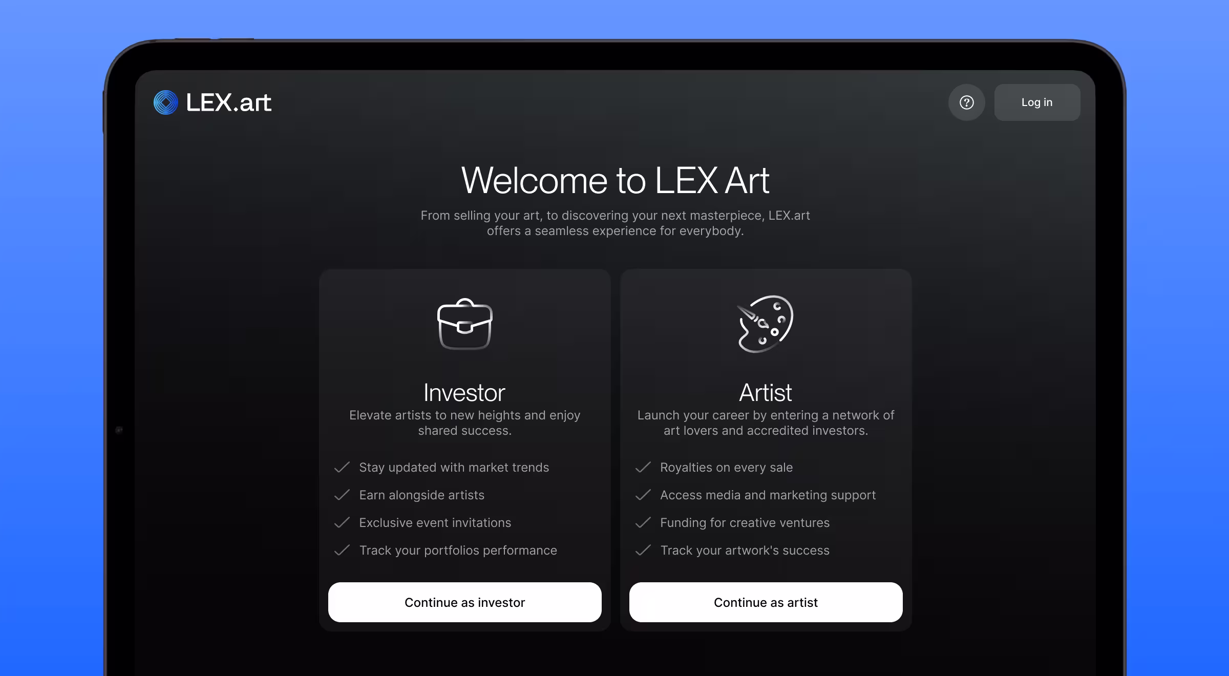
LEX.art serves two sides of the same market: artists and investors. The core idea is profit-share: while an investor holds a work, they receive a defined share of the artist’s future income streams (sales, workshops, merch, etc.). The platform coordinates this relationship and surfaces the signals investors need to judge traction.
🔎 Learn more about data-baked user roles and UX personas in our guide: “UX persona examples from real projects with practical tips”!
Onboarding that reflects risk
- Role gate first. The flow begins with a role choice (investor vs artist), which tailors requirements per path.
- Bank/KYC rails. Investors connect a bank account via Plaid Link before they can transact; this is standard for initiating transfers and verifying debitable accounts.
🤓 If a partner depends on third-party KYC/KYB, Wise Platform outlines both “Wise-run KYC” and “Partner KYC” models — useful patterns when selecting your compliance lane.
💡 Pro tip: keep the “steps ahead” visible during registration and use the left rail to reiterate product value while the form collects sensitive details. This calms drop-off without dumbing down requirements.
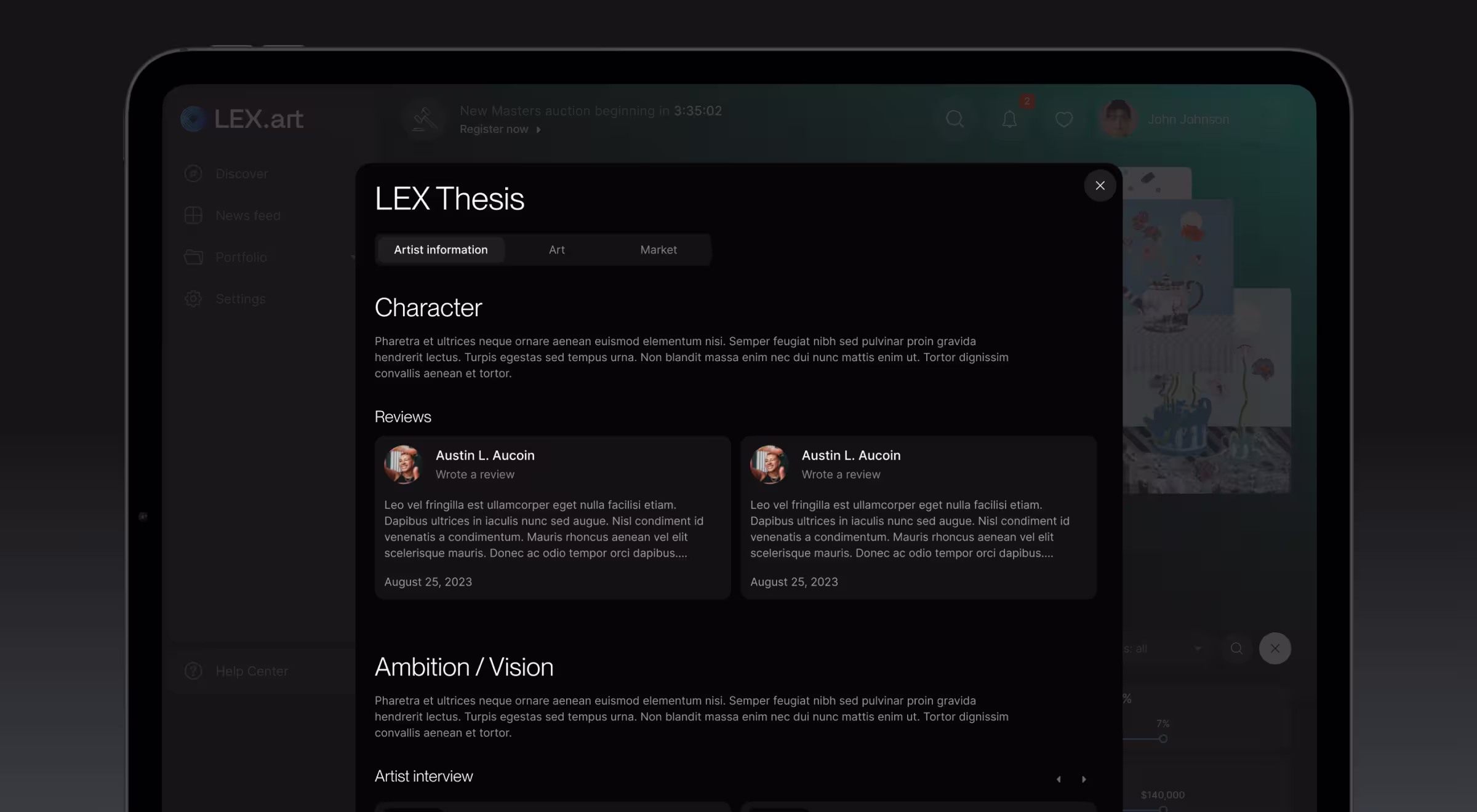
Making value legible on the artist view
Investors browse an artist page organized into three tabs:
- Overview: bio, video, news, auction participation, and popular works for a fast read.
- Analytics: last sale price, profit-share agreements count, net profit, market valuation over time, and social signals — all presented in a dashboard with comparable widgets.
- Artworks: a visual, non-financial grid.
These tabs turn scattered signals into a decision surface, with LEX.art Thesis (a modal containing character, reviews, vision, and achievements) available on demand.
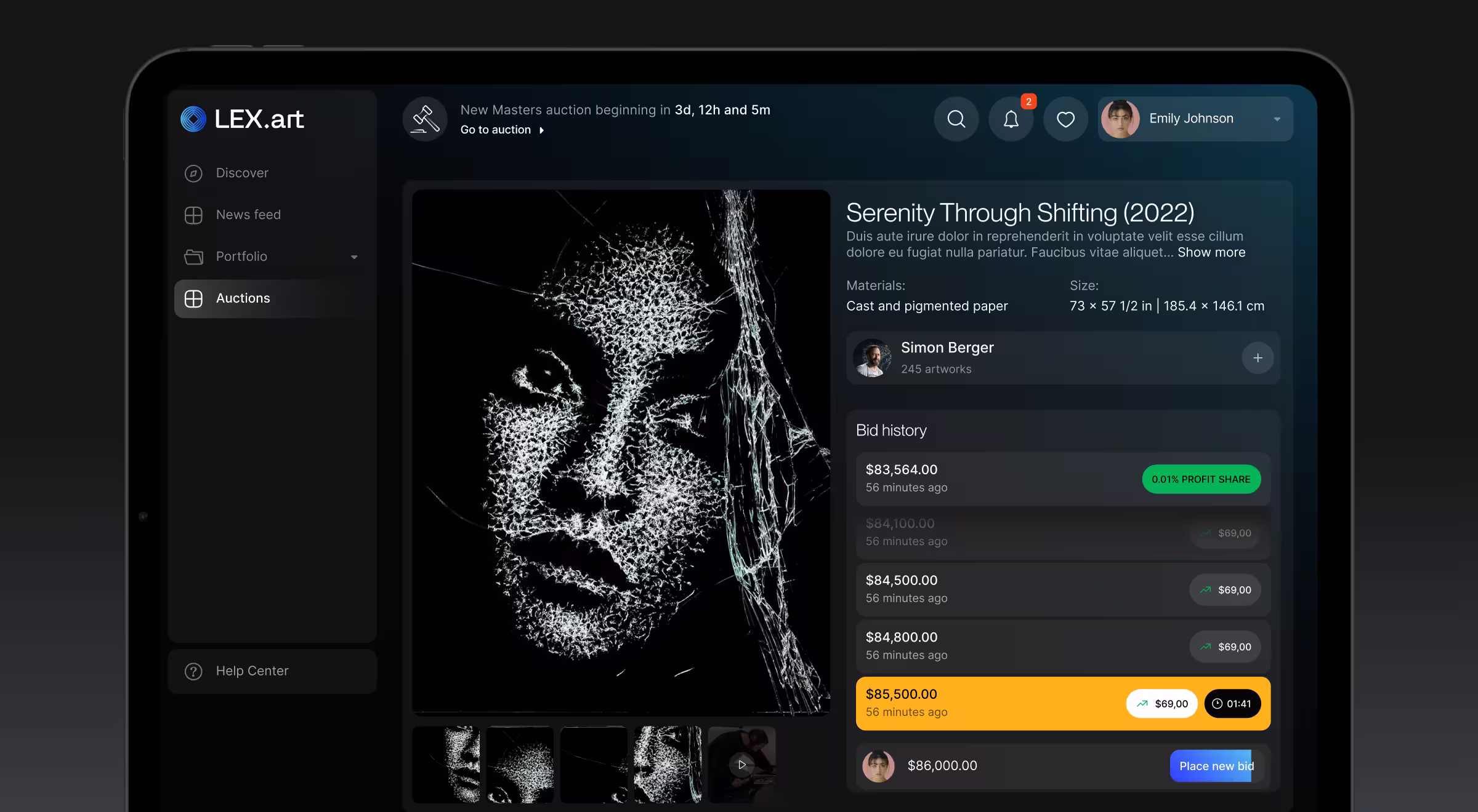
Auctions and artwork detail: state clarity beats friction
For live auctions, the screen keeps video, artwork data, and bidding history in one view. Bid states change color:
- your current winning bid shows green;
- outbid turns orange;
- the leading non-yours bid highlights yellow.
History shows increments and timing so users can reason about price movement. When the piece sells (or not), the interface resets for the next lot.
Outside auctions, the artwork page leans on provenance and comparables: past transactions, price changes, and standardized Q&A. Owners can request that a piece be scheduled for auction; non-owners can make an offer.
Keeping investors oriented between trades
- News feed aggregates artist updates, watchlist changes, upcoming auctions, and market activity so users can scan the landscape quickly.
- Following centralizes everything the user subscribed to artists, artworks, auctions, and articles; filterable by type.
- Discover acts as a catalog with filters for artworks, artists, and articles.
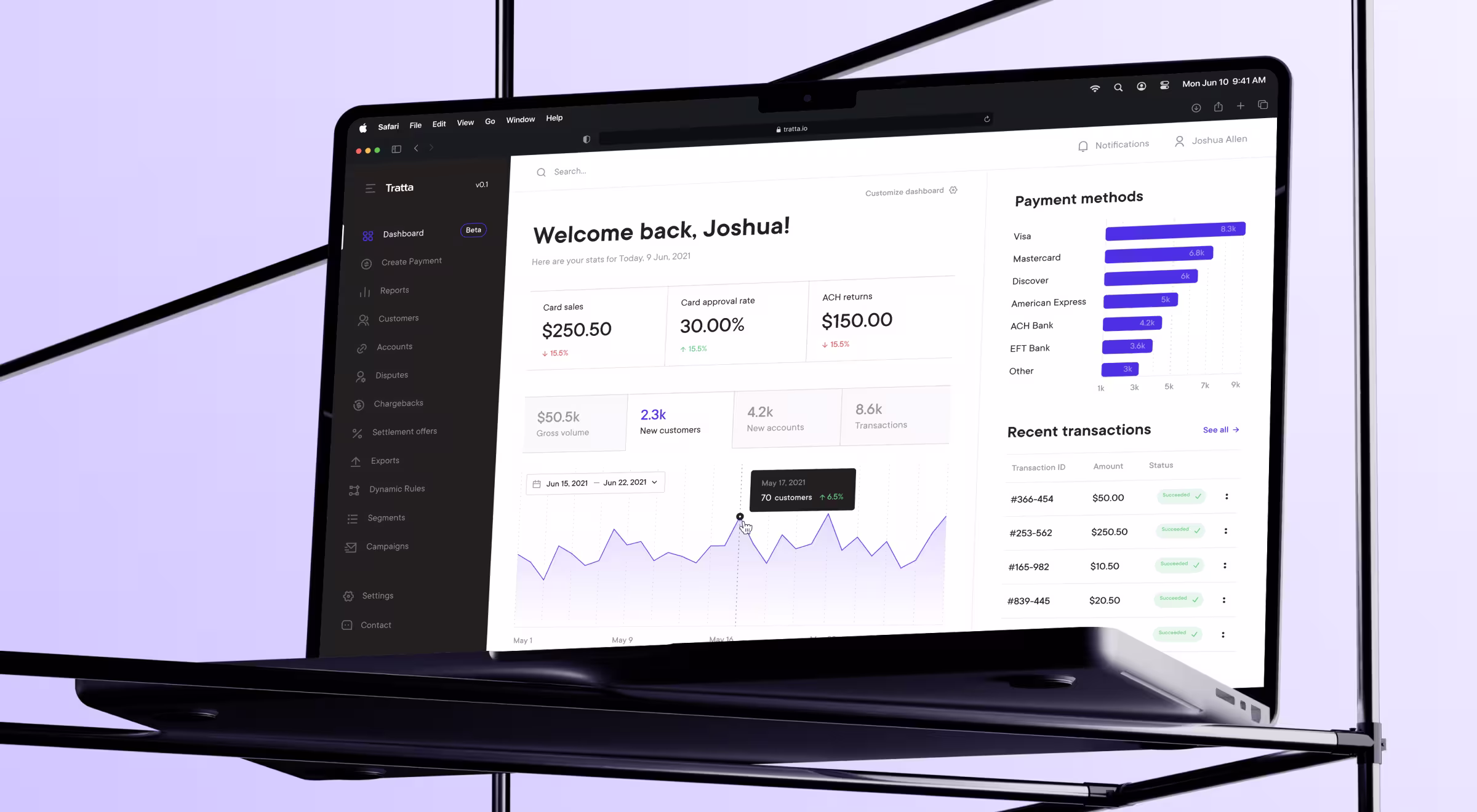
Validating payment UX with Tratta
Tratta’s case reinforces several transaction patterns relevant to investor and fintech products:
- Payment flexibility: Full, Partial, and Payment Plan options reduce friction while matching real-world constraints.
- Guest vs account: A guest flow speeds single payments; an account unlocks additional methods and scheduling (e.g., plan setup and billing view).
- Operational cockpit: “Console” gives collectors a configurable dashboard to manage debtors, balances, transactions, and reports with customizable columns, favorites, and export.
These are the same guardrails we carry into investor-facing apps: flexible payments, low-friction entry, and back-office visibility.
🔎 Need a deeper dive? Check out the full Tratta’s fintech UX case study!
What to reuse on your fintech product roadmap
- Separate paths early. Distinct flows (like investor/artist or borrower/collector) align UX with compliance requirements from step one.
- Put evidence next to action. Keep analytics, recent sales, and third-party signals within one decision surface (not separate report pages).
- Design for audit. Bid histories, price deltas, and profit-share contracts should be inspectable without leaving the page.
- Offer reversible depth. Let users expand to full-screen views or collapse to focus on the active action (e.g., live bidding).
- Flex the payment rails. Mirror Tratta’s flexibility (single, partial, and plan-based payments, plus guest/account choices) to broaden conversion without loosening controls.
Work with us
High-stakes decisions need research you can act on.
If legacy sign-ups or payment paths are leaking users, Lazarev.agency, a digital product design agency for fintech, helps make the path unambiguous: clarify roles from the first tap, make risk and verification steps explicit, and turn analytics into decision surfaces your team can act on.
See where this leads in our fintech solutions, or get in touch to pinpoint where the trust is broken.


.webp)


.avif)
.avif)
.avif)
.avif)
.avif)
.avif)
.jpg)